Brand & Digital
Synergy for Impact, SIMPAC
- Client
- SIMPAC Group
- Category
- Brand, Digital
- Services
- Brand Strategy, Film & Motion, Digital Strategy, Website, Development
- Scope
- Brand Experience, Digital Strategy, Style Guide, Website Design, Mobile Site Design, 3D Modeling, 3D Motion Graphics
- Year
- 2025
- Links
- Visit Website
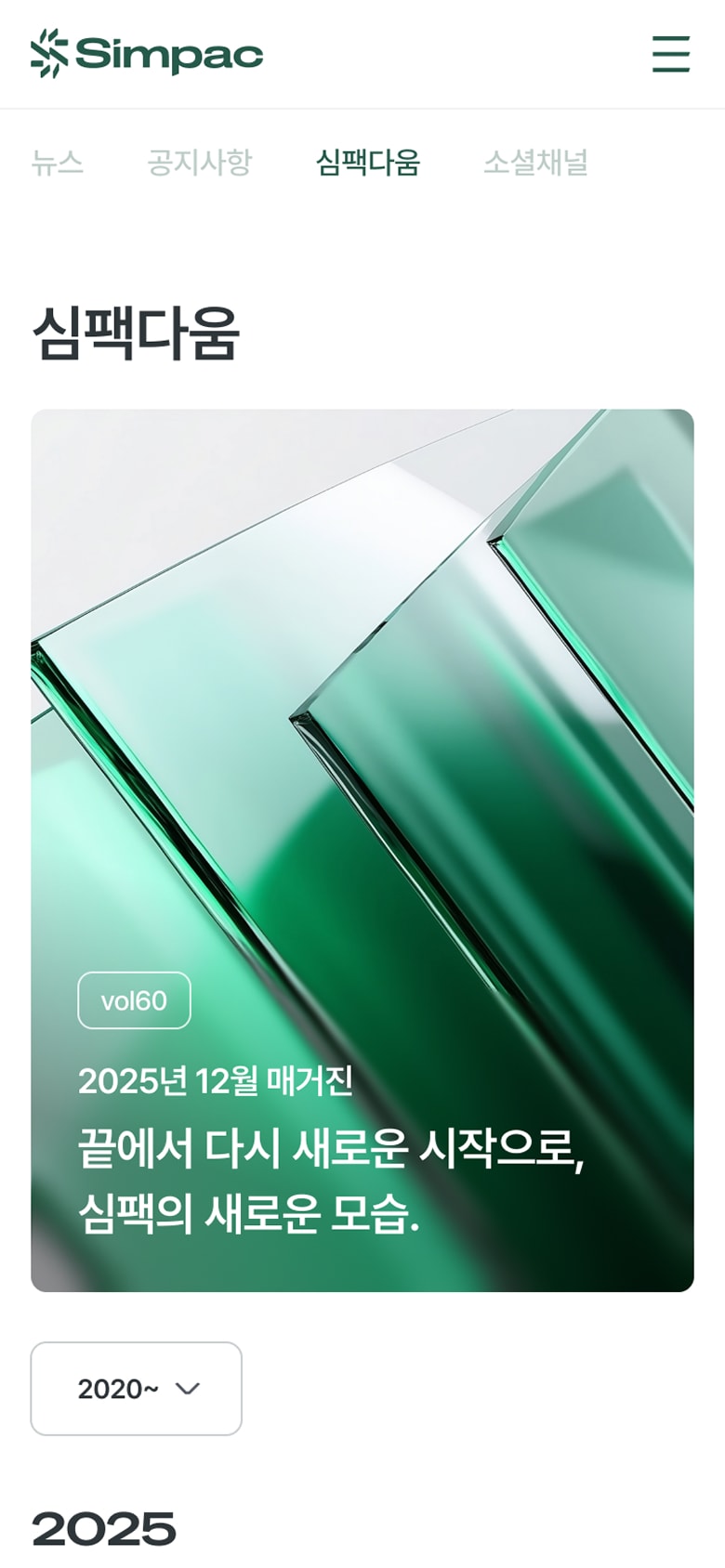
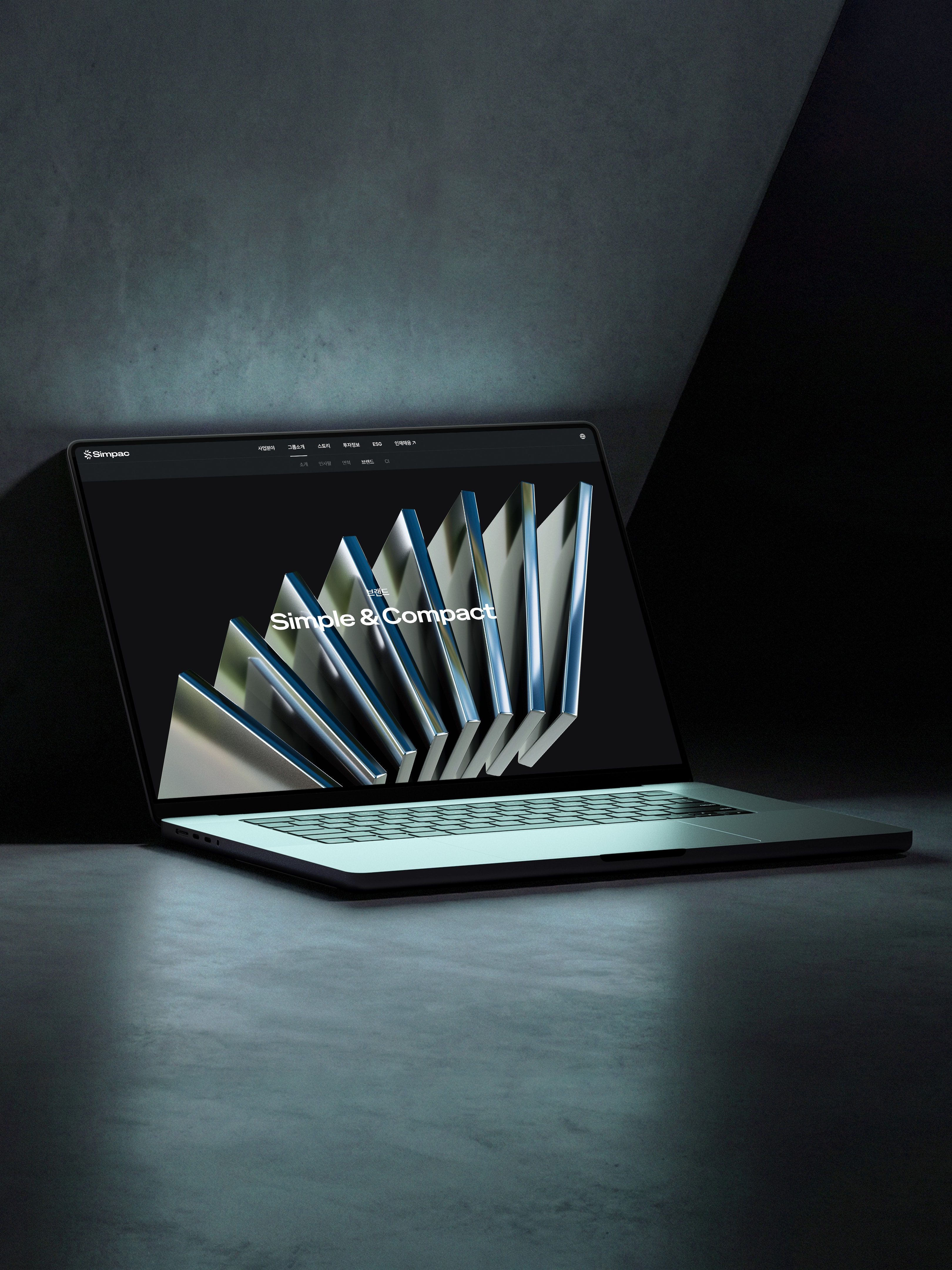
Design is not always about showcasing something extraordinary—it is often about embracing essential standards and simplicity. Under the philosophy of “Simple & Compact,” SIMPAC Group is the leading global manufacturer in the press industry. From its core B2B sectors in presses and industrial machinery to Perfumer H, which recently launched officially in Korea, DFY created a new brand website that represents the full spectrum of SIMPAC Group’s diverse businesses.
Our primary goal was to translate SIMPAC’s robust engineering expertise and its values of trust into design, building a website that remains strong and relevant over time. Through sensory and realistic 3D visuals in a digital environment, we meaningfully expanded SIMPAC’s brand identity and crafted an experience that stays with users. Join SIMPAC on this new digital journey that captures the true essence of advanced technology.
SIMPAC 브랜드 웹사이트 구축 디자인은 때로 어떤 특별함을 보여주는 것이 아니라 본질적인 기준과 심플함을 담는 것이 중요합니다. SIMPAC 그룹은 Simple & Compact라는 브랜드 철학 아래 글로벌 프레스 시장을 선도하고 있는 업계 1위의 제조 기업입니다. 디에프와이는 프레스, 산업기계로 대표되는 B2B 산업에서부터 최근 한국에 정식 런칭한 Perfumer H까지, 다양한 사업분야를 전개하고 있는 SIMPAC 그룹의 새로운 브랜드 사이트를 제작하였습니다. SIMPAC의 견고한 기술력과 신뢰라는 가치를 디자인에 연결하여, 오랫동안 지속되는 단단한 사이트가 될 수 있도록 하는 것이 우리의 가장 큰 목표였습니다. 디지털 공간에서 감각적이고 사실적인 3D 비주얼을 통해 SIMPAC의 브랜드 아이덴티티를 의미있게 확장시키며, 기억에 남는 사용자 경험을 제공할 수 있도록 디자인하였습니다. 첨단 기술의 본질을 담은 SIMPAC의 새로운 디지털 여정에 합류해 보세요.
A brand website built on simple, essential design
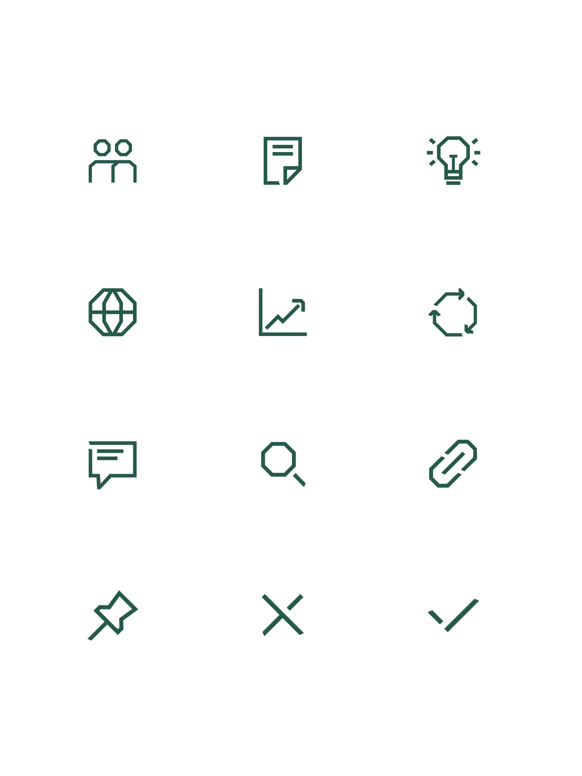
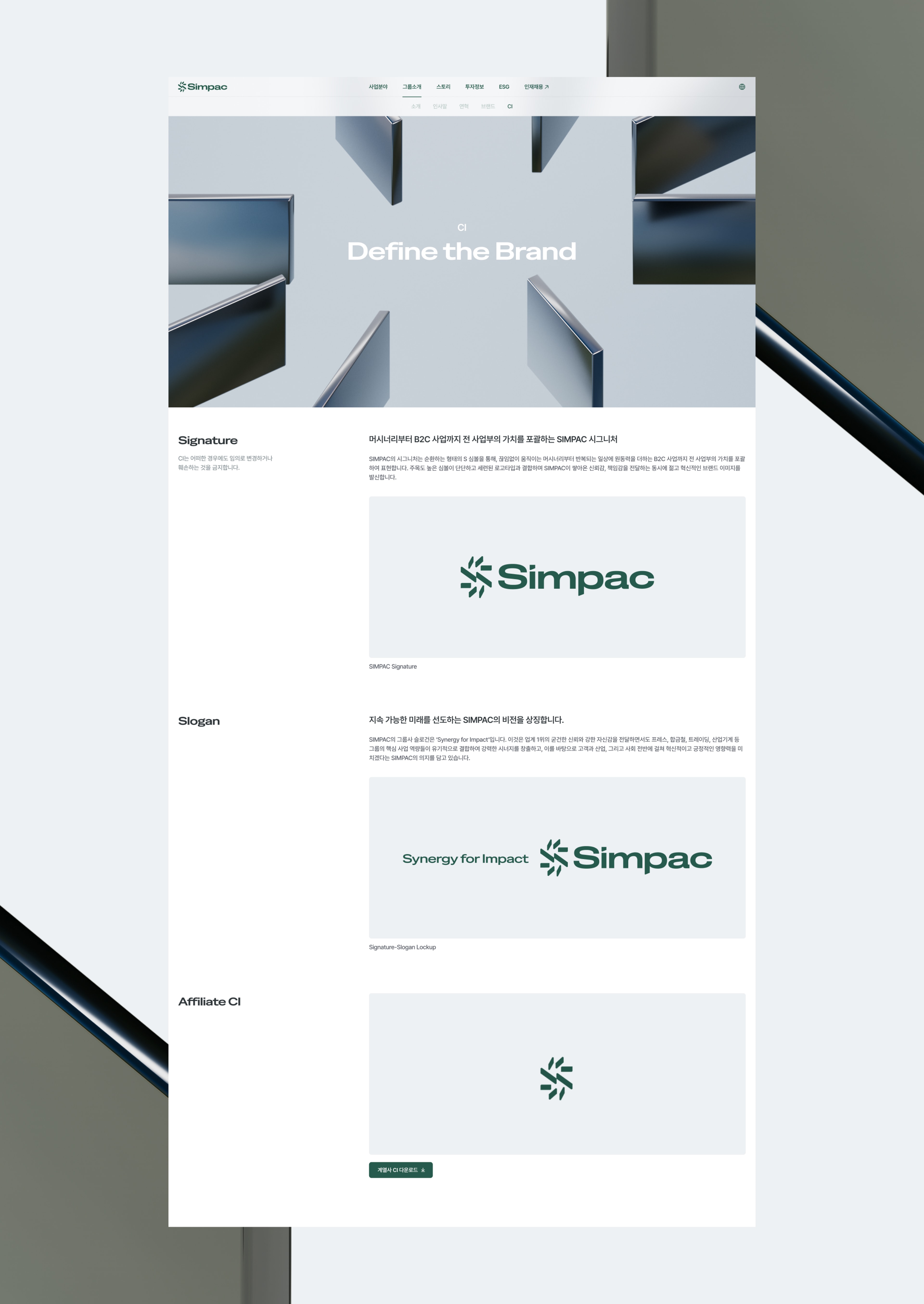
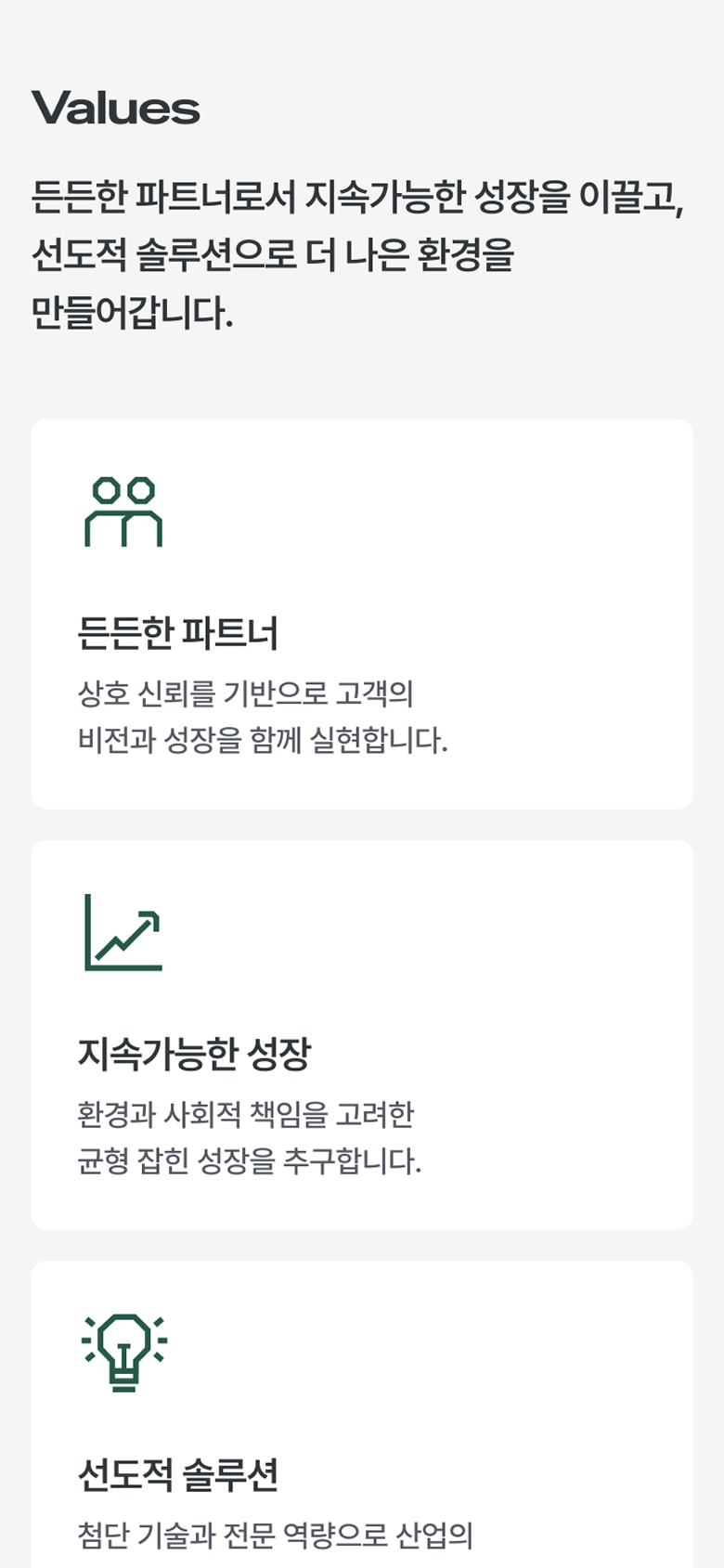
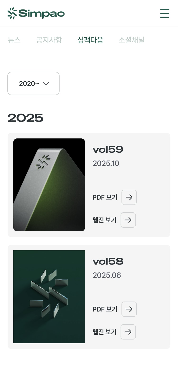
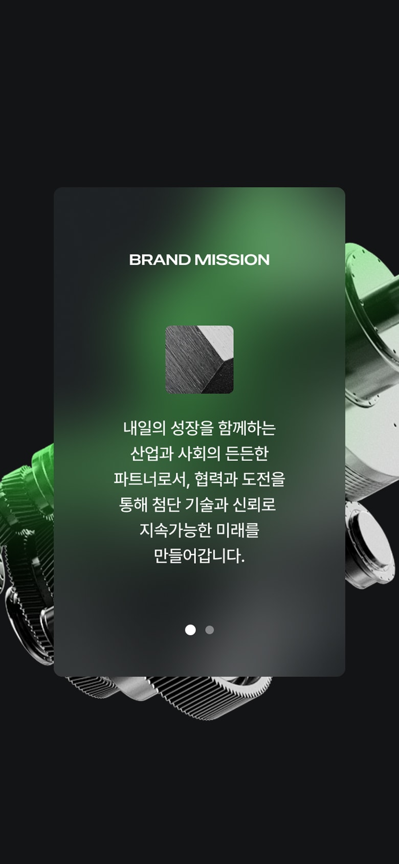
Our website, designed to embody SIMPAC’s brand philosophy, is built on a refined layout and a consistent, professional tone. This approach is not about short-term appeal but about establishing a strong and lasting impression—even five years from now—making it a crucial foundation for long-lasting brand communication. Guided by SIMPAC’s high-impact brand identity assets, we defined key elements across the website. We applied a cyclical motion to the signature logotype and established a clear framework for how brand colors translate to the website’s color system. Additionally, we created a typography guide tailored to the brand’s dedicated typeface to ensure optimal readability for both headlines and body text. Adding subtle detail, we developed an icon system built on linear forms and angled edges. Simple yet distinctive, this iconography integrates seamlessly with the overall design tone and reinforces SIMPAC’s unique brand presence and professional character.
단순하고 본질적인 디자인을 담은 브랜드 웹사이트 SIMPAC의 브랜드 철학을 담은 우리 웹사이트는 정제된 레이아웃과 일관되고 전문적인 톤앤매너를 유지할 수 있도록 설계되었습니다. 이것은 단기적인 만족감이 아닌, 5년 이상 우리 사이트를 보았을 때 단단한 인상을 전달하기 위한 것으로서 생명력 있는 브랜드 커뮤니케이션에 가장 중요한 부분을 차지합니다. 우리는 주목도 높은 브랜드 아이덴티티 에셋에 따라 웹사이트의 다양한 요소들을 정의하였습니다. 시그니처 로고타입에 순환하는 형태의 모션을 적용하고, 브랜드 컬러에 따른 웹사이트 컬러 적용의 기준을 세웠습니다. 또한 브랜드 전용 서체에 맞춘 타이포그래피 가이드를 구성하여 헤드라인과 바디 카피의 가독성을 확보하였습니다. 여기에 작은 디테일을 더하여, 직선적인 형태와 꺾여 있는 엣지를 활용한 아이콘 시스템을 개발하였습니다. 심플하지만 엣지 있는 아이콘 시스템은 전체적인 디자인 톤앤매너와 유기적으로 연결되어 SIMPAC의 고유한 브랜드 인상과 전문성을 부여합니다.
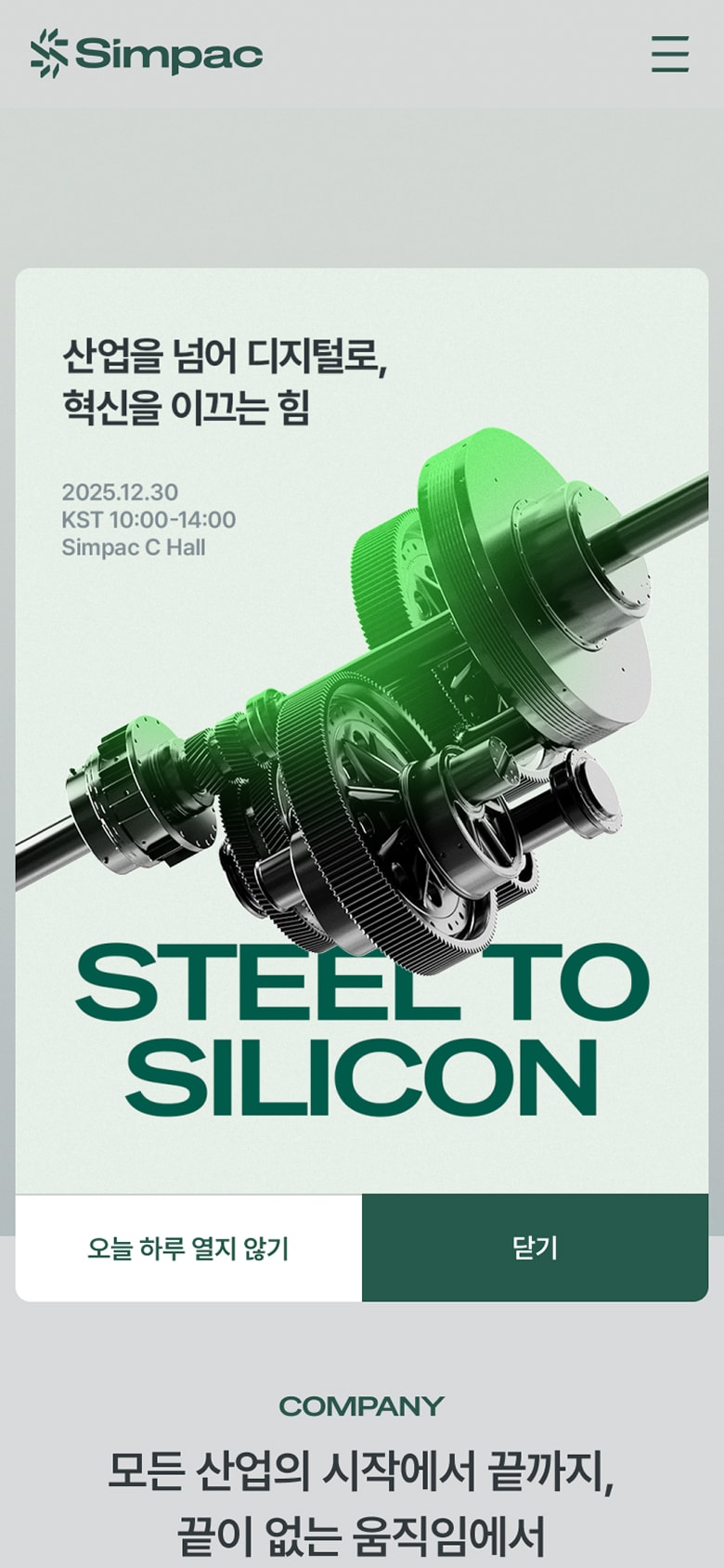
3D assets that express a refined sense of advanced technology
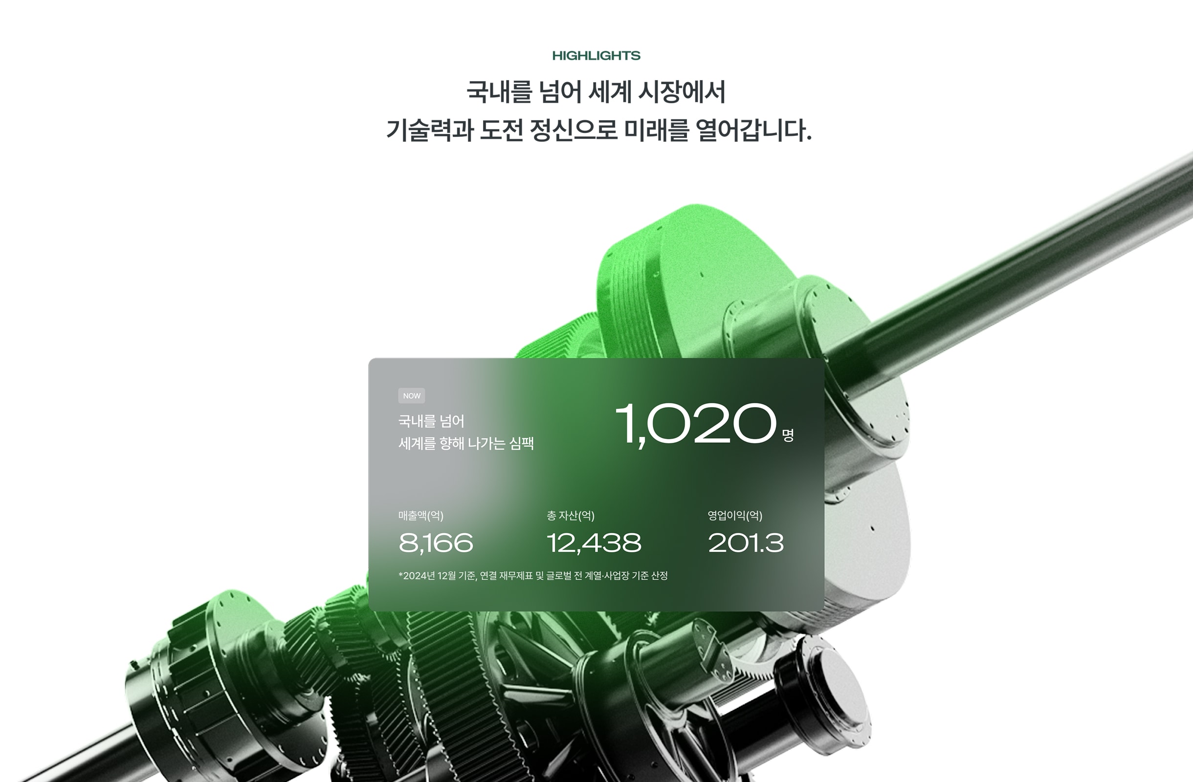
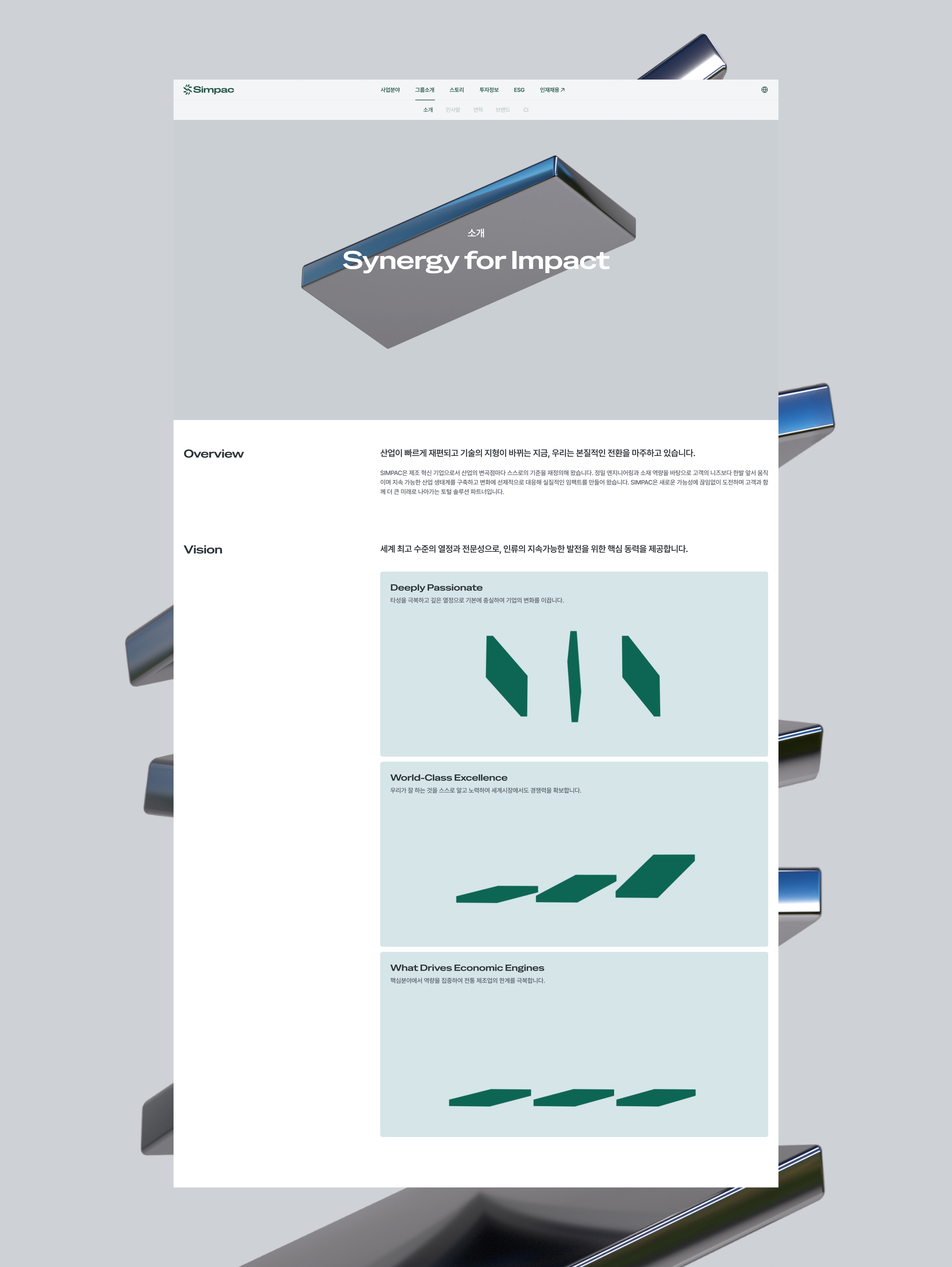
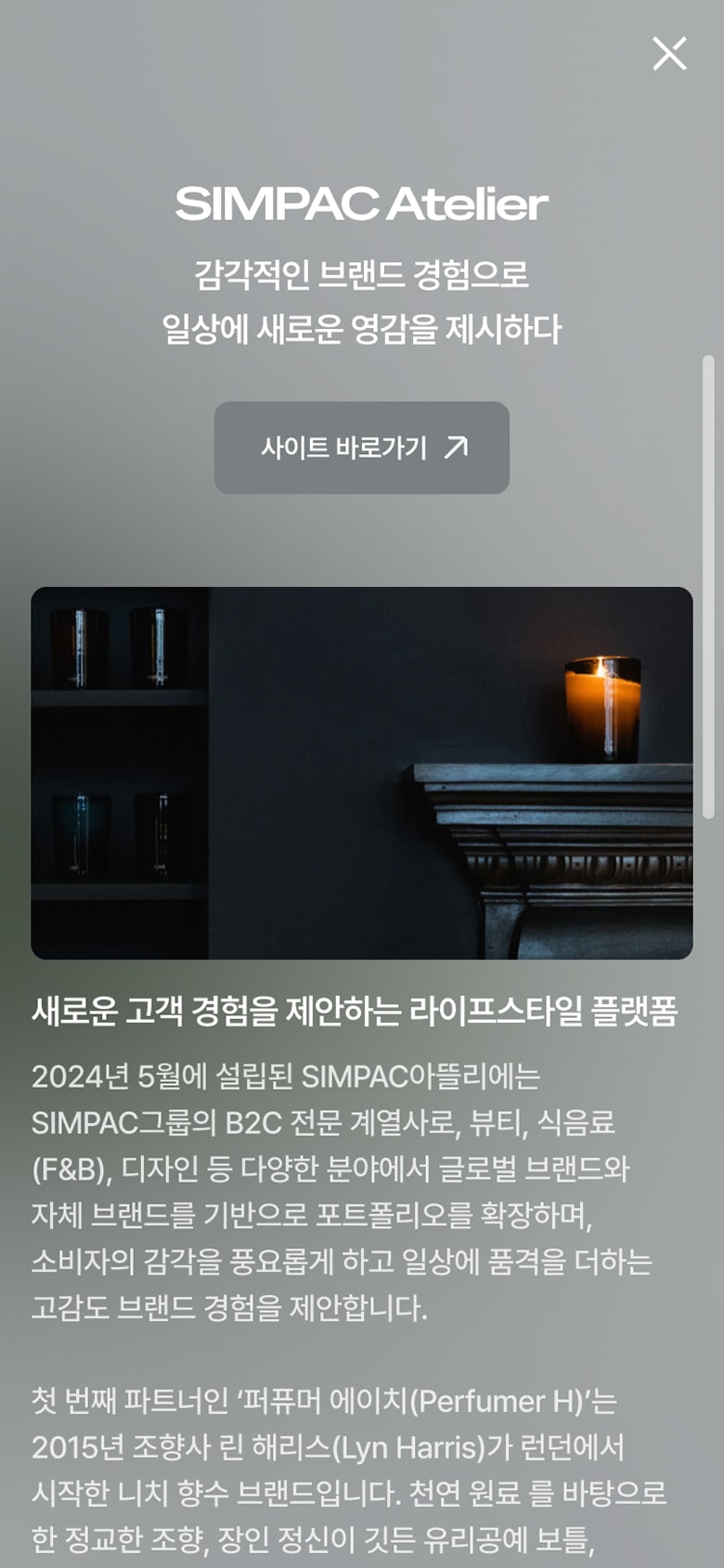
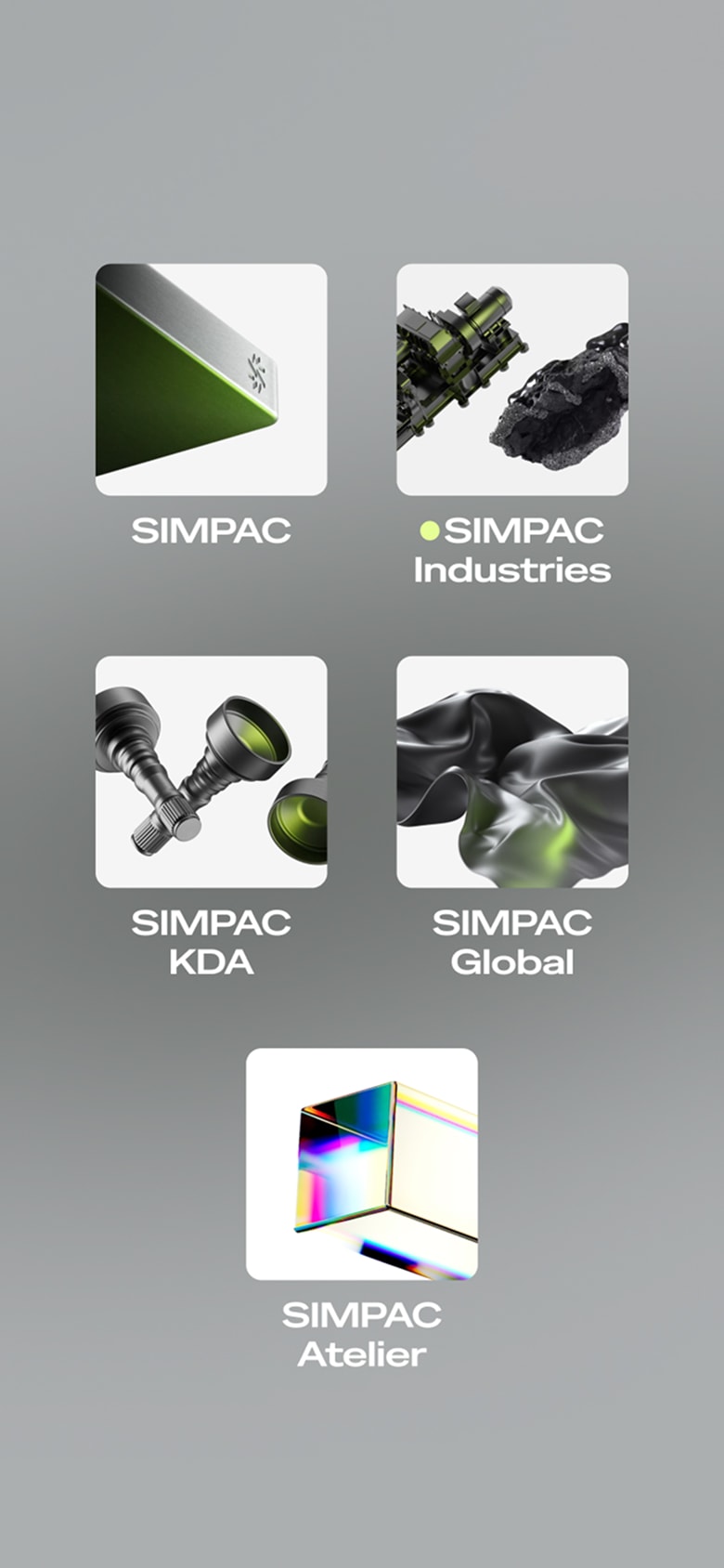
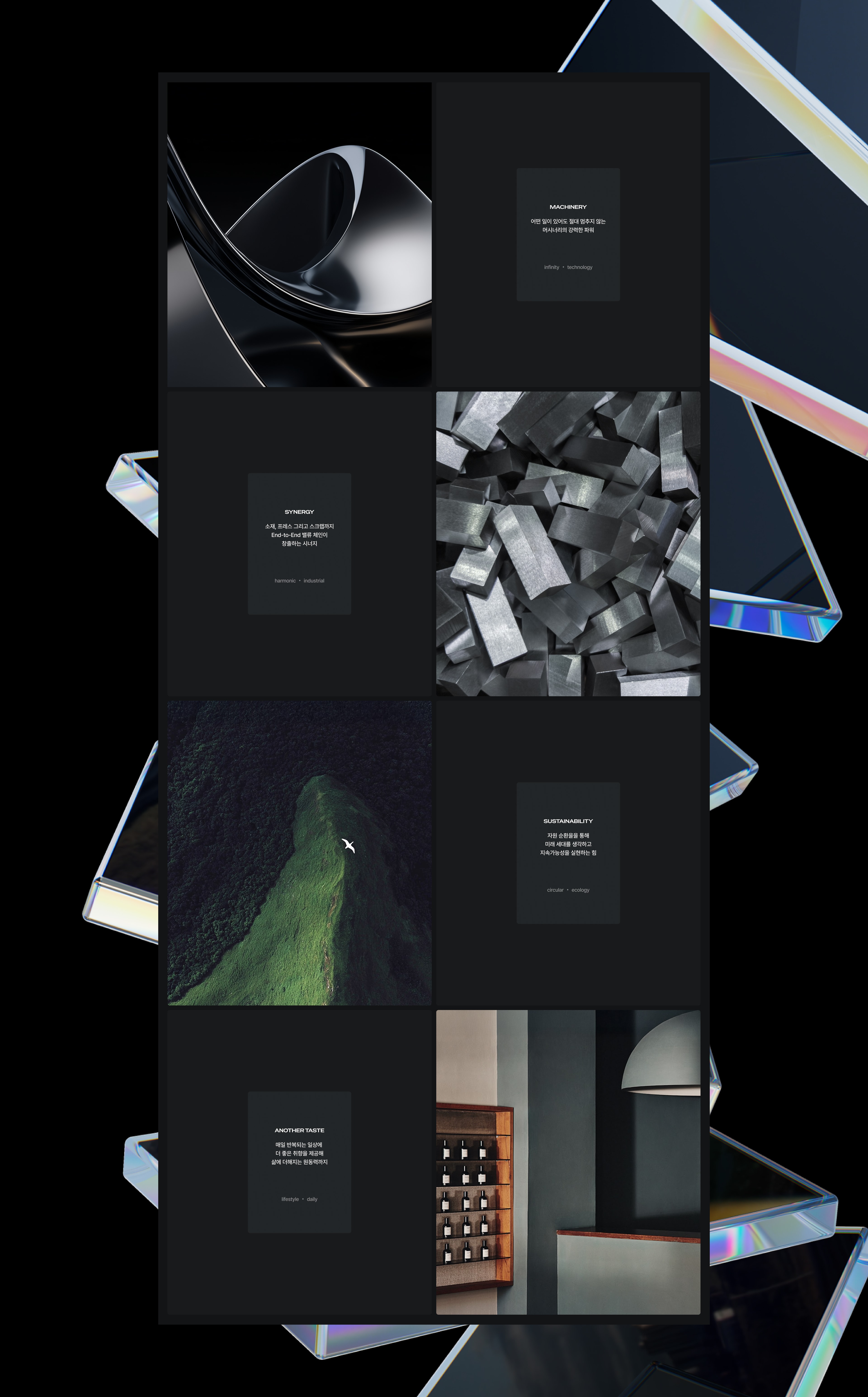
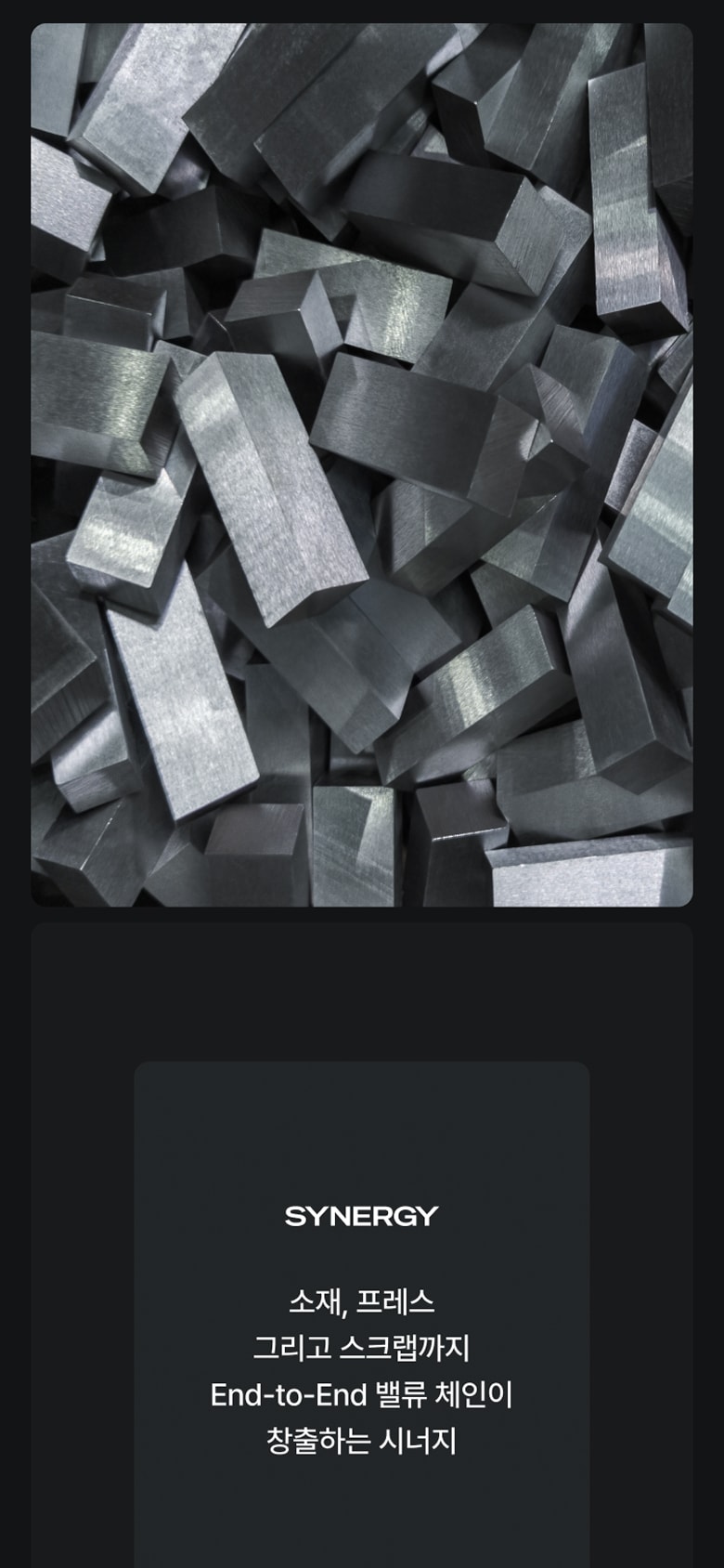
Aligning with SIMPAC’s refined minimalism, we highlighted each business sector’s technological expertise through 3D visual assets. Instead of simple product imagery, we showcased expressive high-resolution textures and precise motion, enabling users to intuitively sense the robustness and sophistication of SIMPAC’s engineering. From metal-textured rectangular forms and H-beams to a variety of industrial machines, components, and even the prism units from SIMPAC Atelier’s B2C business—these visual assets embody the identity of each division while ultimately uniting under one cohesive design language. Through extensive exploration and close collaboration with SIMPAC, we achieved these results, making the entire process both meaningful and enjoyable. The full-bleed 3D videos were designed to help users intuitively grasp SIMPAC’s business domains. Paired with the detailed view and index features below, the interface encourages natural navigation throughout the site, enabling users to efficiently experience SIMPAC’s diverse B2B and B2C offerings.
감각적인 첨단성을 표현하는 3D 에셋 SIMPAC의 정제된 미니멀리즘을 배경으로, 첨단의 기술력을 자랑하는 사업분야를 3D 비주얼 에셋으로 소구하였습니다. 단순한 제품 이미지가 아닌 고해상도의 질감, 정밀한 모션을 감각적으로 보여주어 사용자가 SIMPAC의 견고하고 정교한 기술력을 느낄 수 있도록 제작하였습니다. 메탈 재질이 강조된 직육면체와 H-Beam, 다양한 산업기계와 부품들, 그리고 B2C 사업을 전개하고 있는 심팩 아뜰리에의 프리즘 유닛까지. 이러한 비주얼 에셋들은 각 사업부를 대표하는 아이덴티티가 되지만, 통합된 하나의 디자인 언어로 귀결됩니다. SIMPAC과의 협업을 통해 많은 시도와 심도 있는 연구 끝에 이러한 결과를 얻을 수 있었고, 우리에게도 매우 즐거운 경험이 되었습니다. 풀블리드 구조의 3D 영상들은 사용자로 하여금 SIMPAC의 사업분야를 직관적으로 느낄 수 있도록 설계되었습니다. 또한 하단의 상세 보기와 인덱스 기능을 통해 우리 사이트 안에서 자연스러운 탐색의 과정을 유도하여, B2B와 B2C를 아우르는 SIMPAC의 다양한 사업군을 효율적으로 경험할 수 있도록 제작하였습니다.
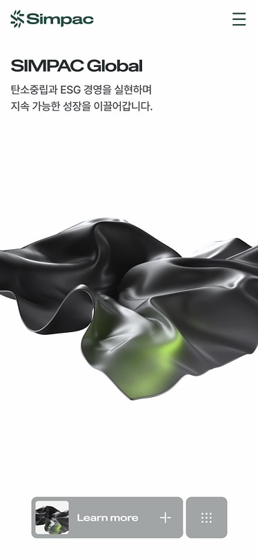
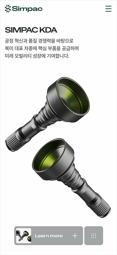
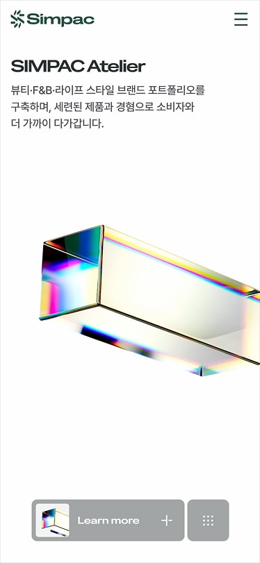
A brand mood that communicates clarity through realistic visuals
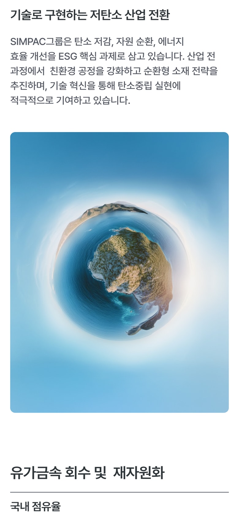
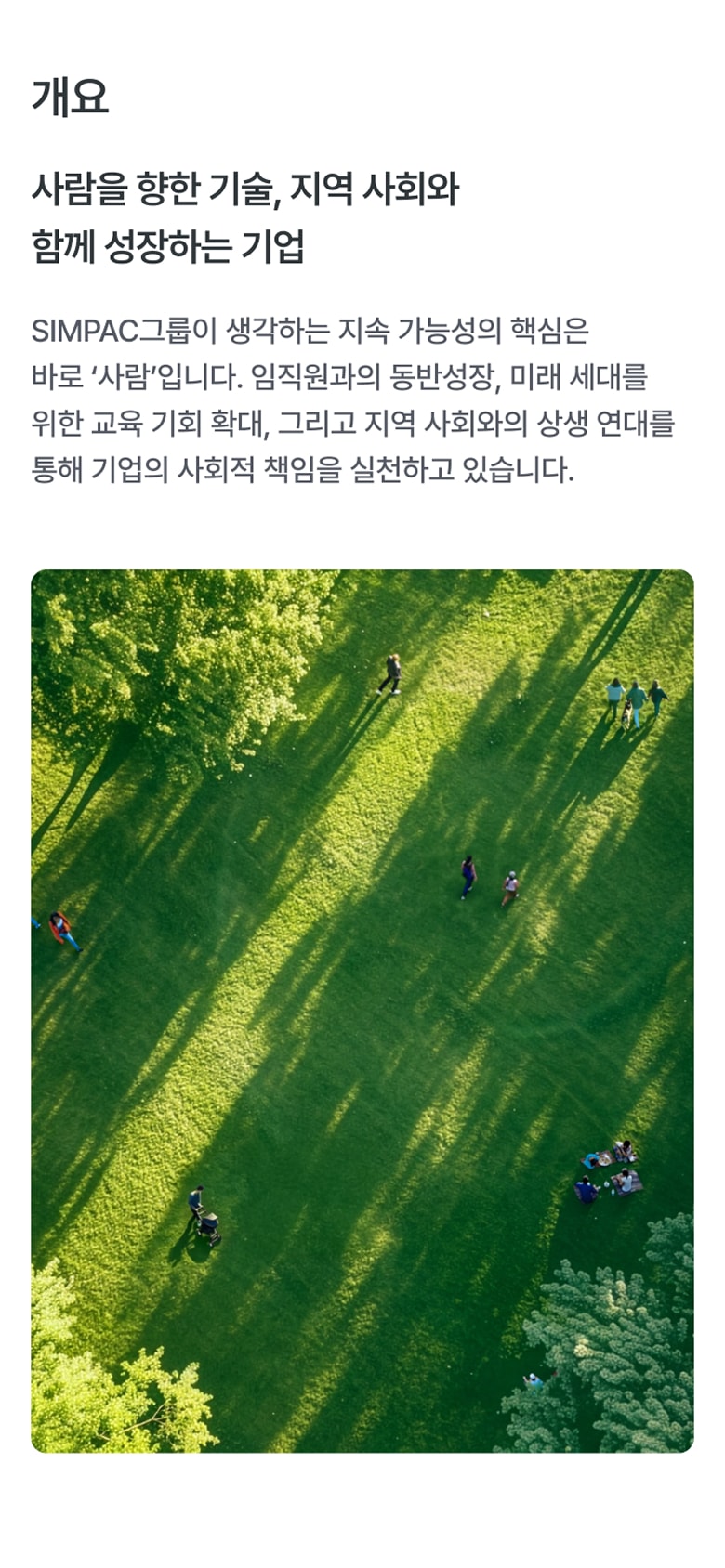
Realistic visuals serve as a direct tool for conveying complex technological information without metaphors or abstraction. We aimed to express SIMPAC’s brand philosophy—centered on advanced business and a sustainable future—through these visuals, allowing the message to resonate naturally with users. This visual strategy broadly illustrates the impact of SIMPAC’s core capabilities across the industry.
사실적인 비주얼을 통해 명료함을 전달하는 브랜드 무드 사실적인 비주얼은 복잡한 기술 정보를 은유나 추상화 없이 가장 직관적인 방식으로 전달하는 도구입니다. 첨단 비즈니스와 지속 가능한 미래를 지향하는 SIMPAC의 브랜드 철학을 사실적인 비주얼로 소구하여 사용자에게 자연스럽게 스며들 수 있도록 의도하였습니다. 이 비주얼 전략은 SIMPAC의 핵심 역량이 산업 전반에 미치는 영향력을 광범위하게 보여줍니다.
A flexible interface built on refined simplicity
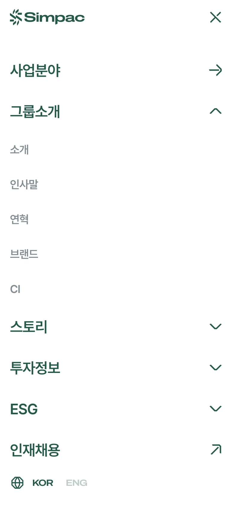
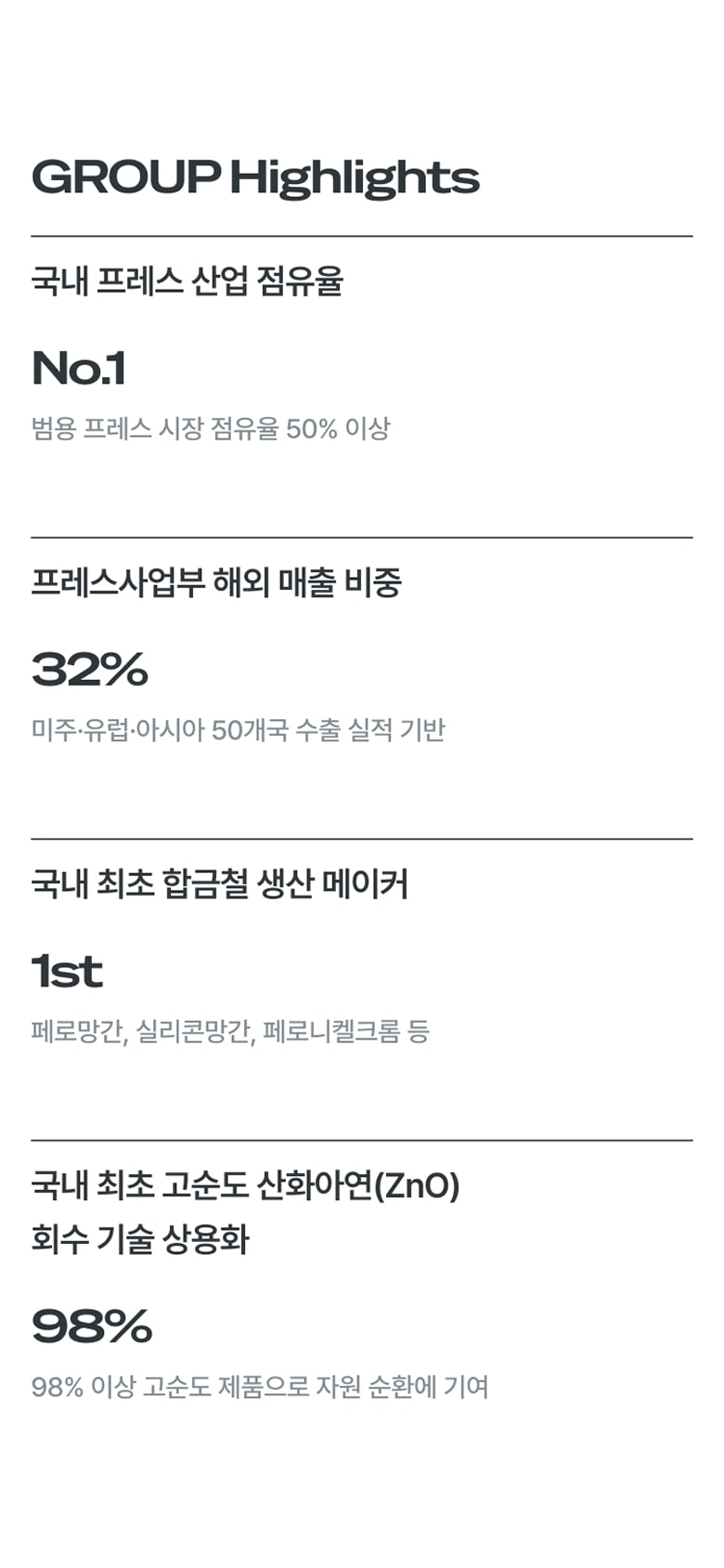
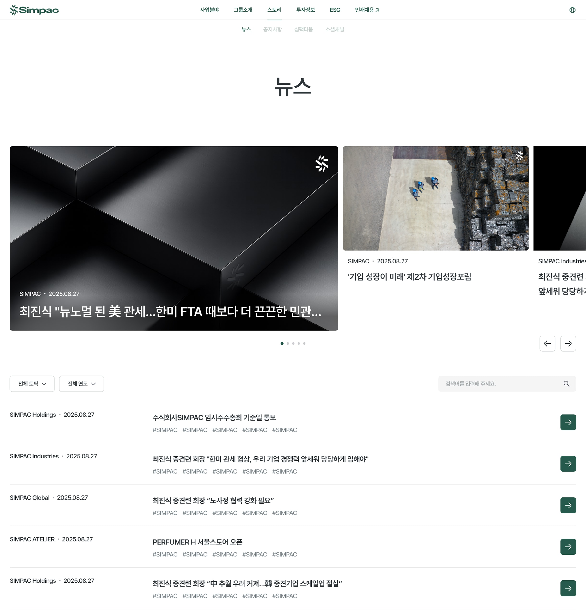
Our website’s user interface removes unnecessary embellishments and focuses on the fundamentals of simplicity. For informational pages such as the company introduction, history, and story, we maintained a clean foundational structure. For pages requiring higher visual impact, such as brand-focused sections, we introduced scroll-driven interactions that create immersion and deliver a distinctly differentiated visual experience. This timeless simplicity, free from trends, gives the site lasting longevity and ensures that SIMPAC’s value is communicated clearly across various media and environments.
유연한 함축의 인터페이스 우리 웹사이트의 사용자 인터페이스는 불필요한 장식을 배제하고, 심플함이라는 기본에 집중하였습니다. 그룹소개, 연혁, 스토리와 같은 정보성 페이지에서는 기본기를 지키면서도, 브랜드와 같은 주목도가 필요한 페이지에서는 사용자 스크롤에 따른 몰입감을 주어 시각적으로 변별력 있는 경험을 제공하였습니다. 유행을 따르지 않는 본질적 심플함은 우리 사이트에 장기적인 생명력을 부여하고, 다양한 매체와 환경에서 SIMPAC의 가치를 명료하게 전달하는 힘이 됩니다.

Credits
Lead AgencyDFYDevelopmentFLUX Interactive
Project ManagementPark ChulsungPlanningBae HeeraAn JiyeongLee HyelimDesign LeadYeon AhyoungChoi BomiUI DesignOh YoonjungGraphic DesignHong Sungbin3D Motion DesignKim ChanjuShin SowonOh Jinhwan3D GraphicsKim TaeiJoo SeunghyukChoi JiwonHa YohanHwang Juseong