Brand & Digital
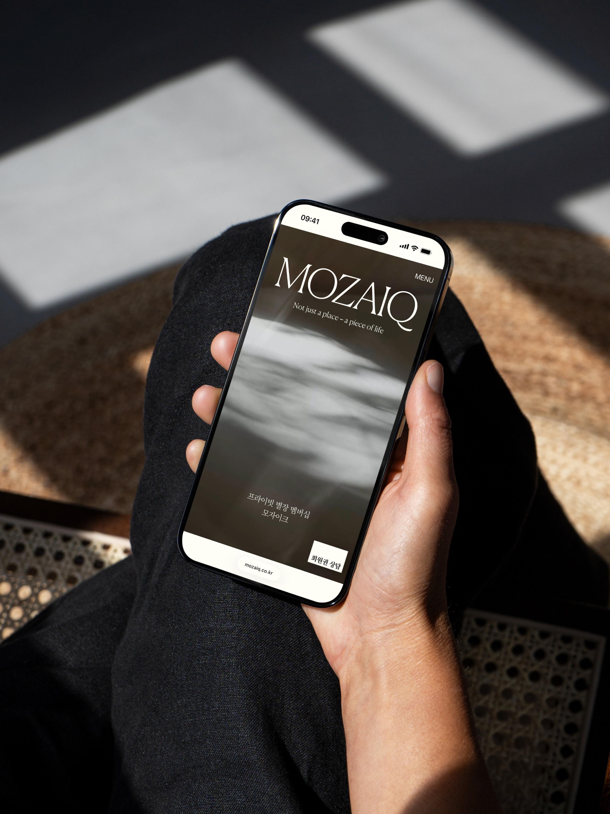
Private Villa Membership MOZAIQ — Not just a place, a piece of life
- Client
- VillaMOZAIQ
- Category
- Brand, Digital
- Services
- Content Design, Digital Strategy, Website, UX/UI, Development
- Scope
- Digital Experience Strategy, UX Strategy, Website Design, Mobile Site Design, Content Direction, Graphic Design, Korean Copywriting
- Year
- 2025
- Links
- Visit Website
MOZAIQ is a private villa membership that gives members exclusive access to a curated collection of premium villas with a single membership. By offering stays across destinations with their own distinct character and atmosphere, the service goes beyond accommodation to inspire a more elevated way of living.
This website renewal was designed to bring that same experience into the digital space. We translated MOZAIQ's refined brand identity into an intuitive online experience by balancing immersive storytelling with a clear information architecture. From the unique character of each villa to membership benefits and the brand's philosophy, every touchpoint was thoughtfully connected to create a seamless journey.
The result is a digital experience that reflects MOZAIQ's vision of rest and modern living, allowing users to discover the brand's lifestyle with clarity, depth, and ease.
MOZAIQ는 단 하나의 회원권으로 큐레이션된 프리미엄 별장을 자유롭게 이용할 수 있는 프라이빗 별장 멤버십 서비스입니다. 각기 다른 지역성과 감도를 지닌 별장을 선택해 머무는 경험은 단순한 숙박을 넘어 사용자의 라이프스타일을 확장하는 특별함을 제공합니다. 이번 리뉴얼은 이러한 서비스의 본질을 디지털에서도 일관되게 전달하는 데 집중했습니다. 브랜드가 지향하는 감도와 사용자가 필요로 하는 정보 구조를 균형 있게 결합해, 별장의 고유한 분위기·회원권의 구조와 혜택·브랜드 철학이 하나의 흐름 안에서 자연스럽게 연결되도록 설계했습니다. 이를 통해 MOZAIQ가 제안하는 휴식의 방식과 새로운 라이프스타일을 온라인에서도 안정적이고 깊이 있게 경험할 수 있는 디지털 환경을 구축했습니다.
Building a Visual Identity That Captures the Brand’s Unique Character
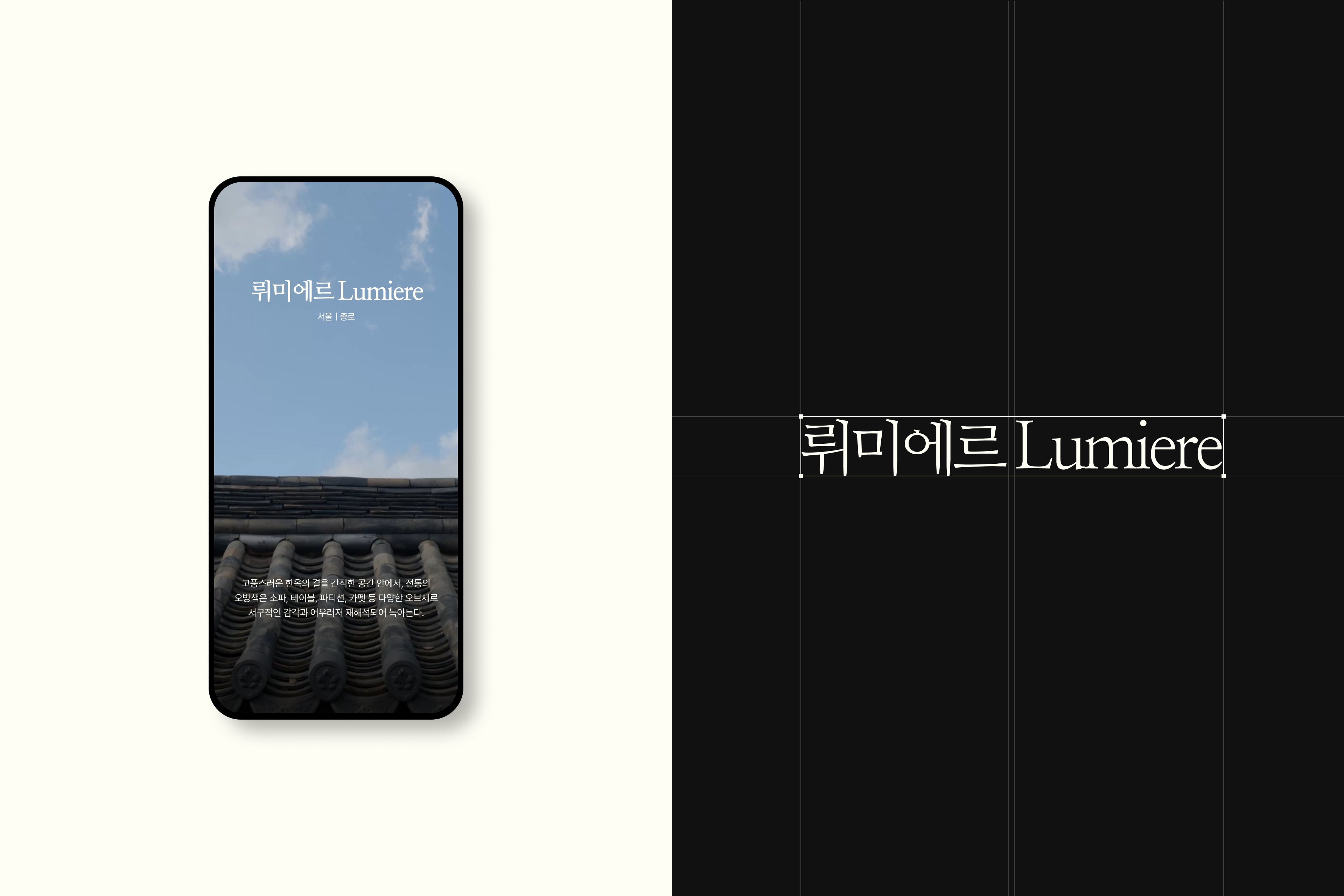
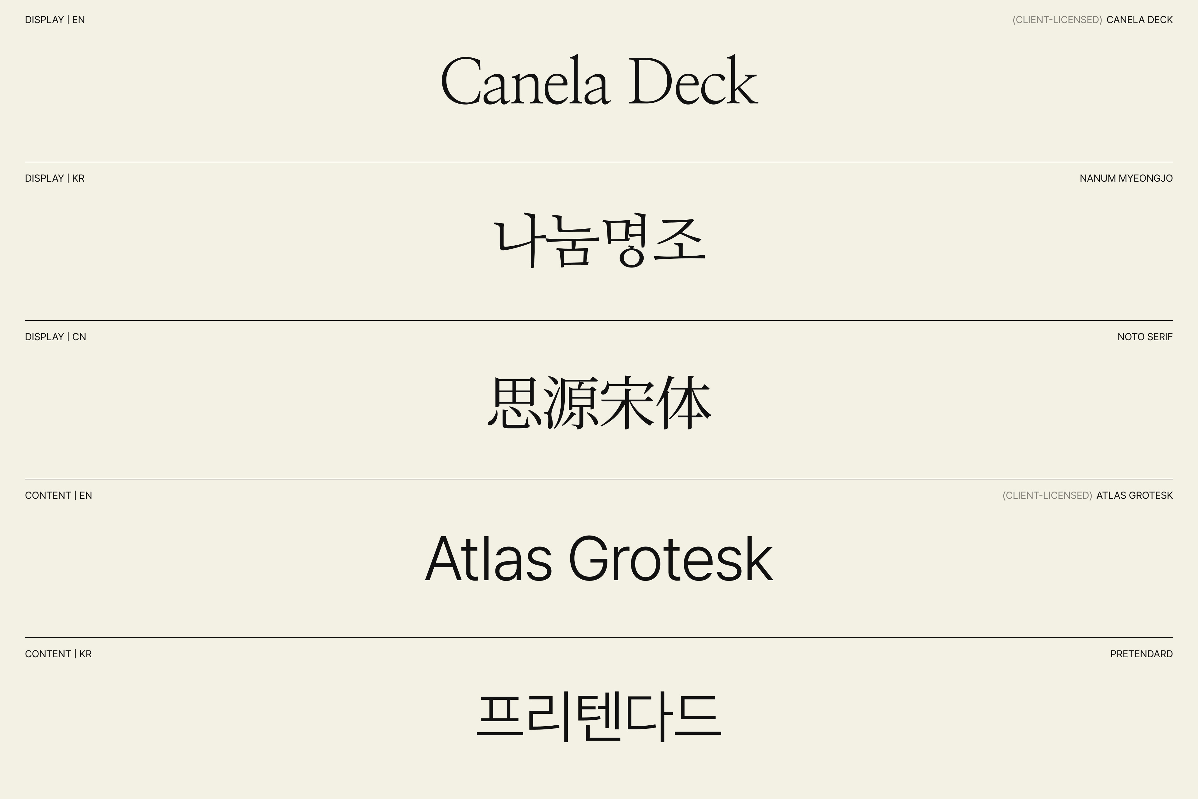
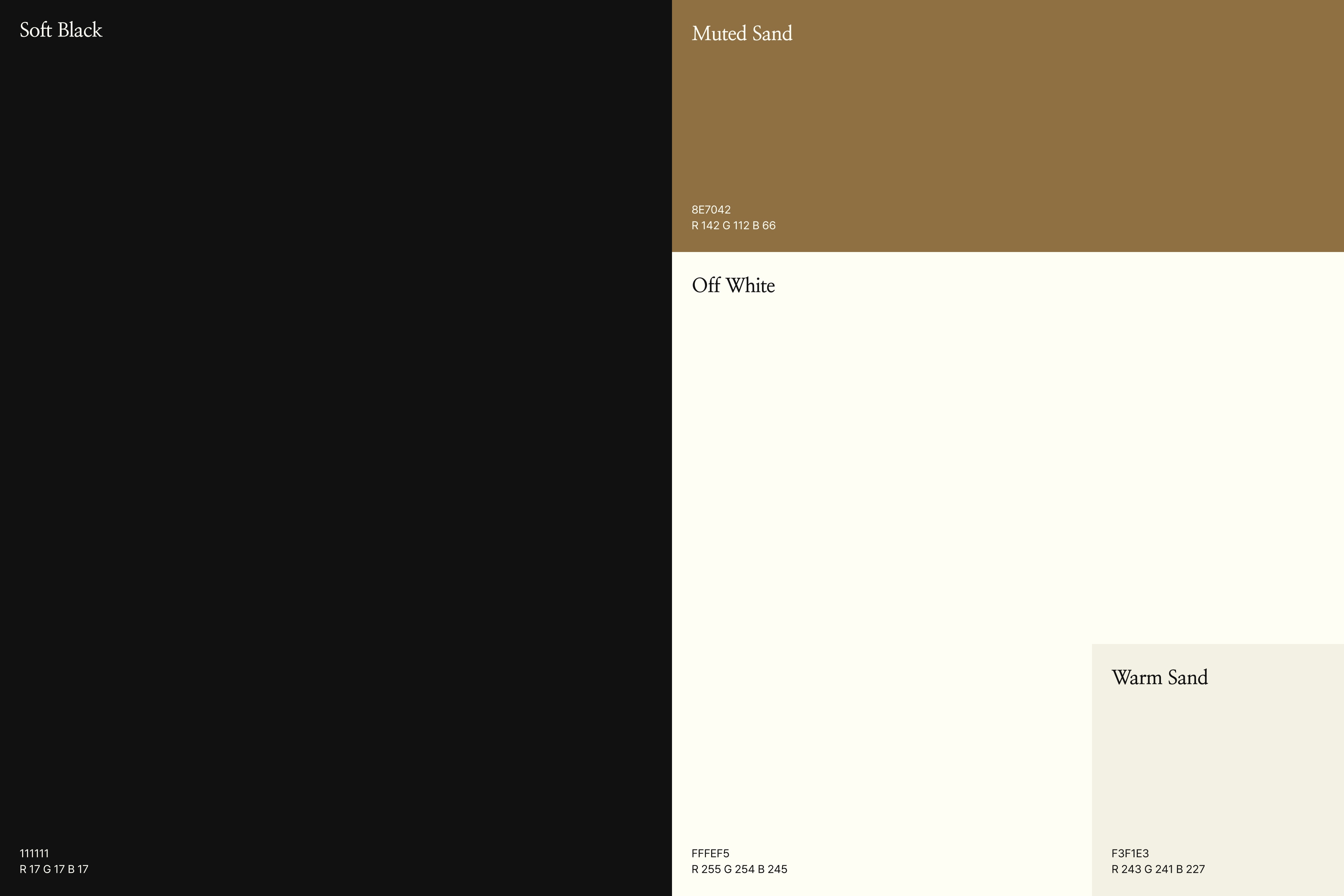
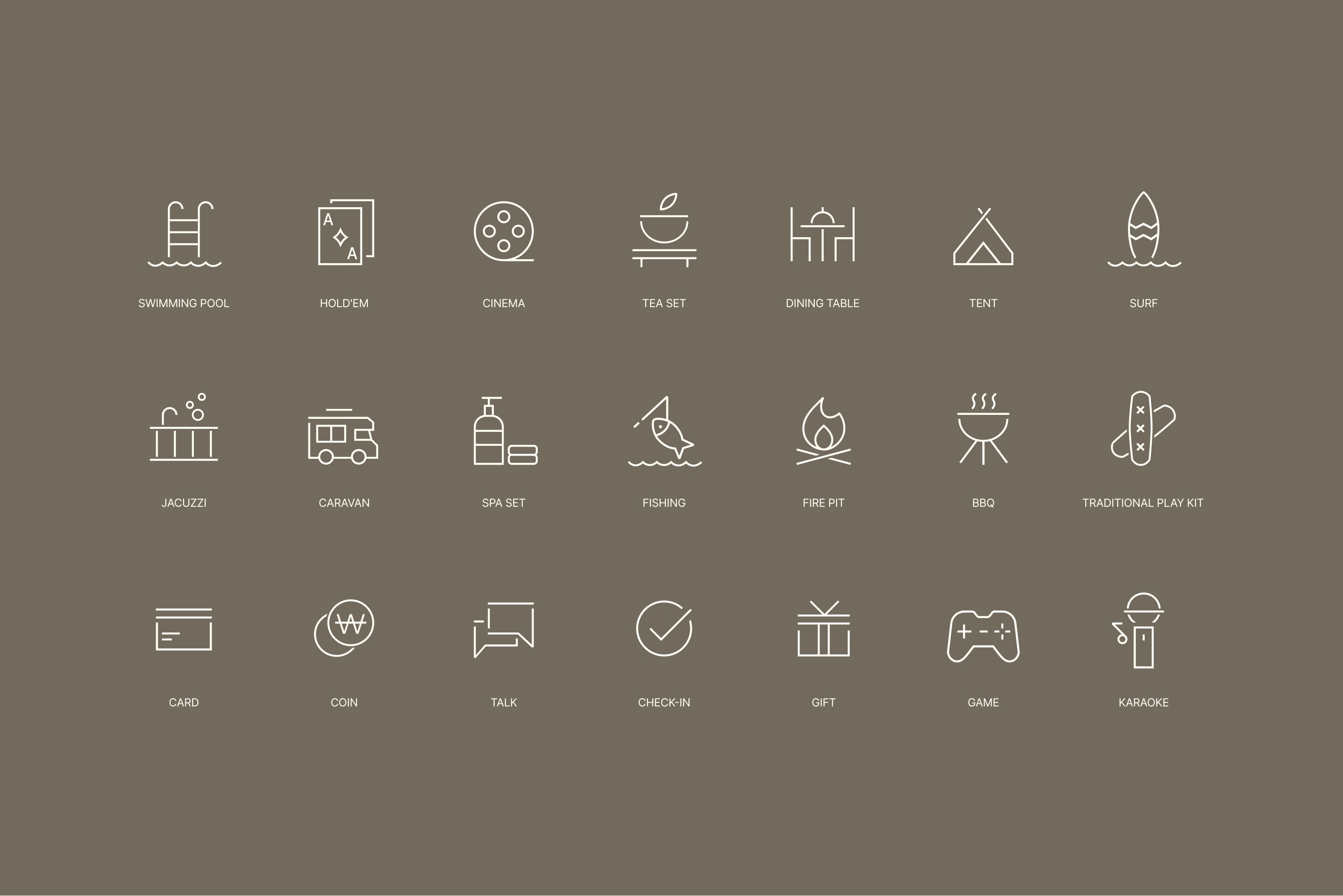
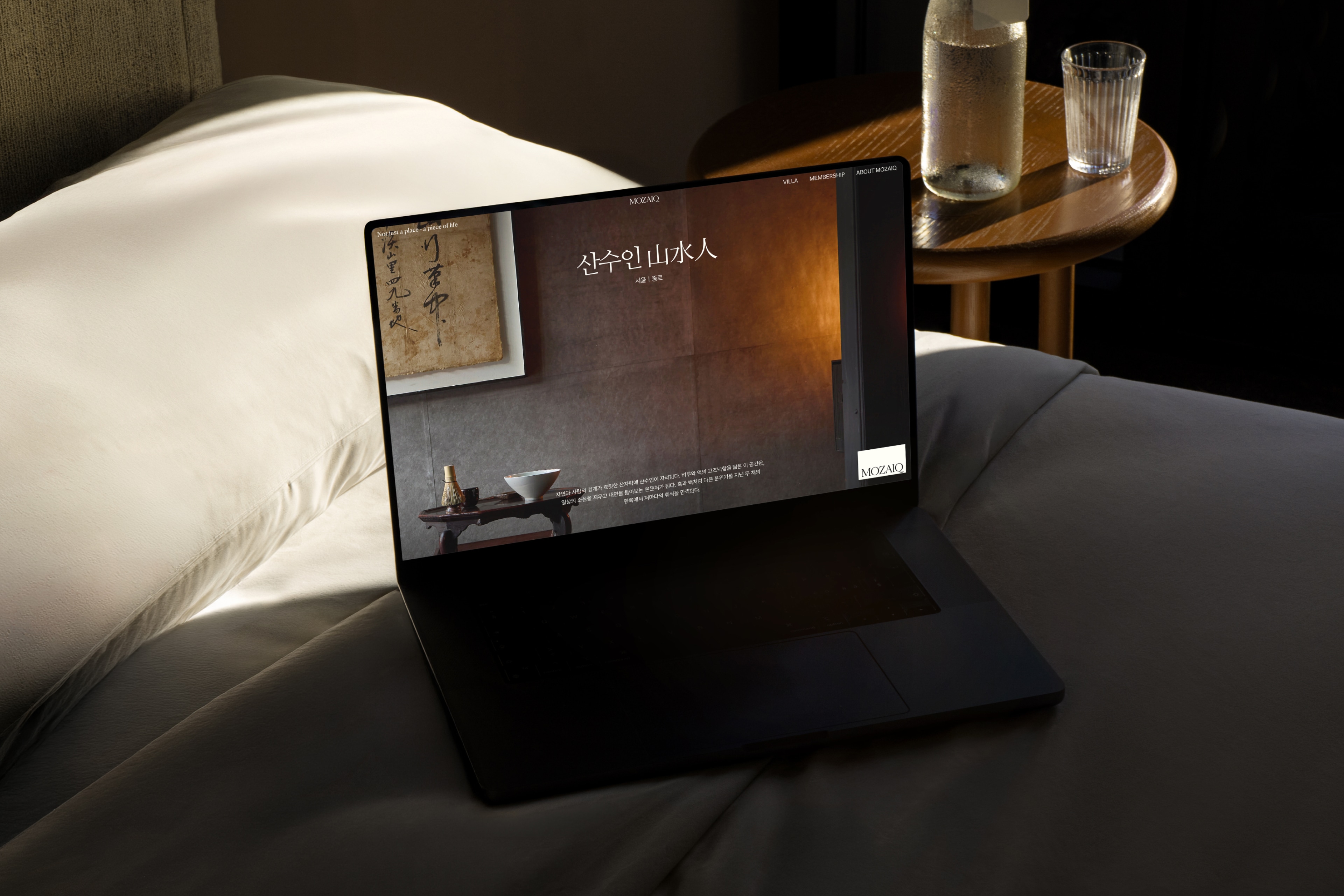
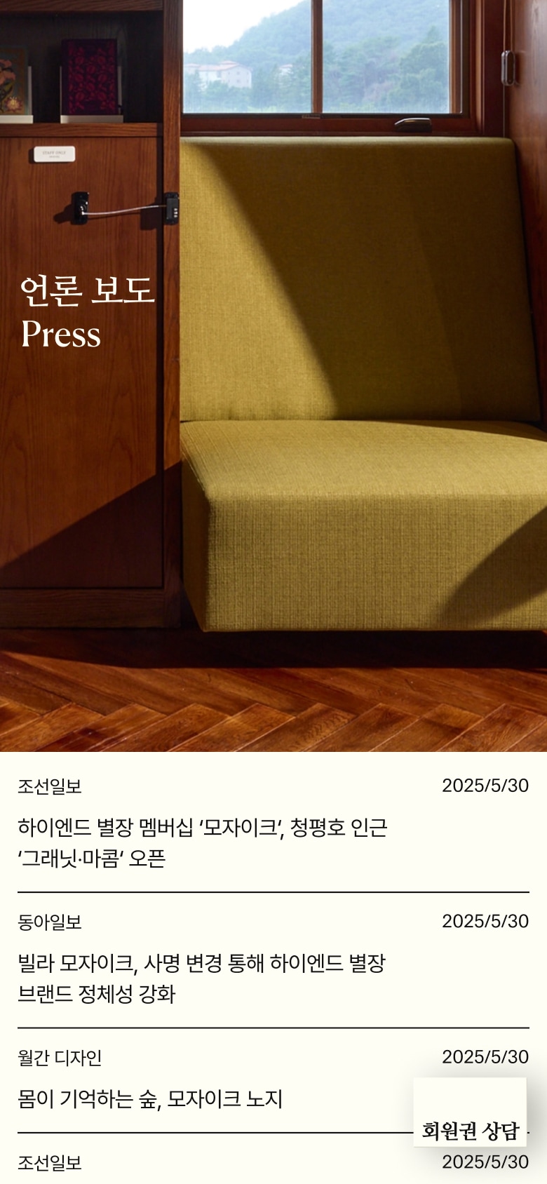
To allow users to naturally experience the distinct character of each villa in the digital space, we developed a visual system centered around color, space, and image composition. We created a new wordmark logo based on a refined serif style, along with a brand slogan that reflects MOZAIQ’s identity. By redefining the brand’s messaging in line with its tone and values, we further strengthened its overall identity. We also combined atmospheric imagery highlighting the light and textures of each space, sophisticated serif-based typography pairings, geometric icons, and subtle line interactions to create a cohesive digital experience. Every element was thoughtfully designed to consistently convey the brand’s refined and luxurious sensibility across the entire service.
브랜드 고유 감도를 반영한 비주얼 아이덴티티 구축 각기 다른 감도의 별장을 디지털에서도 자연스럽게 체감할 수 있도록, 색감·여백·이미지 리듬을 중심으로 비주얼 시스템을 구축했습니다. 세리프를 기반으로 한 새로운 워드마크 로고와 MOZAIQ의 아이덴티티를 반영한 슬로건을 개발하고, 브랜드 톤에 맞춘 메시지를 새롭게 설계해 브랜드 정체성을 한층 강화했습니다. 또한 공간의 빛과 재질을 살린 이미지 연출, 세리프 중심의 정교한 서체 페어링, 기하학적 아이콘, 그리고 절제된 라인 인터랙션을 유기적으로 결합해 브랜드가 지향하는 고급스러운 감성이 서비스 전반에 일관되게 전달되도록 설계했습니다.
Designing the Core Experience to Clearly Communicate the Brand Value and Service Structure
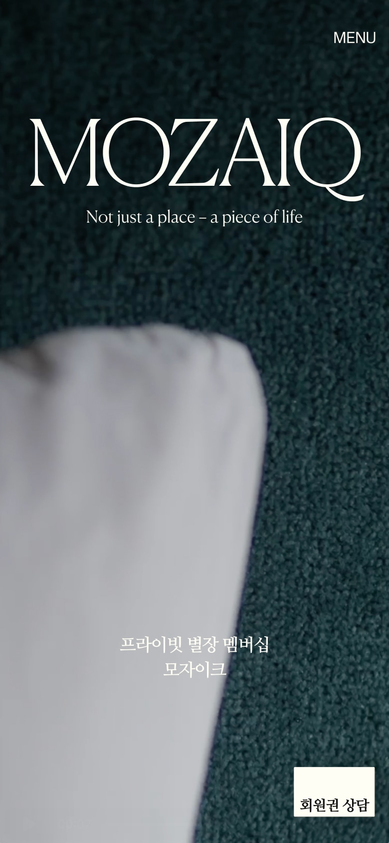
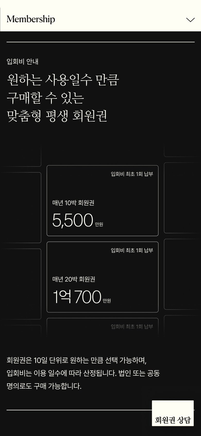
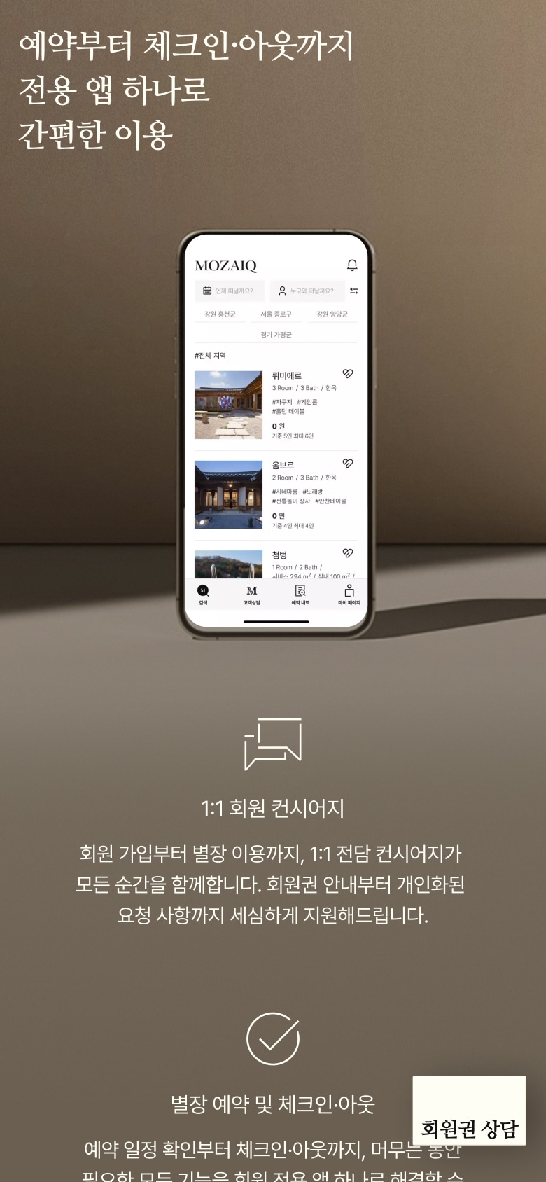
The homepage serves as the first touchpoint where users encounter the MOZAIQ brand. It was designed to allow users to naturally understand the brand value, villa offerings, and membership model within a seamless journey. We structured the experience flow from the initial brand impression to villa discovery and membership understanding, allowing the homepage to serve as the central guide throughout the overall service experience. In particular, the membership section, a key element in understanding the service, was redesigned to present complex information such as benefits, membership fees, reservation options, and transfer structures through a clear visual hierarchy, diagrams, and motion-driven interactions. The result is an experience where users can understand the service simply by exploring the content.
브랜드 가치와 서비스 구조를 직관적으로 전달하는 메인 경험 설계 메인 화면은 사용자가 MOZAIQ 브랜드를 처음 마주하는 지점으로, 브랜드 가치·별장 콘텐츠·회원권 구조가 하나의 흐름 안에서 자연스럽게 인지되도록 설계했습니다. 브랜드 감도를 전달하는 첫 인상에서 별장 탐색, 회원권 이해로 이어지는 탐색 흐름을 명확히 구성해 메인이 전체 서비스 경험을 안내하는 중심 역할을 수행하도록 했습니다. 특히 회원권 소개 영역은 서비스 이해의 핵심인 만큼, 이용 혜택·입회비 안내·예약 환경·회원권 양도 구조 등의 복잡한 정보를 단계별 시각 구조와 다이어그램·모션 중심으로 새롭게 구성해 ‘보면 이해되는 정보’로 완성했습니다.
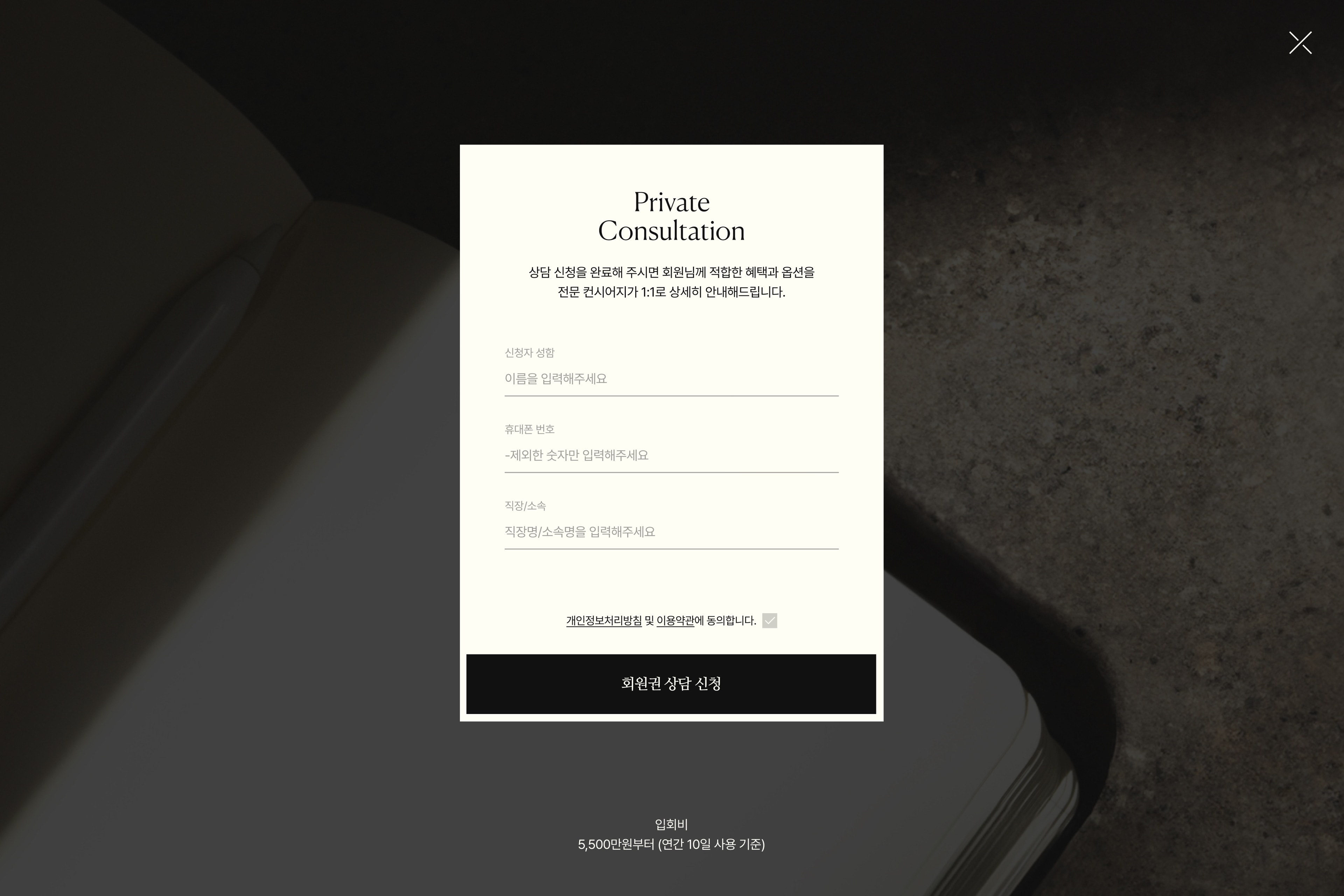
Designing a Consultation Journey Aligned with the User Exploration Flow
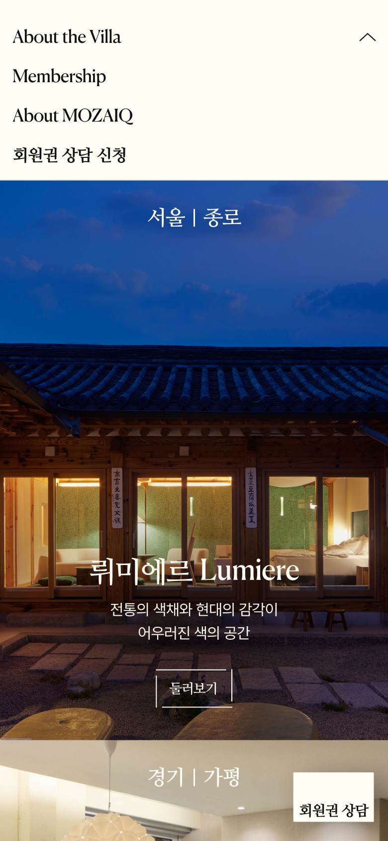
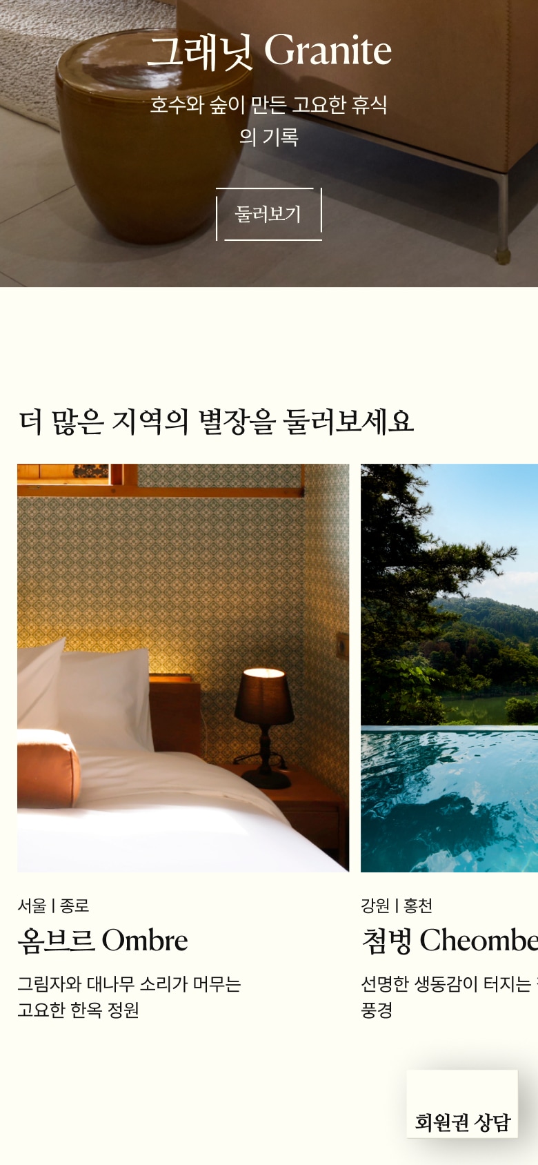
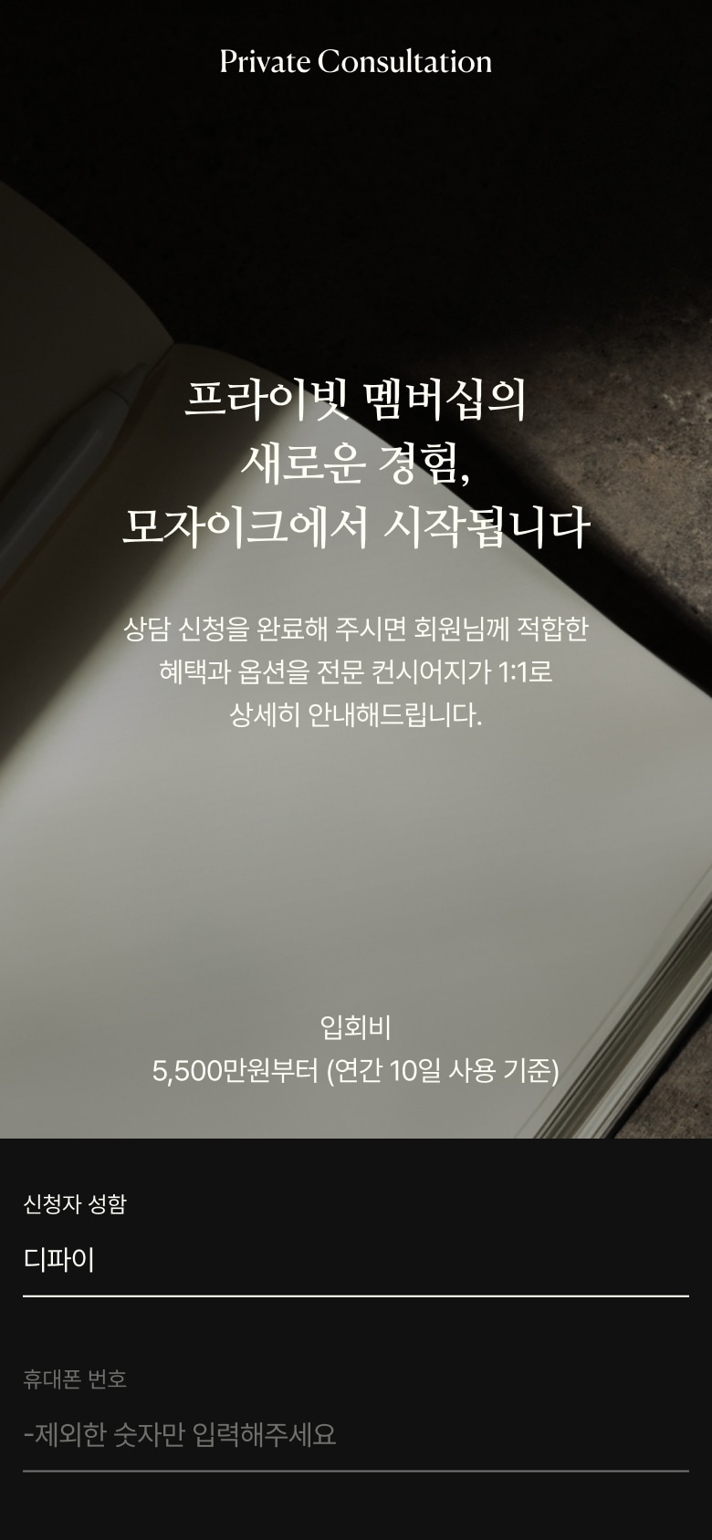
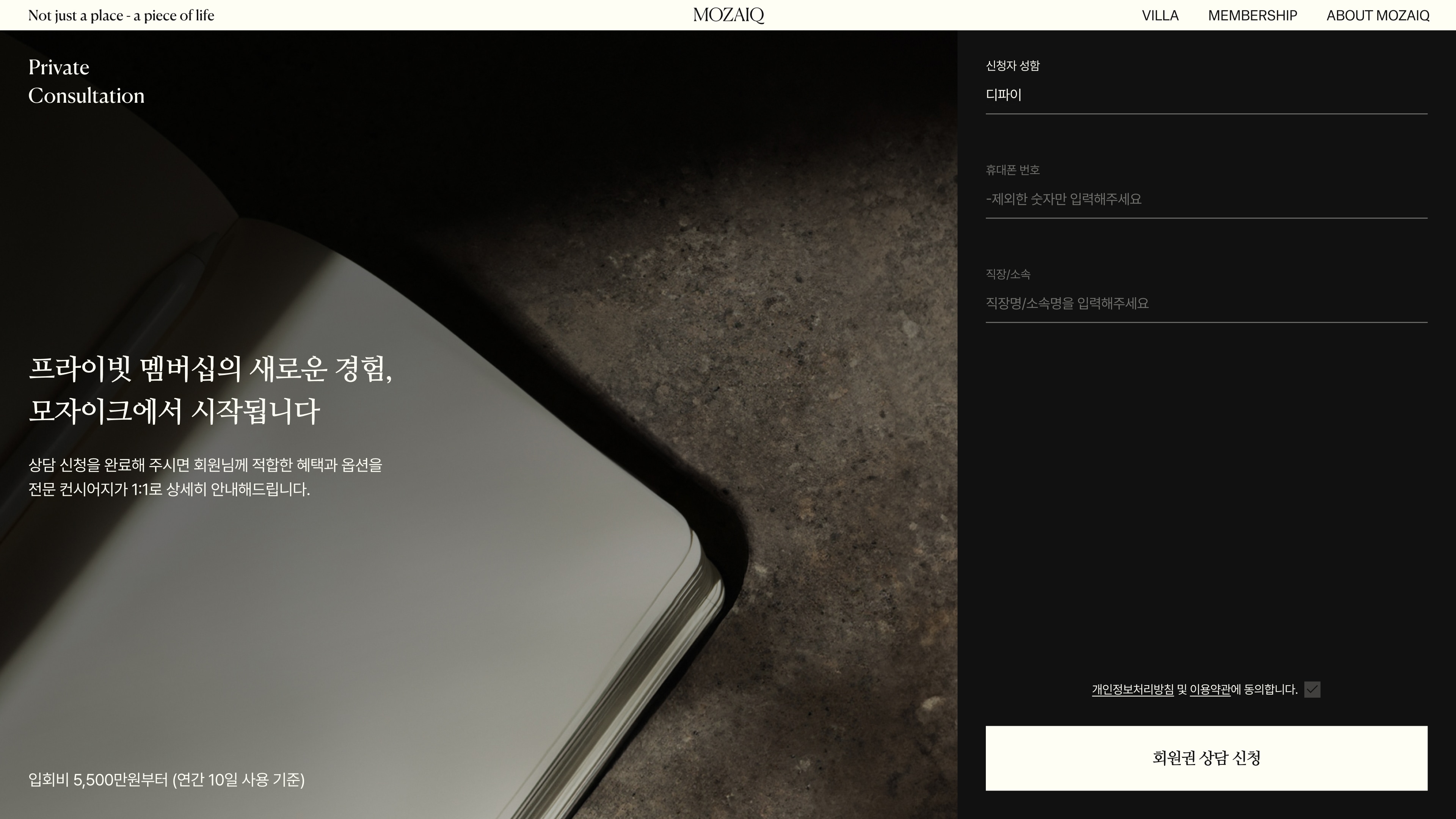
Consultation is the most important conversion point for a premium membership service. We designed the journey to guide users naturally from understanding the brand and its spaces to taking the next step of requesting a consultation. By providing consistent CTA and consultation touchpoints across all pages, users can easily request a consultation at the moment they feel ready after engaging with the content. We refined the CTA placement, tone, timing, and consultation interface to create a clear yet subtle conversion experience, ensuring that the premium brand experience is maintained throughout the entire journey.
탐색 흐름을 고려한 상담 전환 경험 설계 상담 신청은 프리미엄 멤버십 서비스에서 가장 중요한 전환 지점으로, 사용자가 브랜드와 공간을 충분히 이해한 뒤 상담 신청으로 자연스럽게 도달하도록 전환 흐름을 설계했습니다. CTA와 상담 신청 영역을 모든 페이지에 일관된 형태로 제공해, 사용자가 콘텐츠에 몰입한 이후 원하는 시점에 즉시 상담을 요청할 수 있도록 했습니다. 또한 CTA의 위치·톤·등장 타이밍과 신청 과정의 UI를 정제해, 과하지 않으면서도 명확한 전환과 함께 마지막 단계까지 프리미엄 브랜드 경험이 유지되도록 구성했습니다.
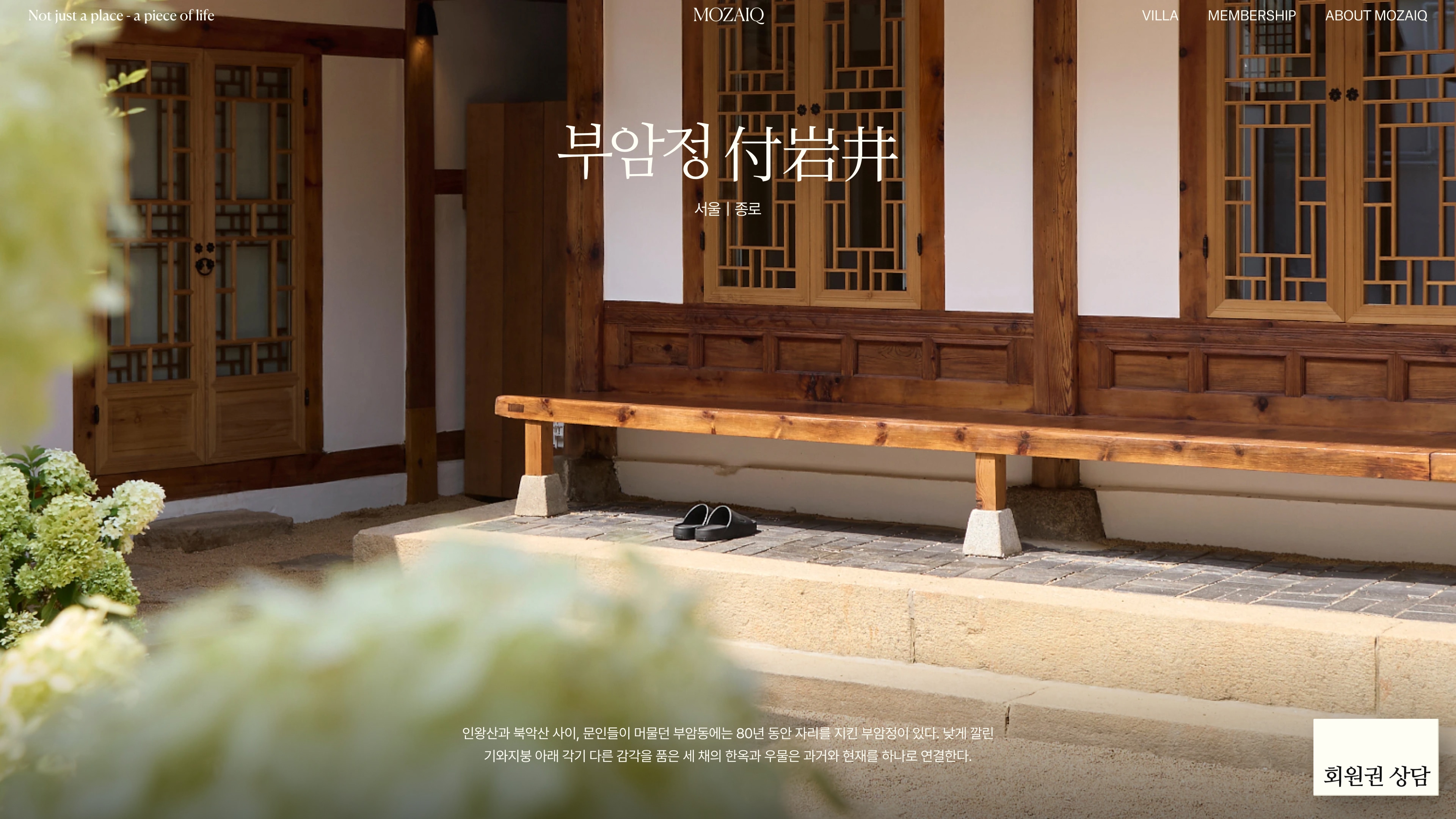
Storytelling UI/UX Inspired by Each Villa’s Location and Narrative
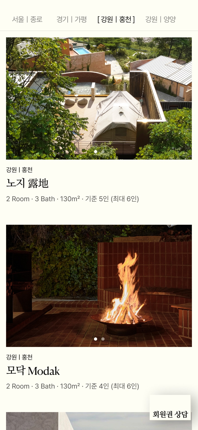
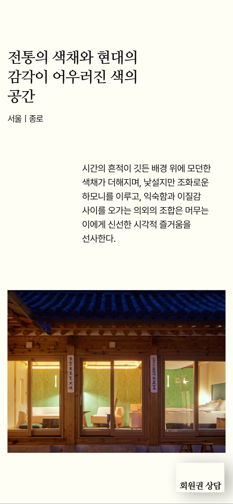
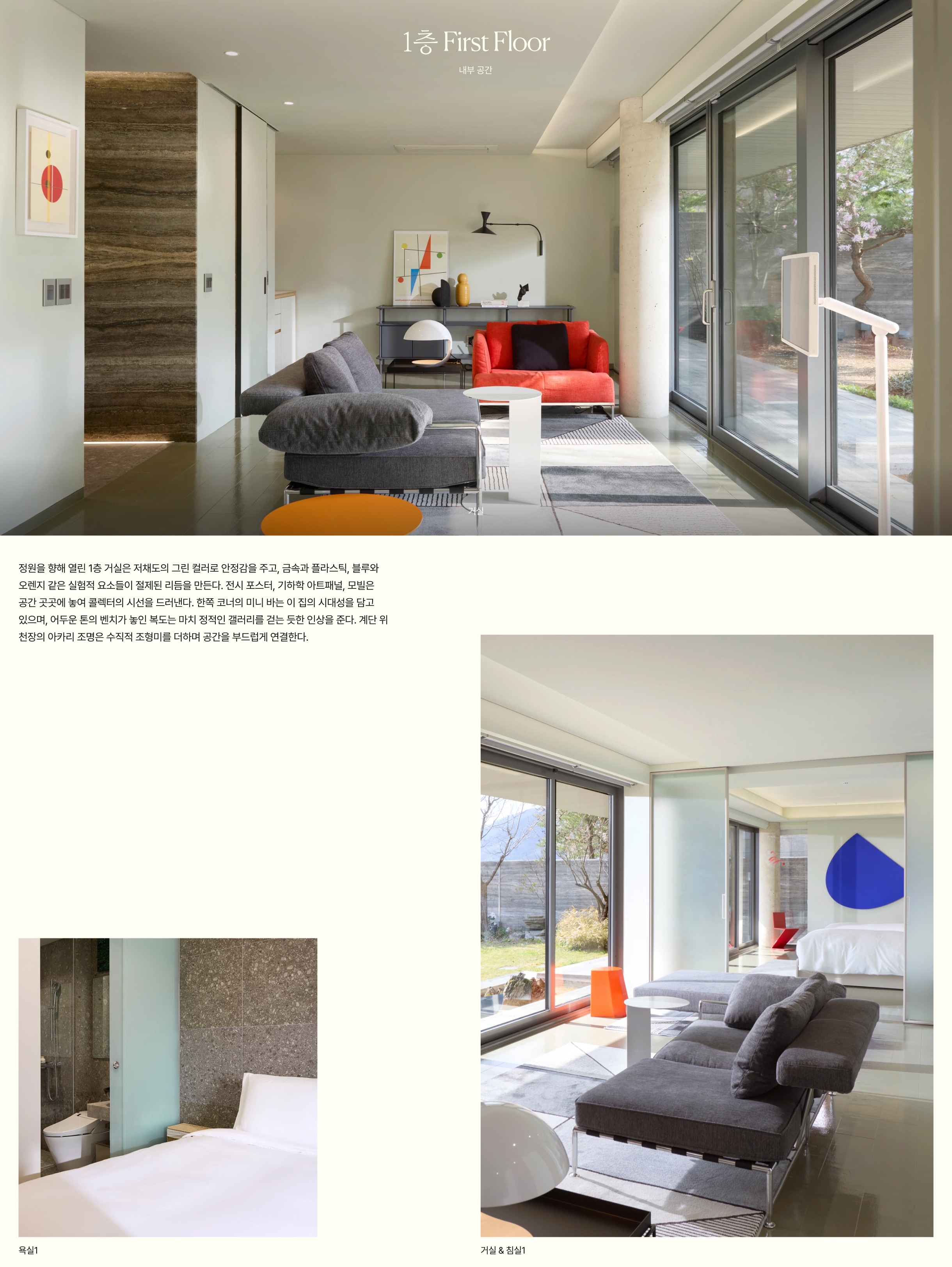
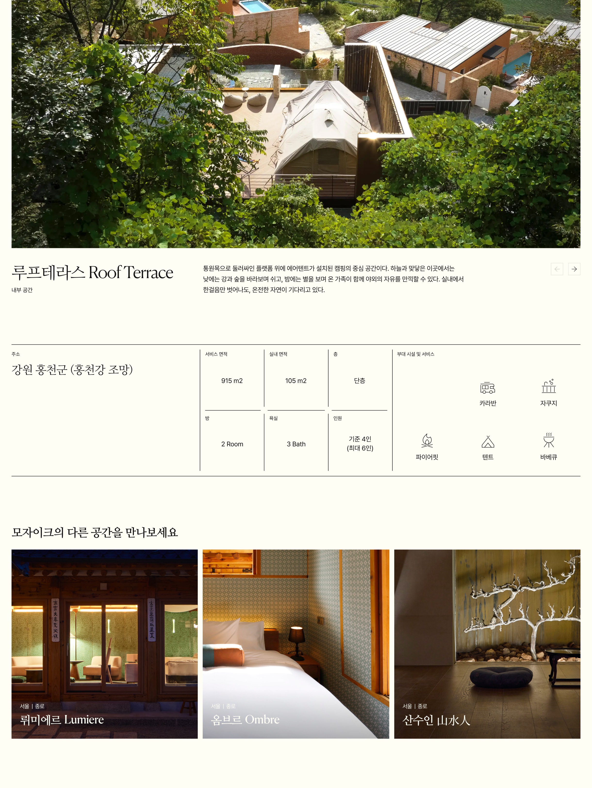
To fully convey the unique character and spatial narratives of each villa in the digital space, we designed a template-based detail page structure that reflects each location’s identity, spatial concept, and design intent. Through careful refinement of imagery, layout, typography, and scroll interactions, we created an experience that goes beyond simply presenting information, allowing users to feel as though they are immersing themselves in the spaces curated by the brand. This approach extends MOZAIQ’s premium spatial experience into the digital environment, delivering the brand’s refined sense of place with greater depth and authenticity.
별장의 지역성과 서사에 기반한 스토리텔링 UI·UX 각 별장이 지닌 지역성과 공간 서사가 온라인에서도 온전히 전달될 수 있도록, 지역성·공간 컨셉·구성 의도를 반영한 템플릿 기반 상세 페이지 구조를 설계했습니다. 이미지·레이아웃·타이포그래피·스크롤 인터랙션을 세밀하게 조정해 사용자가 단순히 정보를 확인하는 것을 넘어, 브랜드가 큐레이션한 공간에 ‘머무는 듯한 경험’을 할 수 있도록 구성했습니다. 이는 MOZAIQ 브랜드가 추구하는 프리미엄 공간 감도를 디지털 환경에서도 깊이 있게 확장하는 방식입니다.
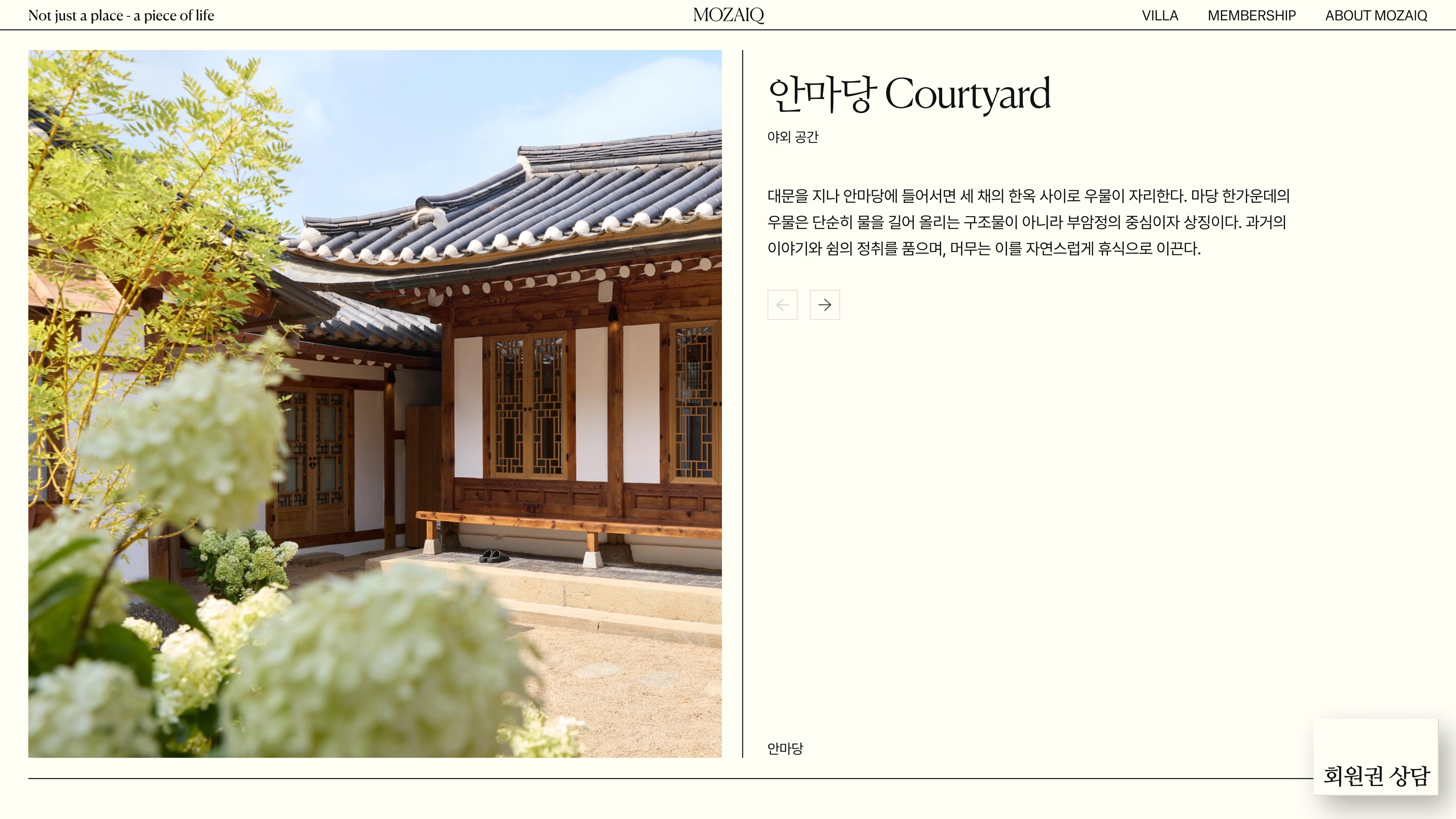
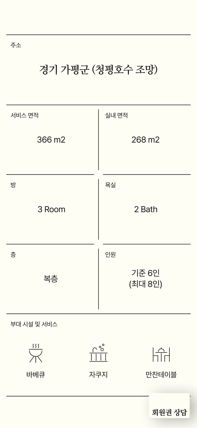
The villas are introduced through a carefully structured journey that follows the flow of the space and the moments of use, moving from exterior to interior environments. By balancing imagery, concise descriptions, and essential information for each area, we designed an experience that naturally communicates each villa’s unique characteristics and the way guests can experience the space.
공간의 흐름과 사용 장면을 따라 외부·내부 공간을 단계적으로 소개합니다. 공간별 이미지와 간결한 설명, 필요한 정보를 균형 있게 구성해 별장의 특징과 머무는 방식이 자연스럽게 전달되도록 설계했습니다.
Designing the Structure and Information Architecture for a Consistent Service Experience
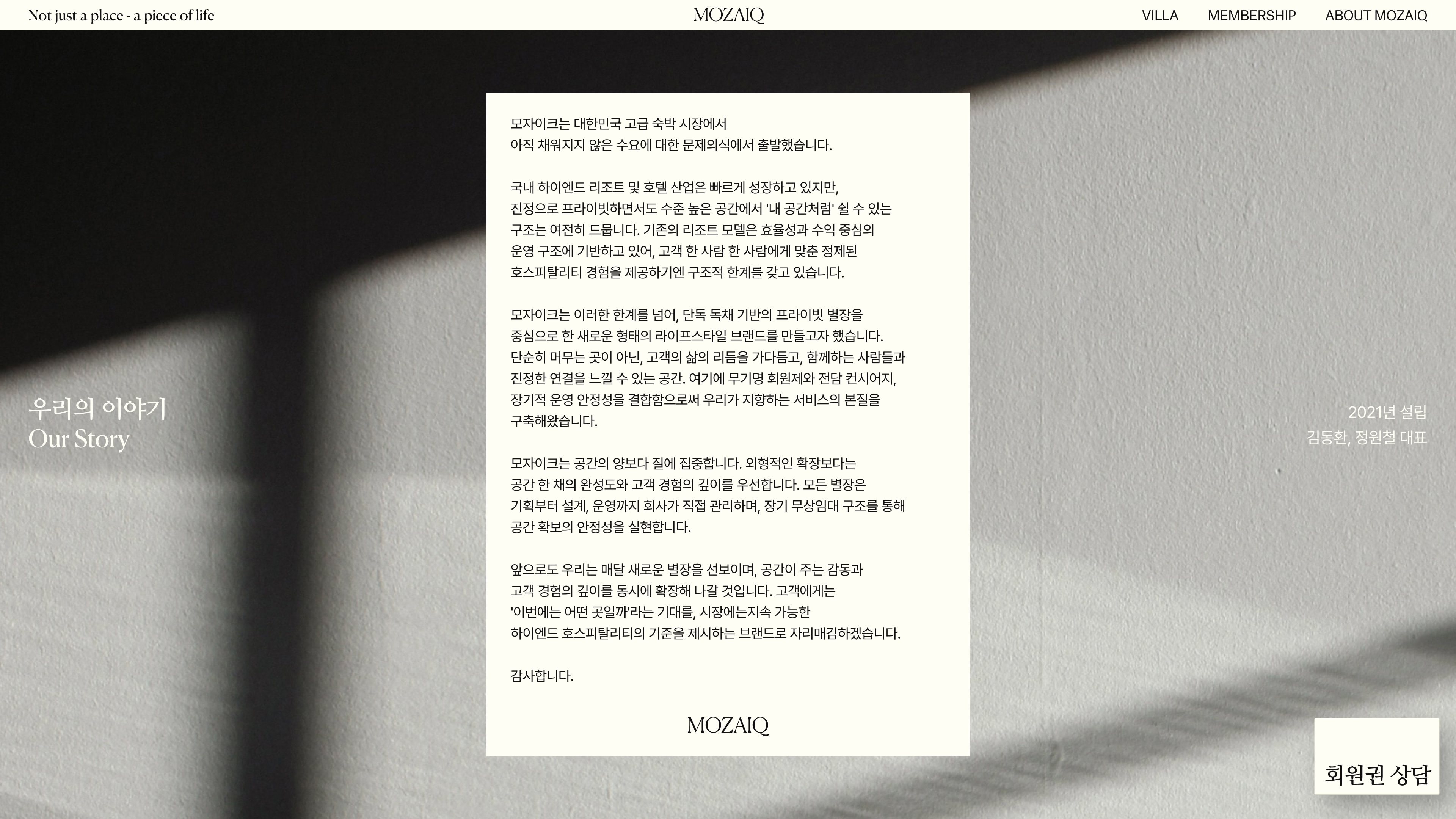
To ensure the information flow and brand perception established across the homepage and key detail pages remained consistent, we redesigned each page structure based on its unique purpose and role. Each page was carefully organized with the appropriate level of information depth, hierarchy, and visual expression, allowing individual experiences such as villa discovery, membership exploration, and brand introduction to function independently while naturally connecting within the overall service journey. Through this approach, users can experience the same level of brand refinement and clarity in information structure regardless of their entry point, enhancing the overall quality and consistency of the MOZAIQ digital experience.
서비스 경험의 일관성을 완성하는 구조 및 정보 설계 메인과 주요 상세 페이지에서 형성된 정보 흐름과 브랜드 인식이 일관되게 이어지도록, 각 페이지의 목적에 맞춰 구조를 새롭게 설계했습니다. 별장 탐색, 회원권 이해, 브랜드 소개 등 각 페이지가 독립적으로 기능하면서도 전체 서비스 경험 안에서 자연스럽게 연결되도록 정보의 깊이와 단계, 표현 방식을 정교하게 구성했습니다. 이를 통해 사용자가 어떤 경로로 진입하더라도 동일한 브랜드 감도와 명확한 정보 구조를 경험할 수 있도록 하여, MOZAIQ 서비스 전반의 완성도를 높일 수 있었습니다.
Credits
Lead AgencyDFYDevelopmentXT
Project ManagementLee HyelimPlanningNam WanwooDesign LeadJo HyewonDesignKwon TaeriKim SoheeCopywritingCheon Nuri2D Motion DesignOh Jinhwan