Brand
HOME&SHOPPING CI Refinement
- Client
- HOME&SHOPPING
- Category
- Brand
- Services
- Brand Strategy, Brand Identity, Content Design, Film & Motion
- Scope
- Brand Experience, Brand Guidelines, Brand Identity, Brand Strategy, Brand Messaging, BX Consulting, 3D Motion Design, Graphic Design, Packaging Design
- Year
- 2026
In 2026, agility is essential to stay relevant in our fast-evolving world. HOME&SHOPPING, established in 2011, was due to breathe new life into its corporate identity. At DFY, we saw the opportunity to strategically blend the brand’s core assets with the latest cutting-edge design trends to elevate the expression of its corporate vision to its highest potential. By challenging the status quo via crafted solutions made to deepen trust between brand and its audience, we hope to spark a deeper conversation about what true brand refinement truly means.
2011년 설립된 홈앤쇼핑은 빠르게 변화하는 미디어 환경에 유연하게 대응하고자 2026년 7월, CI 리파인먼트를 단행하였습니다. 디에프와이는 홈앤쇼핑 브랜드 본연의 핵심 자산과 최신 디자인 트렌드를 전략적으로 결합하여, 기업의 비전을 가장 이상적인 형태로 발전시키고자 했습니다. 브랜드와 고객의 신뢰 관계를 강화하기 위해 우리가 생각한 문제 제기 방식과 해결 과정을 통해서, 진정한 의미의 브랜드 리파인이란 어떤 것인지 함께 생각해 보고 싶습니다.
Brand Story: Built for the Customer
We looked closely at our core target audience: women born in 1970. Having spent their 20s in the 1990s during the rise of modern K-culture, these were women who were stylish trendsetters who dominated the street fashion scene. Driven by this, we redefined HOME&SHOPPING into a brand that was built for the customers and by the customers. While preserving the company’s founding philosophy of supporting SMEs and fostering shared growth, we reconsidered its identity as a commerce business, one that drives real sales results, and repositioned the brand to emphasize its competitive edge in the market. A brand that’s accessible for all, yet chosen by those who value practicality—this is what HOME&SHOPPING was to become.
더불어 브랜드의 핵심 타겟인 1970년생 여성들에 대해서 생각해 보았습니다. 대중문화가 태동하던 90년대에 20대를 보낸 그들은, 어쩌면 스트리트 패션을 주름잡던 멋진 언니들이 아니었을까요? 이 단순한 호기심을 더하여 우리는 본 브랜드를 고객을 위한, 고객에 의한 브랜드가 될 수 있도록 재정의했습니다. 이에 따라 중소기업의 판로 개척과 상생을 추구하는 기업 정신은 계승하되, 실질적인 매출로 이어져야 하는 커머스 비즈니스의 정체성을 재고하여 시장에서 경쟁력 있는 브랜드가 될 수 있도록 리포지셔닝 했습니다. 누구나 진입할 수 있는 쉬운 브랜드, 그렇지만 합리적인 선택을 하는 사람들이 찾는 브랜드. 홈앤쇼핑은 그러한 브랜드가 되기를 바랐습니다.
Research & Analysis: Crafting the Brand Narrative
The project of this scale demanded comprehensive competitive market analysis and consumer surveys. Our challenge was to combine the best of both worlds: HOME&SHOPPING’s original heritage from 2011 and the newer assets from 2025. To add to that one of the brand’s greatest vulnerabilities lay in its name: the use of common words, “Home”, “&”, “Shopping”, made it difficult to leave a lasting impression. Given these complex constraints and challenges, delivering a definitive solution was no easy task. Through extensive interviews with the company’s executives and employees, we were able to exchange diverse ideas and perspectives, and explore a whole spectrum of possibilities before finally converging on the most ideal direction.
경쟁 시장 분석과 소비자 설문을 시작으로 본 프로젝트에 착수했습니다. 2011년 설립 당시 오리지널 자산과 한 번의 디벨롭이 이루어진 2025년 자산의 장점을 취하여, 가장 조화로운 결합을 이루는 것이 필요했습니다. 무엇보다 홈앤쇼핑은 ‘홈’과 ‘&’과 ‘쇼핑’이라는 일반명사의 결합으로 인해 기억에 남기 어려운 브랜드 네이밍을 갖고 있는 것이 큰 취약점이었고, 크고 작은 제약 안에서 뚜렷한 답을 제시해야 하는 어려움이 있었습니다. 우리는 임직원 인터뷰를 통해 다양한 의견을 나누고, 가능한 열린 상태로 모든 경우의 수를 발산하고, 다시 수렴하기를 반복했습니다.

CI Signature: A Fresh Look for HOME&SHOPPING
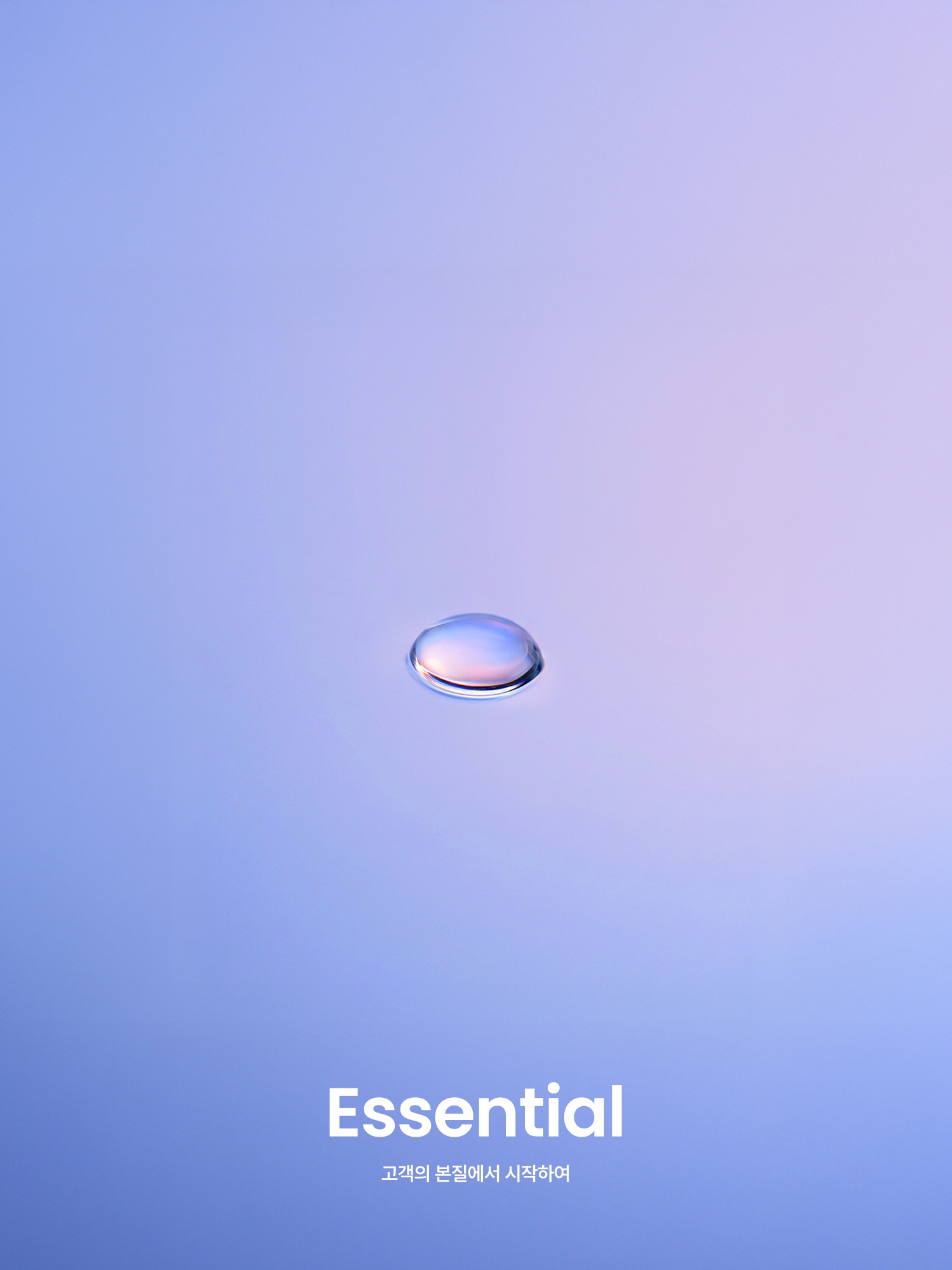
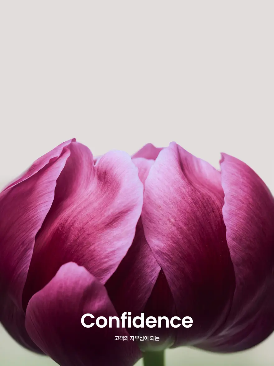
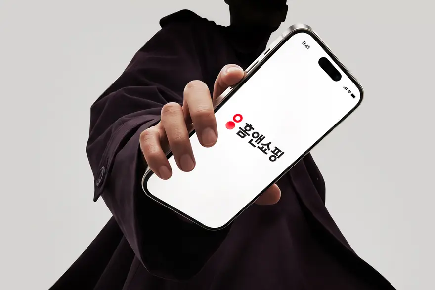
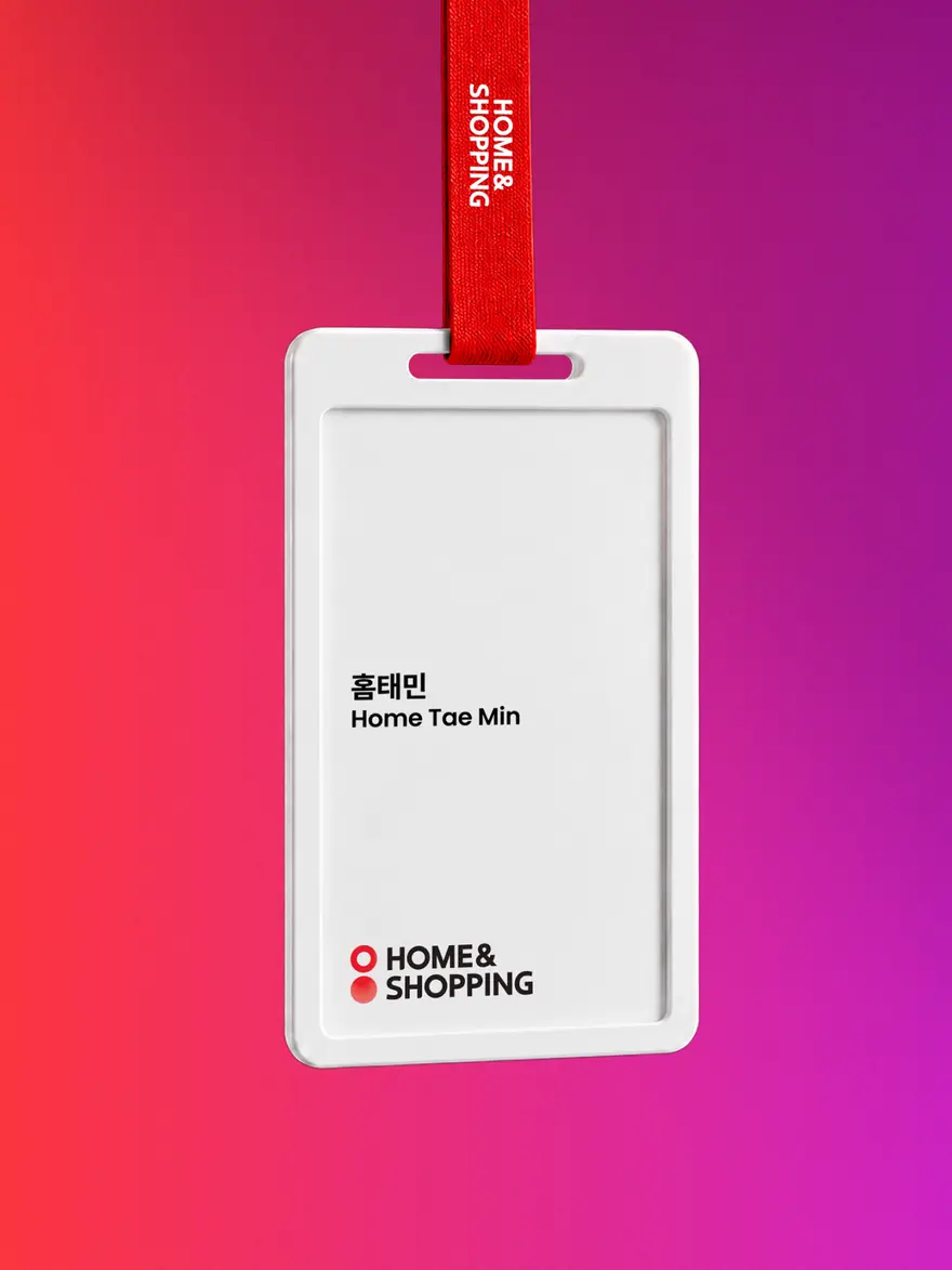
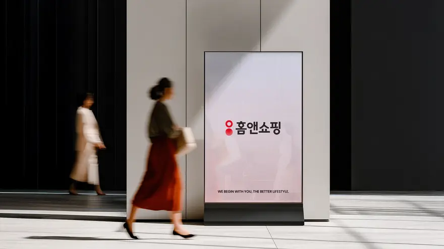
To reinforce the brand’s originality, we leveraged the colon motif, which was previously scattered across its existing assets, and introduced it as a standalone brand symbol. Any unnecessary visual clutter was removed like the circular motif embedded within the old “홈&쇼핑” wordmark as it disrupted the structural harmony and balance of the Hangul typography. The new CI signature combines the colon symbol with the updated wordmark to create something fresh that became definitive of this CI refinement project. Another pivotal change was replacing the ampersand “&” with the Hangul “앤” so that the brand name can be read seamlessly as “홈앤쇼핑” without any disruptions in flow. This resolved the issue where the brand was misread as ‘홈쇼핑’ or ‘홈앤홈쇼핑’, allowing the brand to evolve into one that communicates more clearly and one that can resonate across generations.
기존 자산 내에 분산되어 적용되어 있던 콜론 모티프를 워드마크와 분리하고, 이를 브랜드 심볼로 도입하여 브랜드 오리지널리티를 강화했습니다. 기존 워드마크의 ‘홈&쇼핑’ 내 정원 모티프의 결합으로 인해 한글 활자의 조형성과 밸런스가 깨져 있던 부분을 소거하여, 불필요한 시각 공해를 없애고자 했던 것이 주요 개선 포인트였습니다. 새롭게 도입된 CI 시그니처는 심볼로 분리된 콜론 자산과 새로운 워드마크가 결합된 형태로서, 이번 CI 리파인의 새로운 인상을 전달합니다. 기존 자산에서 ‘&’을 한글 ‘앤’으로 치환하여 한 번에 ‘홈앤쇼핑’으로 읽히게 하는 것 또한 달라진 변화입니다. 이것은 부분적으로 ‘홈쇼핑’, ‘홈앤홈쇼핑’으로 읽혔던 오류를 없애주며, 본 브랜드가 다양한 세대를 아우르며 소통할 수 있는 브랜드로 진화할 수 있도록 합니다.
Color: The Context of Brand Assets
Brand color became the key element that captured the identity from our two distinct assets from 2011 and 2025. Rather than choosing between red or blue, our goal was to find harmony between the two. For the primary color to define the brand, we utilized the red from 2011 and boosted its saturation to optimize it for digital screens. From the 2025 asset, we developed a new sub-color spectrum shifting from purple to blue, creating a harmonious synergy between 2011 and 2025.
브랜드 컬러는 2011년과 2025년, 두 자산에서 뻗어나온 유기적인 흐름을 담기에 최적의 요소입니다. 우리의 목표는 레드와 블루 중 하나를 선택하는 것이 아닌 두 자산 간의 조화로움을 이끌어내는 것이었습니다. 브랜드의 정체성을 나타내는 컬러는 2011년 자산의 레드를 복원하여 오리지널리티를 강화하면서도, 채도를 올려 디지털에 최적화합니다. 여기에 퍼플에서 블루로 이어지는 서브 컬러를 새롭게 지정하여, 2025년 자산을 매끄럽게 연결할 수 있도록 정의합니다.
3D & Graphic Assets: Bringing Energy into Brand Design
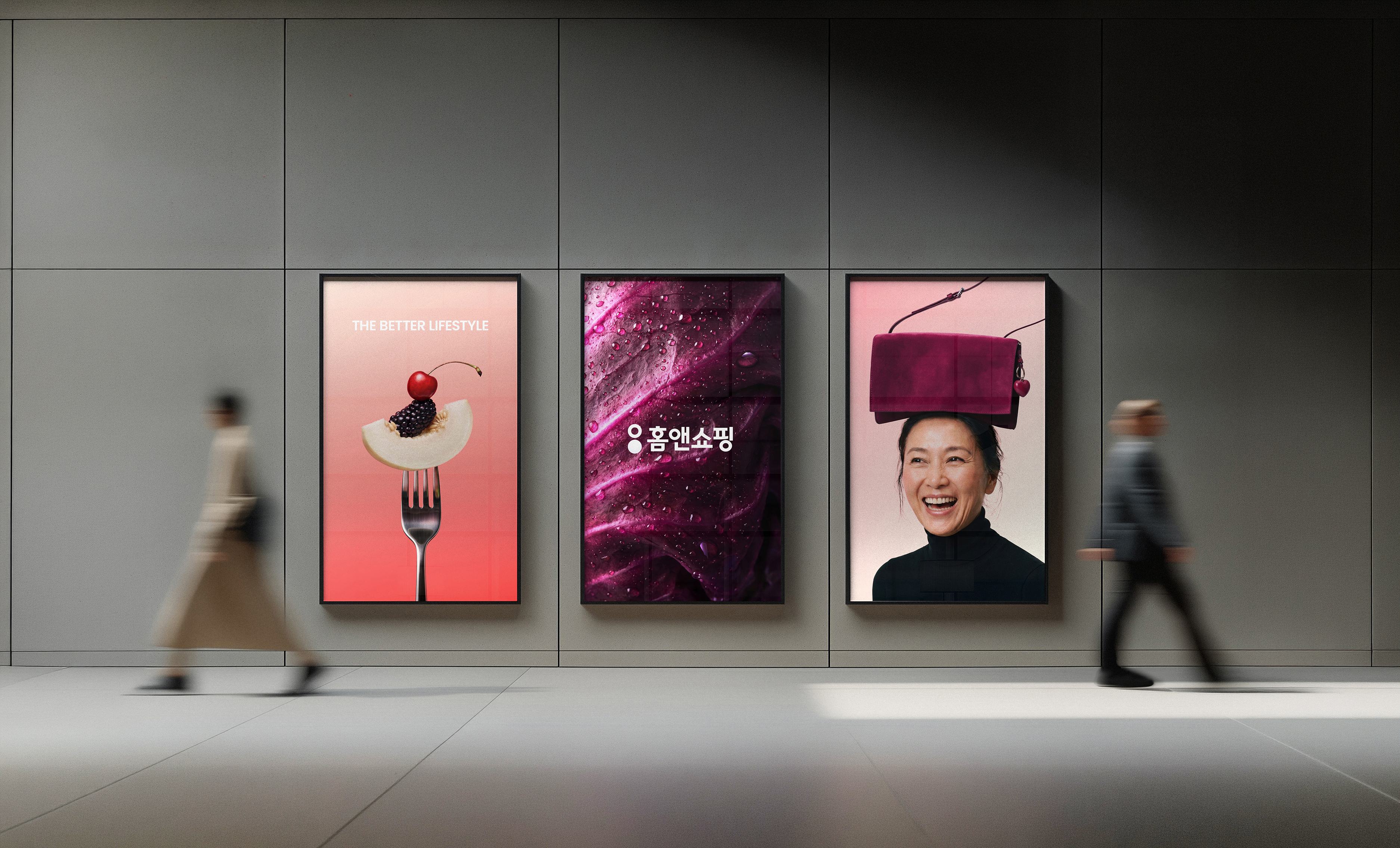
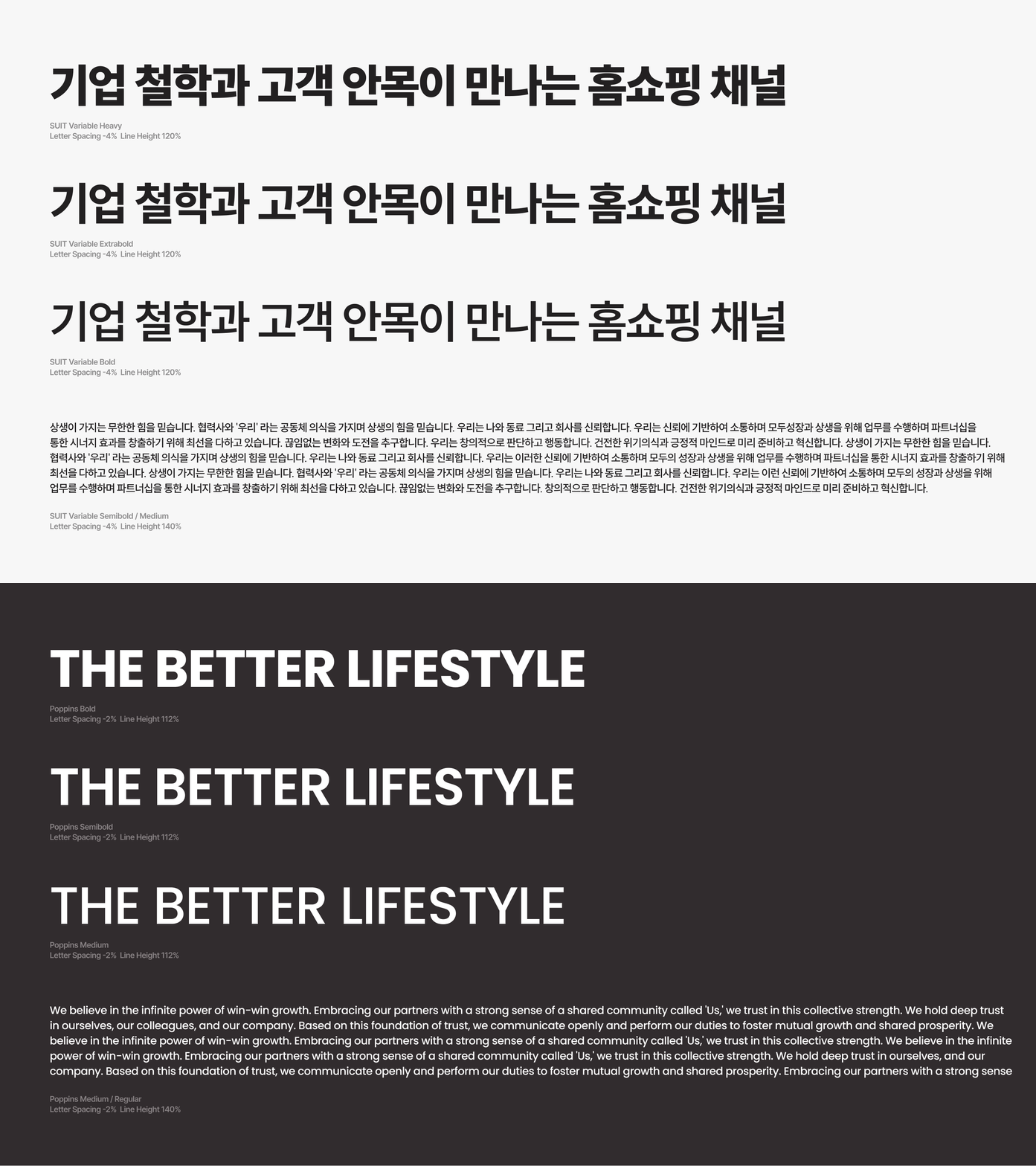
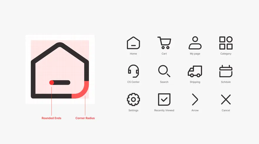
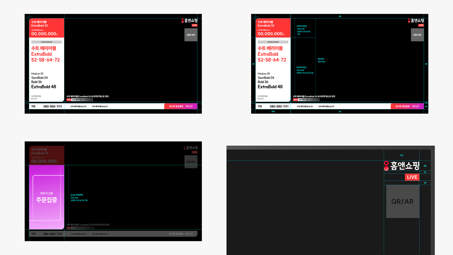
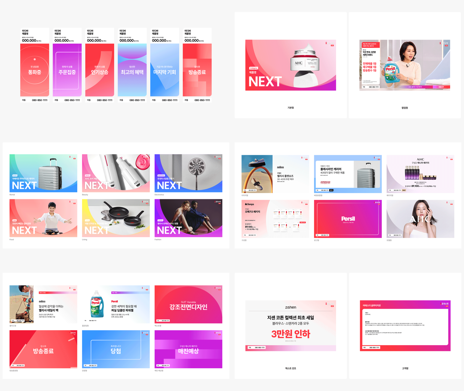
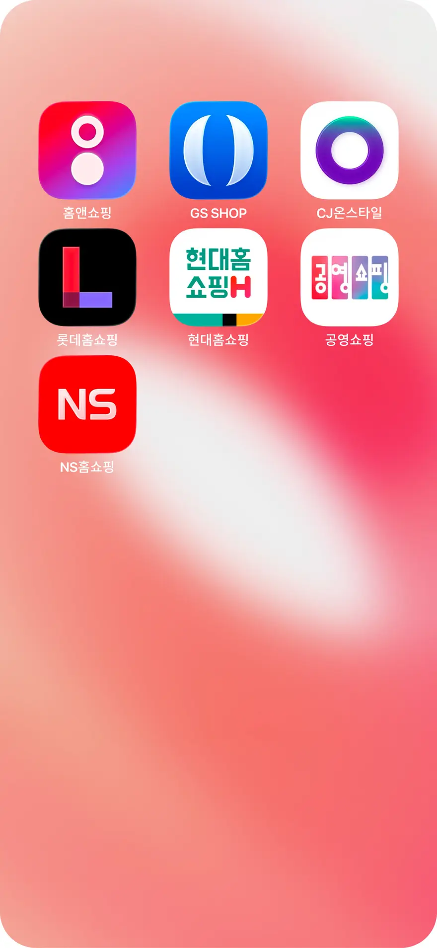
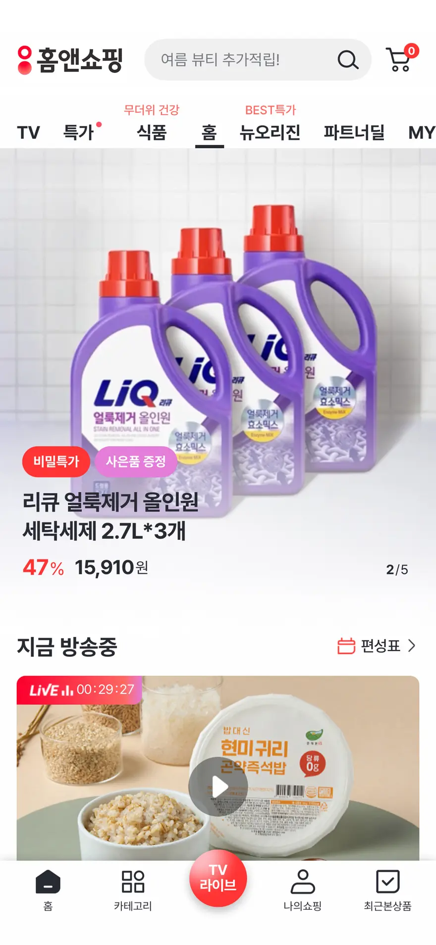
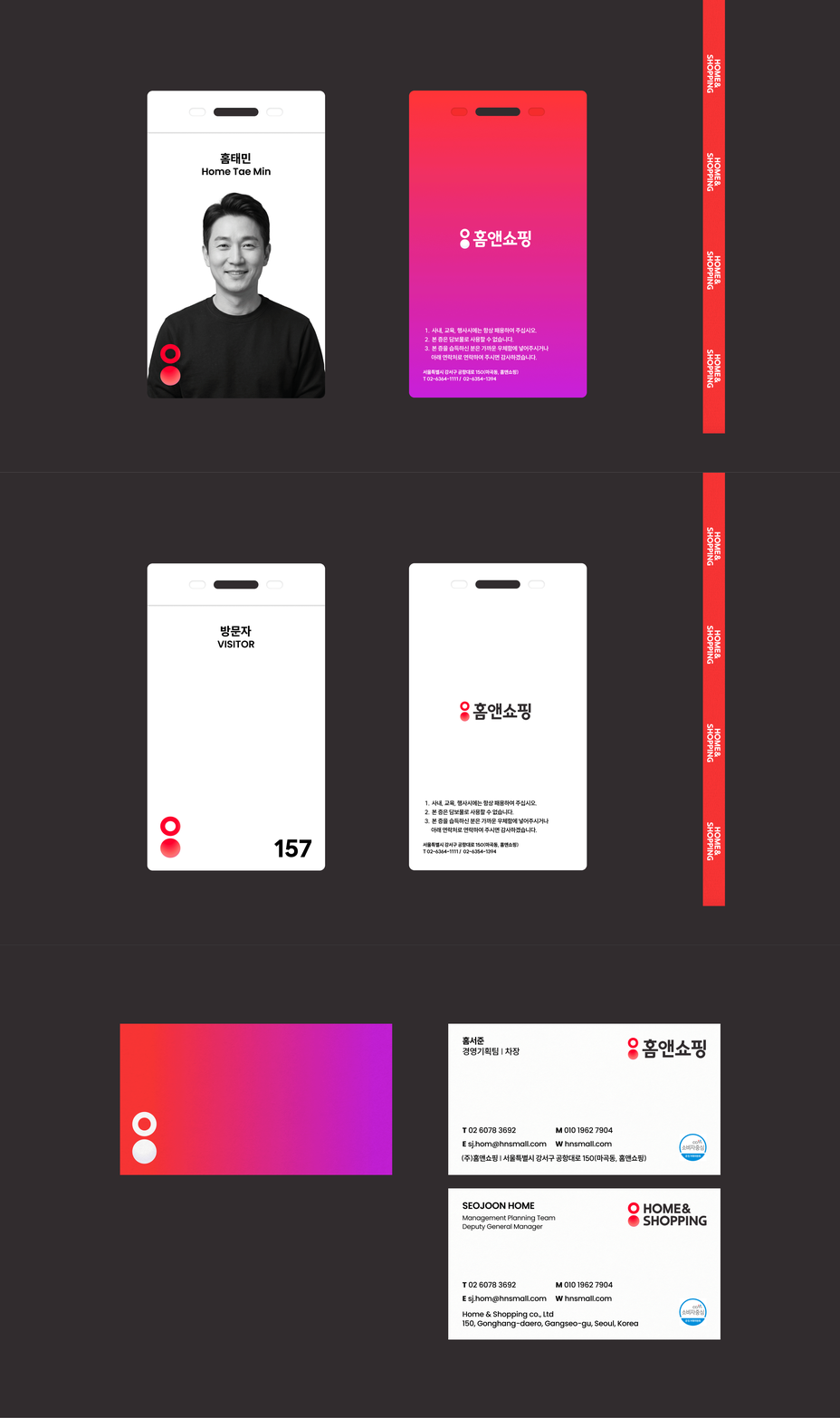
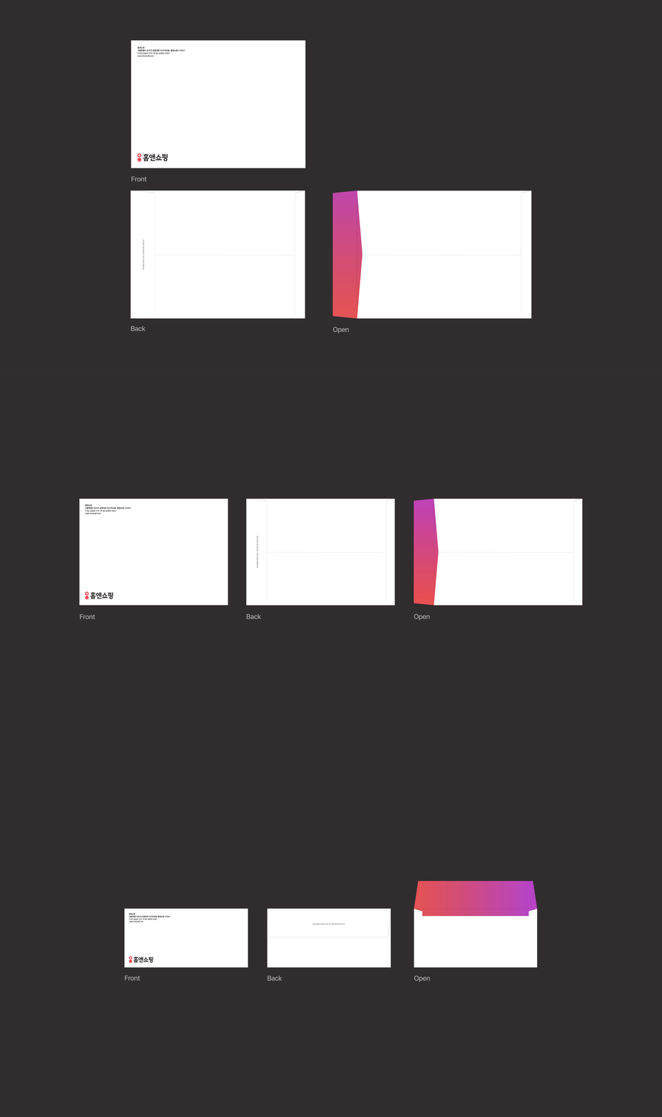
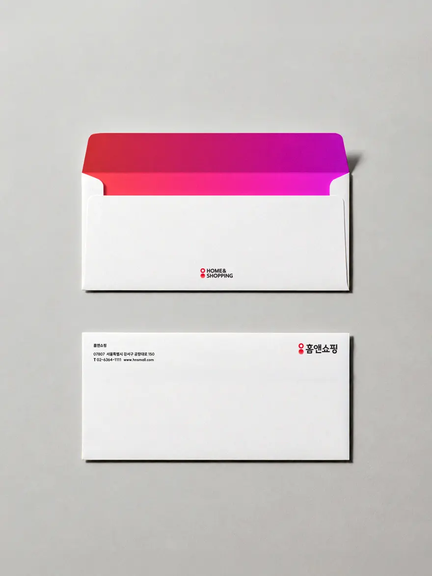
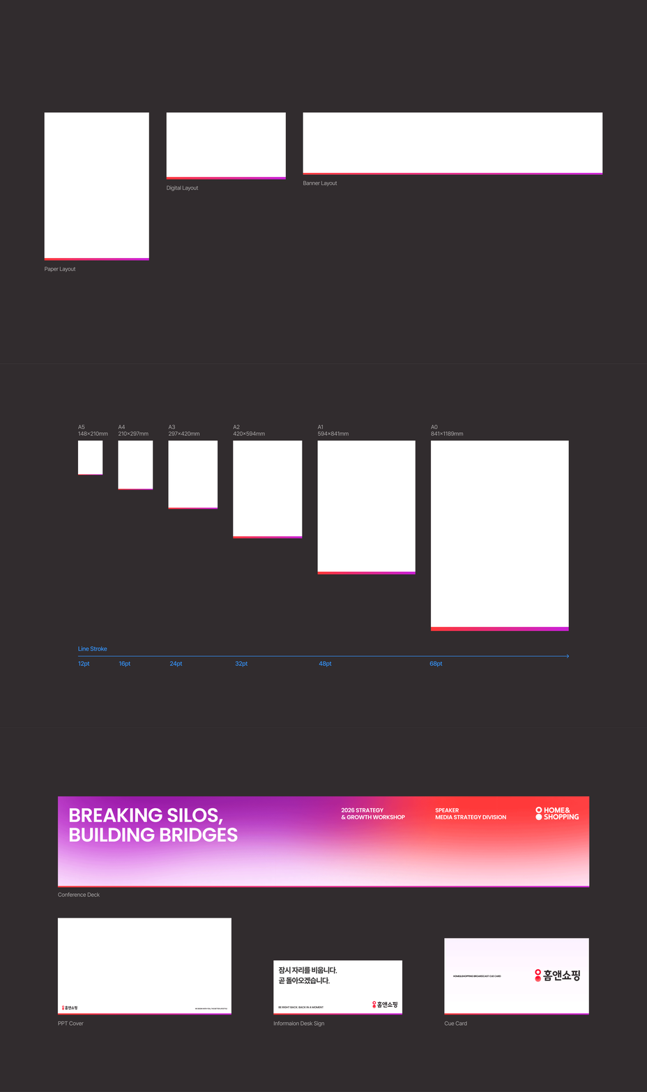
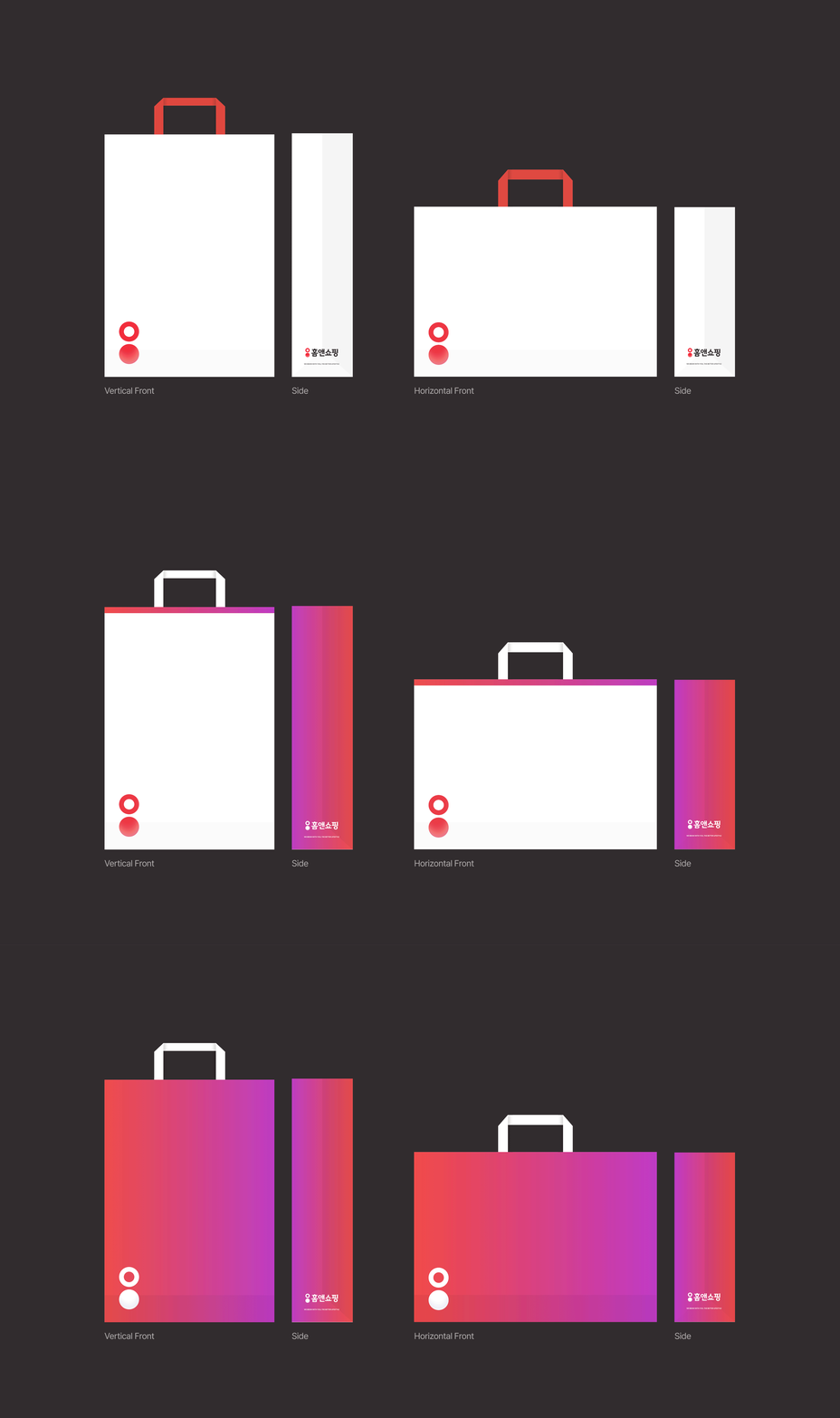
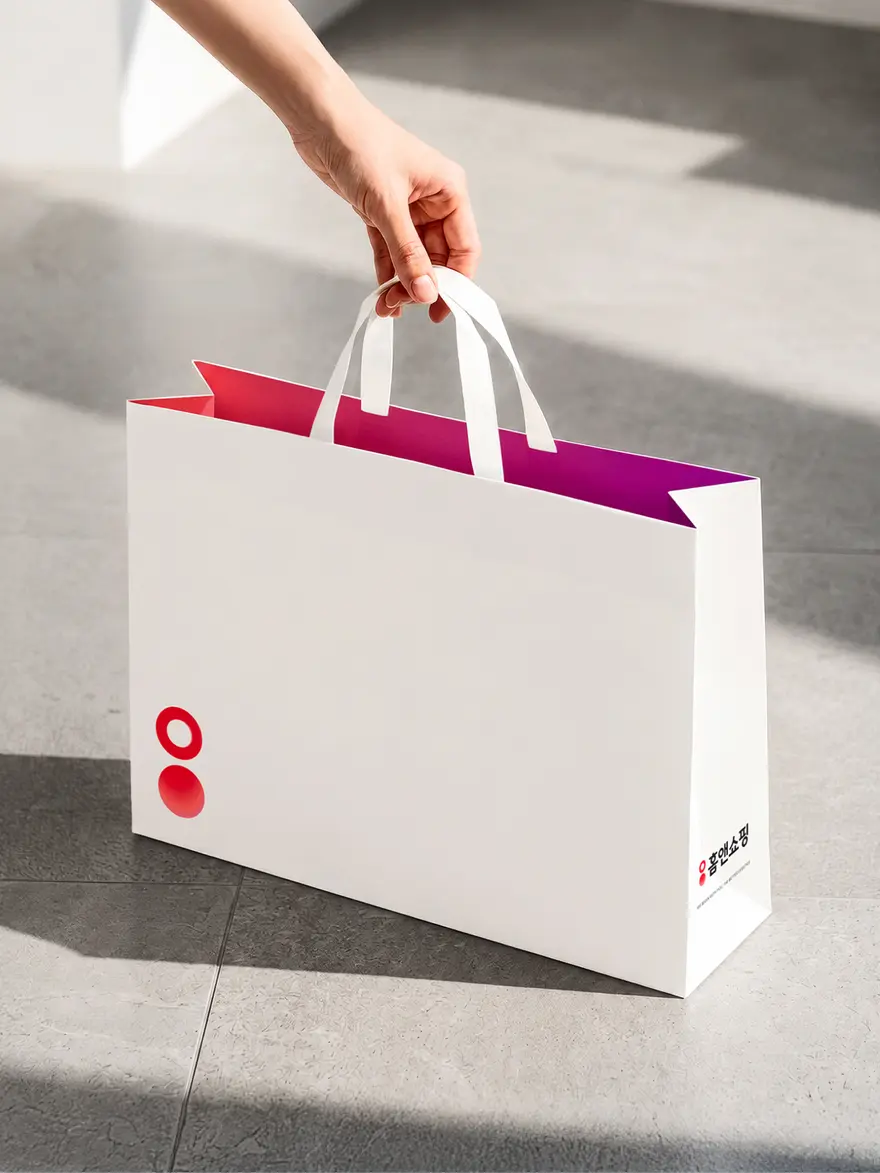
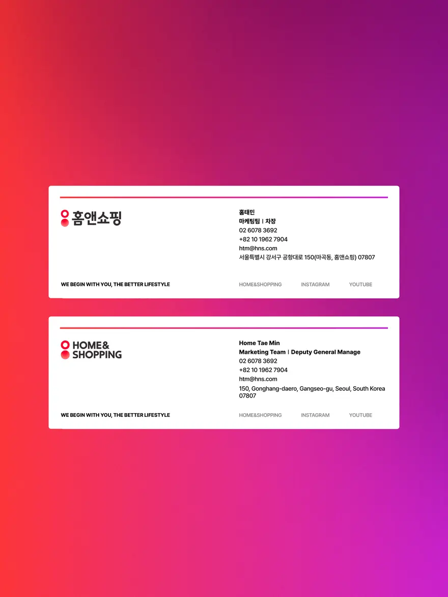
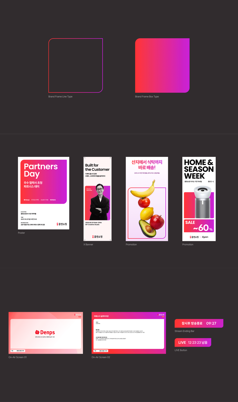
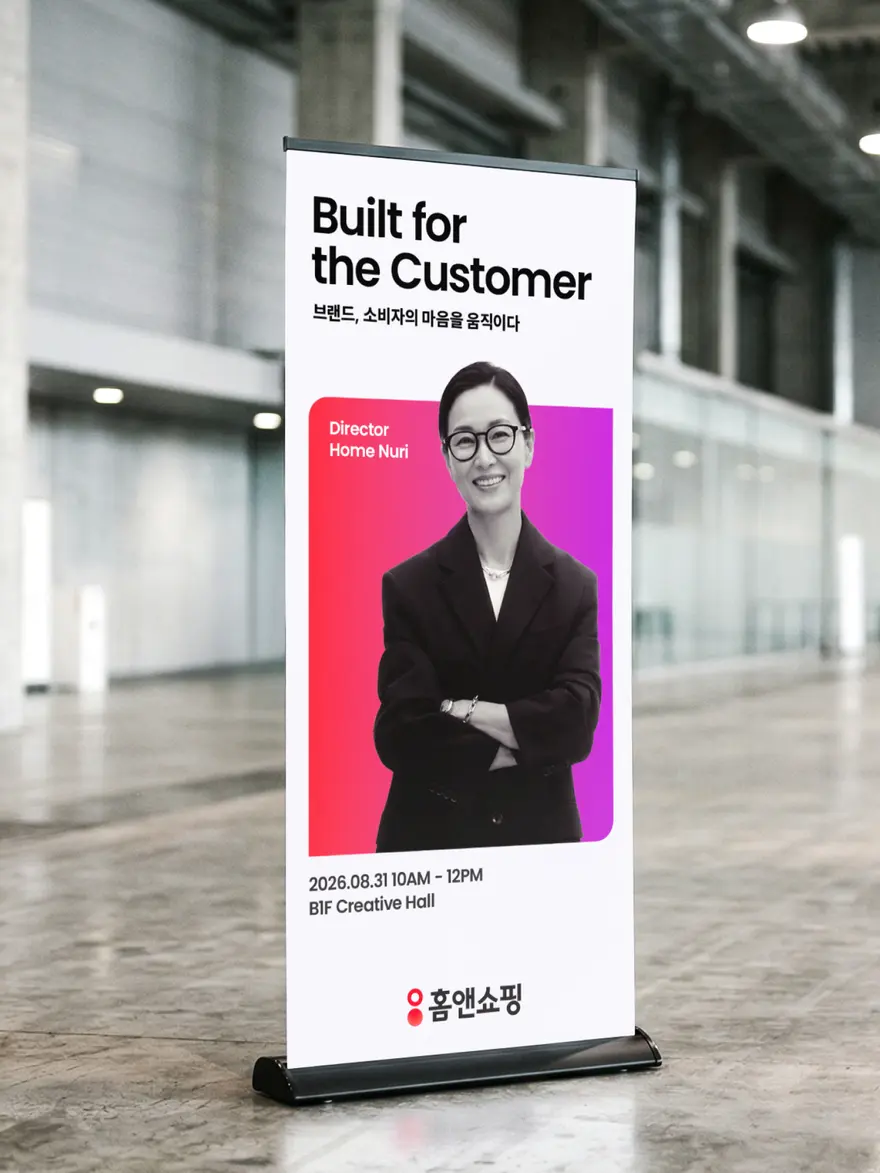
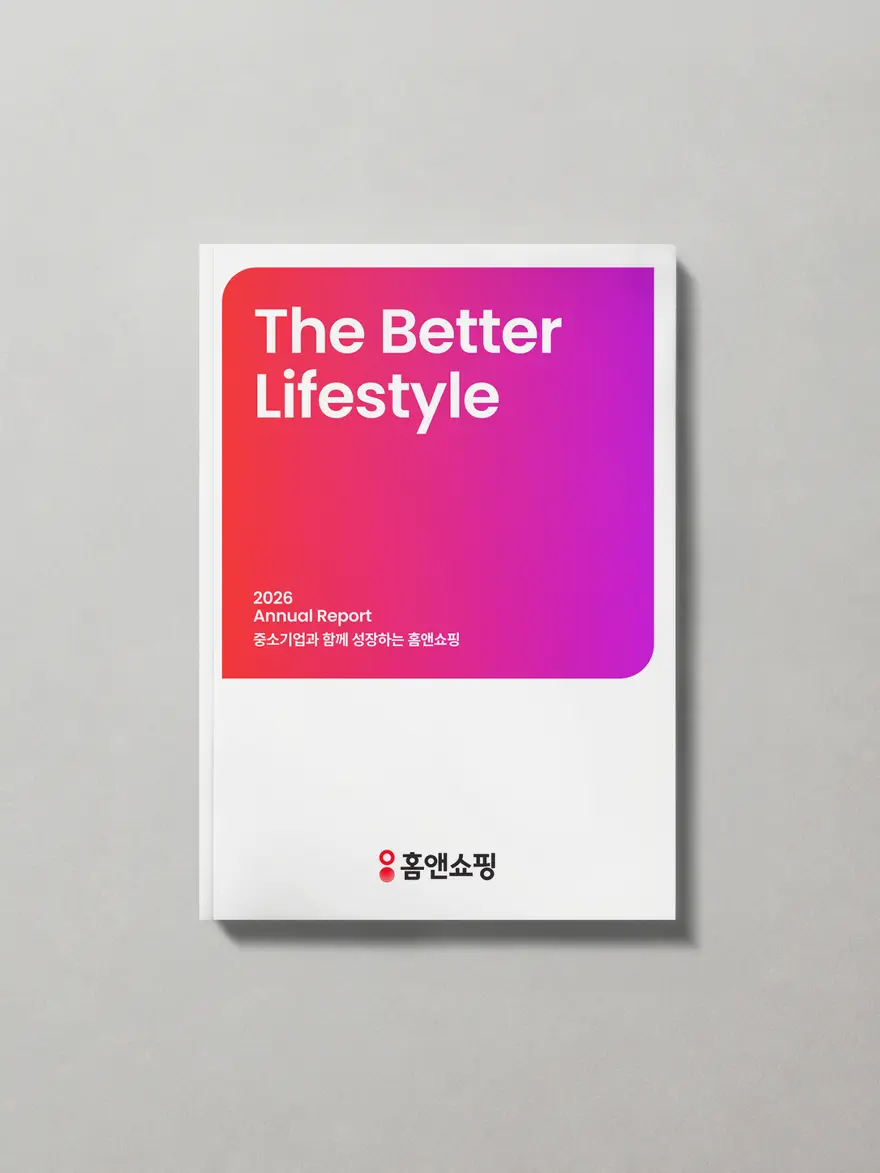
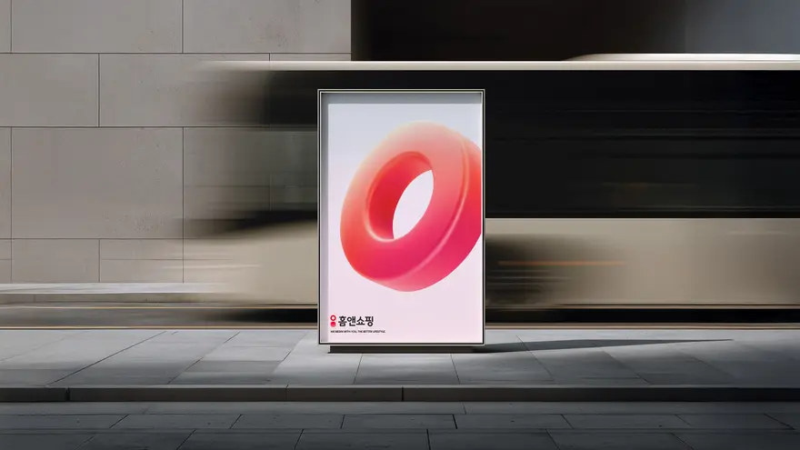
We used a 3D symbol, designed to be scalable across TV and mobile, to enhance the brand’s versatility and consistency across digital touchpoints. The symbol maintained its distinctive form across various angles and in motion, delivering a seamless and immersive brand experience through fluid interactions. Leveraging the brand assets developed from the new CI signature, we established a comprehensive graphic system for TV, mobile, and print. On customer-facing channels like TV and mobile, we applied eye-catching elements that amplify the brand identity through designs made for digital environments. For print graphics, a systemized design layout ensured that the company’s philosophy and identity can be recognized intuitively.
TV 및 모바일 매체에 확장성을 고려한 3D 심볼을 적용하여 디지털 접점에서 브랜드의 확장성과 일관성을 강화합니다. 다양한 각도와 모션에서도 일관된 형태를 유지하며, 매끄러운 인터랙션을 통해 브랜드 경험에 입체감과 몰입감을 제공합니다. 새로운 CI 시그니처에 따른 브랜드 자산을 활용하여 TV 채널 및 모바일, 프린트 그래픽 시스템을 정립합니다. TV 및 모바일과 같은 대고객 채널에서는 브랜드 아이덴티티를 강조한 아이캐칭 요소 및 디지털 환경에 최적화된 디자인을 일관성 있게 적용하고, 지류 그래픽에서는 시스테믹한 디자인 구성으로 기업의 철학과 아이덴티티를 직관적으로 인지할 수 있도록 구성합니다.
Epilogue: Our Perspective
If a sudden change in a brand’s look feels uncomfortable at first that’s only natural. The new always requires time to become familiar. This is precisely why we choose the phrase “refinement” over “rebranding”. Rather than complete transformation, this was a process of discovering elements that grow on you over time, of setting priorities, and introducing change in the subtlest of ways. It wouldn’t be an exaggeration to say that this project was this idea of “refinement” to its very core, requiring us to truly listen to gather diverse perspectives on the brand and distill them into actionable design. We still remember wrapping up the project with a mix of anticipation and anxiety, wondering how our efforts—born from countless discussions, difficult conversations, and tough decision-making—would resonate with our consumers. We live in an era where the brands that succeed are those that endure. Crafting a brand’s direction, shaping its context, and weaving those elements into a narrative that is uniquely its own may seem like the essence of branding. Yet what ultimately gives a refined brand lasting meaning is not the story it tells, but the people who embrace it—its consumers and customers. And it feels as though we’re already in the midst of another leap forward.
갑자기 달라진 브랜드의 인상이 불편하다면, 그건 어쩌면 당연한 일일 것입니다. 새로운 것은 익숙해지는 시간이 필요하죠. 여기에서 우리가 취사선택할 수 있는 방법이 ‘리브랜딩’이 아닌 ‘리파인’입니다. 완전한 탈바꿈이 아닌, 오래 보아야 좋은 것들을 발견하고 우선순위를 가려서 아주 작은 방식으로 바꾸어 보는 것입니다. 이번 프로젝트는 바로 이 ‘리파인’에 초점을 맞추고, 본 브랜드를 바라보는 의견들을 모으는 과정이 전부였다고 해도 과언이 아닙니다. 쉽지 않은 안건과 의사결정을 거쳐 나온 리파인의 결과물들이 소비자들에게 어떠한 존재가 될지 기대 반 걱정 반으로 프로젝트를 마무리했던 기억이 납니다. 지금은 살아남는 브랜드가 성공한 브랜드라고 여겨지는 시대입니다. 브랜드의 흐름과 맥락을 만들고 이것들을 연결시켜 그만이 가질 수 있는 서사를 완성하는 것은 특별해 보이지만, 리파인 이후의 브랜드가 세상에서 의미 있는 존재가 되도록 만드는 것은 결국 우리의 소비자, 고객입니다. 우리는 이미 또 다른 도약을 향한 과정 속에 있는 듯합니다.
Credits
Project ManagementPark ChulsungDesign LeadChoi BomiBranding StrategyKim MinchaeCheon NuriBrand DesignPark YejinJang YonghwanHong Sungbin3D Motion DesignKim Chanju