Brand & Digital
A Complete Redesign of the NEXON NYPC Platform and User Experience
- Client
- NEXON Korea
- Category
- Brand, Digital
- Services
- Brand Identity, Content Design, Website, Platform
- Scope
- Brand Identity, Website Design, Mobile Site Design, Graphic Design, Content Production
- Year
- 2026
- Links
- Visit Website
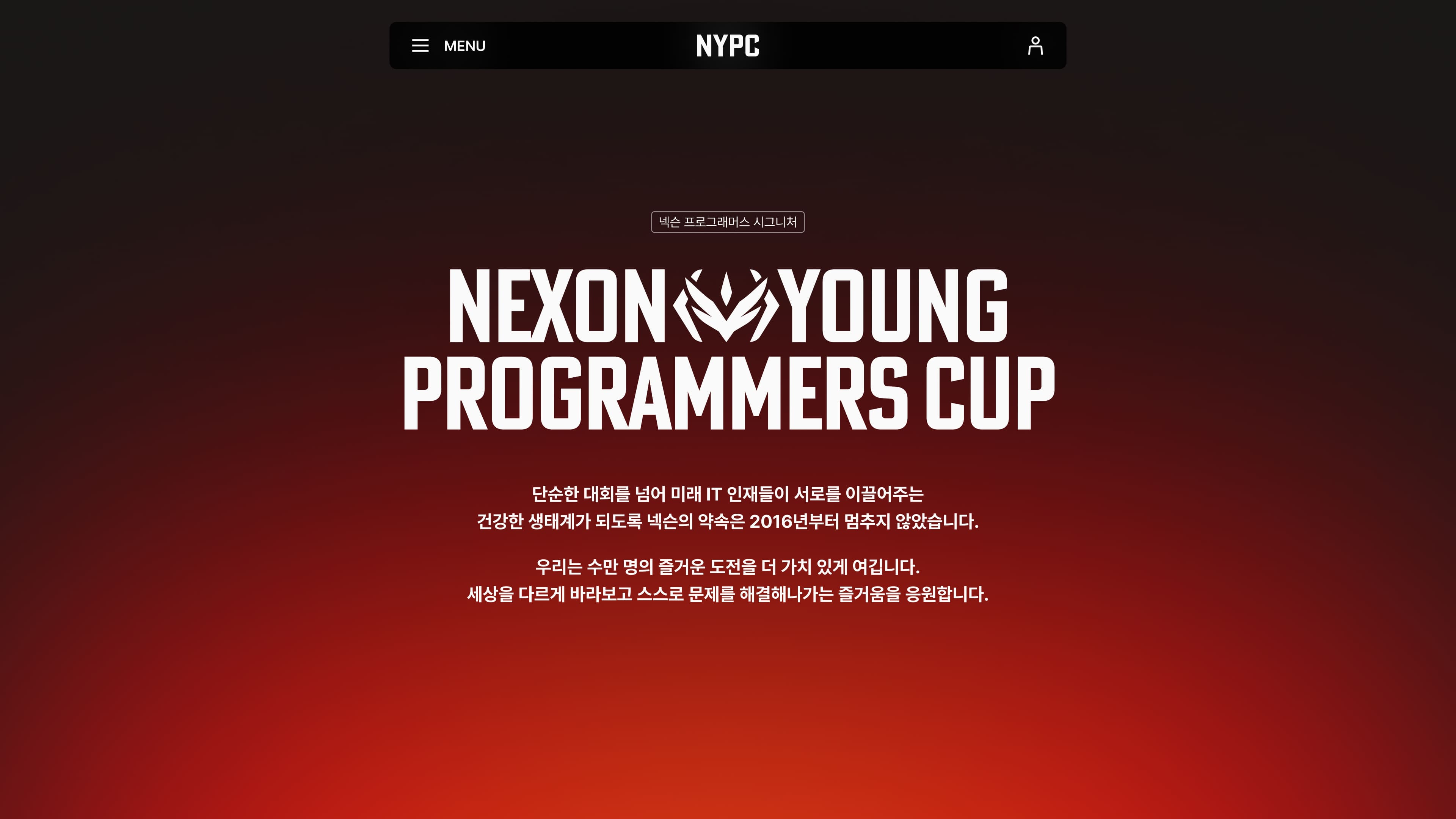
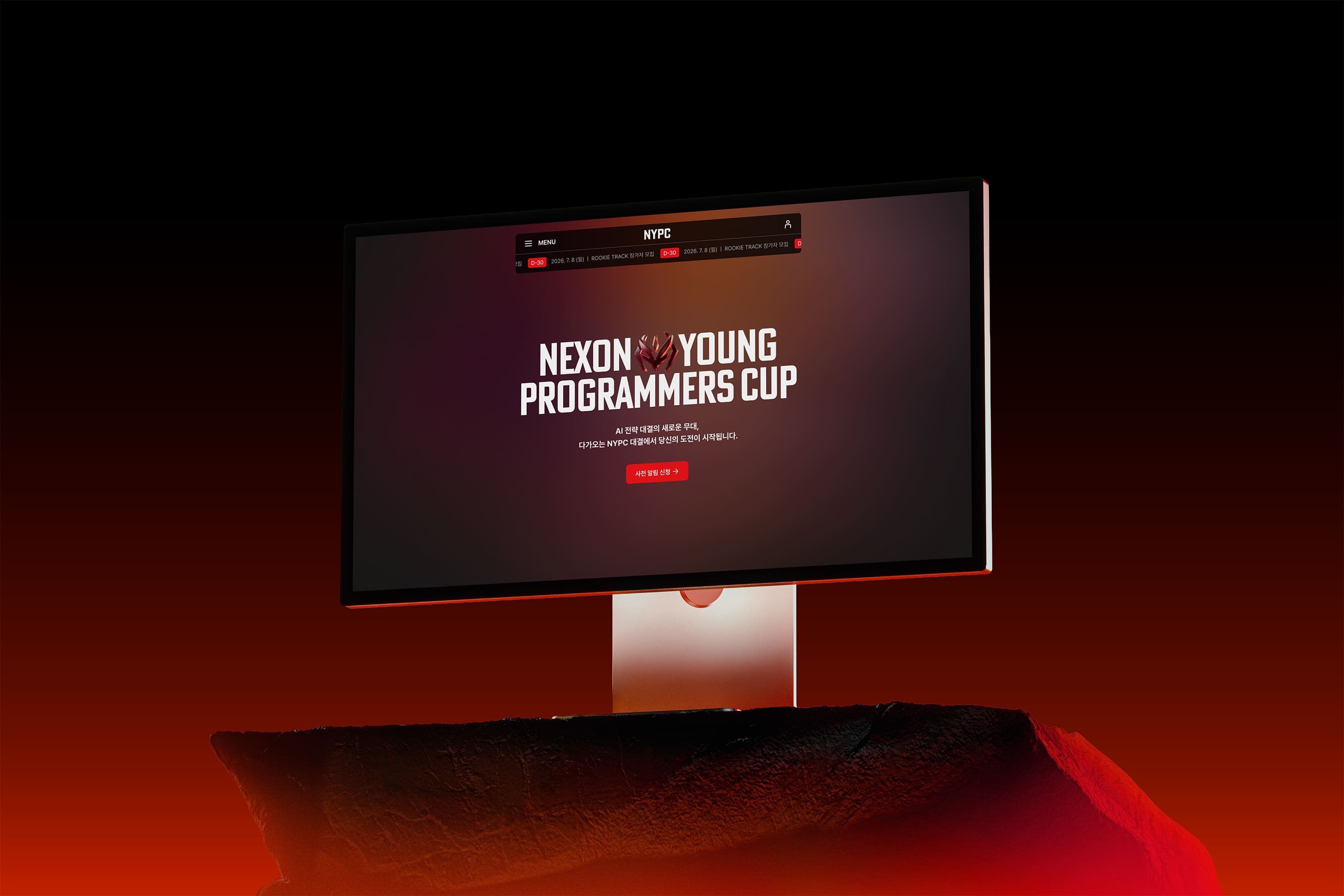
NYPC was on its 10th year and it had already evolved from a youth education initiative into a dynamic, global competition where university students and talent from across the world could challenge each other through cutting-edge technology. The existing static website experience could no longer convey the excitement, intensity, and prestige of today’s NYPC. Rather than just sharing information about NYPC, we designed a connected narrative that flows seamlessly from the beginning of the competition all the way to the moment of victory. Bold visual language inspired by technology paired with a meticulously designed information architecture provided an immersive experience from the moment users arrive, making them feel as though they’re stepping into an actual live arena.
넥슨 NYPC 대회 사이트 및 사용자 경험 전면 리뉴얼 10주년을 맞이한 NYPC는 단순한 청소년 지원 사업을 넘어, 대학생과 글로벌 인재들이 기술로 부딪히는 역동적인 경기장으로 진화해야 했습니다. 우리는 기존의 정적인 포털 구조가 대회의 열기와 긴장감을 충분히 담아내지 못한다는 점에 주목했습니다. 단순한 정보 전달을 넘어 대회 시작부터 성취의 순간까지 유기적으로 이어지는 성장의 서사를 구축하는 데 집중했습니다. 기술적 권위를 상징하는 날카로운 비주얼 언어와 참가자의 여정을 세밀하게 고려한 정보 설계를 통해, 사용자가 사이트에 진입하는 순간부터 실전 경기에 참여하는 듯한 압도적인 몰입감을 경험하도록 재구축했습니다.
Expanding the Brand Identity and Redefining the Persona (BX Strategy)
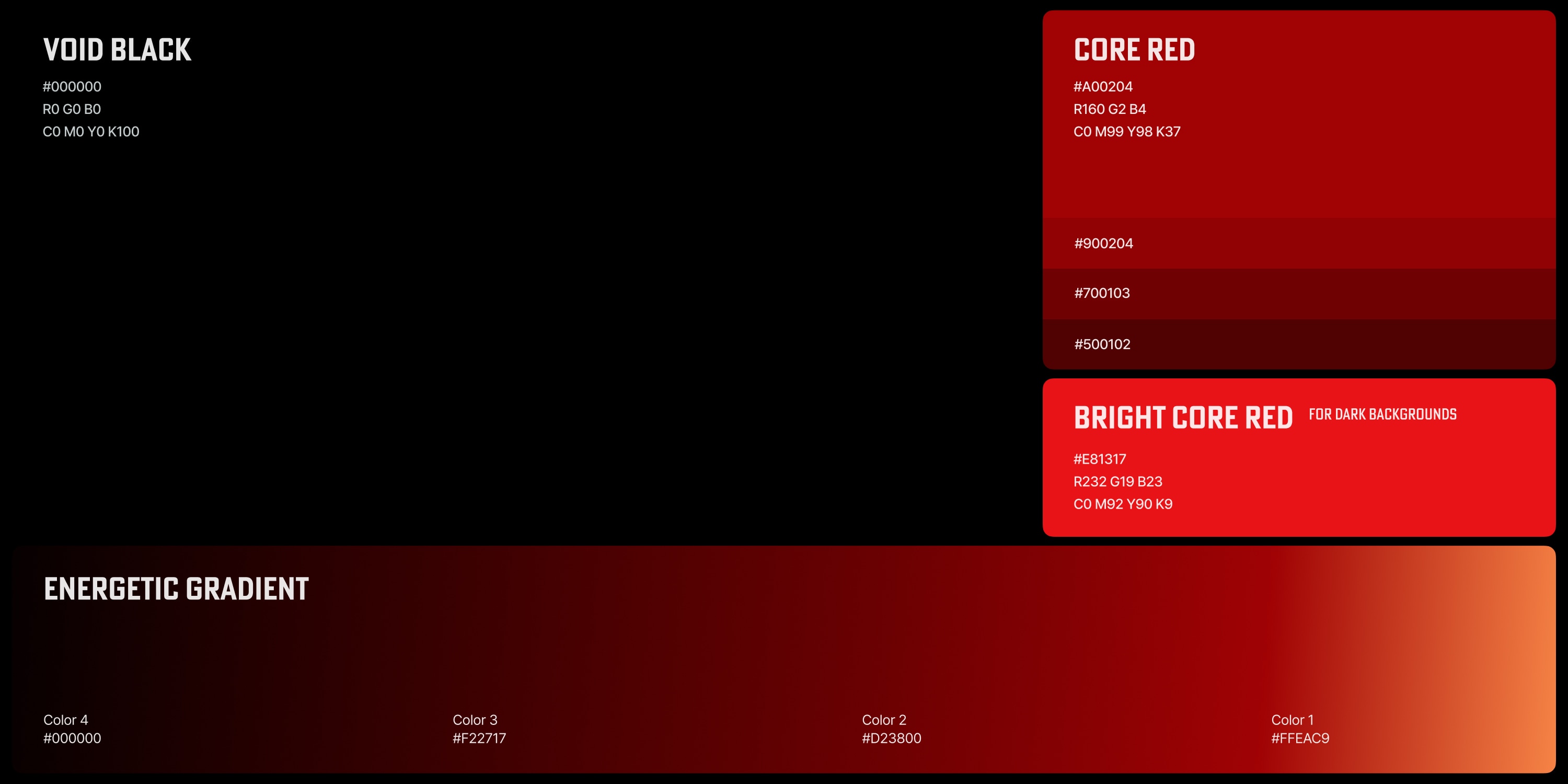
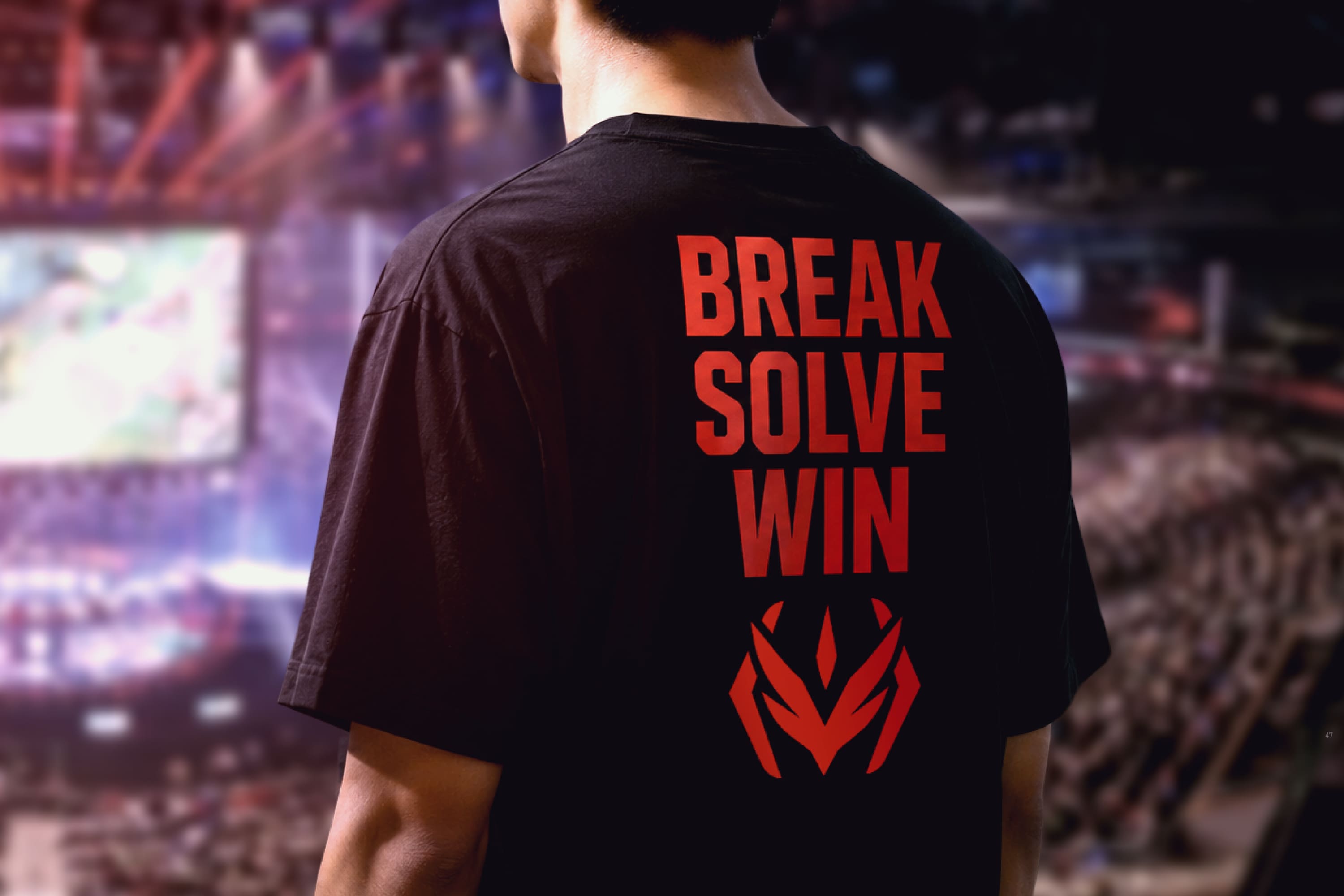
Evolving the Visual Identity: On its 10th year, NYPC had grown beyond its CSR-oriented image and had already established itself as a prestigious competition for the ambitious and the tech-savvy. The new visual language we developed was inspired by the intense passion and first-class expertise that the competition had become known for. < > (code brackets) with a powerful spark of energy at its center became the brand’s signature, serving as a visual metaphor for the cutting-edge precision necessary for coding, the endless pursuit of excellence, and the high-stakes tension present at every NYPC. A striking color palette of deep red and solid black reinforces the tech-driven aesthetic and psychologically shifts the user experience from just visiting a website to entering a competitive arena—resulting in a far stronger and more aspirational brand presence that reflects the evolution and future of NYPC.
브랜드 아이덴티티의 확장과 페르소나의 재정립 (BX Strategy) 비주얼 정체성 확장 : 10주년을 기점으로 기존의 친근한 CSR 이미지를 탈피하여, 기술적 권위와 승부의 열정을 상징하는 새로운 비주얼 언어를 도출했습니다. 시그니처 모양을 날카로운 직선 형태의 < >(Code Bracket)로 확장하고 그 중심에 응축된 에너지의 불꽃을 배치하여, NYPC가 지향하는 정교한 기술력과 경쟁의 긴장감을 시각적으로 형상화했습니다. 딥레드와 솔리드 블랙이 조화된 대비감 있는 테크 무드는 참가자들에게 단순한 웹사이트 방문을 넘어 프로페셔널한 경기장에 입성했다는 심리적 전이를 일으키며, 브랜드의 혁신적이고 강렬한 이미지를 전달합니다.
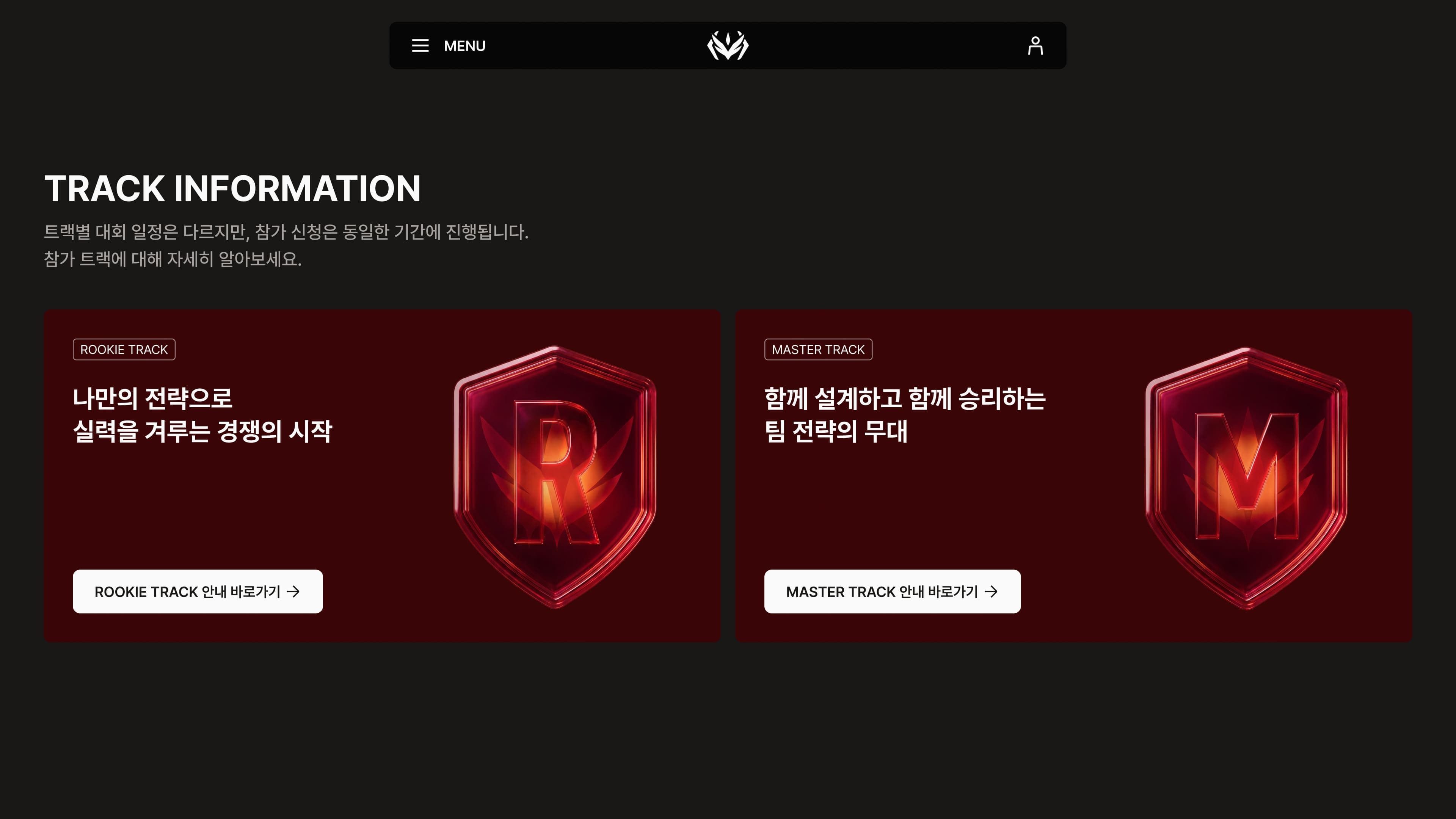
Immersive Visuals: High-fidelity 3D elements were introduced throughout the user experience to express the competition’s new identity and to create an unforgettable first impression from the moment users first enter the platform. Moving away from the lighter, more approachable feel of previous iterations, the color spectrum and lighting treatment were refined to emphasize this sense of immersion through enhanced contrast, depth, and visual weight—creating an atmosphere that draws participants into the world of NYPC, fully engaging them to solve challenges and perform at their best.
몰입형 비주얼 튜닝 : 메인 비주얼에 배치된 고해상도 3D 오브젝트는 대회의 정체성을 입체적으로 표현하며 진입 단계에서부터 강력한 인상을 남깁니다. 기존의 가벼운 톤에서 벗어나 대회의 무게감을 확보하기 위해 정밀하게 튜닝된 컬러 스펙트럼은 빛의 대비를 극대화하여 묵직한 몰입감을 형성합니다. 이를 통해 참가자는 NYPC가 제공하는 기술적 세계관에 자연스럽게 동화되며, 본인이 해결해야 할 문제와 도전 과제에 대해 최고의 집중력을 발휘할 수 있는 안정적이고 권위 있는 환경을 마주하게 됩니다.
Designing an Organic, Growth-Oriented Experience Ecosystem (UX & Admin System)
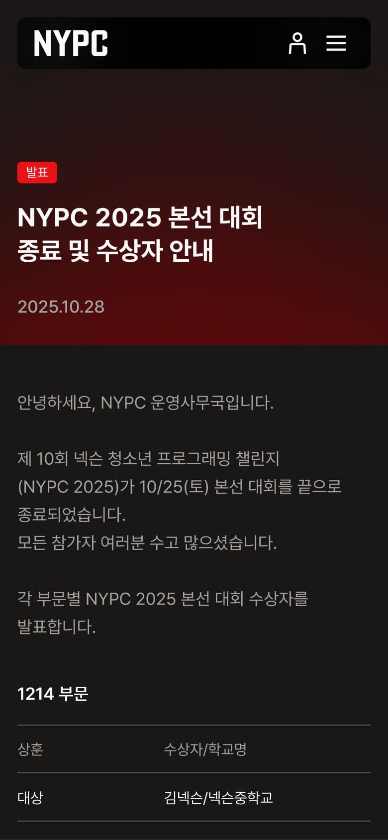
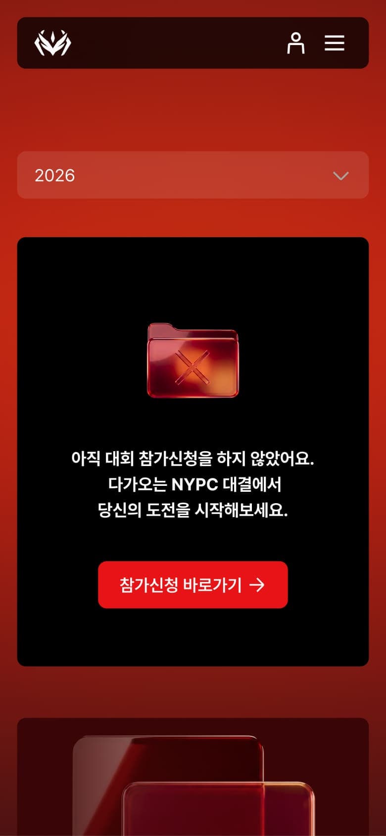
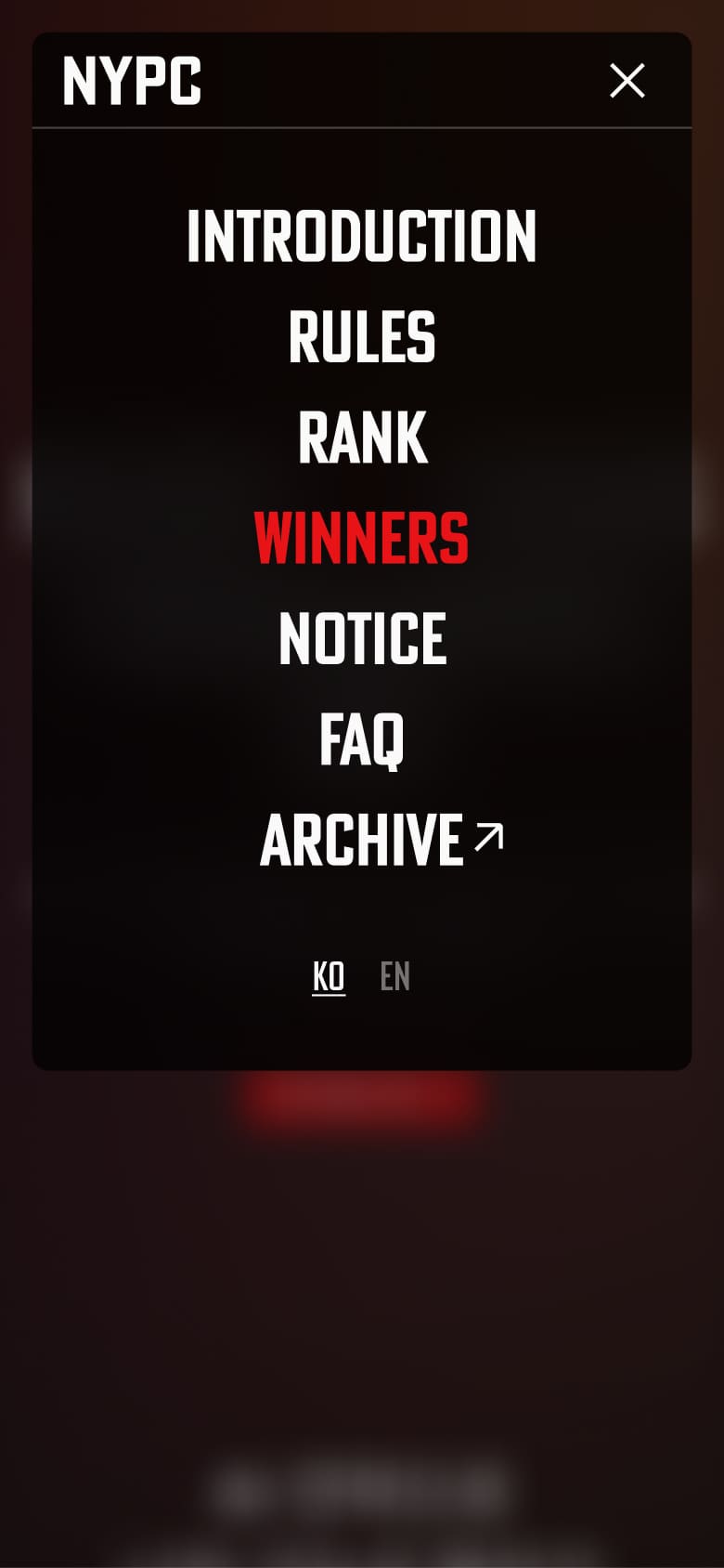
Narrative-Driven Information Architecture: The platform’s previous navigation structure was completely reimagined around the user journey. By creating a cohesive narrative flow, users were guided through every stage of NYPC from the competition introduction, registration, live rankings, and the Winners Hall of Fame. Information was reorganized so that users can understand the broader context of the event without any extra effort. To support engagement throughout the event lifecycle, we introduced a flexible layout system that adapts to each phase of the competition. This dynamic structure allows for continuous exploration that organically brings users towards their next action, minimizing friction and service drop-off.
사용자 성장에 집중한 운영 중심의 유기적 구조 설계 (UX & Admin System) 연속성 있는 정보 설계 : 파편화되어 있던 기존의 메뉴 구조를 사용자 여정에 맞춘 네러티브 기반의 정보 흐름으로 전면 재설계했습니다. 대회 소개부터 신청, 실시간 랭킹, 그리고 명예의 전당인 Winners로 이어지는 유기적인 배치는 사용자가 별도의 탐색 비용 없이도 대회의 전체 맥락을 한눈에 체득할 수 있도록 돕습니다. 특히 대회 진행 상태에 따라 섹션이 유연하게 변화하는 가변형 레이아웃을 채택하여, 사용자가 현재 위치에서 다음 행동으로 자연스럽게 이어질 수 있는 ‘연속적인 탐색 흐름’을 구축하고 서비스 이탈을 최소화했습니다.
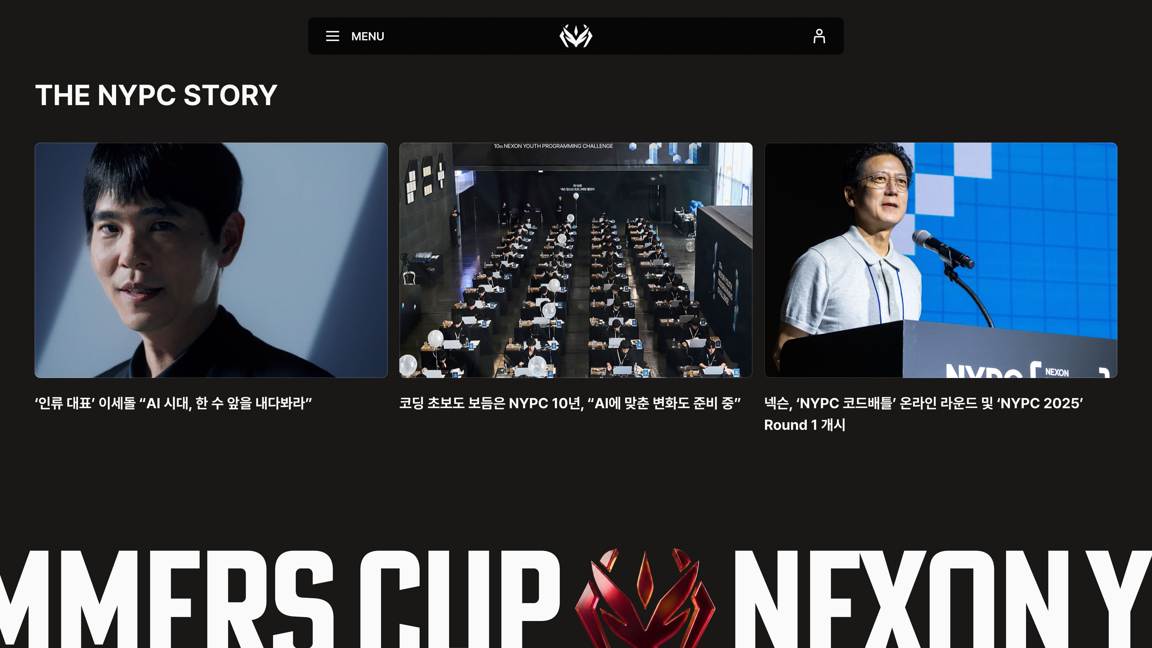
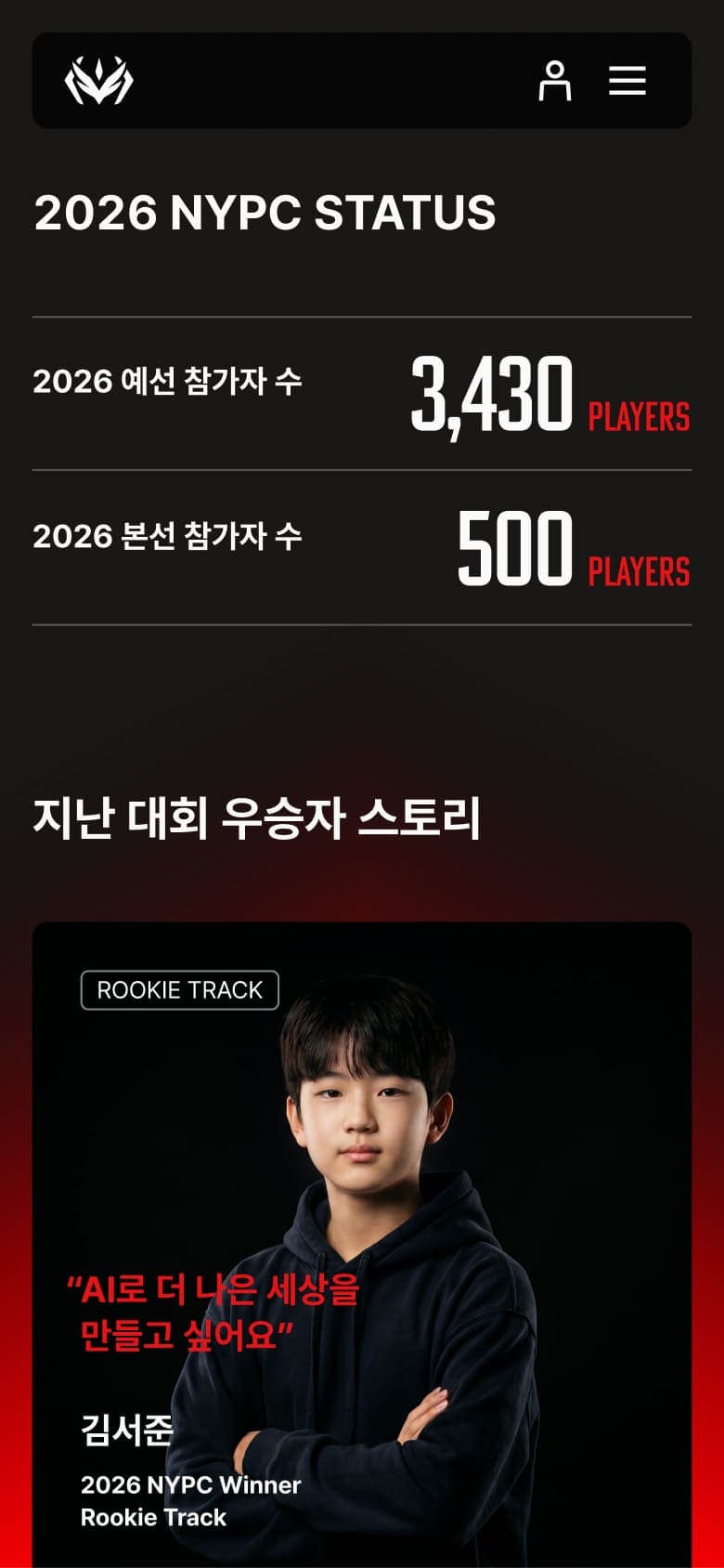
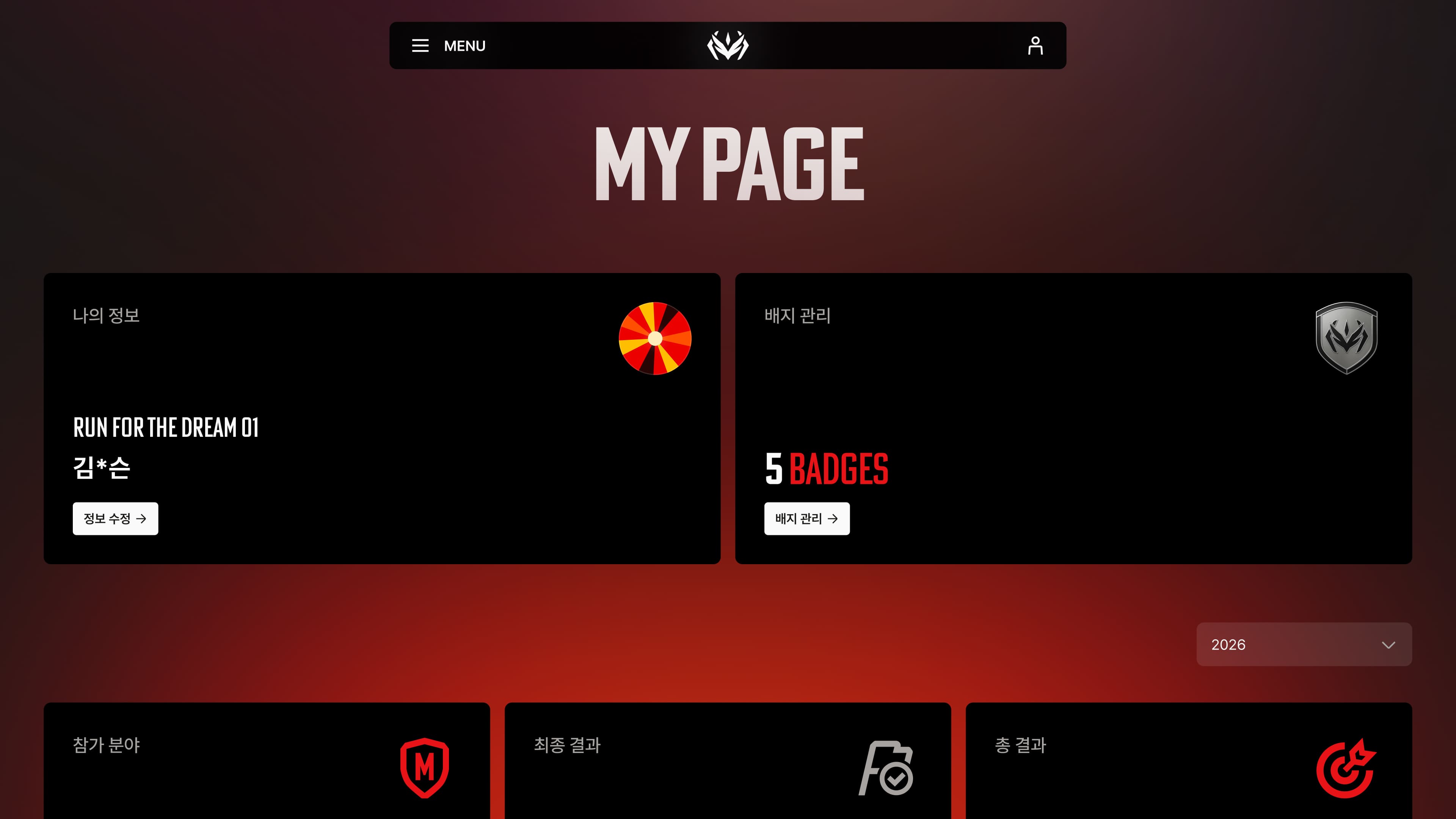
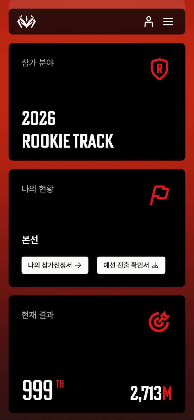
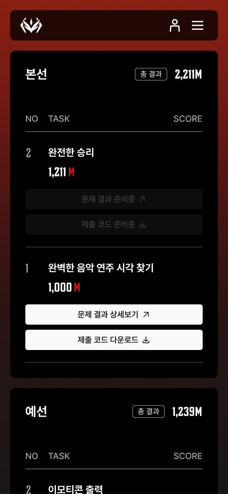
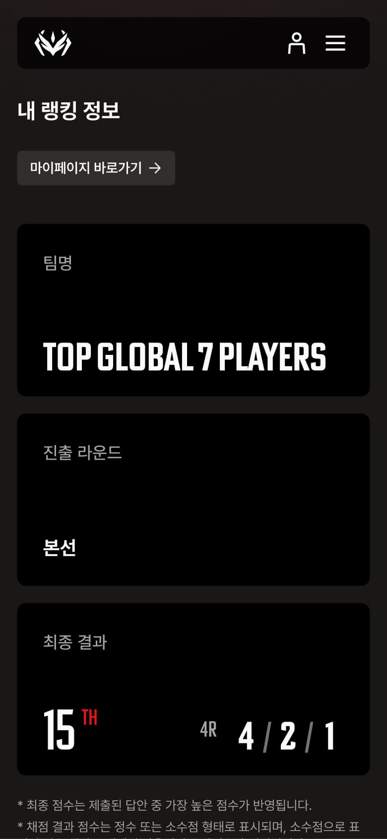
Data-Driven Achievements Page: Going beyond a simple ‘My Page’, we introduced a personalized data dashboard that visually analyzes users’ challenge history, progress status, and achievements. Participants can intuitively track their own growth and accomplishments through performance metrics, rankings, and earned badges. Built on a carefully-structured grid system, the dashboard balances high information density with clear visual hierarchy, allowing users to quickly see their standing and milestones at a glance, motivating them for their future challenges. By making data more meaningful, we positioned NYPC as more than a competition, reinforcing its role in each participant’s personal journey of growth and mastery.
데이터 기반의 성취 경험 : 단순한 마이페이지를 넘어, 사용자의 도전 이력과 진행 상태를 시각적으로 분석해 주는 데이터 대시보드 시스템을 도입했습니다. 참가자는 자신의 성적과 획득한 배지를 통해 본인의 성장을 직관적으로 확인하며, 이는 단순한 기록 조회를 넘어 대회에 대한 강력한 성취감과 소속감을 느끼게 하는 핵심 장치로 작동합니다. 그리드 시스템을 기반으로 정교하게 짜인 대시보드는 정보 밀도를 높이면서도 위계를 명확히 하여, 참가자가 자신의 기술적 위치를 명예롭게 확인하고 다음 도전을 향한 동기부여를 얻을 수 있도록 설계되었습니다.
Celebrating Achievements through an Intelligent Design System (UI & Visual System)
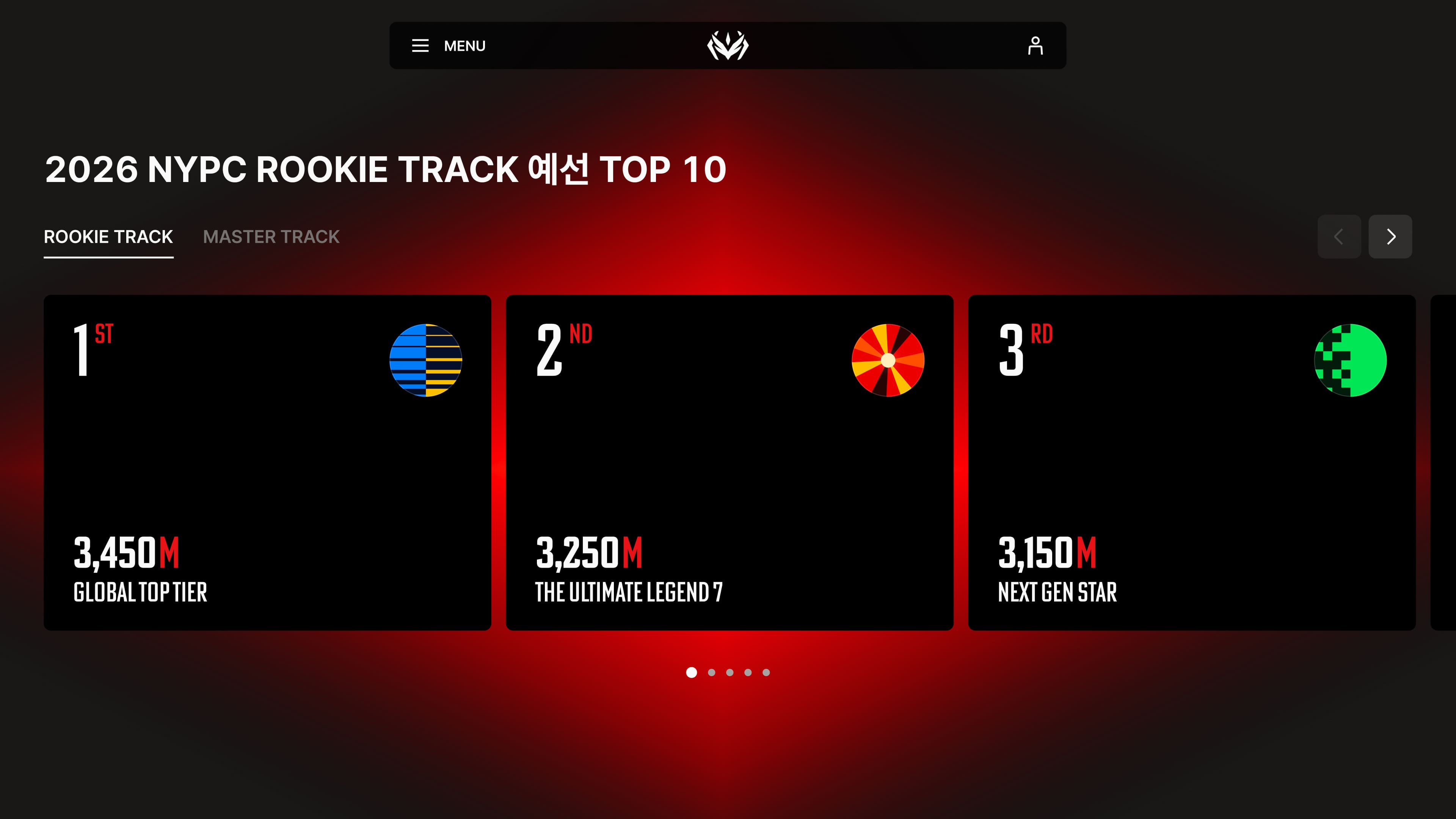
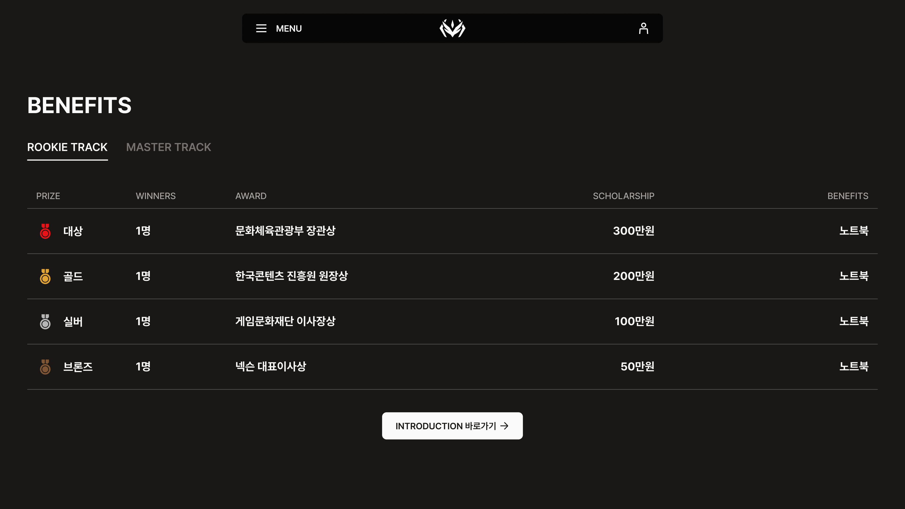
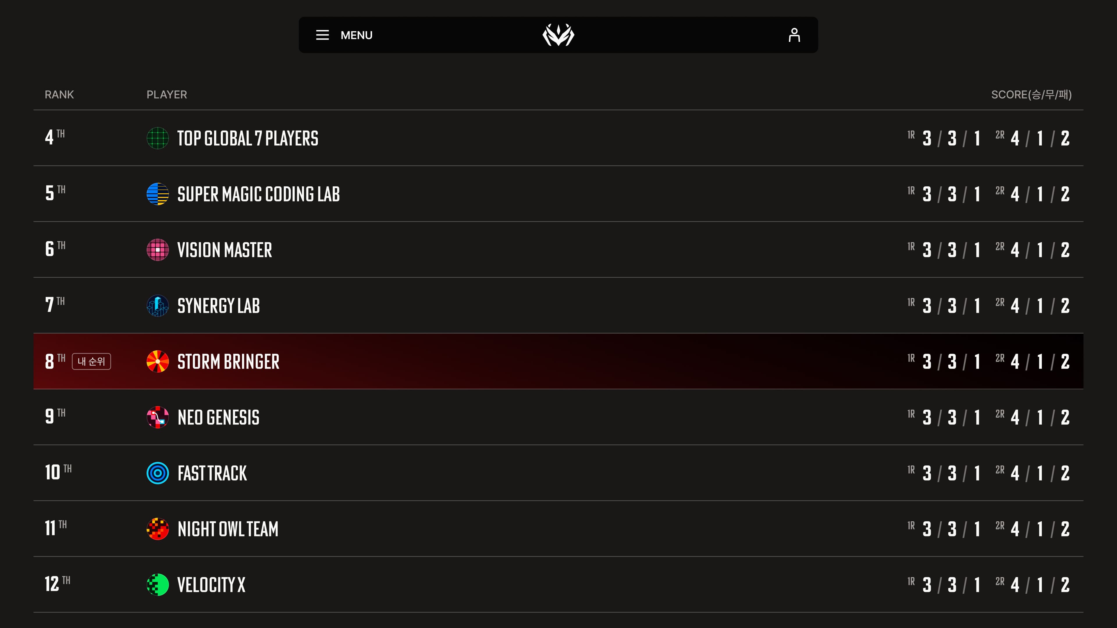
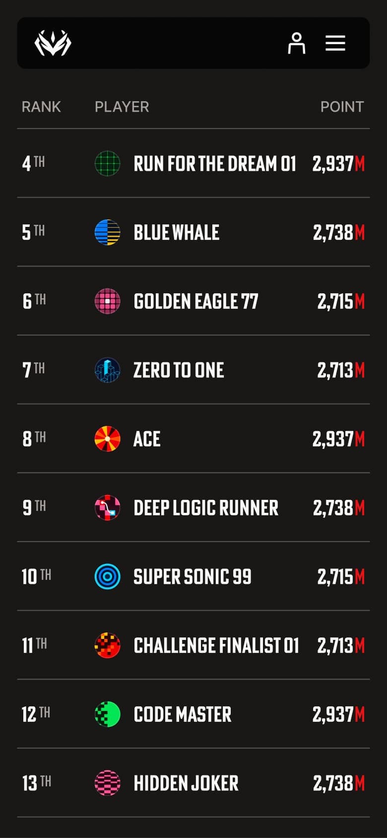
Clarity Through Structure and Hierarchy: Information remains the focal point of the experience so we stripped away any unnecessary visual elements and built a design system focused on structure, hierarchy, and contrast. Bold uppercase headlines and a strict layout create a strong visual presence focused on the clarity of key content. Rankings and competition results were designed to be impactful with just typography. Through the skillful use of scale, weight, and spacing, we transformed data into a compelling visual element that expresses the competition’s intensity and the sense of achievement and progression while still maintaining exceptional readability and a sense of sophistication.
성취의 가치를 증명하는 인텔리전트 디자인 시스템 (UI & Visual System) 구조와 위계의 완성도 : 정보 자체가 가장 돋보일 수 있도록 불필요한 장식을 걷어내고, 구조적 대비를 강조한 디자인 시스템을 구축했습니다. 볼드한 대문자 헤드라인과 슬림한 레이아웃 가이드는 시각적 무게감을 분산시키지 않으면서도 핵심적인 데이터를 명확하게 전달합니다. 특히 랭킹 시스템과 결과 테이블은 타이포그래피의 강약 조절만으로 시각적 쾌감을 선사하며, 긴장감 넘치는 경기 데이터를 하나의 그래픽 요소로 승화시켜 정보의 가독성과 플랫폼의 세련미를 동시에 확보했습니다.
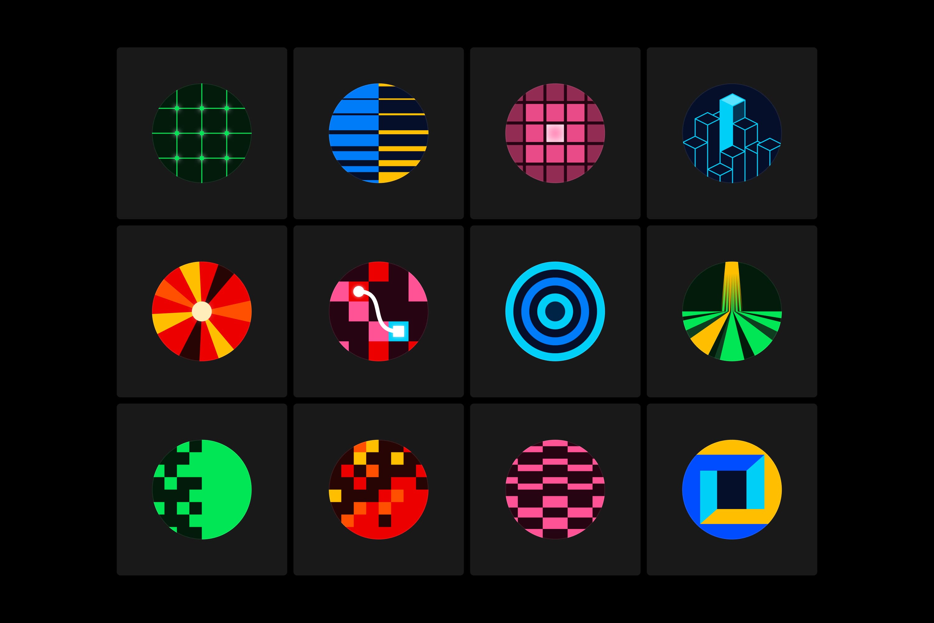
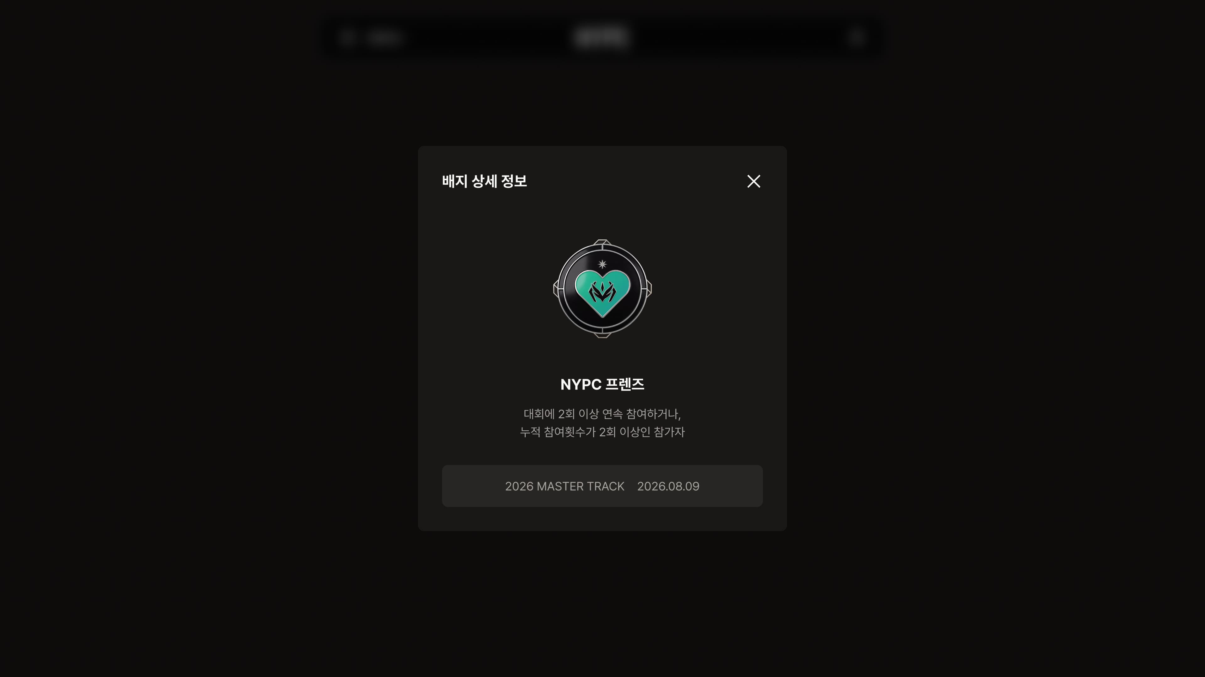
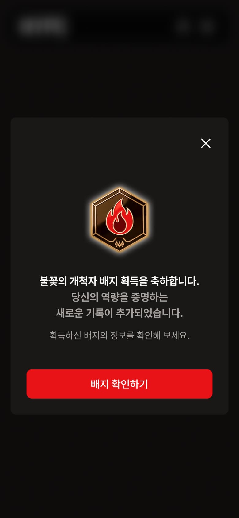
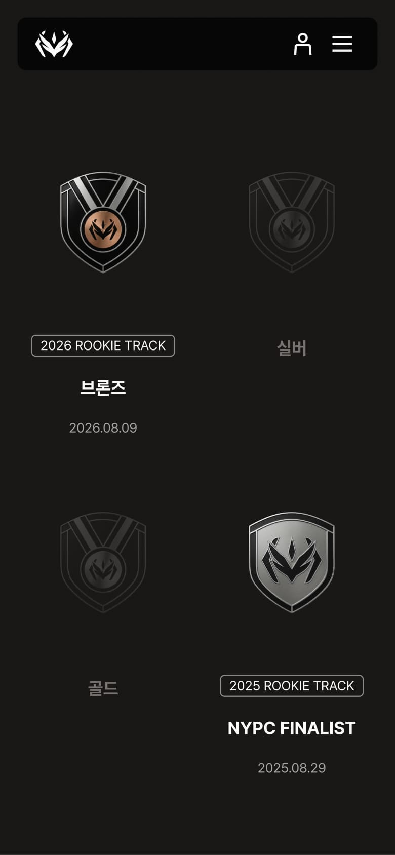
A Systemized Visual Language of Achievement: Participants’ accomplishments were celebrated through a structured three-layer modular badge system (Shape, Icon, Frame) that establishes a clear visual hierarchy across different achievement levels and tiers while still maintaining a distinct NYPC identity. Each badge is meant to be meaningful and aspirational, serving as a tangible symbol of success and recognition. Tier-specific glow effects, metallic frame treatments, and other visual distinctions reinforce the rarity and prestige of each badge, encouraging continued participation. Through the badge system, the competitive spirit of NYPC is translated into achievements that participants can earn, showcase, and aspire towards.
시스템화된 성취 오브젝트 : 참가자의 도전과 성과를 시각적으로 박제하는 배지 시스템은 정교하게 조립된 3단 레이어 구조를 통해 완성되었습니다. [Shape-Icon-Frame]으로 이어지는 시스템 가이드는 등급과 희귀도에 따른 시각적 위계를 엄격히 준수하면서도 NYPC 고유의 DNA를 담아내어, 배지 하나하나가 참가자에게 실질적인 명예의 상징으로 체감되도록 했습니다. 등급별로 차등화된 글로우 효과와 메탈릭 톤의 프레임 처리는 수집욕을 자극하며, 대회의 권위가 시스템을 통해 사용자 개인에게 전달되는 고도의 브랜드 경험을 완성합니다.
Credits
Project ManagementSohn YeseulUX PlanningMoon JayoungLee YunmiCD+DesignGwon SoongyuWeb DesignKim MinhyoekKim YejiEom HaeyeonBrand Identity DesignPark YejinGraphic DesignKim MinhyoekEom Haeyeon