Digital
Remodeling of National Museum of Korea Website.
- Client
- NTS
- Category
- Digital
- Services
- Digital Strategy, Website, UX/UI
- Scope
- Digital Experience Strategy, UX Strategy, Art Direction, Mobile Site Design, Website Design, Style Guide
- Year
- 2014
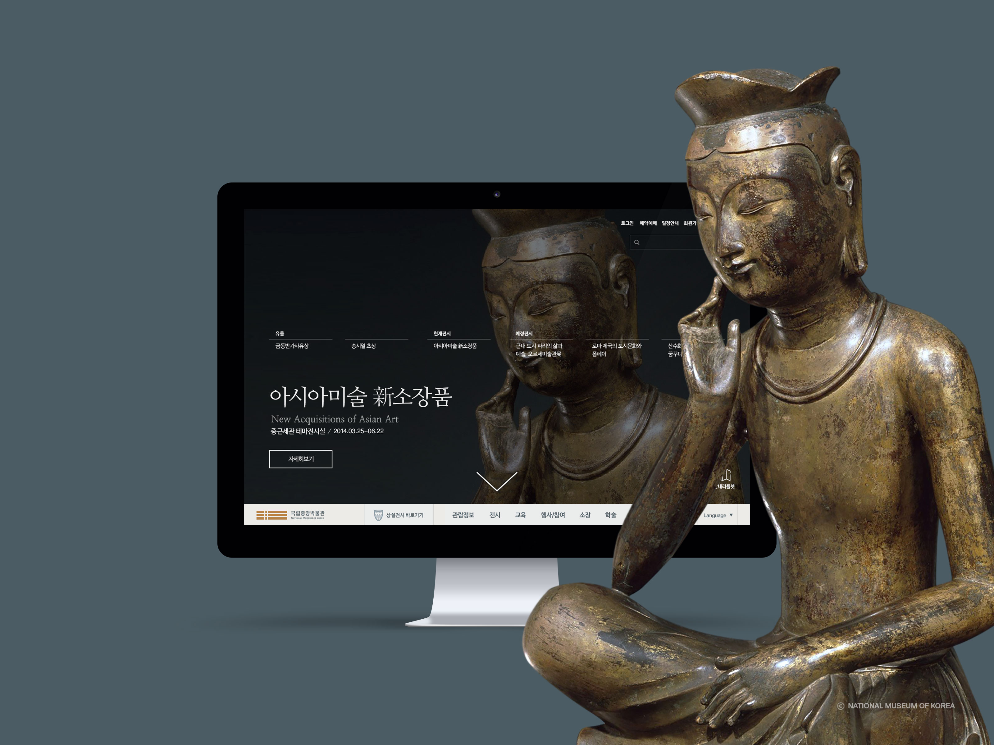
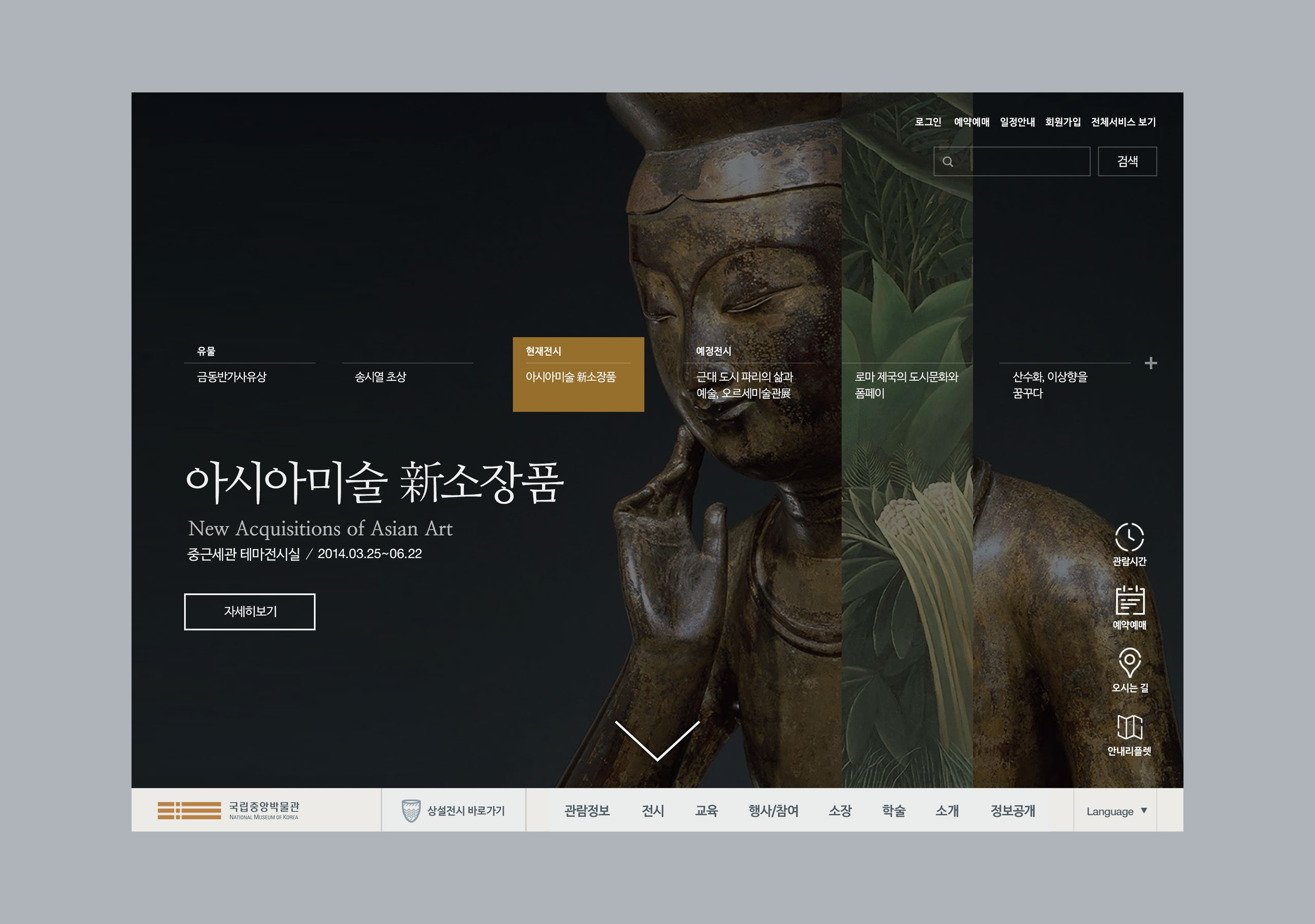
The method of stylish display of high-quality relics and exhibition contents by the National Museum of Korea was studied to apply big background image and newest UI/UX complied with the latest trend in website remodeling.
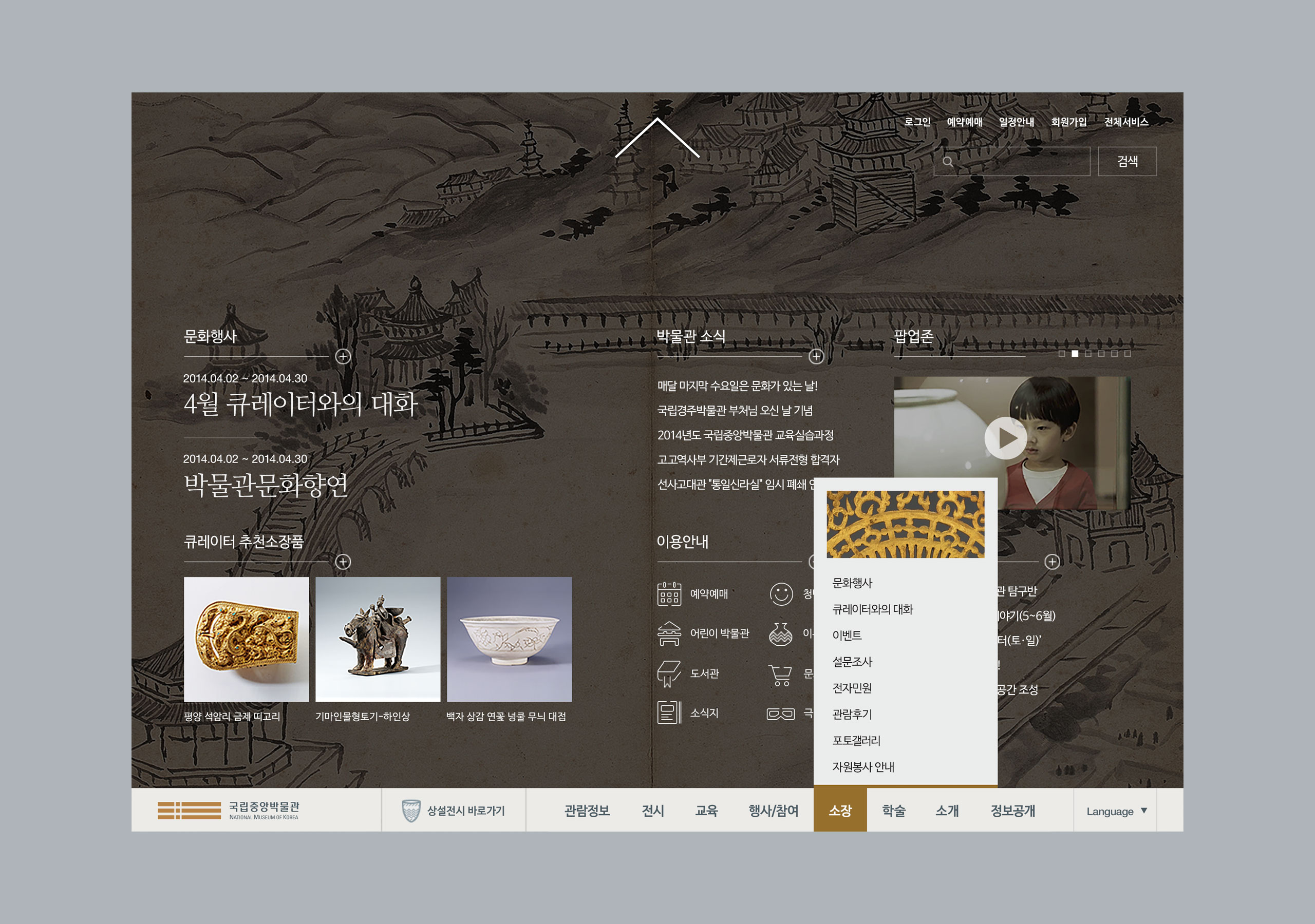
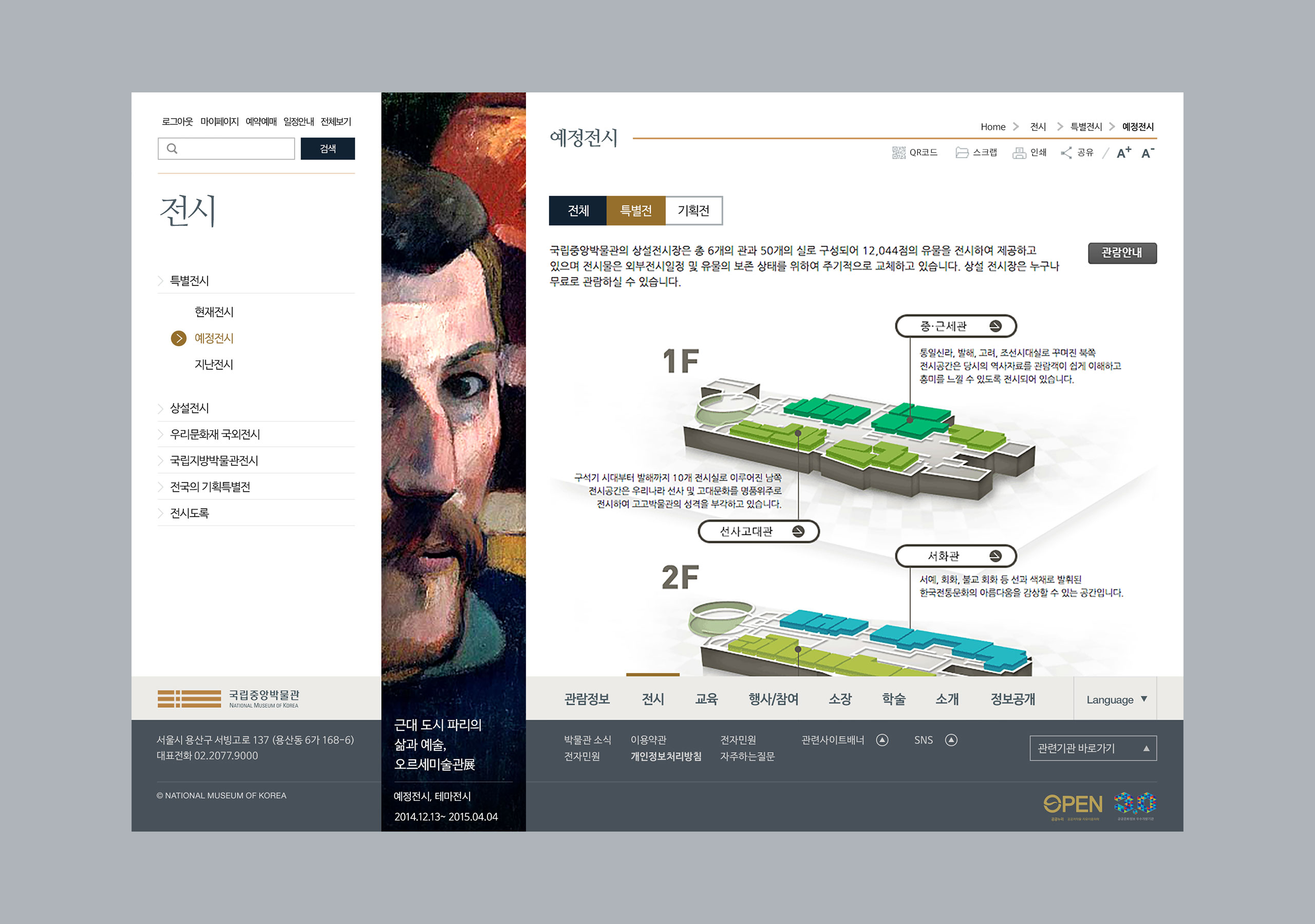
Because the connected satellite site may not be developed as well, conventional sub-contents were left as they were, and the method of remodeling external feature of main page and sub-page was applied to complete reorganization that provides a sense of overall website renewal.
By impactly displaying current exhibition, prospect exhibition, and relics in the National Museum of Korea through large images of high-resolution in the main page, or in the initial page of access, the form of increasing comprehension of exhibition schedule and relics was implemented.
국립중앙박물관 웹사이트 리모델링국립중앙박물관이 소장한 유물과 전시물들의 퀄리티 높은 컨텐츠들을 온라인상에서 세련되게 보여질 수 있는 방법을 연구하여 요즘의 트렌드에 부합하는 Big Backgound Image와 신선한 UI/UX들을 적용하여 웹사이트를 리모델링 하였습니다. 연동되어있는 위성사이트까지 모두 개발할 수는 없었던 배경으로, sub content들은 그대로 두고, 메인 페이지와 서브 페이지의 외관을 바꾸는 리모델링 기법을 적용, 전체 웹사이트가 리뉴얼 된듯한 개편을 완료 하였습니다. 현재 진행중인 전시와, 예정중에 있는 전시, 국립중앙박물관에서 소장중인 유물들을 고해상도의 큰 이미지로 사이트 최초접근시 보여지는 메인페이지에서 임팩트있게 보여짐으로서, 전시일정과 유물에 대한 이해도를 높이는 형식으로 구현되었습니다.
Metaphor Grid of BI.
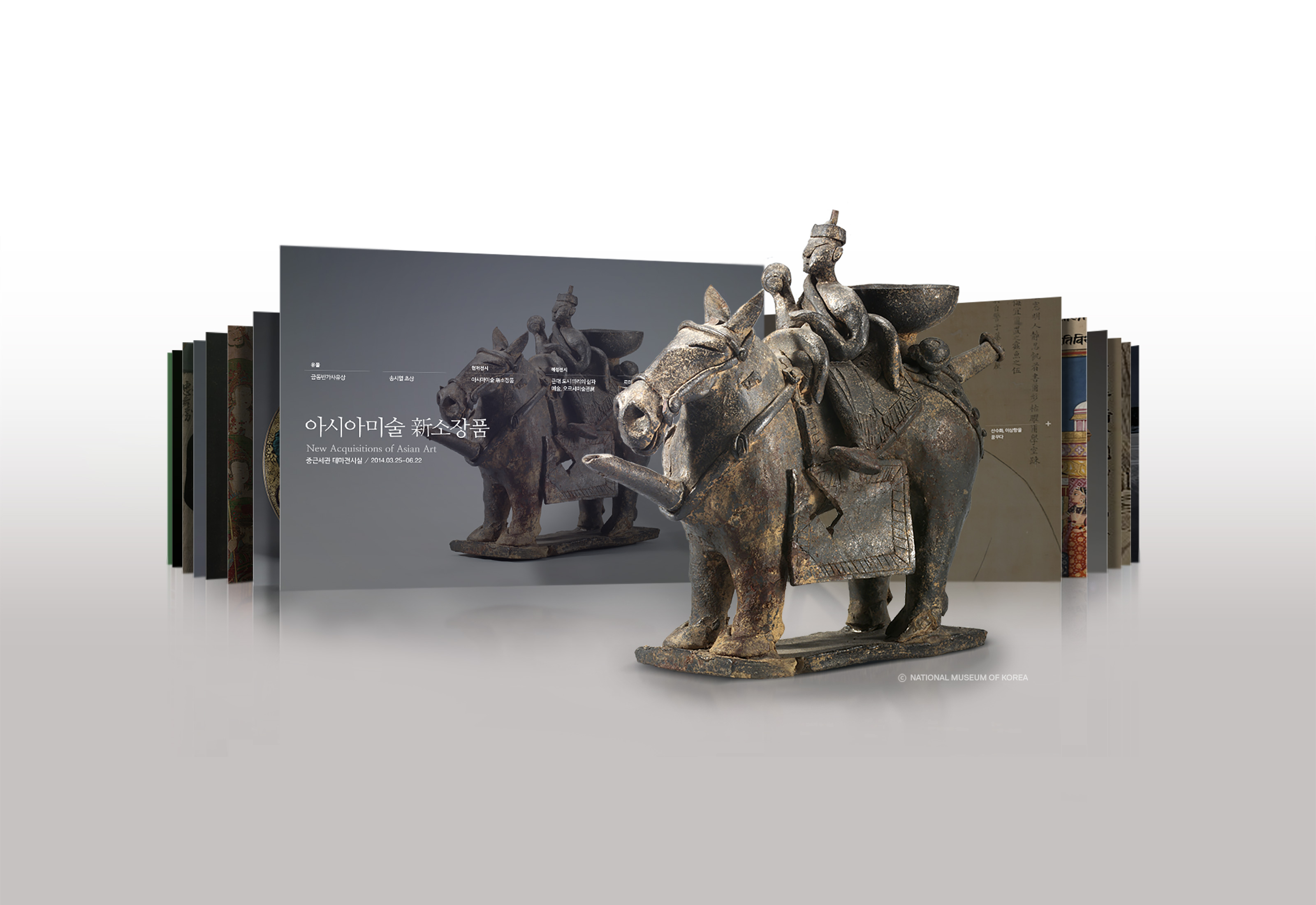
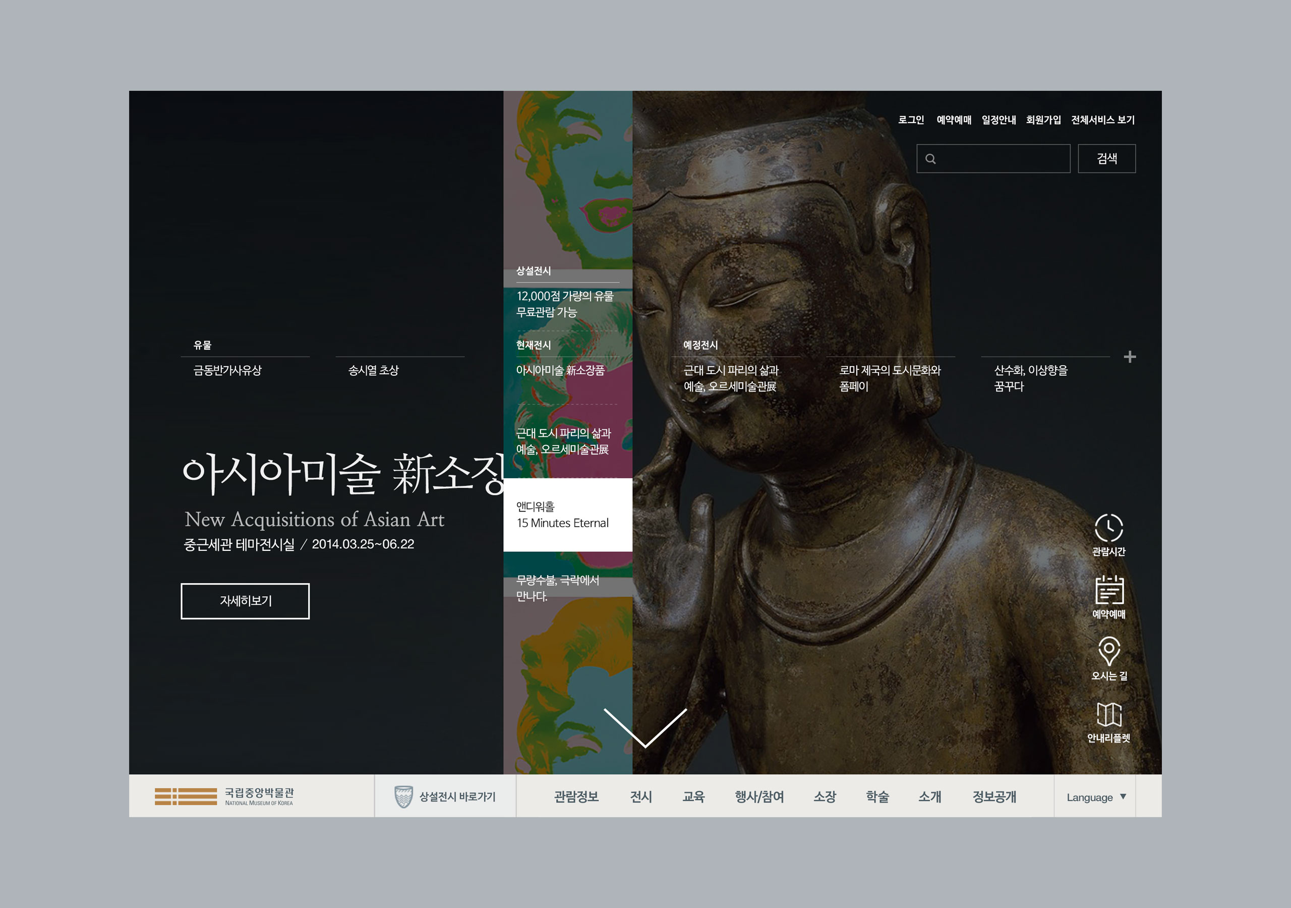
The UI used on the main page is a symbolic metaphor using BI of the National Museum of Korea, and it contains meanings of time of past-present-future. The grid of cell style form derived from BI of the National Museum of Korea is shown with impact on the main page to implement increased comprehension of exhibition schedule and relics.
BI의 메타포 그리드를 기반으로 설계 되었습니다. 메인에서 사용된 UI는 국립중앙박물관의 BI를 이용한 상징적 메타포로서, 과거-현재-미래의 시간적인 의미를 담고 있습니다. 국립중앙박물관의 BI에서 차용한 '셀 레이어' 형태의 그리드는 메인 페이지에서 임팩트 있게 보임으로써, 전시 일정과 유물에 대한 이해도를 높이는 형식으로 구현되었습니다.
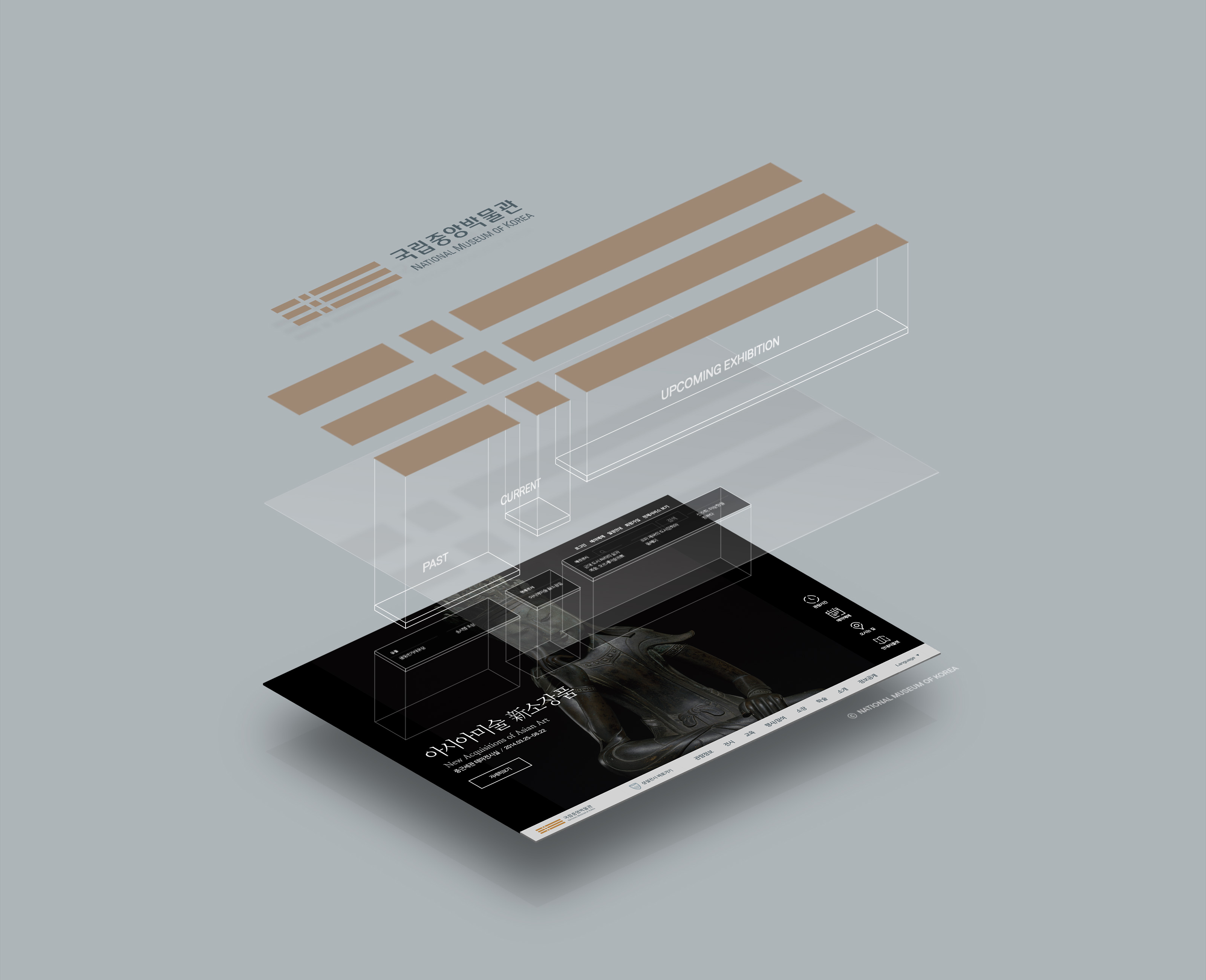
Cell Layer System.
We adopt the shown the part of image in 'cell layer type' among big backgound image to deliver as visual information of many relics under possess of the National Museum of Korea and exhibition schedules.
국립중앙박물관에서 소장 중이며 전시 중인 유물과 전시 일정 안내 등을 시각적인 정보로서 전달하기 위하여 고해상도 배경이미지의 일부분을 '셀 레이어' 형식으로 보여주는 기법을 채택하였습니다.
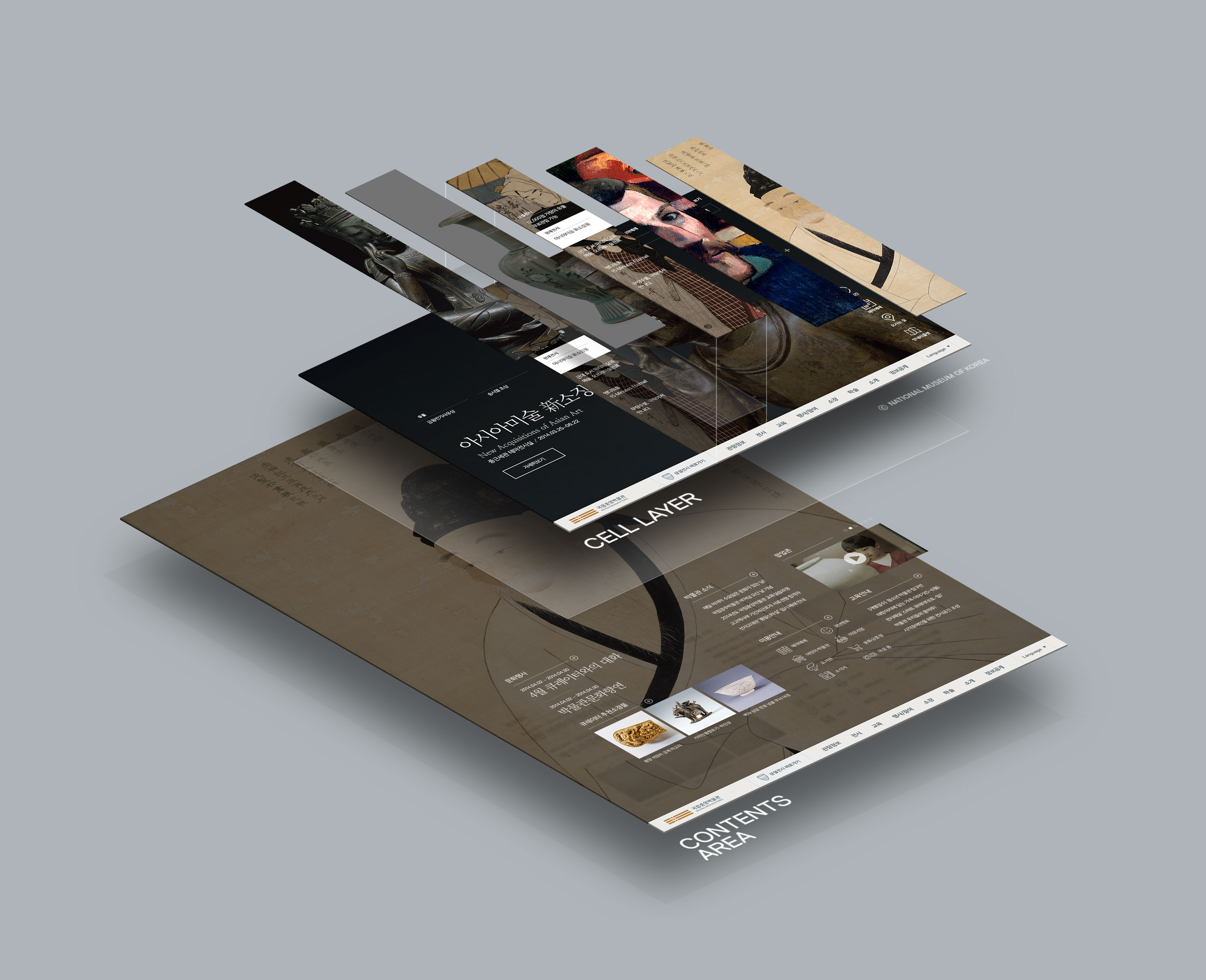
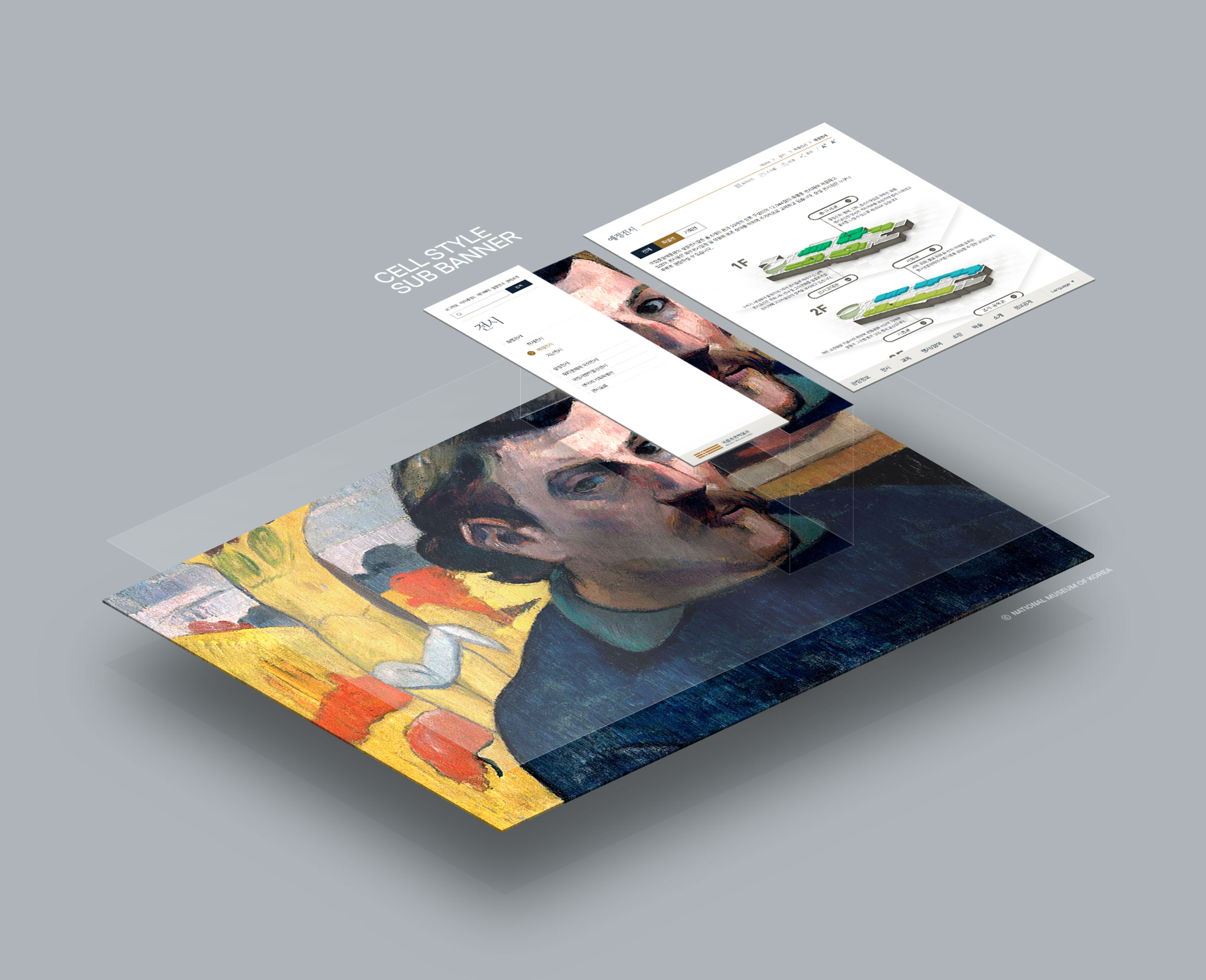
UI metaphor in united and consistents.
As a UX to display each collection and exhibition, the method of partially showing exhibition was selected, and by showing partial images on the sub-pages, the metaphor connected from the main page to sub-page provides correlation and unity applied on overall website.
연관성과 통일성 있는 UI 메타포를 가지고 있습니다. 각각의 소장품/전시 등을 보여주기 위한 UI로 전시 이미지의 일부분을 보여주는 방법을 채택하였는데, 서브 페이지에서도 이미지의 일부를 보여줌으로써, 메인에서 연결된 메타포는 서브 페이지까지 이어져 사이트 전반에 적용되어 연관성과 통일성으로 흐릅니다.
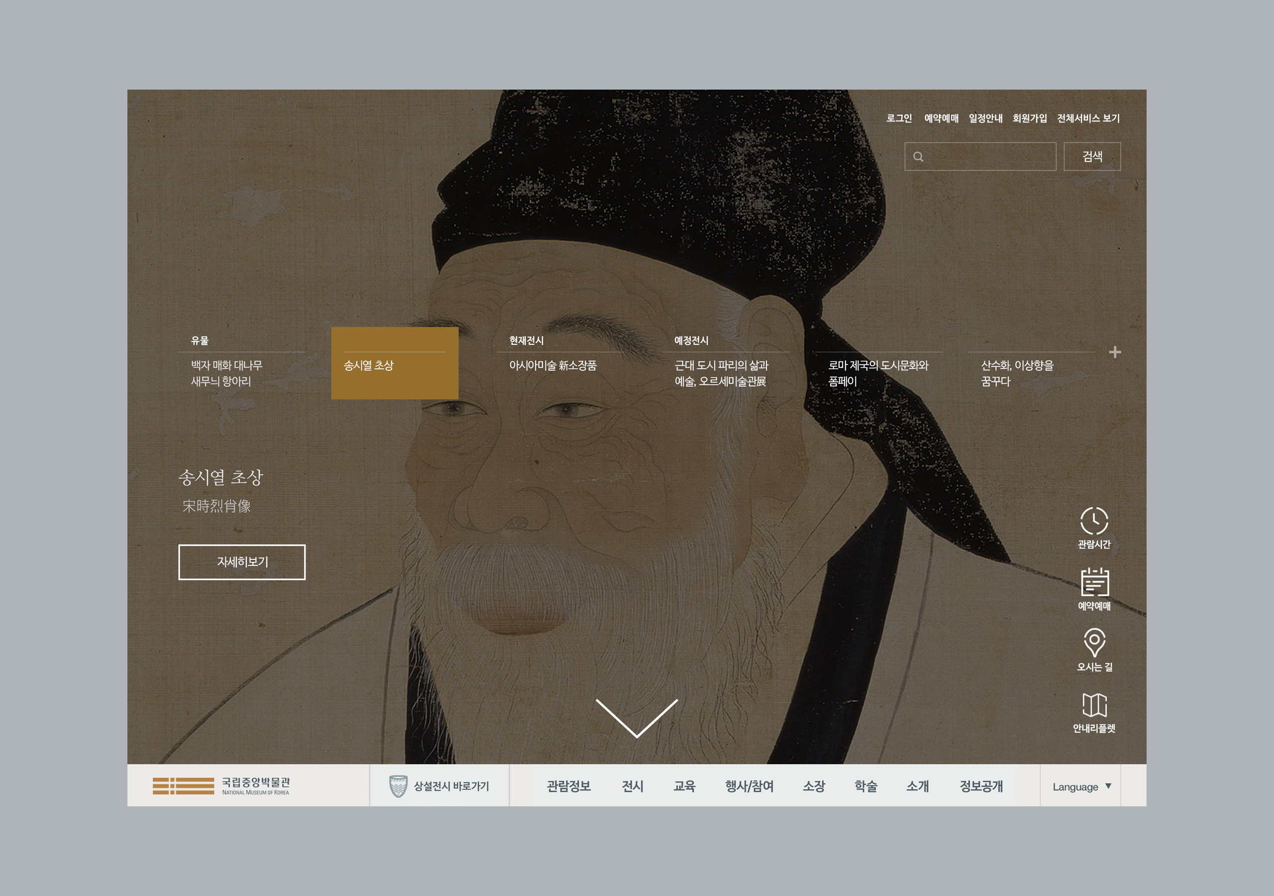
Ideal Screen for Visual Information.
The area to introduce each collection of the National Museum of Korea, overall application of background image on the main page of initial access for display of current exhibition and prospect exhibition at once, and arrangement of high-quality image of high-resolution deliver clear visual information even without text.
시각적인 정보를 위한 이상적인 화면을 구성하였습니다. 국립중앙박물관에서 소장 중인 수천 개의 소장품들을 하나씩 소개할 수 있는 영역, 현재 진행 중인 다양한 전시와 진행 예정인 전시를 한눈에 쉽게 볼 수 있는 방법을 위해 사이트에 접근하자마자 보이는 메인 페이지에서 배경이미지를 전체로 활용, 고 해상도의 퀄리티 높은 이미지를 시각적으로 보여줌으로써 텍스트를 하나씩 읽지 않아도 어떤 내용인지 알 수 있도록 명확한 시각적 정보를 전달할 수 있도록 하였습니다.
Method of Website Remodeling.
This is a website remodeling renewal case not of entire website development but of partial website that is connected with numerous satellite sites. Through re-design of the main page and sub-page and unification of relative UI and colors, the total-renewal-like effect is displayed.
연동되어있는 위성 사이트가 많이 있는 사이트로서, 전체 개발까지 구축된 웹사이트가 아닌 일부 주요 화면과 부분을 리뉴얼 케이스입니다. 메인 페이지와 서브 페이지의 리디자인, 그에 해당되는 UI와 컬러의 통일을 통해 전체 사이트가 리뉴얼 된듯한 웹사이트로 재탄생 되었습니다.