Digital
MarppleShop, a One-Stop Marketplace for Creators’ Custom Goods
- Client
- Marpple Corporation
- Category
- Digital
- Services
- Website, Platform, E-commerce, Mobile App, UX/UI
- Scope
- E-commerce Strategy, UX Strategy, UI/UX Design, Style Guide, Mobile Site Design, Website Design, Mobile App Design
- Year
- 2021
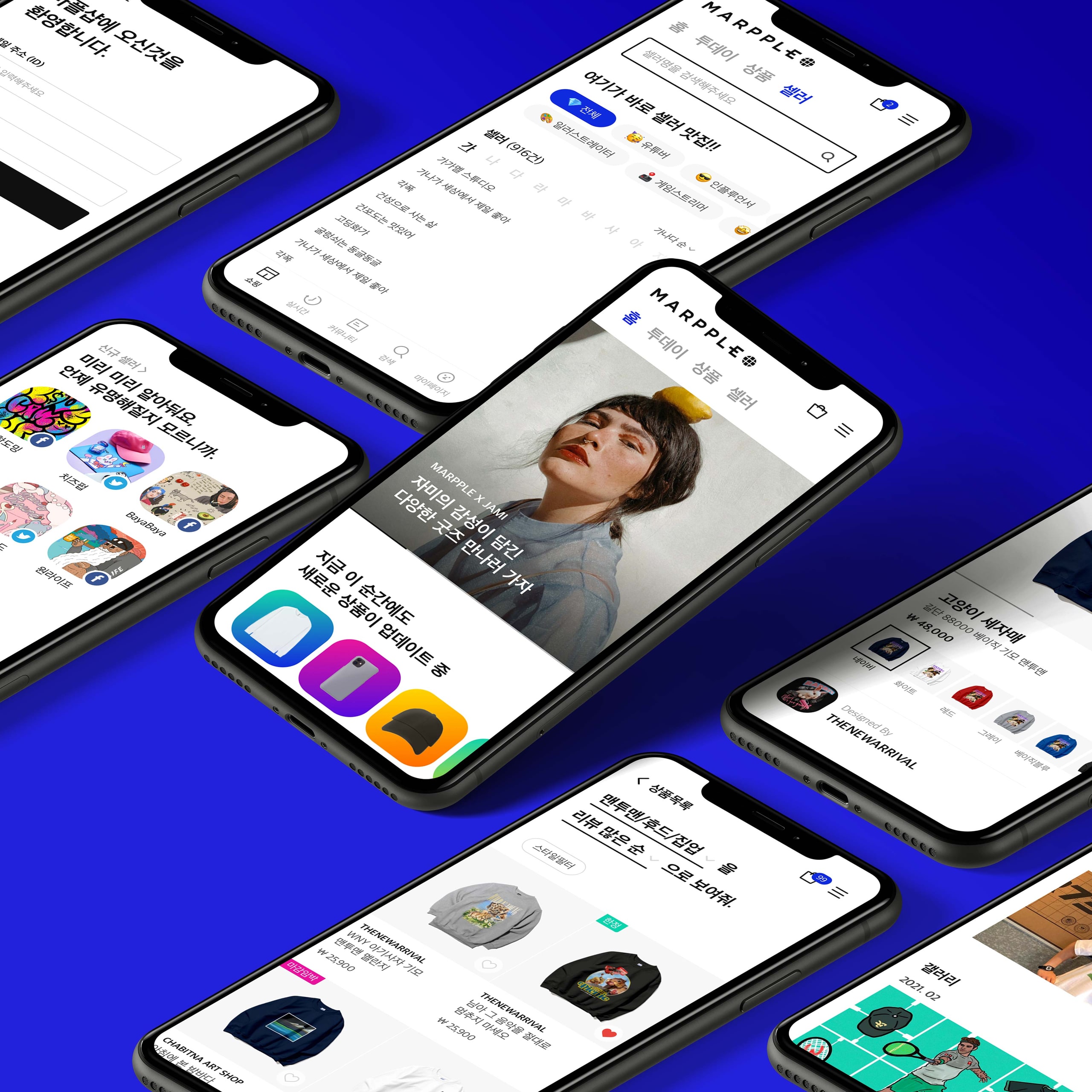
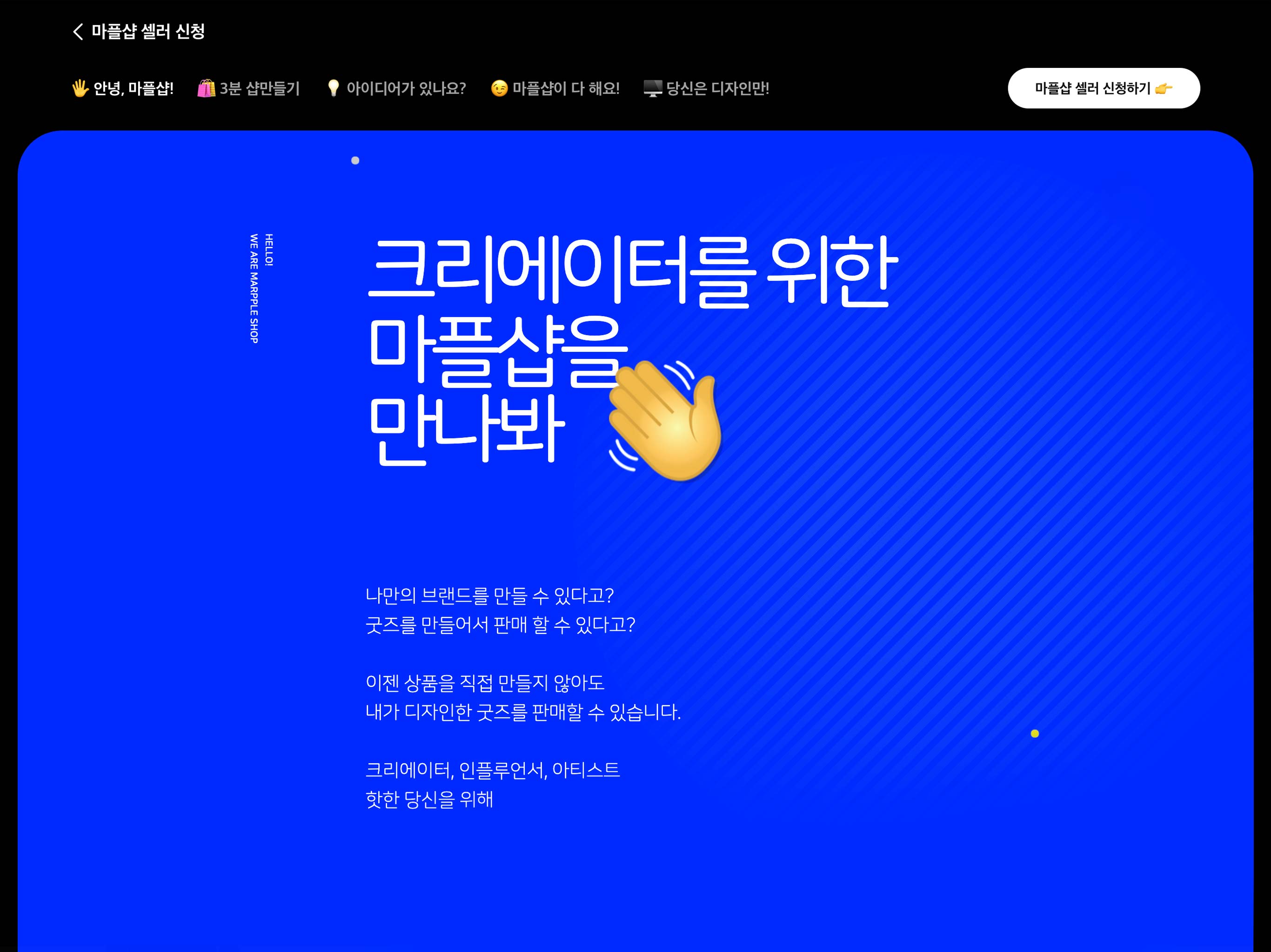
MarppleShop takes care of the entire process from production to delivery. Creators only need to bring their ideas.
The main focus of this project was the UXUI renewal of the MarppleShop online platform and was launched in time for the airing of the brand TV commercial in July.
상품 제작부터 배송까지 모두 알아서 해주는 세상 모든 크리에이터를 위한 굿즈 커머스 마플샵. 아이디어만 있다면 누구나 심사를 거쳐 셀러로 등록이 가능하고 마플샵 내에 본인의 셀러샵을 오픈할 수 있기에 세상의 모든 크리에이터를 위한 굿즈 커머스를 슬로건으로 하고 있습니다. 이번 마플샵 프로젝트는 UXUI 개편이 주요 과제였으며, 개편의 목적으로는 7월부터 TV런칭하는 CF에 걸맞는 퀄리티 있는 디자인을 진행하는 것이었습니다.
We are Marpple shop
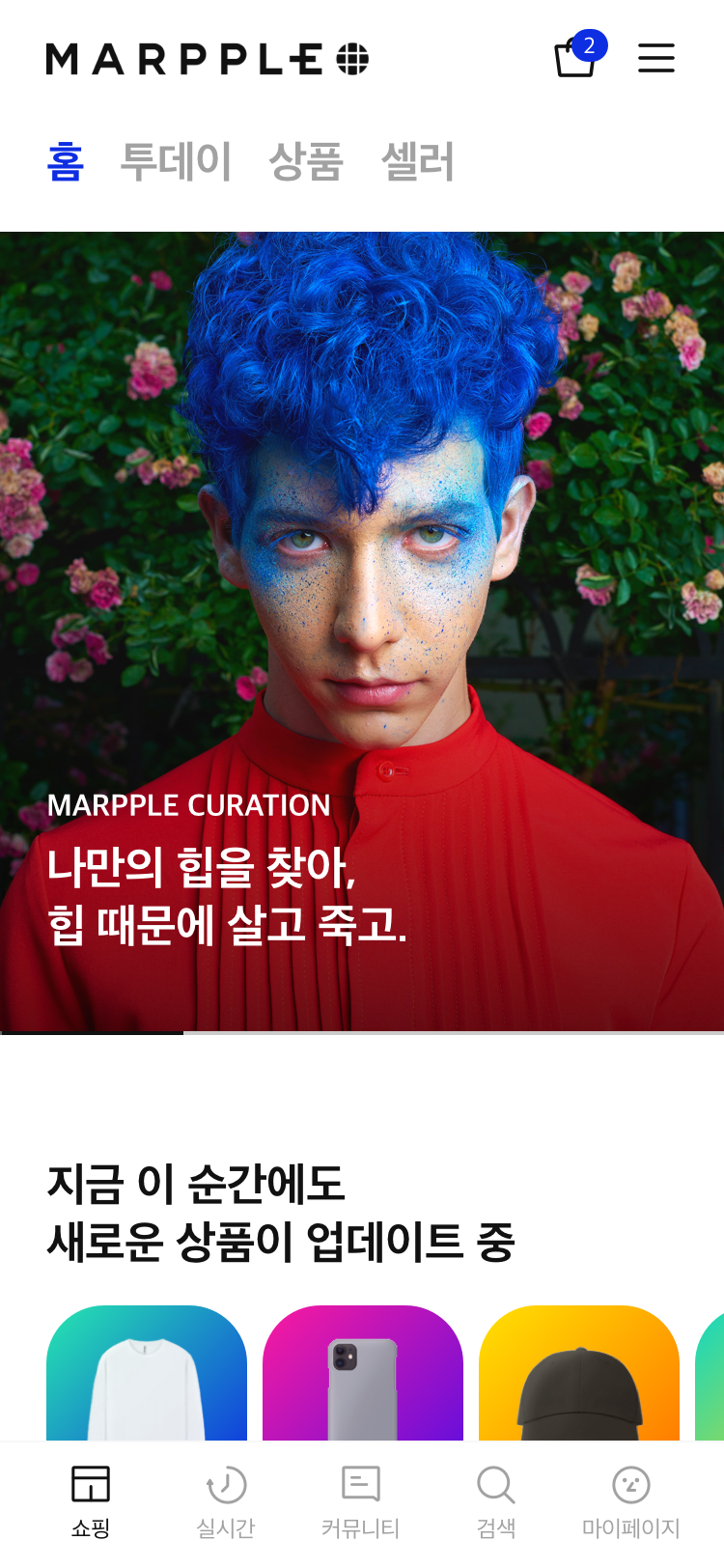
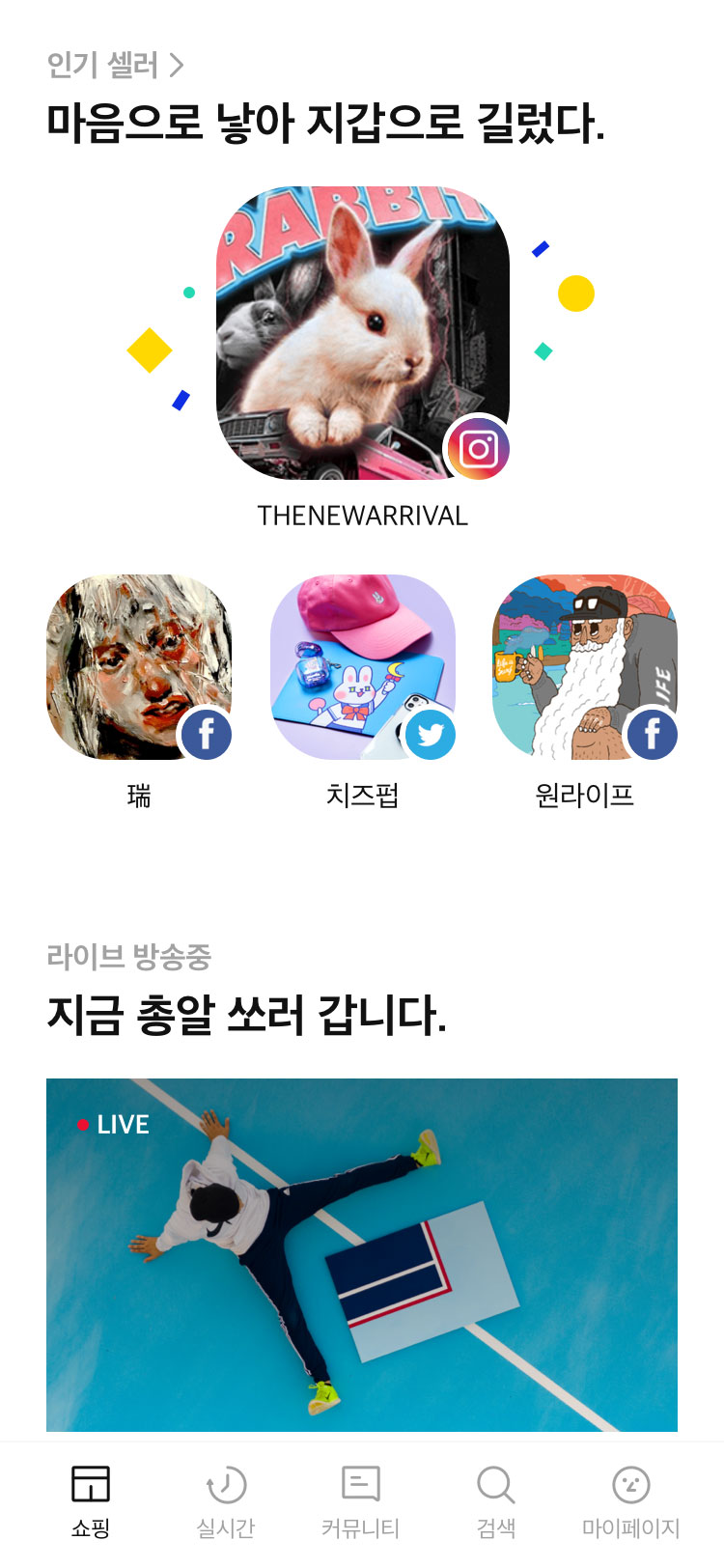
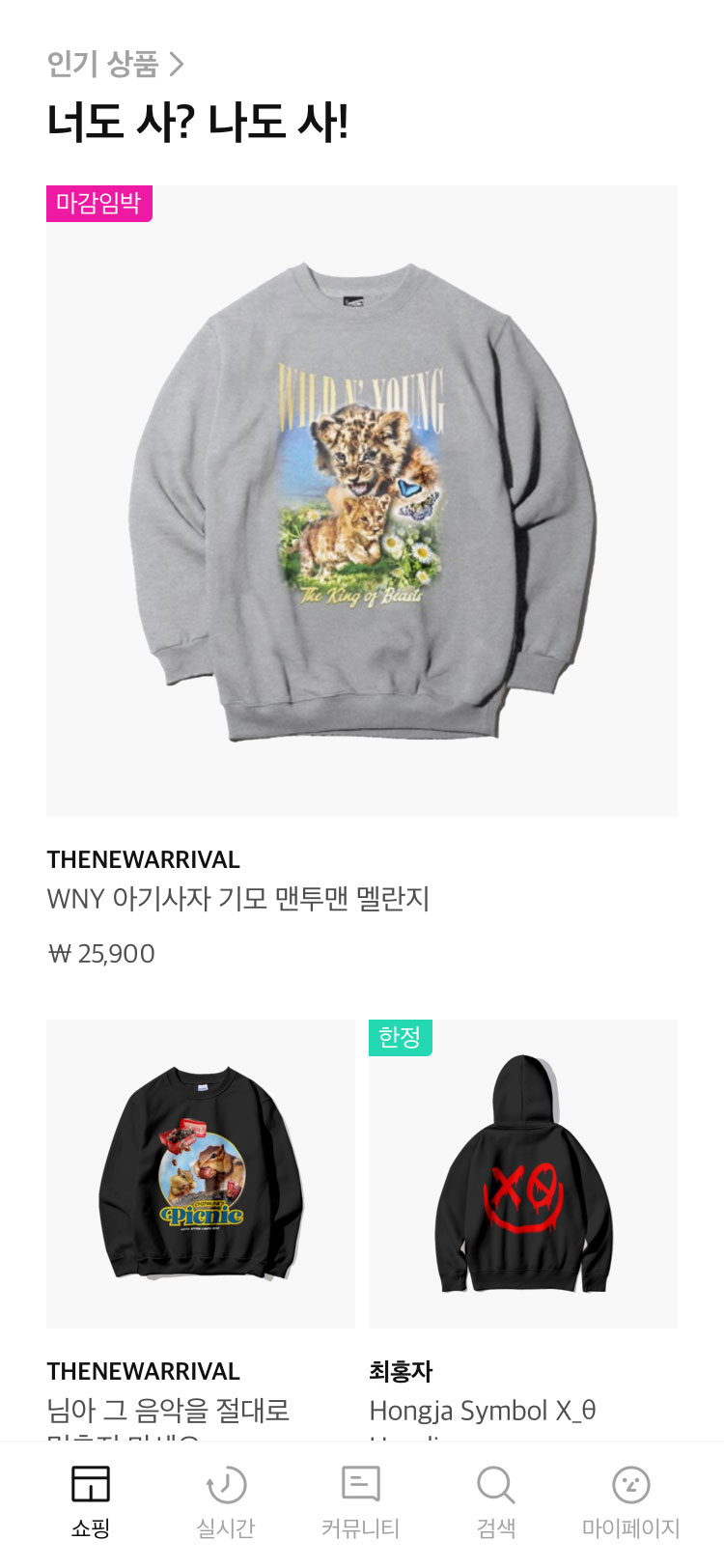
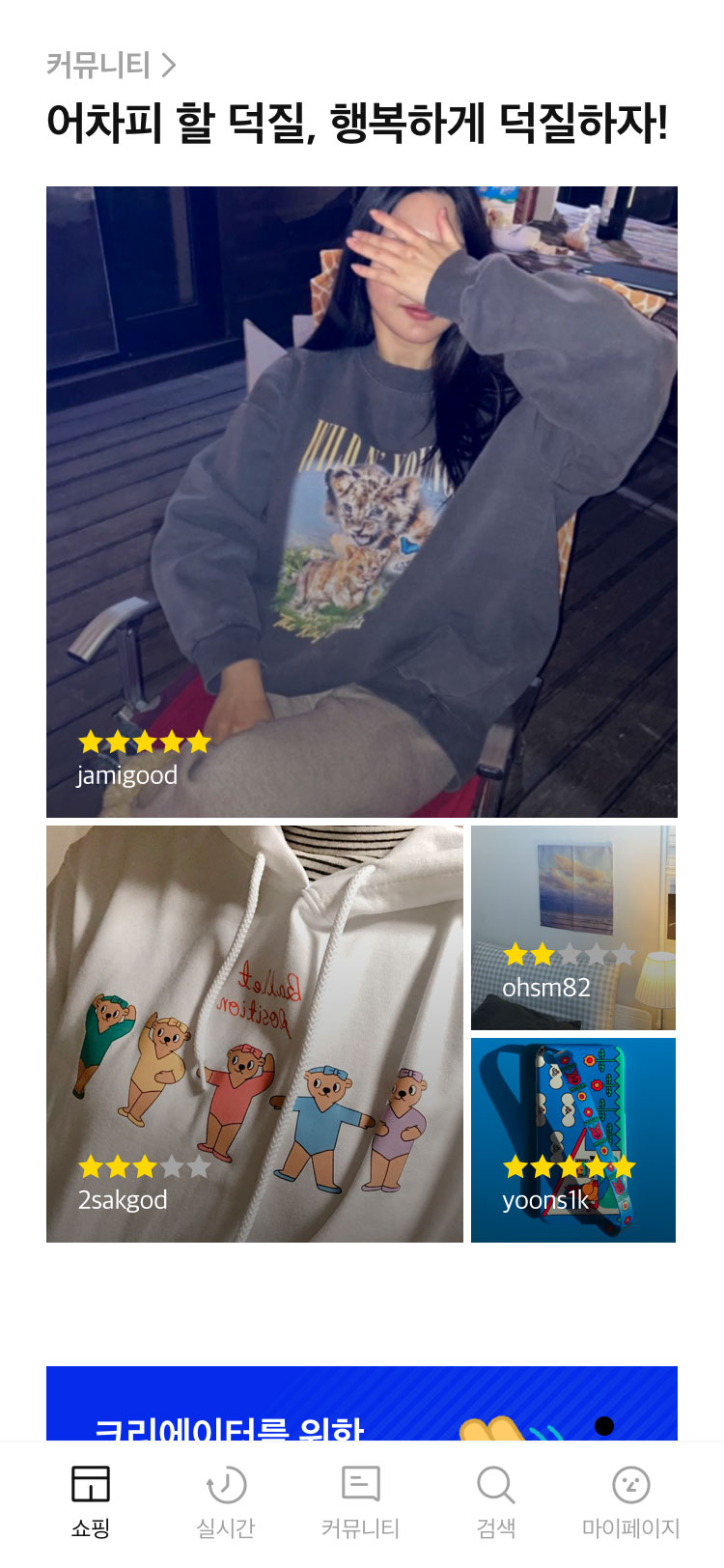
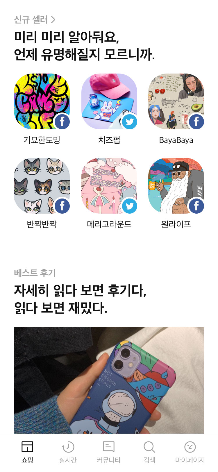
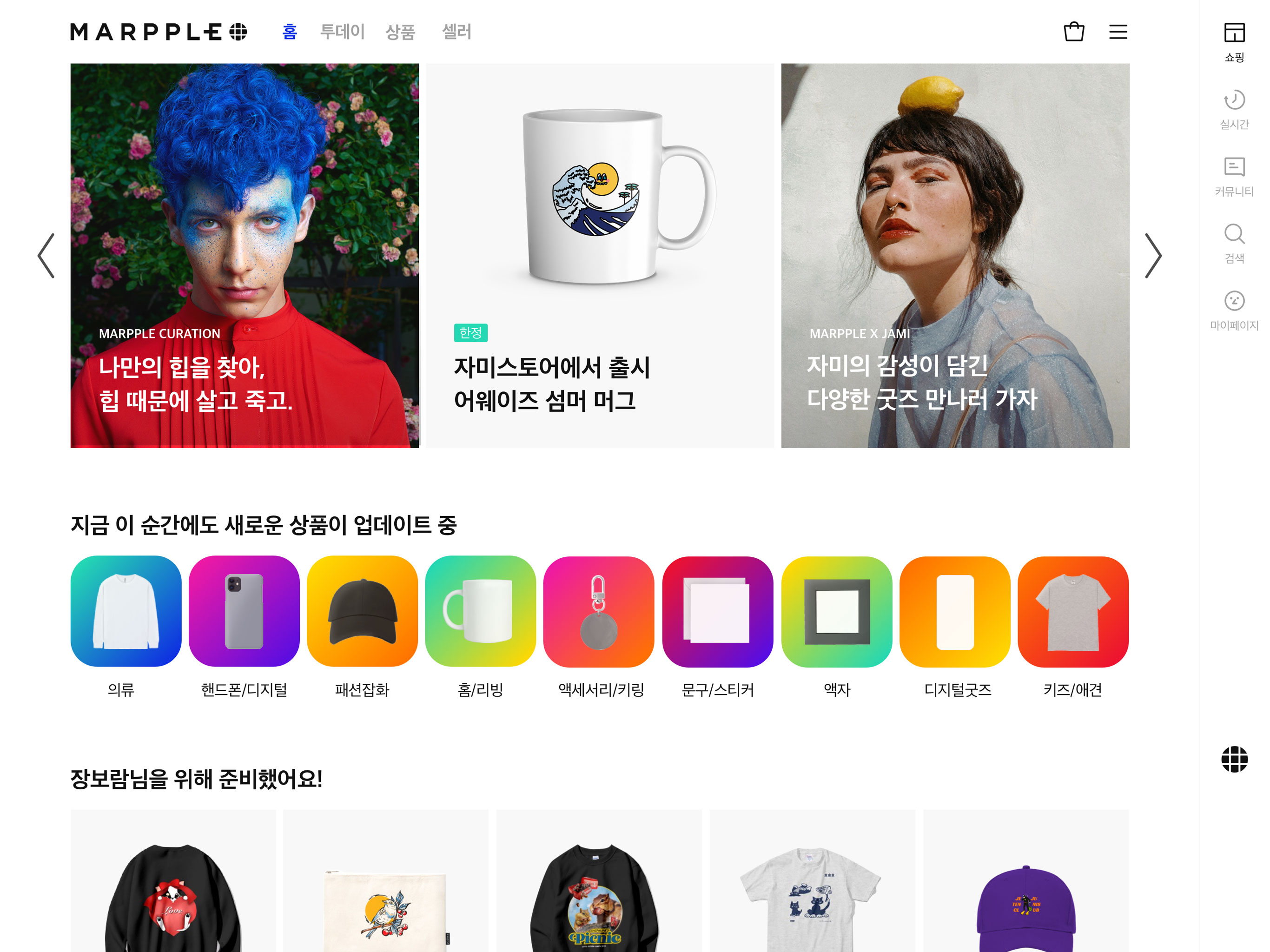
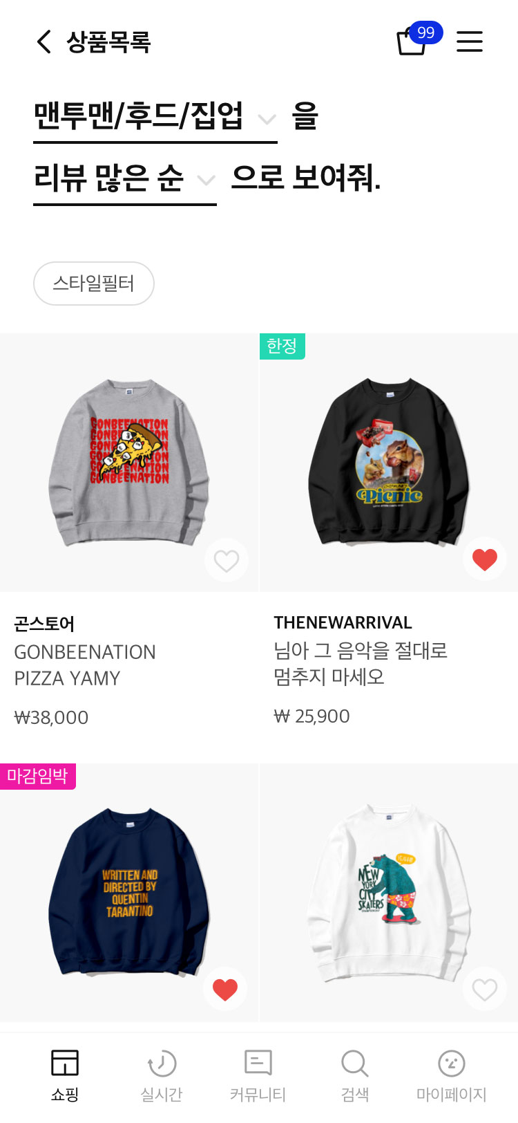
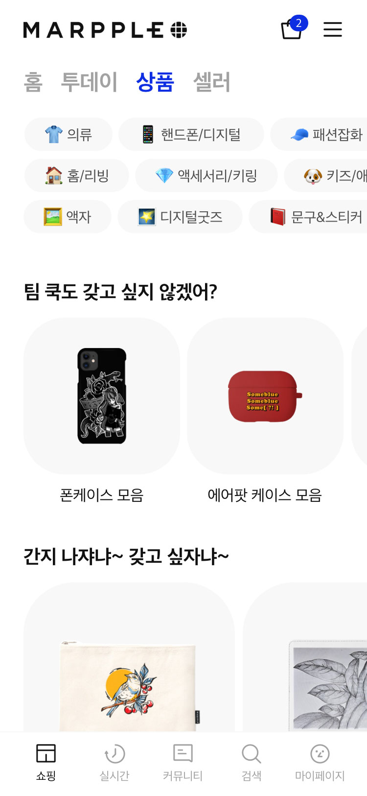
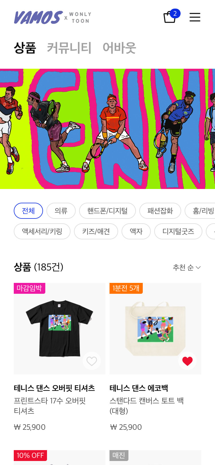
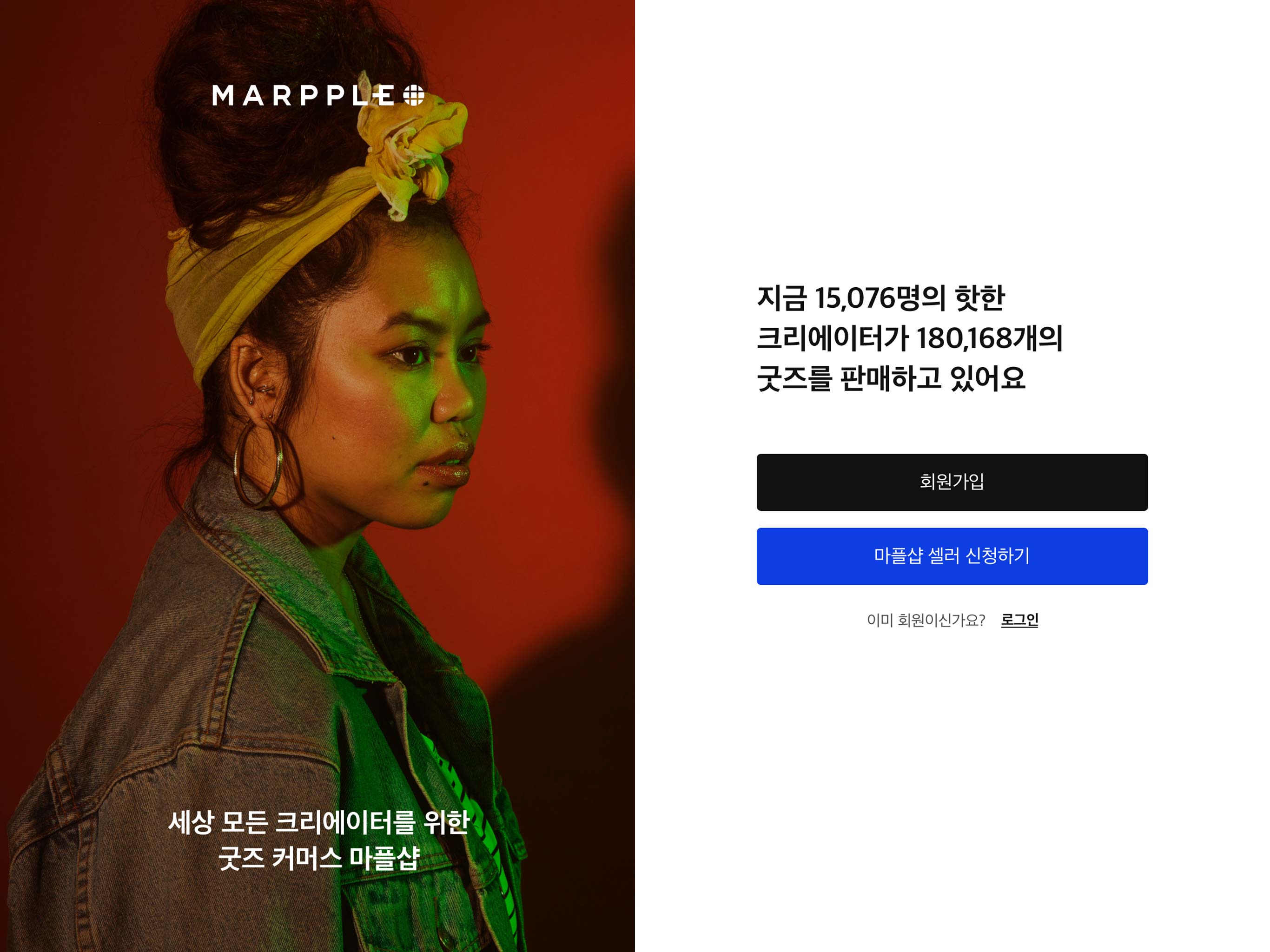
First impressions that make an impression. Our key goal was to build and design the main page so users landing on the website by downloading the app or through online search after seeing the TV ad would be immediately engaged and start browsing. We removed all unnecessary details and designed a layout that kept the focus on the products and adopted a casual, friendly tone in the copy to create a warm connection with users.
사용자를 한 눈에 사로잡는 첫 인상. 먼저, TV CF를 보고 App을 다운로드 하거나, 검색을 통해 마플샵에 진입 했을 때 사용자가 몰입도 있게 자신이 원하는 콘텐츠를 잘 찾아 볼 수 있는 메인 화면을 구성하는 것이 첫번째 목표였습니다. 불필요한 디자인 요소는 최대한 배제하고, 상품에 집중할 수 있는 직관적인 배치, 사용자에게 친근하게 다가가는 구어체 형태의 카피가 가장 큰 특징이라 할 수 있습니다.
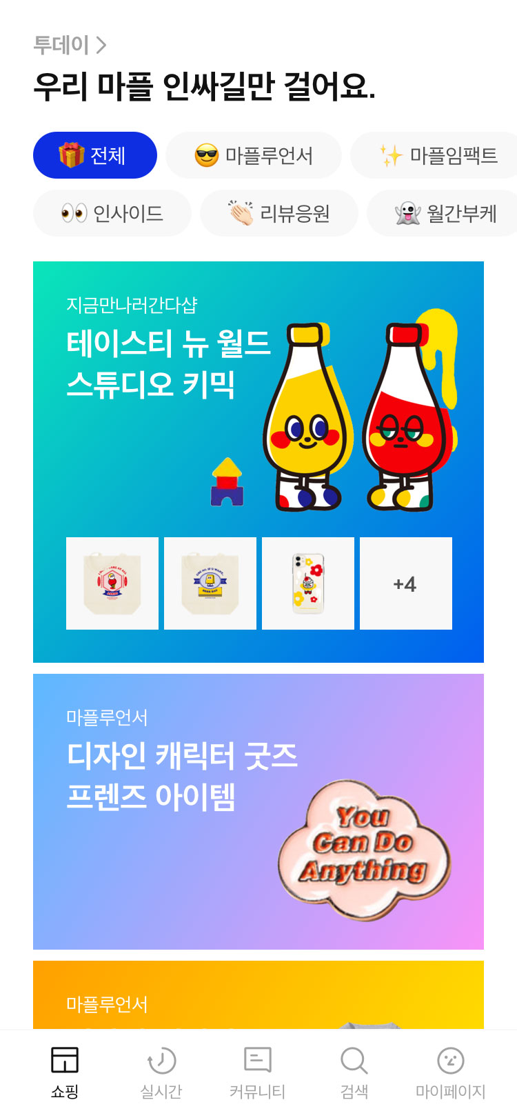
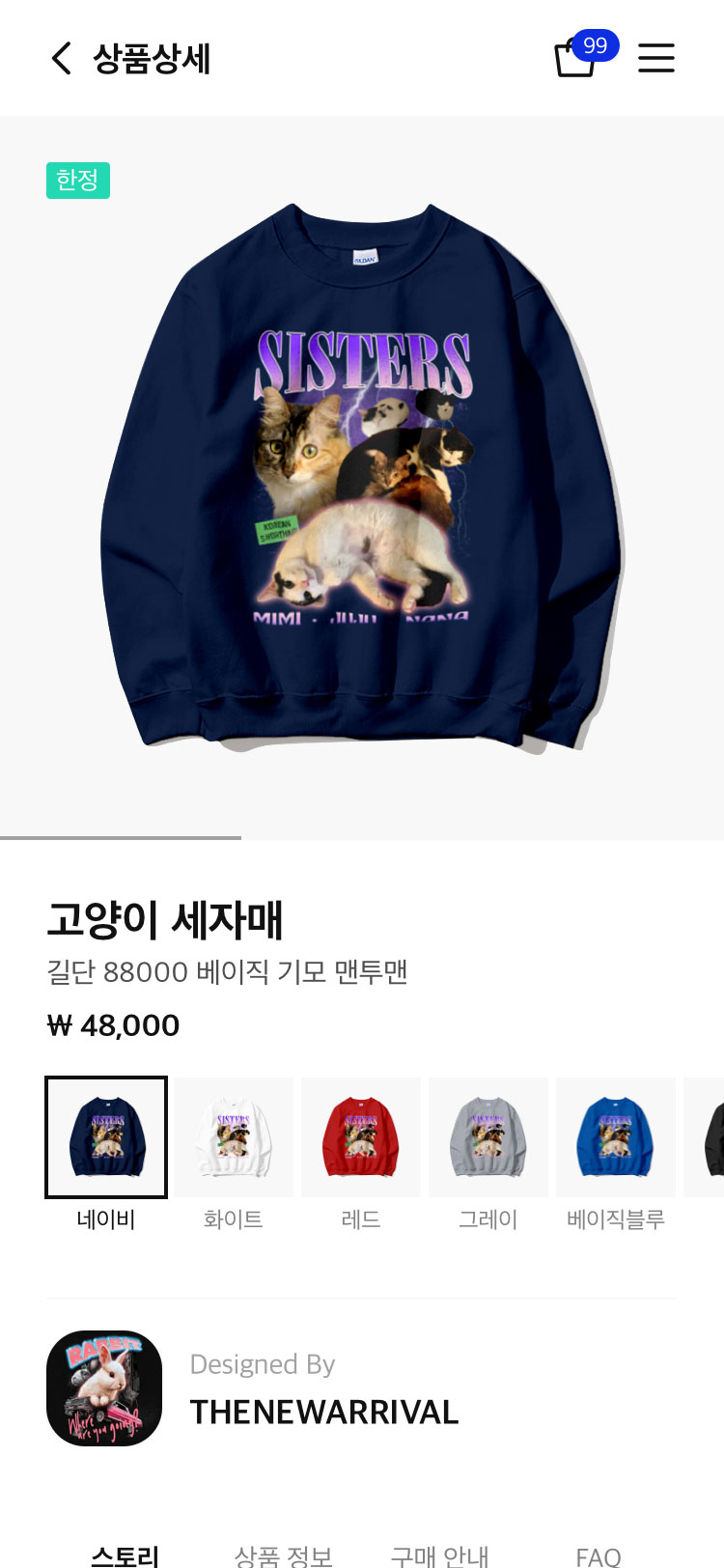
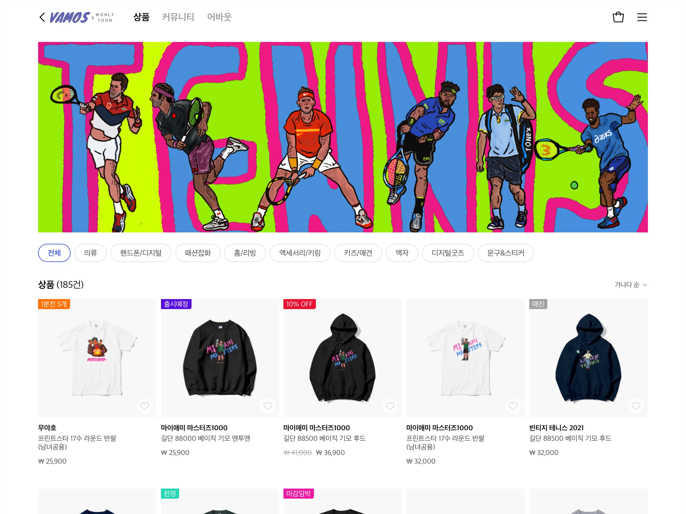
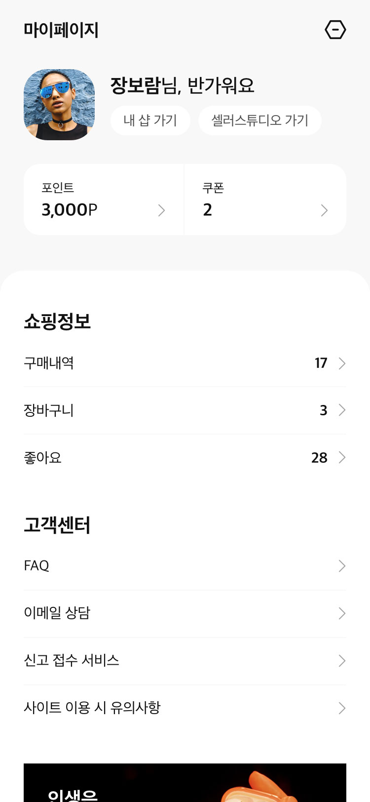
Going beyond responsive web design. UX that enables the exact same experience for PC and mobile. The initial plan was to implement responsive design but we wanted to take things one step further and enable the exact same experience for both PC and mobile. And that resulted in the experimental UI that’s currently live. We did away with the Global Navigation Bar(GNB) that’s typically found on PC websites and instead adopted the same navigation bar used for mobile, and in place of the GNB, we used the space for titles and the back button — as you would normally see in mobile UX.
반응형 웹 그 이상, PC와 모바일 완벽히 동일한 컨텐츠의 흐름의 UX를 제공합니다. 기본적으로 반응형 웹사이트를 제작하는 것이 방향성이었으나, 모바일의 UX를 PC에도 최대한 동일하게 적용하고자 모험적이고, 실험적인 UI를 구성하였습니다. 모바일의 네비게이션 바를 PC에도 동일하게 적용하여 우측 네비게이션 바를 제공하며 기본적으로 PC 전체페이지에 유지되는 GNB를 과감히 생략하고, 모바일과 동일하게 백버튼과 타이틀 영역으로 대체함으로써, 기존에 없던 새로운 PC UI를 제공합니다.
Got some crazy ideas?
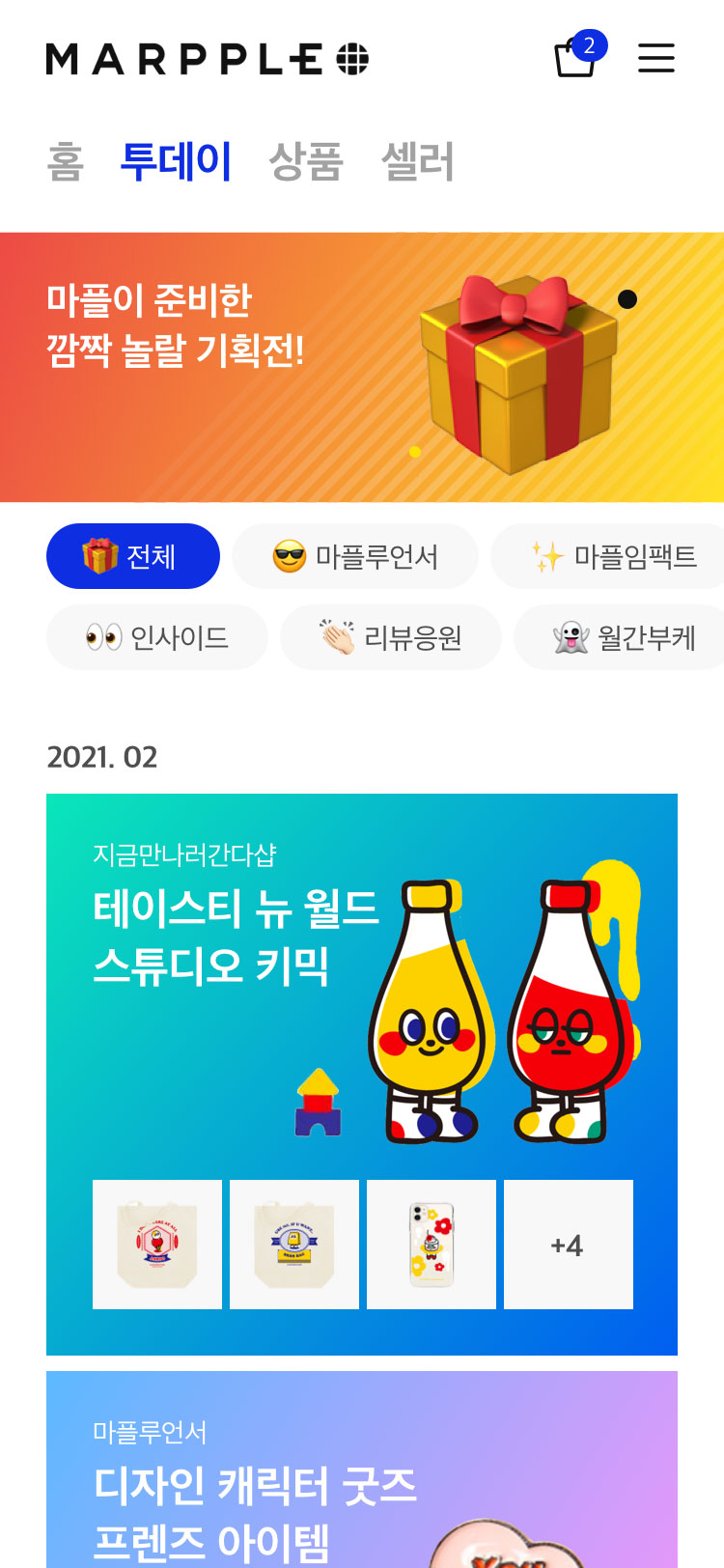
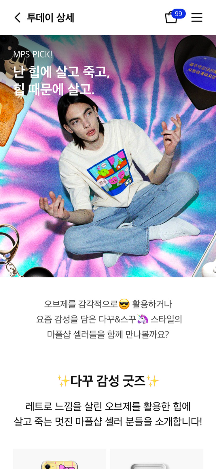
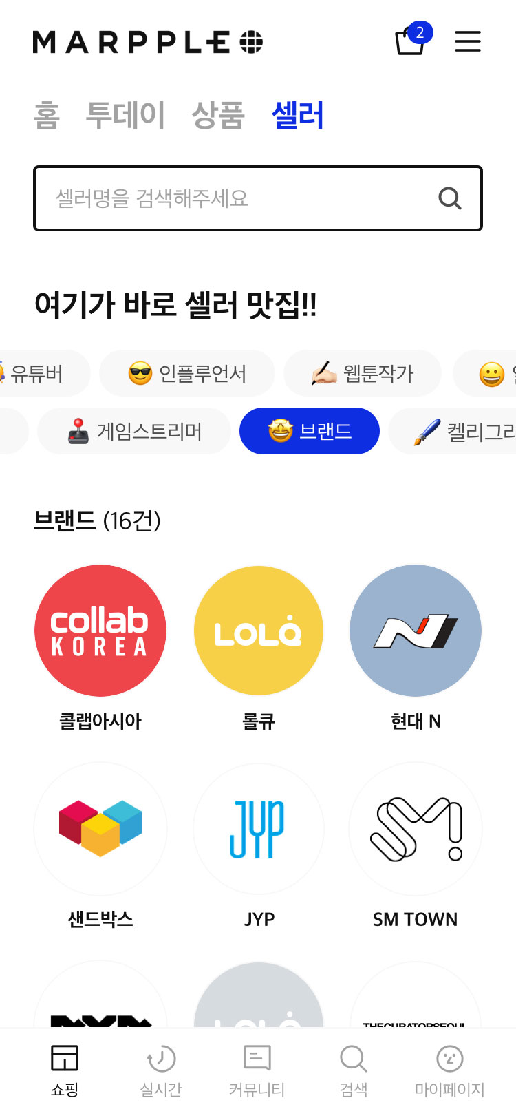
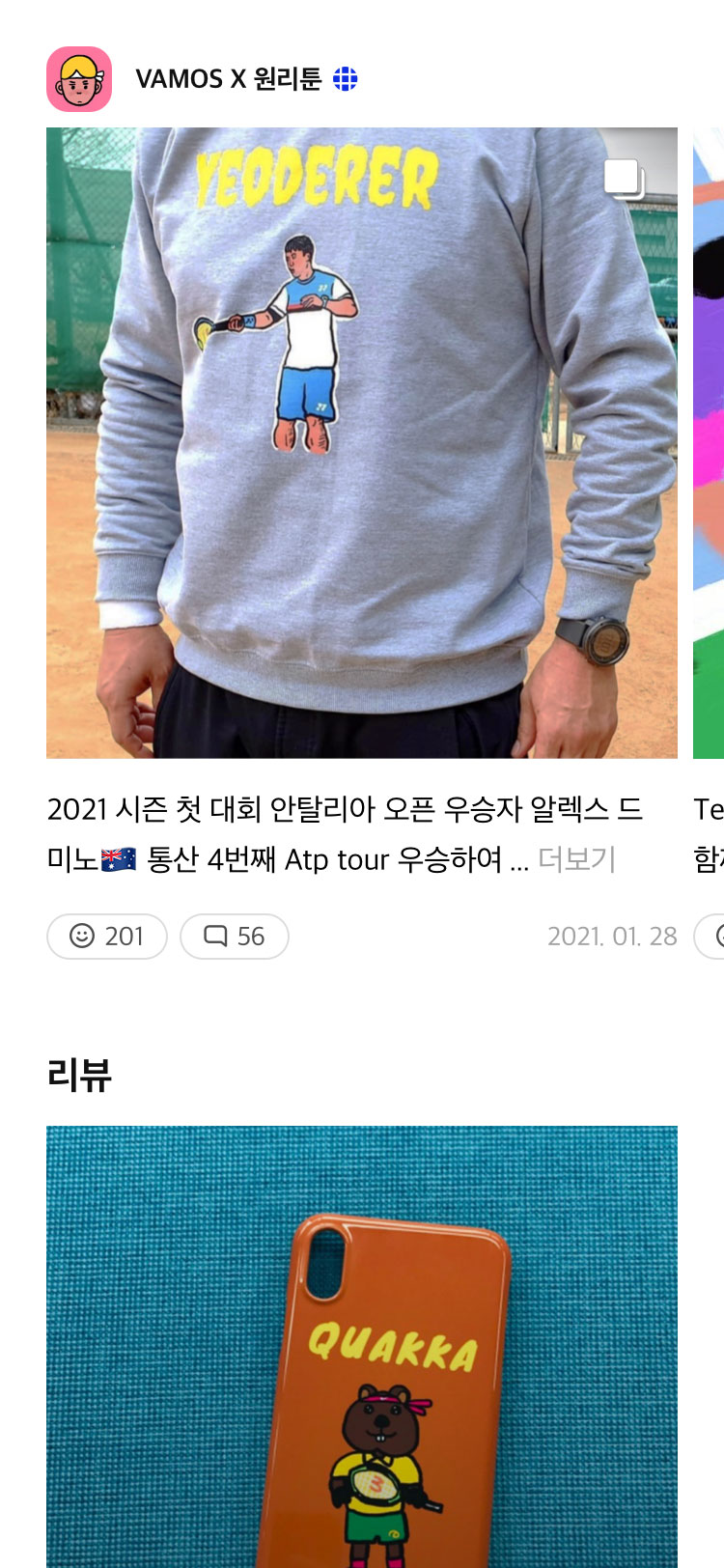
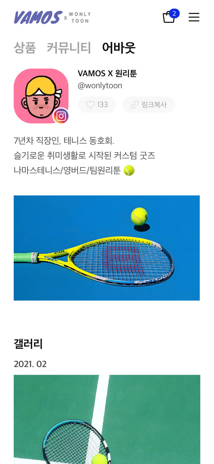
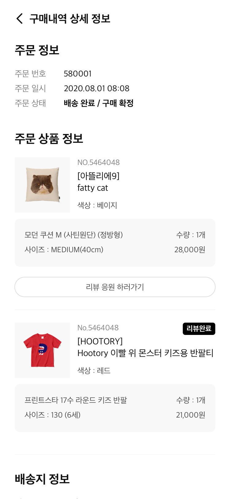
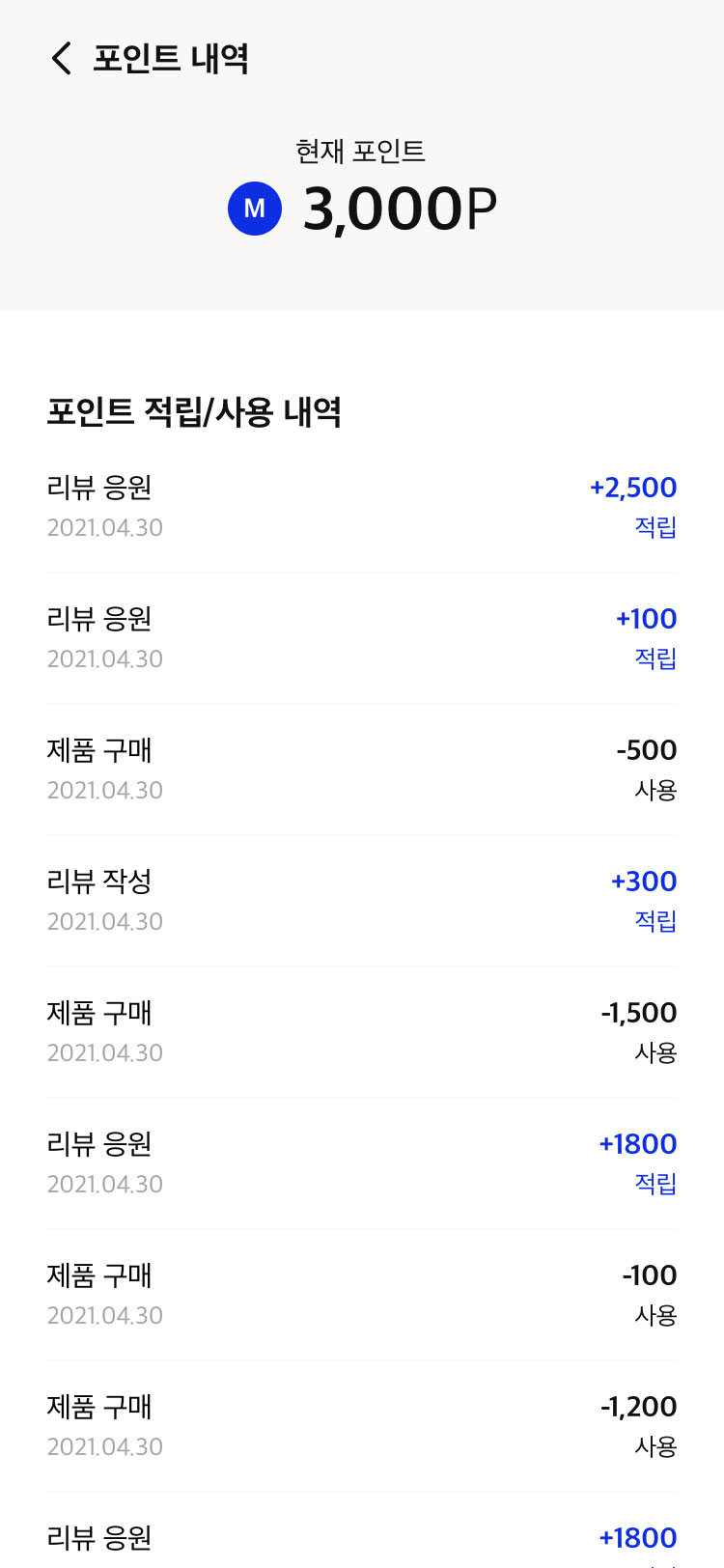
Making the search and shopping cart functions stronger, and providing an aligned UI. For the nearly 20,000 sellers and some 190,000 items, we optimized the search process and feature to provide easier and better access to the products. And before, if you found something you liked, items from different sellers were added to separate carts. We improved the process to have all items added to one cart to make it easier for customers to make purchases. And with the Feed being one of the highlights of the page, we created a detailed guide so ensure the feed’s visual tone would stay intact.
검색 및 장바구니 기능 강화, 통일된 UI를 제공합니다. 대략 2만여명에 가까운 셀러와 19만개에 이르는 많은 상품을 사용자가 쉽게 검색 및 정렬하여 탐색할 수 있도록 기능을 개선 하였고, 1셀러 1장바구니로 운영 되던 부분을 각각 다른 셀러의 상품을 담아도 하나의 장바구니에 담아 한번에 결제할 수 있도록 통합 장바구니로 기능을 개선하였습니다. 뿐만 아니라, 마플샵의 가장 주요한 콘텐츠인 FEED 콘텐츠(기획전)의 상세화면 가이드를 제작하여 통일된 UI로 제공할 수 있도록 하였습니다.
Ready, set, open!
Credits
Production AgencyDFY
Project ManagementSon JeongeunPlanningLee YujinJeon DahyeAD+DesignJang BoramUI DesignKim JiyunKim HyeonmoOh SaemeeCho Yoonshik