Brand & Digital
Translating Innovation into Digital Experience
- Client
- LG Electronics
- Category
- Brand, Digital
- Services
- Content Design, Film & Motion, Website, UX/UI, Search & Performance
- Scope
- Content Strategy, Website Design, Mobile Site Design, UI/UX Design, Art Direction, 2D Video, 3D Motion Design, English Copywriting, Photography, SEM/SEO
- Year
- 2025
- Links
- Visit Website
With its groundbreaking performance and refined design, LG TV continues to capture the attention of global audiences. Each new product launch is not only a major industry event, but also a benchmark for the latest in technology and design trends.
This project focused on developing PDPs (Product Detail Pages) for LG’s latest TV lineup—translating the brand’s leadership, technological superiority, and differentiated customer experience into a compelling digital narrative.
Our goal was to deliver impactful, intuitive content that allows users to easily grasp each product’s strengths and experience the brand’s value on a deeper level. From structuring content around key USPs to planning user flow, copywriting, visual design, motion graphics, and asset production, we oversaw the full spectrum of digital experience design.
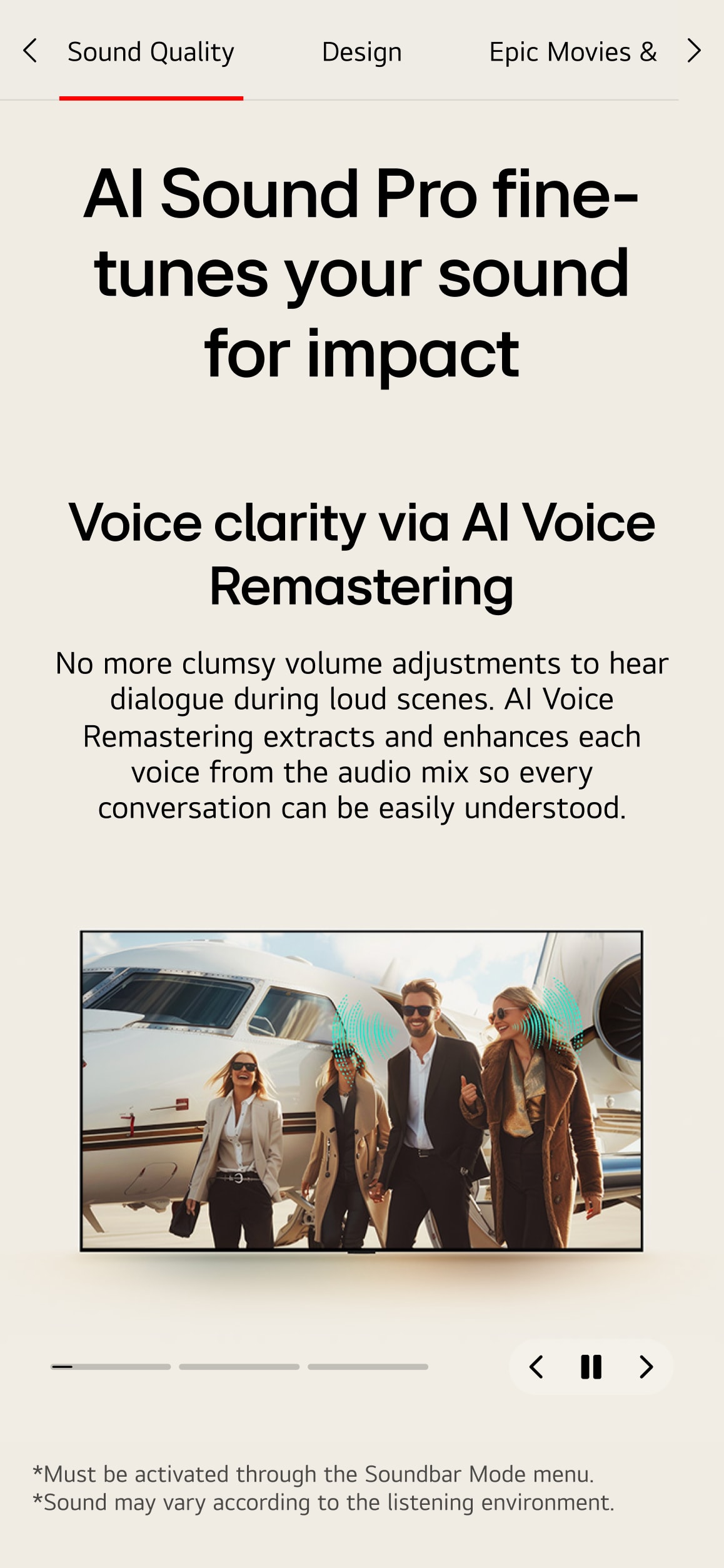
While meeting optimization and scalability requirements using AEM-based GP1 components, we also pushed for immersive and visually dynamic executions that defy monotony. The scope included over 40 product PDPs, lifestyle imagery, and banners across OLED, QNED, the world’s first Transparent OLED TV, and the lifestyle-forward StanbyME 2—culminating in a global rollout across more than 70 countries.
끝없는 혁신이 실현하는 디지털 경험 압도적인 성능과 유려한 디자인으로 전 세계의 시선을 사로잡는 LG TV. 신제품 출시는 그 자체로 글로벌 시장이 주목하는 빅 이벤트이자, 최신 기술과 트렌드를 가늠하는 기준이 됩니다. 본 프로젝트는 LG TV의 신제품 라인업을 소개하는 PDP 제작을 중심으로, 브랜드의 리딩 포지션과 기술적 우월성, 그리고 차별화된 사용자 경험을 시각적으로 설득력 있게 전달하고자 했습니다. 사용자가 제품의 강점과 성능을 직관적으로 이해하고, 브랜드의 매력을 자연스럽게 체감할 수 있도록 임팩트 있는 콘텐츠 구성에 집중했습니다. Key USP 기반의 정보 설계부터 콘텐츠 기획, 카피라이팅, 비주얼 디자인, 모션 그래픽, 그리고 다양한 제품 에셋 제작까지 전 과정에 걸쳐 완성도 높은 디지털 경험을 설계했습니다. AEM 기반의 GP1 컴포넌트에 맞춰 범용성과 최적화를 충족하면서도, 시각적 몰입감을 높이기 위해 입체적이고 감각적인 연출을 적용하였습니다. OLED, QNED, 세계 최초의 투명 OLED TV, 그리고 소셜미디어를 통해 주목받은 라이프스타일 TV StanbyME 2까지, 약 40여 개 라인업의 PDP와 관련 배너, 라이프스타일 이미지 등을 제작하였으며, 70여 개국 대상의 글로벌 롤아웃을 성공적으로 수행하였습니다.
Digital Experience LG TV PDP
OLED – Experiencing the Scale of Global No.1
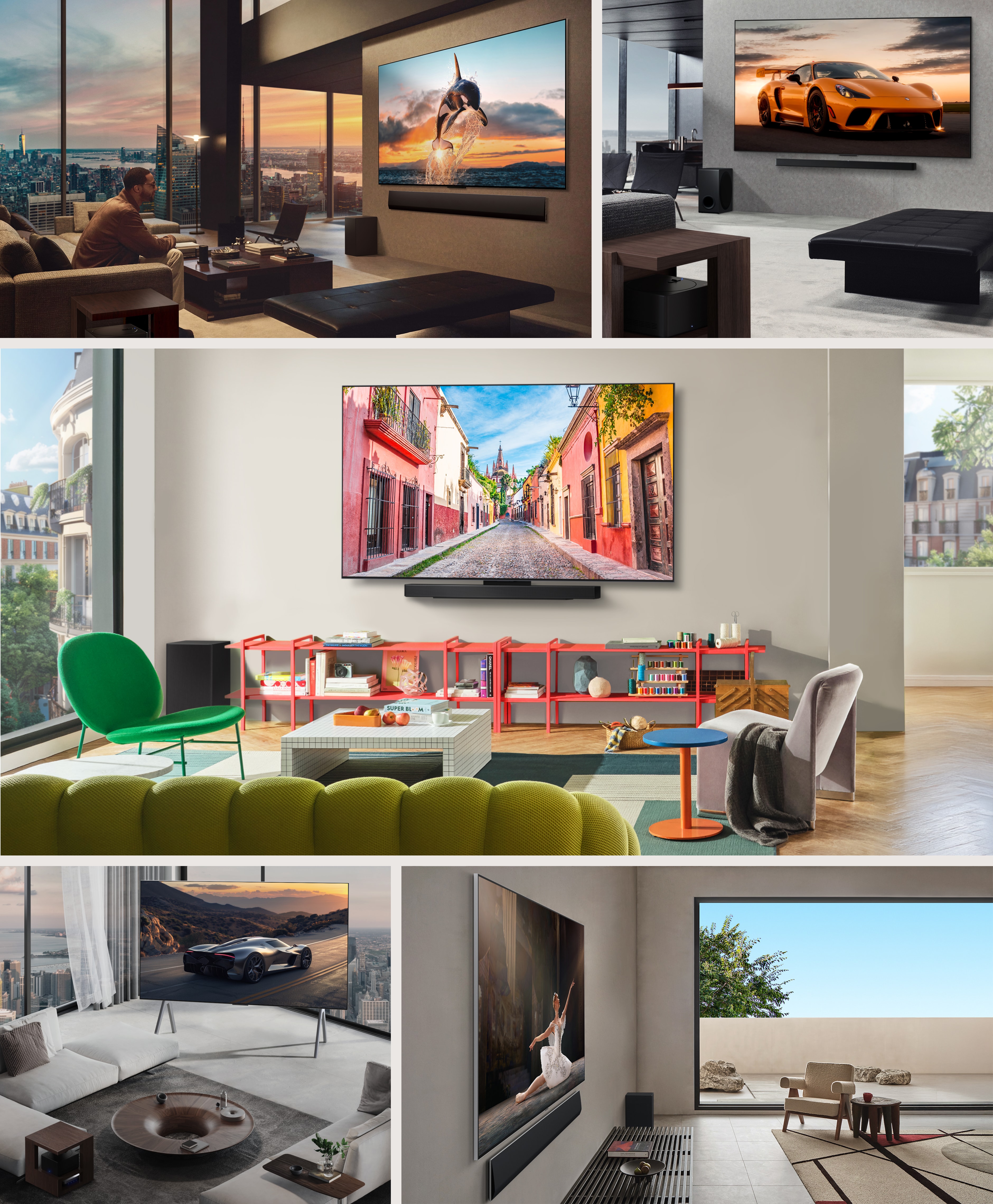
LG has secured the No.1 position in the OLED market with its unrivaled technological dominance and the world’s most diverse range of form factors. This section was designed to highlight the breadth of the lineup through a strategically structured content flow, while visually reinforcing the brand’s leadership and premium identity. Immersive 3D-rendered visuals were employed to encourage active exploration, allowing users to engage more deeply with each product while intuitively experiencing the technological sophistication and emotional appeal that define LG OLED. To break away from the limitations of standardized PDP structures, we incorporated premium interior imagery that reflects real-life settings. These contextual shots not only enhance the sense of realism but also elevate the user experience—transforming a templated framework into a richer, more user-centric browsing journey.
압도적인 기술력으로 OLED 시장 점유율 1위를 기록하고 있는 LG는, 세계 최다 폼팩터 라인업을 보유한 브랜드입니다. 본 섹션에서는 그 다채로운 제품 구성을 돋보이게 하기 위해 정보 구조를 전략적으로 설계하고, 시각적으로도 브랜드의 리더십과 프리미엄 이미지를 효과적으로 전달하는 데 집중하였습니다. 3D 모델링을 활용한 몰입형 연출은 사용자가 콘텐츠를 능동적으로 탐색하는 경험을 유도하며, 제품의 특징뿐 아니라 브랜드가 지닌 기술적 우월성과 감성적 가치를 동시에 전달할 수 있도록 디자인되었습니다. 또한, 프리미엄 제품에 어울리는 인테리어 컷을 전략적으로 배치함으로써 정형화된 PDP 구조에서 벗어나, 다양한 공간 속 제품의 실제 사용감을 생생하게 전달하였습니다. 이는 GP1 컴포넌트의 한계를 극복하는 동시에, 사용자 중심의 콘텐츠 소비 환경을 더욱 풍부하게 만들어 주었습니다.
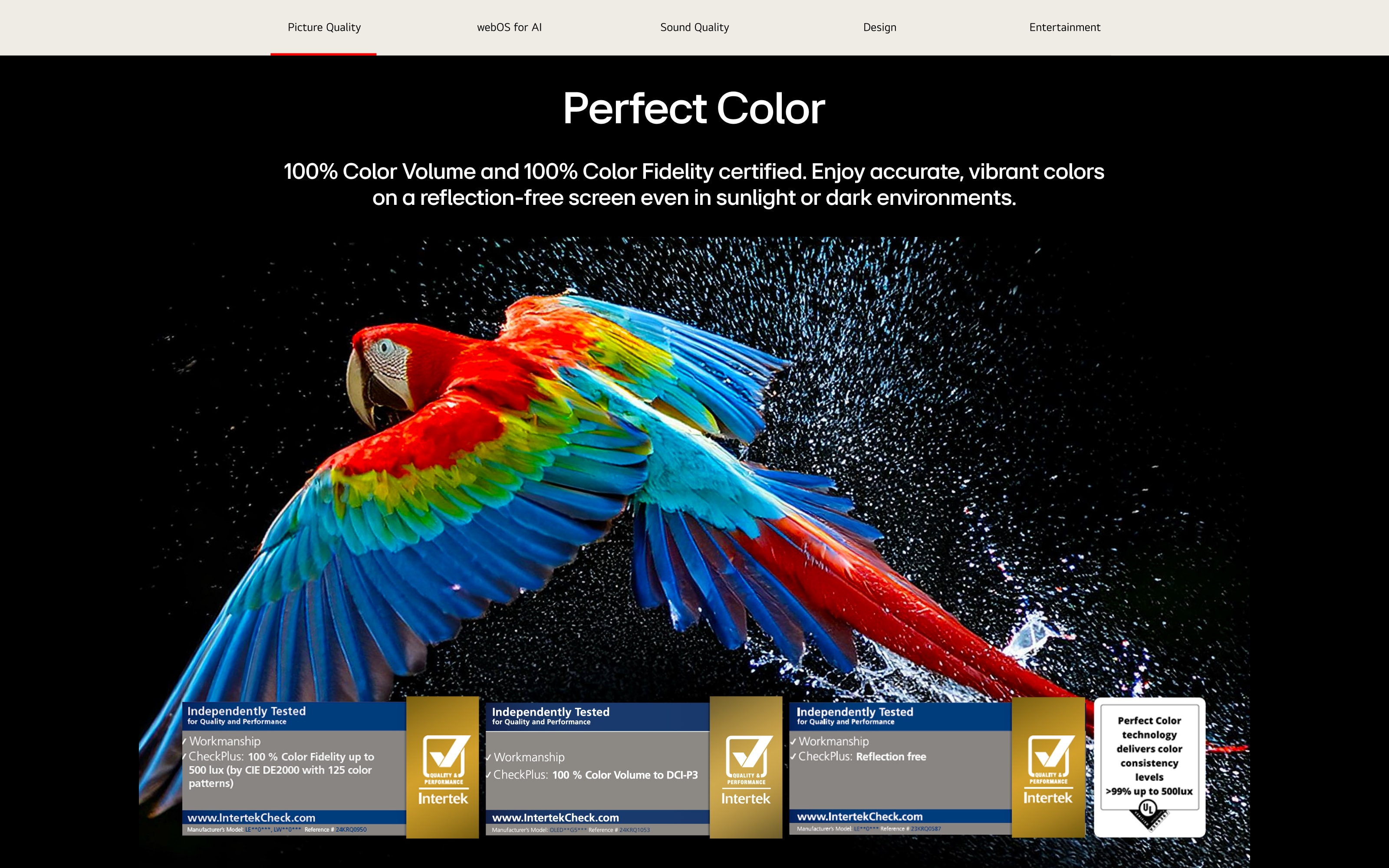
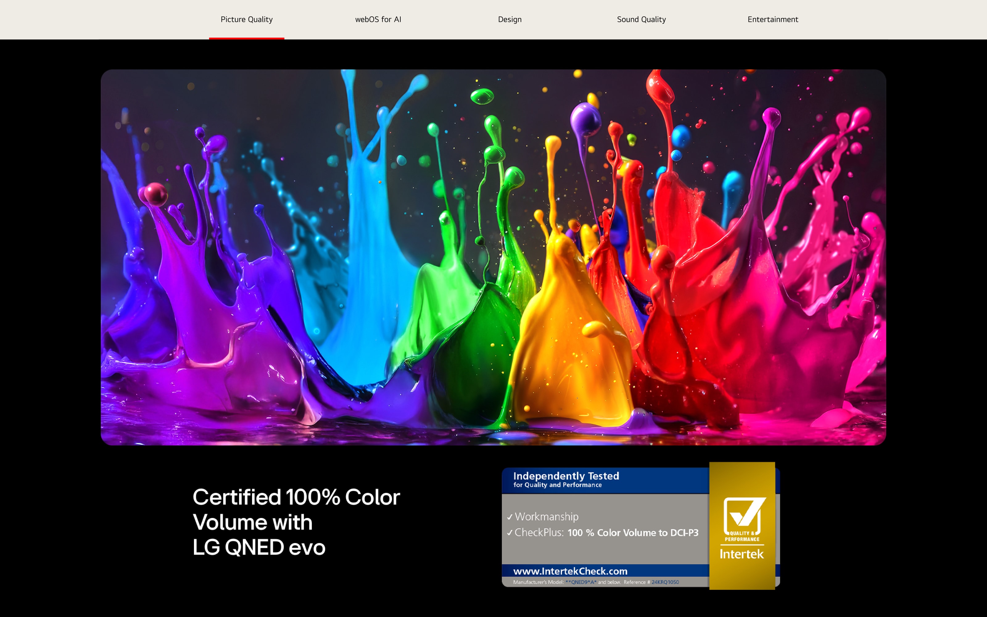
QNED, LG’s flagship LCD TV line that delivers picture quality closest to OLED, took a significant leap forward this year with the launch of the first-ever QNED evo lineup. To spotlight this evolution, we crafted a content structure that distinctly communicates both the product’s advanced technology and its enhanced user experience. A bold layout tailored to ultra-large screen sizes draws attention to the product, while vibrant in-screen visuals highlight QNED’s strength in realistic color expression—making the content feel rich and immersive. Lifestyle-focused design elements help visualize how QNED naturally elevates the everyday, emphasizing positive shifts in the user’s viewing environment. On mobile, we preserved the flow and visual impact of the desktop experience while optimizing for intuitive, touch-based interaction. Content was reorganized with clarity and responsiveness in mind, ensuring seamless usability without sacrificing design intent. For the broader LCD lineup—including NanoCell, UHD, and FHD models—we balanced distinct marketing strategies with a unified design system. By applying a consistent tone and visual logic, we showcased the shared strengths of LG’s LCD offerings while reinforcing a cohesive brand presence across all tiers.
OLED에 가장 가까운 화질을 구현하는 QNED는 LG LCD TV 라인업의 기술력과 프리미엄 경험을 대표하는 제품입니다. 특히 이번 프로젝트에서는 QNED evo 라인의 첫 출시를 맞아, 진화된 화질과 성능의 차이를 명확히 보여줄 수 있도록 콘텐츠 구조와 메시지를 정교하게 설계하였습니다. 100인치 초대형 제품에 맞춘 볼드한 레이아웃과 연출은 시선을 집중시키고, 다양한 컬러의 인스크린 비주얼은 실제에 가까운 색 표현력을 강조하며 콘텐츠 몰입도를 높였습니다. 강화된 사용자 편의성과 라이프스타일 연계 요소는 제품 사용 이후의 긍정적인 변화까지도 시각적으로 설계하였습니다. 모바일에서는 데스크톱 환경에서의 콘텐츠 흐름과 감각적인 연출을 그대로 유지하면서도, 터치 기반 사용성에 최적화된 인터랙션과 정보 배치를 적용해 사용자의 몰입을 방해하지 않도록 설계하였습니다. 또한, QNED 이하 라인업인 나노셀, UHD, FHD 제품군은 각기 다른 마케팅 전략을 반영하되, 공통된 기술적 특장점을 시각적으로 통일되게 표현하여 LG LCD 라인업 전체의 일관된 브랜드 톤앤매너를 완성하였습니다.
To showcase each product from multiple angles with clarity, we developed 3D models that allowed for detailed, dynamic visual presentation. In parallel, we conducted a lifestyle photoshoot that captured a newly defined “young premium” aesthetic, aligning each scene with clearly articulated personas. These lifestyle images were crafted to go beyond decorative visuals—they conveyed not only product usage in real-life contexts but also the emotional and stylistic values of the brand. Every image was carefully styled to reflect the habits, tastes, and environments of the intended target audience. The resulting assets were widely utilized across PDPs, PR campaigns, and various marketing channels, serving as versatile, high-impact visuals that elevated both product storytelling and brand perception.
다양한 제품의 각도를 직관적으로 보여줄 수 있도록 3D 모델링을 제작하고, 새롭게 정의된 ‘영 프리미엄’ 감성을 담은 라이프스타일 촬영을 병행하여 진행하였습니다. 라이프스타일 이미지에는 제품별 타깃 소비자에 맞춘 페르소나와 공간 활용이 정교하게 설계되어 있어, 단순한 연출컷을 넘어 브랜드 감성과 실제 사용 경험을 동시에 전달합니다. 이 에셋들은 PDP를 비롯해 온·오프라인 PR 및 다양한 마케팅 채널에서 유연하게 활용되며, 제품의 매력을 보다 현실적이고 감각적으로 표현하는 데 중요한 역할을 했습니다.
T4
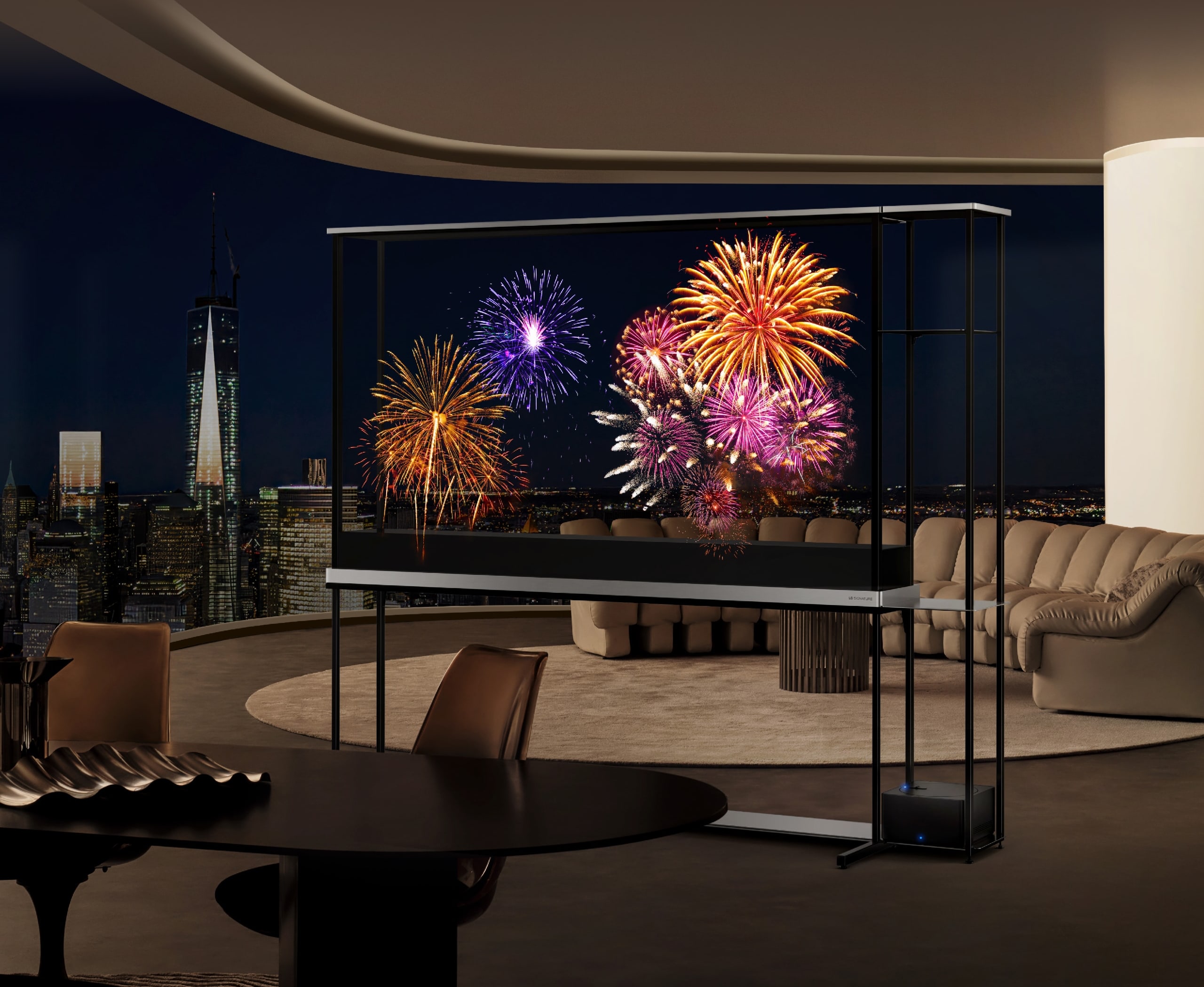
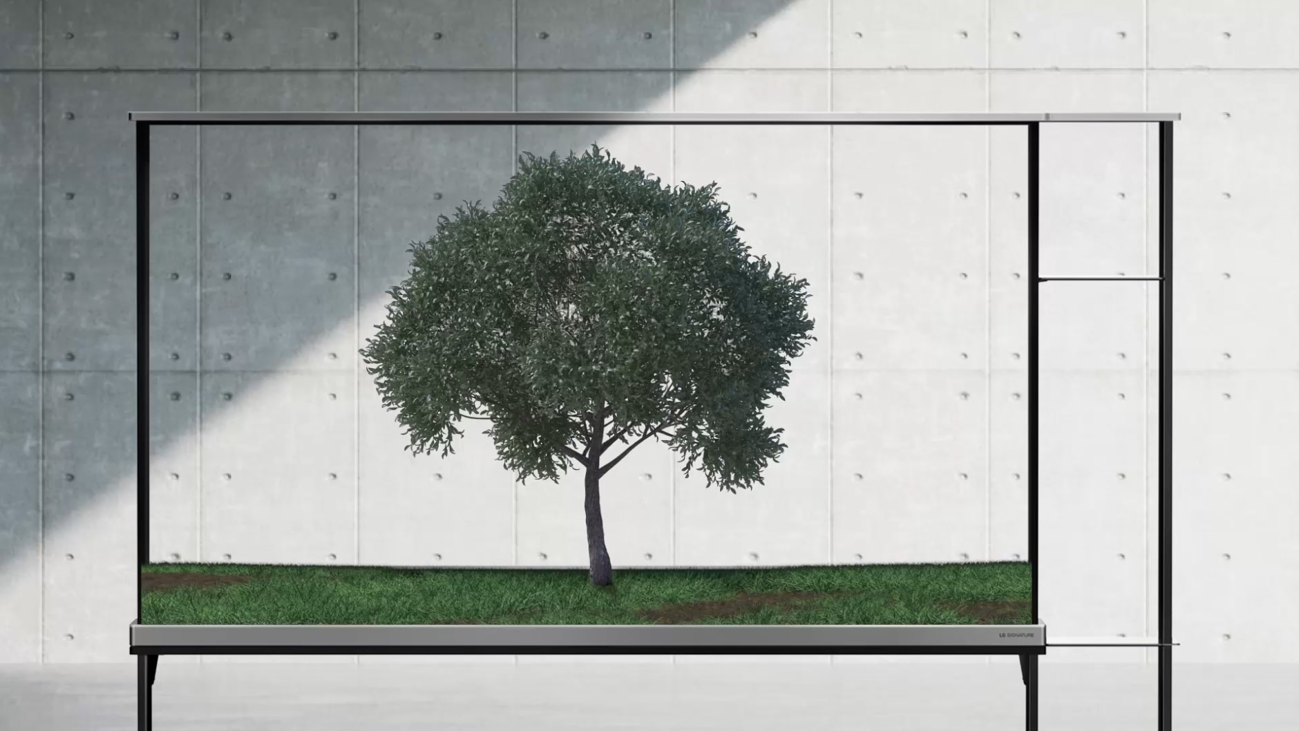
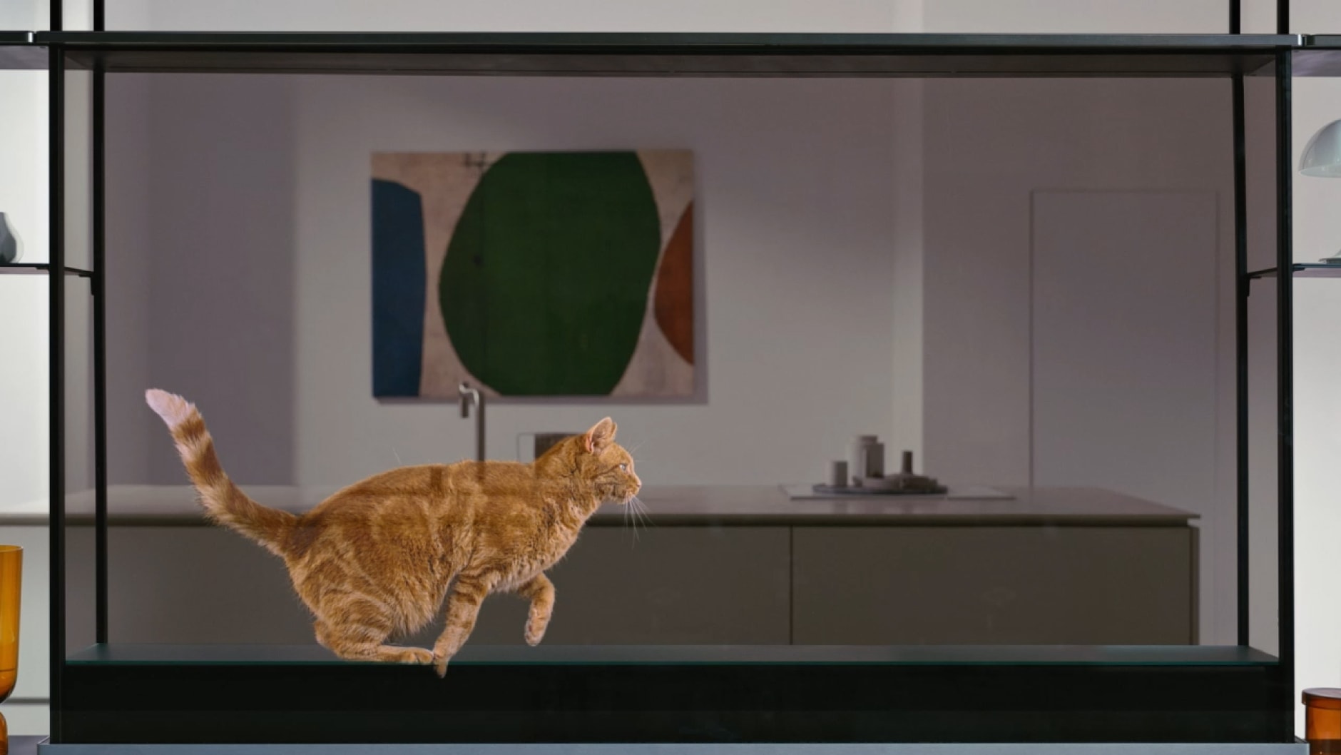
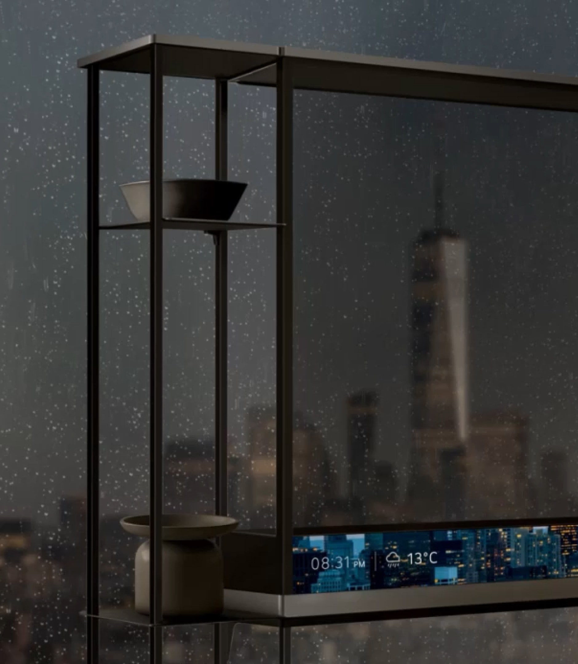
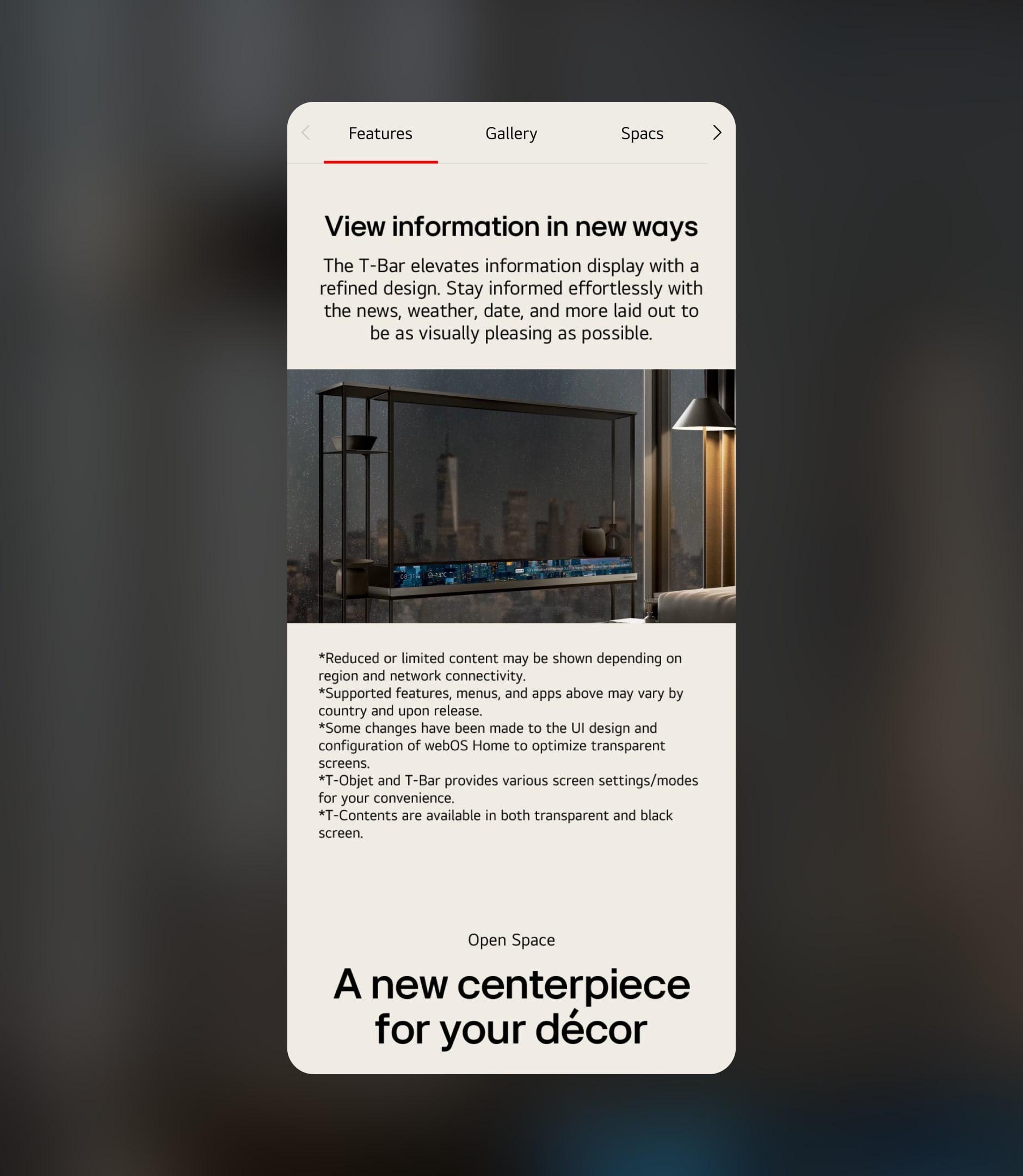
The OLED T4 is LG’s first-ever transparent OLED TV—a product less about functionality and more about fascination. This wasn’t just another PDP; it was a design challenge to visualize desire itself. We set out to create an experience that made people say: “I don’t need that—but I want it.” With no assets available at the start, the project required full creative development from the ground up—including concepting, photography, 3D modeling, and high-level compositing. Through surreal AOD scenes—like whales swimming through city-view windows or tropical fish gliding across desert skylines—we reframed the product not as a display, but as a lens between imagination and space.
OLED T4는 LG가 선보인 세계 최초의 투명 OLED TV로, 기능보다 감각이 먼저 다가오는 상징적인 제품입니다. 화질이나 성능을 설명하기보다, **‘이것은 필요하지 않지만 갖고 싶은 것’**이라는 선망의 감정을 어떻게 시각화할 것인가가 이 프로젝트의 핵심이었습니다. 제품 실물이 거의 없는 상황에서 프로젝트가 시작되어, 기획부터 촬영, 3D 모델링, 합성까지 전 과정을 제로 베이스에서 구축해야 했습니다. 도시의 유리창 너머로 고래가 유영하거나, 사막 뷰 앞에 열대어가 헤엄치는 듯한 투명 AOD 콘텐츠 연출을 통해 제품이 놓이는 공간마저 상상력을 자극하는 스토리로 전환했습니다.
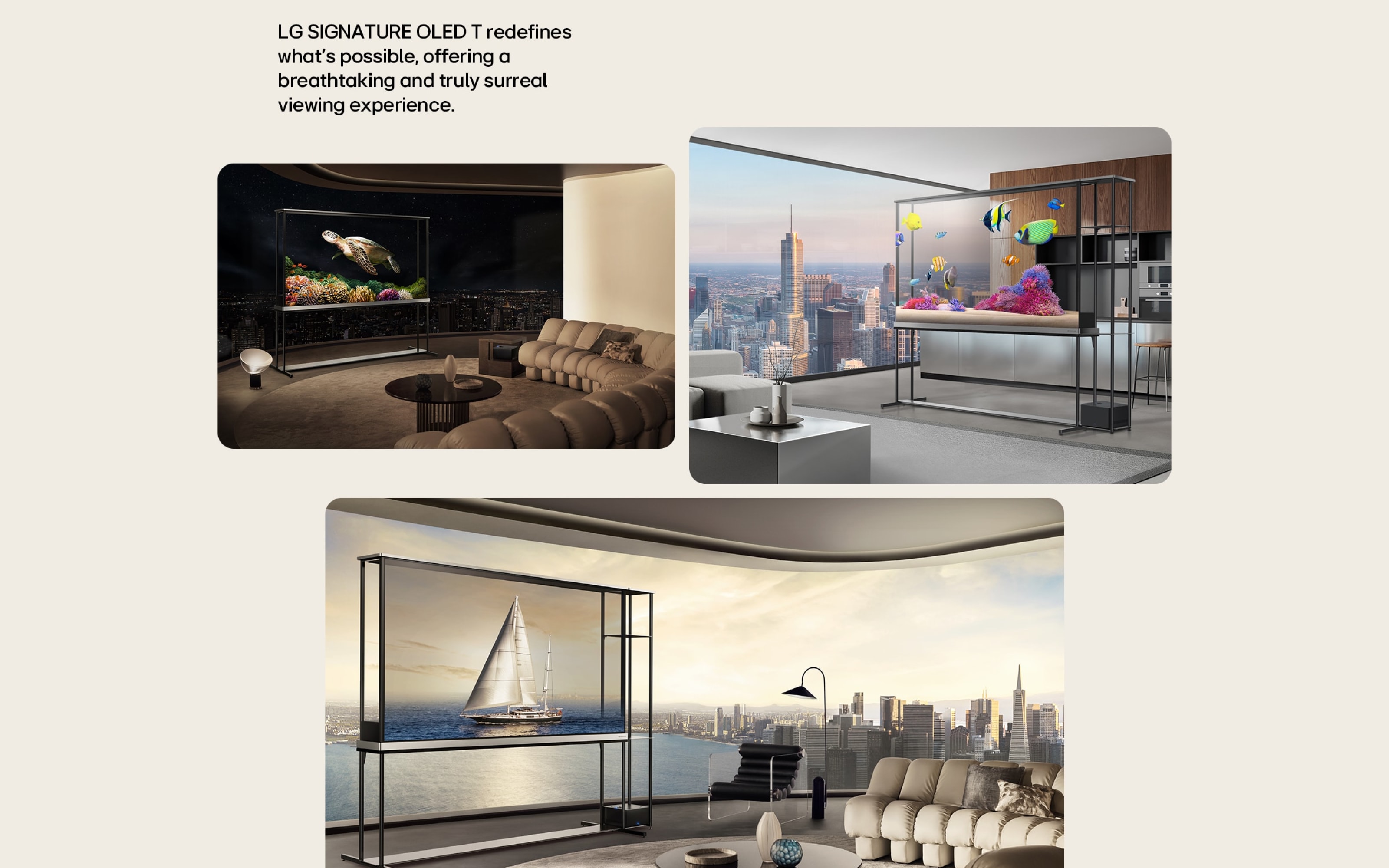
Designed around its 77-inch transparent panel, the content prioritized emotion over utility, and presence over practicality. The visual and verbal storytelling evolved repeatedly throughout the process, but we stayed focused on one goal: to capture LG’s boldest, most aspirational vision in a way that would spark global curiosity and admiration. OLED T4 isn’t just a product—it’s a provocation. And we built it from the moment it existed only as an idea.
77인치의 크기와 투명 디스플레이의 특성을 살리기 위해 사용성보다는 감정, 기능보다는 존재감에 집중한 콘텐츠 설계가 이뤄졌고, 선망성과 브랜드의 미래 지향적 이미지를 동시에 표현하기 위해 카피라이팅, 콘텐츠 방향성, 시각 전략이 수차례 조정되는 난이도 높은 과정 속에서도 일관된 톤앤매너를 유지하는 데 집중했습니다. T4는 단순한 제품이 아니라, 브랜드의 비전과 상상력을 시각적으로 구현한 하나의 ‘경험’으로 설계되었습니다. 그리고 우리는, 그 가능성이 아직 보이지도 않았던 시점부터 그것을 만들어 냈습니다.
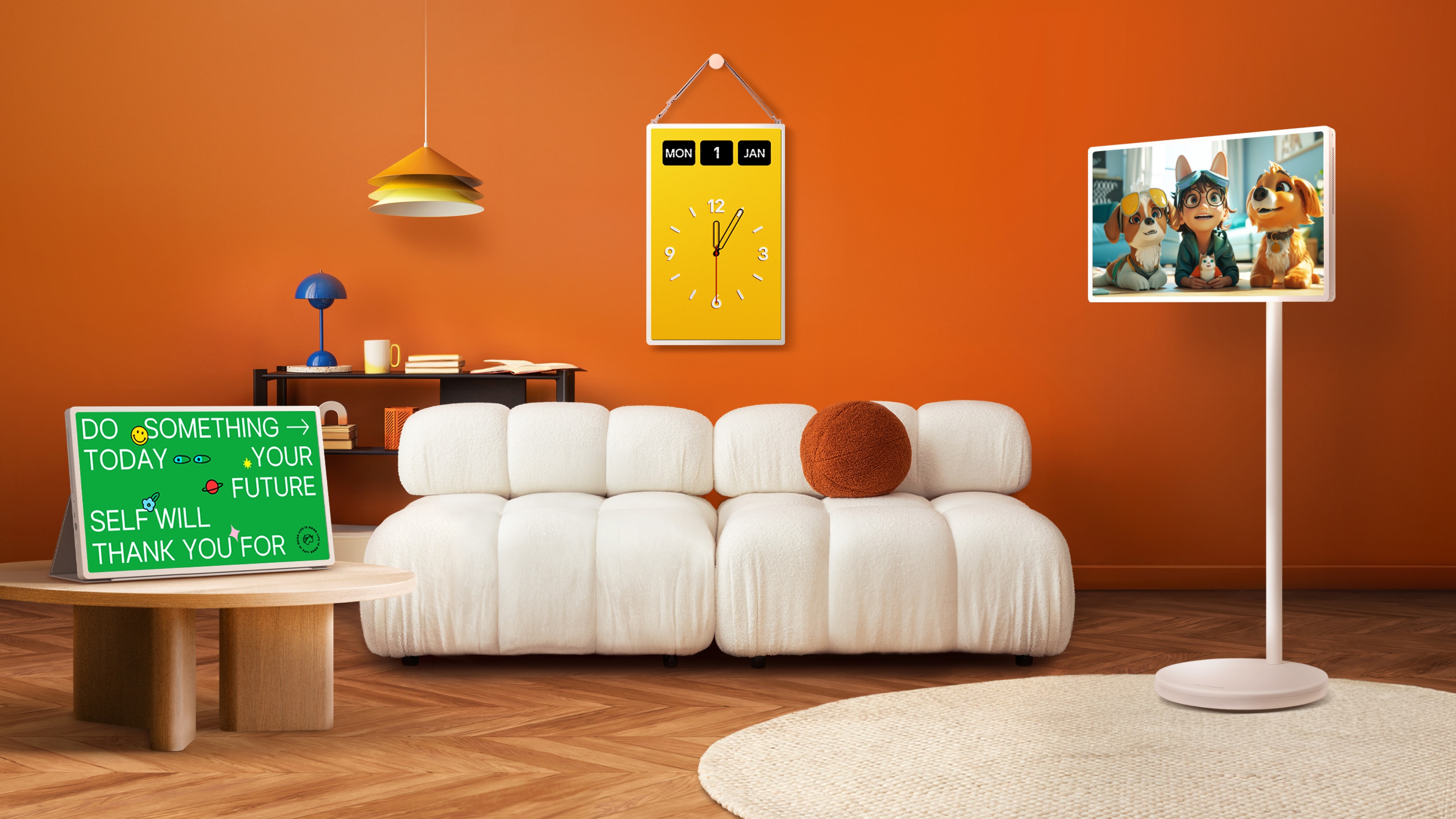
STANBYME 2
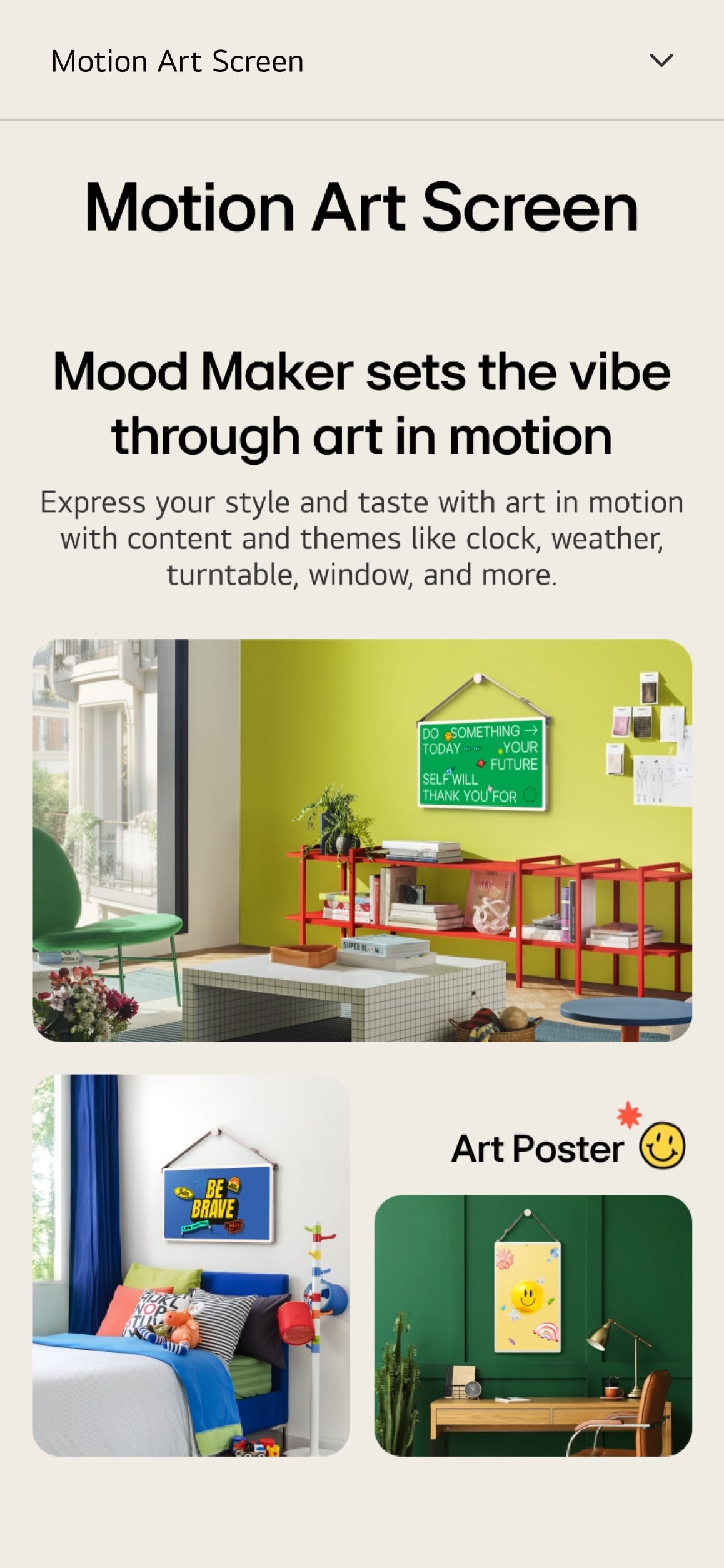
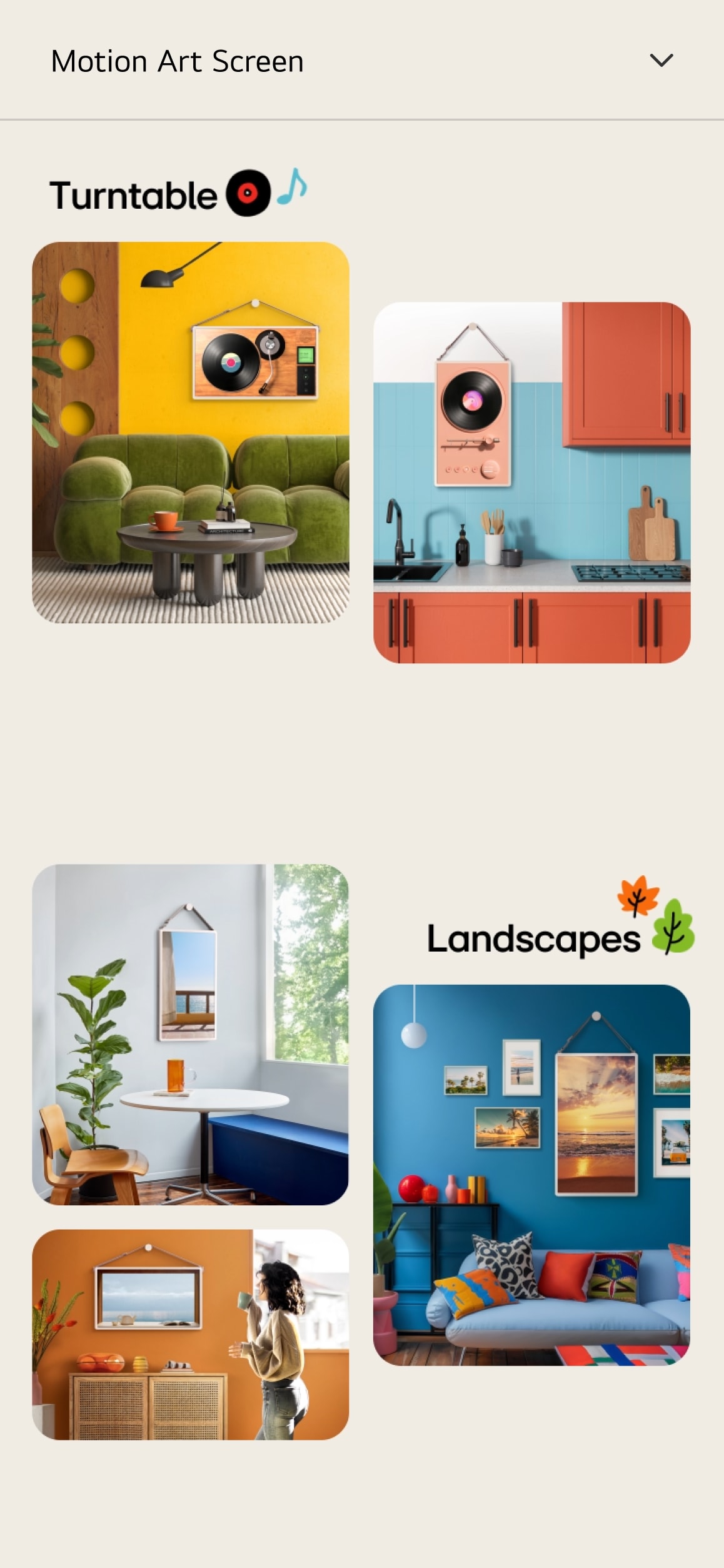
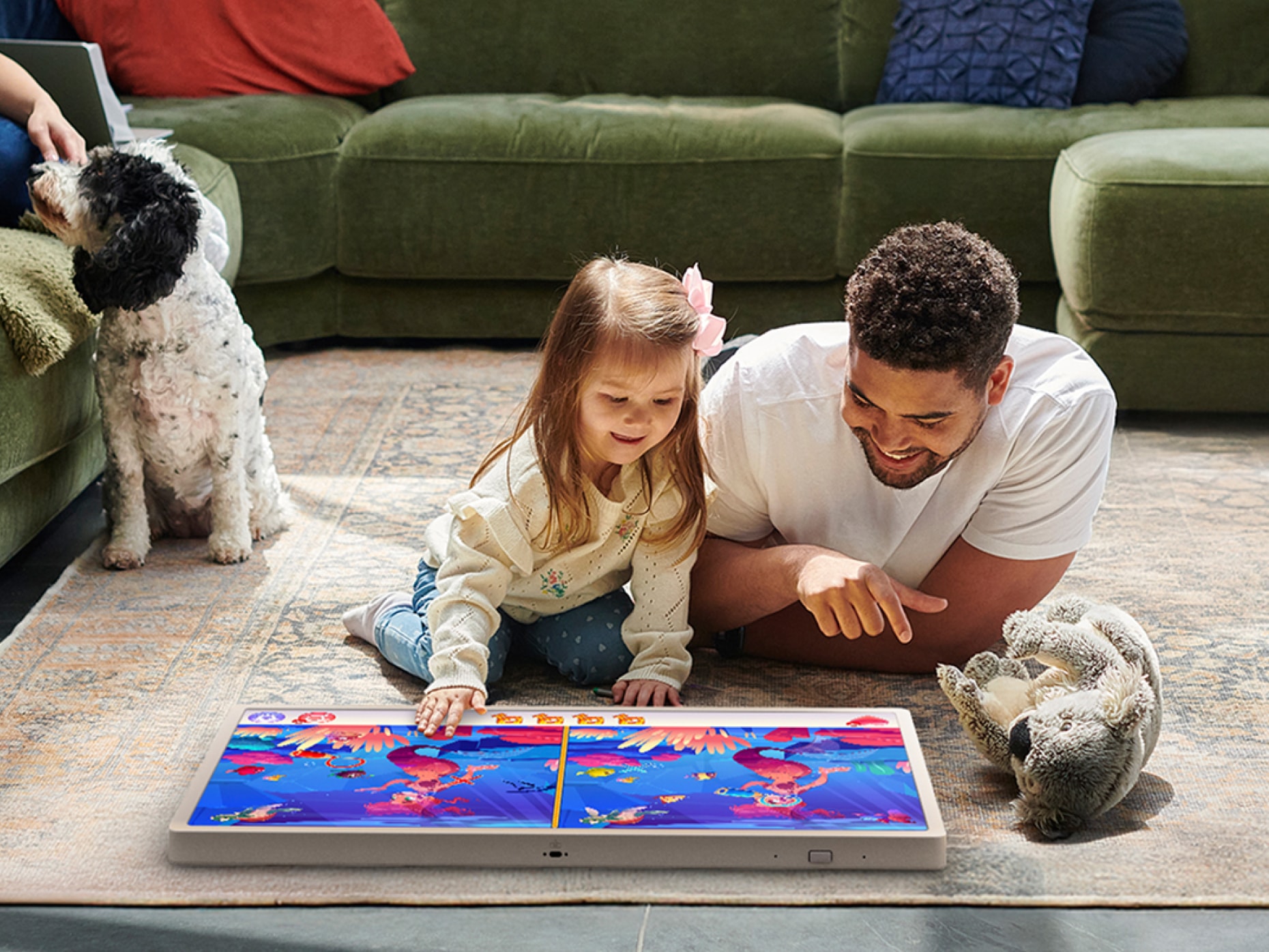
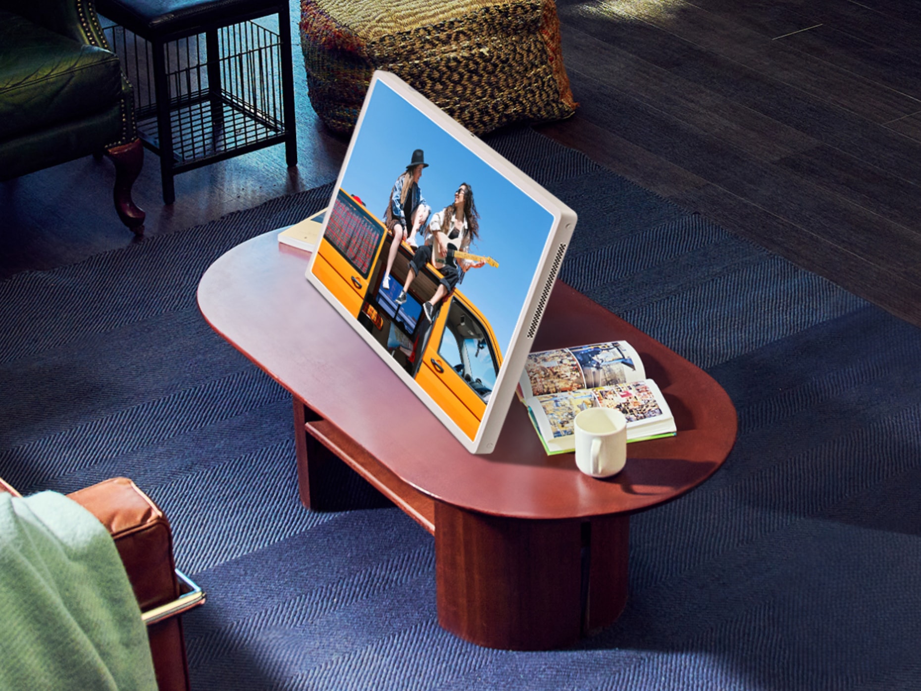
StanbyME 2 is more than an upgrade—it’s a reimagining of screen usability and form factor flexibility. Unlike the first-generation model, it adapts to a wide range of usage scenarios through enhanced rotation, tilt, and wall-mount options, allowing users to experience content comfortably from any position. The redesigned stand enables smooth angle adjustments whether seated on the floor, lying on a sofa, or viewing from above. Additional accessories such as the fully covered folio stand and one-click table stand offer new modes of interaction, while the strap-based wall-mount system supports both portrait and landscape orientations, emphasizing its seamless integration into any living space.
StanbyME 2는 단순한 업그레이드가 아니라, 스크린 사용성과 폼팩터의 새로운 가능성을 제안하는 제품입니다. 기존 1세대와 달리, 회전·각도 조절·벽걸이 등 다양한 사용 환경에 대응할 수 있도록 형태가 유연해졌으며, 이에 따라 페이지 설계 역시 제품이 ‘어디에나 존재할 수 있음’을 보여주는 방향으로 진행되었습니다. 스탠드형에서도 자유롭게 각도를 조절할 수 있어 바닥에 앉든, 소파에 눕든, 위에서든 아래에서든 시야에 맞게 조정할 수 있고, 별도의 풀리오 커버나 원클릭 스탠드를 통해 테이블 스탠드처럼도 활용이 가능합니다. 특히 스트랩을 활용한 벽걸이형은 가로·세로 전환이 모두 가능하며, 공간 활용의 유연성을 강조하는 주요 포인트로 설계되었습니다.
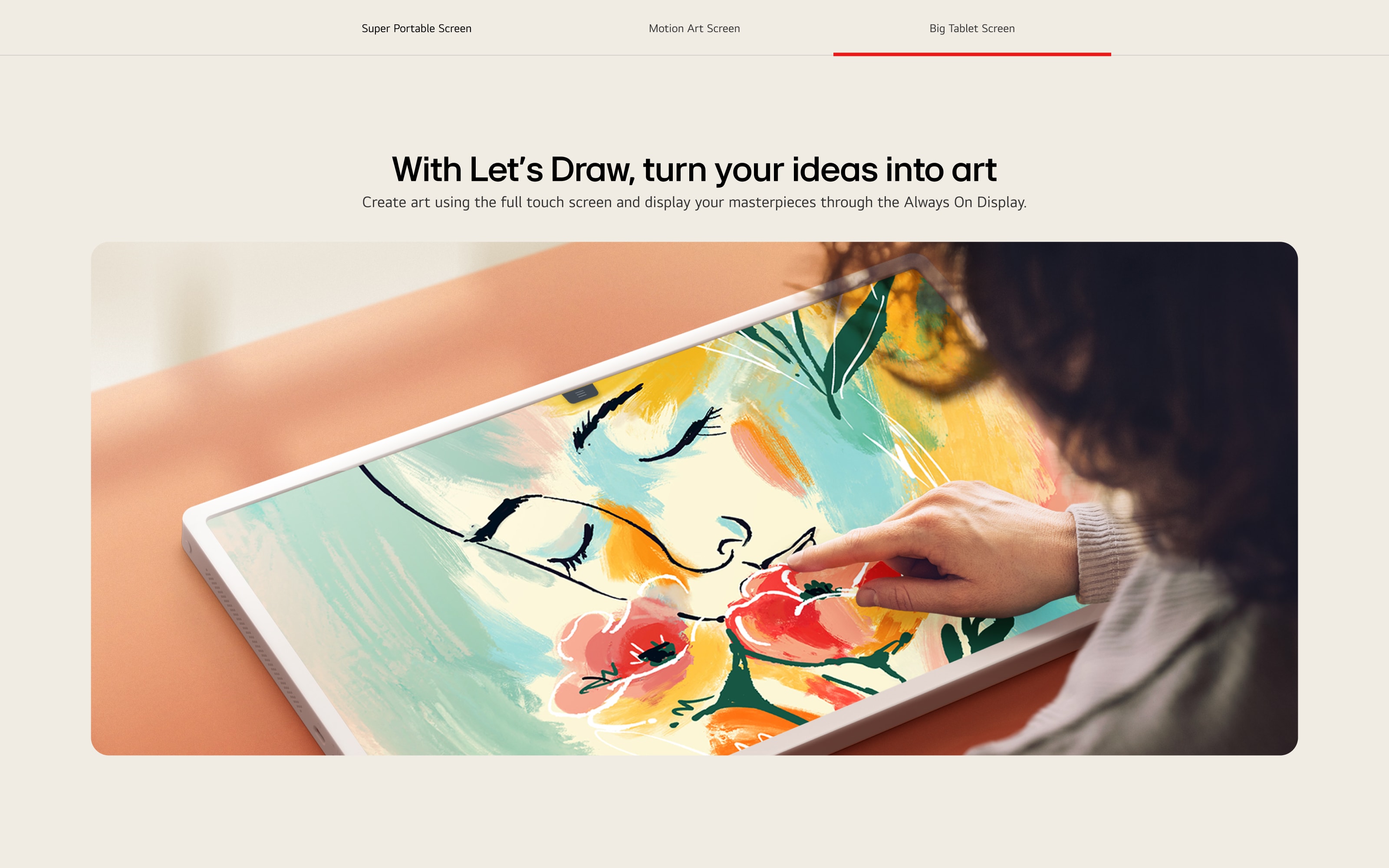
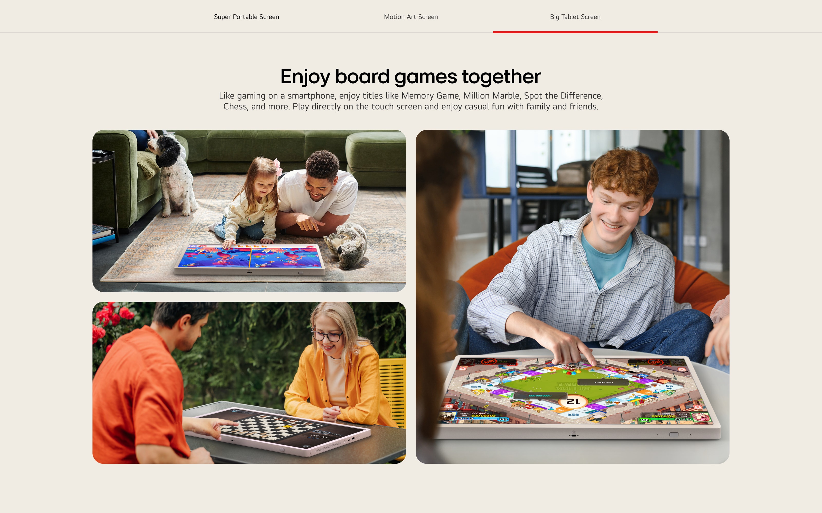
The product’s evolution extends beyond hardware. With improved touch sensitivity that enables light sketching and built-in board games that support shared family interaction, StanbyME 2 introduces thoughtful functional upgrades into the everyday. Originally scoped as a one-month sprint, the project ultimately unfolded over 3.5 months of intense iteration and creative problem-solving. The result is more than a product detail page—it’s an experience that reflects a screen designed to evolve with life itself.
또한 터치 감도가 개선되어 간단한 드로잉까지 가능한 UI, 보드게임을 설치해 온 가족이 함께 즐길 수 있는 인터랙티브 요소 등, 기능적 진화 또한 콘텐츠 안에 자연스럽게 녹여냈습니다. 최초 기획 당시 한 달이면 끝낼 수 있다고 했던 프로젝트는, 3.5개월간의 혼돈과 집중 끝에 완성되었습니다. 이 페이지는 단지 제품을 소개하는 것이 아니라, 변화하는 삶에 유연하게 대응하는 스크린의 존재 방식을 보여주는 하나의 경험이 되었습니다.
Digital Experience MICROSITE
LG AI Microsite – Designing Experiences, Not Just Technology
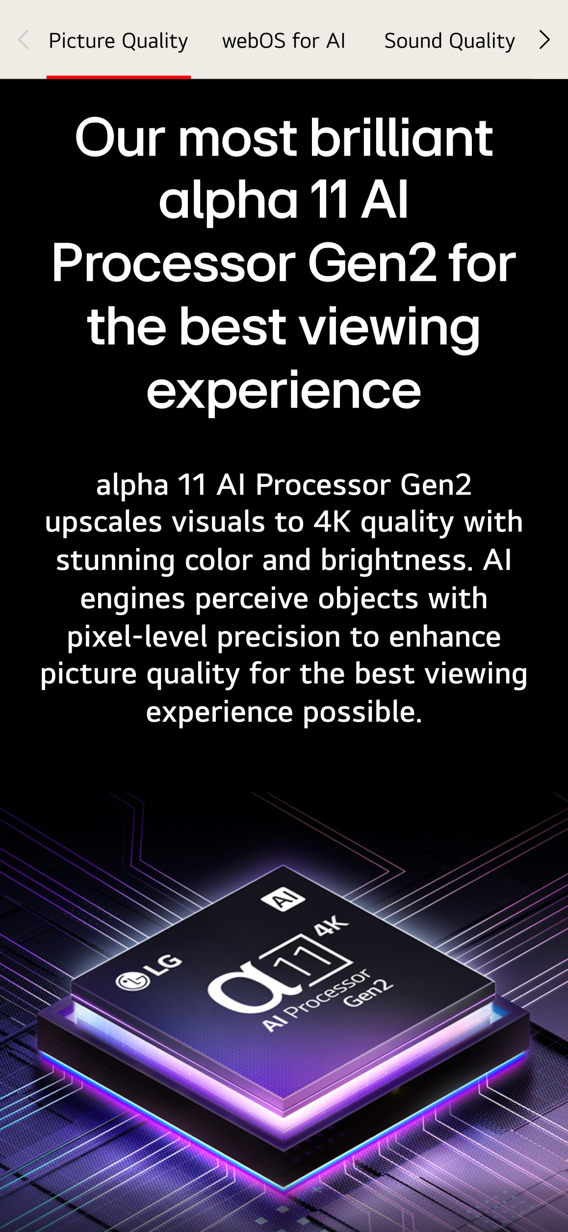
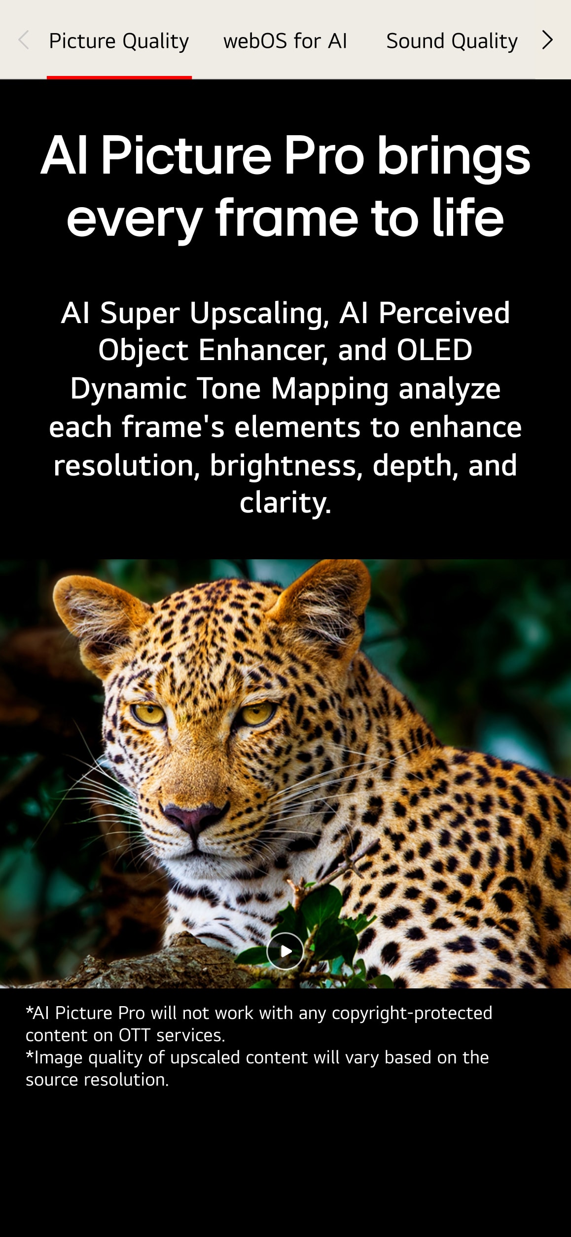
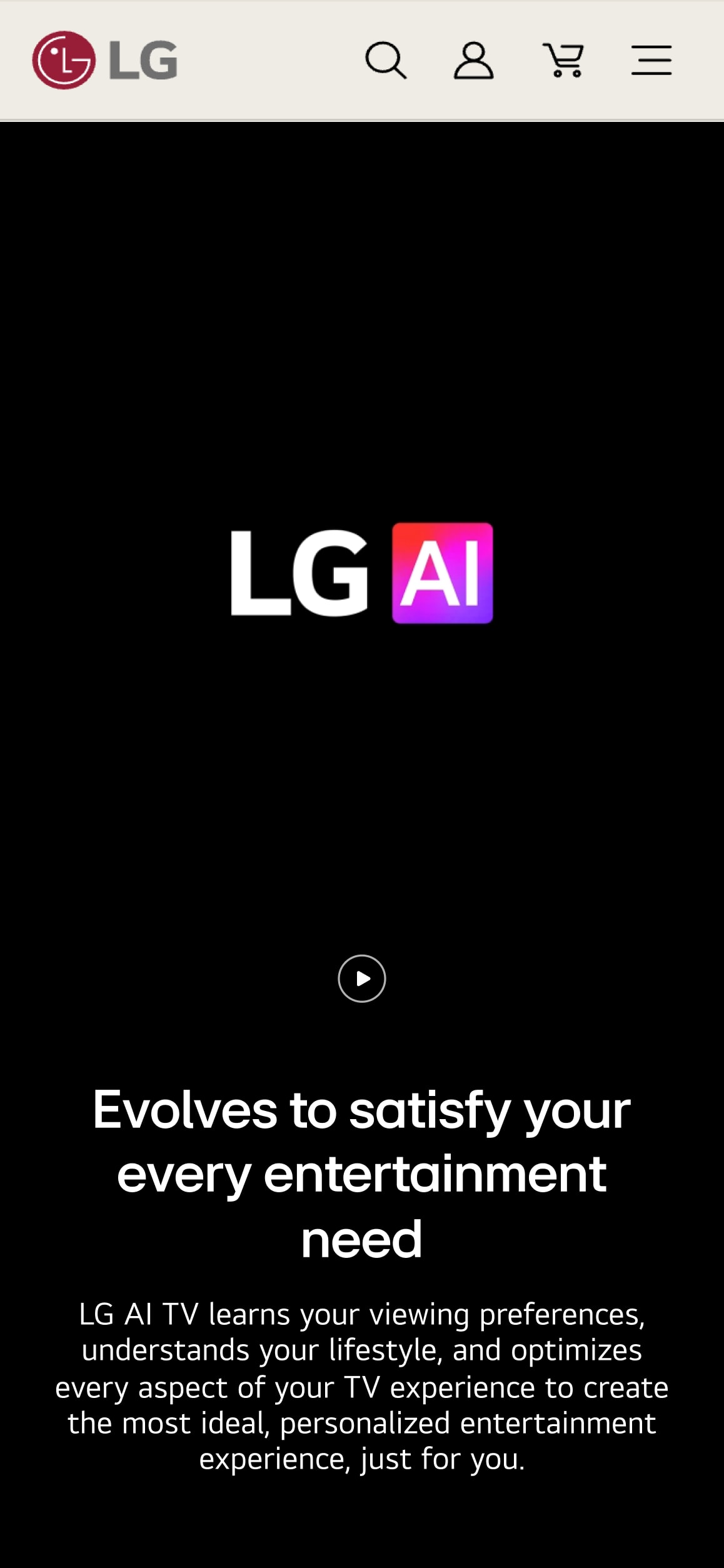
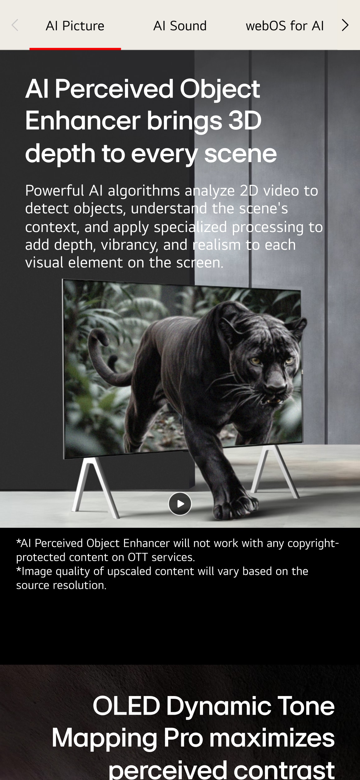
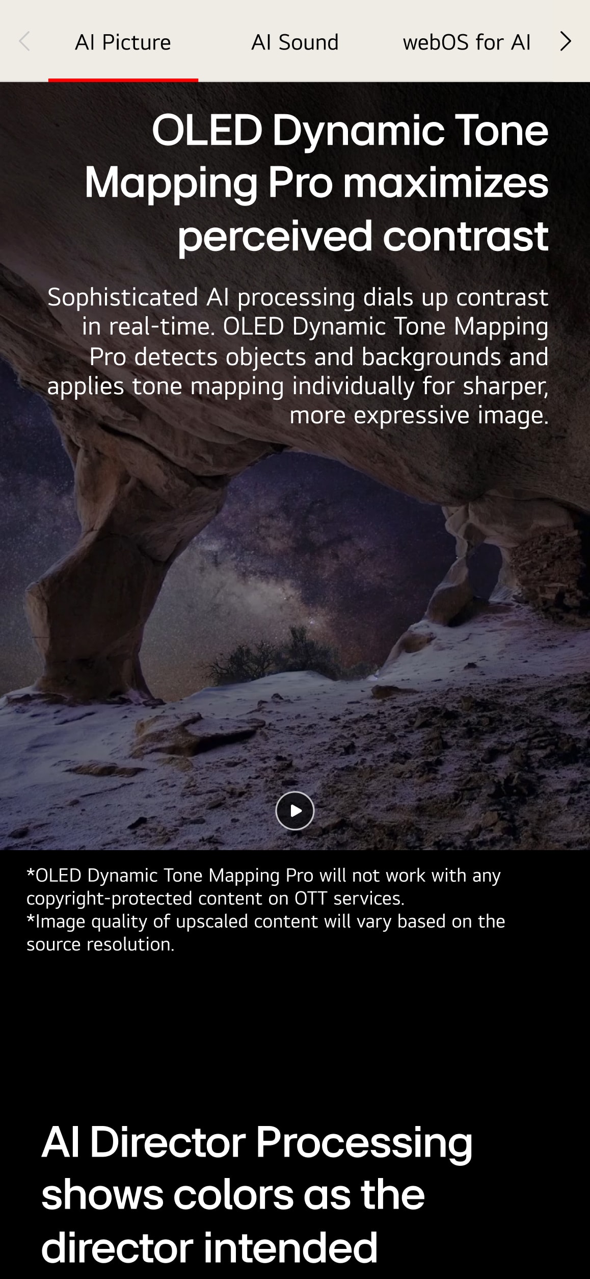
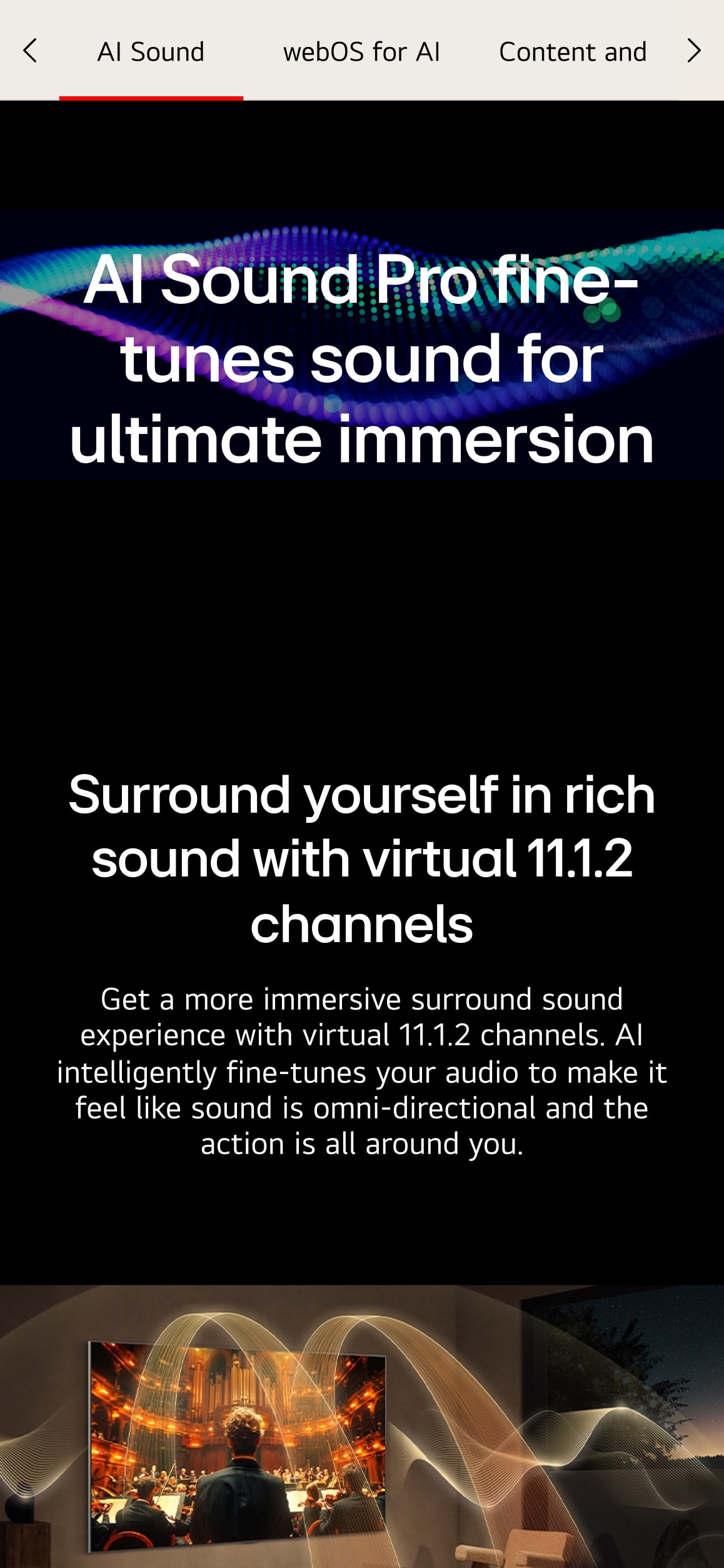
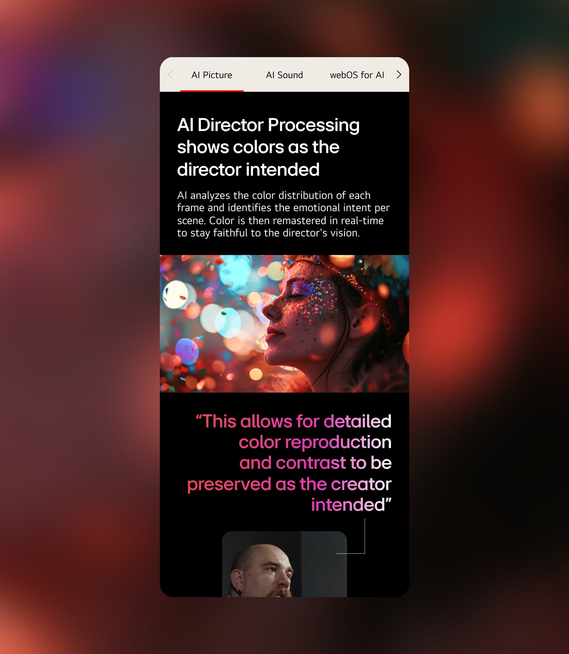
Unlike product-focused PDPs, the LG AI Microsite was crafted as a brand-led experience platform—one that explores how artificial intelligence transforms everyday viewing into something more immersive, responsive, and personalized. Rather than listing technical features, the content presents AI as a living system: one that analyzes content, recognizes emotional cues, adjusts audio and visuals accordingly, and continuously learns from user behavior. These complex functions are visualized through a clear, scenario-driven storytelling structure that invites users to understand not just what the technology does, but how it feels. With a sleek dark theme and luminous purple gradients, the visual design reinforces LG’s positioning as a premium tech brand. The experience makes advanced AI feel both accessible and aspirational, transforming abstract intelligence into intuitive, emotional impact. While PDPs focus on product details and features, this microsite is about brand philosophy and user empathy—an invitation to imagine what living with AI should feel like.
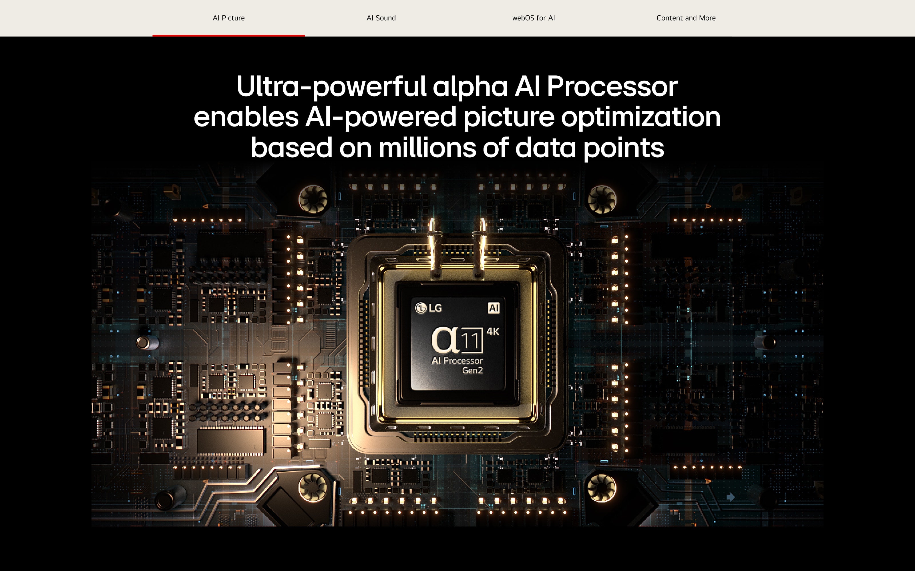
LG AI Microsite는 제품 중심의 PDP와는 달리, 기술이 삶에 미치는 변화와 감각을 중심으로 풀어낸 브랜드 경험형 콘텐츠입니다. 단순히 인공지능 기술을 소개하는 것을 넘어, LG TV가 지닌 AI 기능이 사용자의 일상과 어떻게 연결되고, 어떤 방식으로 몰입·추천·감정까지 반응하는지를 스토리텔링 중심의 시나리오로 전달합니다. 사이트 구성은 Alpha 11 AI 프로세서의 성능 설명부터 시작해, 콘텐츠 분석, 사용자 인터랙션, 개인화 추천, 사운드 최적화 등 기술이 기능을 넘어 감각으로 작동하는 전환점을 중심에 두고 설계되었습니다. 또한, 블랙 베이스와 퍼플 라이트 톤의 연출은 프리미엄 테크놀로지 브랜드로서의 이미지를 직관적으로 전달하며, AI라는 복잡한 개념을 시각적으로 간결하게 체험할 수 있게 구성되었습니다. PDP가 ‘정보’를 전달하는 페이지라면, 마이크로사이트는 브랜드 철학과 기술 방향성에 대한 ‘이해와 공감’을 이끌어내는 페이지로, 구매를 넘어 브랜드에 대한 신뢰를 확장하는 데 기여합니다.
True Wireless & OLED INNOVATION - Turning Technology into Tangible Experience
Though built for different product lines, the OLED Innovation and True Wireless microsites were both designed to translate LG’s technological leadership into rich, experience-driven storytelling. Each site focuses not on specs alone, but on how innovation reshapes the way we live, watch, and connect. The OLED Innovation Microsite highlights LG’s decade-long dominance in OLED technology through a timeline-based structure. Instead of listing achievements, it visualizes each year’s milestone as part of a cohesive brand evolution. From world-firsts to design breakthroughs, the content is positioned to build credibility and trust—showing not just what LG has made, but what it has consistently led. Beyond the product itself, the site expands into AI processing, intelligent UI, and user-centric features, demonstrating how LG’s broader ecosystem works seamlessly to enhance the viewing experience. It’s a narrative that ties innovation to lifestyle, not just to hardware.
두 개의 마이크로사이트는 각기 다른 제품군을 다루고 있지만, 공통적으로 LG가 선도하는 기술 혁신을 ‘경험 중심의 스토리텔링’으로 풀어낸 캠페인형 콘텐츠라는 점에서 하나의 전략 아래 연결되어 있습니다. OLED Innovation 마이크로사이트는 LG OLED의 기술적 진보와 시장 리더십을 연대기적 구성과 인터랙티브한 콘텐츠로 풀어낸 페이지입니다. 세계 최초·최고의 기술을 단순 나열하는 데 그치지 않고, 매년의 주요 진화 지점을 비주얼 타임라인으로 구성하여 브랜드의 지속 가능성과 신뢰를 자연스럽게 전달합니다. 또한, 인공지능·AI 프로세서·홈 UI 등 LG TV 전반의 기술이 사용자의 라이프스타일과 어떻게 연결되는지를 종합적으로 보여주며, 브랜드 스토리를 감각적으로 완성합니다.
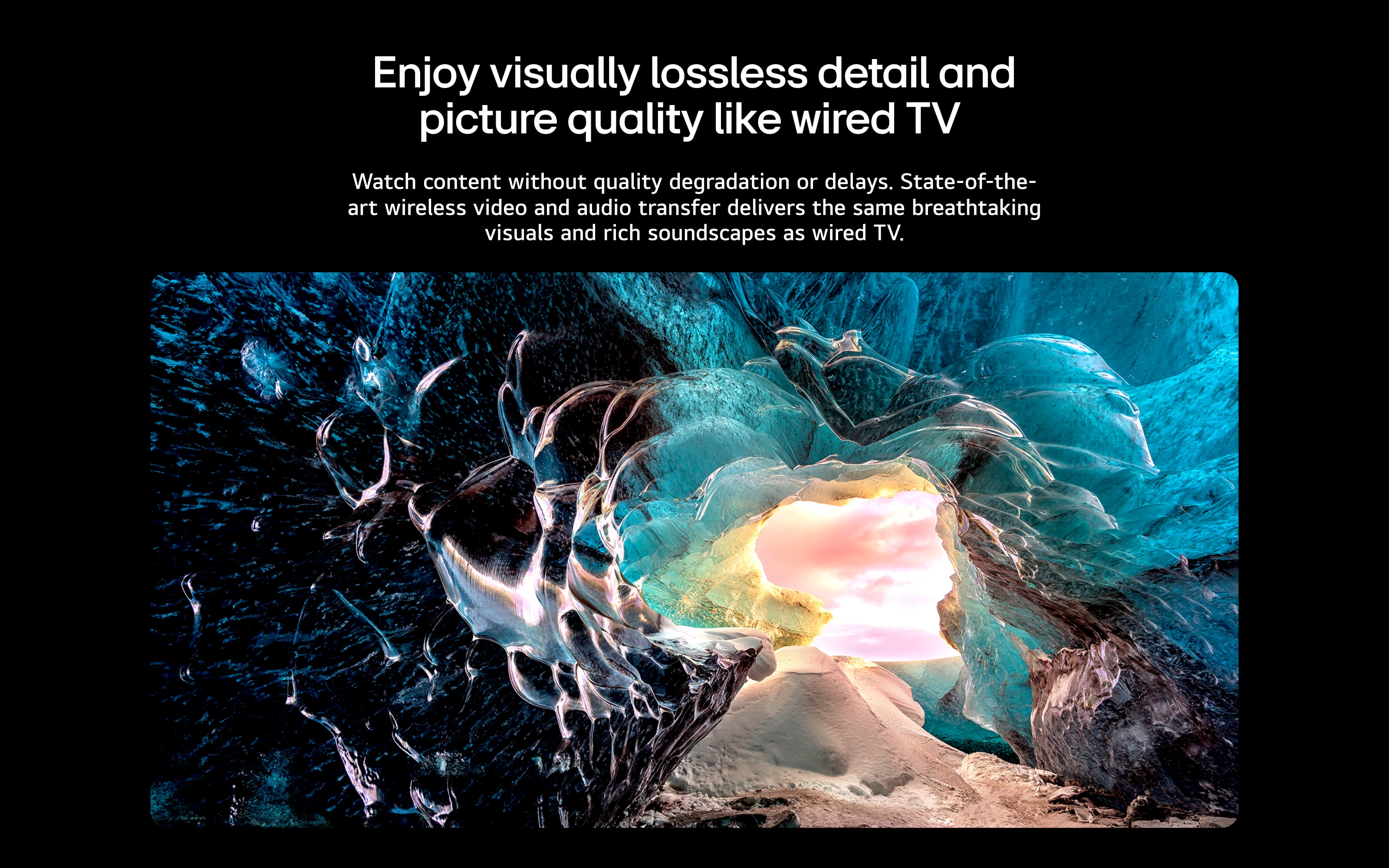
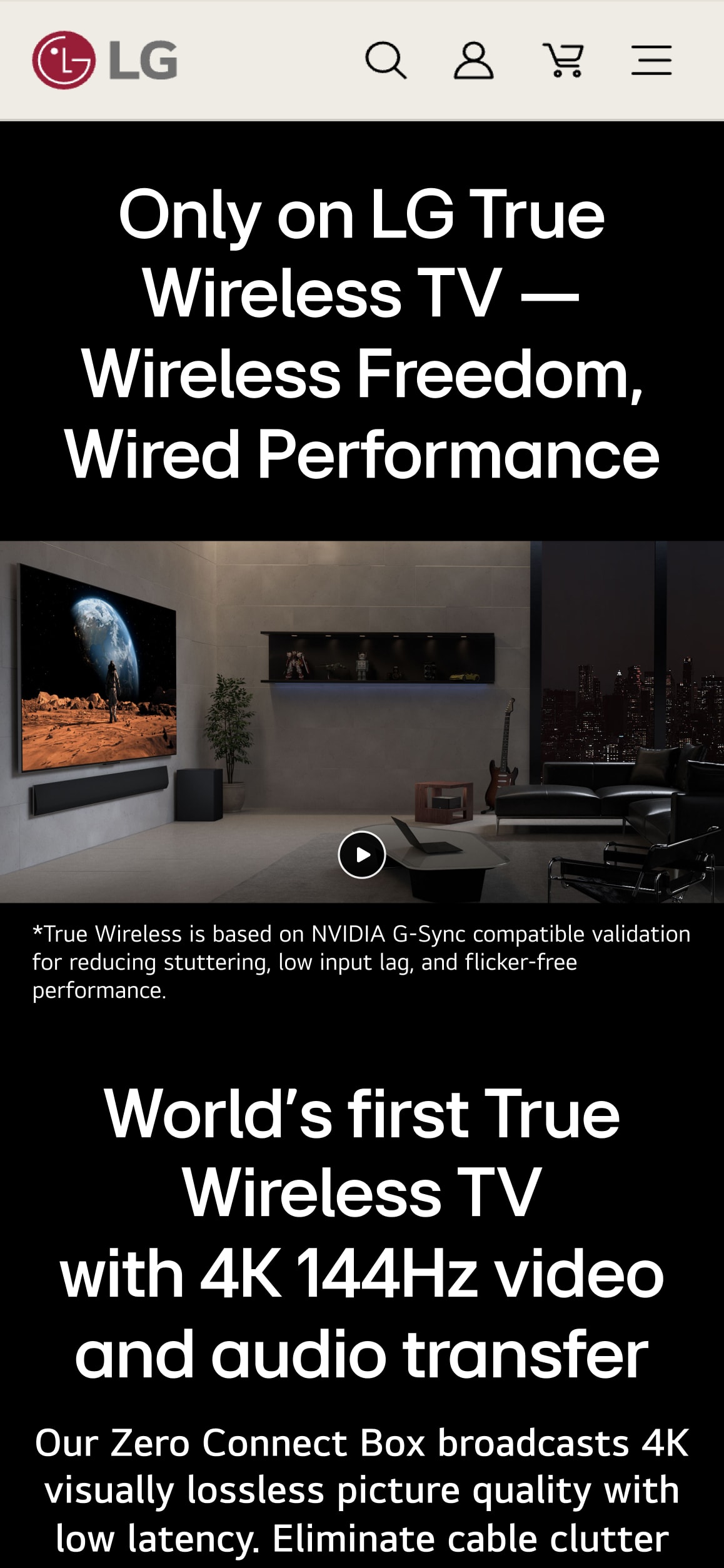
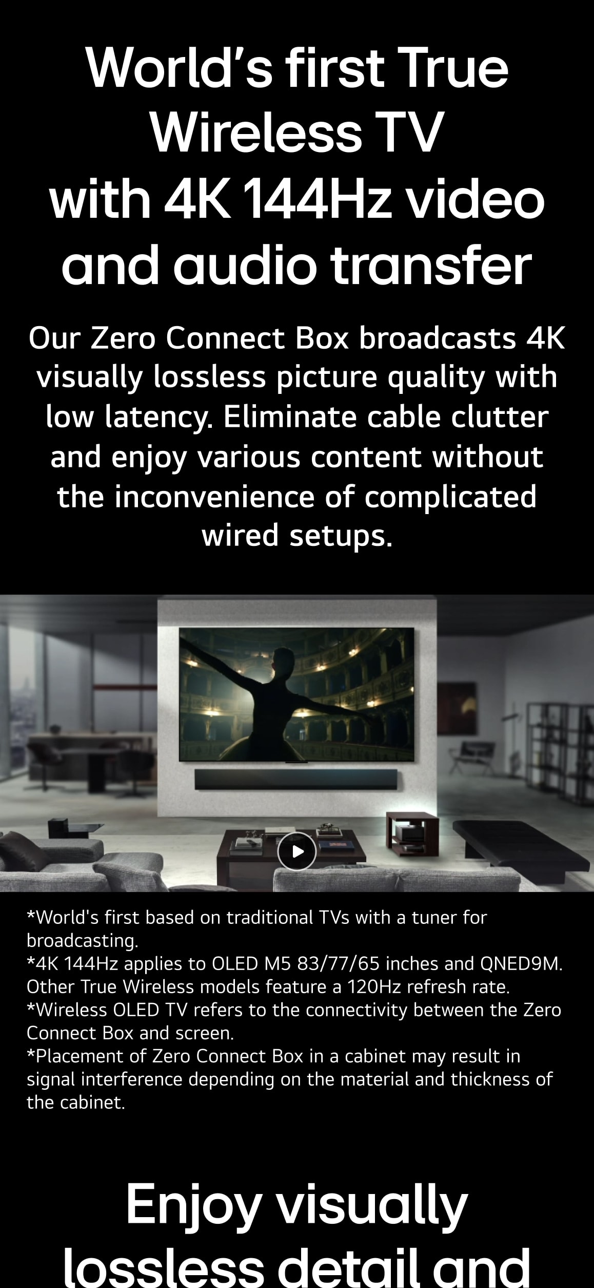
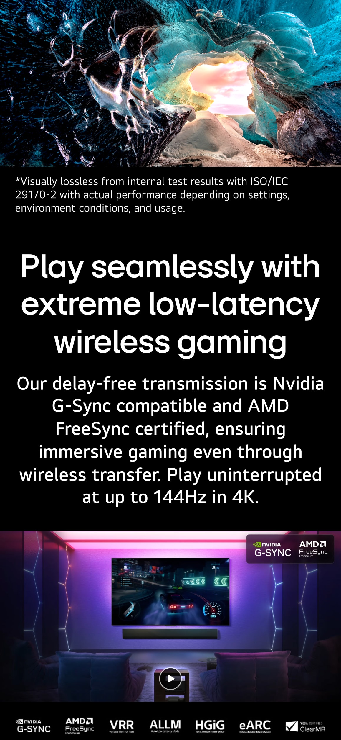
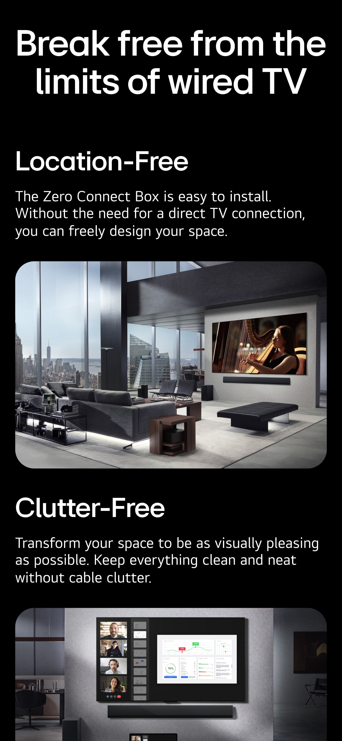
In contrast, the True Wireless Microsite takes a focused, product-led approach—presenting LG’s completely wireless TV as a redefinition of what a display can be. With bold claims like 4K 144Hz video and audio transmission, ultra-low latency gaming, and the flush-fit Zero Connect Box, the content shifts attention from technical detail to real-world freedom: freedom from wires, from placement limitations, from compromise. Both microsites aim to do more than explain technology—they shape how it feels. By framing innovation as a personal, emotional benefit rather than a technical concept, they reinforce LG’s identity as a brand that builds meaningful, human-centered progress.
한편, True Wireless 마이크로사이트는 “세상에서 가장 완전한 무선 TV”라는 포지셔닝을 기반으로, 유선 TV가 지닌 모든 한계를 제거한 새로운 사용자 경험을 설계하는 데 집중합니다. 4K 144Hz 영상/오디오 무선 전송, 초저지연 게이밍 환경, Zero Connect Box로 구현한 매립형 설치 등 구체적인 기술적 성과를 중심으로, 공간의 자유와 기능의 완성도가 어떻게 공존하는지를 직관적인 구조와 영상 중심의 콘텐츠로 설계했습니다. 두 마이크로사이트 모두 LG의 기술력 자체를 강조하기보다, “그 기술이 사용자에게 어떤 감각과 삶의 변화를 제공하는가”에 대한 브랜드 관점의 서사를 강조합니다. 단순한 제품 소개를 넘어, LG의 혁신이 얼마나 인간 중심적으로 진화하고 있는지를 설계와 내러티브로 입증한 콘텐츠입니다.
Credits
Project ManagementKim WheekyoungPark JihyeOh GaramProject DirectionLee MyungjooLee HyelimLim InseongPlanningKim NahyunKim YongjinPark GeumnaPark SeoyeongPark SoyeonBae HeeraYoon SubinLee YujinLee YunmiJung MoonheeCho HyeonjeongCD+DesignLee SaetbyeolJo HyewonDesign LeadGim DamiKim SoheeYeon AhyoungLee AhhyunLim EunjungDesignKwon JungheeKwon TaeriKim DabinKim DohyeonKim MinyoungNa HeesuRhu HeejinPark SeongeunSung SuyeonShin HeejeongWu SusungChoi DainTak YeseulHwang YejinHwang JinhoEnglish CopywritingBym BuhainJennifer Choung3D Motion DesignKim TaeiShin SowonJoo SeunghyukChoi JiwonHa YohanHwang Juseong