Brand
Let’s Play Learning, Kidsworld
- Client
- LG U+
- Category
- Brand
- Services
- Brand Strategy, Brand Identity
- Scope
- Brand Experience, Brand Guidelines, Brand Identity, Brand Strategy, Art Direction, Visual Language
- Year
- 2022
Kidsworld is a joyful OTT platform service for children that pursues both fun and learning. With its renewed launch as an independent OTT platform from LG Uplus in 2022, we wanted to establish our presence as a leading platform for children.
Our goal was to create a differentiated brand identity that went beyond the typical image of cute and friendly kids service. We wanted to build an identity that left a bold and lasting impression and deliver the message that Kidsworld is a joyful place where you grow by learning.
세상에 없던 키즈 OTT, 아이들나라 아이들나라는 LG U+ 산하 브랜드의 전신에서 독자적인 키즈 OTT 서비스로 다시 태어나, 세상에 없던 키즈 플랫폼으로서의 입지를 개척하고자 하였습니다. 이에 디파이는 기존 U+ 아이들나라와 차별화된 전략을 통해 새로운 브랜드 아이덴티티를 개발하였습니다. ‘키즈’ 서비스가 대변하는 친근하고 아기자기한 인상을 넘어 아이들나라는 사용자에게 오래도록 기억에 남는 플랫폼 서비스가 될 수 있도록 리뉴얼 하는 것이 우리의 가장 큰 목표였습니다. 이에 아이들나라만이 줄 수 있는 ‘즐거운’ 인상과 ‘배움을 통한 깨우침’을 담아 볼드하고 명료한 브랜드 아이덴티티를 재정립할 수 있었습니다.
The Joyful Discovery of Learning
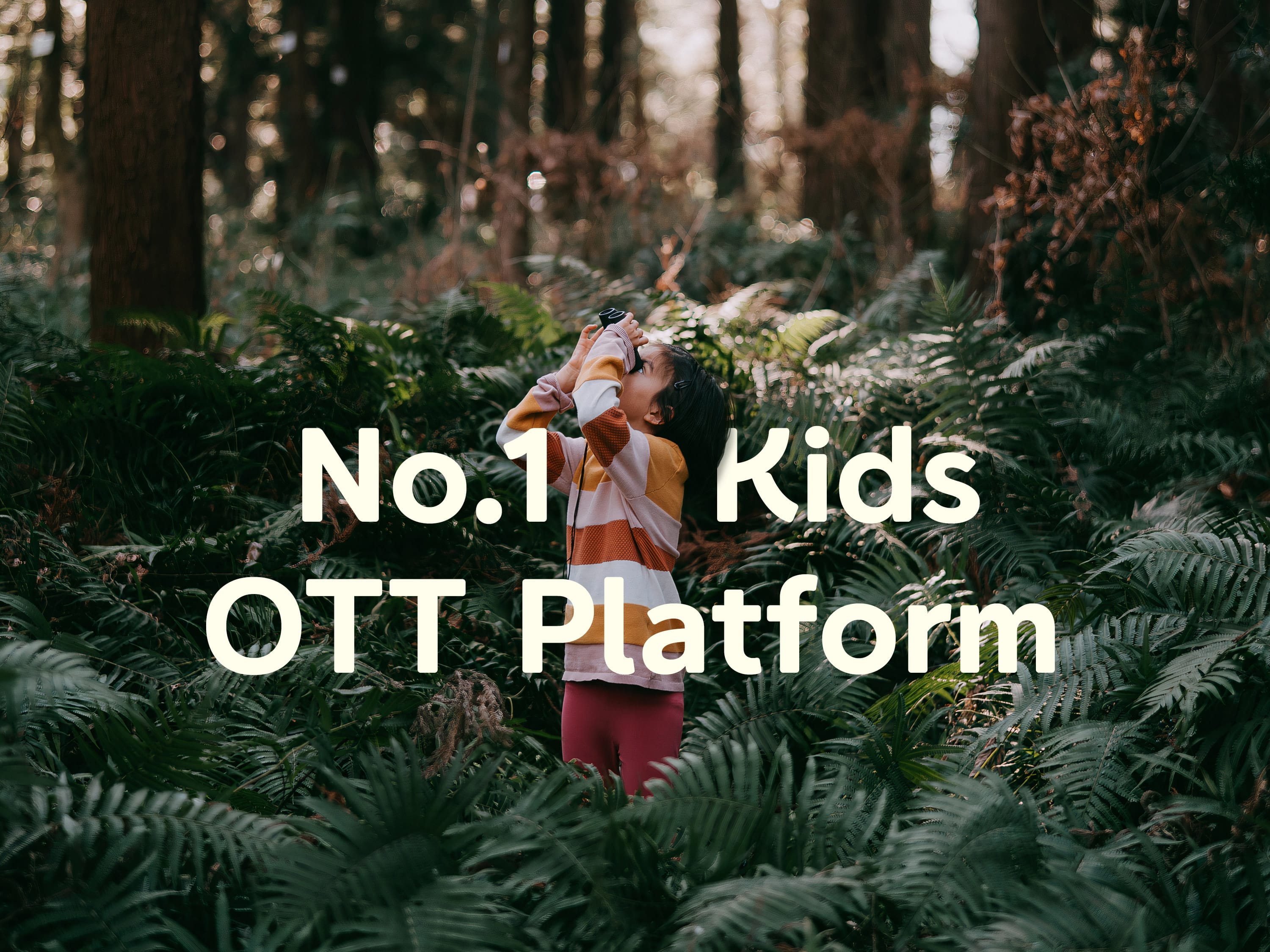
Kidsworld helps children learn how to think creatively and helps them build worlds of imagination. By making learning fun, Kids World provides the foundation for children to continue learning as they grow.
배움 속의 즐겨운 발견. 아이들나라는 아이들의 다양한 사고와 감정속에 잠재되어 있는 상상력의 세계를 추구합니다. 더불어 재미있는 학습과 배움을 통해 아이가 깨우치는 과정에서 얻는 유익한 가치를 지향합니다.
Content Pot for Kids Platform
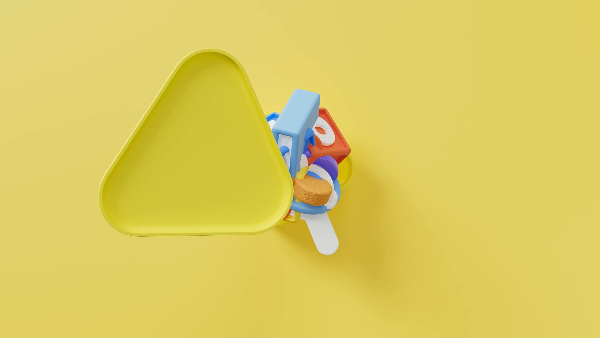
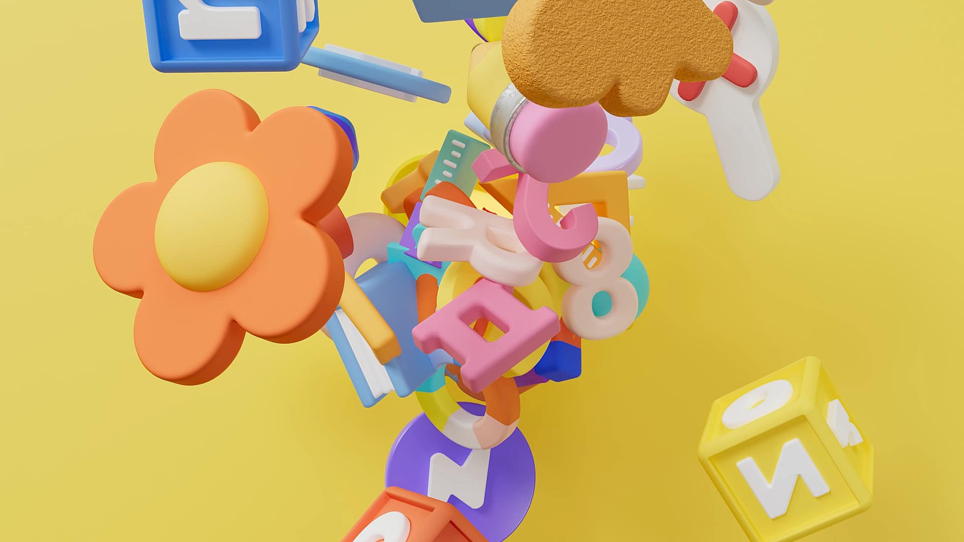
Kidsworld offers a wide range of content specially made for children and we reflected this wealth of content in branding the identity of the platform.
키즈 콘텐츠를 아이들나라에 담다. 다양한 키즈 콘텐츠를 유기적으로 담는 ‘그릇’으로서 키즈 콘텐츠 플랫폼의 정체성을 아이들나라 브랜드 아이덴티티에 담아내었습니다.
Content Pot for Kids Platform
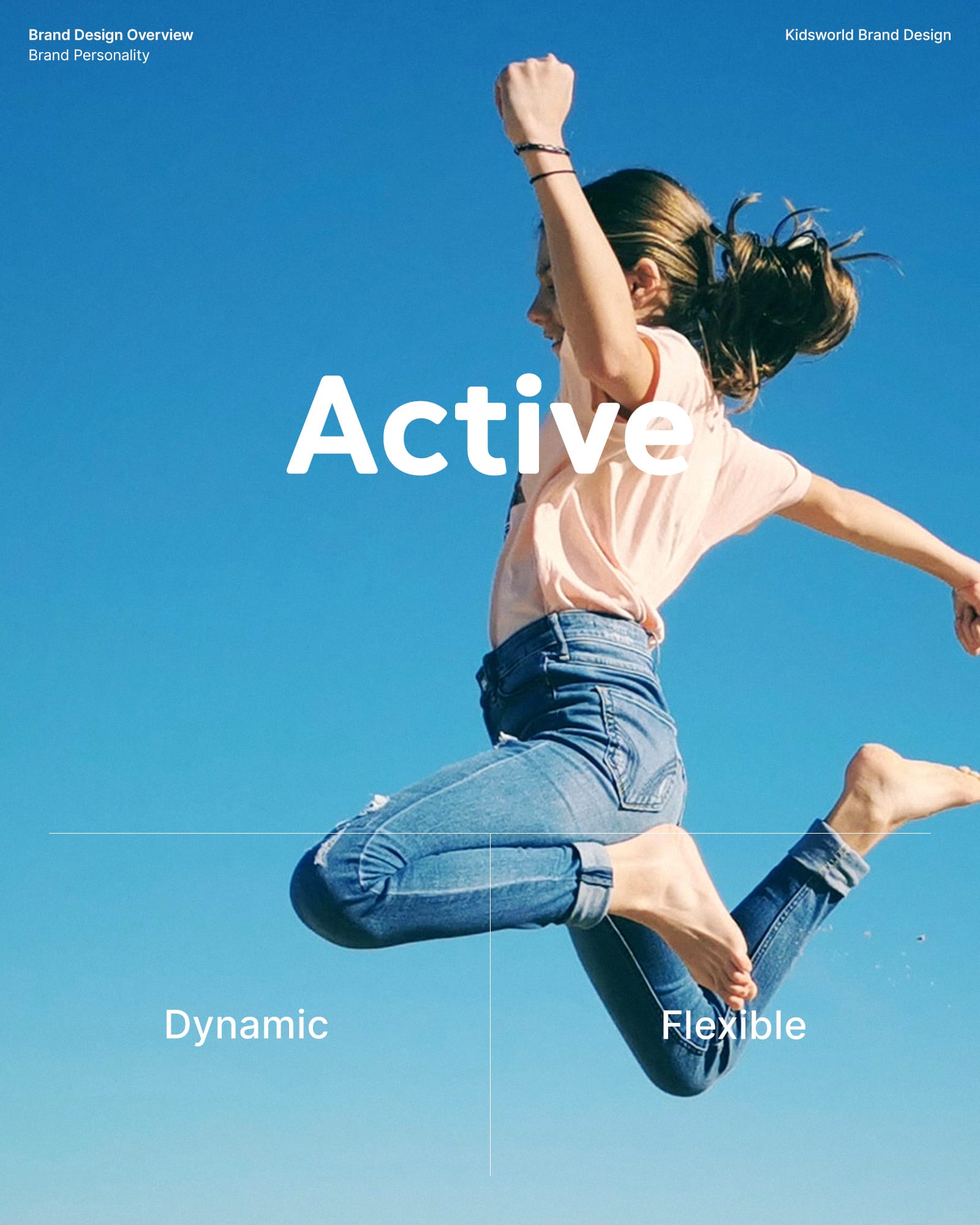
We gave Kidsworld its own distinct identity in a way that still shared the key values of Uplus. By creating an active, bold and colorful tone of voice, we ensured consistency in branded communications.
아이들나라 ABC T&M. U+의 핵심가치를 대의적으로 계승하되, 아이들나라만의 고유한 정신을 담아 Active, Bold, Colorful T&M로서 일관된 브랜드 커뮤니케이션을 유지할 수 있도록 제작하였습니다.
An Immersive Experience for Children and Parents
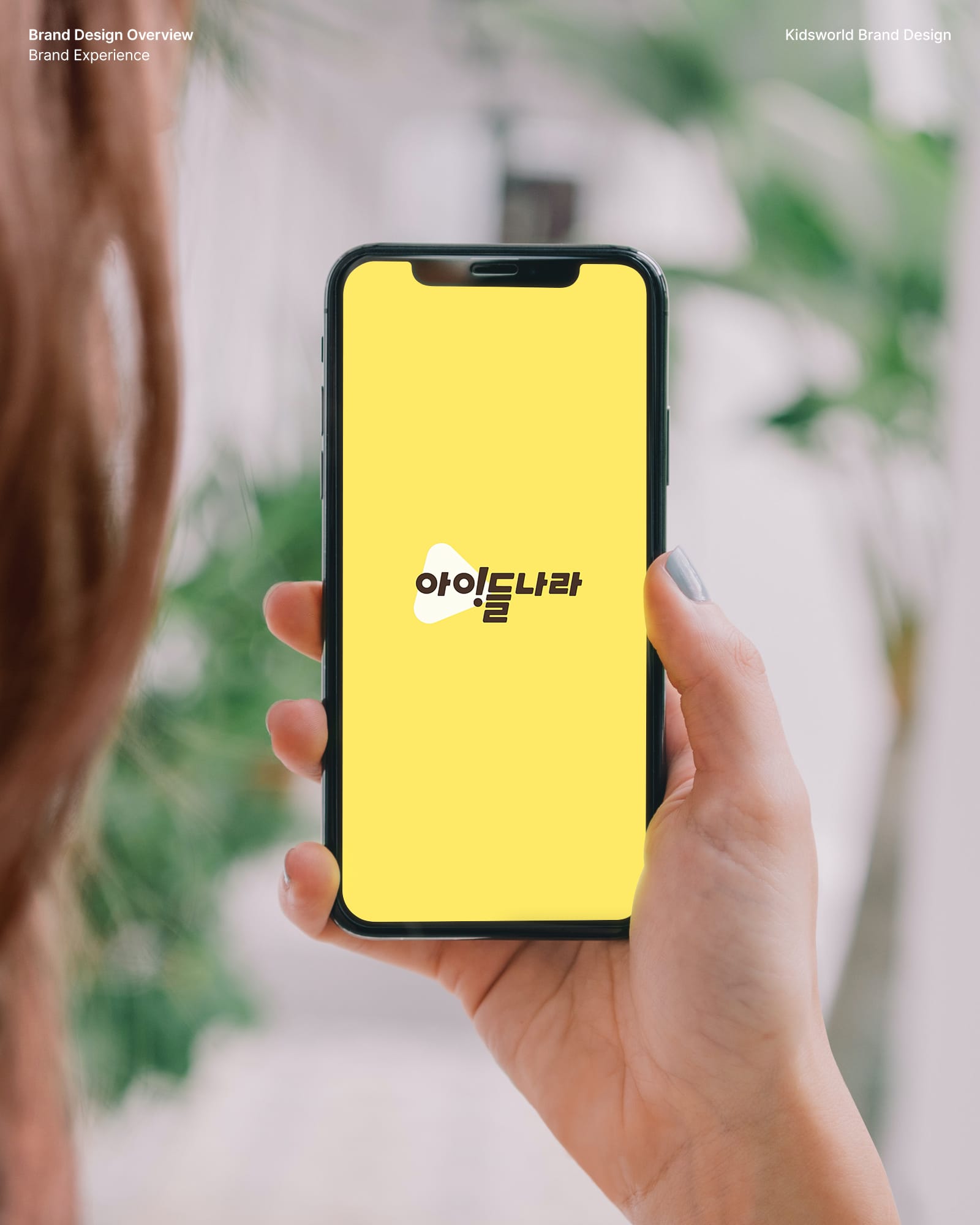
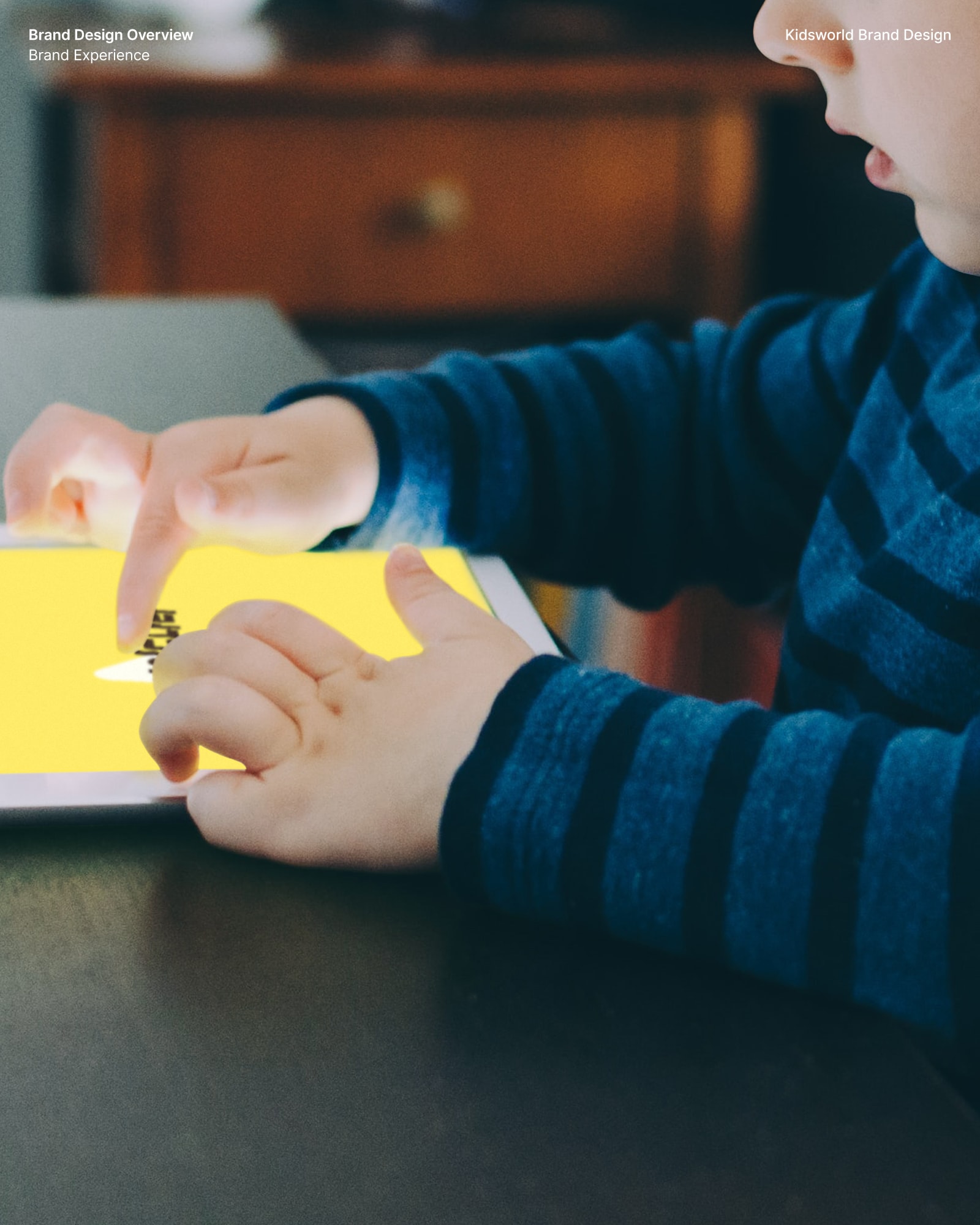
Children are always ready to have fun. At the same time, they’re always hungry to learn. By providing a platform for them to experience a wide range of content with their parents, children are able to gain positive experiences by finding joy in the act of learning.
부모와 아이가 함께 몰입할 수 있는 경험. 아이들나라는 ‘즐거움’ 뿐만 아니라 ‘유익한 배움’을 통한 선순환을 추구합니다. 부모와 자녀가 함께 콘텐츠를 탐험하며 배우는 과정을 통해 깨우칠 수 있는 계기를 제공하여, 결과적으로 아이들에게 유익한 영향을 줄 수 있습니다.
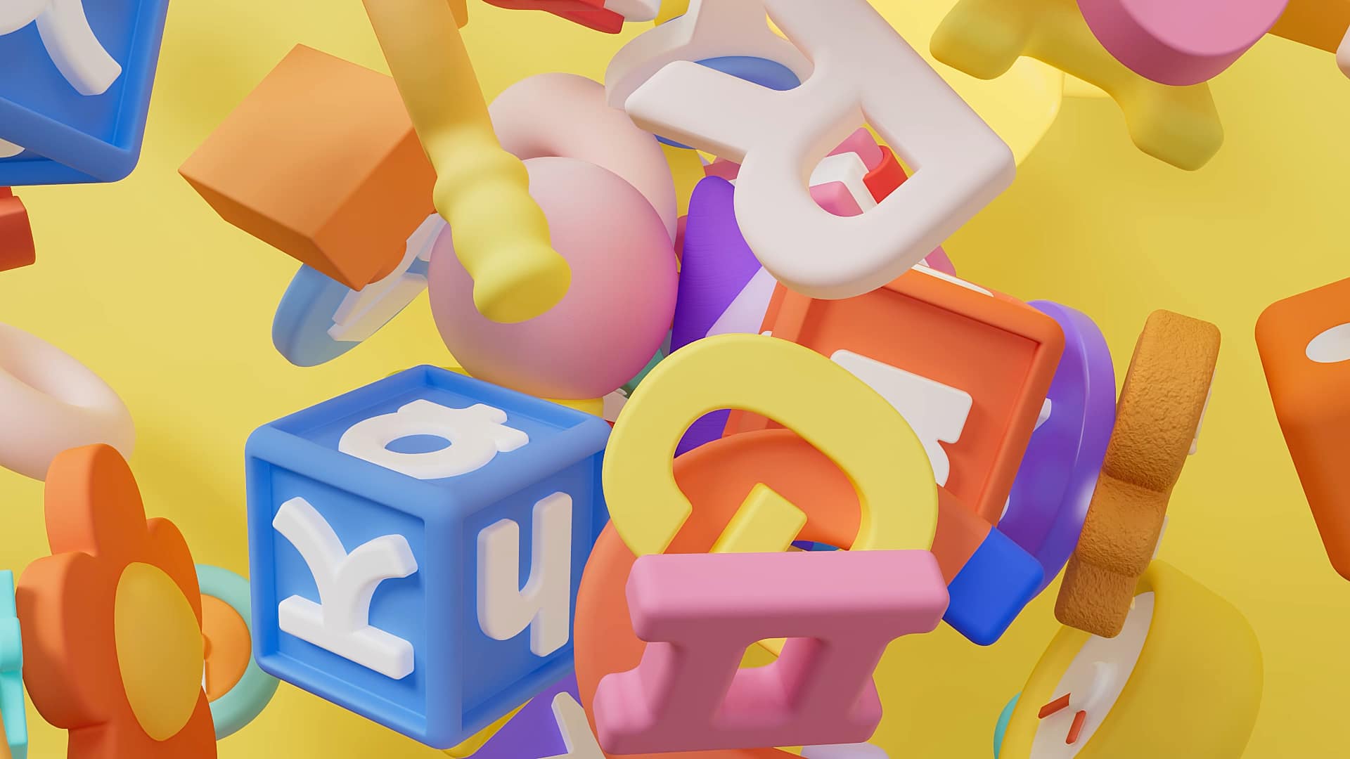
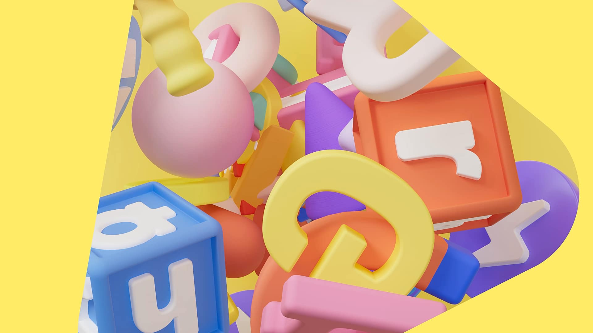
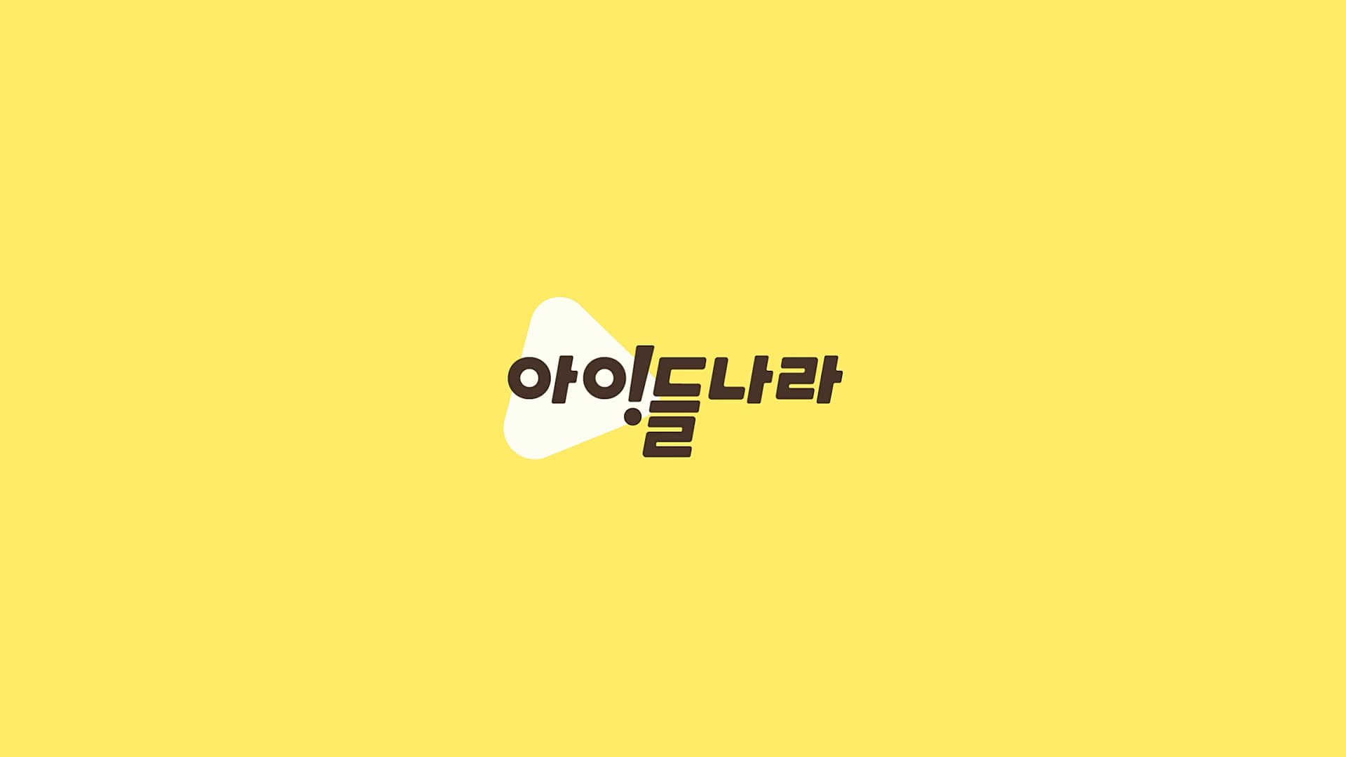
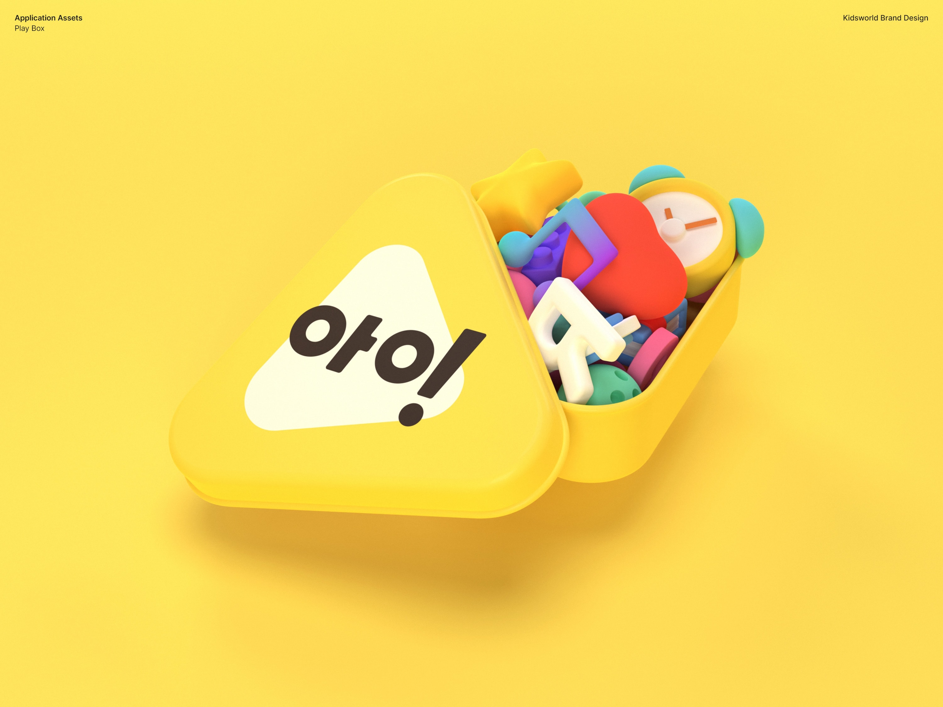
A Playbox of Imagination, Kidsworld
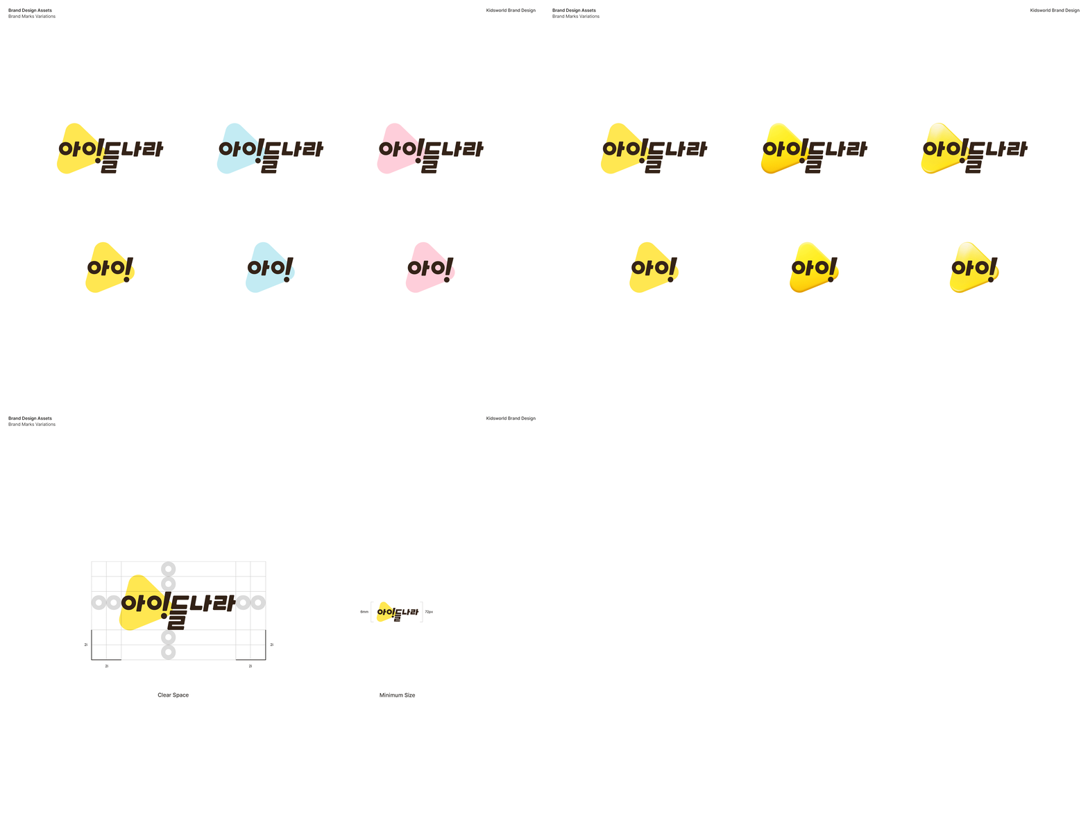
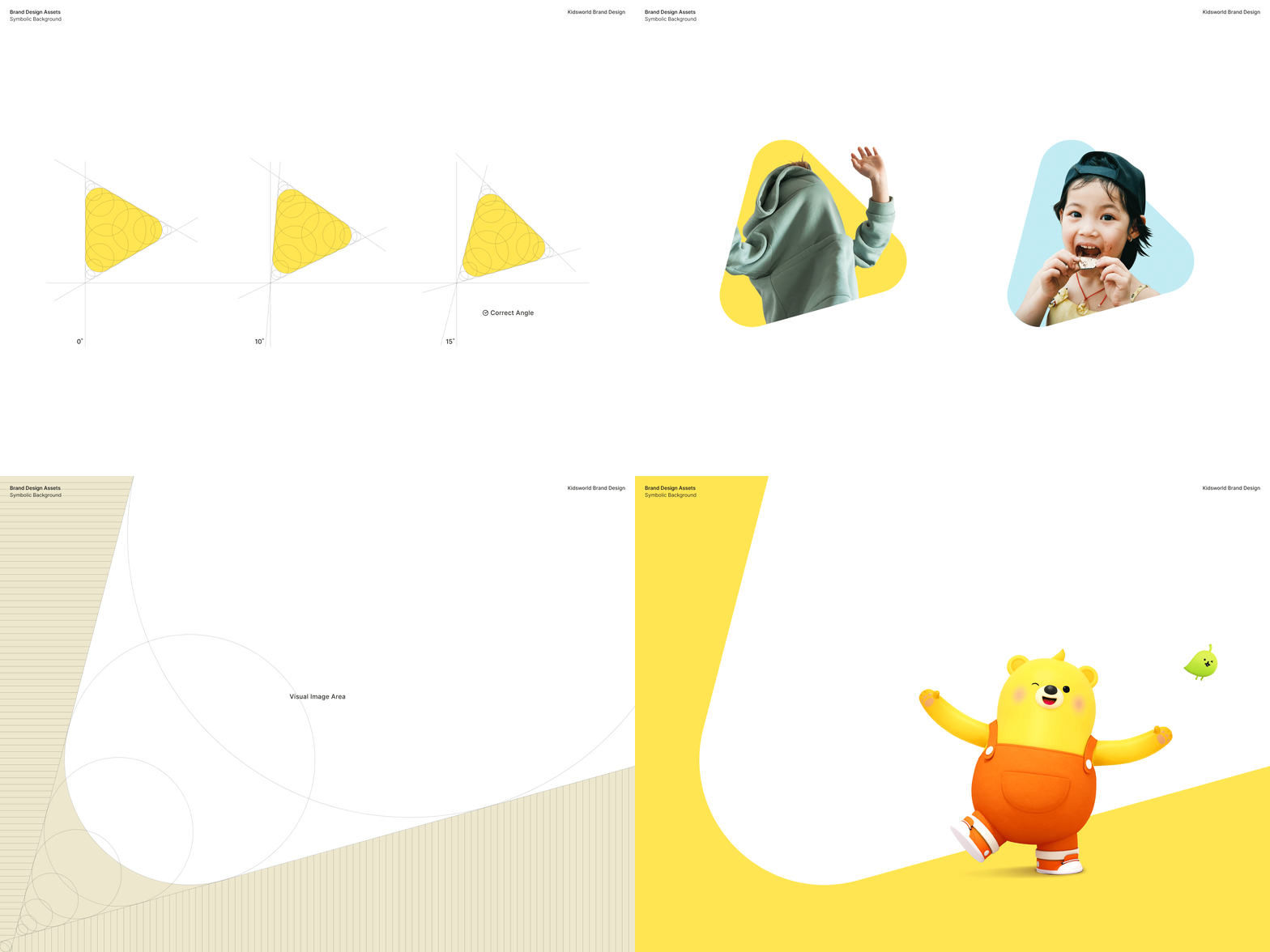
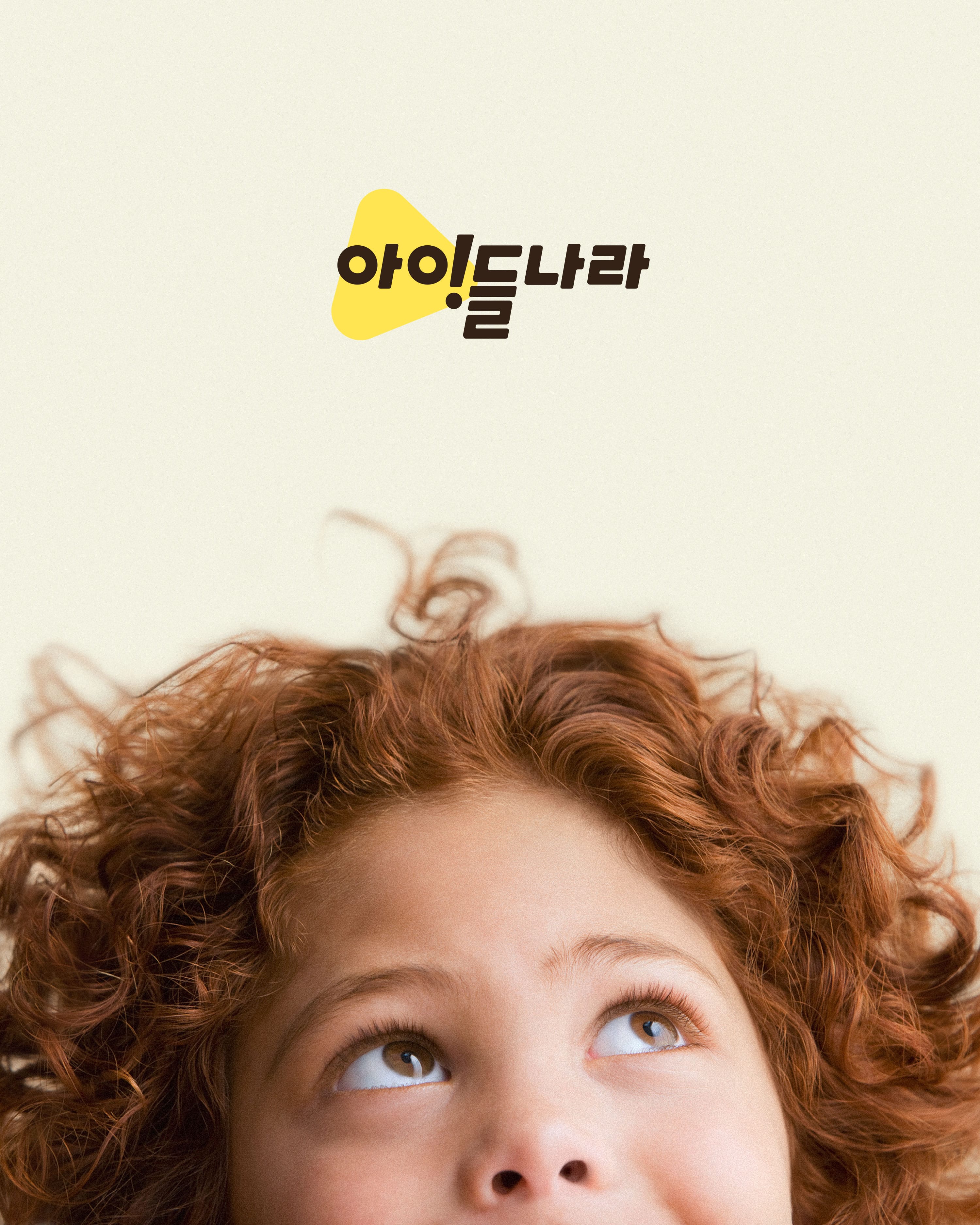
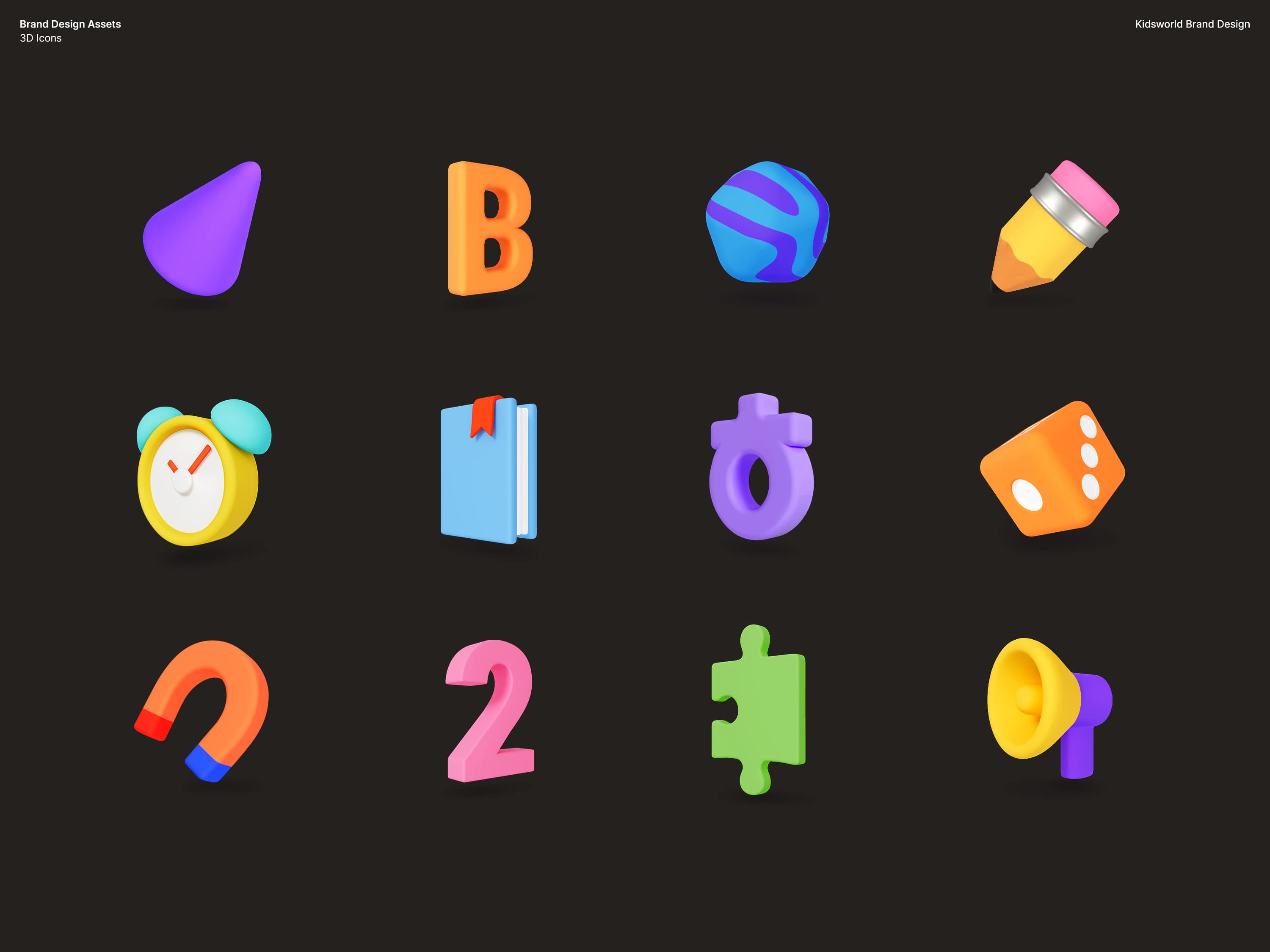
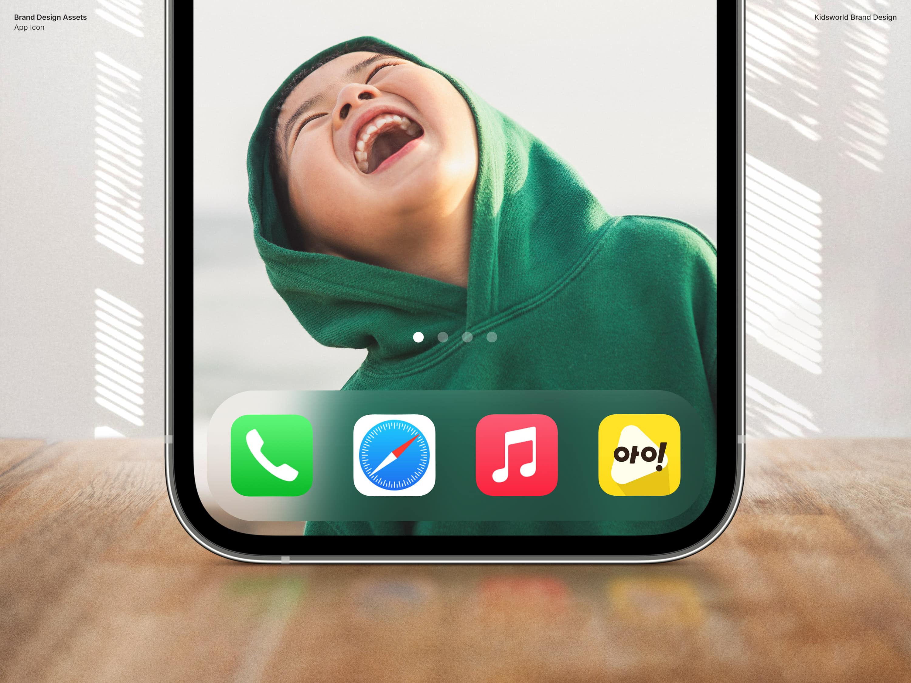
We expressed children’s boundless world of imagination through a concept we call Playbox and used the play button as a visual motif. We also incorporated the exclamation mark to express the process and emotions children go through when they learn as they play.
상상력의 플레이박스, 아이들나라. 아이들에게 잠재된 상상력의 세계를 플레이 박스 = 플레이 버튼에 담아내어 표현하였습니다. 동시에 놀이와 배움을 통해 깨우치는 과정을 감탄형 메시지로서 함의하여 디자인하였습니다.
Kidsworld Core Color Palette
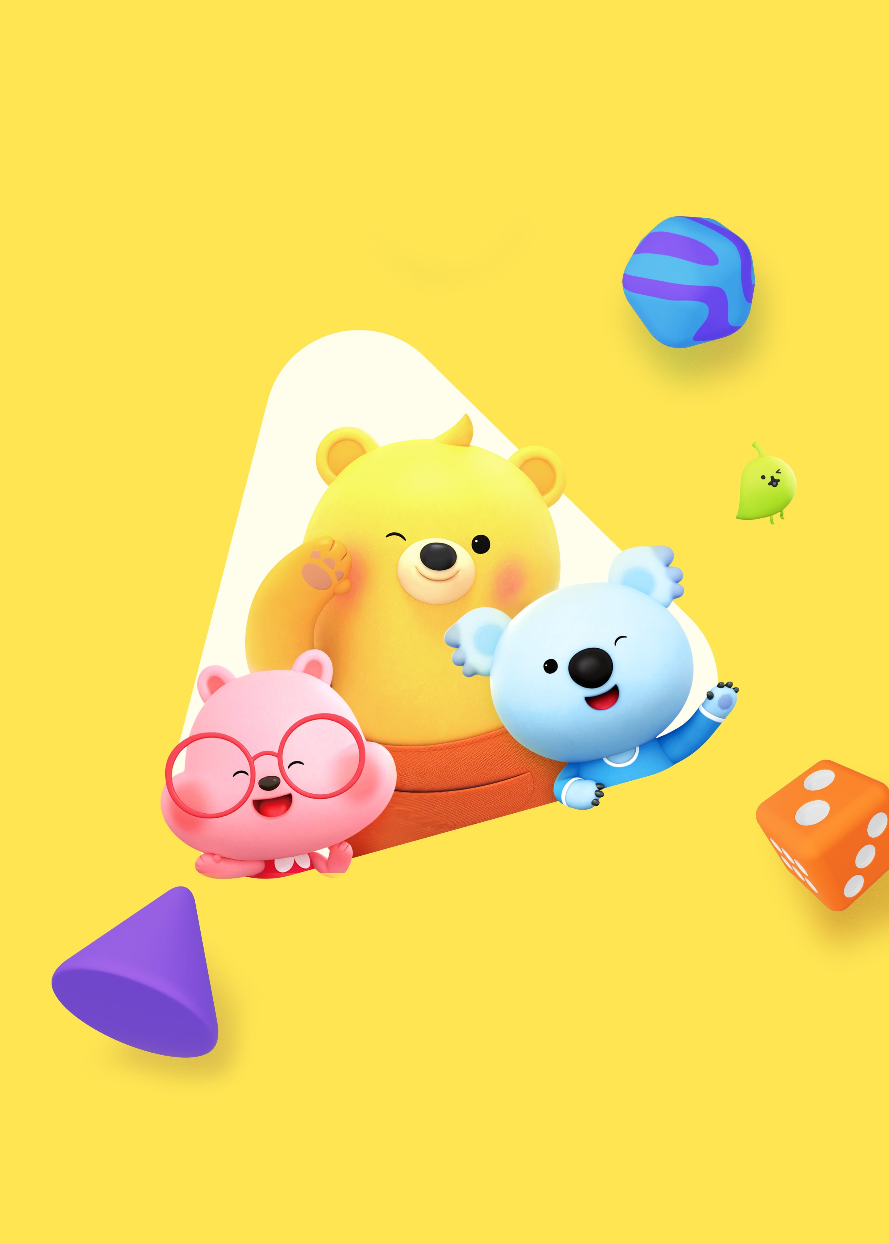
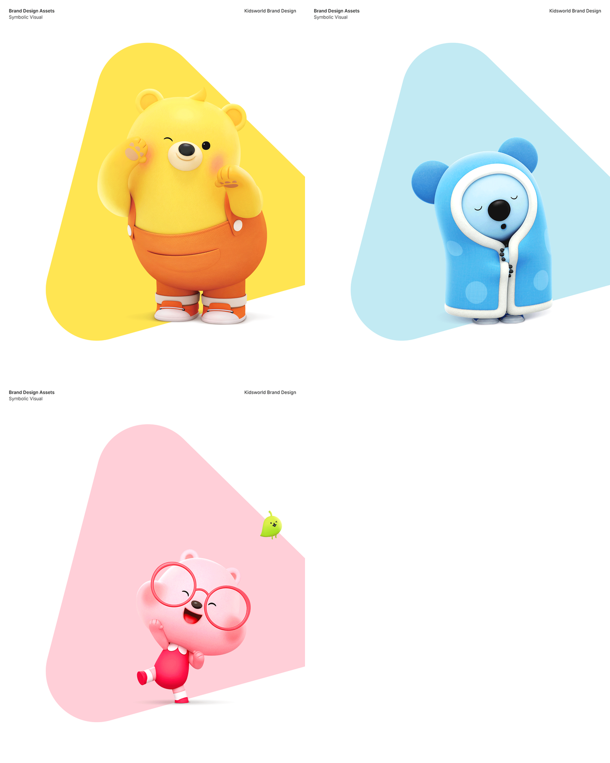
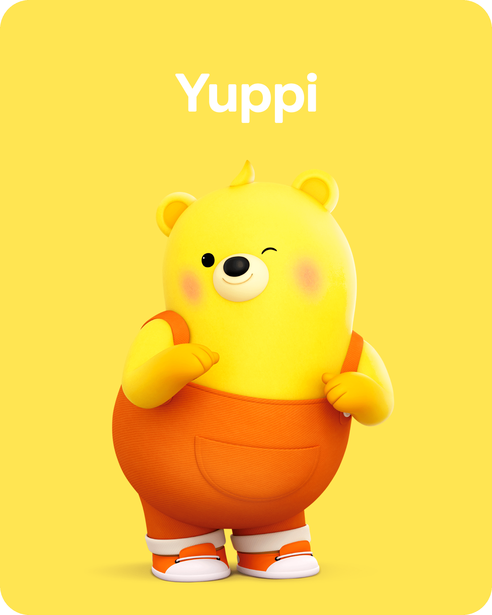
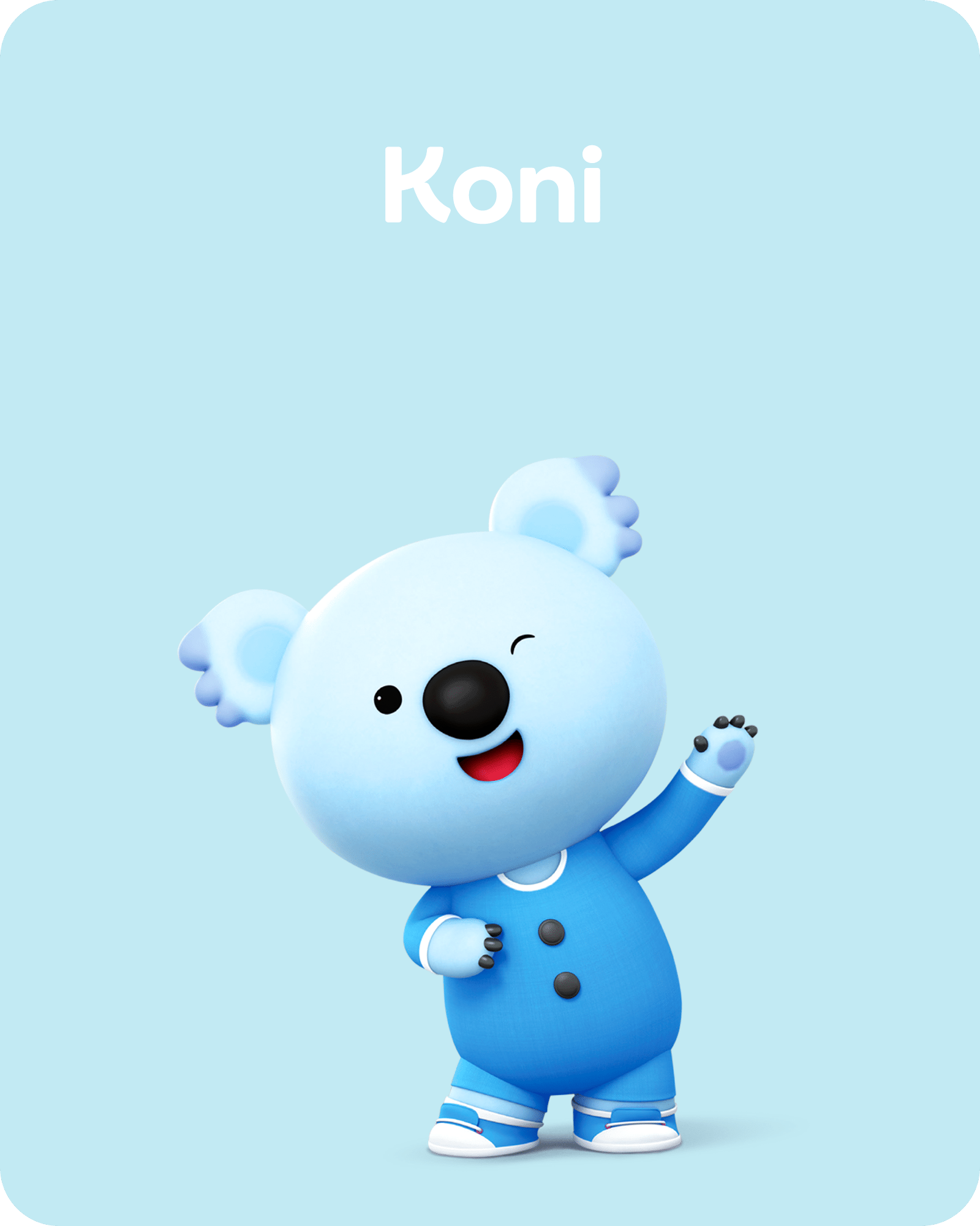
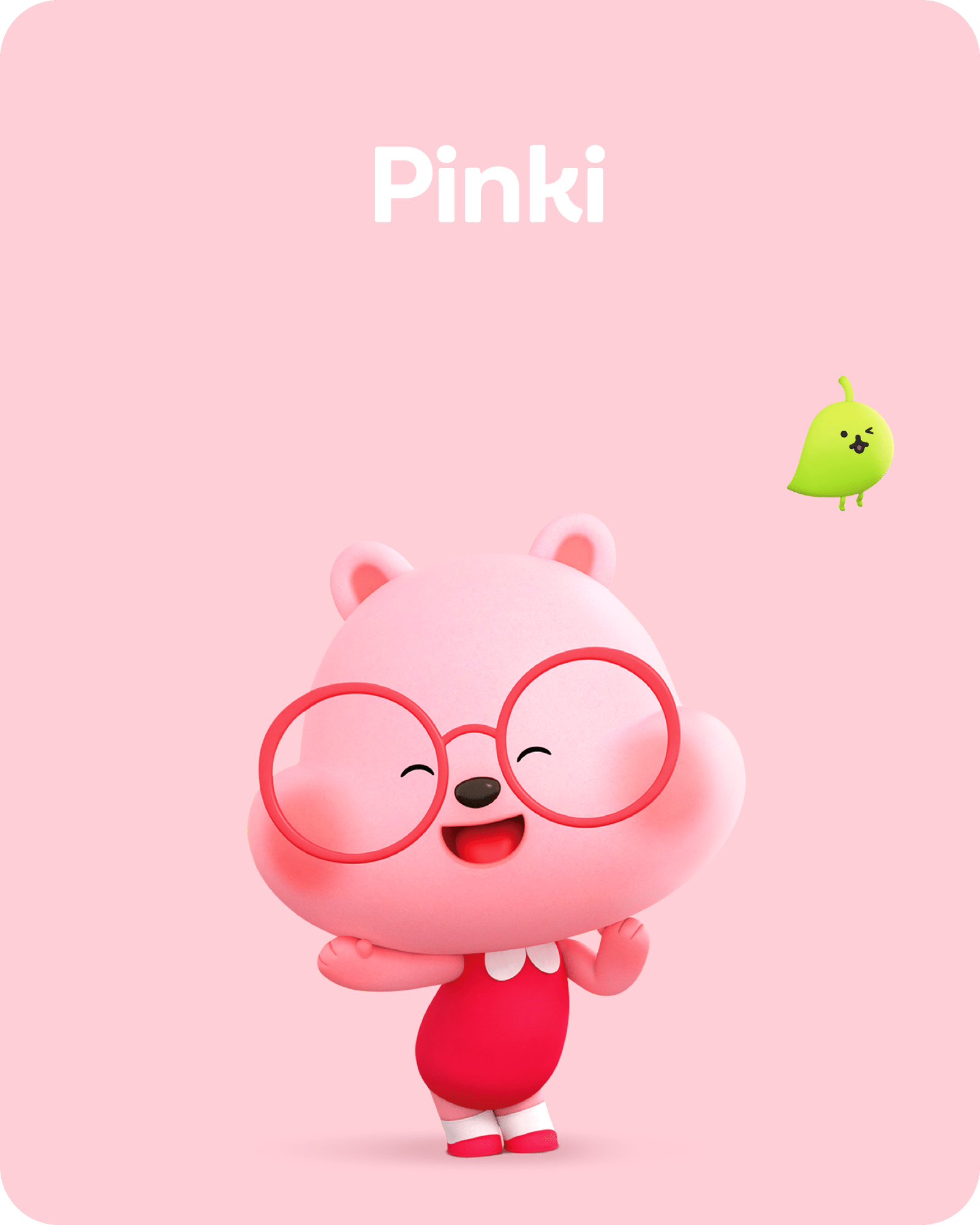
We selected a pastel color palette from the colors of Yuppi and friends characters to convey a lively and bright image. We added black and white to create a balance, creating a full and vibrant brand identity.
아이들나라 코어 컬러 팔레트. 유삐와 친구들 캐릭터가 보유한 컬러군 중 생기있고 밝은 인상을 전달할 수 있는 파스텔 컬러를 선별하여 코어 팔레트로 지정하였습니다. 이와 조화로운 완성도를 이루는 블랙&화이트 컬러를 적용하여 전체적으로 풍부한 색감의 브랜드 아이덴티티를 완성하였습니다.
Typeface and Logo Play that Stands for Children’s Imagination
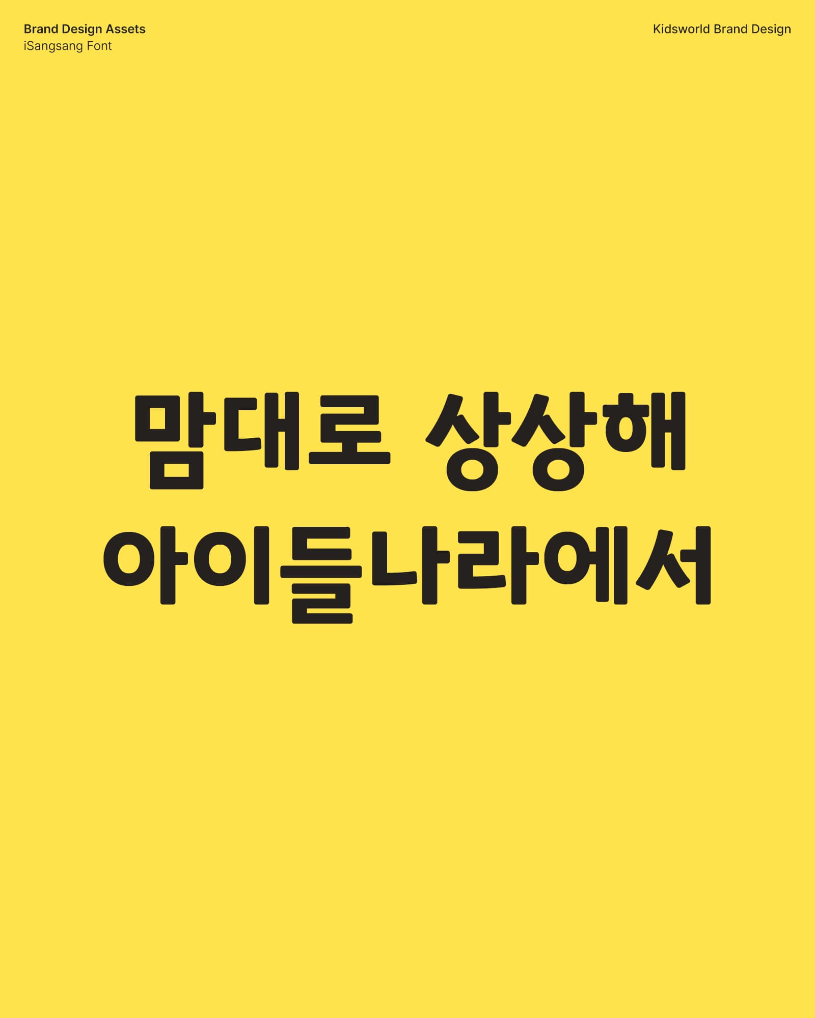
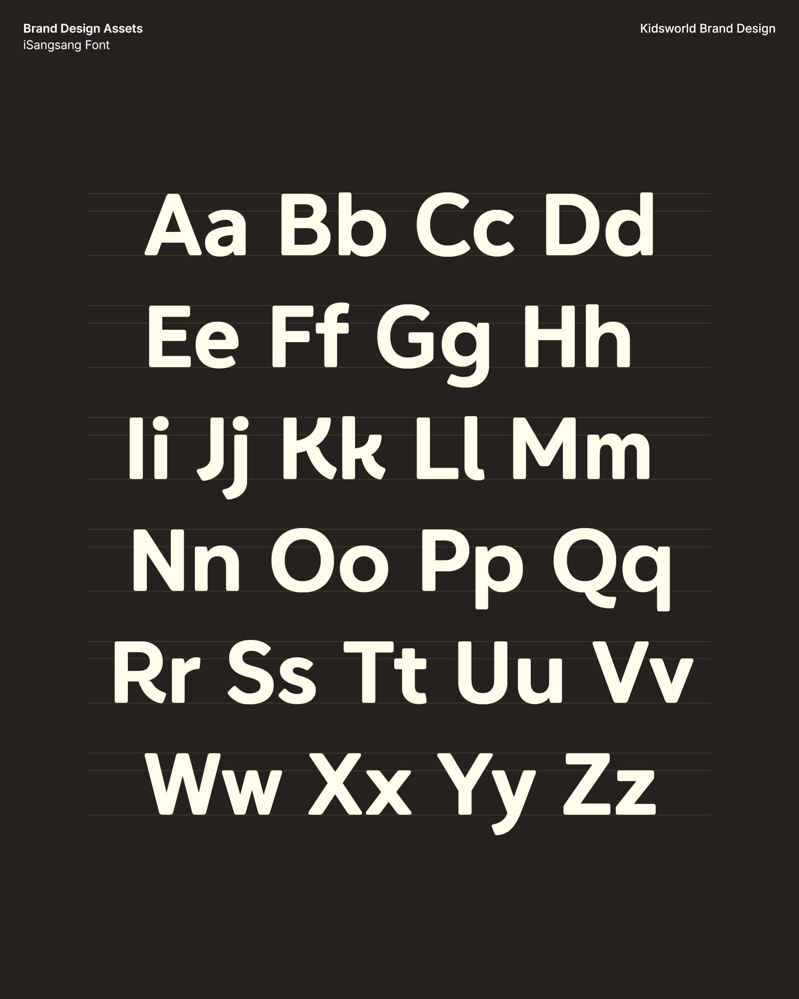
We collaborated with Yoondesign to create a typeface called ‘iSangsang’ to reflect the world of imagination that children can access through Kidsworld. And we collaborated with He Was Born to design an animated version of the logo to highlight the Kidsworld’s concept of ‘Playbox of imagination’ to complete the brand identity.
아이들의 상상력을 자극하는 타입페이스와 오리지널 로고 플레이. 아이들나라 로고타입의 특징을 포괄하는 동시에 아이들의 상상력을 자극할 수 있는 재미있는 인상의 ‘아이상상체’를 윤디자인에서 개발하여 디파이와 협업하였습니다. 이와 함께 ‘상상력의 플레이박스’라는 브랜드 컨셉을 역동적인 모션으로 적용한 로고 플레이를 히워즈본에서 제작하여 브랜드 아이덴티티에 완성도를 높였습니다.

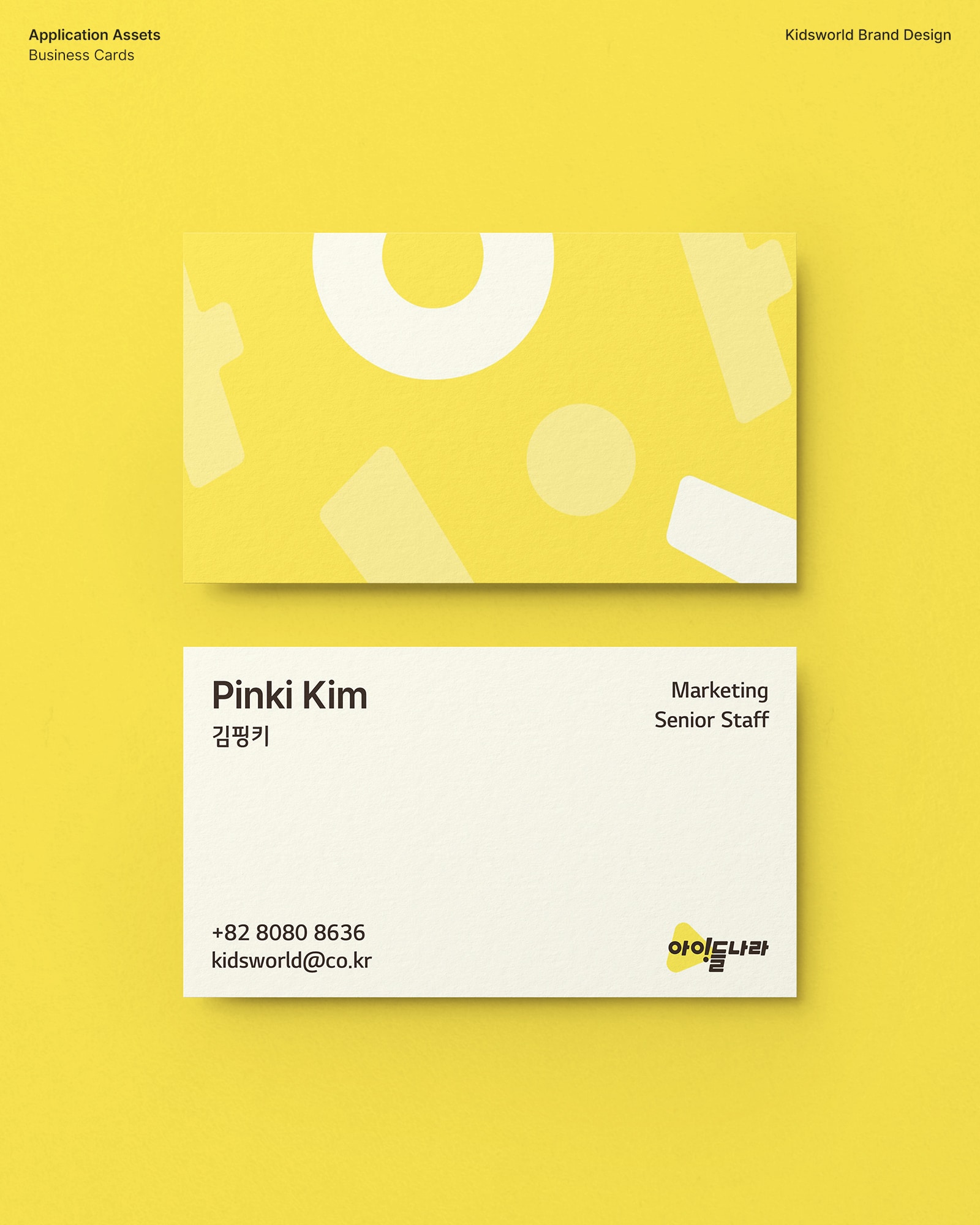
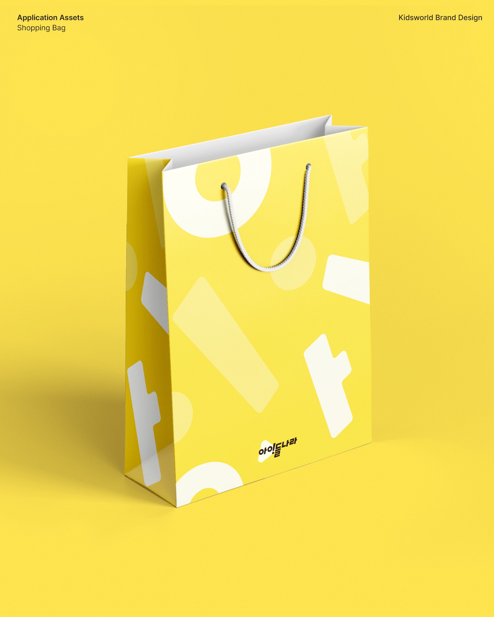
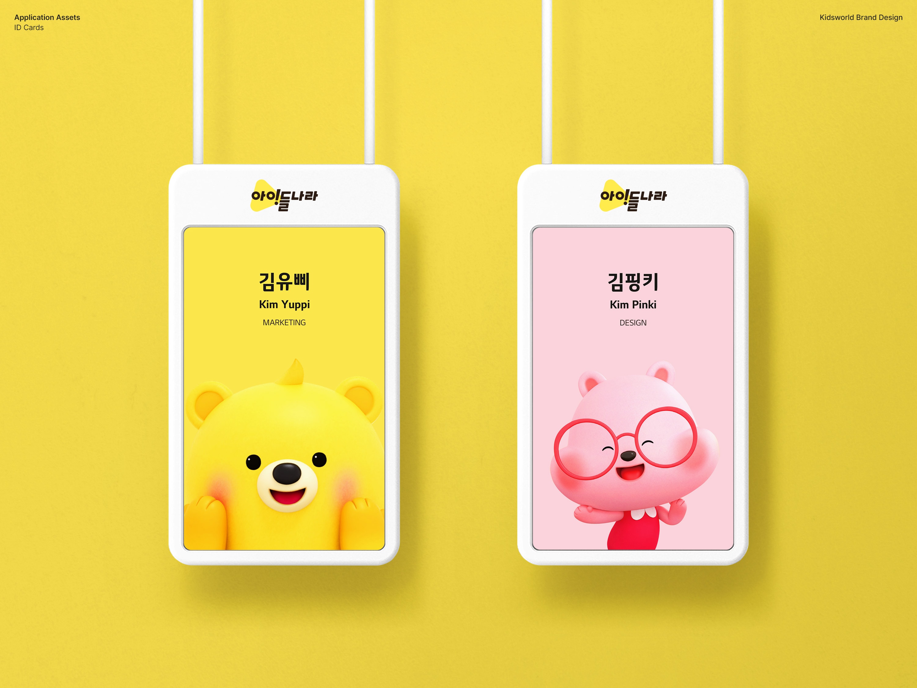
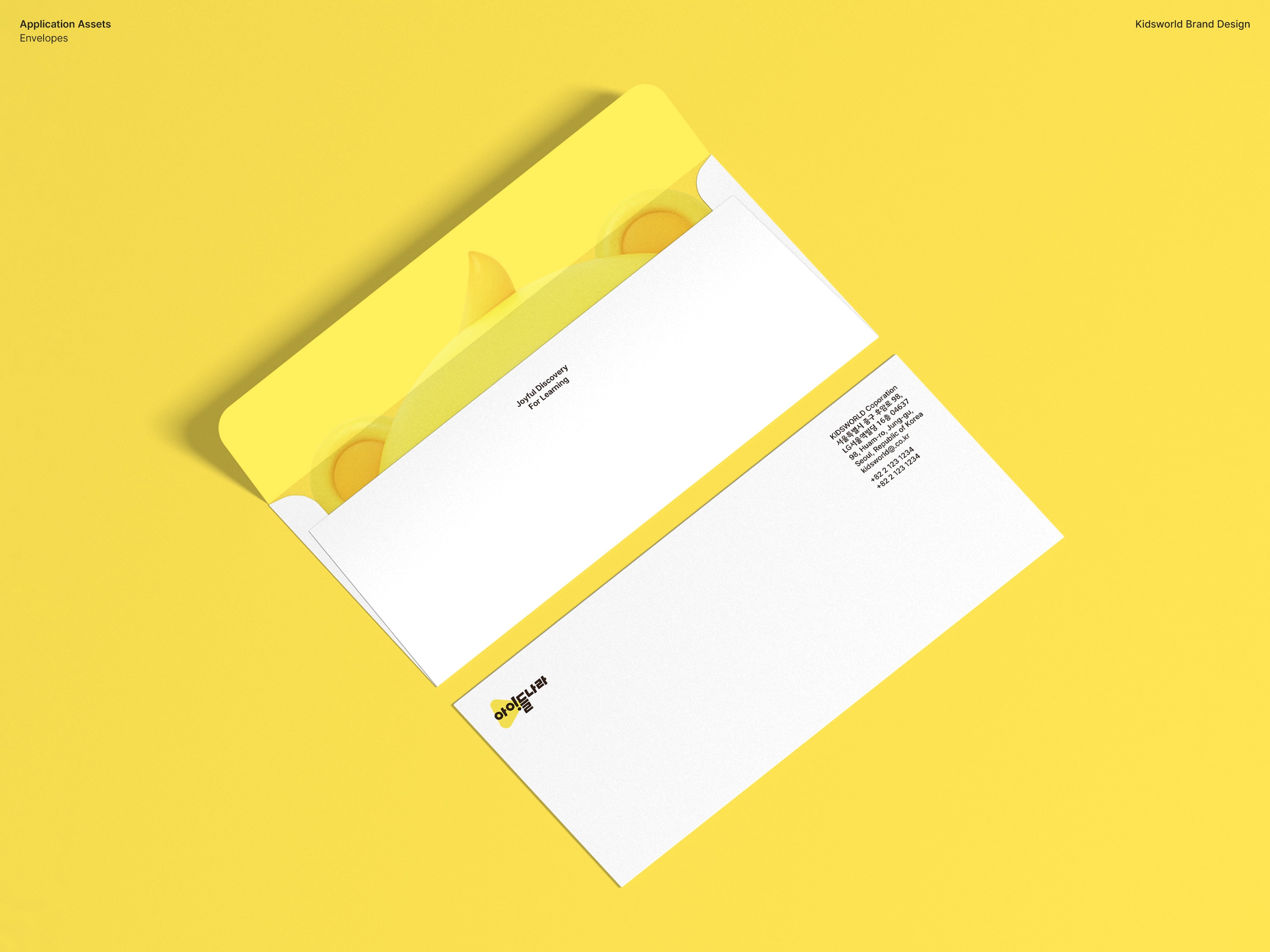
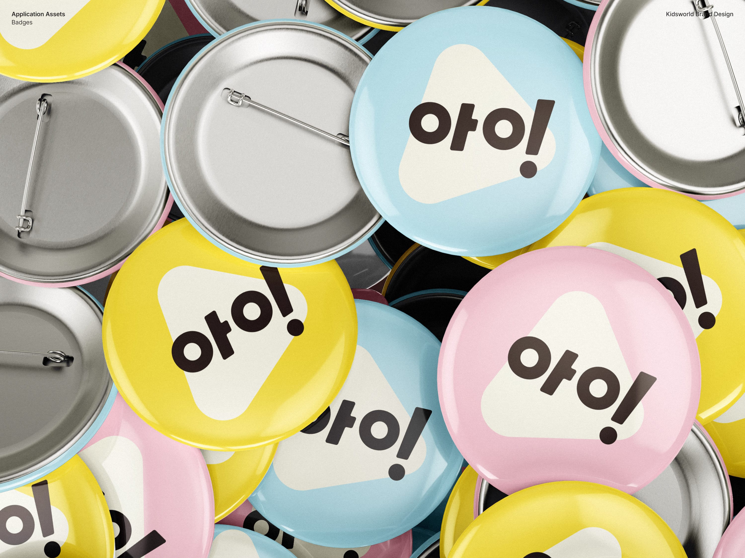
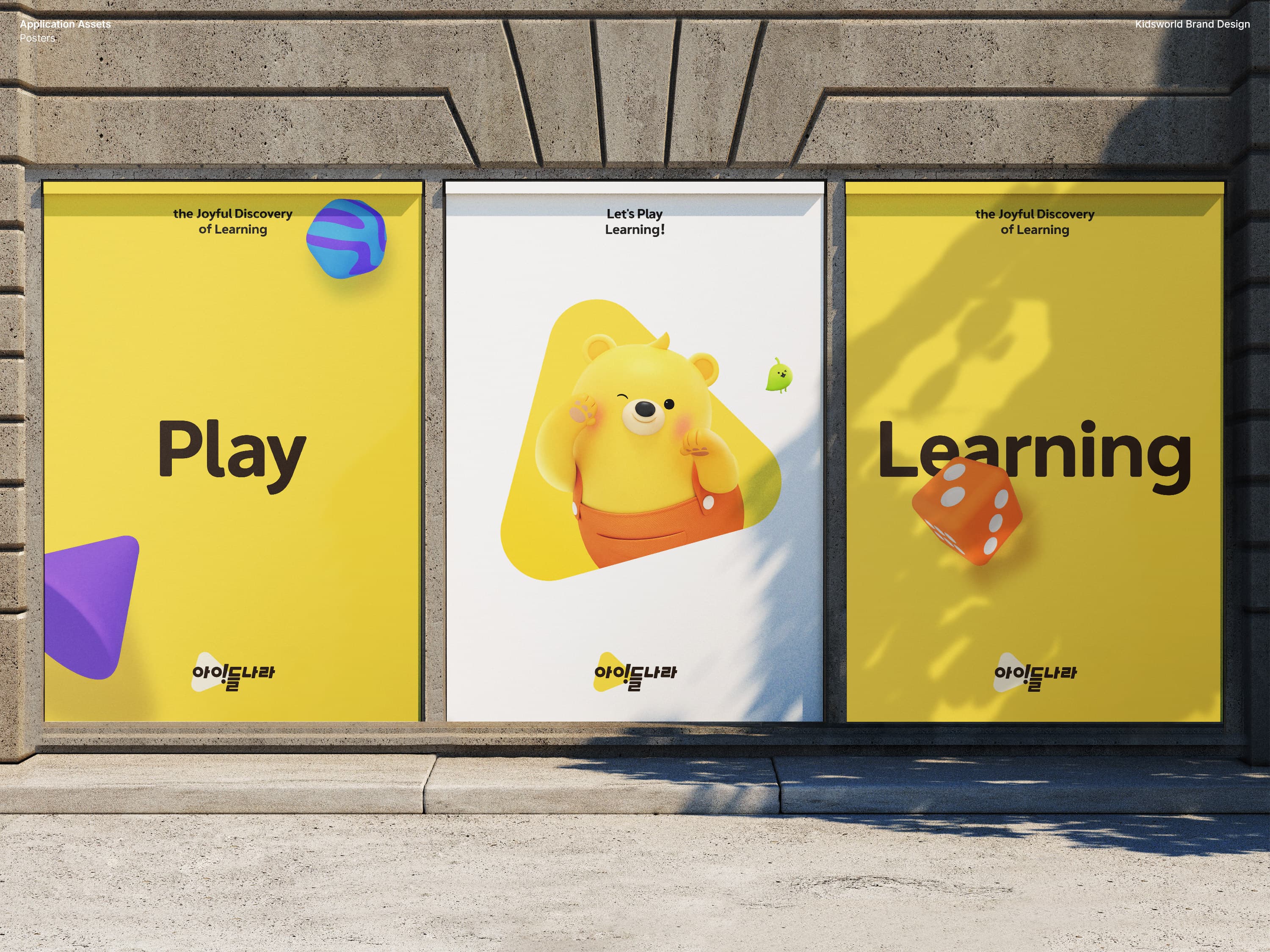
Applications
Credits
Lead AgencyDFYPartner AgencyYOONDESIGNHE WAS BORN
Project ManagementJang SejinCreative DirectionHwang ByungsamAD+DesignChoi BomiDesignLee HyeonseonChae SongyiHan Hyongsub3D Motion DesignHE WAS BORNTypeface DesignYOONDESIGN