Brand & Digital
Introducing the New Super Powerful Note, Samsung Galaxy Note9
- Client
- Samsung Electronics
- Category
- Brand, Digital
- Services
- Brand Identity, Content Design, Film & Motion, Website, UX/UI, Development
- Scope
- Product Branding, UX Strategy, Art Direction, Interactive Style Guide, UI/UX Design, Mobile Site Design, Website Design, English Copywriting, Content Production, 2D Motion Design, 3D Modeling
- Year
- 2018
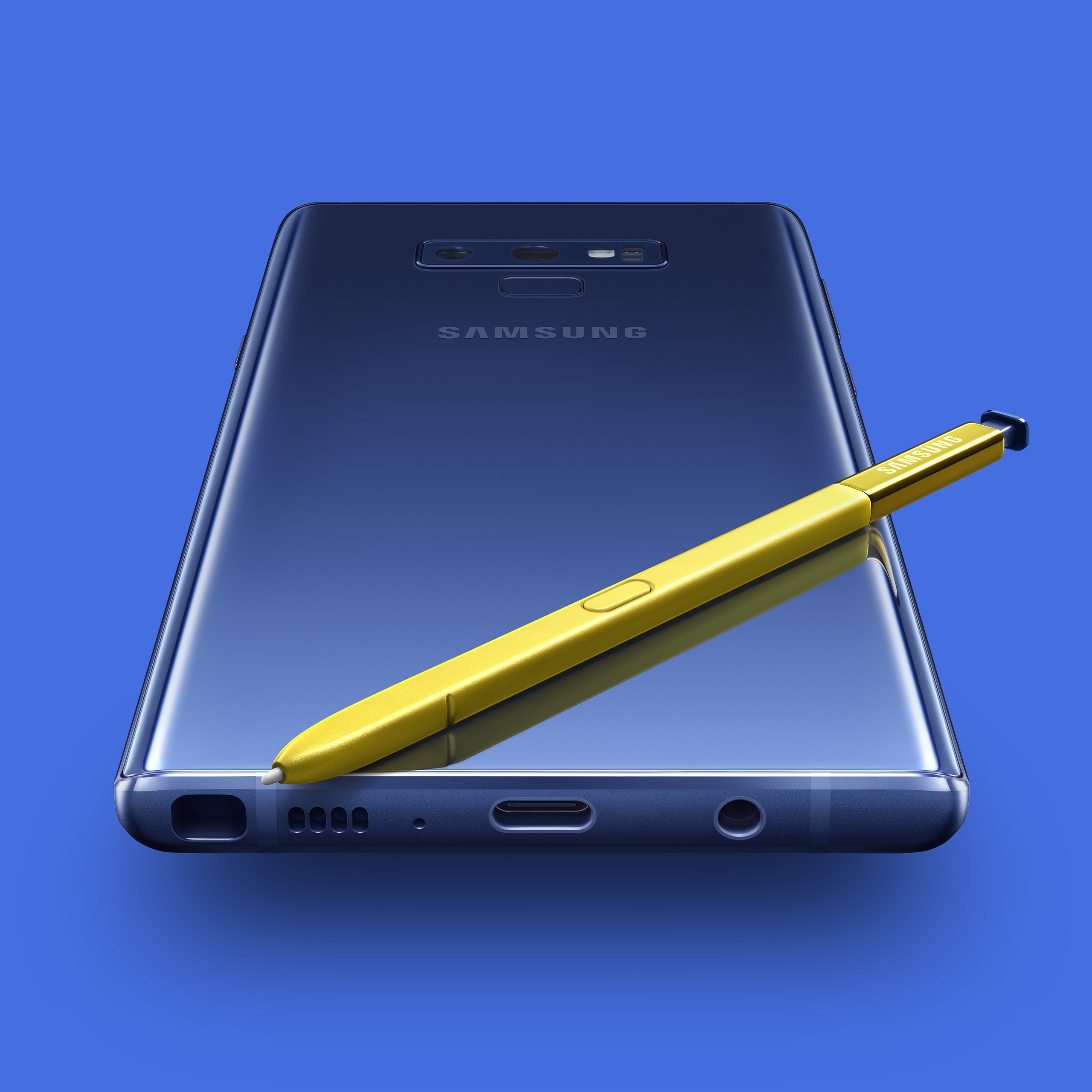
Twice a year, Samsung Electronics launches a new flagship Galaxy phone. During the launch, called UNPACKED, the innovations and features are introduced via marketing sites that roll out to 80 countries. For Galaxy Note9, Samsung wanted to differentiate from the Galaxy S9 and S9+, putting a focus on the hardware upgrades and the S Pen.
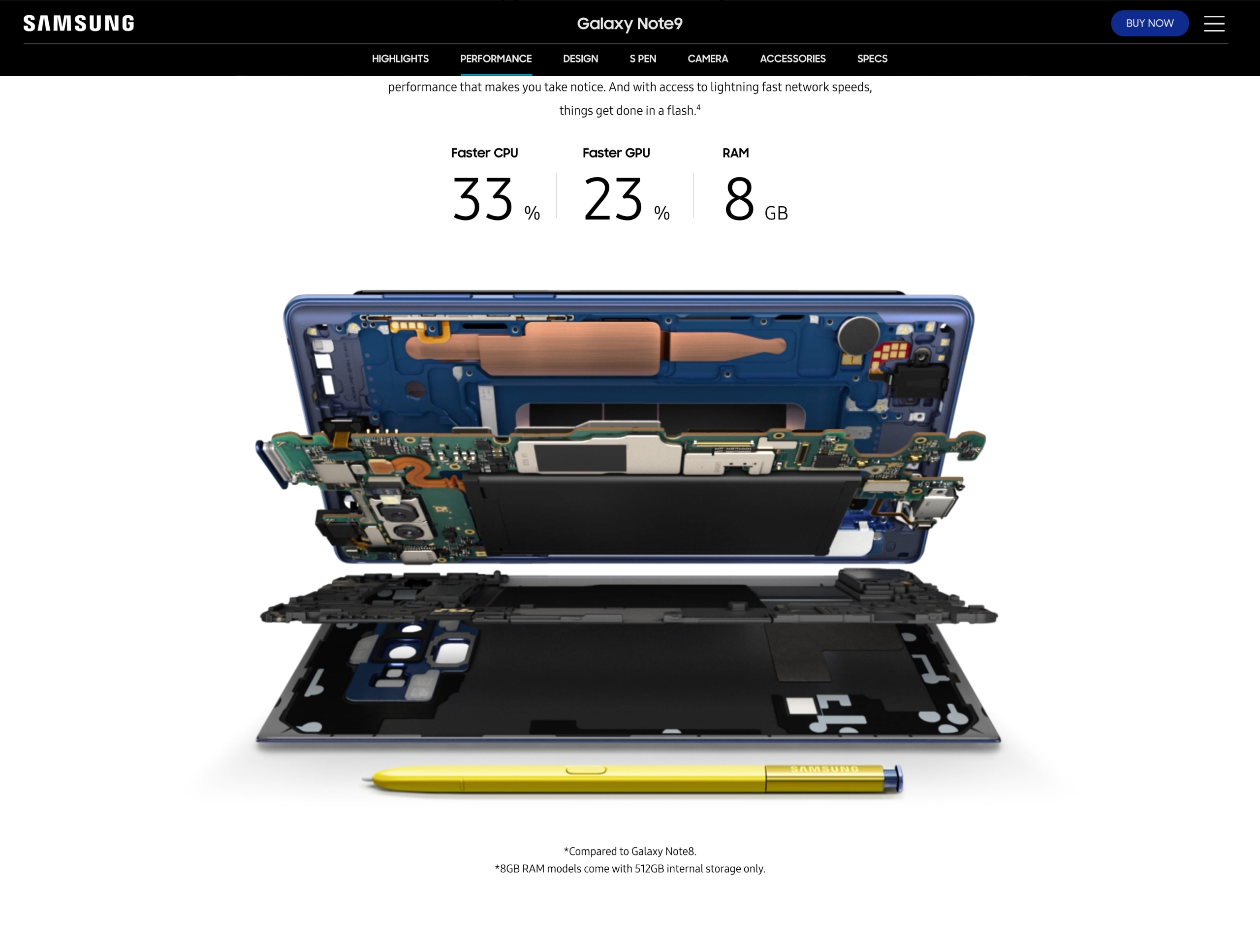
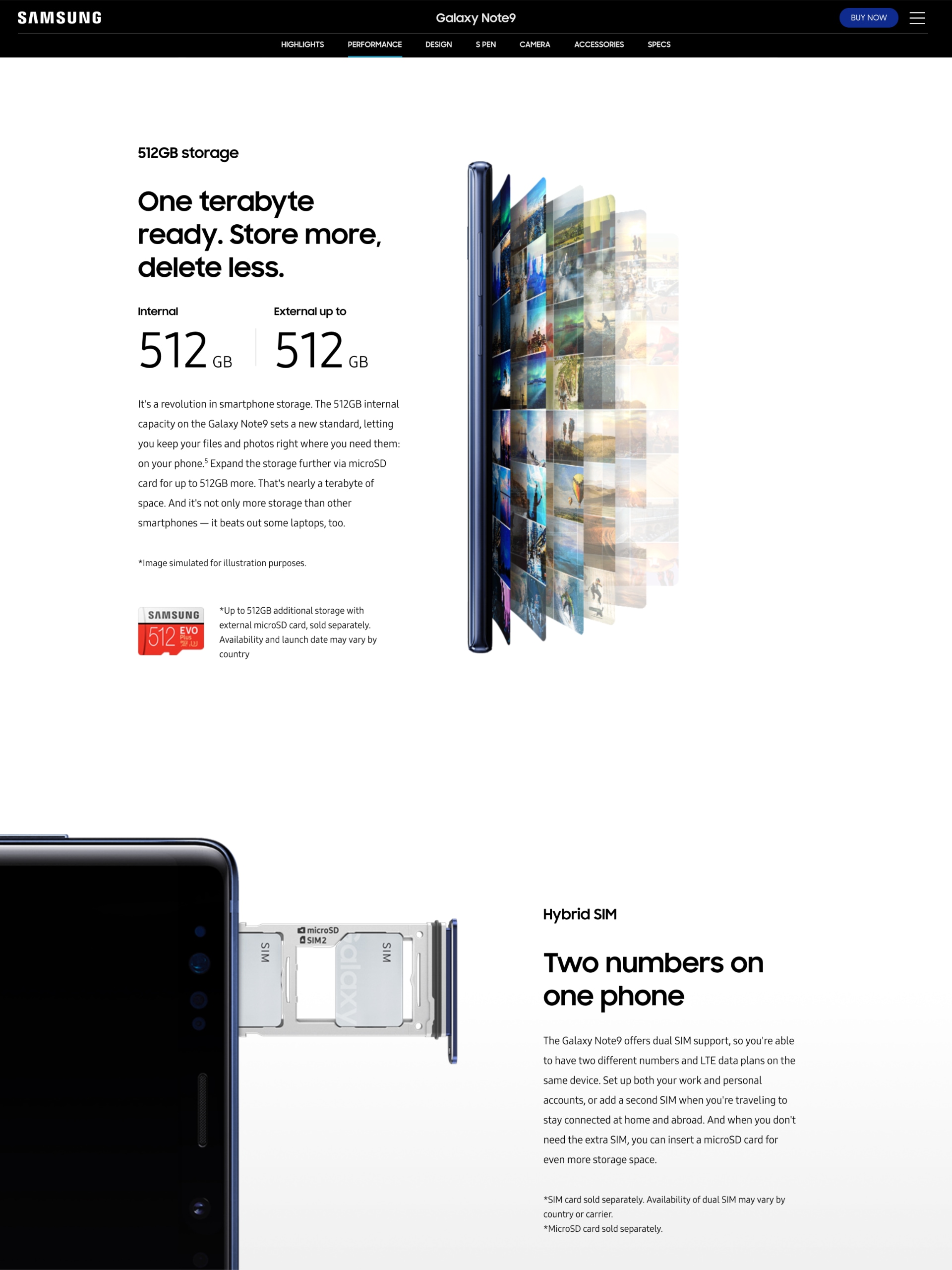
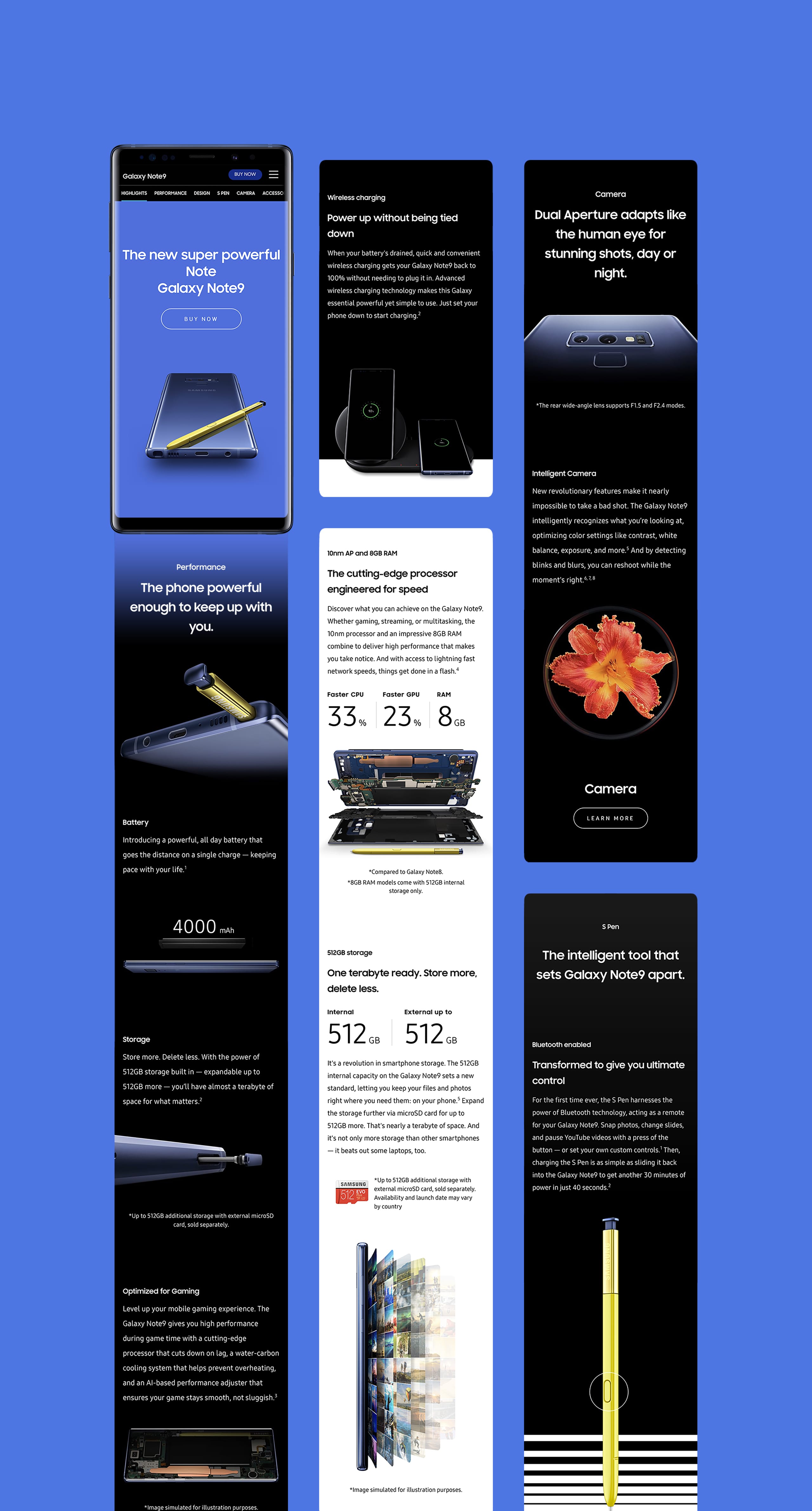
Some of the biggest factors for the Galaxy Note9 were the large storage — up to 1TB with a memory card — an all-day battery, and an S Pen newly enhanced with Bluetooth that served as a remote control.
편의성을 갖춘 S Pen과 더 강력해진 성능으로 출시된 갤럭시 노트9. 우리는 웹사이트를 통해 제품의 고급스러움을 더하고, 구동 방식의 새로움을 더해 구매 욕구를 자극하고 싶었습니다. 1TB까지 사용할 수 있는 대용량 메모리, 리모컨처럼 활용할 수 있어 프레젠테이션은 물론 셀피까지 찍을 수 있는 더욱 똑똑해진 S Pen 등 갤럭시 노트 9은 사용자의 편의성을 위한 기능들로 매력을 더했습니다. 제품의 매력을 극대화하기 위해, 갤럭시의 기본적인 비주얼 철학 Black & White 그리고 Bold 함을 기준으로 제품을 표현했던 우리는 제품 Key Visual과 align을 맞추기로 하였습니다.
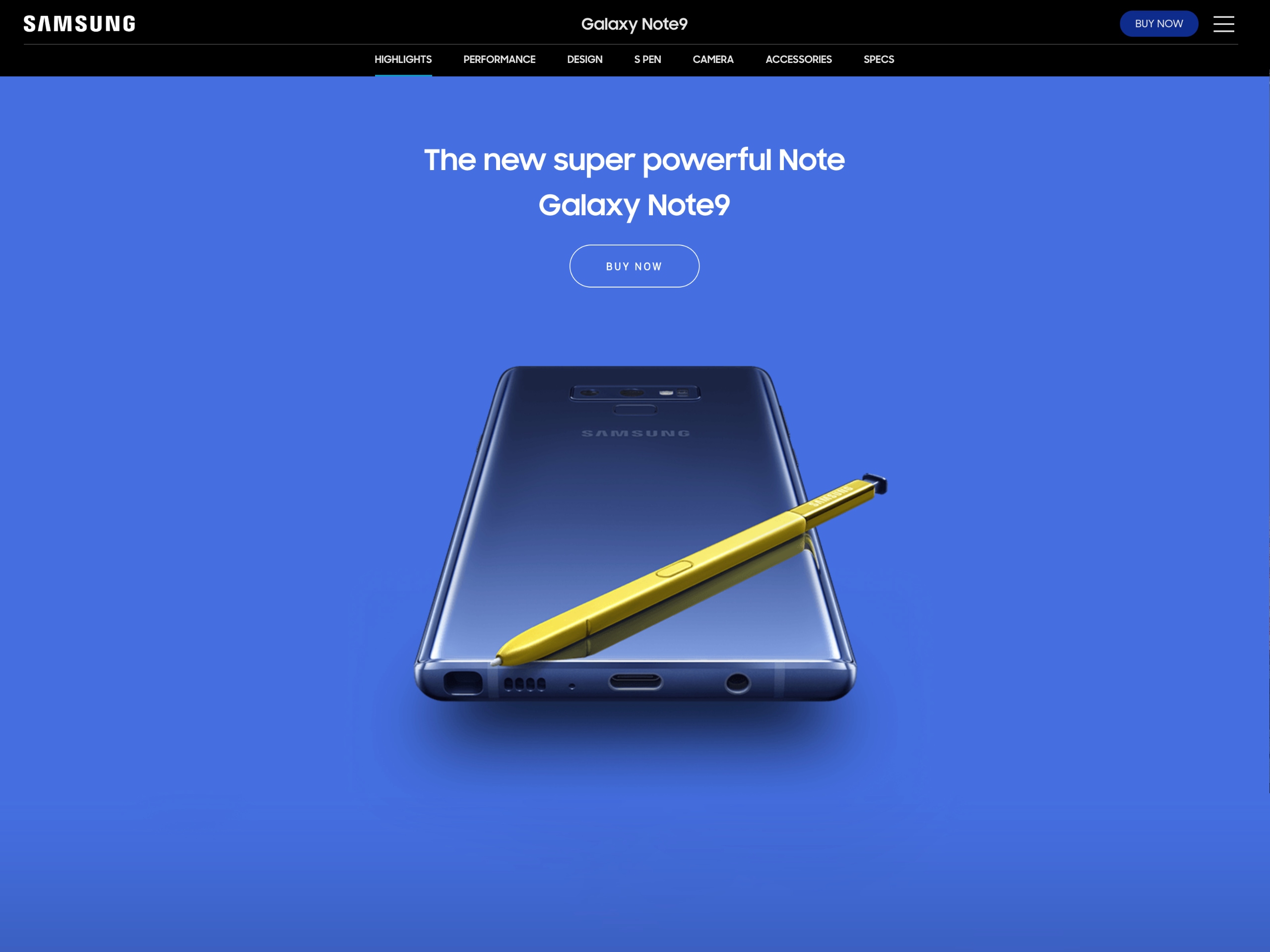
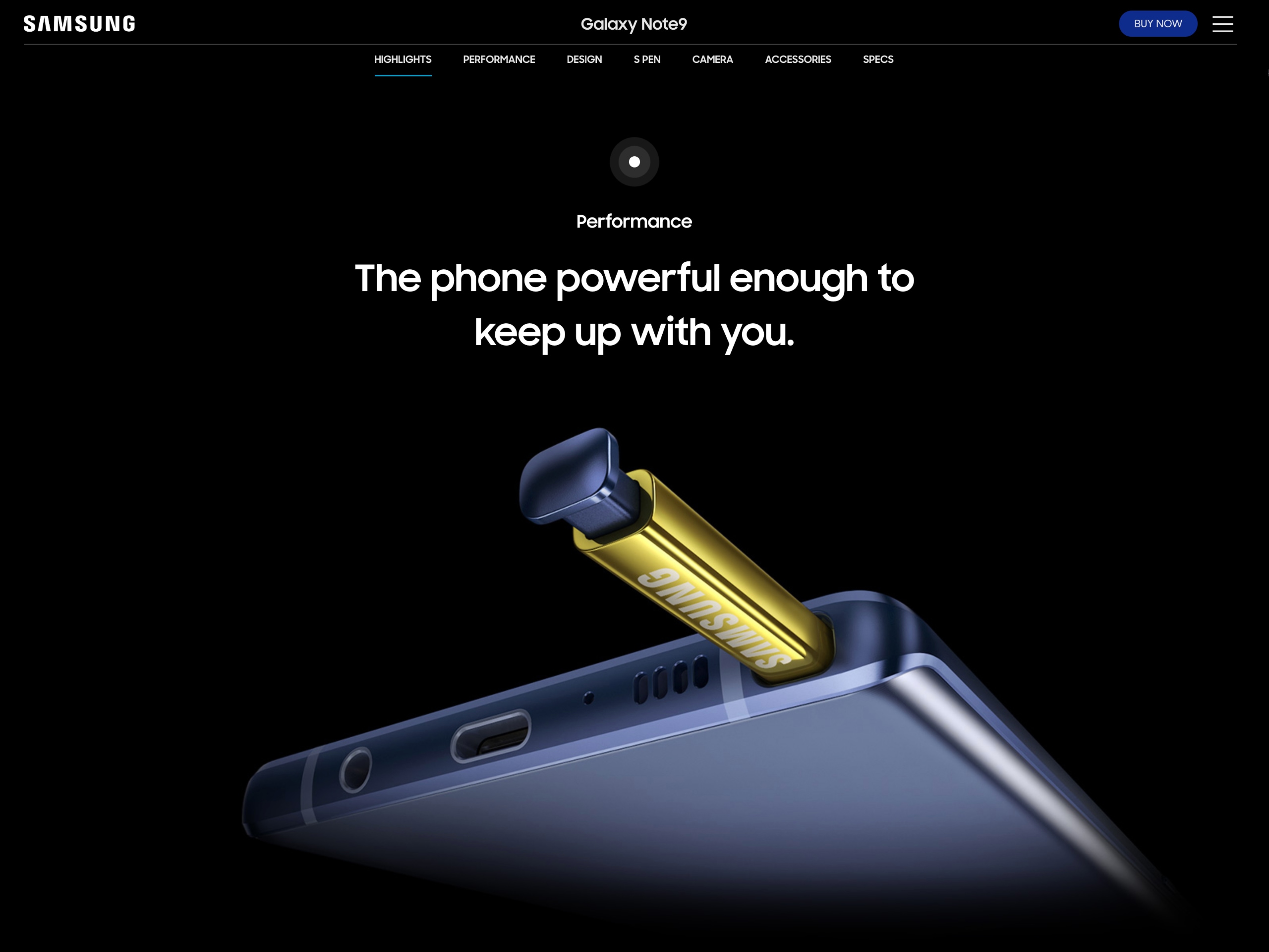
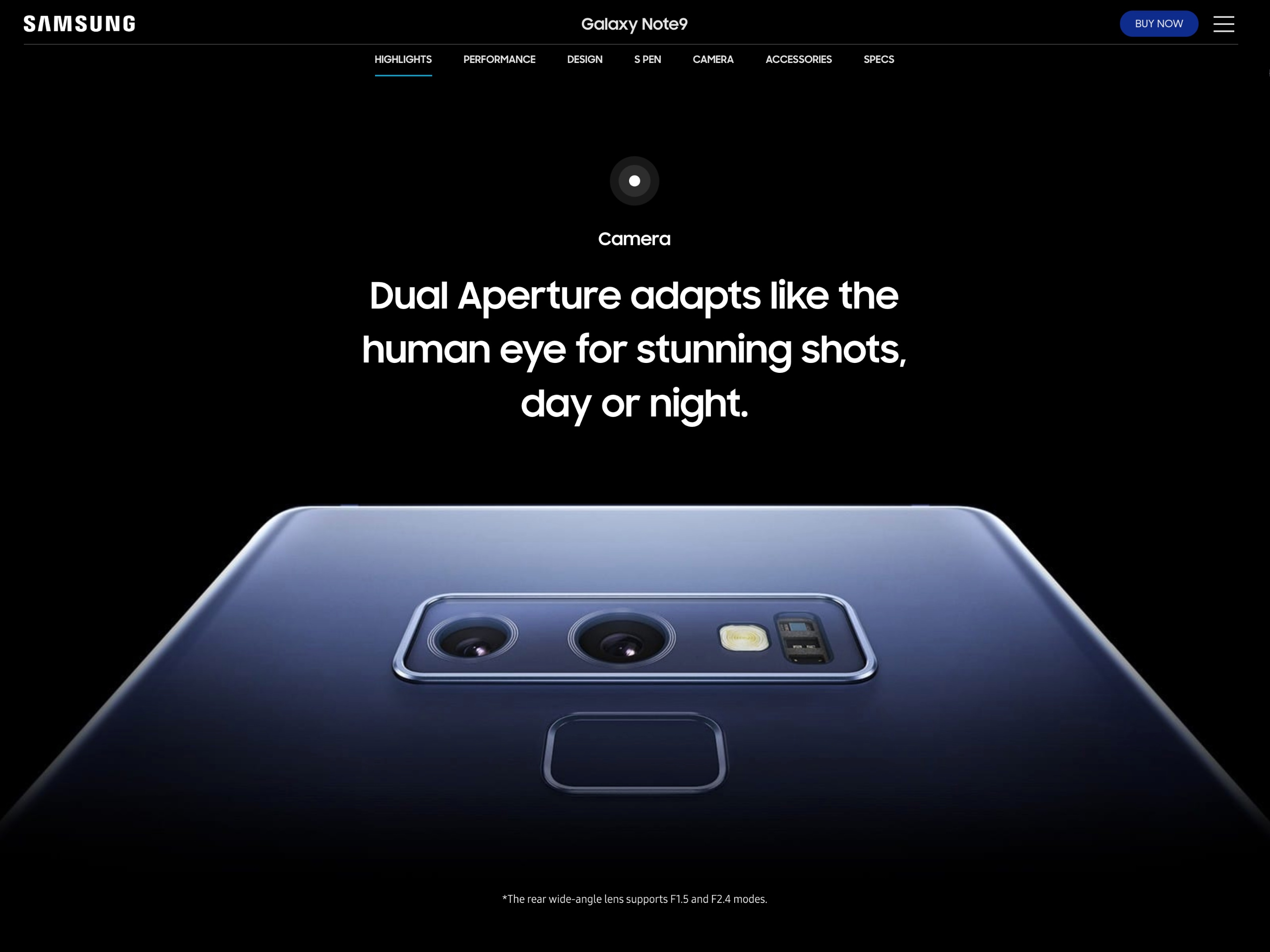
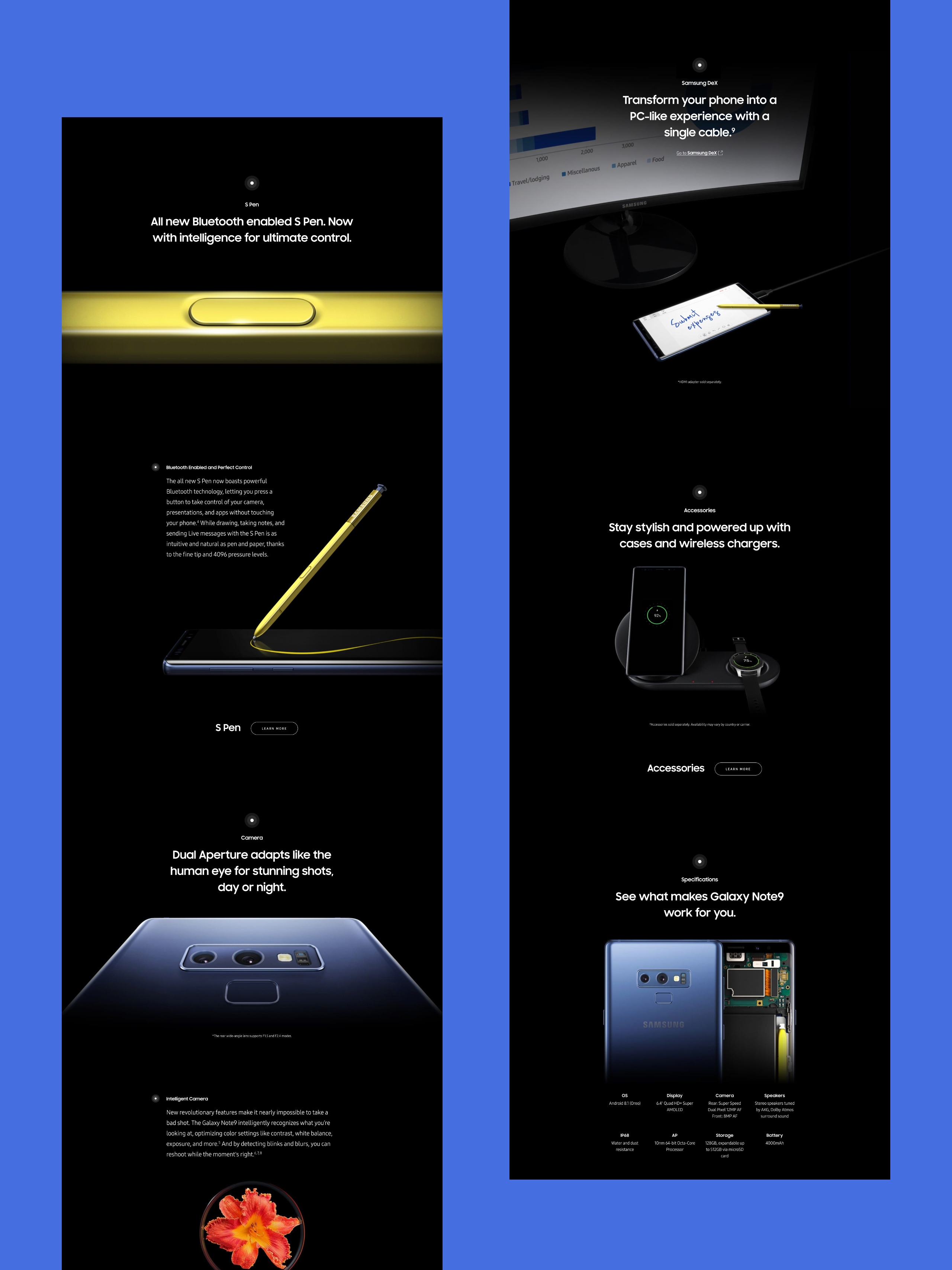
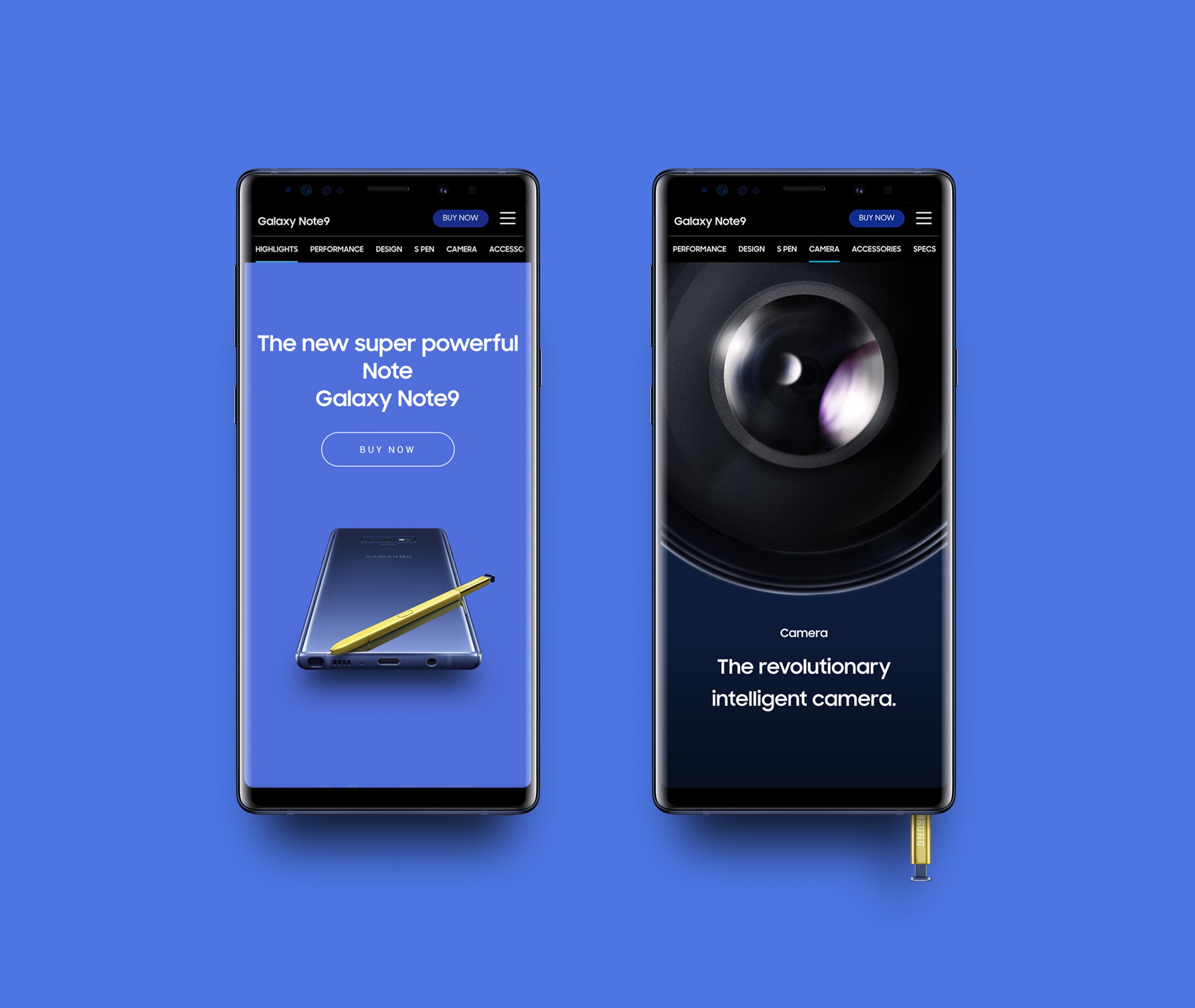
We highlighted these new features using animations modeled after the phone’s UI and images that broke out of the typical website grid. The Galaxy visual philosophy of black, white, and bold was accented with blue and yellow on the main page, while tone-on-tone KVs also put a spotlight the phone’s exciting new colorways. Full bleed closeups, dynamic angles, and micro interactions while scrolling keep the user’s attention.
제품의 매력을 극대화하기 위해, 갤럭시의 기본적인 비주얼 철학 Black & White 그리고 Bold 함을 기준으로 제품을 표현했던 우리는 제품 Key Visual과 Align을 맞추기로 하였습니다. 갤럭시 노트 9의 Key Visual은 블루, 블랙, 라벤더, 코퍼 네 가지 제품 컬러와 배경 색상이 Tone on Tone 으로 전작들과 달리 ‘Pop’ 하게 제작되었습니다. 갤럭시 노트 9이 오션블루 색상에 밝은 옐로 S Pen으로 포인트를 준 것처럼, 저희는 사이트 최초 진입 시 파란색 배경으로 시작하여 검은색으로 전환되는 백그라운드 효과와 제품의 앵글 표현을 새롭게 하여 pop 한 느낌을 전달하고자 했고, Bold 한 스타일의 비주얼로 마무리하였습니다.
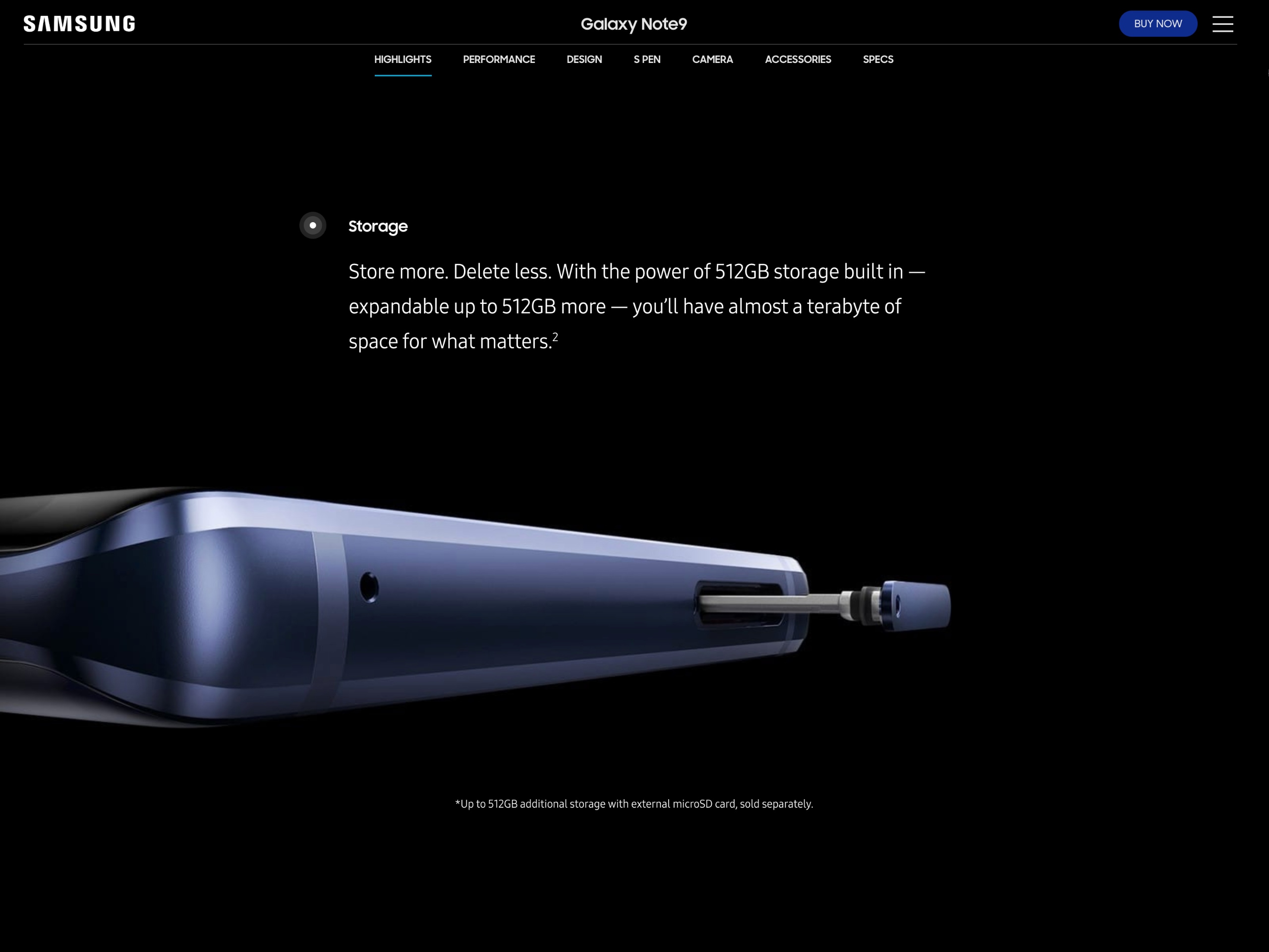
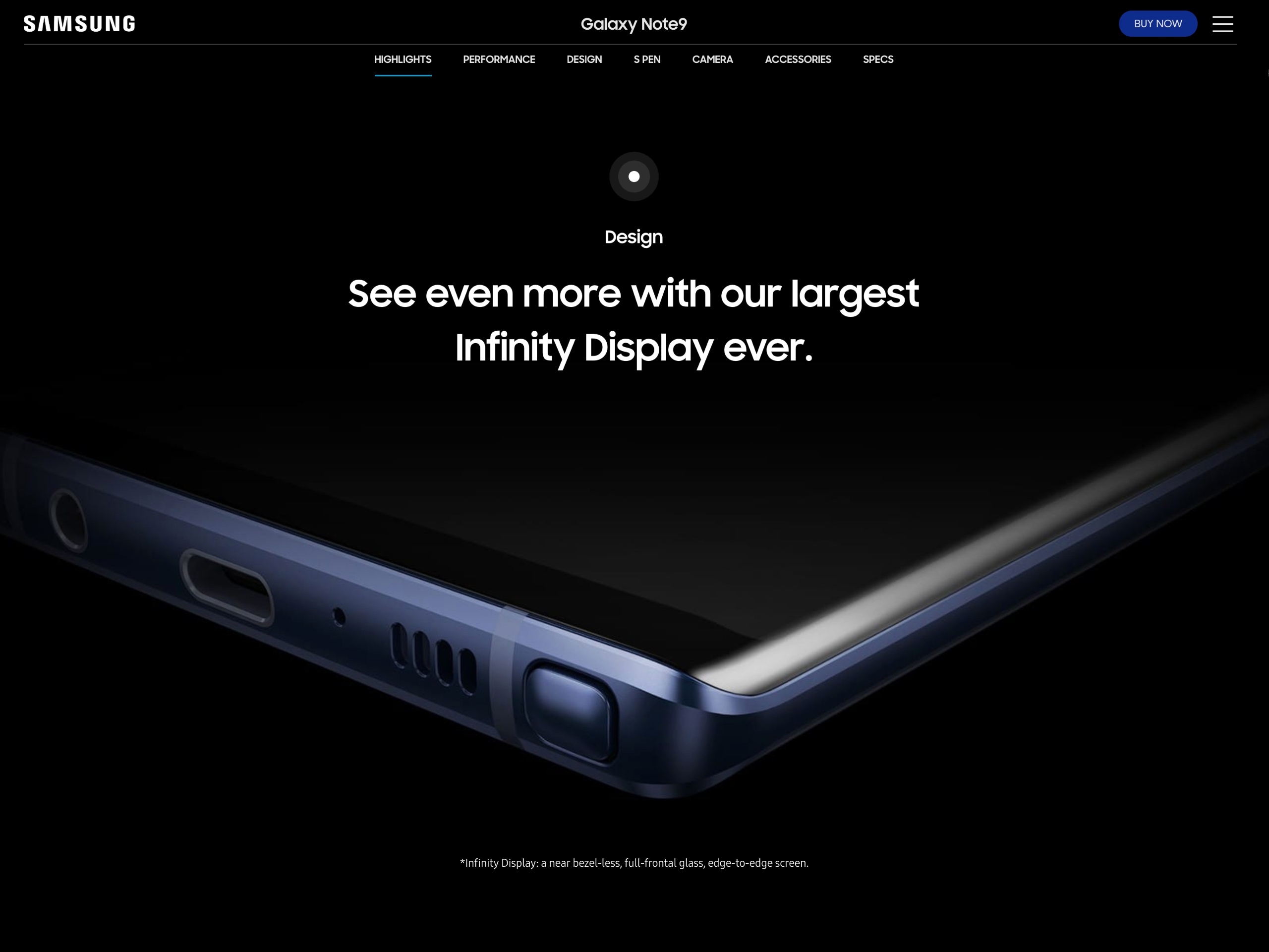
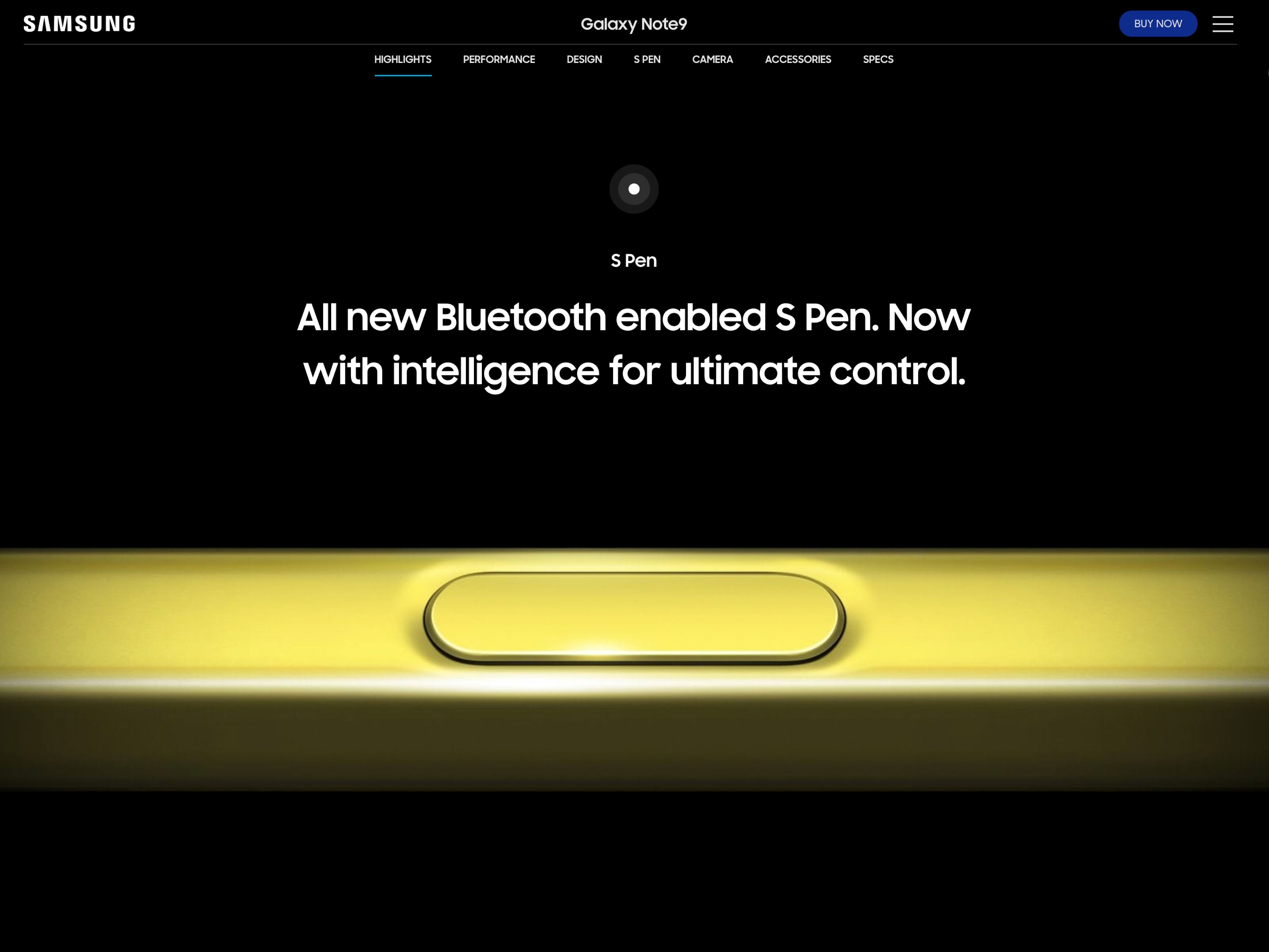
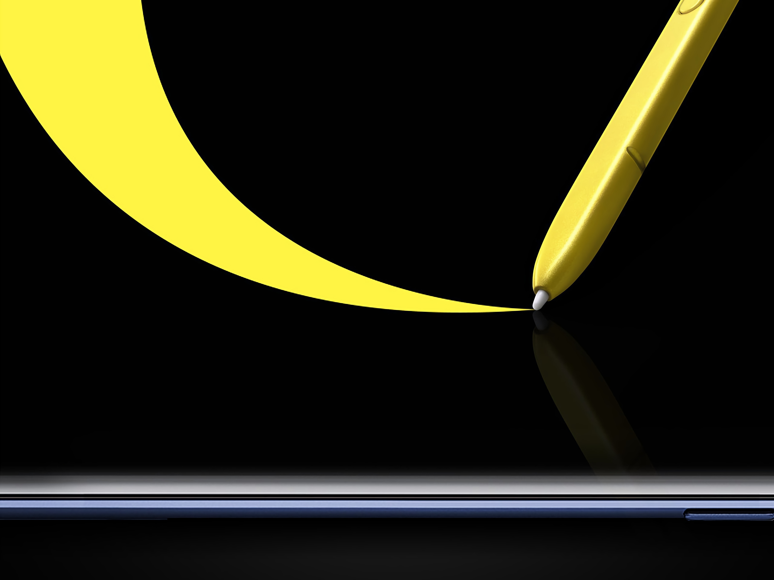
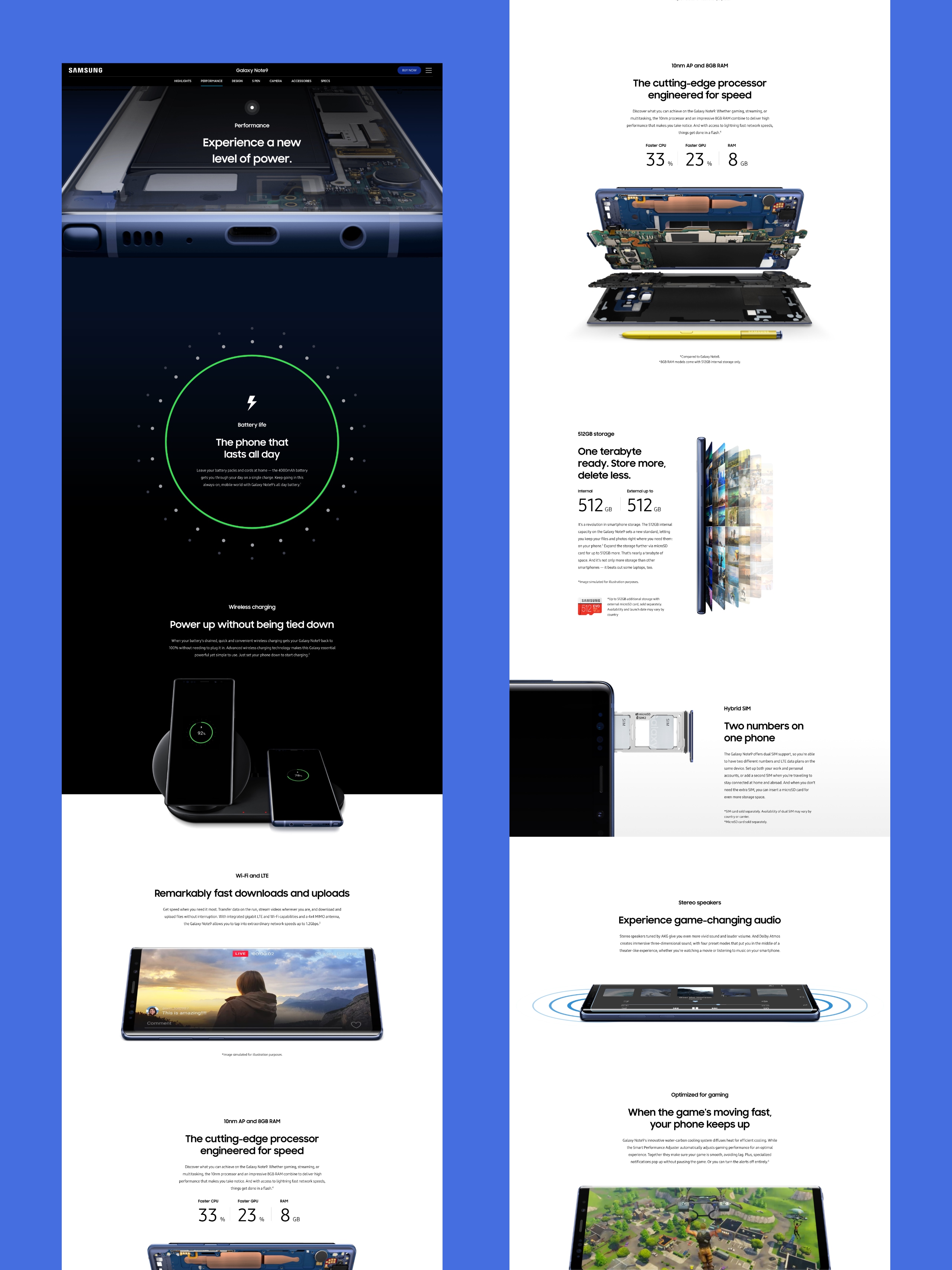
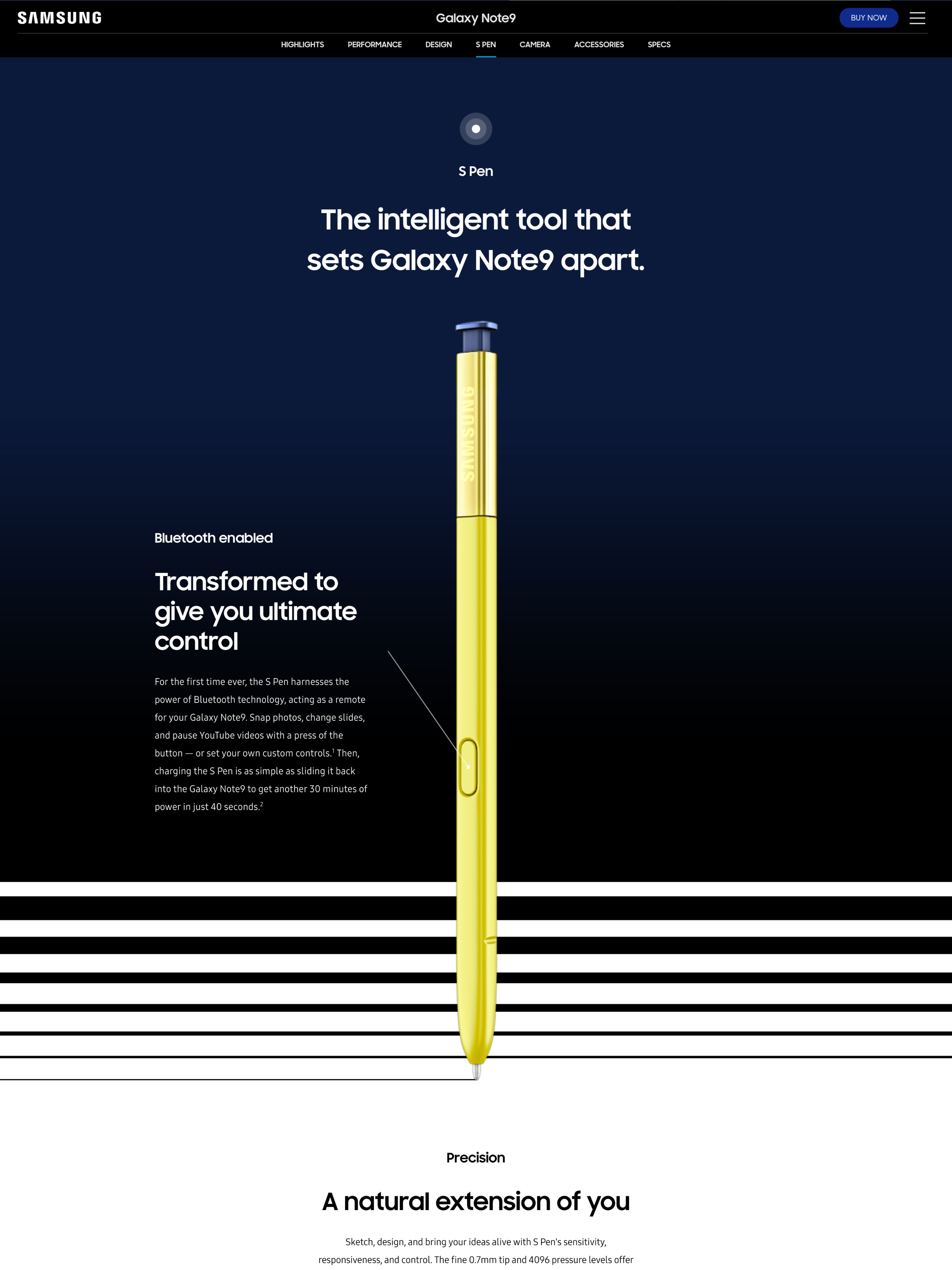
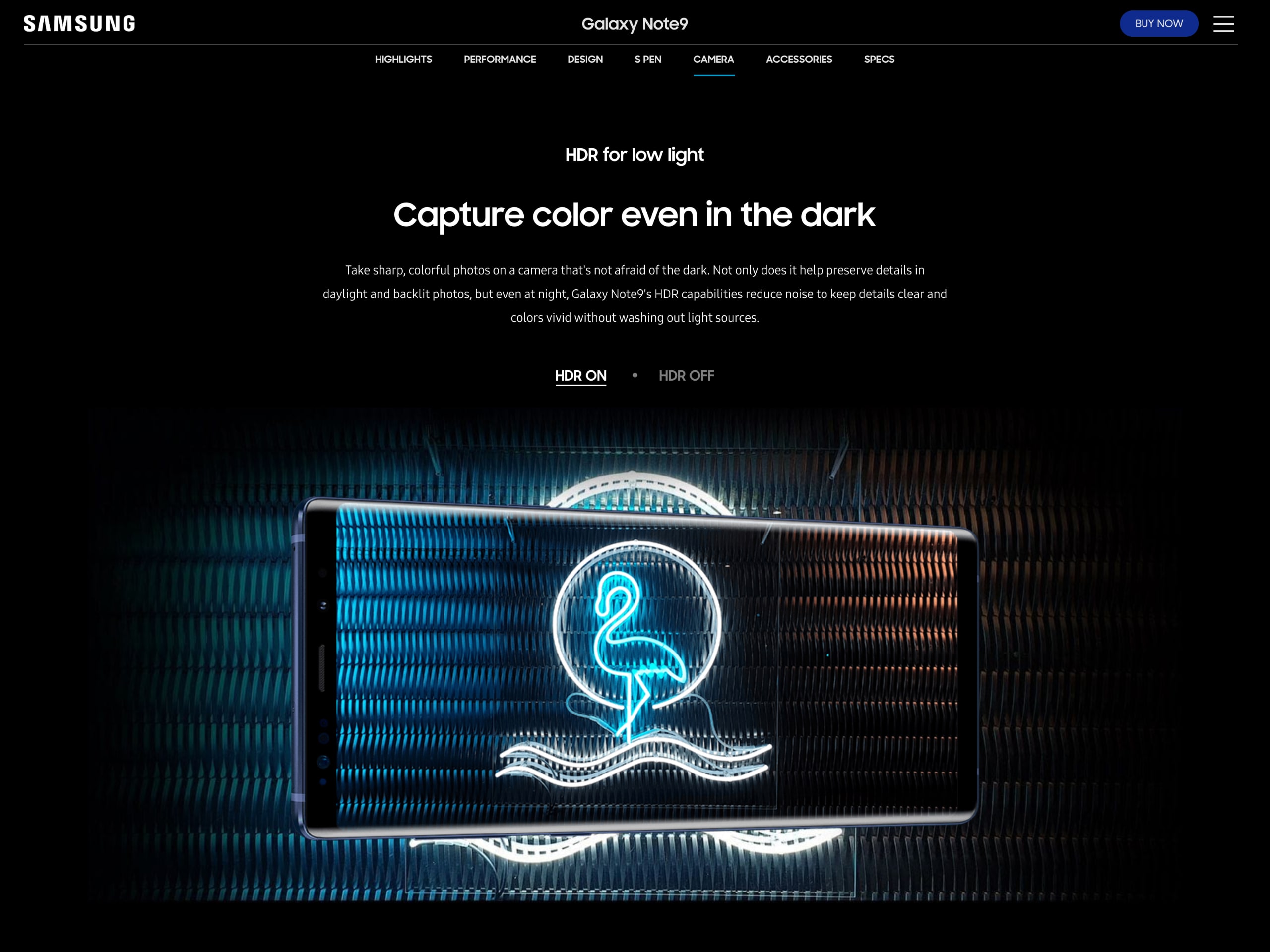
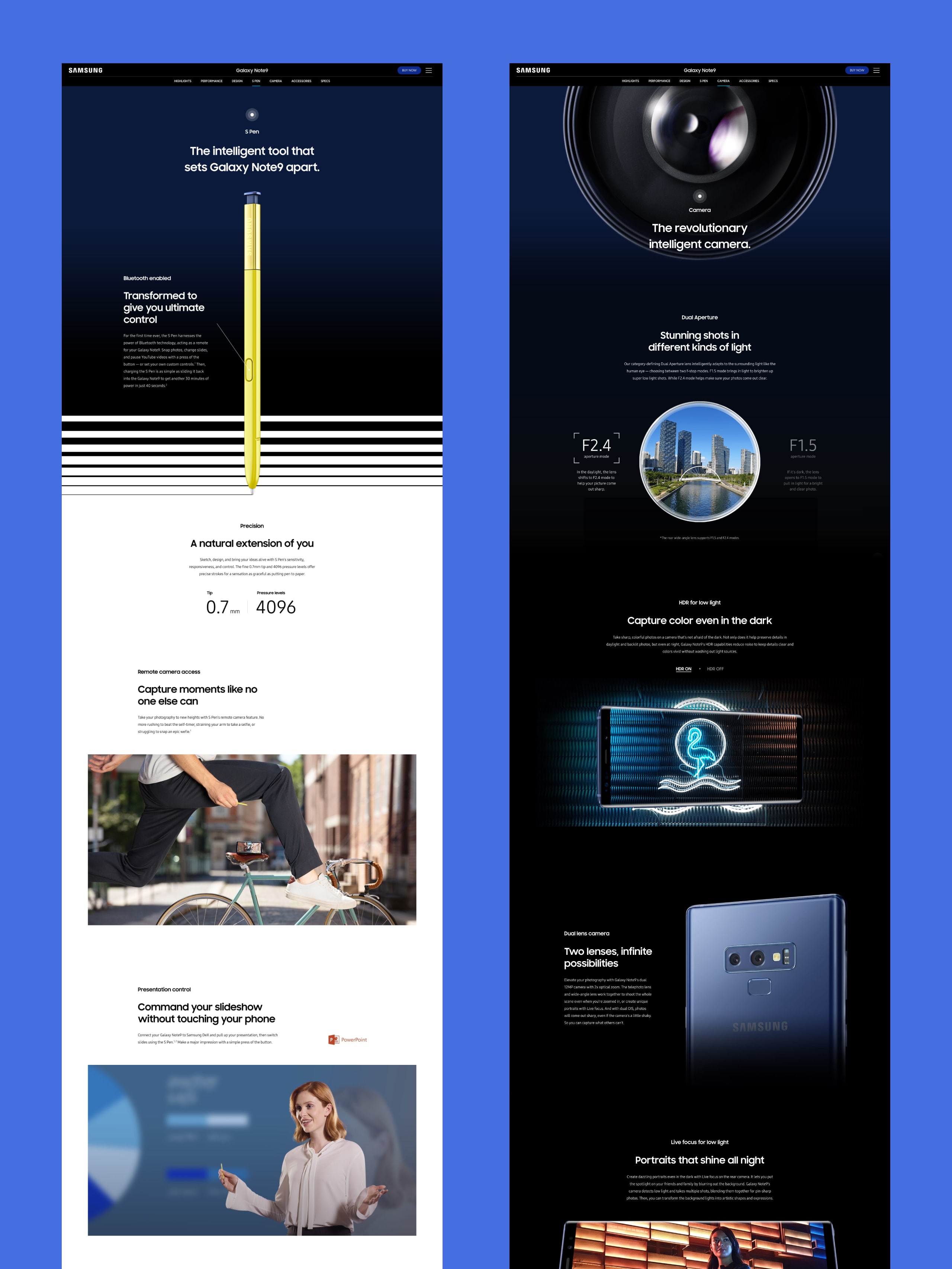
In addition to rolling out sites to 80 countries that were translated and localized based on the global site, we provided support for accessibility and search optimization, creating SEO copy to help ensure that Galaxy site is the preeminent place for a curious audience to find out more about the Galaxy Note9.
저희는 80개 사이트를 동시 오픈, 다양한 국가와 언어로 진입하는 사용자들에게 최적화된 SEO와 메타태그 등 접근성 및 검색 최적화로 세계 각국의 사용자를 배려하였습니다.
Credits
Lead AgencyCHEILProduction AgencyDFY
Project ManagementKim WheekyoungPlanningKim SojeongOh GaramHwang IlminCD+DesignKim JunyoungDesignNam JinsungPark JoeunSong JiyoungYang GwanghoonLee GaeunLee SeulJo HyewonChoi JungminEnglish CopywritingDana Melanz3D GraphicsKim WonkyuJang SeminJoo SeunghyukDevelopment DirectionLee WongyoonDevelopmentKang ByunghwanGong AhreumKim JumiPark GyutaePark JinkyungJung SunghwaChoi Yoonjung