Brand & Digital
Mobile website construction according to brand identity evolution.
- Client
- Fidelity
- Category
- Brand, Digital
- Services
- Content Design, Digital Strategy, Website, UX/UI
- Scope
- Digital Strategy, UX Strategy, Content Guidelines, GUI Design, UI/UX Design, Mobile Site Design
- Year
- 2013
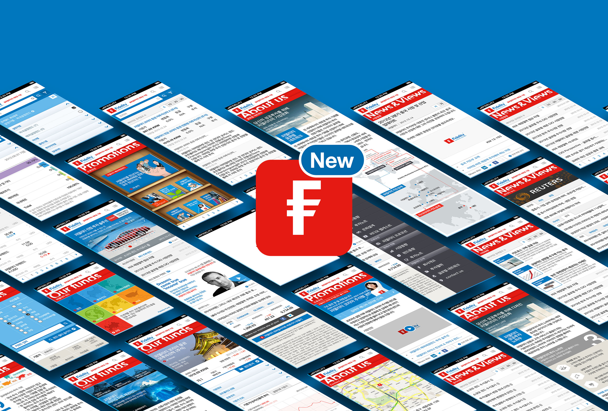
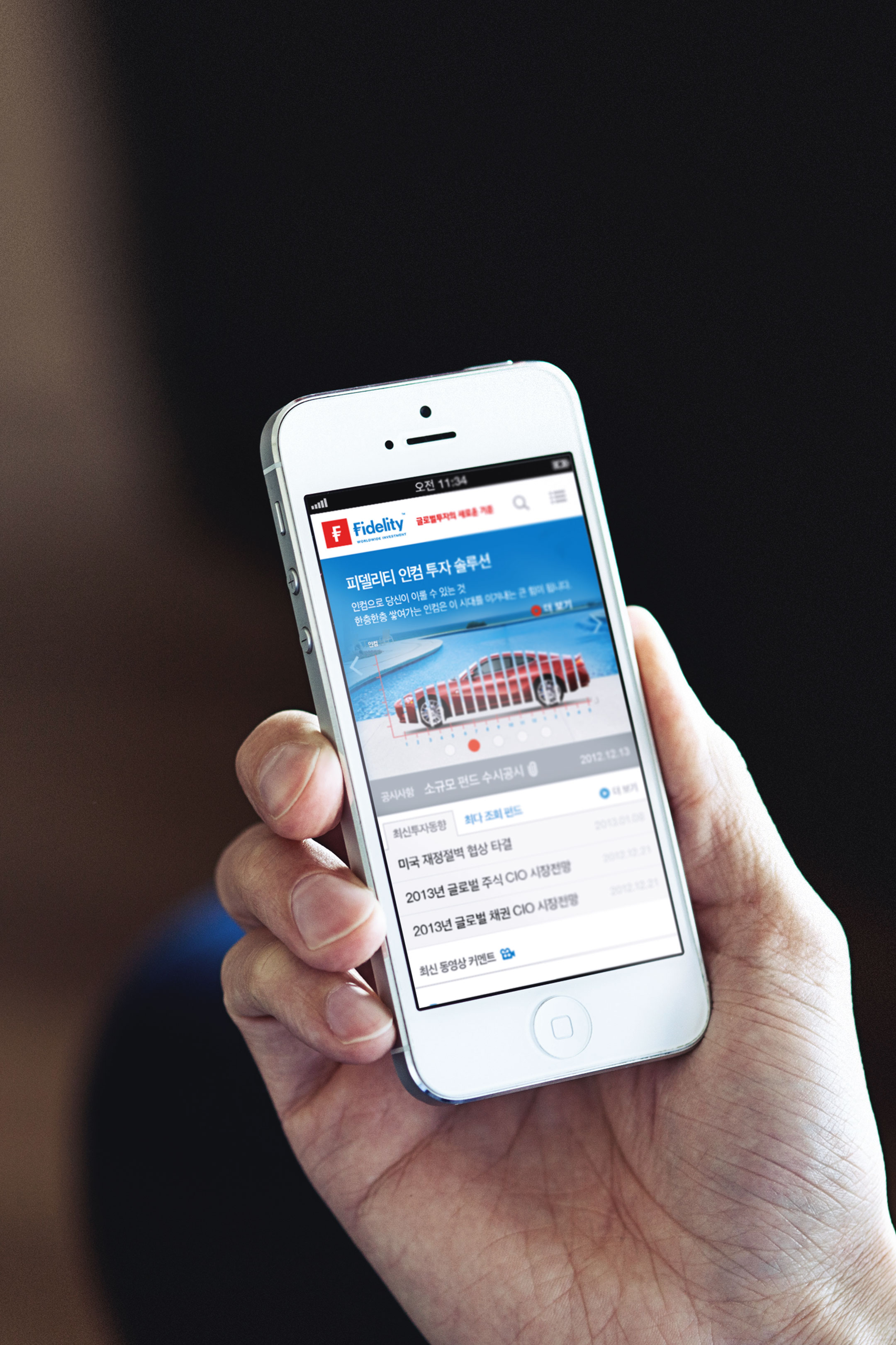
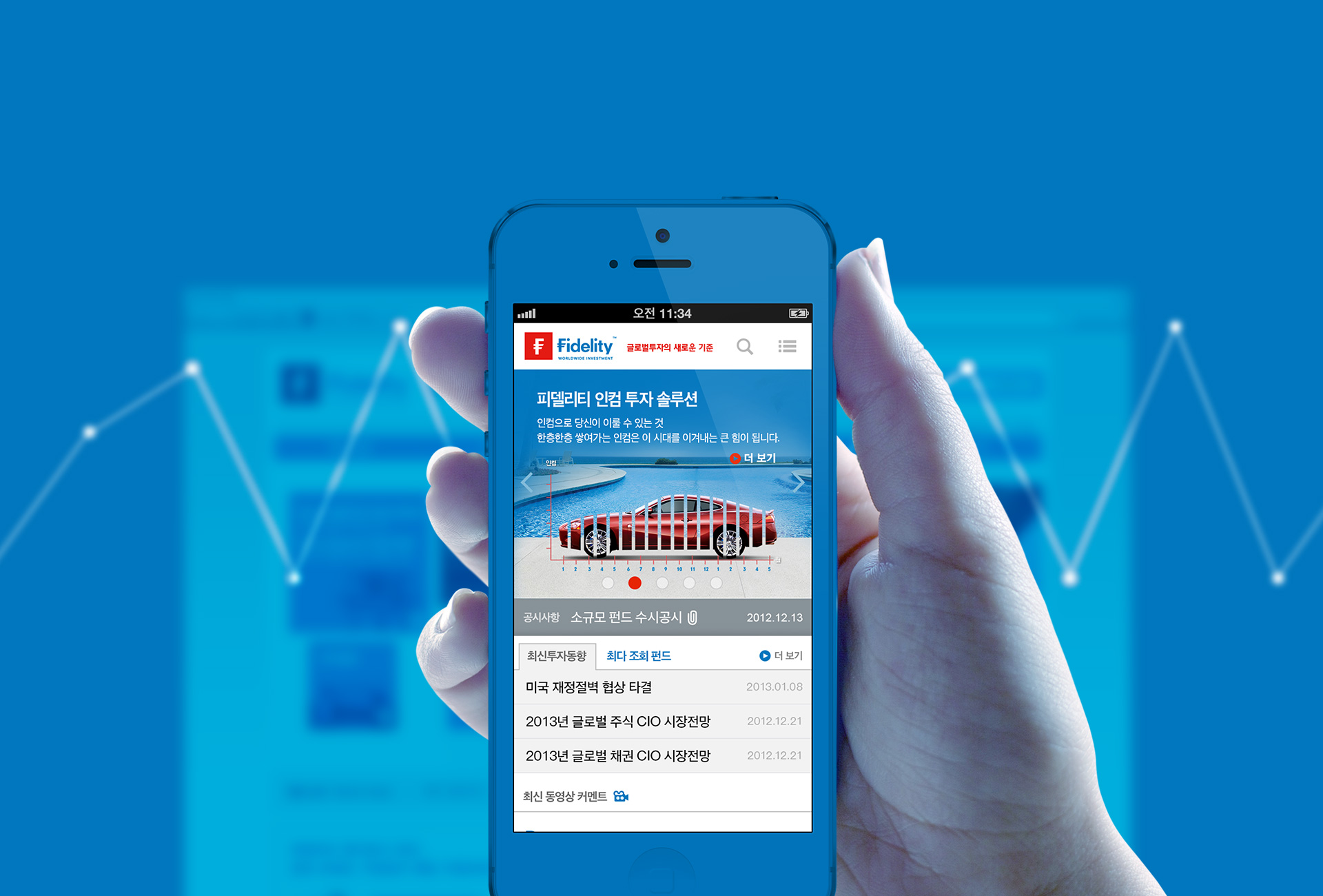
As the brand identity of Fidelity, the global asset management specialist, was changed, its mobile brand site was reorganized.
Applying the evolved new logo and brand color identity meeting the business environment and customer needs to PC web and mobile web consistently, it strengthens new brand image and delivers the message of ‘new standard of global investment’ at once.
세계적인 자산운용 전문업체 피델리티의 브랜드 아이덴티티가 변경됨에 따라 모바일 브랜드 사이트가 개편되었습니다. 기업 환경과 고객의 니즈에 부응하도록 진화한 새 로고 및 브랜드 컬러 아이덴티티를 PC웹에서부터 모바일웹까지 일관되게 적용함으로써 새로워진 브랜드 이미지를 강화하고 ‘글로벌 투자의 새로운 기준’이라는 메시지를 일괄적으로 전달하고자 합니다.
Web orientation along with company value.
Fidelity is to be the world best asset management company in three aspects of investment management performance, customer service and business ethics and they always work for customer profitability first. On the basis of this, the mobile site contains the business value of Fidelity which tries to provide the best profit to customers and the opportunity and reward to employees.
기업의 가치를 따라가는 웹 방향성. 피델리티는 투자 운용 성과, 고객서비스, 기업윤리 3가지 면에서 세계 최고의 자산운용사가 되고자 하는 기업으로서 항상 고객의 이익 창출을 최우선으로 합니다. 이를 바탕으로 고객에게는 최상의 수익을, 직원에게는 기회와 보상을 제공하도록 노력하는 피델리티의 기업 가치를 모바일 사이트에 담아냅니다.
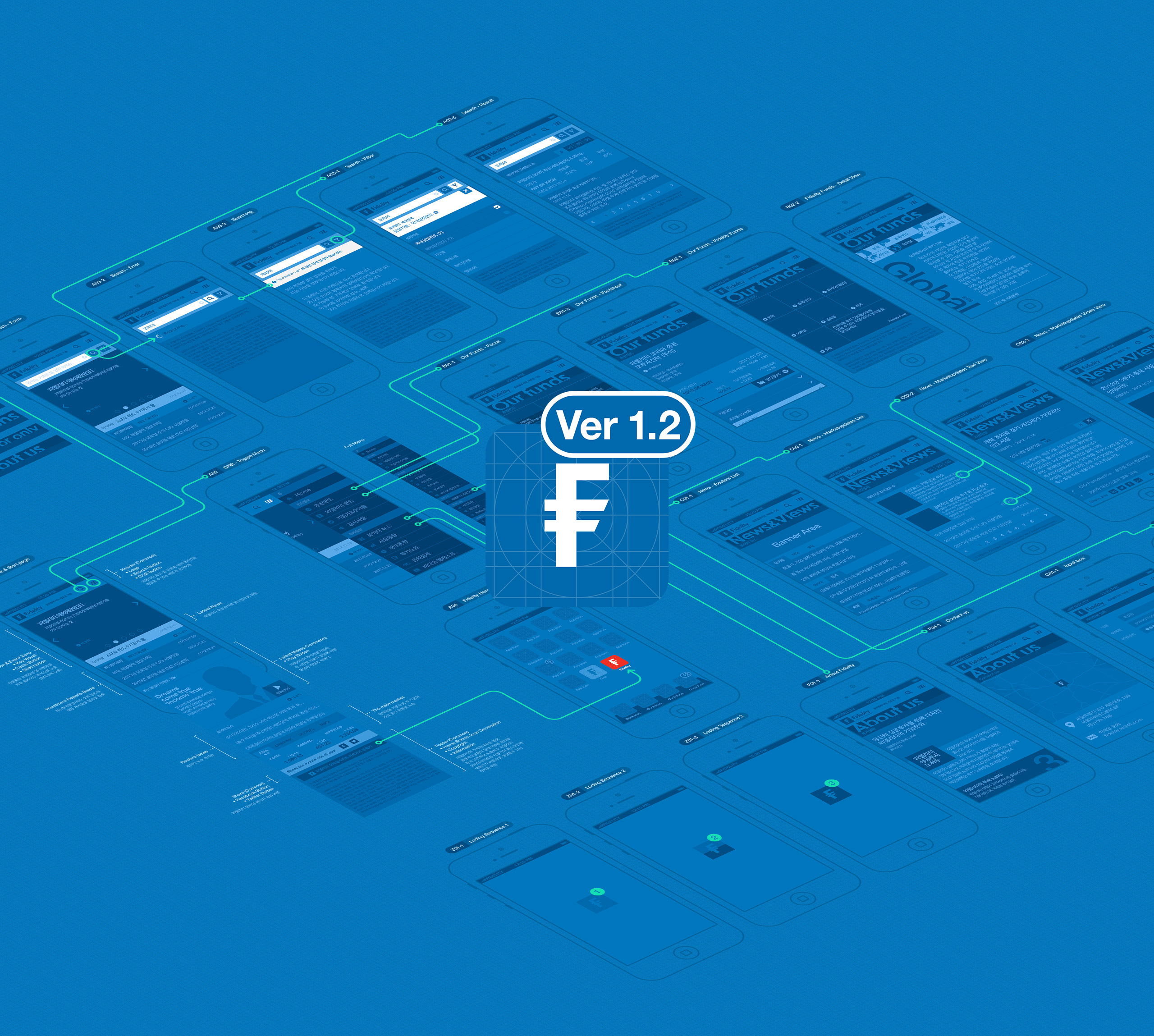
Mobile optimization is the business optimization. For the reorganization of UX design optimized for mobile maintaining the relevance with Fidelity website, it placed the promotion contents with high priority at the top to raise its efficiency. And with the simple design complying with global guide, the customer can use the investment information and expected earning rate conveniently.
모바일 최적화가 곧 비즈니스의 최적화. 피델리티 웹사이트와의 연관성을 유지하면서 모바일에 최적화된 UX디자인으로 개편을 위해 우선 순위가 높은 프로모션 콘텐츠를 상단에 배치하여 사용의 효율성을 높였습니다. 또한 글로벌 가이드를 준수한 심플한 디자인은 고객이 작은 화면에서도 투자정보 및 예상 수익율 등의 정보를 보다 쉽고 편리하게 이용할 수 있도록 합니다.

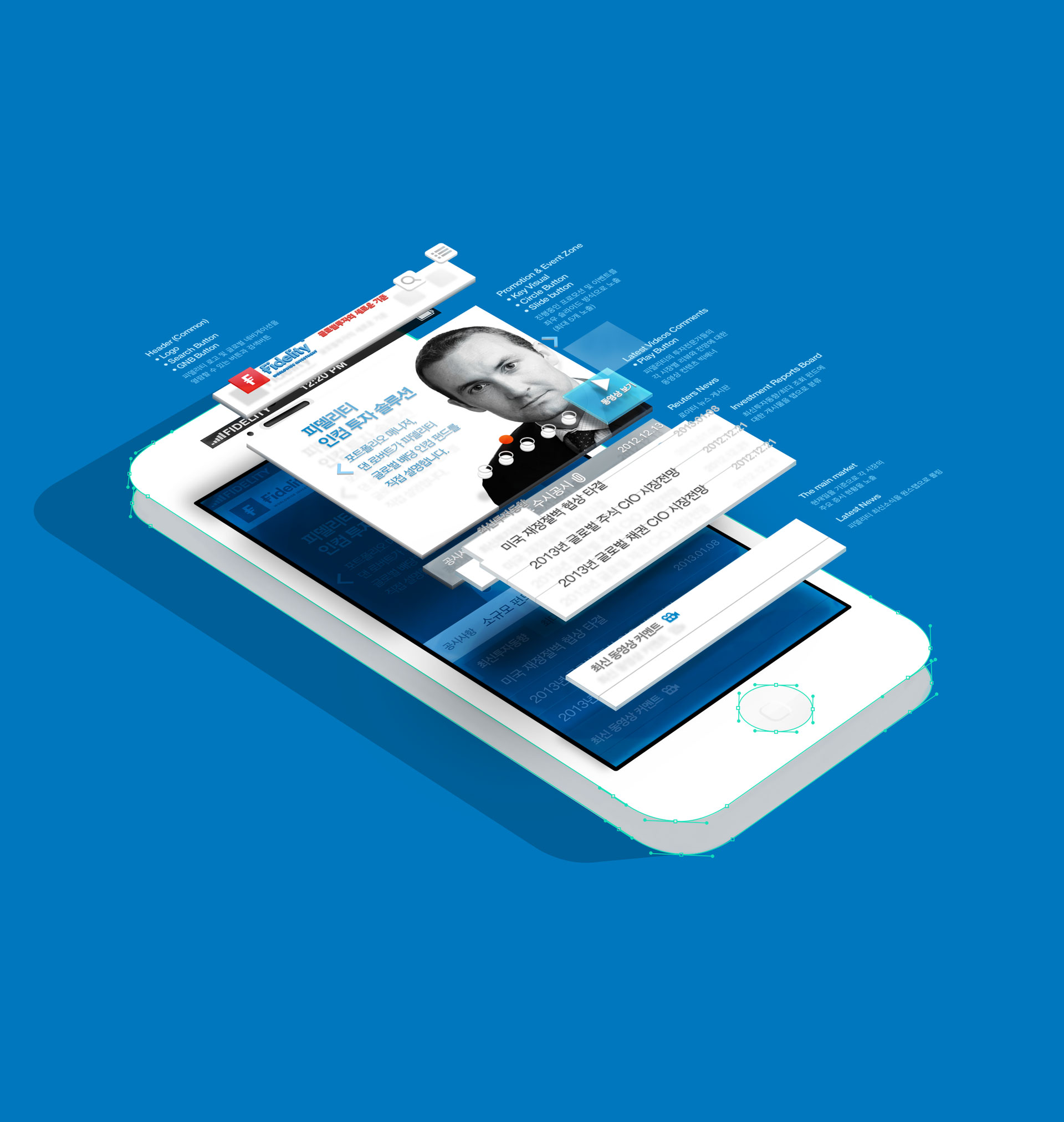
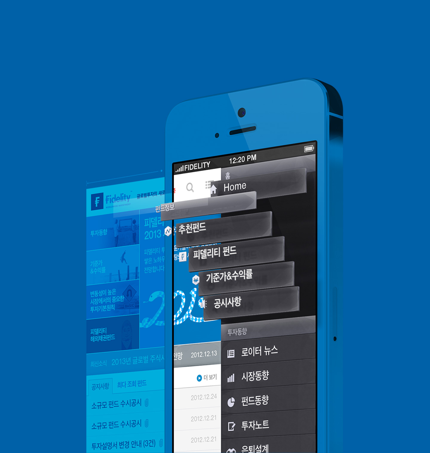
Customer-oriented service investing to customer. Enabling to search keyword and view the whole menu anywhere anytime through search icon and side menu icon, it provides the customer-oriented service possible on mobile website.
고객에게 투자하는 고객 중심 서비스 제공. 검색 아이콘, 사이드 메뉴 아이콘을 통해 언제 어디서나 키워드 검색과 전체 메뉴 보기가 가능하도록 하여 모바일 웹사이트에서 가능한 고객 중심의 서비스를 제공합니다.
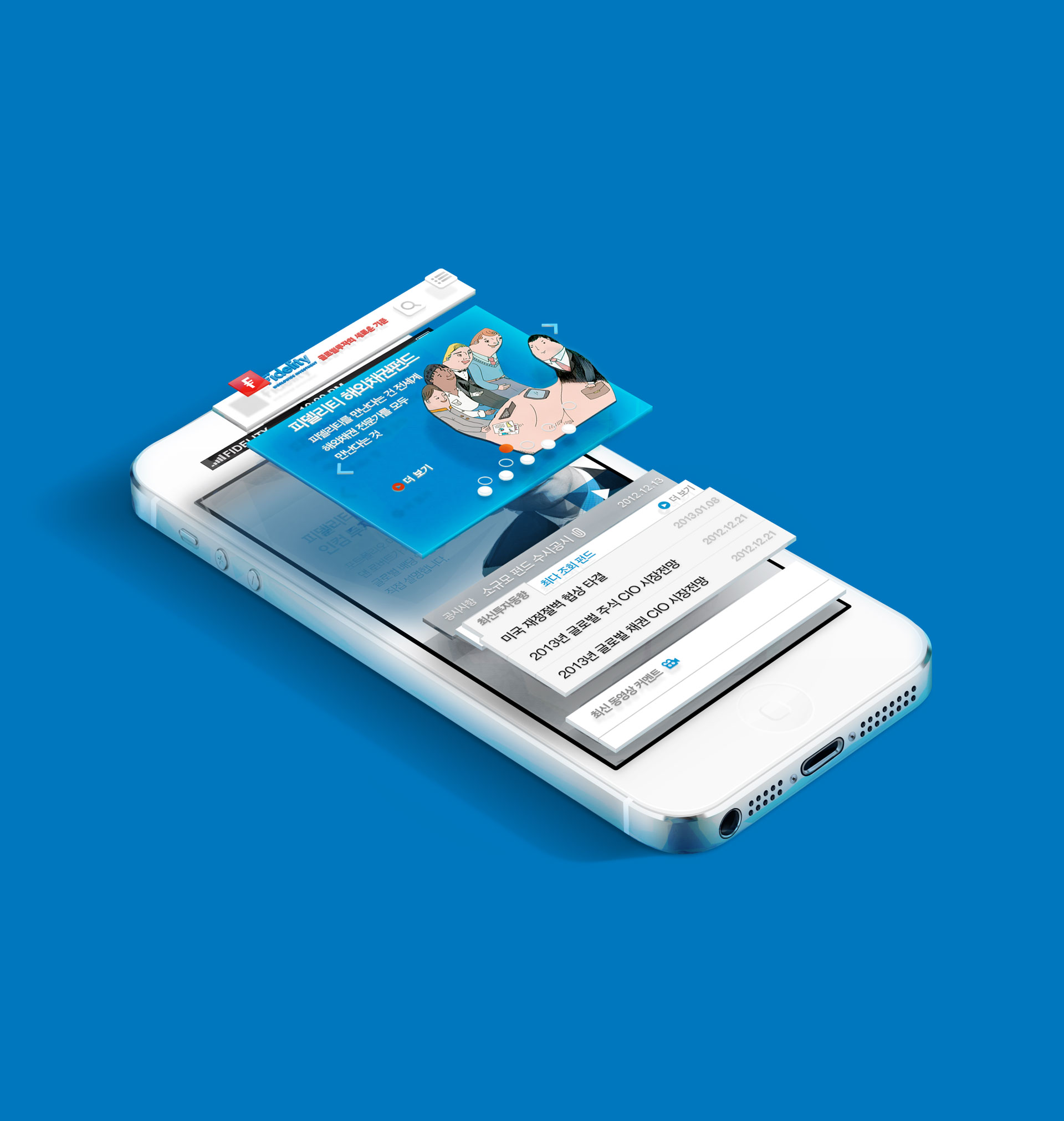
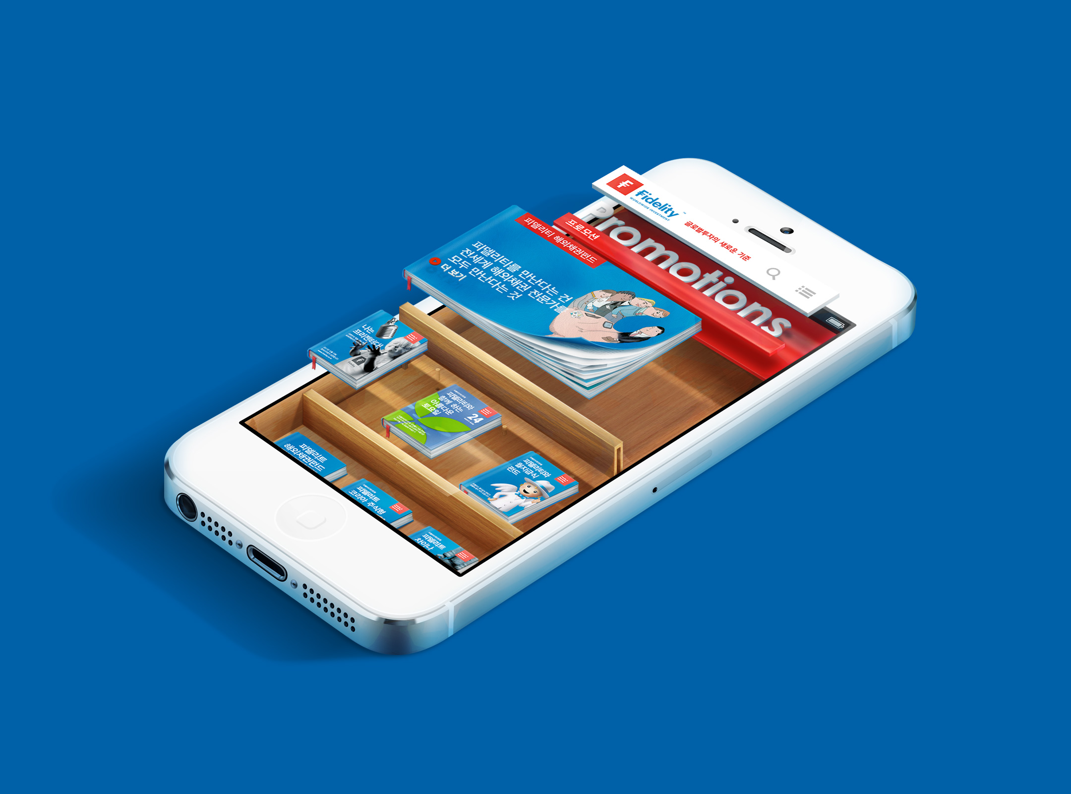
Three-dimensional promotion of present progressive.
Producing the various promotions of Fidelity which leads financial industry with a lot of turning points and variables in the form of Book Stand, it delivers the company’s image to provide newest investment information and induces the customer to participate in a more three-dimensional way.
현재 진행형의 입체적인 프로모션. 수많은 터닝포인트와 변수가 많은 금융업계를 선도하는 피델리티의 다양한 프로모션을 Book Stand 형태로 제작하여 최신 투자 정보를 제공하는 기업의 이미지를 전달하고 보다 입체적으로 참여할 수 있도록 유도합니다.
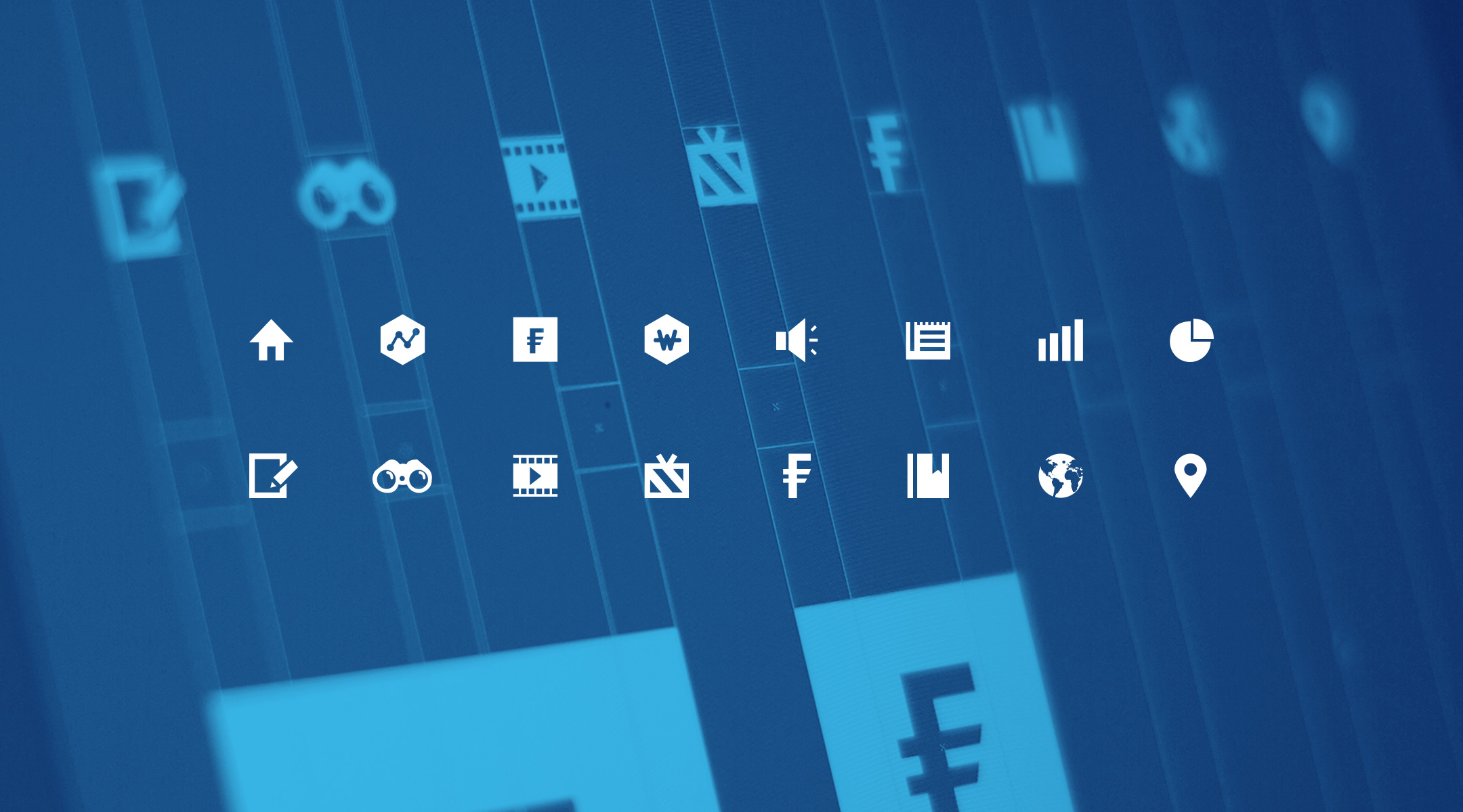
Enhancement of usability with simple and clear icon.
In order to deliver all contents and services of Fidelity easily and quickly, it produced the simple and clear icon. It complies with global guide of Fidelity, and at the same time, it makes a harmony with new brand identity to enhance the company’s brand image.
심플하고 명확한 아이콘으로 사용성 강화. 빠르고 정확한 정보를 전달해야 하는 피델리티의 모든 콘텐츠 및 서비스를 쉽고 신속하게 전달하기 위해 심플하고 명확한 아이콘을 제작하였습니다. 이는 피델리티의 글로벌 가이드를 준수함과 동시에 새롭게 변경된 브랜드 아이덴티티와도 조화를 이루어 기업 브랜드 이미지도 강화시킵니다.
Taking advantage of book-marking function like an application. The book-marking icon is designed like an application button. It can be accessed with a single touch without using other internet browser application in order to enhance its accessibility. And it strengthens the brand identity promotion effect on home screen which is exposed to users most.
북마킹 아이콘을 어플리케이션 버튼처럼 디자인하였습니다. 별도의 인터넷 브라우저 어플리케이션을 통하지 않고 피델리티 모바일 사이트를 한 번의 터치로 접속하도록 접근성을 강화시키고 사용자에게 가장 많이 노출되는 홈 화면에 피델리티 브랜드 아이덴티티 홍보 효과를 높입니다.

Successful maintenance and promotion performance.
Applying FLAT UI which is the worldwide web design trend in representing the global investment portfolio information and promotion of Fidelity, DFY focused on delivering the keywords of challenge and success as a global partner moving quickly. And performing our maintenance since 2011 in order to cope with aggressive marketing successfully and produce a stylish UI suitable for global guide, it made a vigorous communication effect with more various customers as well as the awareness increase effect in domestic market.
디파이는 피델리티의 전세계 투자 포트폴리오 정보 및 프로모션을 표현함에 있어 월드와이드 웹 디자인 트렌드인 FLAT UI를 적용하여 발빠르게 움직이는 글로벌 파트너로서 도전과 성공의 키워드를 고객에게 전달하는 데 중점을 두었습니다. 또한 2011년부터 유지·보수를 수행하면서 공격적인 마케팅에 성공적으로 대응하고 글로벌 가이드에 적합한 세련된 UI로 국내 시장에서의 인지도 상승 효과는 물론, 더욱 다양한 고객층과의 활발한 커뮤니케이션 효과를 이끌어 냈습니다.