Brand & Experience
D FLAT Seongsu - A hip brand in a hip neighborhood
- Client
- D FLAT
- Category
- Brand, Experience
- Services
- Brand Strategy, Brand Identity, Content Design, Campaign, Spatial Branding
- Scope
- Brand Experience, Brand Guidelines, Brand Identity, Brand Strategy, Campaign Strategy, Packaging Design, Product Branding, Creative Direction, Content Direction, Graphic Design, Social Media Management, Content Strategy
- Year
- 2022
D FLAT, opened in Seongsu-dong in April 2022, is ‘a nest for smart mobile creators.
This place offers a comfortable atmosphere and reasonable prices with the consideration of the MZ creators, known as Zoomers and Millennials, in Seongsu-dong, the complex area including much of restaurants, workshops, cafes, design shops, and co-working spaces around Seoul Forest Park.
Also, this place is well-equipped for work with spacious tables and enough outlets.
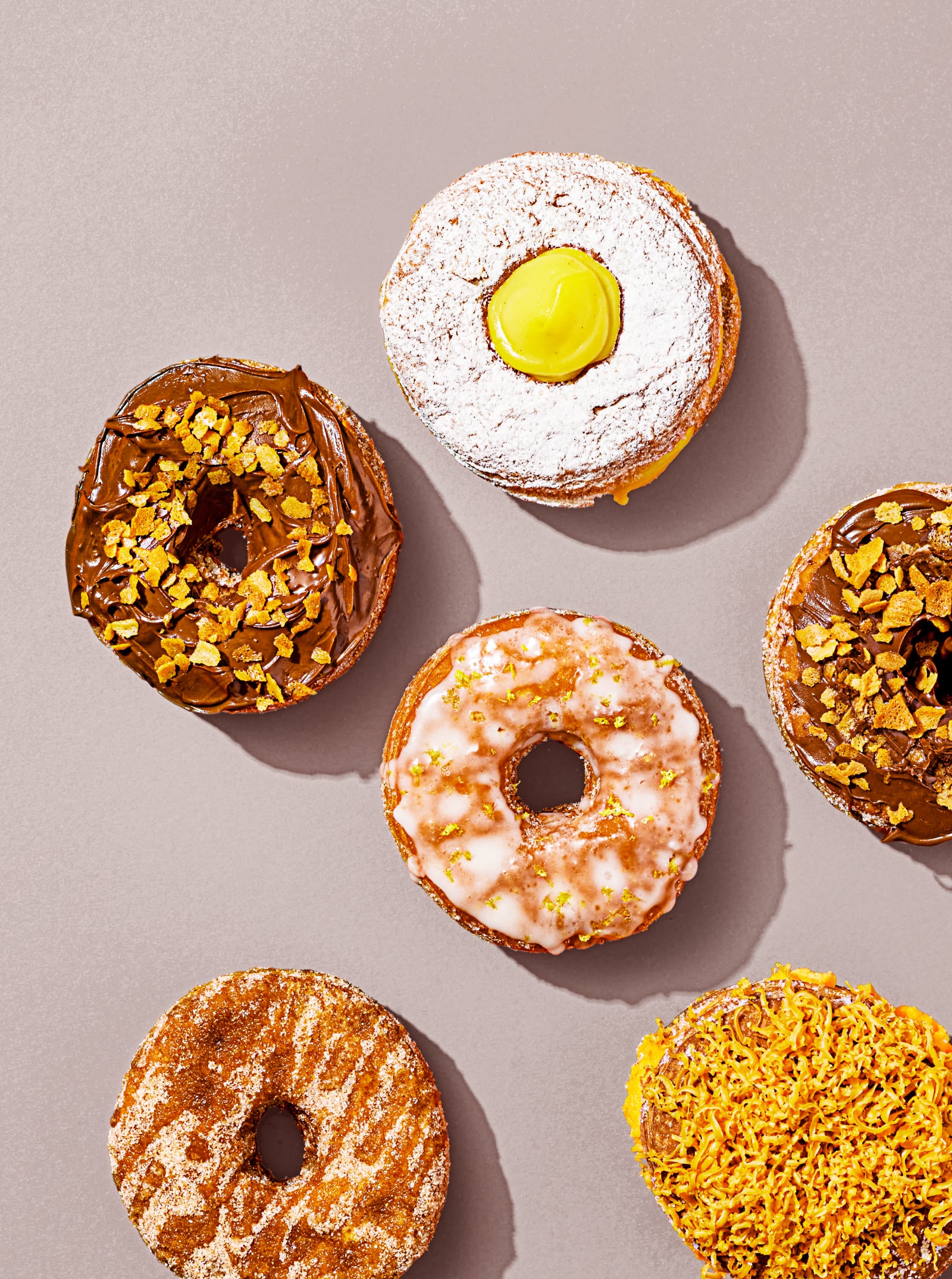
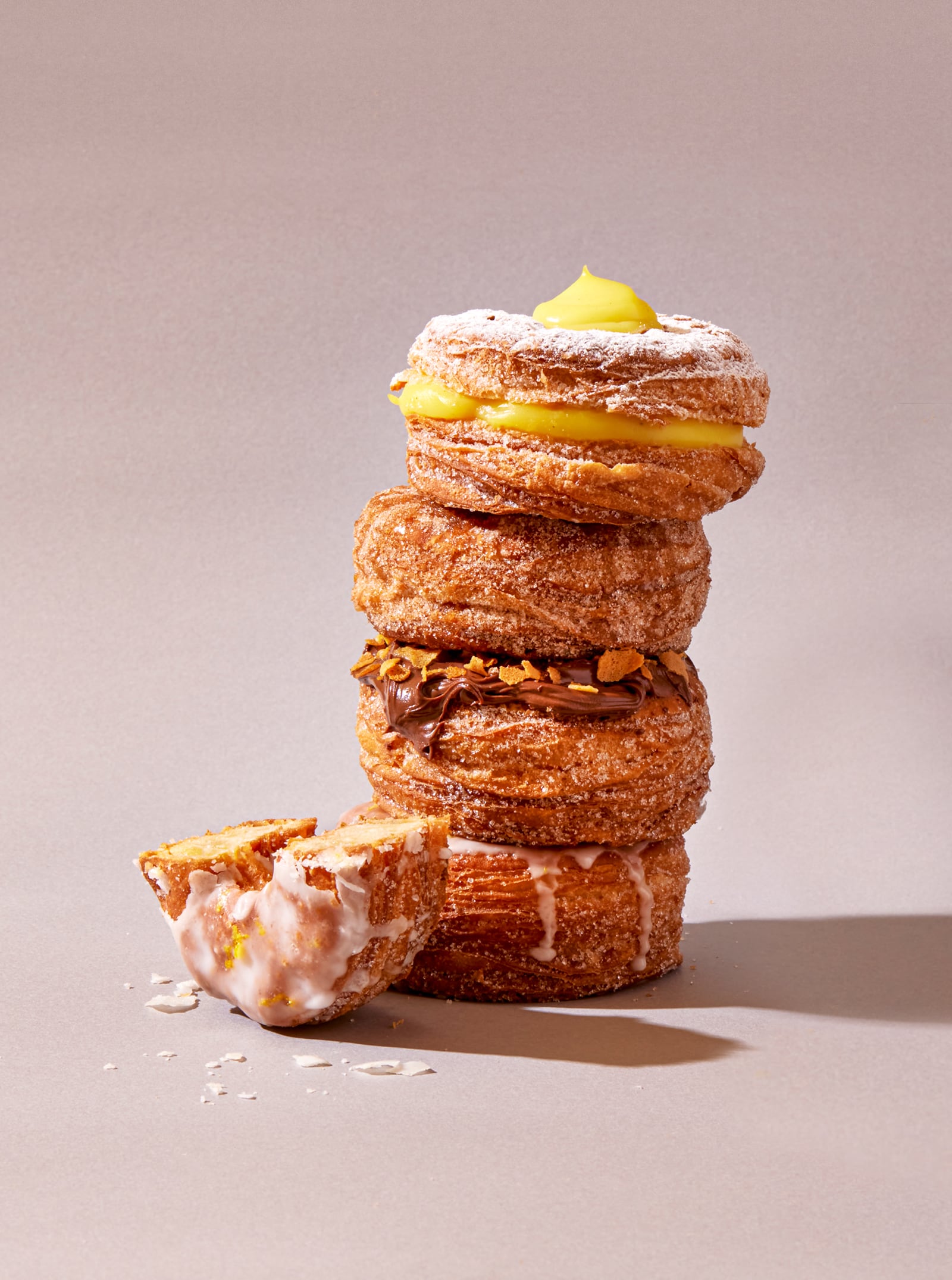
D FLAT as a brand aims to provide a pleasure experience offering not only various desserts and seasonal menus but also a cozy atmosphere, quality service, and successful teamwork.
In the future, D FLAT will continuously diversify its appearance and contents depending on various areas and purposes.
디플랫 성수 - 각광받는 동네, 각광받는 브랜드. 2022년 4월 '디플랫 D FLAT'이 성수동에 오픈했습니다. MZ세대와 성수동에 대한 재고찰을 바탕으로 설립된 이 곳은, 음식점, 공방, 카페, 디자인 숍, 코워킹 공간, 대규모 숲 등이 혼재하는 성수동에서, 'The nest for smart mobile creators'를 모토로 편안한 분위기와 합리적인 가격의 서비스를 제공합니다. 빅 테이블에는 콘센트가 배치되어 있어서 사무실이나 집 밖에서 작업할 때 최적의 환경을 제공합니다. 브랜드는 다양한 디저트와 계절에 따른 변화를 주는 시즌 메뉴를 제공하며, 공간의 분위기, 서비스, 팀웍 등으로 긍정적인 경험을 제공하고자 노력합니다. 앞으로도 디플랫은 여러 지역과 목적에 따라 모습과 컨텐츠가 다양해질 예정입니다.
BRAND CORE VALUE
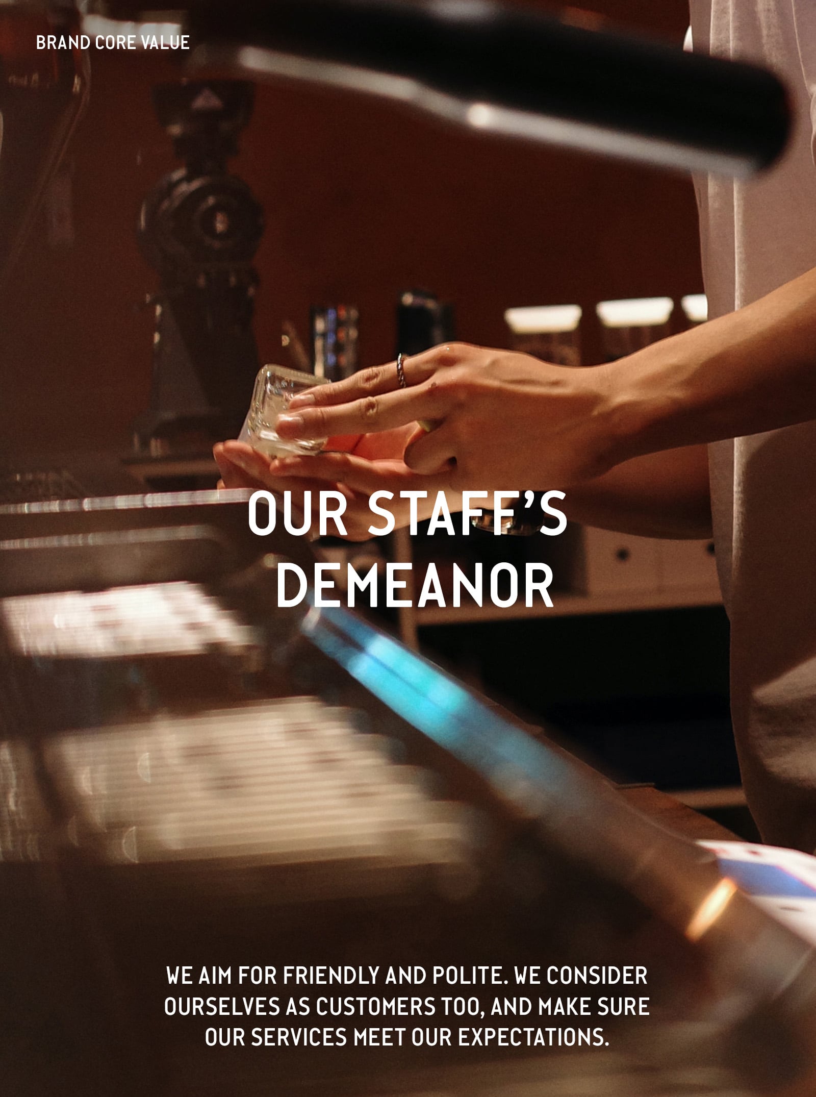
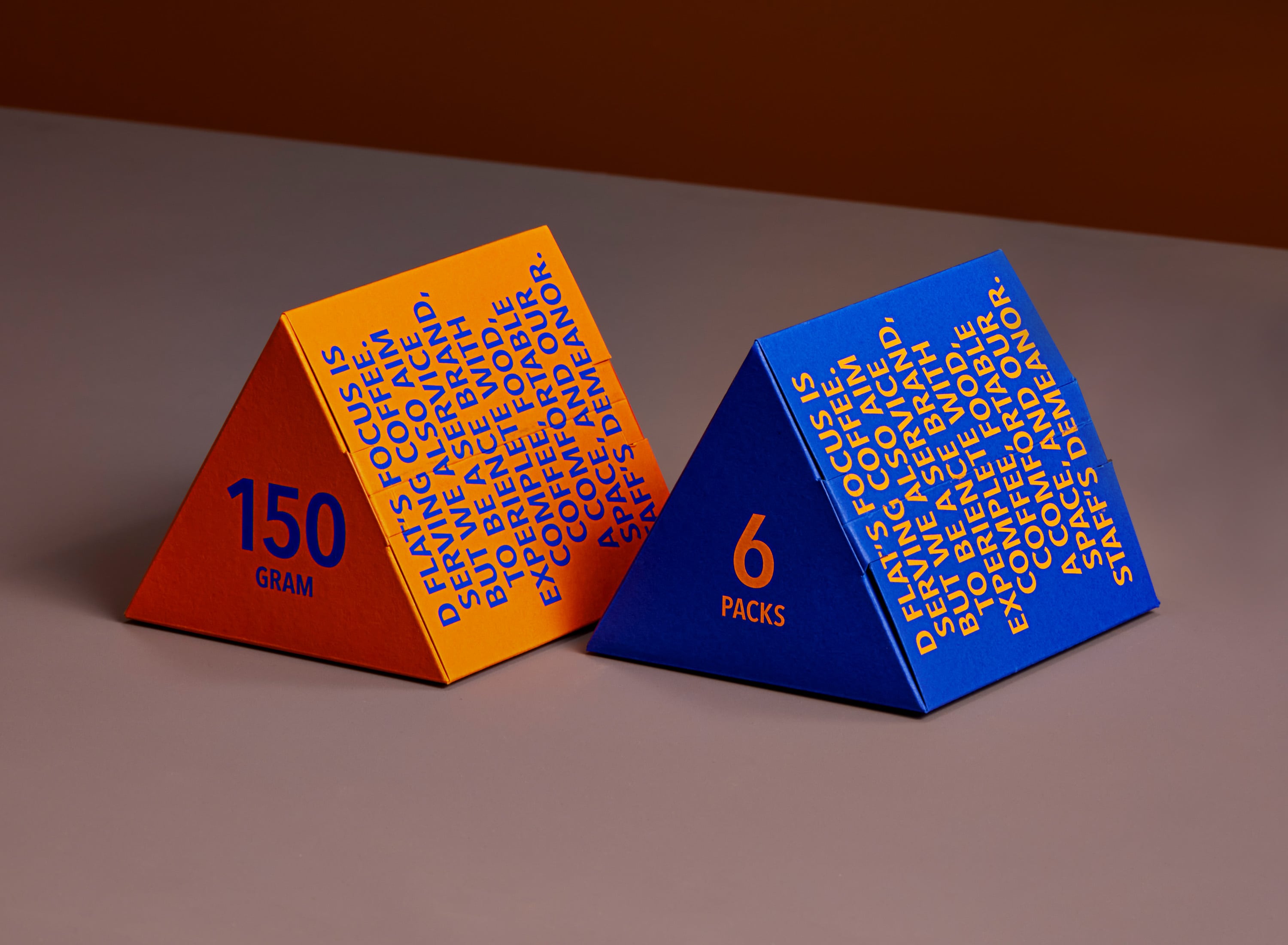
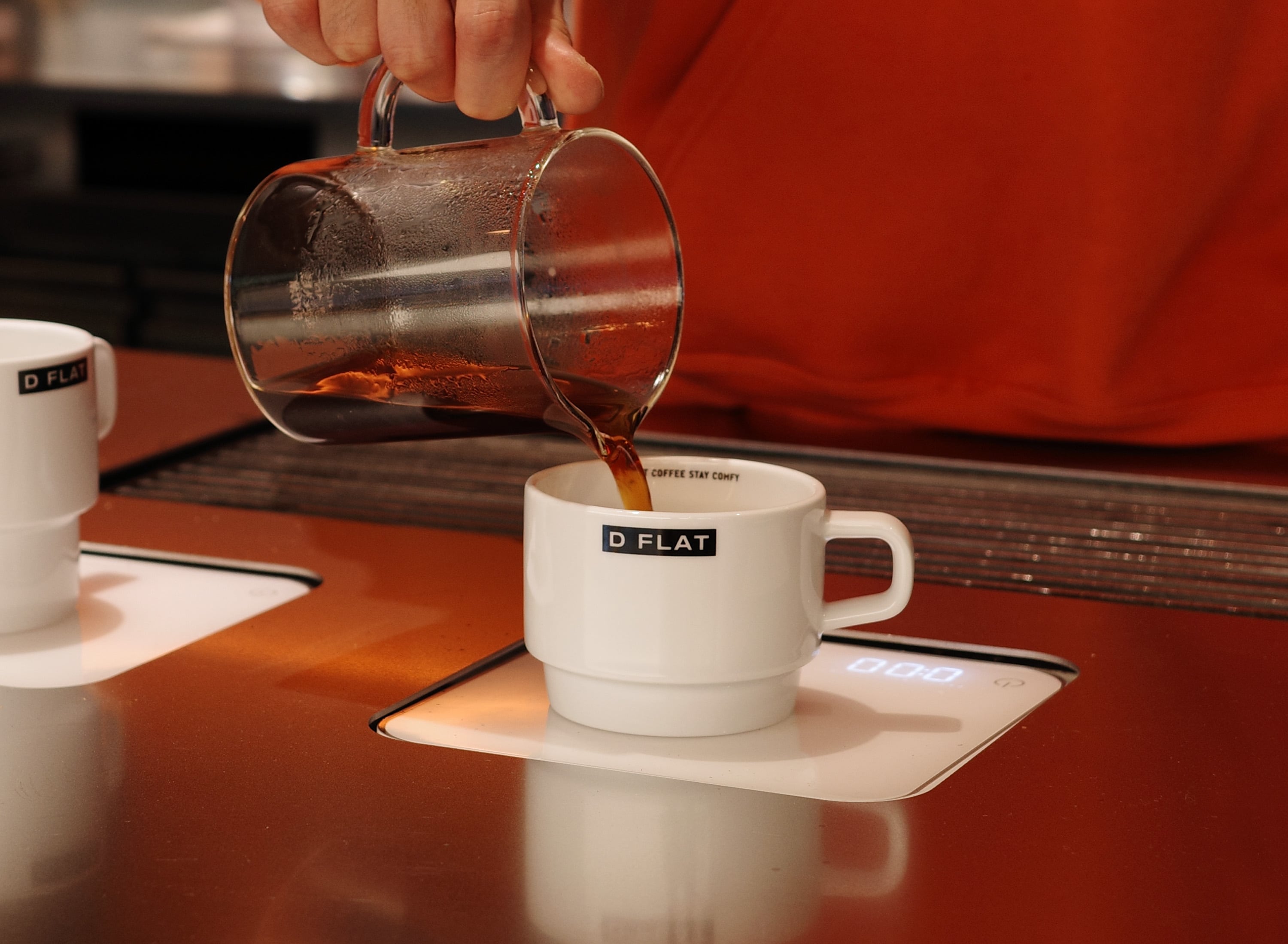
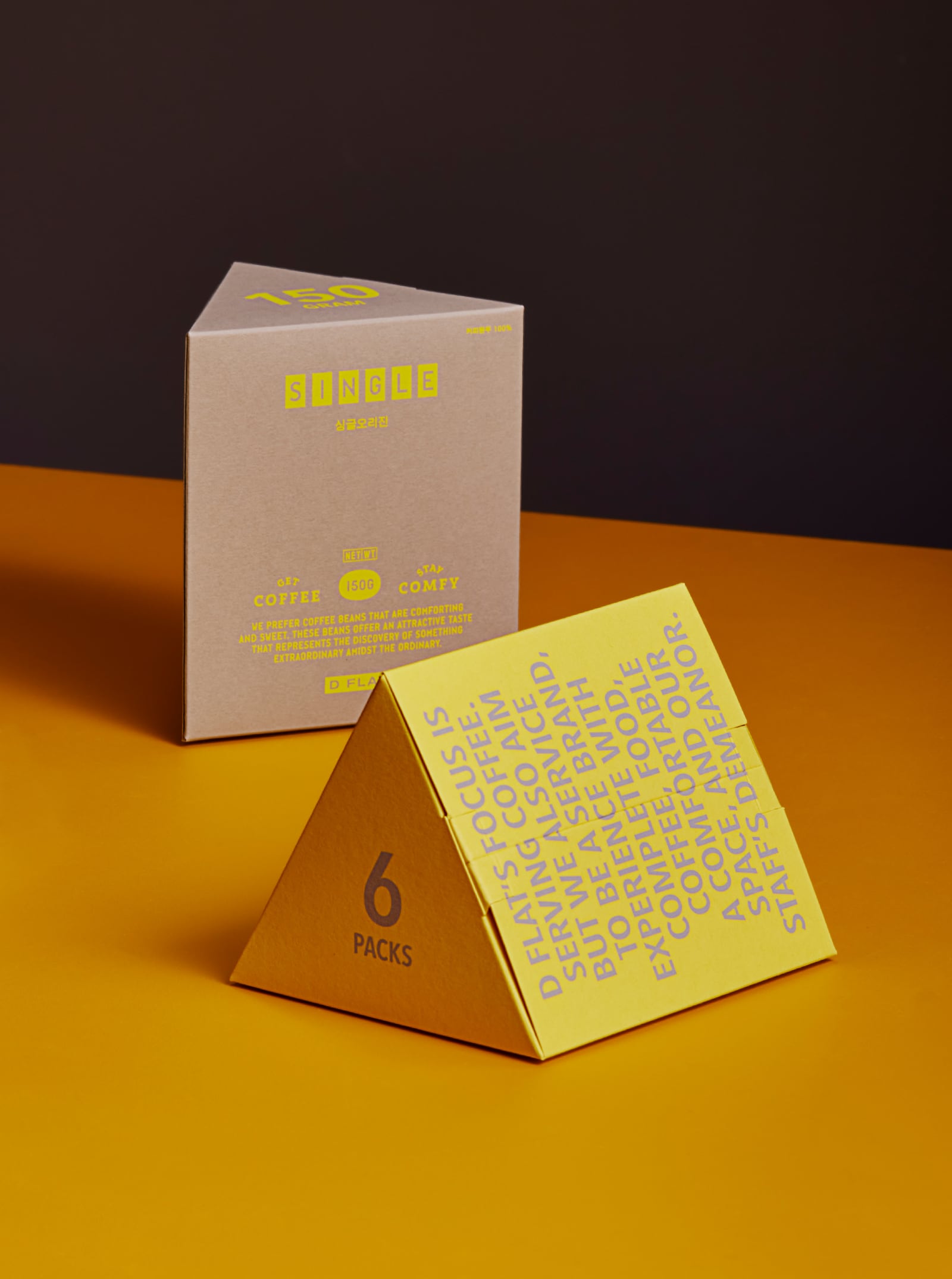
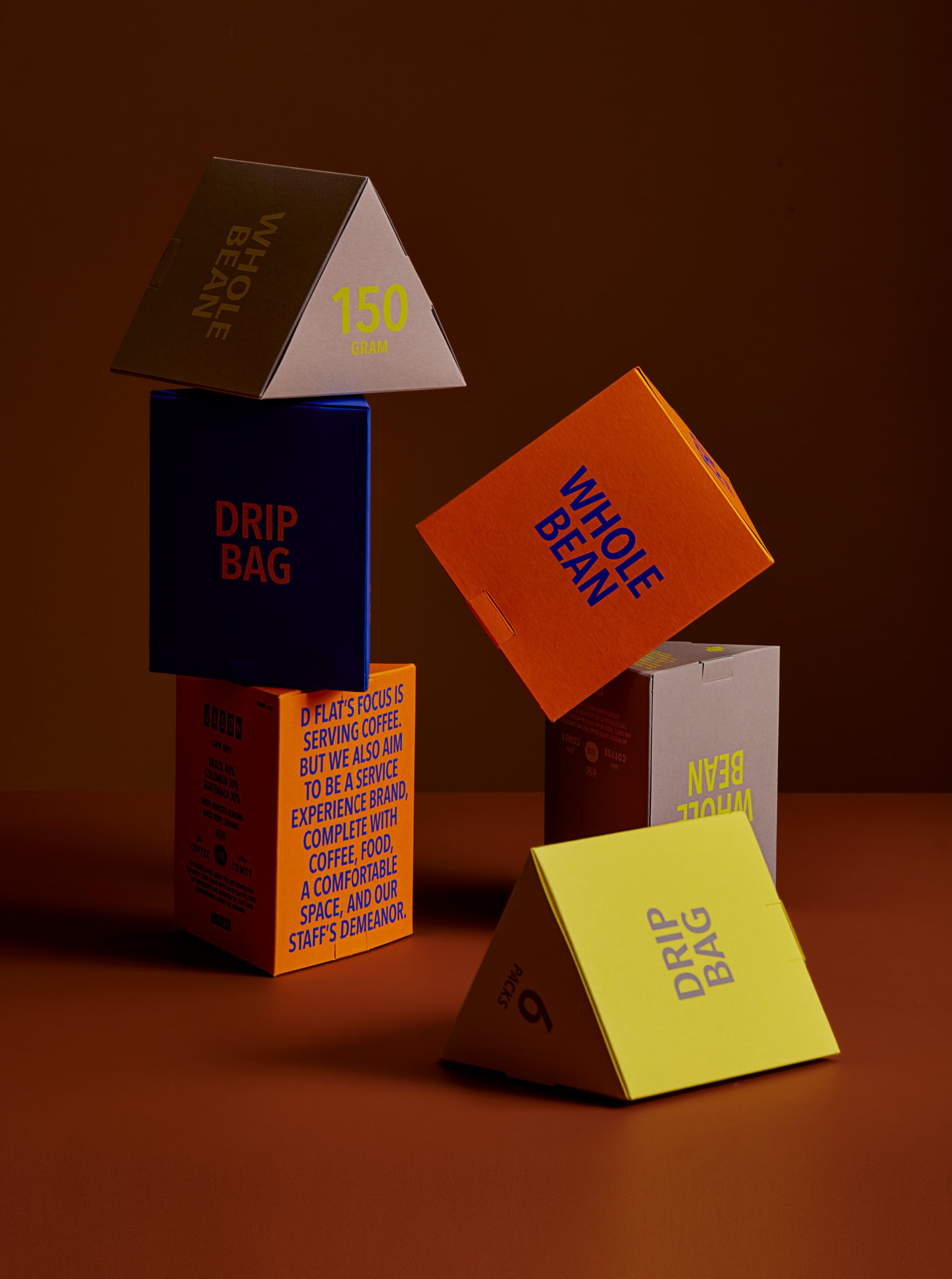
D FLAT’s focus is serving coffee. But we also aim to be a service experience brand, complete with coffee, food, a comfortable space, and our staff’s demeanor.
D FLAT은 커피를 메인으로 서비스하고 있지만, 커피를 포함한 모든 음식과 공간이 주는 느낌, 그리고 직원들의 태도로 완성된 하나의 서비스 브랜드(Service Experience Brand)를 지향합니다.
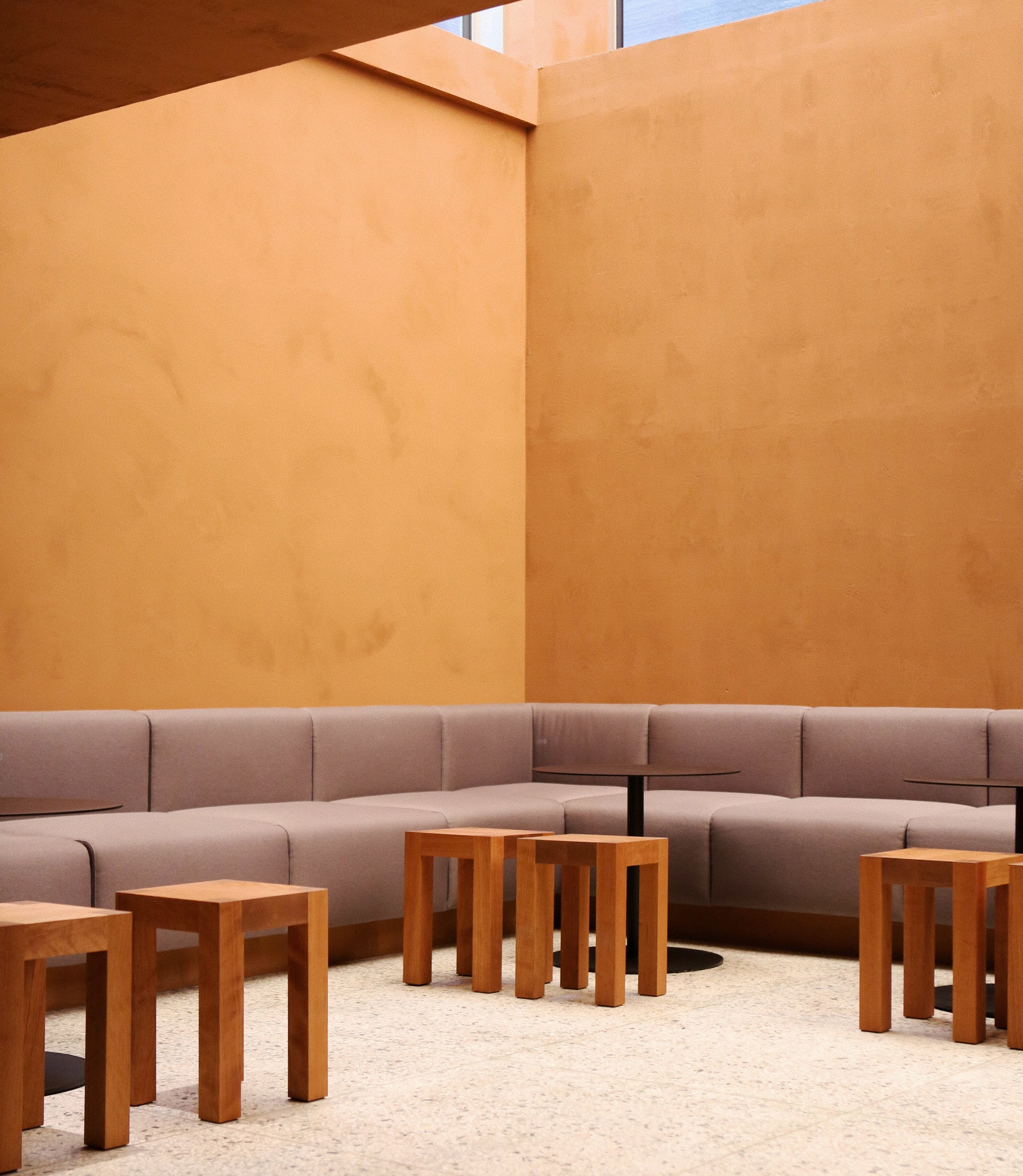
The minimalist and refined interior follows thoughtful and sustainable design principles, enhancing the characteristics of the buildings and neighborhoods we’re located in. Our spaces are built to be multifaceted, keeping in mind the movements and convenience of the employees who spend their days there, as well as creating visual divisions that allow patrons to enjoy their time whether they’re the only guest, or one of many. When guests sit down, their eyes will naturally drift towards the windows, taking in the natural view of the landscaping, creating an atmosphere that they’ll fall in love with more as time goes on.
간결하고 정제된 인테리어는 우리의 매장이 입점한 건물과 동네 주변의 특색을 더해 지적이면서도 지속 가능한 디자인을 추구합니다. 가장 많은 시간을 보내게 될 직원들의 동선과 편의를 배려하고, 방문한 손님들이 편안한 시간을 가질 수 있도록 독립적인 공간을 만들어 시선을 분리합니다. 좌석에 앉았을때 자연스럽게 시선이 가는곳에 창을 두고 조경을 하여 오래 두고 보면 볼수록 좋아하게 되는 공간의 분위기를 만듭니다.
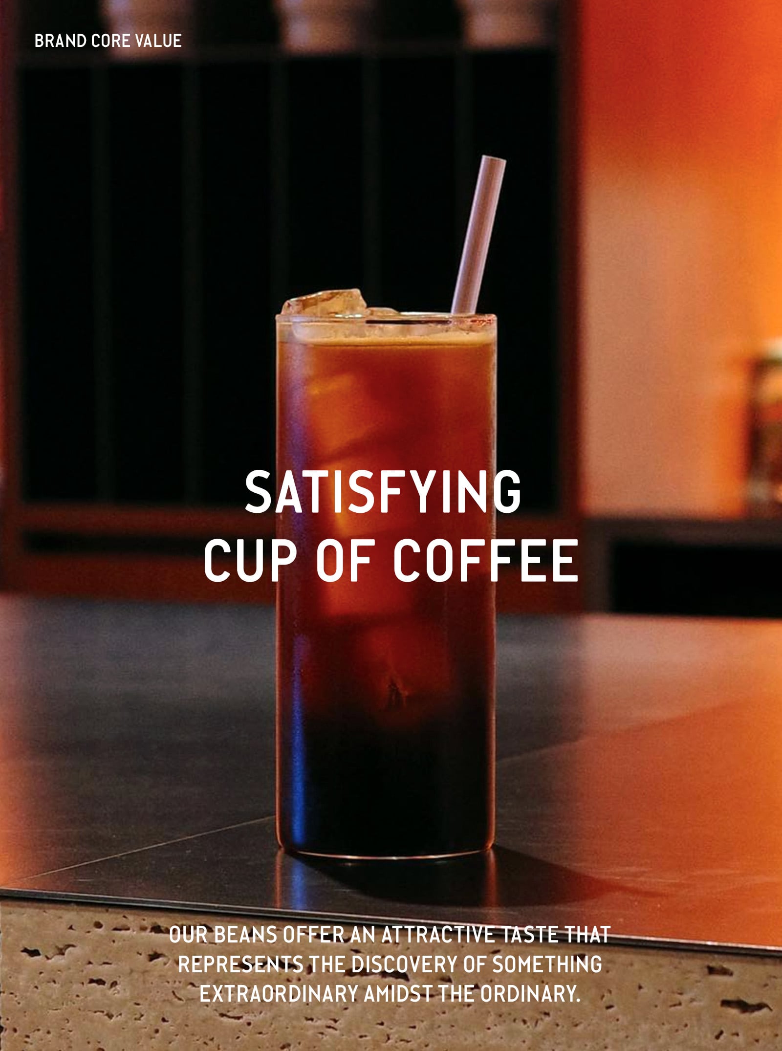
We prefer coffee beans that are comforting and sweet. These beans offer an attractive taste that represents the discovery of something extraordinary amidst the ordinary. Our desserts items are unique to our shop, and as delicious as they are visually pleasing. We won’t say we’re the best — taste and atmosphere are subjective, after all — but we are extremely selective and careful, only choosing ingredients we consider the best.
우리는 편안하고 단맛이 좋은 원두를 선호합니다. 평범함 속에서 비범함을 강조하여 매력적인 맛을 선사합니다. 디저트는 어디서나 쉽게 맛볼 수 없어야 하고, 시각적인 즐거움을 제공해야 합니다.식음료의 맛과 공간 그리고 직원들이 주는 느낌들에 대한 평가는 주관적인 영역이라 우리가 최고라고 말할 수는 없지만, 우리는 아주 까다롭고 신중하게, 그리고 우리가 판단했을때 ‘최고’ 라고 여겨지는 재료들로 선정합니다.
우리는 친근하면서도 매너를 지키는 서비스를 지향합니다. 우리는 우리 자신을 최대의 고객이라 생각하고 우리의 서비스가 스스로의 기대에 부합할 수 있도록 합니다.
BRAND ESSENCE
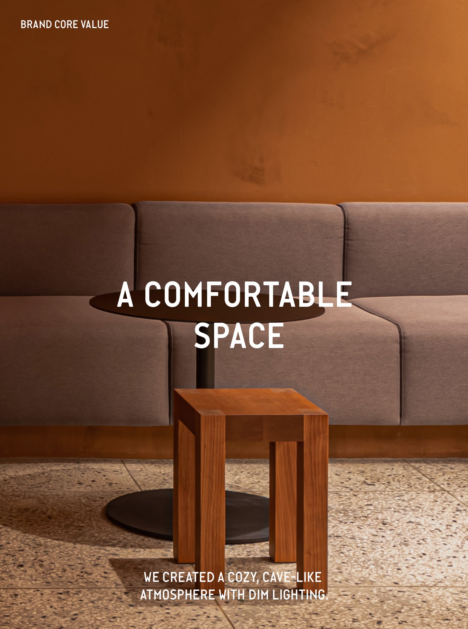
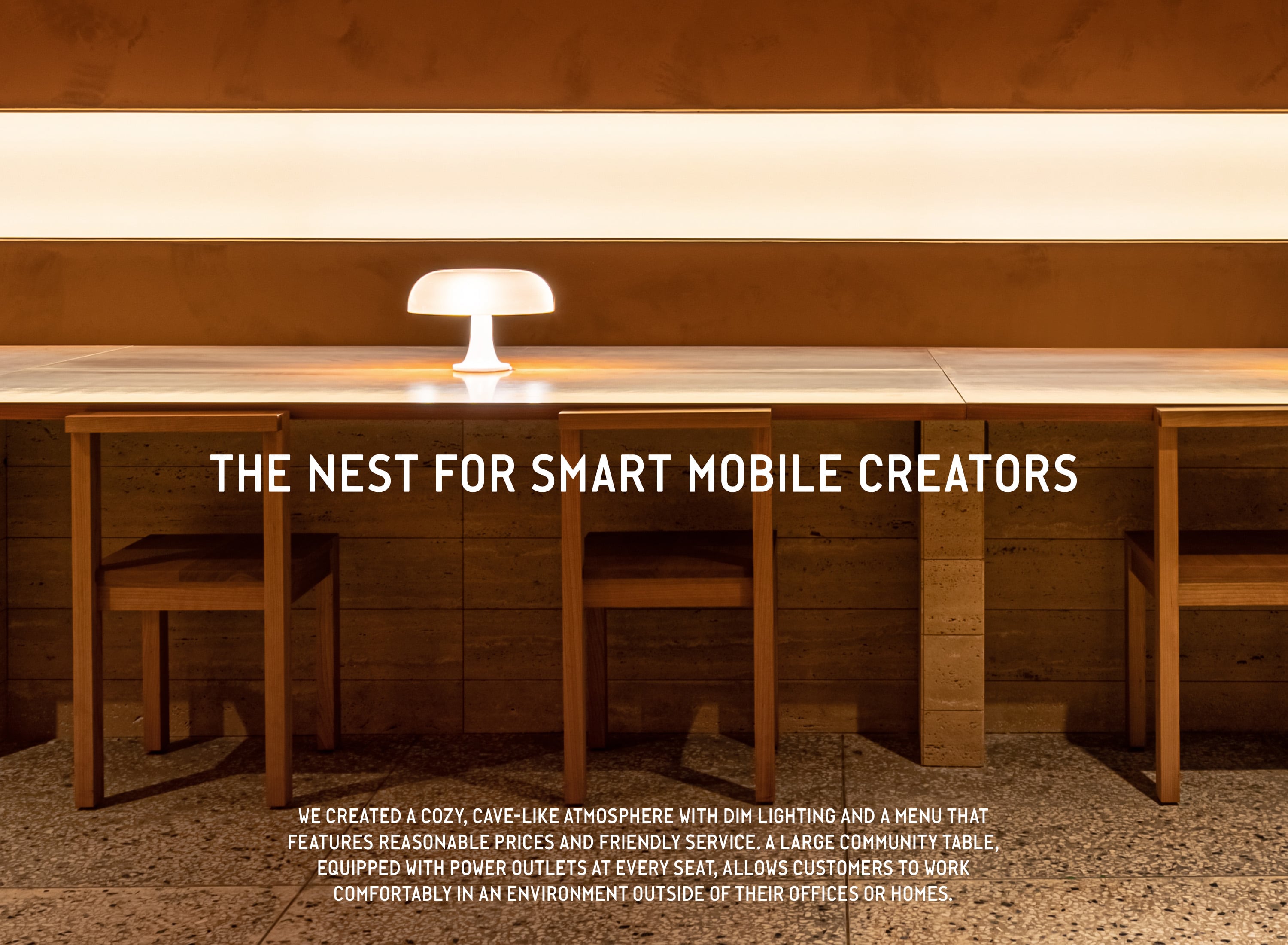
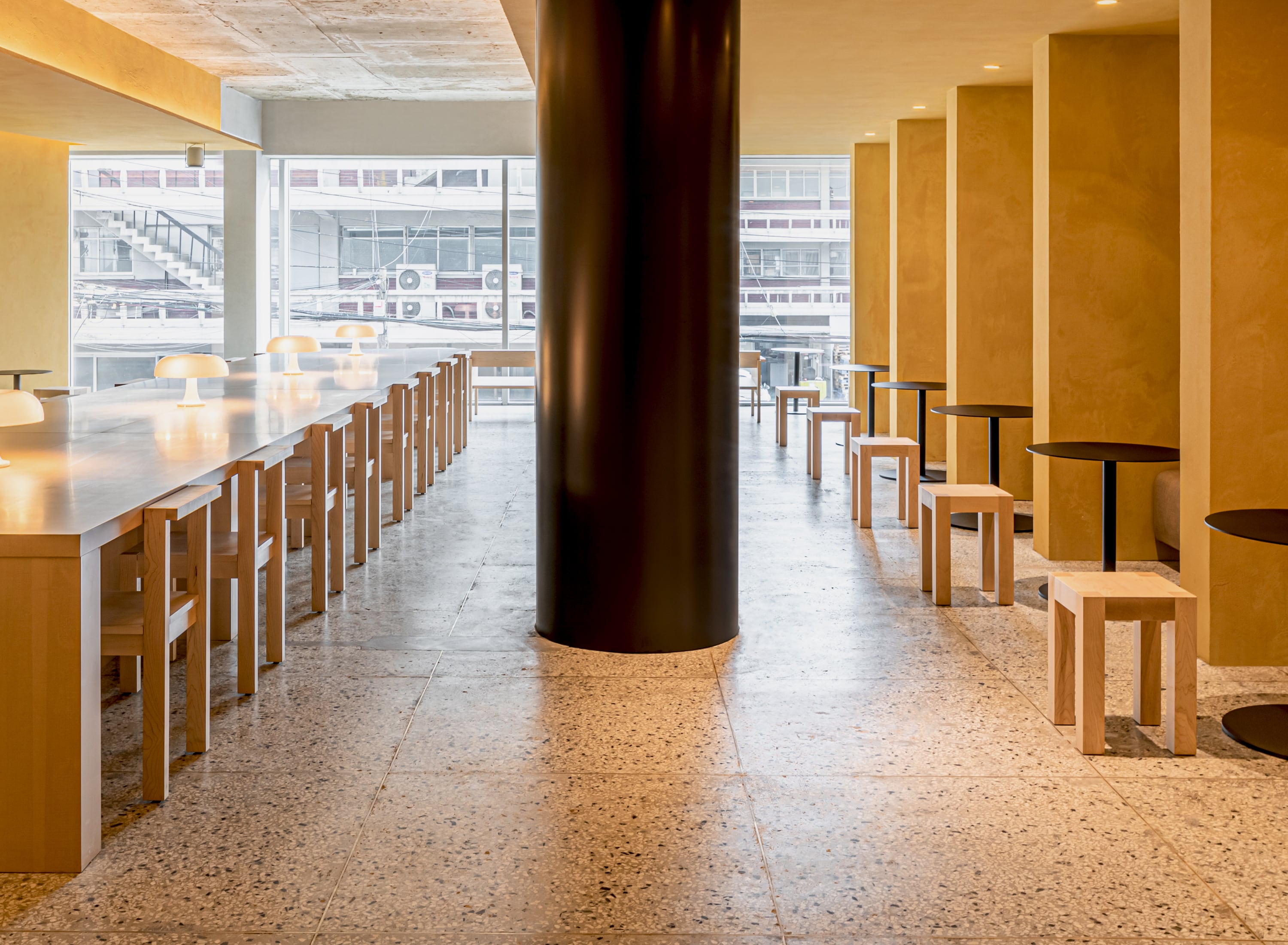
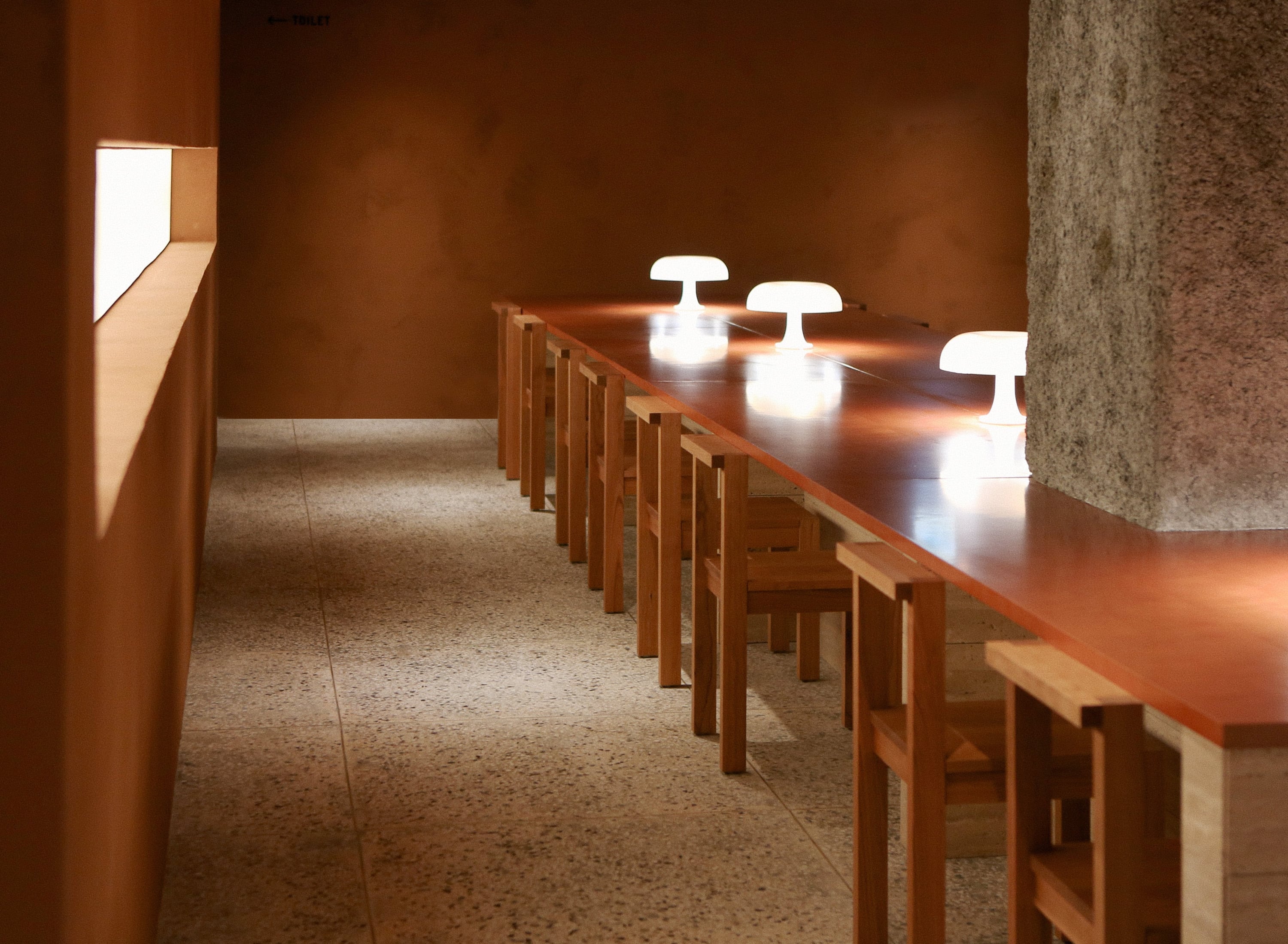
We discovered that, despite their inclination to share everything online, Gen Z still seeks out places with a more subdued atmosphere. It's human nature to tire of things that are overly shiny and new. So, we created a space that offered comfort and stability within a neighborhood known for its swift and sometimes chaotic changes. We defined D FLAT as "A nest for smart mobile creators." We created a cozy, cave-like atmosphere with dim lighting and a menu that features reasonable prices and friendly service. A large community table, equipped with power outlets at every seat, allows customers to work comfortably in an environment outside of their offices or homes.
모든 것을 공유해야지만 직성에 풀리는 Gen-Z 라고 해서 절제되고 안락곳을 마다할 이유가 없지요. 유독 눈에 띄면 띌수록 쉽게 질려버리는 사람들의 소비 패턴이란것이 있습니다. 디플랫은 그에 반(反)하여 멋있고 힙하지만 급변하고 어지러운 성수동에서 편안한 공간의 이미지를 구체화 하고, 이를 바탕으로 ‘The nest for smart mobile creators’라 정의 했습니다. 편안한 분위기에서 기분 좋은 서비스를 합리적인 가격에 제공하고, 전반적으로 어두운 조도를 유지하여 동굴같은 아늑함을 느낄 수 있도록 했습니다. 빅 테이블에는 좌석마다 콘센트를 배치하여 사무실을 벗어나, 집 안을 벗어나 잠깐 잠깐 작업을 해야하는 상황등을 대비하여 최적화된 환경을 만들었습니다.
BRAND LOGO & SLOGAN
The minimalist and refined interior follows thoughtful and sustainable design principles, enhancing the characteristics of the buildings and neighborhoods we’re located in. Our spaces are built to be multifaceted, keeping in mind the movements and convenience of the employees who spend their days there, as well as creating visual divisions that allow patrons to enjoy their time whether they’re the only guest, or one of many. When guests sit down, their eyes will naturally drift towards the windows, taking in the natural view of the landscaping, creating an atmosphere that they’ll fall in love with more as time goes on. We are extremely selective and careful, only choosing ingredients we consider the best.
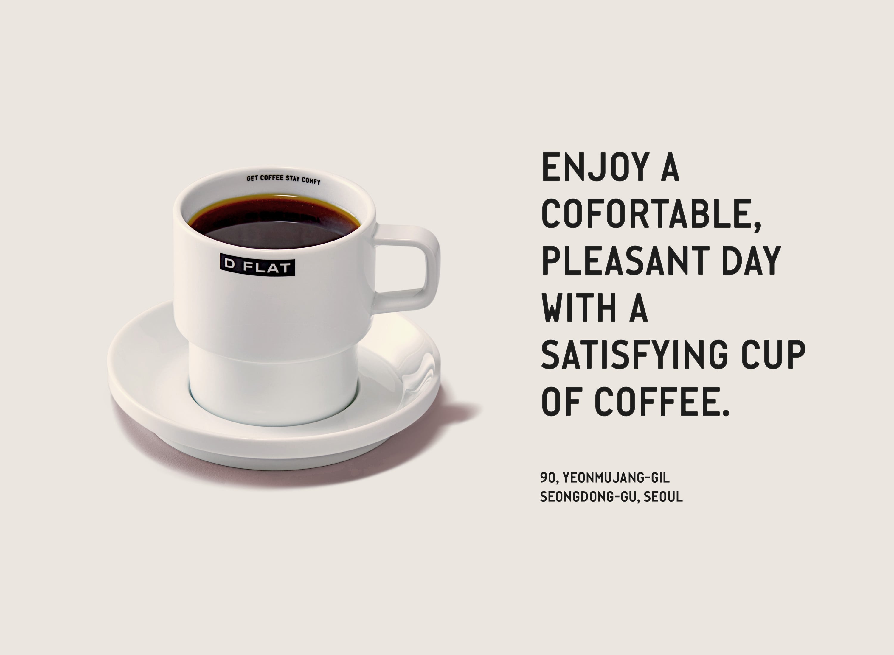
간결하고 정제된 인테리어는 우리의 매장이 입점한 건물과 동네 주변의 특색을 더해 지적이면서도 지속 가능한 디자인을 추구합니다. 가장 많은 시간을 보내게 될 직원들의 동선과 편의를 배려하고, 방문한 손님들이 편안한 시간을 가질 수 있도록 독립적인 공간을 만들어 시선을 분리하였습니다. 좌석에 앉았을때 자연스럽게 시선이 가는곳에 창을 두고 조경을 하여 오래 두고 보면 볼수록 좋아하게 되는 공간의 분위기를 만듭니다. D FLAT을 방문한 손님들이 잠시라도 마음의 평화를 느끼고, 만족스러운 커피 한잔으로 편안하고 기분 좋은 하루를 보내시길 바랍니다.

BRAND TYPOGRAPHY
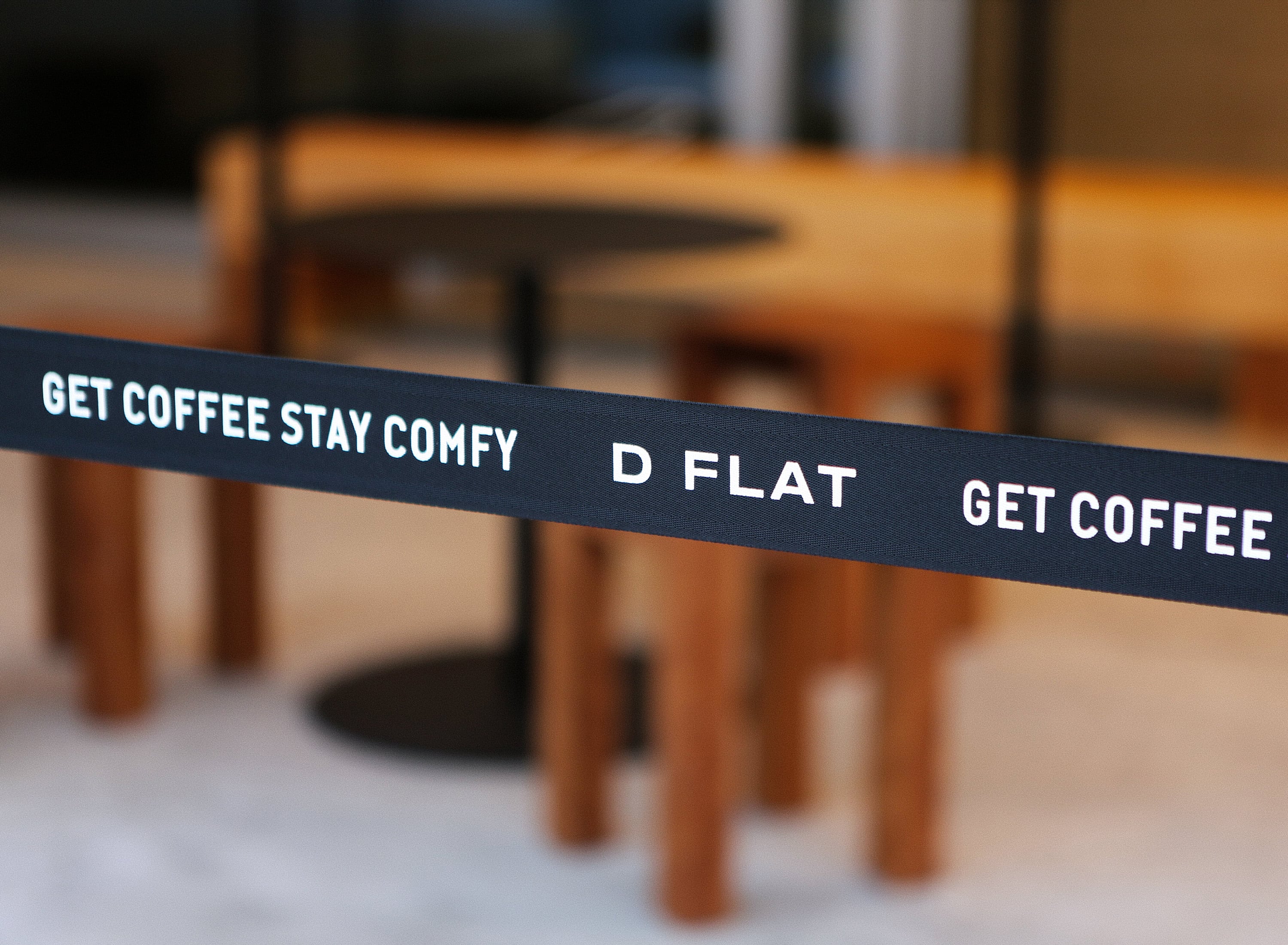
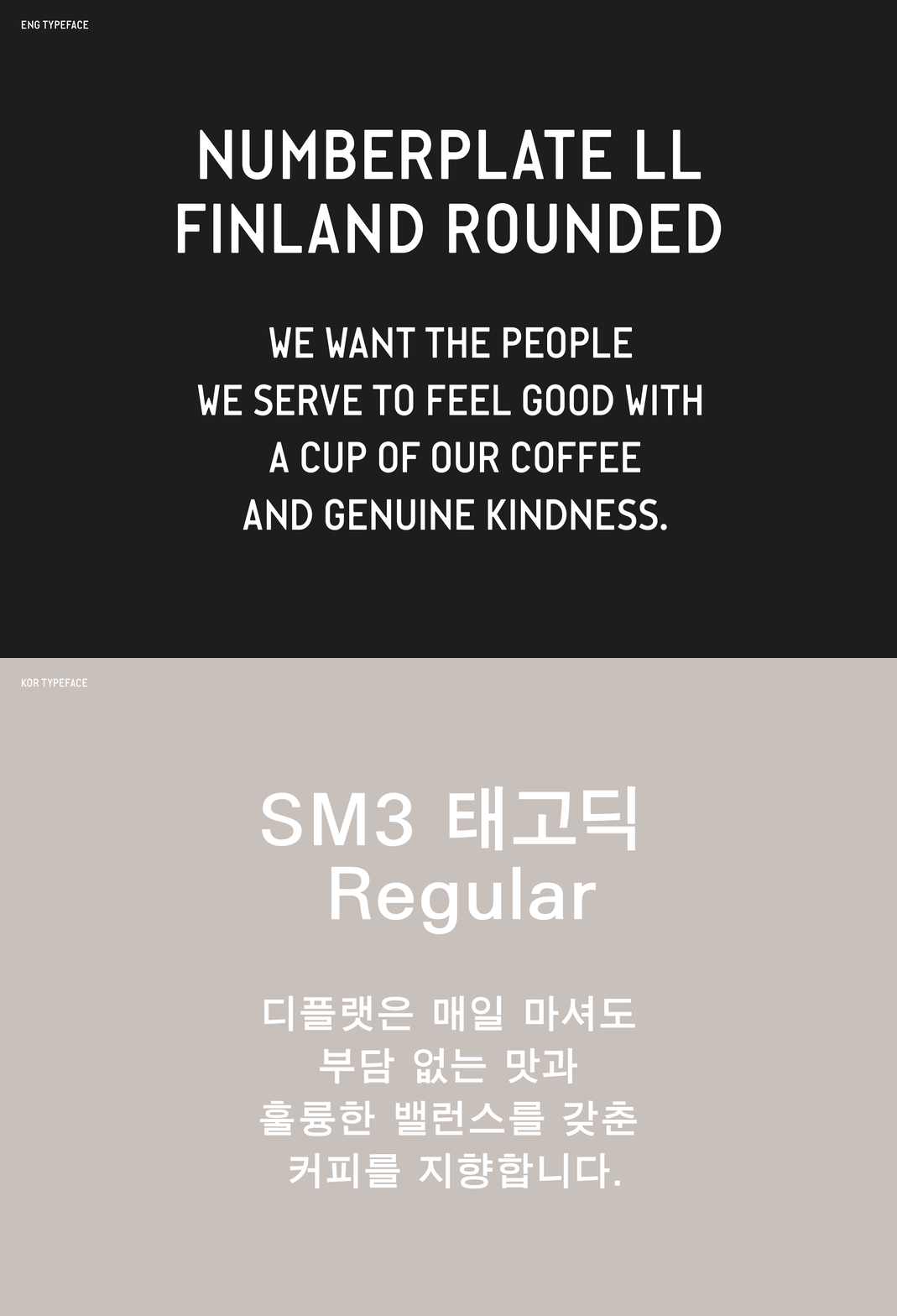
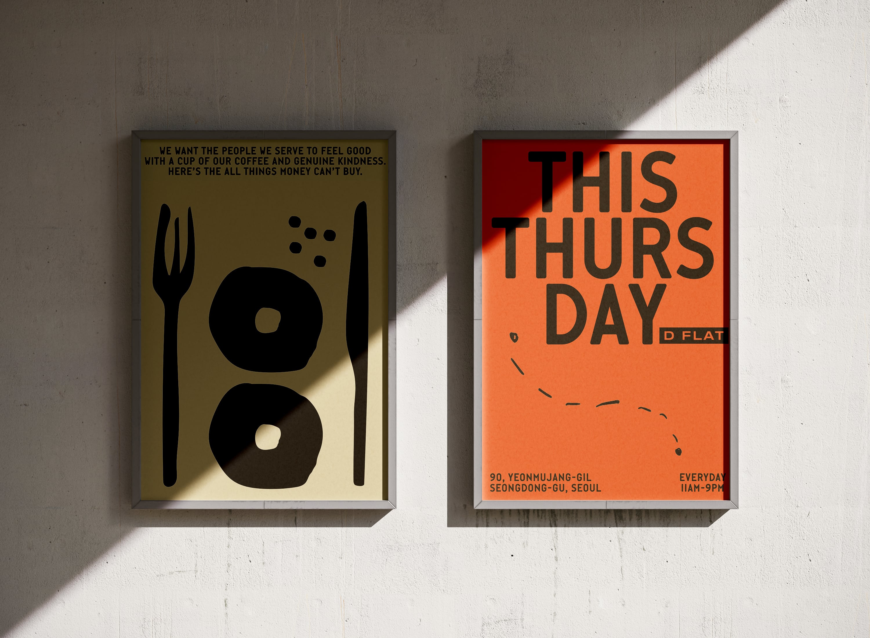
English font and Korean font were selected. English font is a font used for car license plates in Europe and it’s concise and legible font. The Korean font is a slightly weighted font so that even small explanatory text can be seen clearly.
각각 영문서체와 한글서체를 선정하였는데, 영문은 유럽에서 자동차 번호판으로 사용되고 있는 서체로, 간결하고 가독성이 좋은 폰트로 지정 했습니다. 한글서체는 약간의 웨이트가 있는 폰트로 작은 설명 글씨도 잘 보이도록 했습니다.
D FLAT’S HEROES
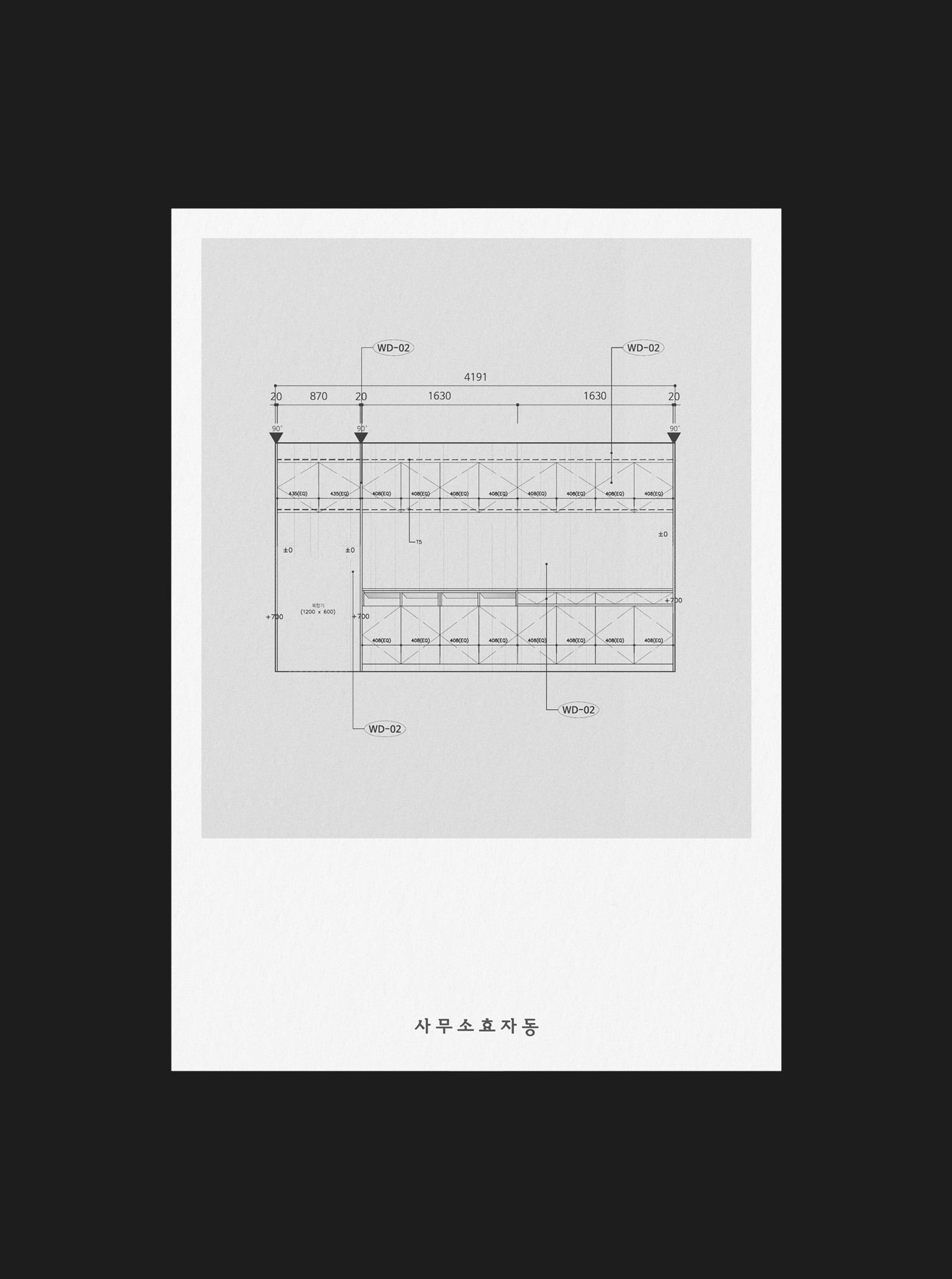
Starting from architectural remodeling to interior, landscaping, and furniture - Office Hyoja-dong, Archi, Wave Plant, and General Grey, who helped with the color of D-Flat down to the very details - all completed D-Flat with great ideas and detailed completion with professionalism.
건축 리모델링부터 시작하여 인테리어, 조경, 가구 - 아주 디테일한 부분까지 디플랫의 컬러를 위해 도와준 사무소효자동, 아취, 파도식물, 제너널그레이 - 모두 훌륭한 아이디어와 디테일한 완성까지 프로페셔널함으로 디플랫을 완성해주었습니다.
ARCHITECTURE
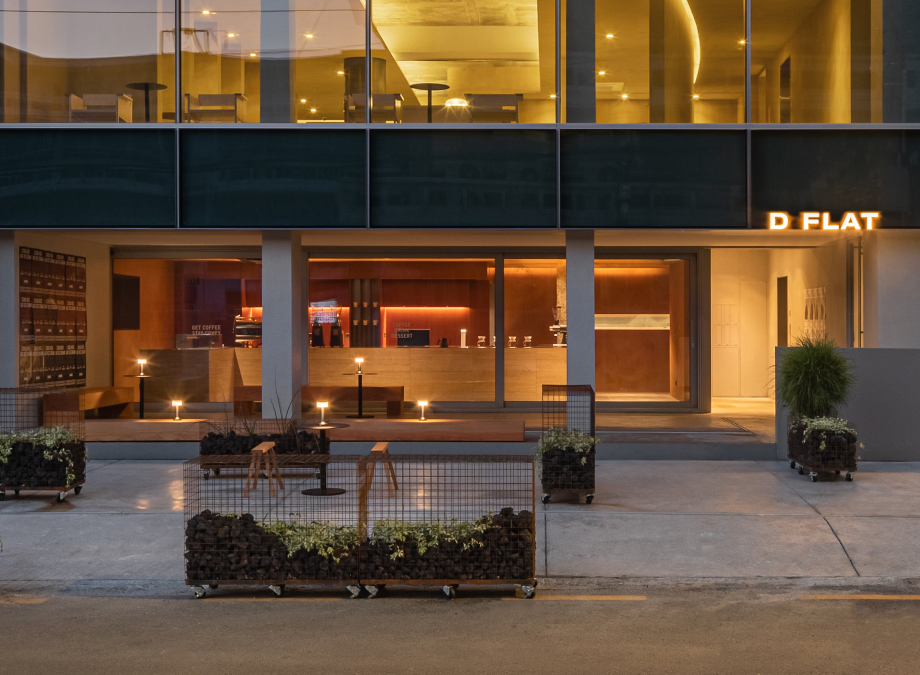
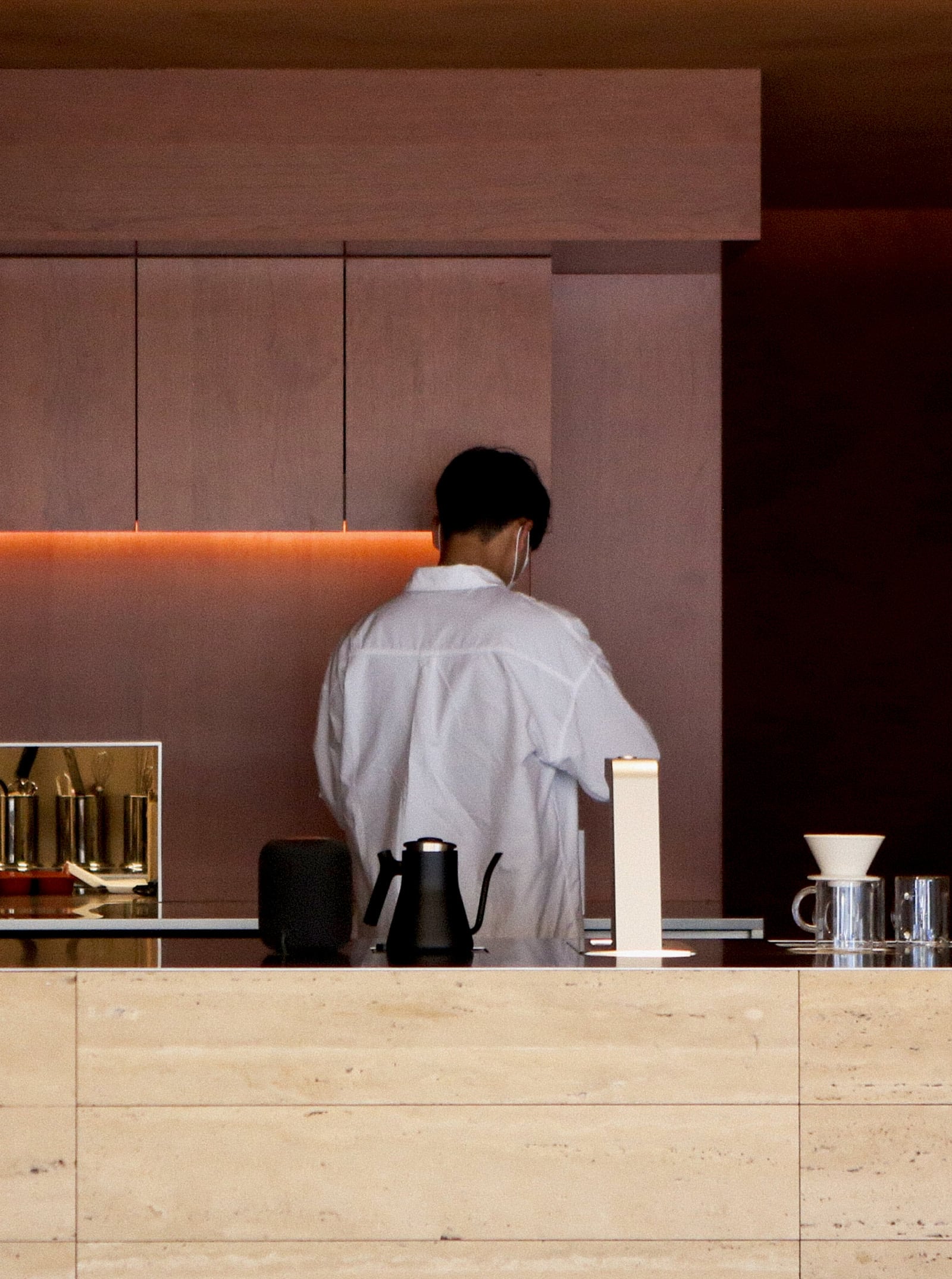
It seems that D-Flat Seongsu's biggest concern was about the user flow or traffic rather than brand image and design. In order to create an additional floor that was not in the existing building, the first floor had to be used as coffee bar and for that, pushing the building inside and drilling the floor had to be done for securing more space. Even after securing space for the elevator, the first floor seemed too narrow for the staff to use, but we successfully designed space with high quality. The low ceiling looked little stuffy, but we decided to use that part to create a dark and cozy atmosphere like a cave.
기존의 오래된 특색 없는 건물을 힙한 동네에 힙한 분위기의 카페가 들어서기 위해 어떻게 변경해야 하는지에 대한 고민으로부터 시작했습니다. 결론적으로는 카페를 위해 전체 건물을 변경할것은 아니기에 인테리어에서 풀기로 하고 건물은 다른(Office등) 용도로 사용하기에 무리가 없도록 설계하고 기존 엘리베이터가 없는 건물에서 엘리베이터를 추가 하는등 ‘대수선’의 과정을 거쳤습니다. 1층을 Bar, 지하1층과 2층을 카페 좌석으로 활용하기로 하고 그에 맞추어 동선과 구성을 진행하였습니다.
INTERIOR
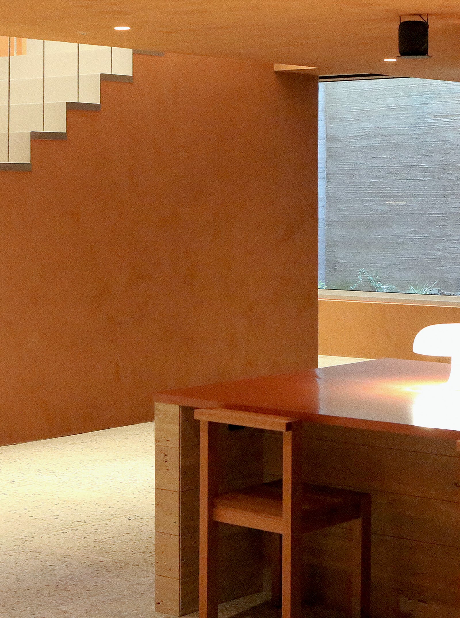
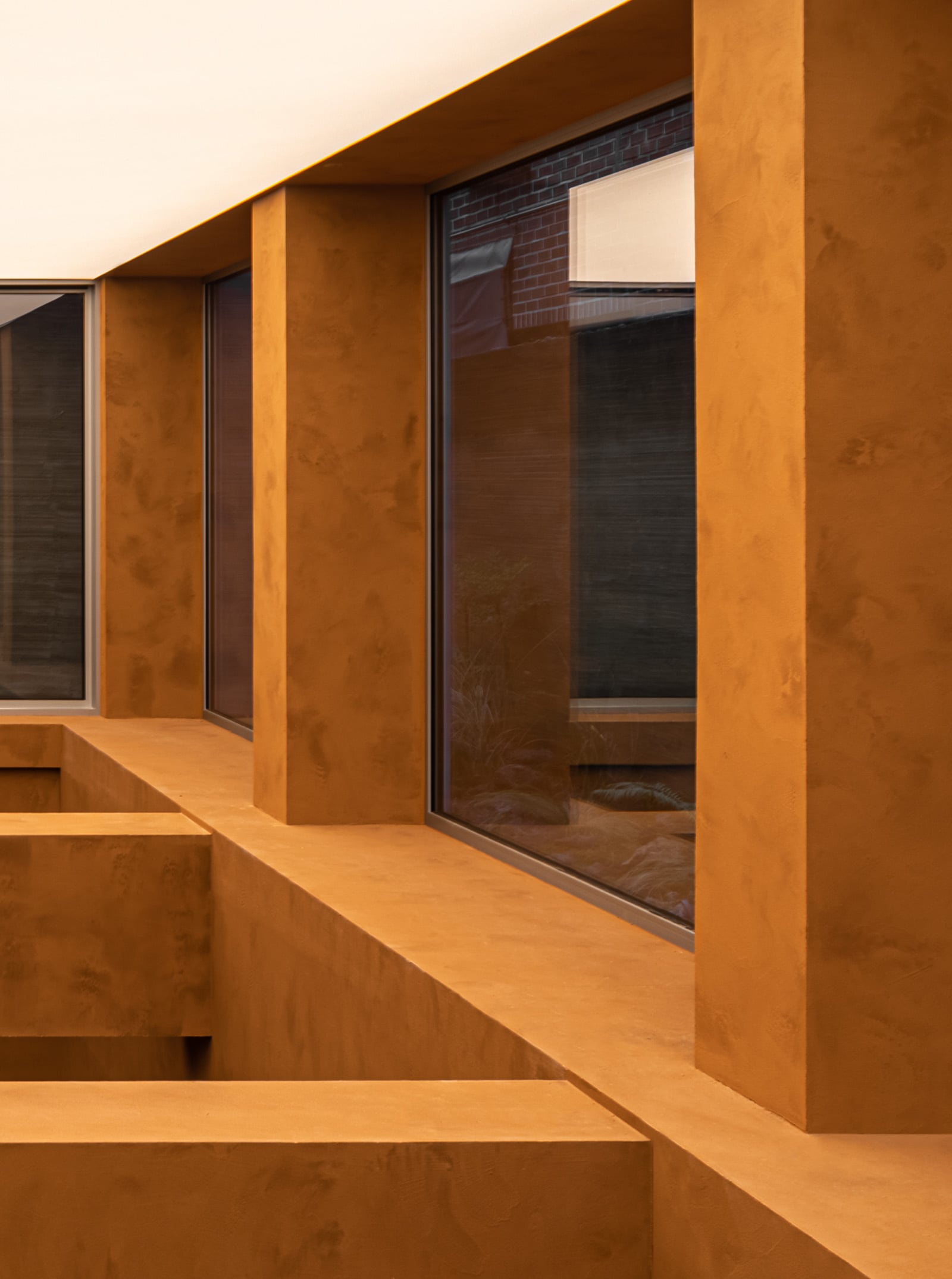
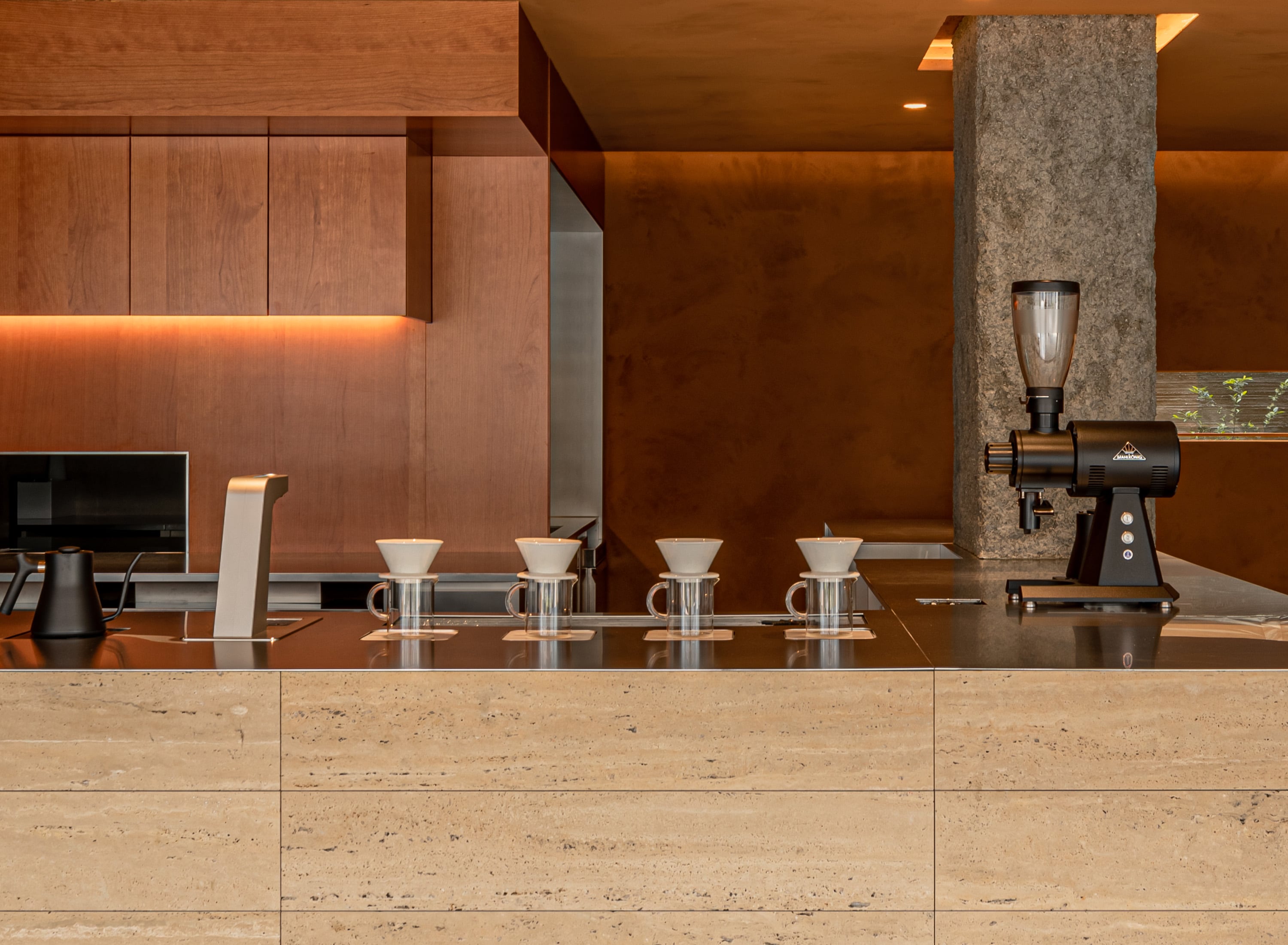
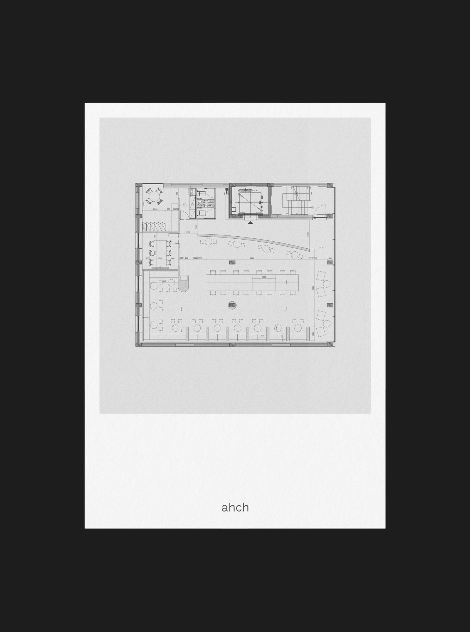
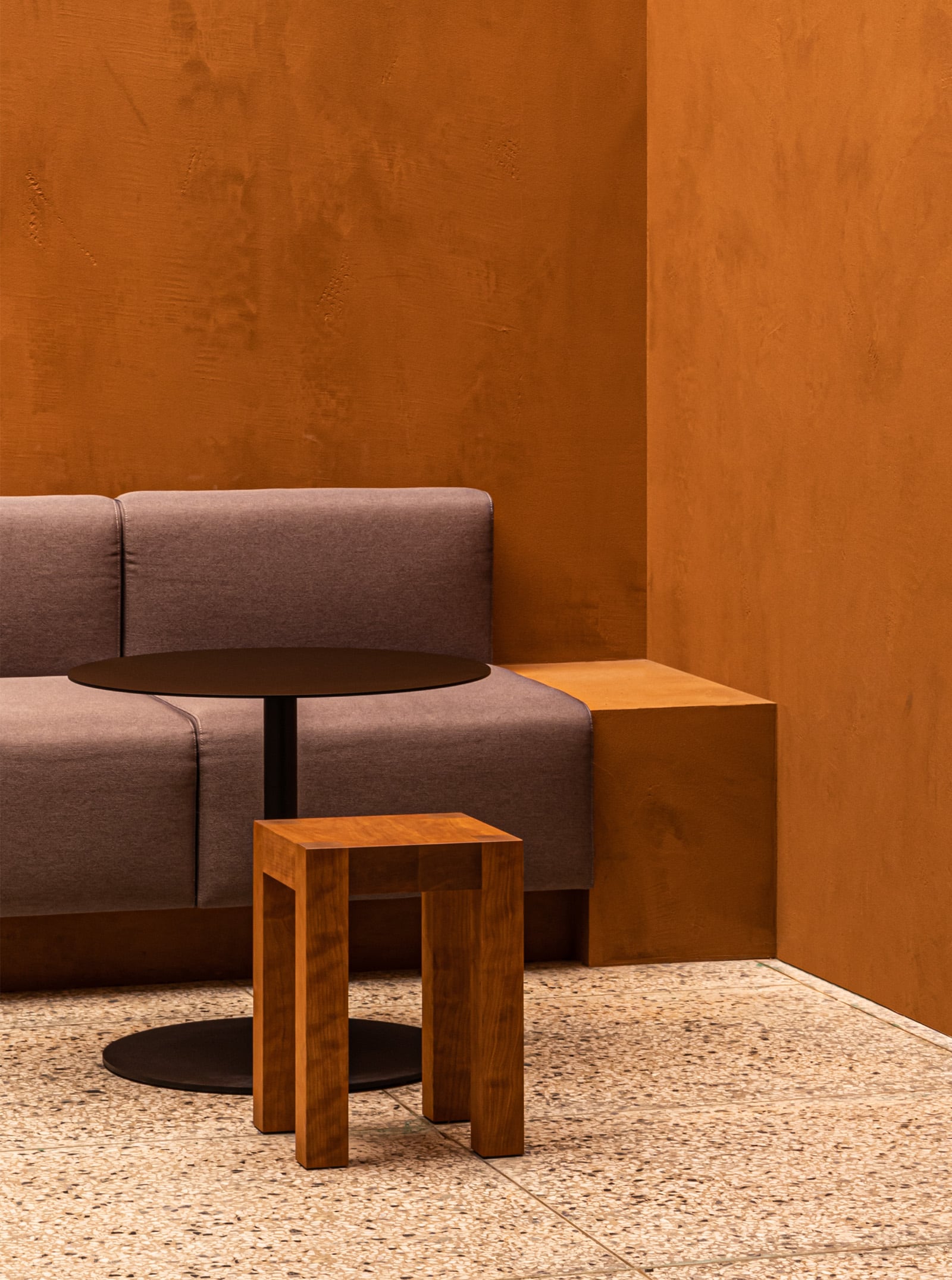
It seems that D-Flat Seongsu's biggest concern was about the user flow or traffic rather than brand image and design. In order to create an additional floor that was not in the existing building, the first floor had to be used as coffee bar and for that, pushing the building inside and drilling the floor had to be done for securing more space. Even after securing space for the elevator, the first floor seemed too narrow for the staff to use, but we successfully designed space with high quality. The low ceiling looked little stuffy, but we decided to use that part to create a dark and cozy atmosphere like a cave.
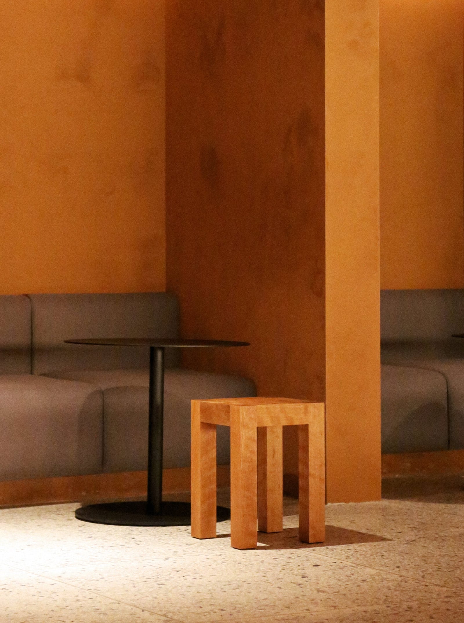
디플랫 성수의 가장 큰 고민은 어떤 이미지, 어떤 브랜드, 어떤 디자인 이런 눈에 보이는 부분 보다는 사실 동선에 대한 고민이 가장 컸습니다. 기존 건물에는 없었던 한개의 층을 추가로 만들기 위해서는 1층의(COFFEE BAR)의 땅을 내어주어야 했고, 그를 위해서는 건물을 안으로 밀어넣고 바닥을 뚫는 등의 말 그대로 땅을 내 주어야 했습니다. 심지어 엘리베이터에게까지 땅을 내 주고나니 1층은 직원들이 쓰기에도 좁아보였지만 어떻게든 구기고 구겨, 해낼수 없는 설계라고 하기엔 완성도가 훌륭한 설계를 해냈습니다. 낮은 천장은 답답해 보였지만 되려 그 부분을 활용하여 동굴같은 어둡고 아늑한 분위기를 만들기로 했고, 그를 위해 누군가는 찜질방, 누군가는 멕시코라고 말하는 테라코타 컬러를 벽색깔로 결정했습니다.
LANDSCAPE
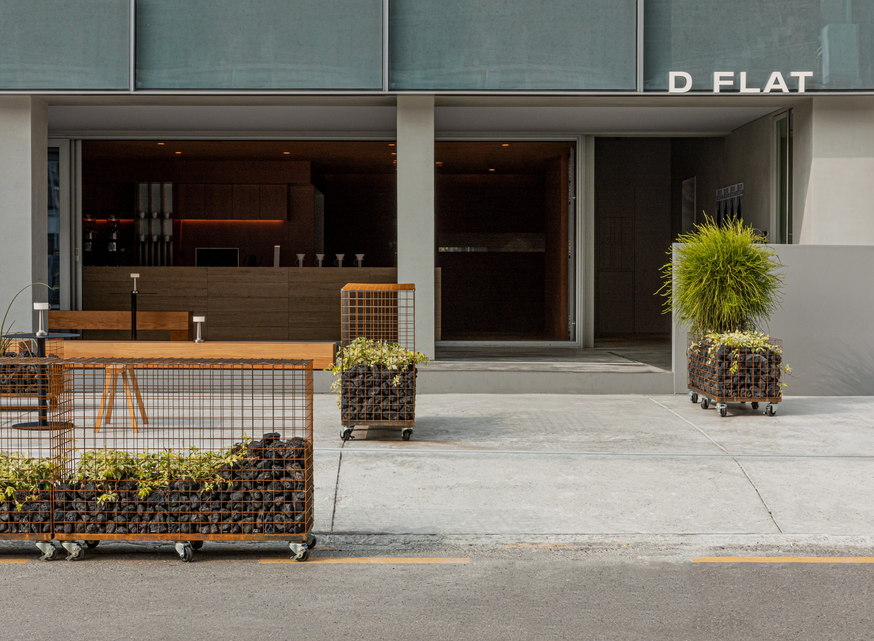
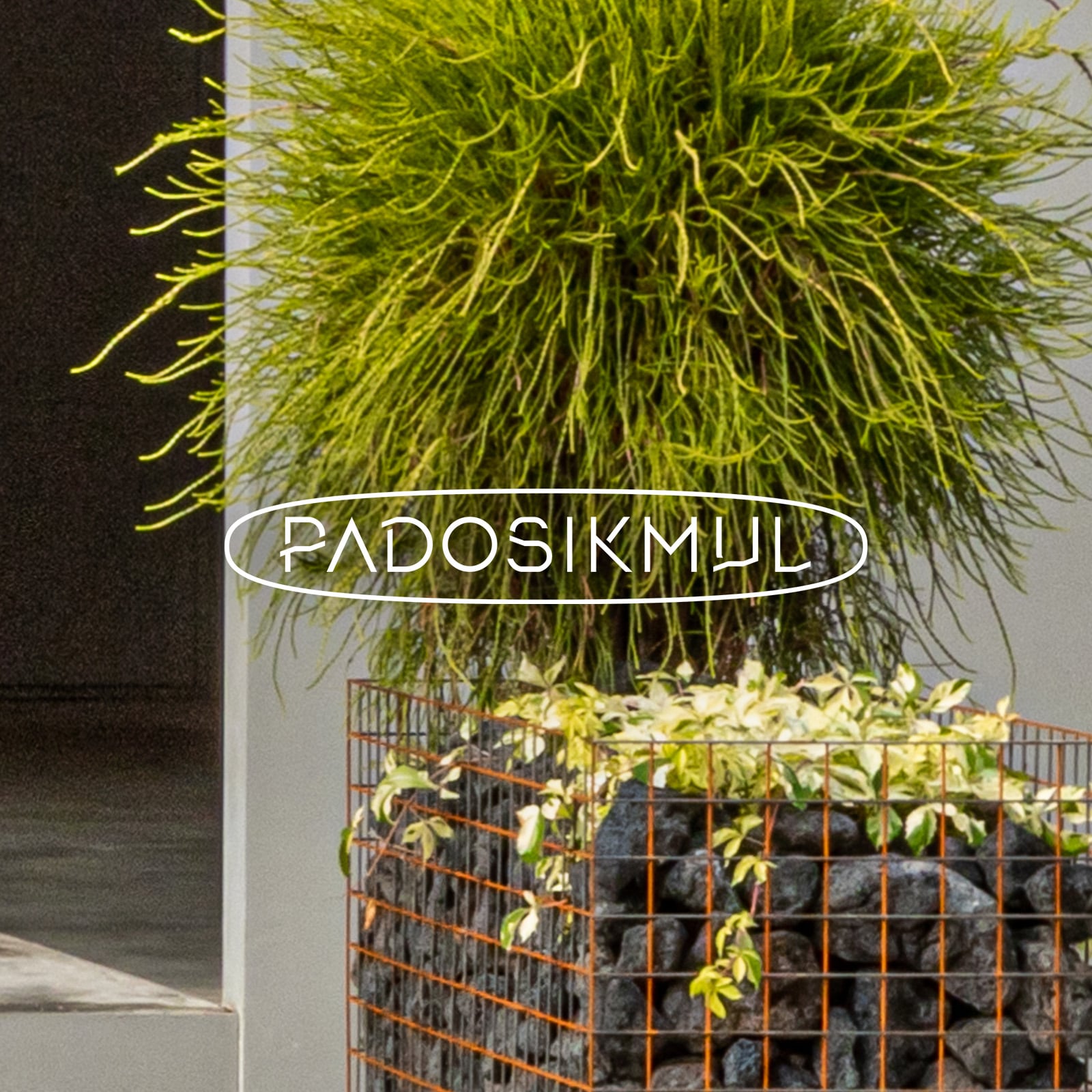
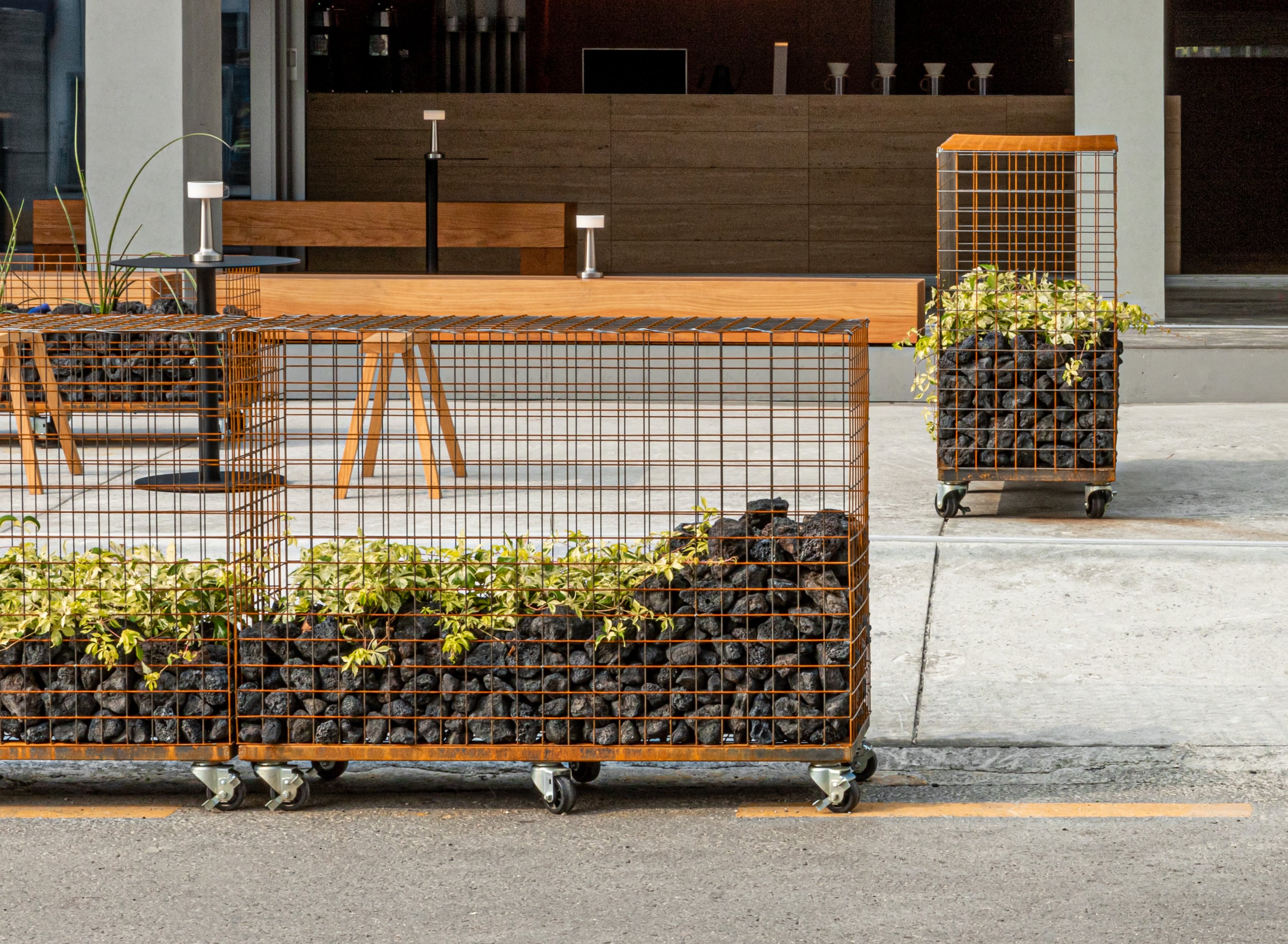
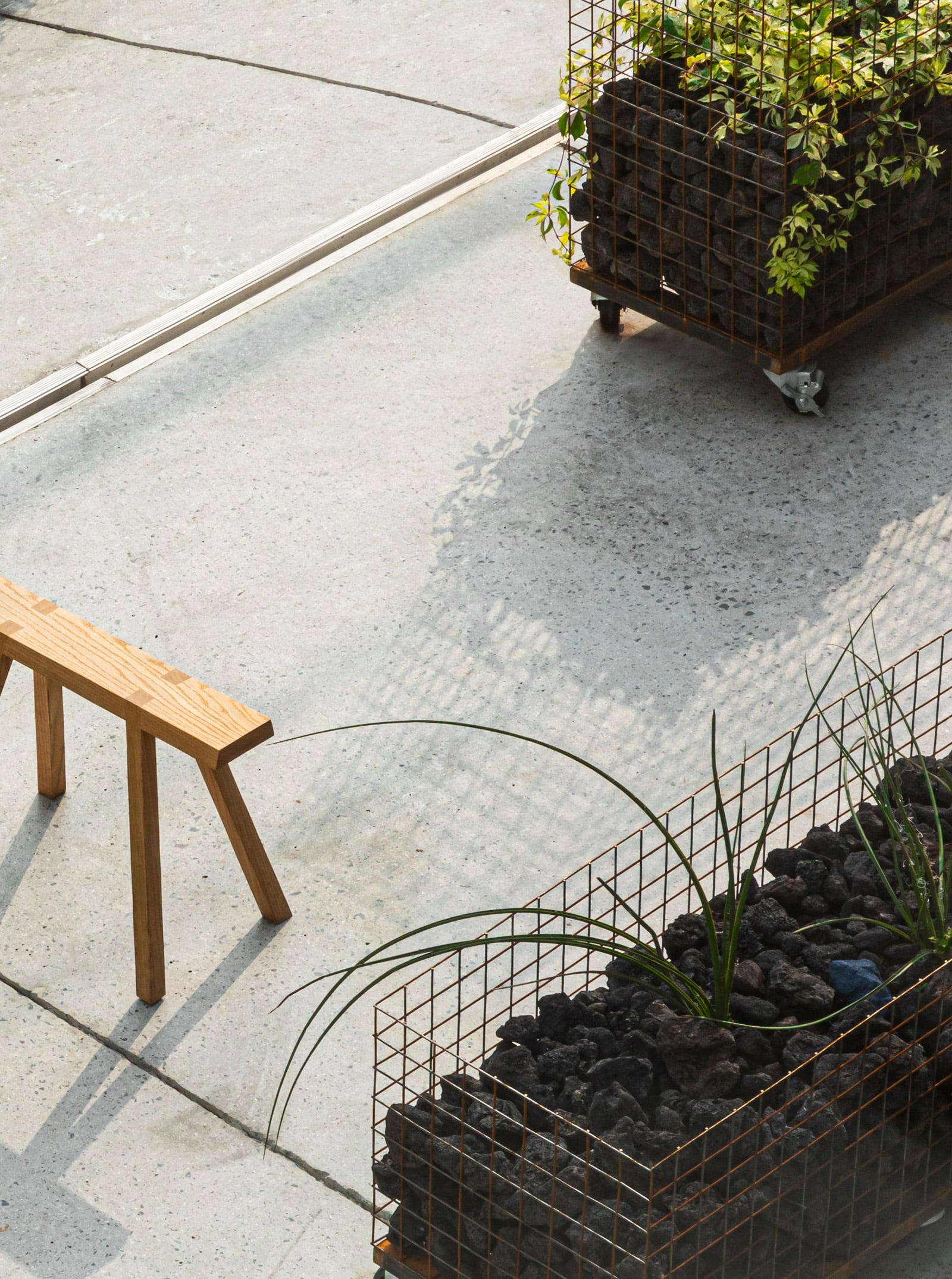
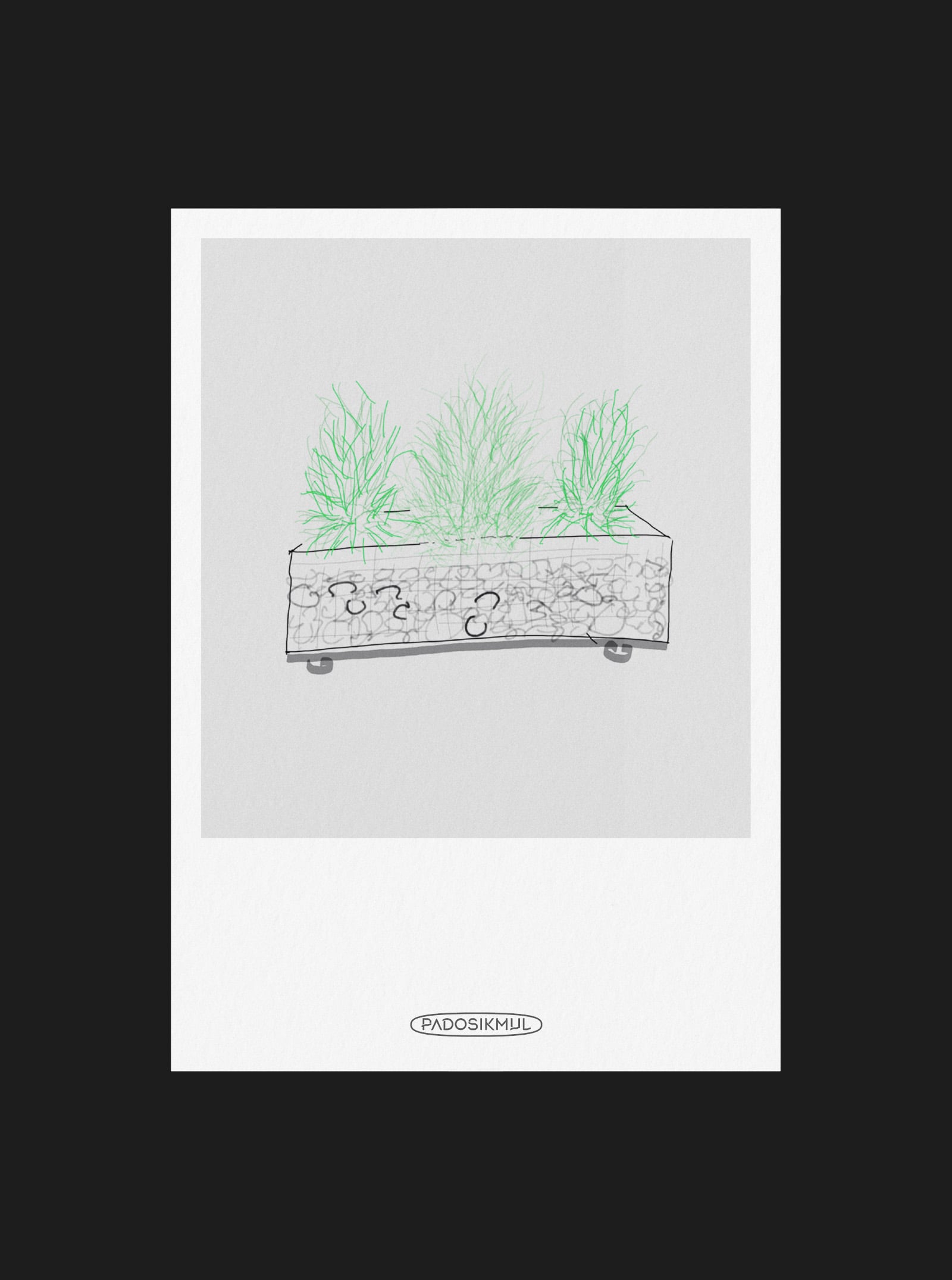
It was chaos here in Seongu with lots of motorcycles, cars, broken cars, and crowded people were around. We decided to use parking space as a FRONT YARD to create a breathing space so we requested landscape gardening to see greenery scene. Thank you to the ‘wave plant’ that created Gabion as hip space.
오토바이, 사람, 자동차, 부서진차 그야말로 혼돈의 성수동에서 숨쉴틈을 만들기 위해 주차공간을 양보해 FRONT YARD로 지정하고, 약간의 초록이라도 보고싶어 조경을 의뢰하였습니다. 처음엔 의심 가득했던 개비온(GABION)을 이렇게까지나 힙하게 만들어준 파도식물에 감사를😉
FURNITURE
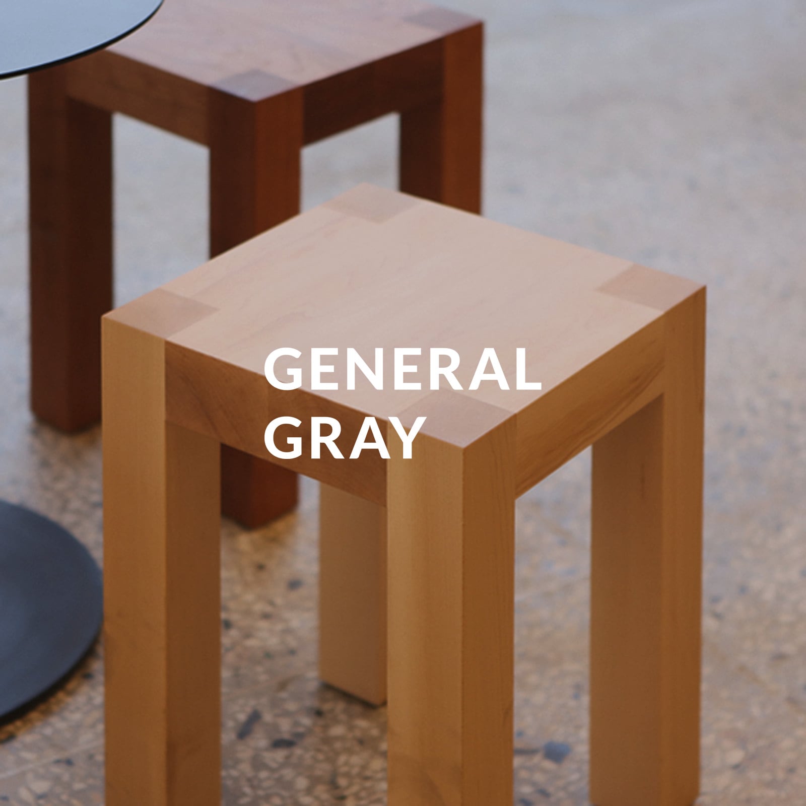
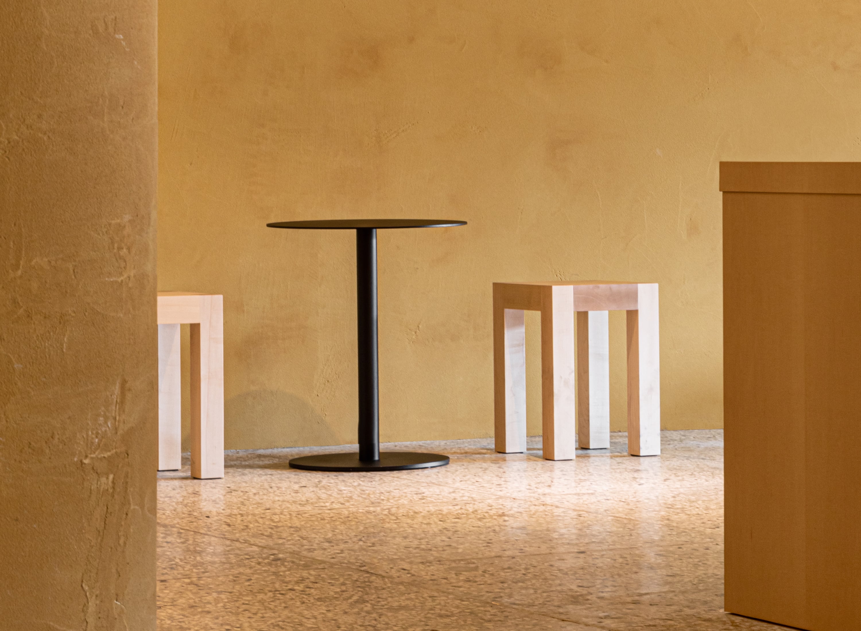
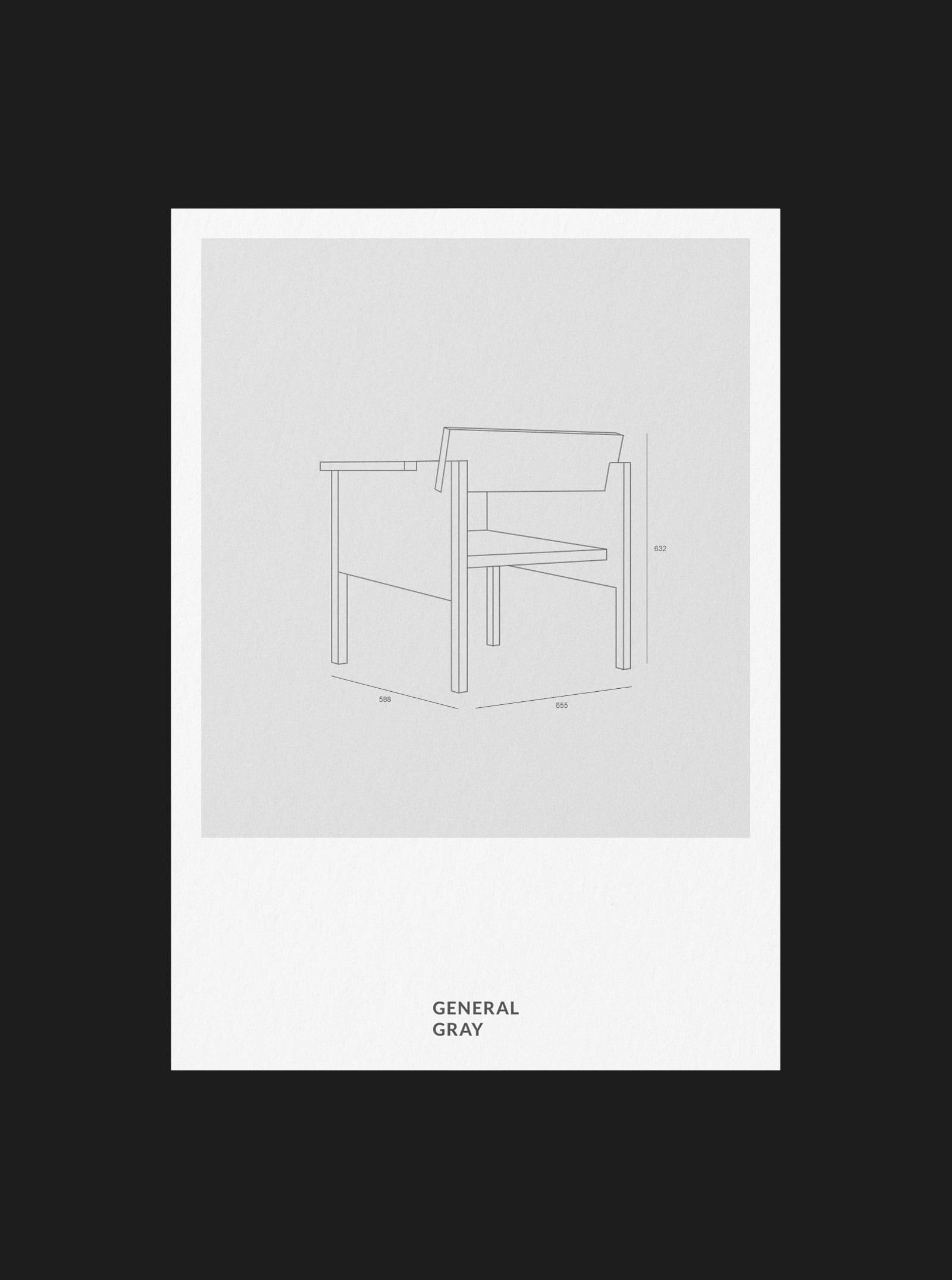
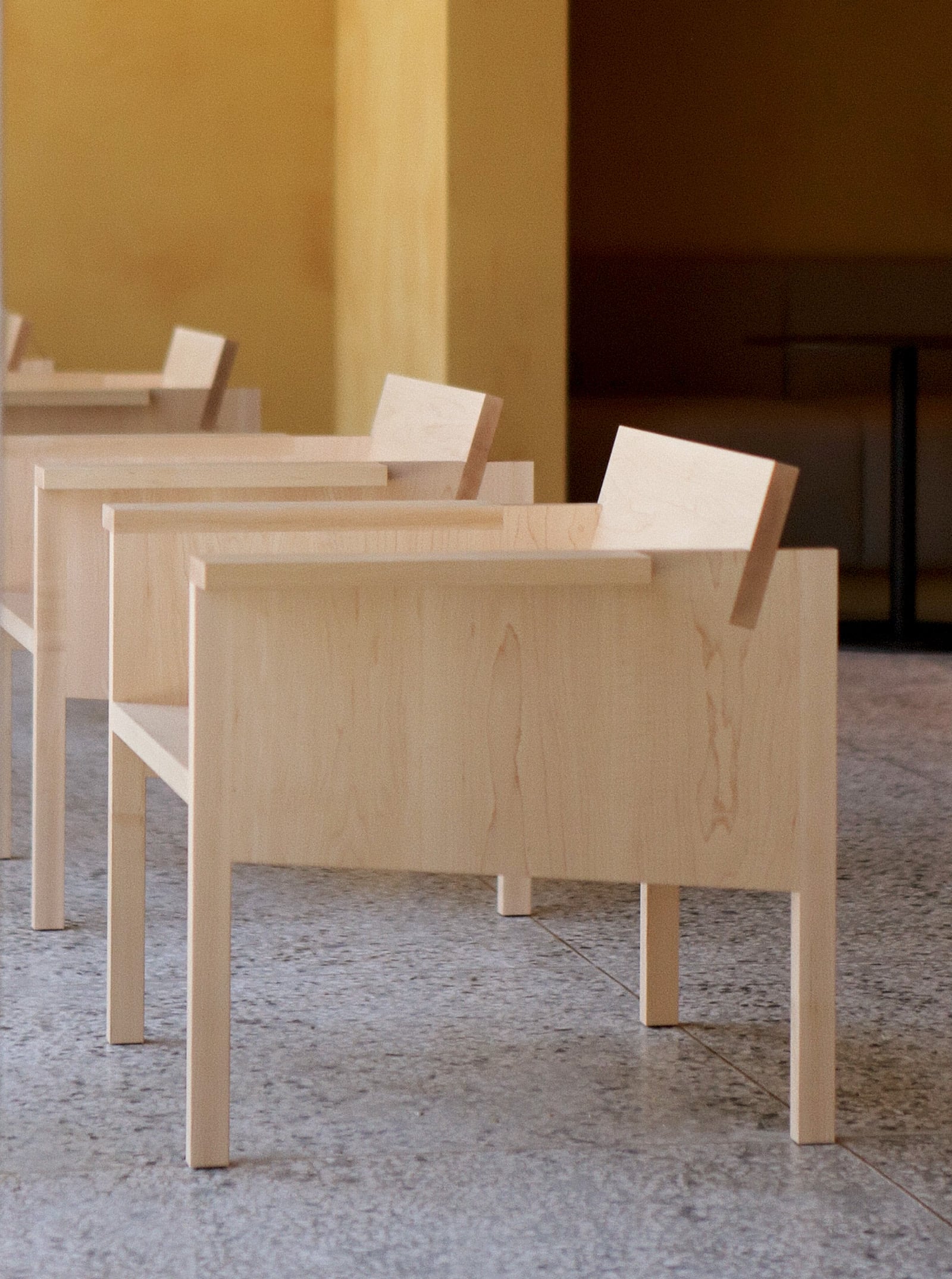
General Gray without any doubts made a wonderful chair with minimal lines this time as well.
믿고 가는 제너럴그레이는 이번에도 역시나 최소한의 선(Line)들로 멋진 의자를 만들어주셨습니다🫢
BRAND APPLICATION
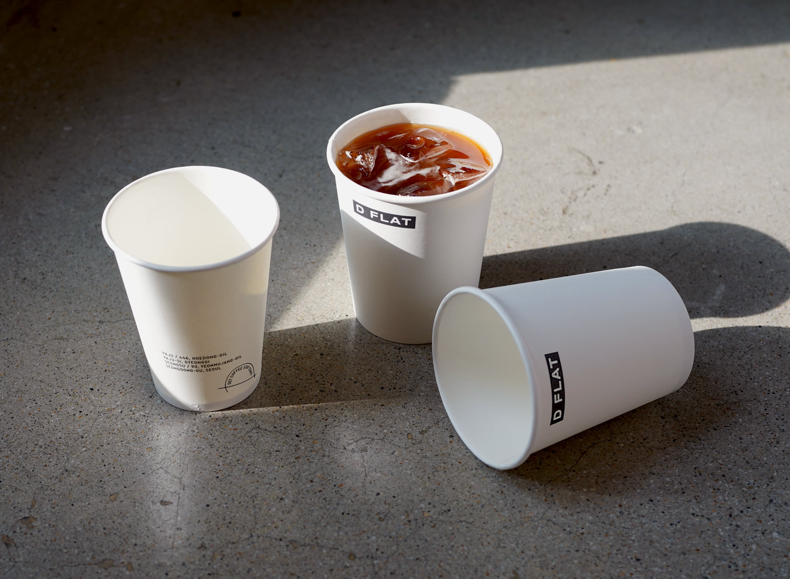
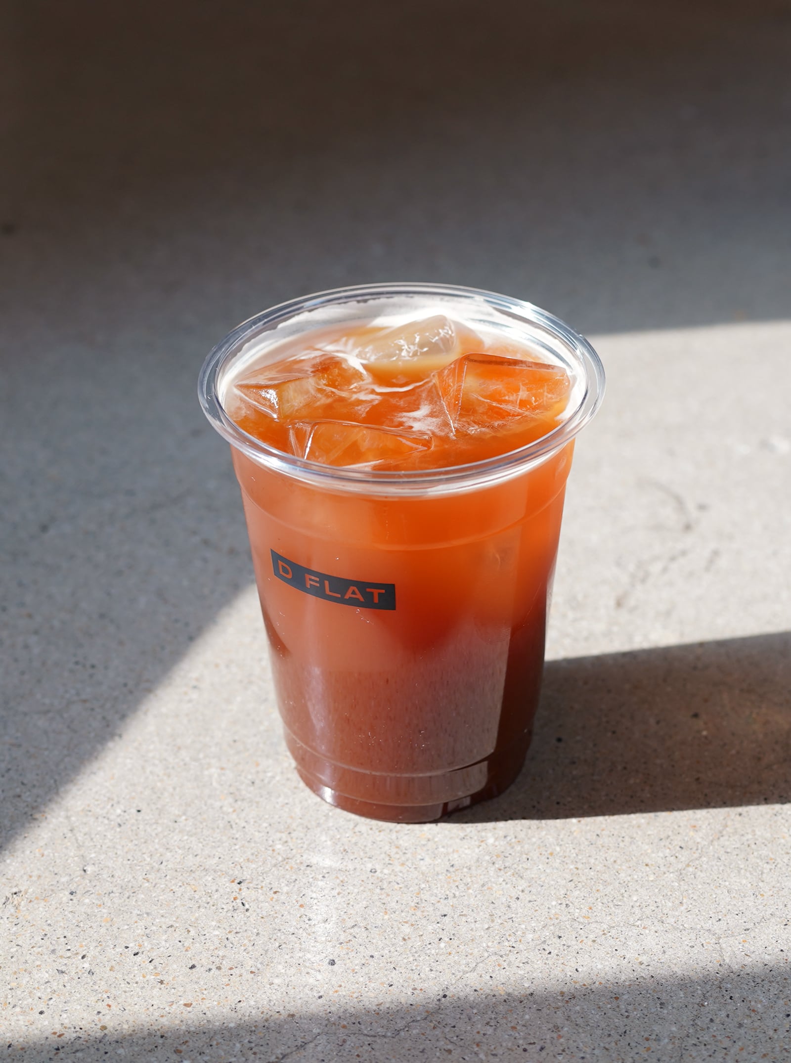
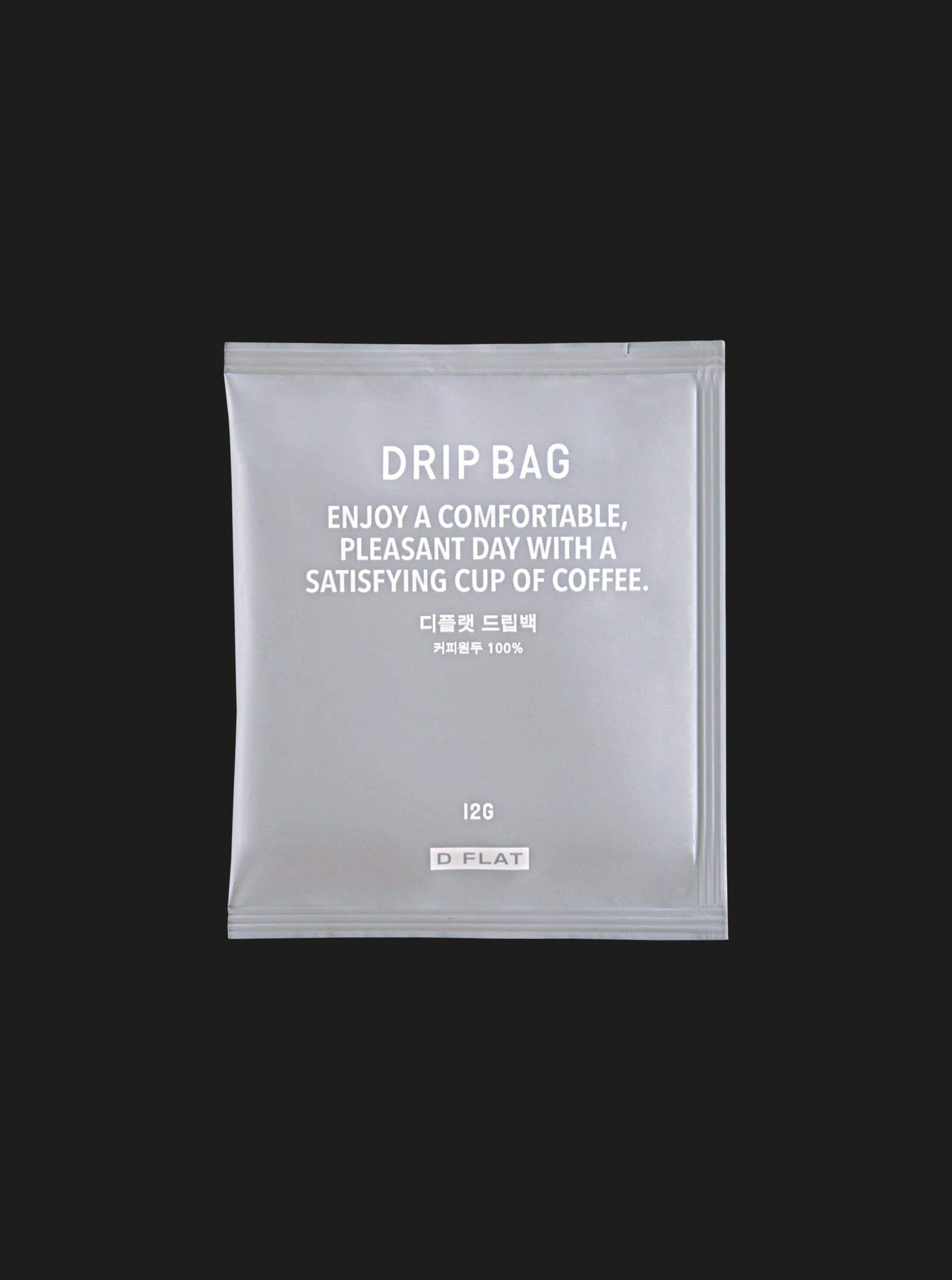
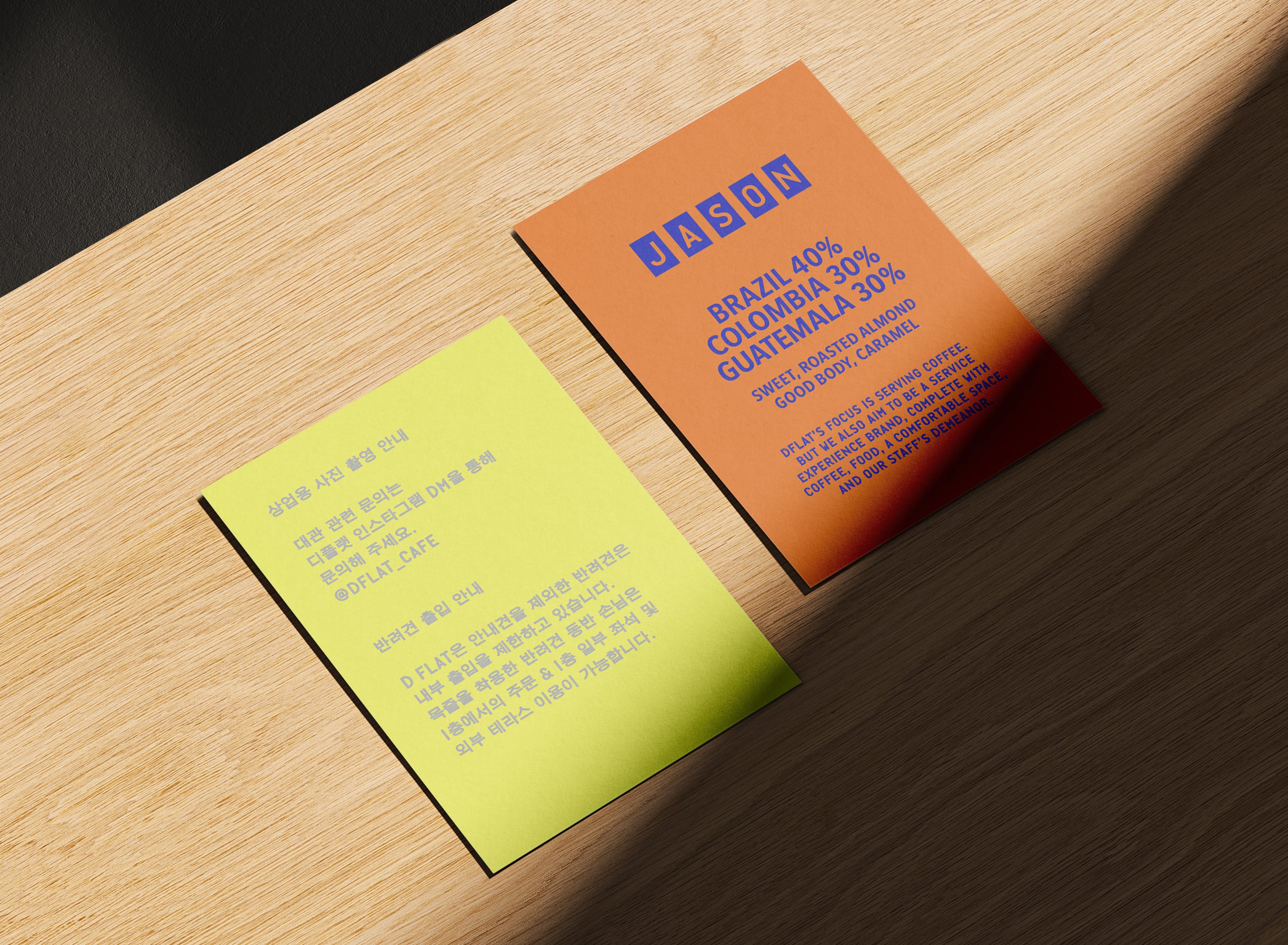
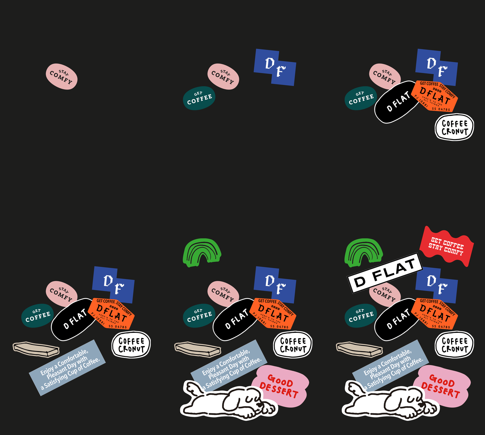
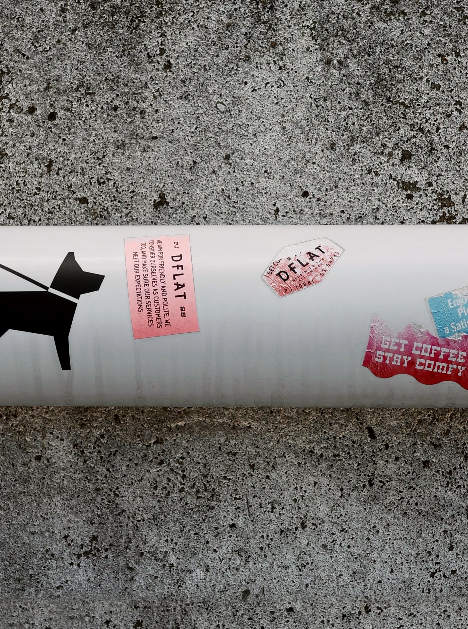
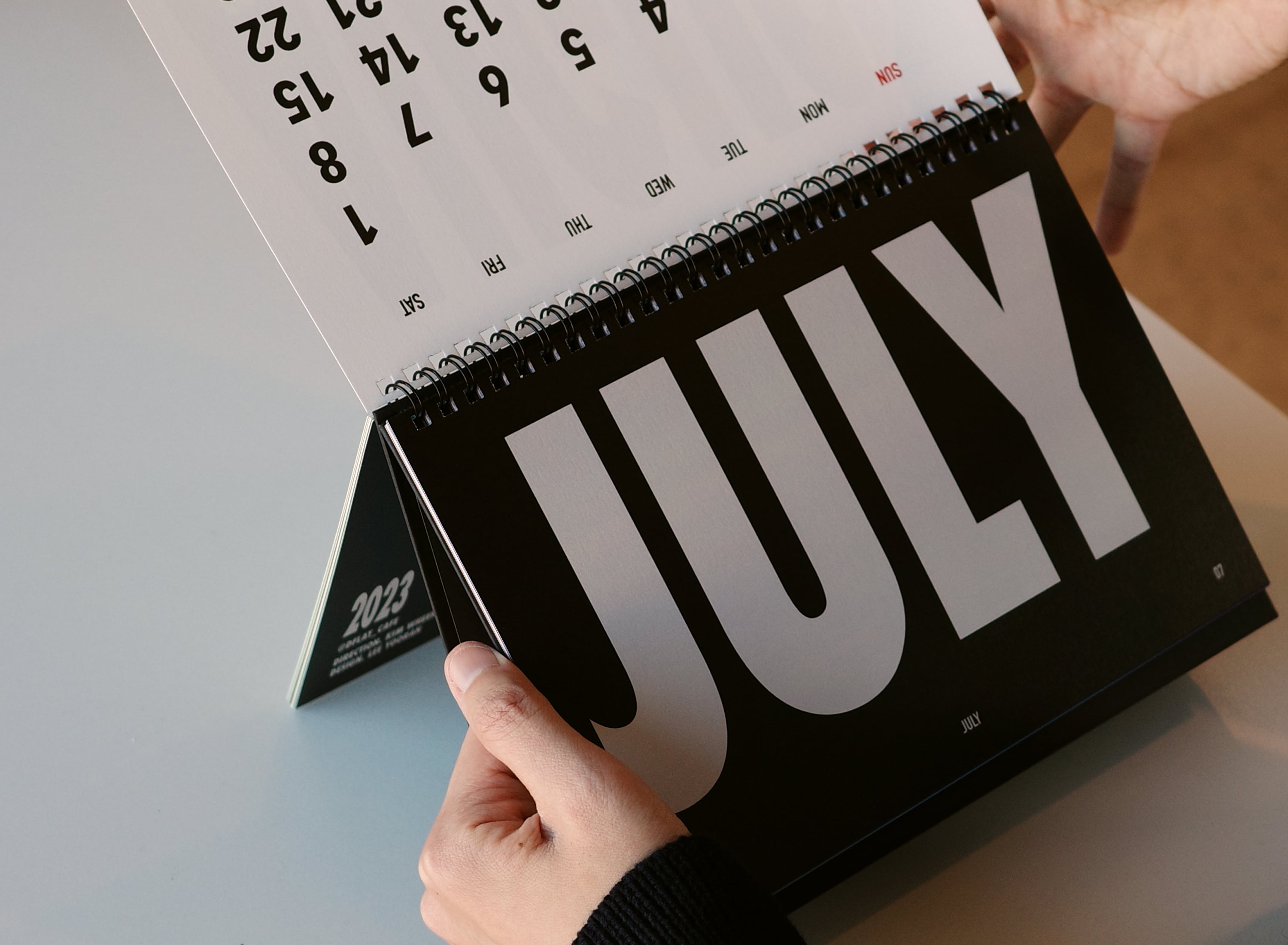
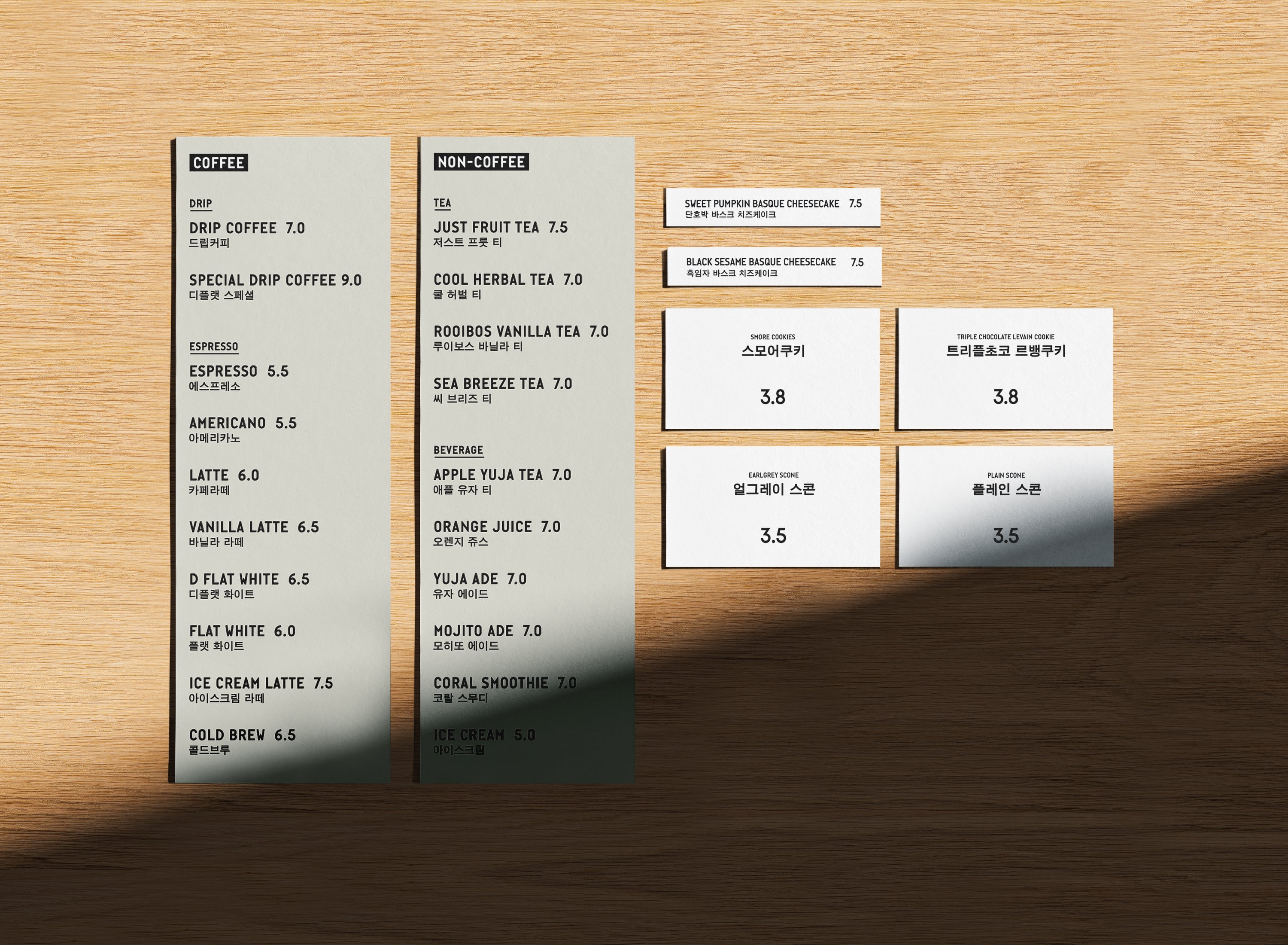
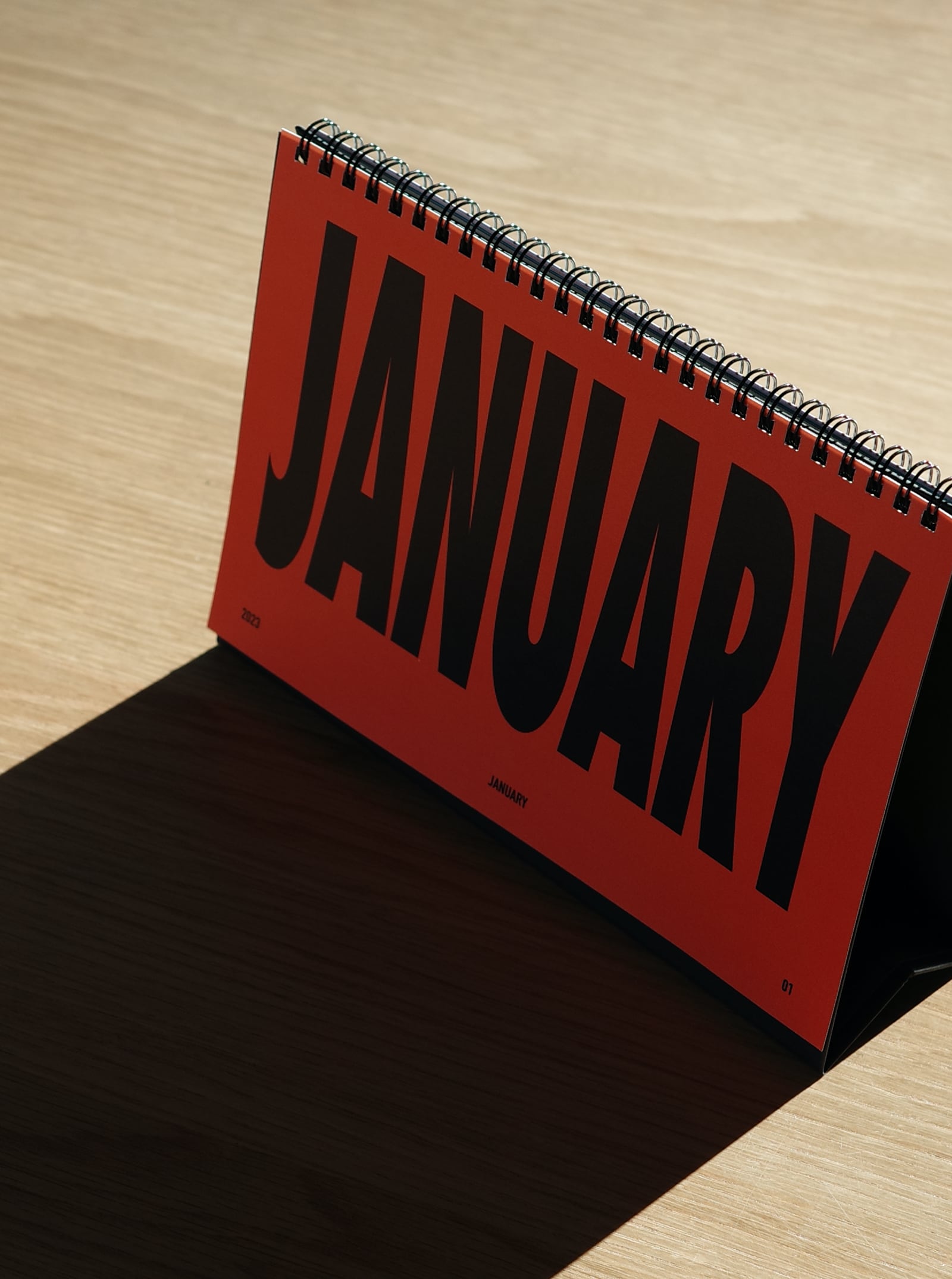
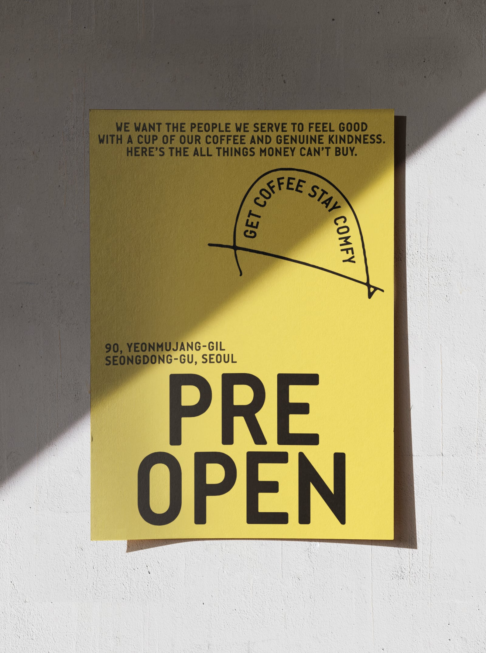
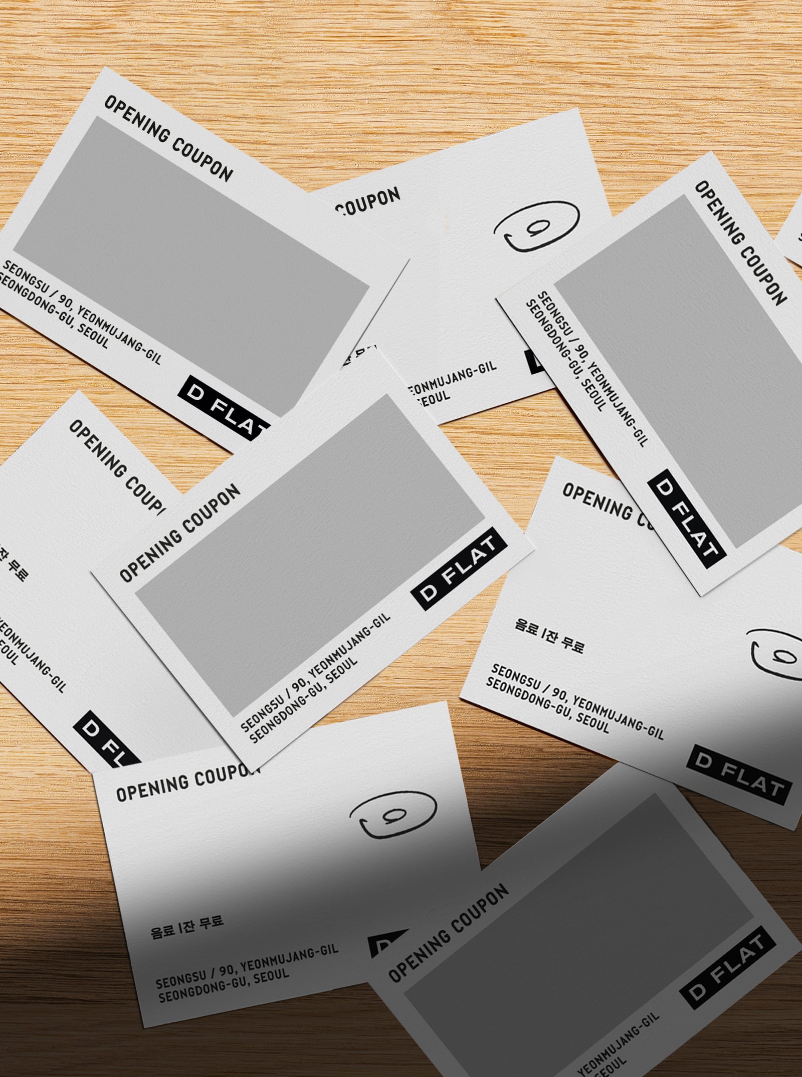
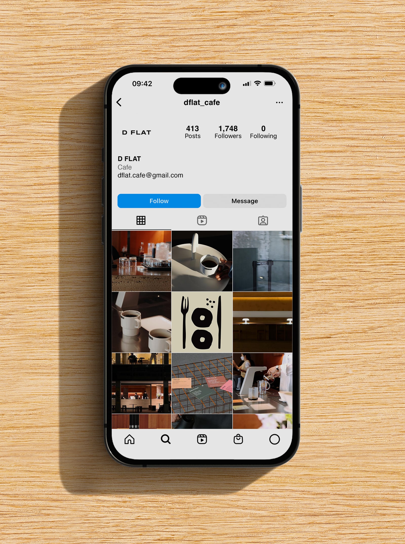
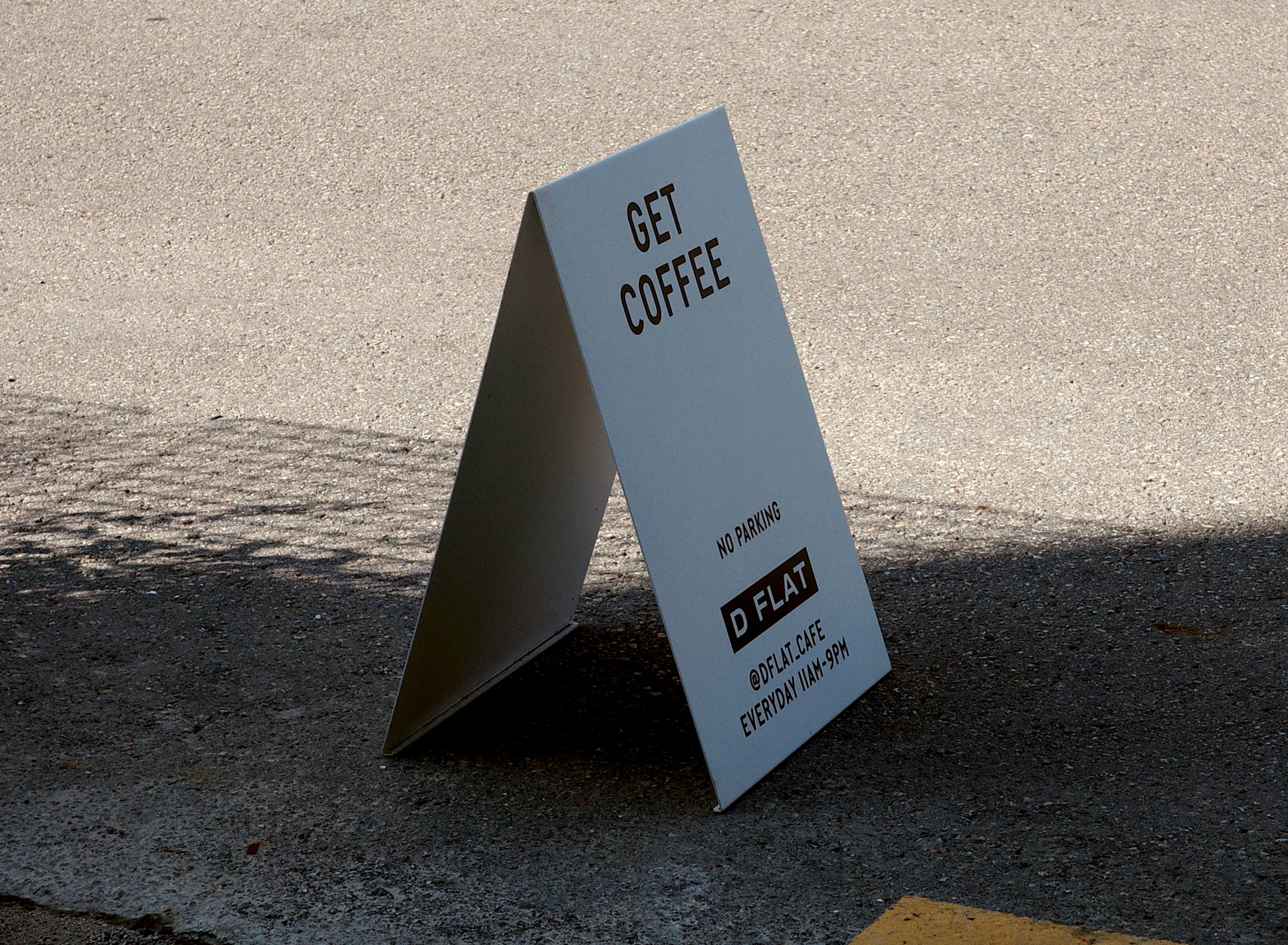
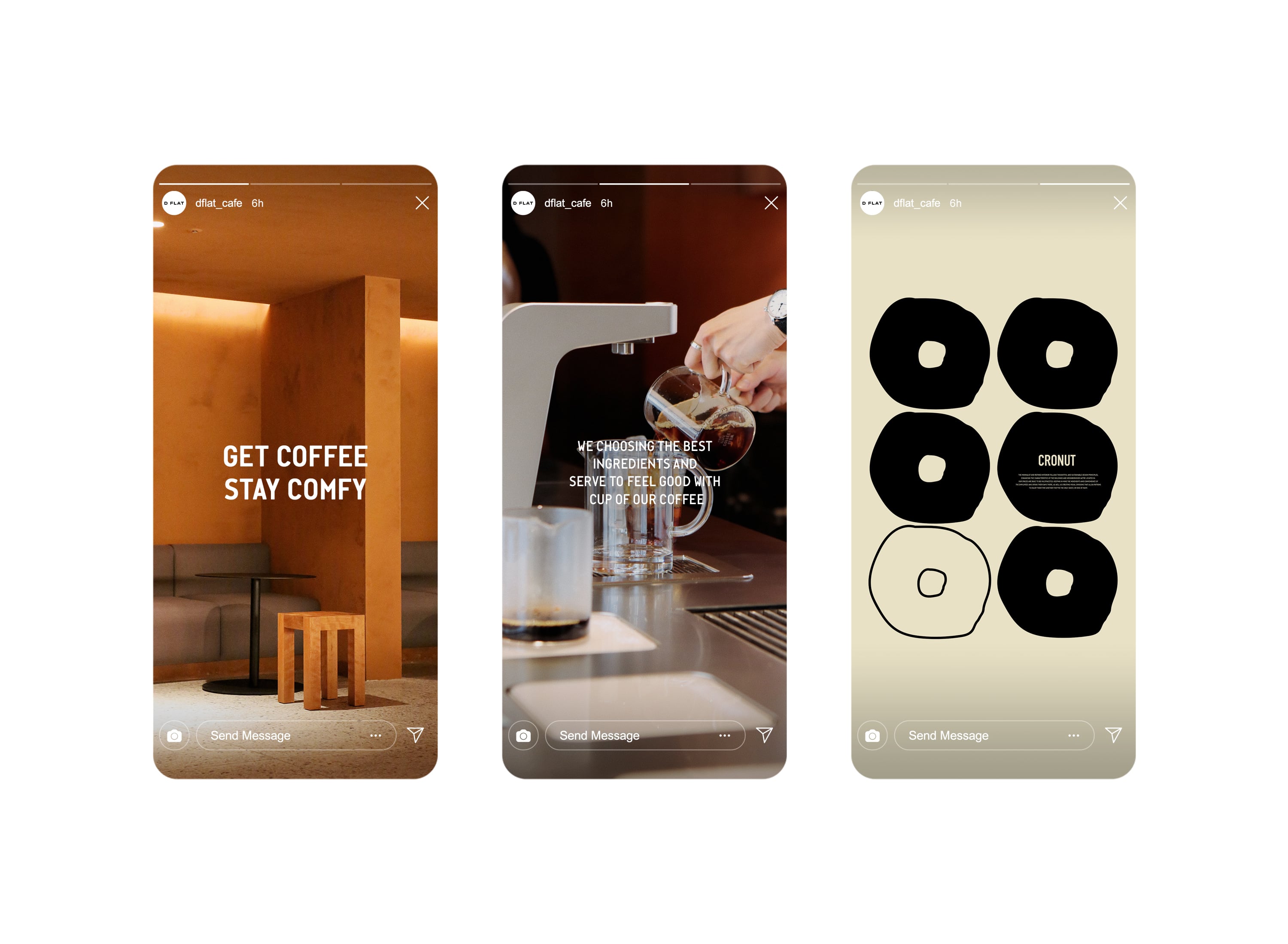
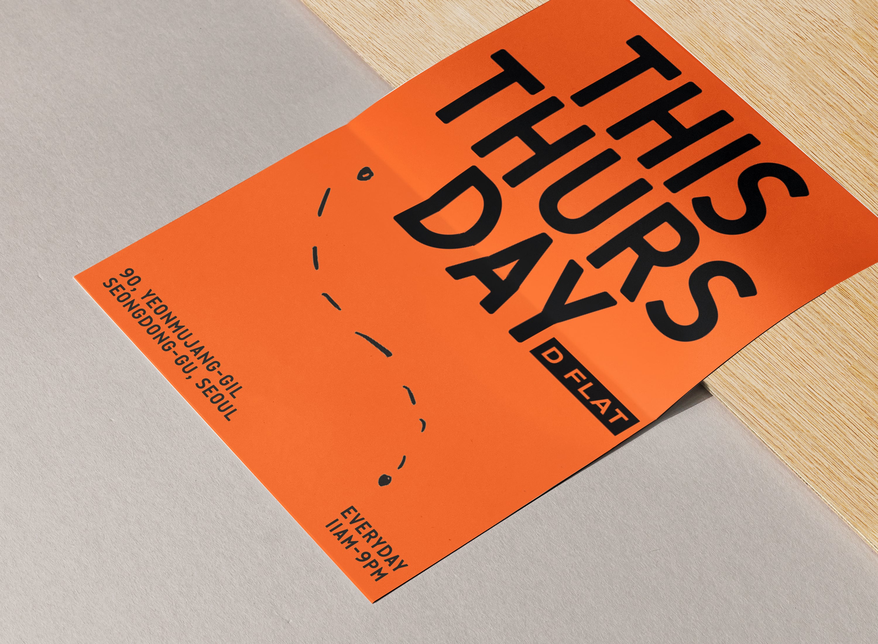
In order to continue growing, brands must adapt and evolve. D FLAT started out as a simple coffee shop, but now offers a wide selection of desserts and special seasonal menus. Branding is the result of a balance between familiarity and novelty. It comes from not only design and signage, but also the overall atmosphere of the space, the taste of the food, and the friendly service provided by a team of dedicated staff. All of these elements come together to create a great experience, which ultimately results in great branding. It can be difficult to change and evolve while maintaining a comfortable and refined brand tone, but nothing worth achieving comes easily. D FLAT began as a cafe, but we have plans to expand to different areas with different concepts that fit the surrounding neighborhoods, all while staying true to our basic philosophy.
브랜드도 살아있기 위해서는 꾸준히 움직이고 변화되는 모습을 보여줘야만 합니다. 커피로 시작한 디플랫은 다양한 디저트류를 선별하고 제공하고 있고 시즈널 메뉴와 같은 계절에 따른 변화를 주고 있습니다. 브랜딩이란 늘 익숙함과 새로움이 조화를 이뤄야 하고, 디자인과 사이니지가 모든것을 대변하지 않습니다. 우리는 늘 공간의 분위기, 음식의 맛, 그 무엇보다 스탭들의 친절한 서비스와 그들만의 팀웍이 느껴 질때야 말로 비로소 ‘경험’이 되고 이 경험이 긍정적일때 훌륭한 브랜딩이라고 생각합니다. 안락하고 정제된 분위기를 유지하면서 계속해서 바뀌는 모습을 보여준다는것이 뭔가 아이러니 하고 어려울것 같지만, 사실 생각보다도 더 어려운것 같습니다. 디플랫은 카페로 시작했지만 앞으로도 계속 확장해 나갈 계획입니다. 단순히 여러개의 매장을 복제한다기 보다, 지역과 목적에 따라 모습이 달라질 수 있고 컨텐츠도 달라질 수 있을것입니다. 디플랫의 기본적인 철학은 유지하면서 그때 그때 우리가 하고 싶은 것들을 만들어 보고 싶습니다.
Credits
Project DirectionChoi JihoonProject ManagementKim WheekyoungBrand DevelopmentSeong Minjae (rootroute)Brand Identity DesignSeong Minjae (rootroute)Space ProgrammingahchGraphic DesignSeong Minjae (rootroute)Lee YooranArchitecturesamuso hyojadongInteriorahchLandscapepado sikmulLightingahchFurnituregeneralgrayConstructiondesign jeongin plusPhotographytexture on texture