Brand
A new take on a universal language, Coway Pictogram
- Client
- Coway
- Category
- Brand
- Services
- Brand Strategy, Brand Identity, Content Design
- Scope
- Brand Experience, Visual Language, Style Guide, Graphic Design
- Year
- 2022
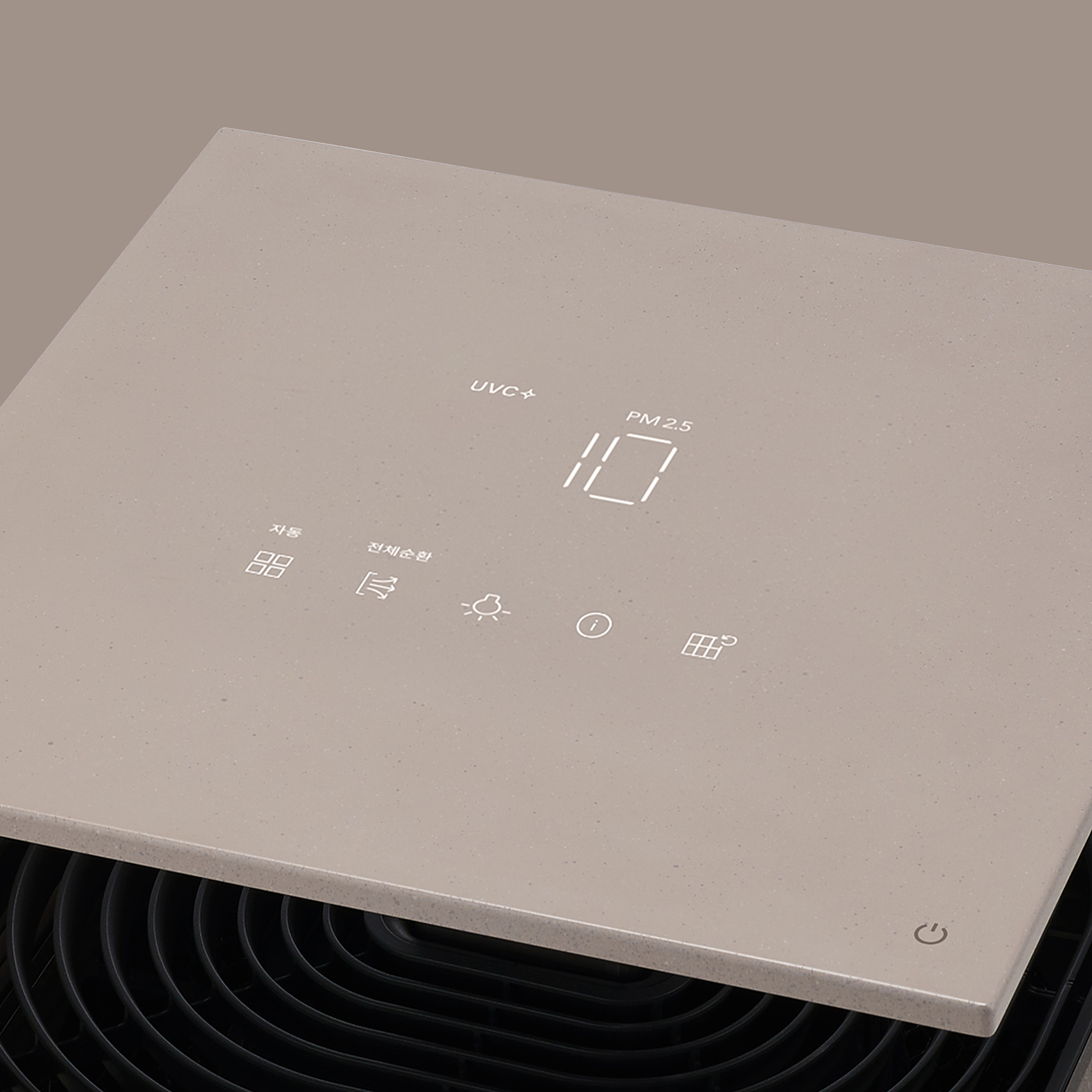
There is a quiet language that guides our daily lives — the pictogram. It is a visual language that is made to be quickly and easily understood by the general public.
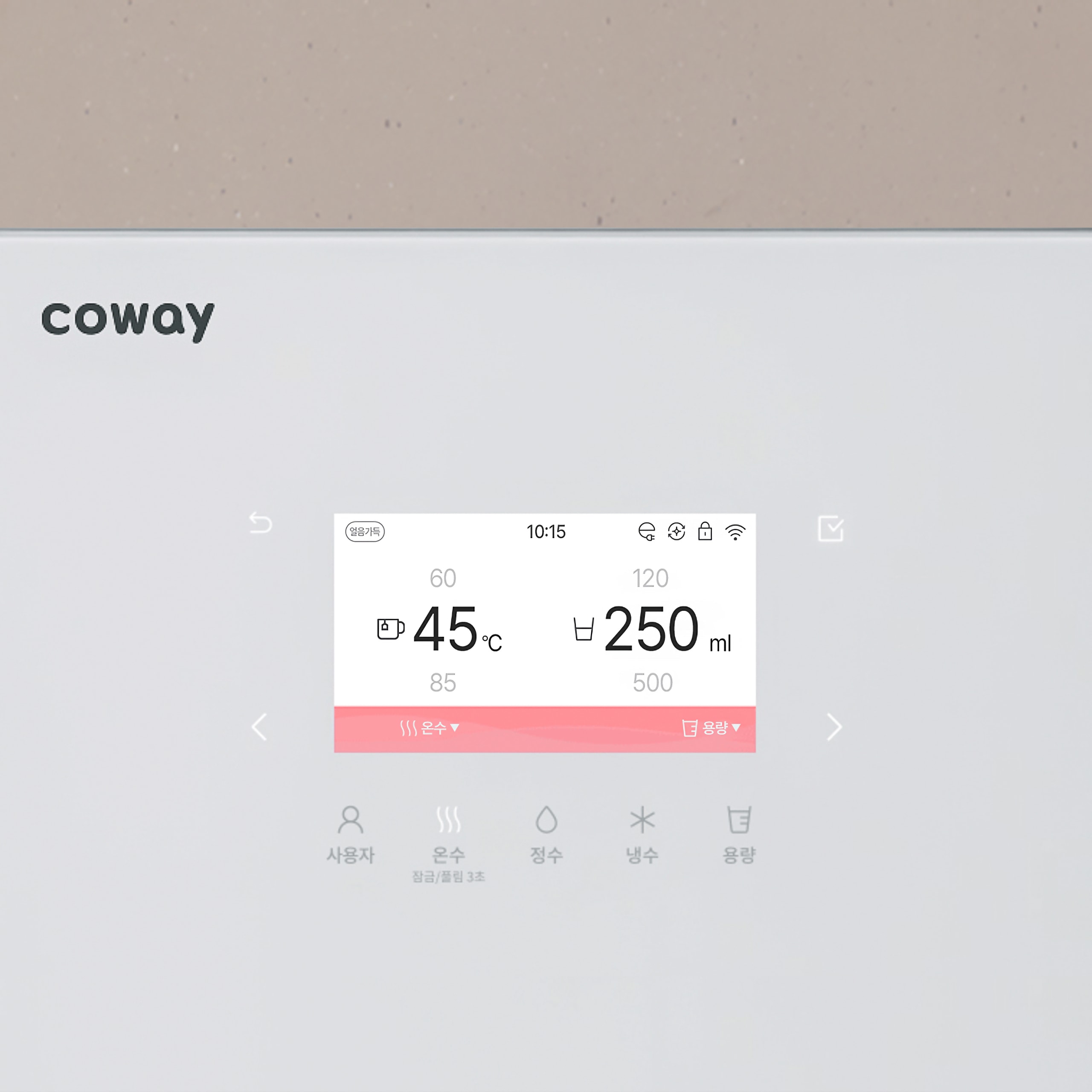
Through the Coway Pictogram project, we developed a compelling design language in the form of pictograms that aligned with the products and was intuitive in meaning.
We focused on building a visual language that conveyed universality with a creative, young, and elegant vibe.
특별한 보편성, 코웨이 픽토그램 우리의 일상을 만드는 조용한 언어가 있습니다. 픽토그램은 그림을 뜻하는 픽토(picto)와 텔레그램(telegram)의 합성어로 사물・시설・행동을 상징화해 불특정 다수의 사람이 빠르고 쉽게 이해할 수 있는 시각적 언어입니다. 디파이는 코웨이 픽토그램 프로젝트를 통해 누구나 바로 이해할 수 있고 제품과 조화를 이루면서 눈에 잘 띄는 디자인을 선보였습니다. 특히 사회적 통념에 기반한 크리에이티브로 특별한 보편성을 확보하고, 젊고 우아한 바이브로 최적의 사용성과 정보 전달을 표현하는 데 집중했습니다.
8 weeks, 102 designs
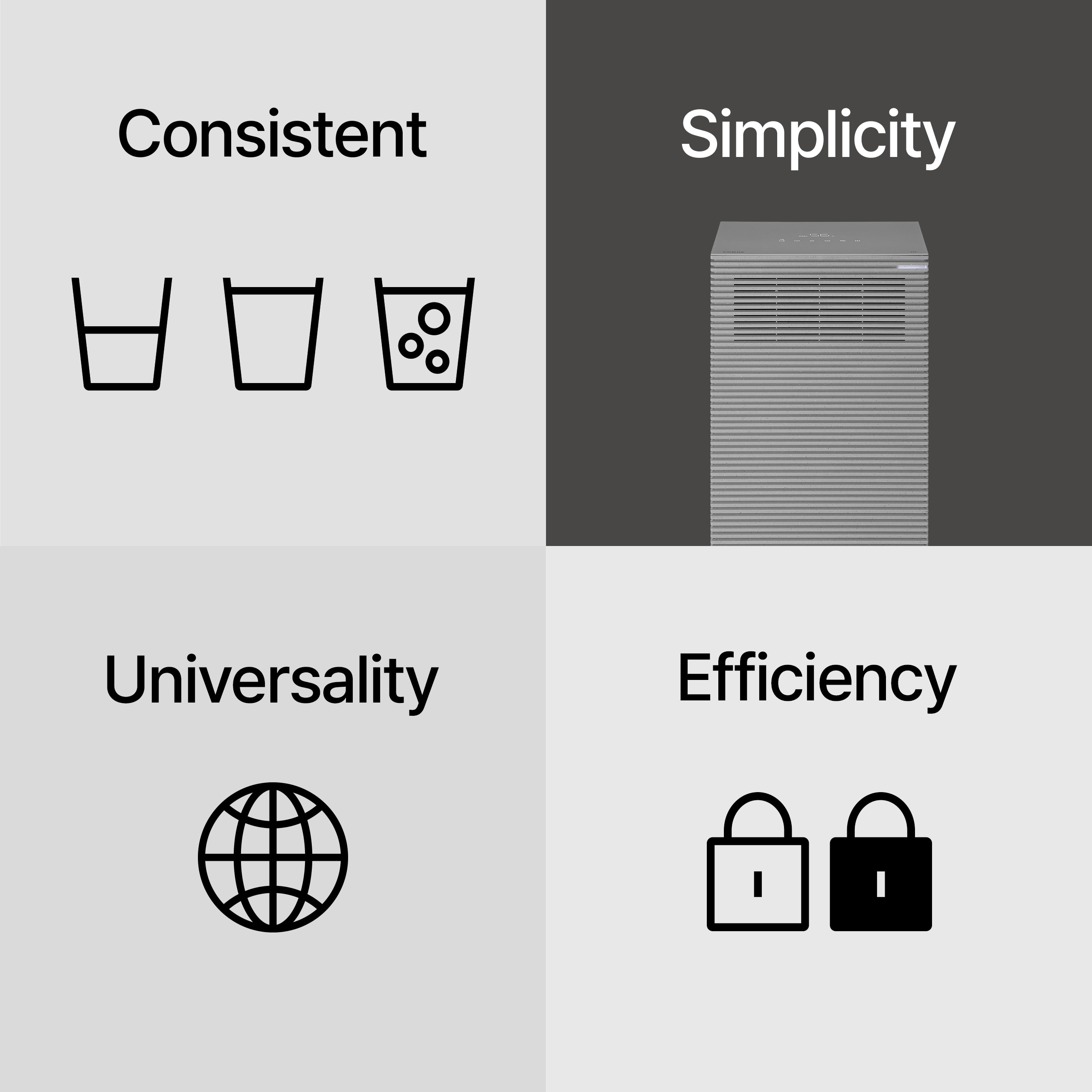
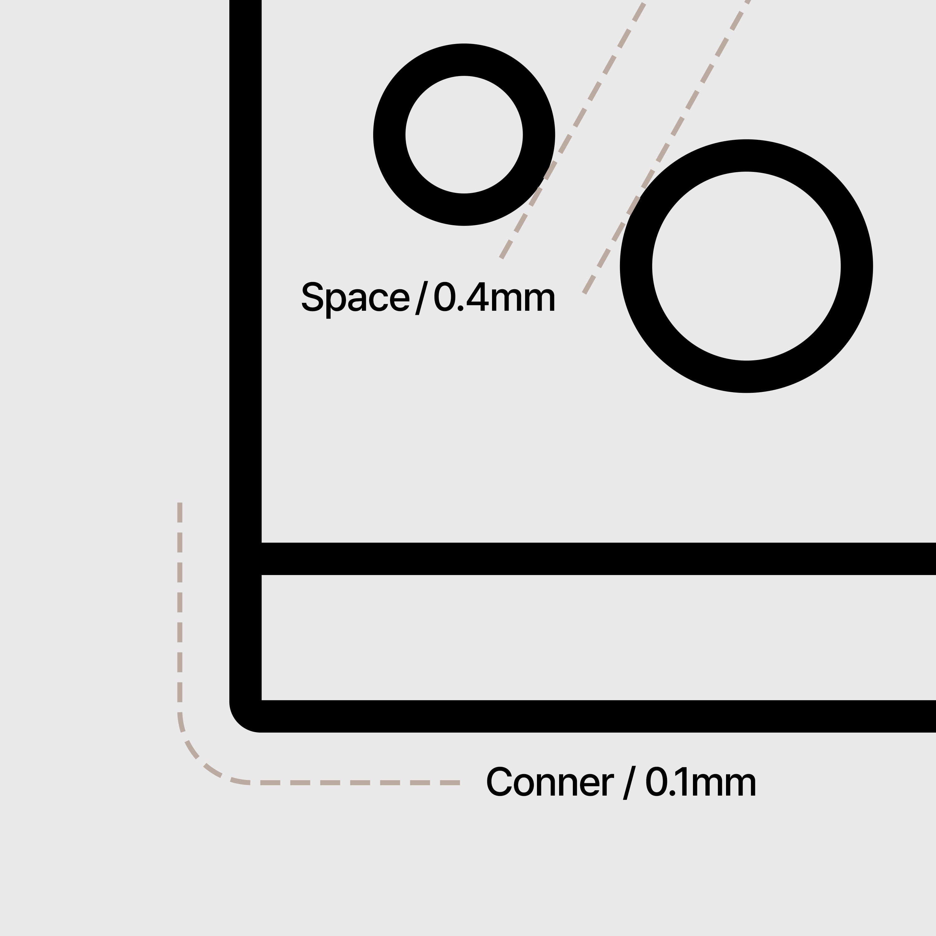
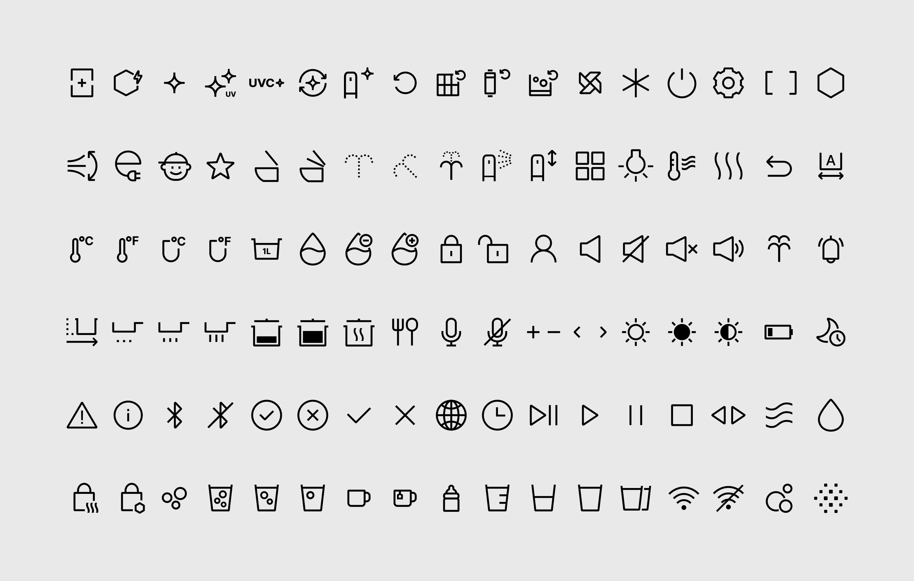
For 8 weeks, we designed 102 pictograms. If we included the variations in thicknesses and sizes, it came to a total of 380. Before we started on the design, we analyzed Coway’s branding as well as that of other companies. We also did extensive research on icons that were commonly used on mobiles, PCs, and in public places. The insights and inspiration gained in this process were translated into hand sketches to discuss the overall direction with the client. In the end, we came up with a design concept that was based on five guides: intuitive, consistent design language and efficiency that allows continuous updates, simplicity inspired by Coway's product design, unique yet familiar universality.
우리는 8주 동안 픽토그램 102종을 디자인했습니다. 픽토그램 항목당 두께, 솔리드, 미니 사이즈 작업까지 합하면 산출물이 380개에 달합니다. 디자인 착수 전 고객사의 브랜드 가치와 타사 제품을 분석했고 모바일, PC, 공공장소에서 두루 사용하며 동시대 사회적 통념이 된 아이콘도 수집했습니다. 이 과정에서 얻은 인사이트와 영감을 디자이너들이 손 스케치로 표현했고 초안을 고객사와 공유해 방향성을 정립했습니다. 우리는 분석과 스케치 단계를 거쳐 5가지 콘셉트를 도출했습니다. 누구나 이해하기 쉬운 직관성, 일관된 디자인 언어와 지속적 업데이트가 가능한 효율성, 코웨이 제품 디자인에 기반한 간결성, 익숙하면서도 특별한 범용성을 바탕으로 본격적으로 디자인에 들어갔습니다.
Intuitive design for all
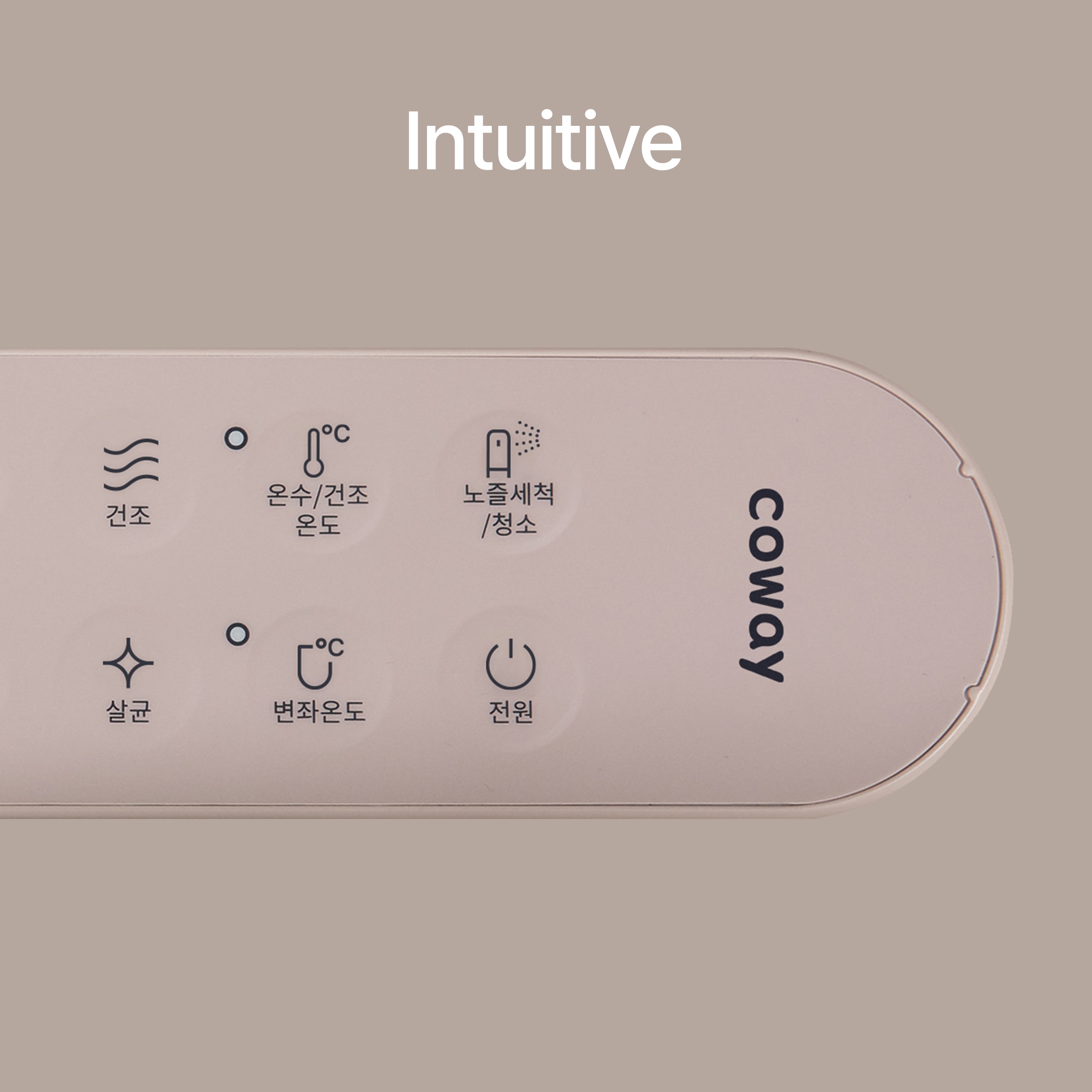
We focused on intuitively communicating information with the goal of creativity based on social conventional wisdom, that is, special universality. Through this, we found an expression that allows users to understand the meaning of pictograms without paying attention as soon as they see them.
누구나 이해하기 쉬운 직관성 사회적 통념에 기반한 크리에이티브, 즉 특별한 보편성을 목표로 삼아 정보를 직관적으로 전달하는 데 집중했습니다. 이를 통해 우리는 사용자가 픽토그램을 보는 순간 의식을 기울이지 않아도 의미를 알 수 있는 표현을 찾아냈습니다.
Consistent design language
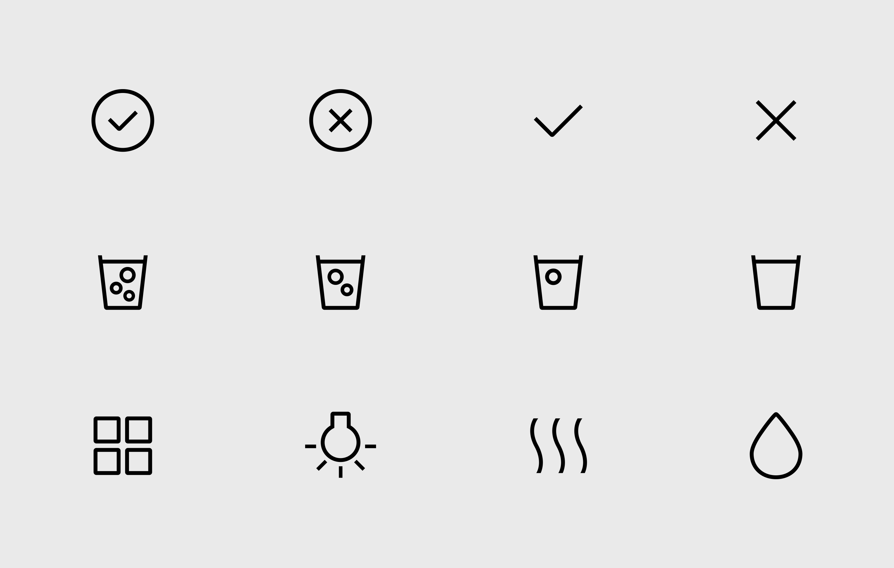
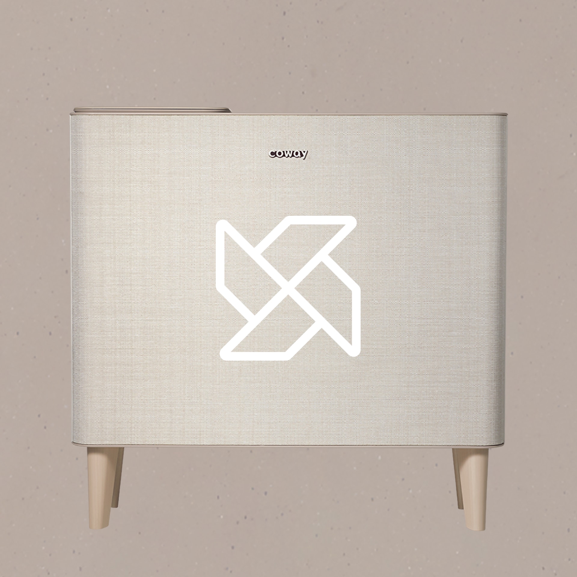
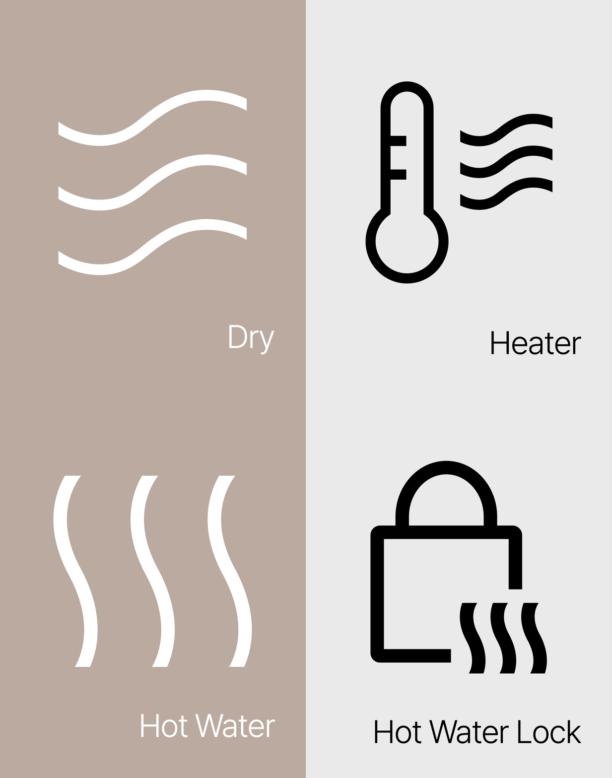
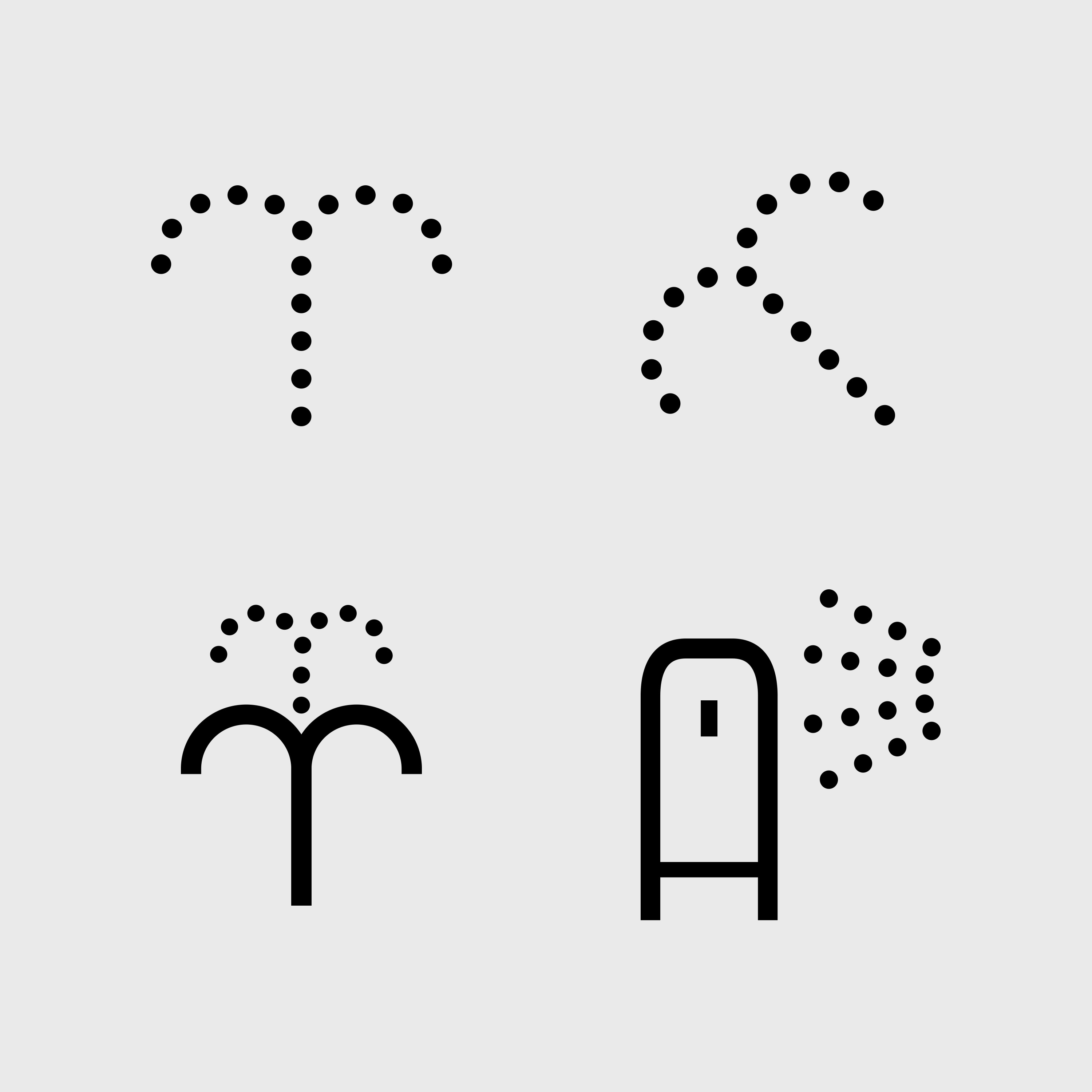
For each feature or design element, we found the common denominator and translated it into easy to understand and consistent pictograms. For example, for air-related features, we created variations of the same wind icon. We also considered the need for pictograms to be updated so created a system and a guide for future use. Using the guide, the client will be able to update the pictogram system in a flexible manner when needed.
일관된 디자인 언어 인덕션, 정수기, 공기청정기, 비데 등 다양한 제품의 기능 중 공통된 함의를 찾아 일관된 디자인 언어로 표현했습니다. 예를 들어 픽토그램에 두루 사용되는 도트(dot) 형태를 통일시켰고, 건조와 온풍에 내포된 ‘바람’을 동일한 아이콘으로 표현했습니다. 제품 업데이트에 따른 F/U 업무의 효율성을 높이기 위해 디자인 규칙성 및 가이드라인을 제공했습니다. 또 신규 기능, 새로운 폼팩터 관련 거버넌스에 통일성과 확장성을 부여함으로써 고객사의 다양한 부서와 실무자가 변화에 빠르게 대응할 수 있도록 만들었습니다.
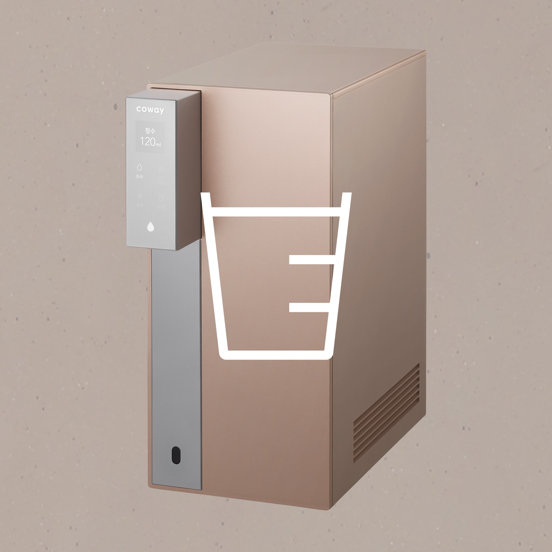
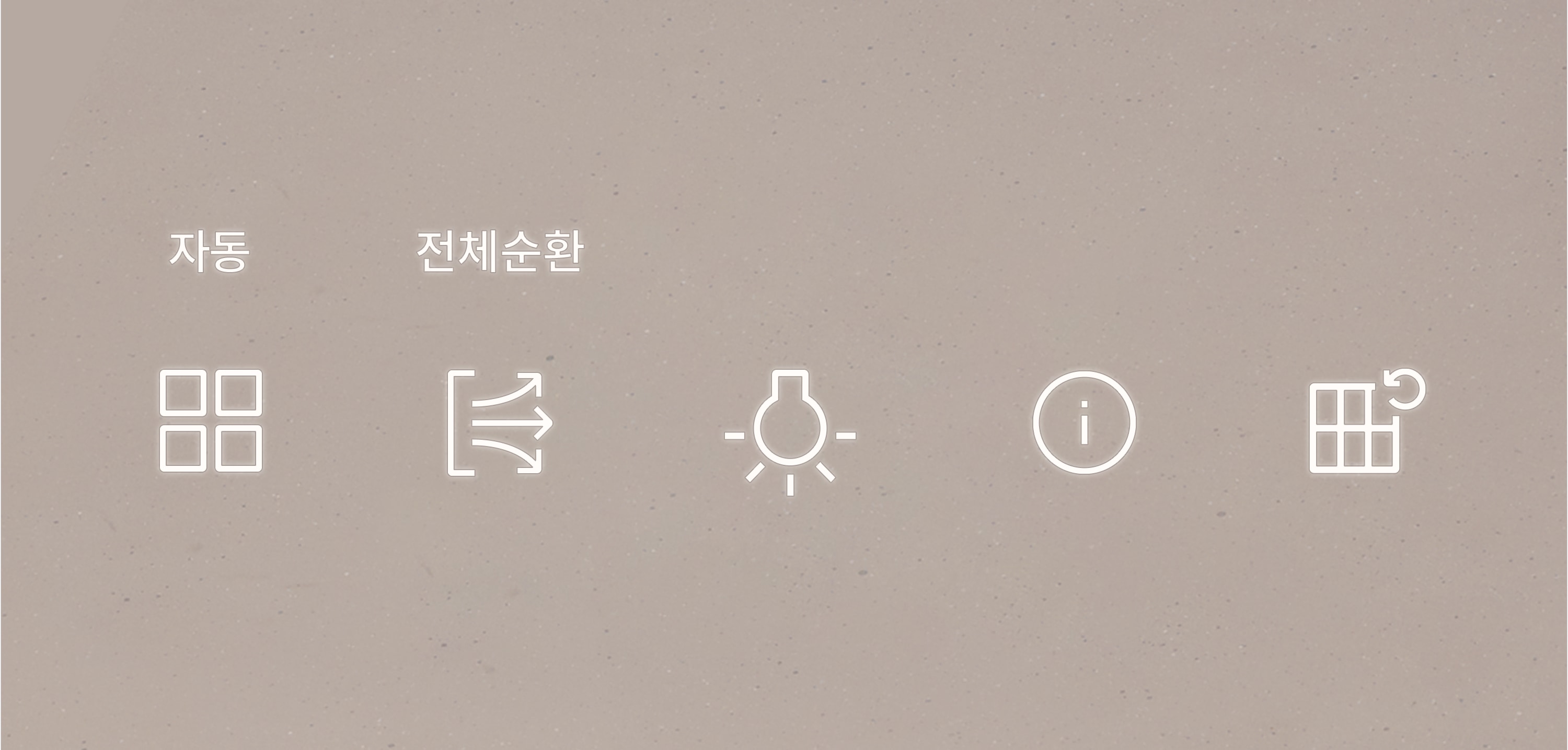
Simplicity inspired by Coway's product design
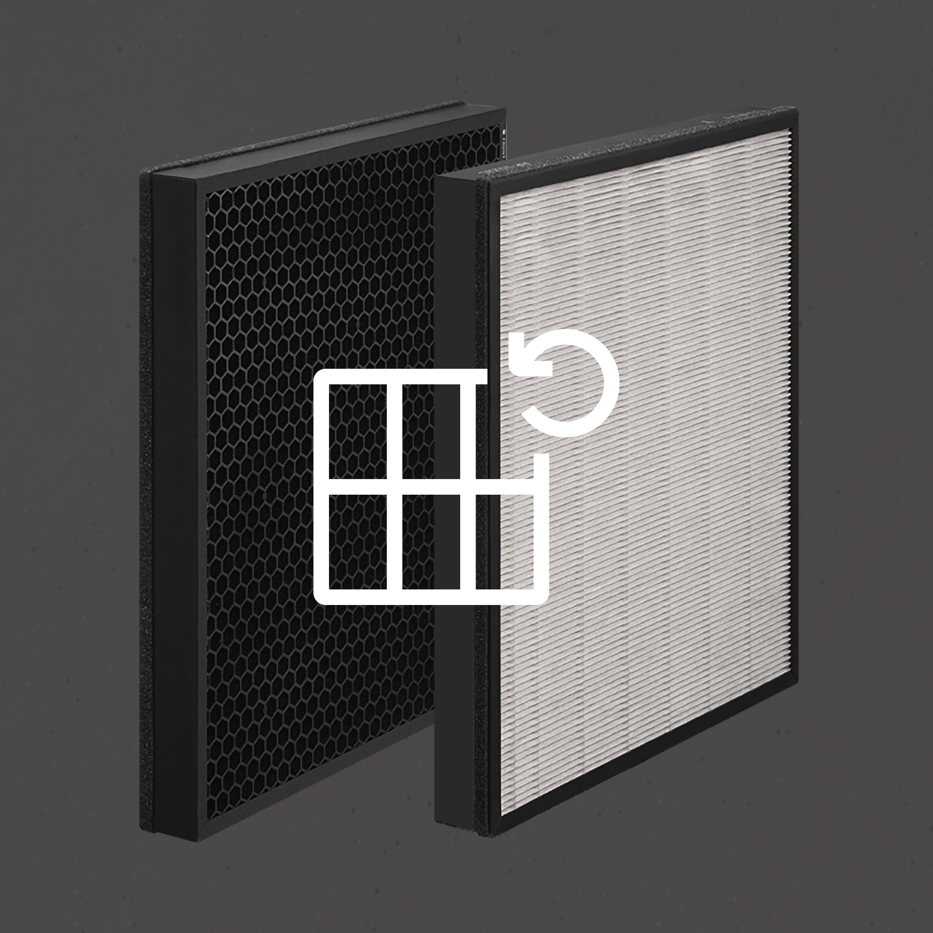
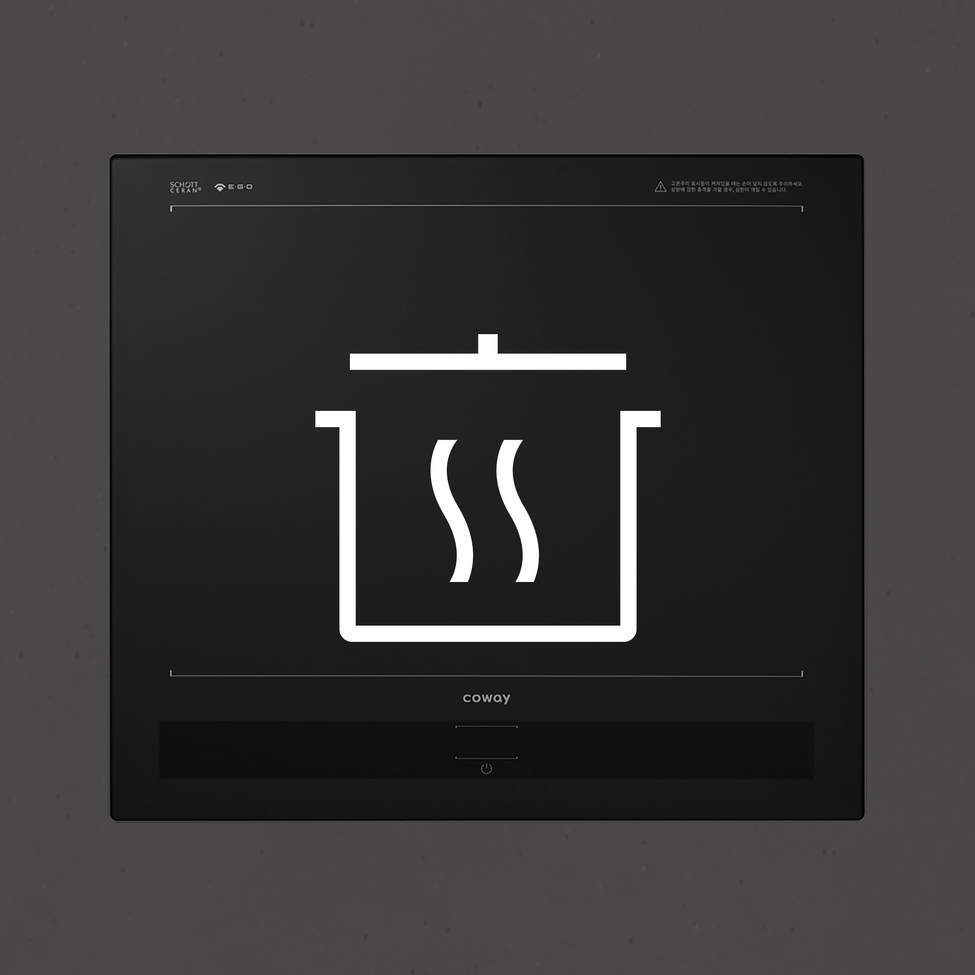
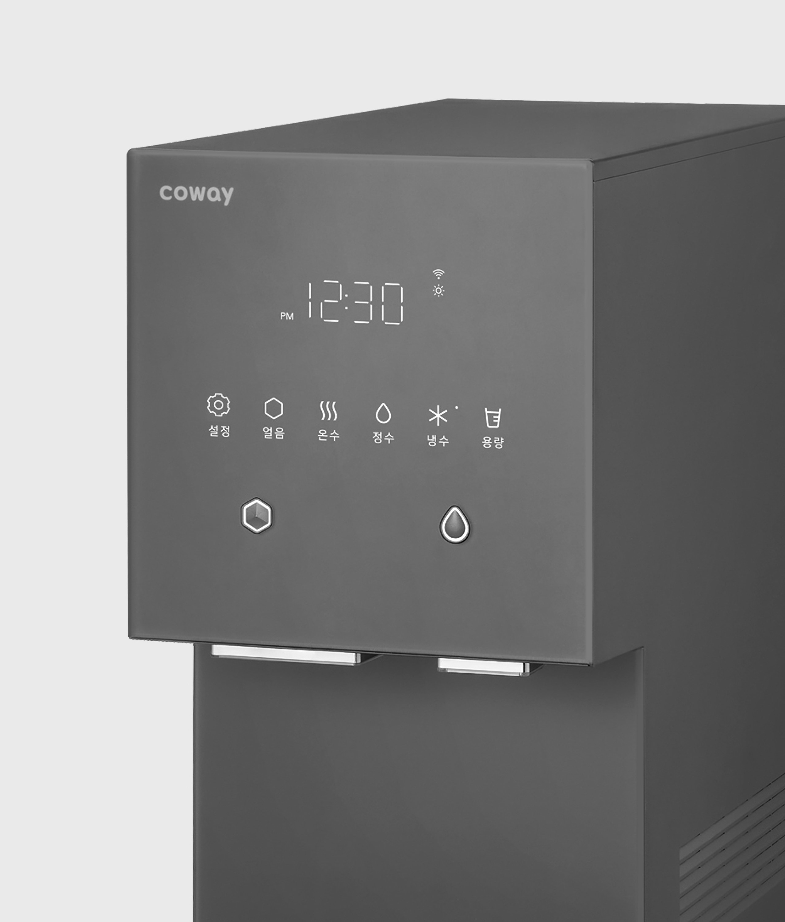
We were tasked with creating a pictogram system that aligned with Coway products while being eye-catching in design. We eliminated unnecessary elements and focused on expressing key features and information. We also ensured the design communicated the premium yet young brand voice in a cohesive manner.
제품 디자인에 기반한 간결성 심리스 디자인으로 공간미를 높이는 코웨이 제품과 조화를 이루면서 눈에 잘 띄는 픽토그램이 필요했습니다. 우리는 불필요한 장식을 덜어내고, 기능과 정보의 핵심을 간결하게 표현하는 데 집중했습니다. 일상성과 프리미엄 기능을 동시에 지닌 브랜드 특징을 고려해 젊고 우아한 바이브를 디자인에 담았고, 때로는 특정 기능이 일으키는 감각과 감성을 표현하기도 했습니다.
Unique yet familiar universality
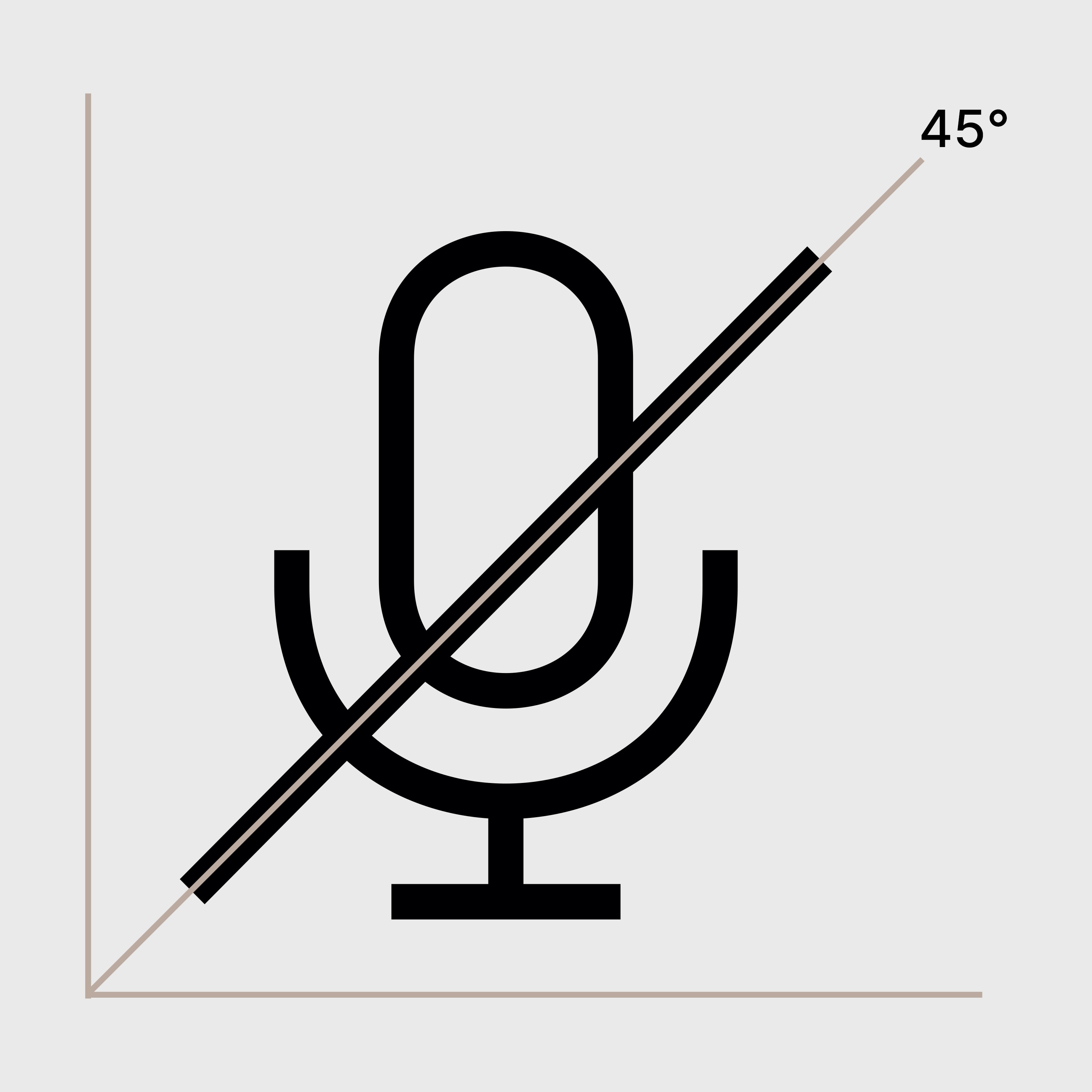
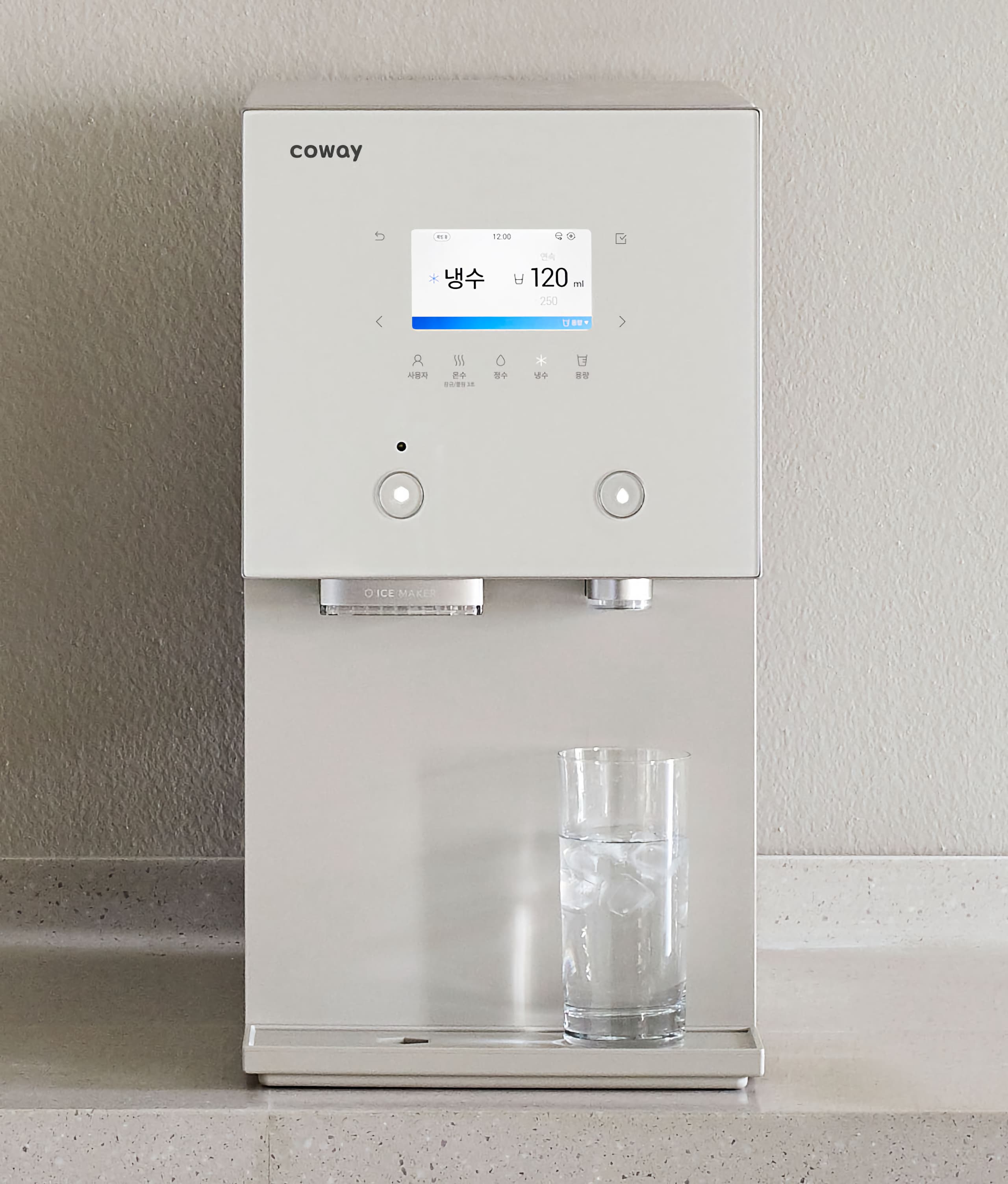
In designing the pictograms, we sorted the features or functions that were common to most products such as, ‘setting’, ‘left or right’, ‘pause’ and the features that were specific to certain products such as ‘carbonation level’, plus’, ’EW sterilization’ so the function was clear to the user. We also focused on making the pictograms for ‘coffee’, ‘tea’, and ‘one cup’ as clear as possible. . It gives a stable balance to all pictograms, and adds rhythmicality to elements that can be boring or obvious. Through this, we expect Coway users to feel familiar with the change and have a more convenient and pleasant daily life.
익숙하면서도 특별한 범용성 ‘설정’ ‘좌우’ ‘일시정지’ 등 통용할 수 있는 항목과 ‘탄산 강도’ ‘플러스(인덕션의 화구 연결)’ ‘EW살균(비데의 전기분해수를 이용한 순환살균)’처럼 제품 특성을 고려해야 하는 항목을 구분해 최적의 사용성을 표현했습니다. 기존에 비슷하게 표현되었던 ‘커피’ ‘차’ ‘용량’ ‘한 컵’ 같은 경우 메타포 디테일에 차별점을 부여해 사용성을 높였습니다. 모든 픽토그램에 안정적인 밸런스를 부여하며 자칫 지루하거나 뻔하게 느낄 수 있는 요소에는 리드미컬함을 더하기도 했습니다. 이를 통해 우리는 코웨이 사용자가 변화를 익숙하게 느끼고, 더 편리하고 기분 좋은 일상을 보내길 기대합니다.
Credits
Project ManagementLee MyungyeonCreative DirectionHwang ByungsamAD+DesignRhu HeejinPark JihyunDesignPark NaraeJang Jihun