Brand
Olive Young From Beauty to Entertainment ALLYOUNG TV

- Client
- Olive Young
- Category
- Brand
- Services
- Brand Strategy, Brand Identity, Content Design, Film & Motion, Digital Strategy
- Scope
- Digital Strategy, Brand Identity, Brand Strategy, Art Direction, Interactive Style Guide, 2D Motion Design, Graphic Design
- Year
- 2021
Olive Young is the number one health and beauty product store in South Korea. Everywhere you go, there is always an Olive Young store just around the corner. With their high brand awareness and dominance in the market, the company was looking for a more creative way to connect with consumers. As a result, Olive Young launched their YouTube channel, providing fun and entertaining beauty content with the products they sell — but in order to be competitive, they wanted a unique brand identity for their channel.
To enhance their YouTube presence and the entertainment aspect of their content, DFY was tasked with rebranding their YouTube image, transforming the Olive Young channel into the Allyoung TV channel.
Through the process, we established a new digital brand identity and guidelines for Allyoung TV as well as the brand identities and guidelines for the channel's two new YouTube content series: ‘Corporate Card Chance’ and ‘Review the Reviews’.
올리브영은 H&B 스토어 원톱 브랜드로 올리브영만의 강력한 브랜드 파워를 지니고 있습니다. 높은 브랜드 인지도와 시장 지배력을 바탕으로, 소비자와 보다 친밀하게 소통할 수 있는 방법으로 올리브영은 즐겁고 다채로운 뷰티 콘텐츠를 제공하는 YouTube 채널, 올영TV를 시작했습니다. 올리브영 YouTube 채널이 보다 경쟁력을 갖추고, 전문화된 서비스를 제공하기 위해서는 올리브영만의 브랜드 채널 아이덴티티가 필요했습니다. 이를 위해, 소비자에게 올리브영만의 경험을 만들어주기 위해 우리는 ‘올영TV’만의 로고 리브랜딩부터 YT채널에서 활용 가능한 다양한 브랜딩 요소를 포함한 가이드를 제작하여 올영TV 디지털 브랜딩을 진행했습니다.

Olive Young TV Brand Identity
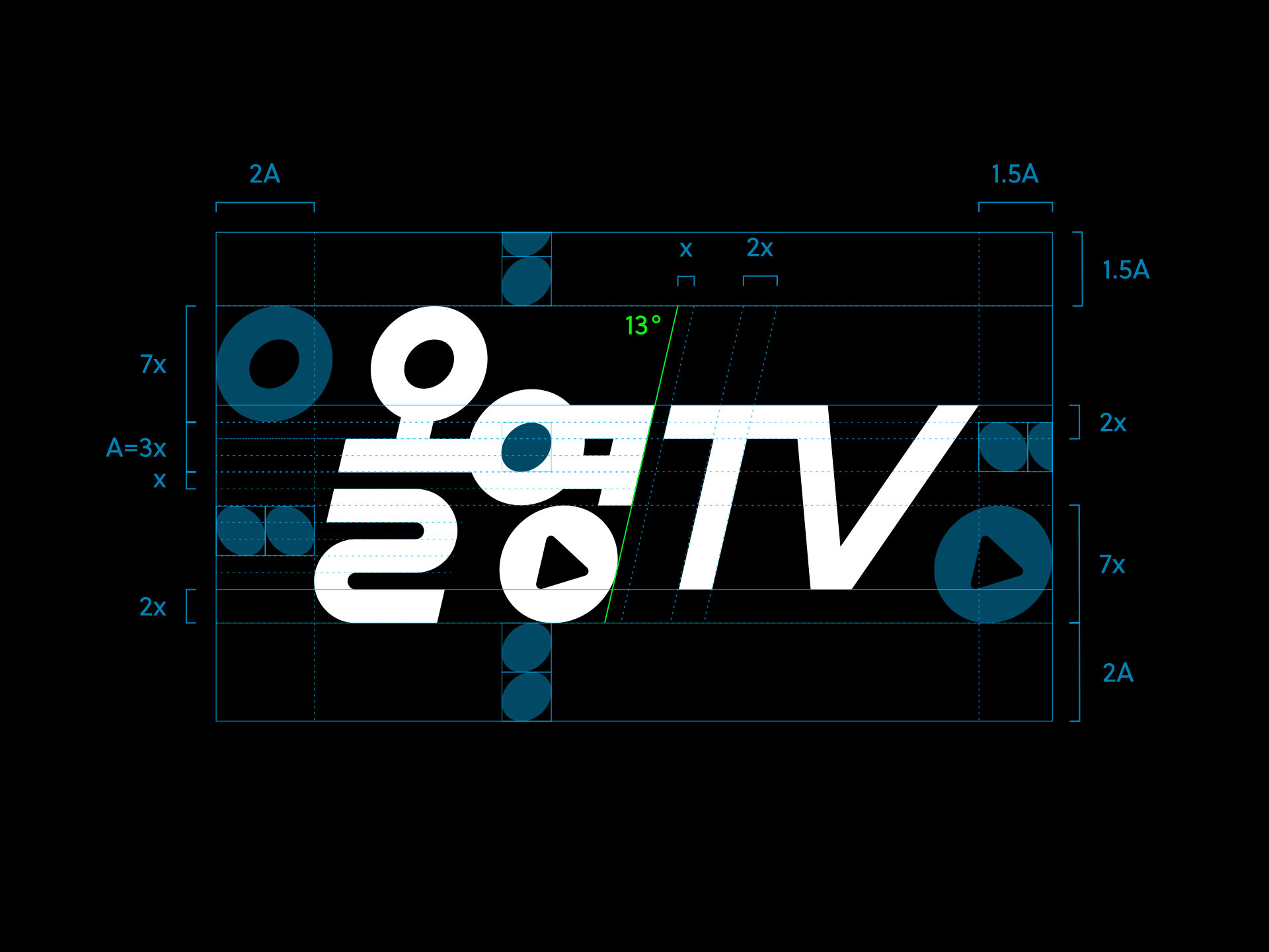
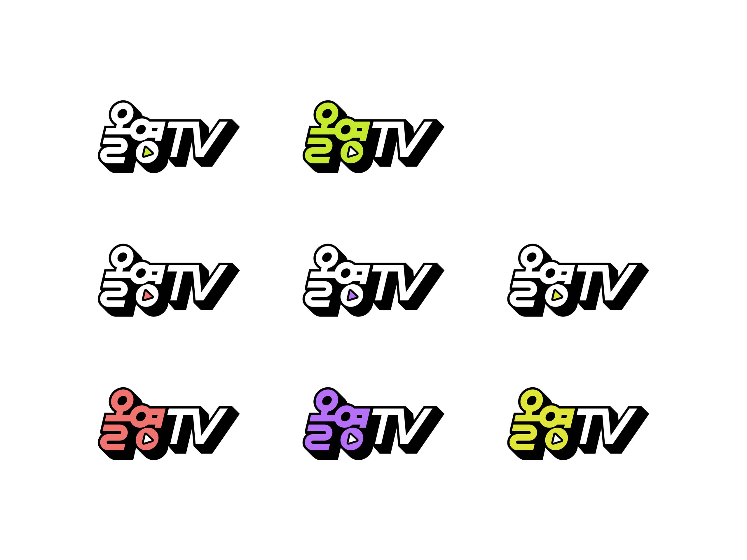
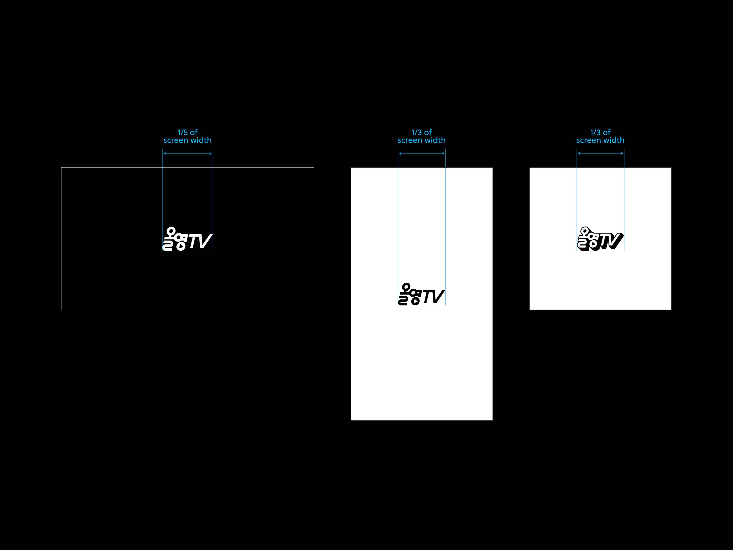
The YouTube channel needed a unified look that could encompass both existing and future content. When creating the logo for Allyoung TV, we maintained the same 13-degree slant as the existing Olive Young symbol. Because it’s born of the same DNA as the existing Olive Young Brand, ’Allyoung TV’ is used as the main logo in all media such as YouTube videos, social media, and digital content.
올리브영의 새로운 디지털 브랜드, 올영TV 올리브영 YouTube는 기존의 콘텐츠와 앞으로 만들어질 콘텐츠를 아우를 수 있는 통합된 아이덴티티가 필요했습니다. 새롭게 태어난 ‘올영TV’는 기존의 올리브영의 심볼과 동일한 13도의 기울기를 유지합니다. 기존의 올리브영 브랜드와 동일한 DNA를 가진 ‘올영TV’는 유튜브 동영상, 소셜 미디어, 디지털 콘텐츠 등 모든 미디어에서 메인 로고로 사용됩니다.



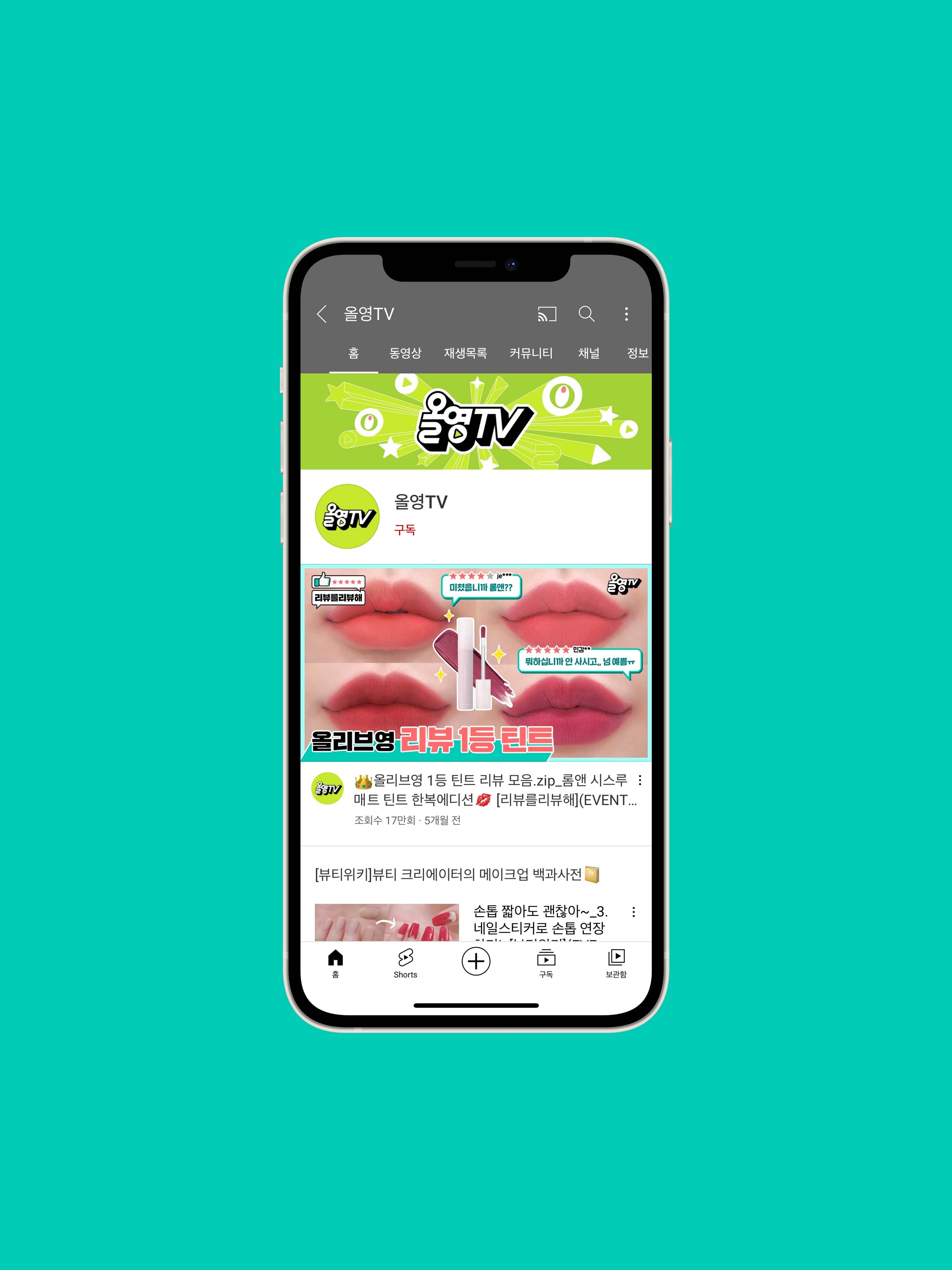
YouTube Channel art
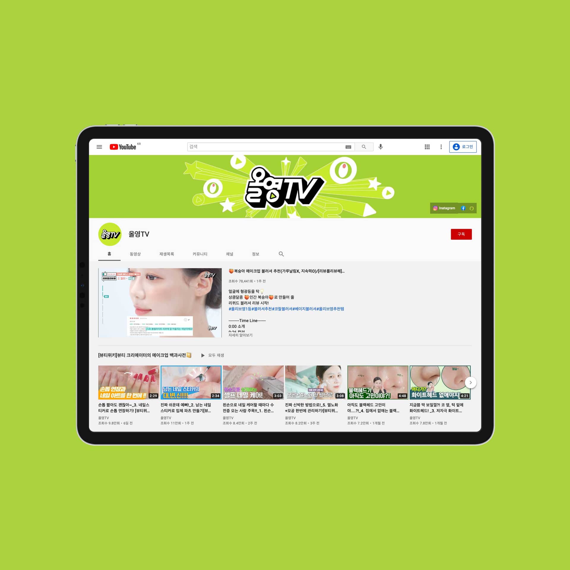
We created channel art infused with the Olive Young logo and signature olive color, to reflect the new Allyoung TV vibe while keeping Olive Young’s brand essence.
우리는 새로운 ‘올영 TV’ 채널 아트가 올리브영의 브랜드 본질을 유지하면서 새로운 로고가 대중들에게 효과적으로 각인될 수 있도록, 올리브영의 ‘심볼’과 ‘기존의 올리브그린 컬러’를 함께 노출시켜 제작했습니다.
Content Branding
Along with the main Allyoung TV brand identity, we were tasked with creating the identities for the channel’s two new YouTube content series ‘Corporate Card Chance’ and ‘Review the Reviews’. For each series, we designed on-screen graphics (bugs), intros, thumbnails, and titles/captions/information, aligned with the creative direction of the content.
'올영TV' 브랜딩과 함께, 우리는 새롭게 출시할 YouTube 콘텐츠 시리즈 ‘법카찬스’와 ‘리뷰를리뷰해’의 아이덴티티와 가이드라인을 만들었습니다. 각각의 콘텐츠 방향성에 맞게 로고(버그), 인트로 모션, 섬네일, 부제/자막/인포메이션을 디자인했습니다.
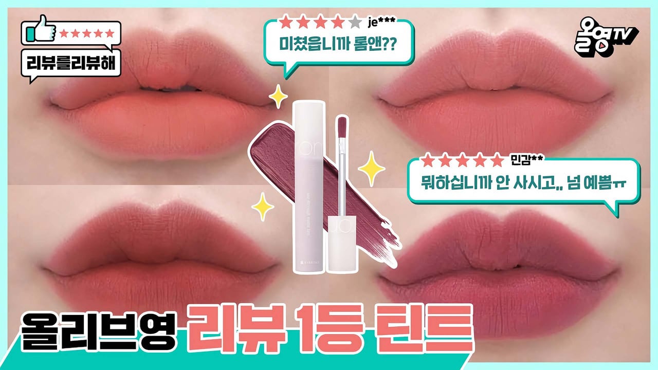
‘Review The Reviews’ Brand Identity. This YouTube content series features hosts reviewing the actual user reviews of products sold in Olive Young stores. We created an identity that reflects what the content is about while keeping it fun and engaging. The logo (bug) has two speech bubbles overlapping each other, making it visually clear and easy to convey that the customer’s review is being reviewed by the hosts. Because customer participation and information delivery are important in this context, we carefully created informative content to reproduce their responses while maximizing the feeling of real customer reviews.
‘리뷰를리뷰해’는 올리브영 웹사이트에 있는 실제 고객들의 찐리뷰를 다시 한번 리뷰하는 콘텐츠입니다. 로고(버그)에 말풍선 두 개가 서로 대화하듯이 겹쳐있어, 리뷰를 다시 한번 리뷰한다는 것을 시각적으로 명확하고 쉽게 전달할 수 있게 만들었습니다. 고객들의 참여와 정보 전달이 중요한 콘텐츠로 실제 고객들의 리뷰 느낌을 최대한 살리면서 그들의 반응을 재생산할 수 있도록 인포메이션 부분을 신경 써서 제작했습니다.
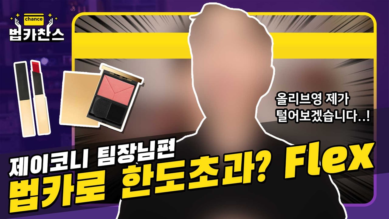
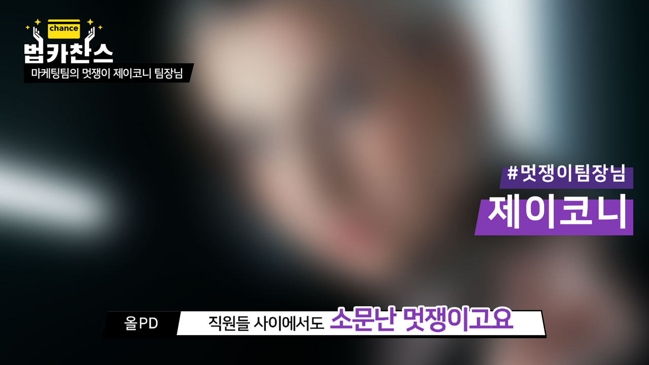
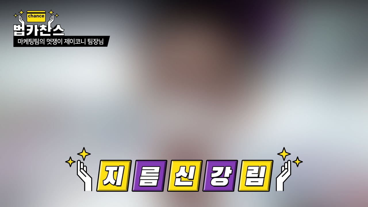
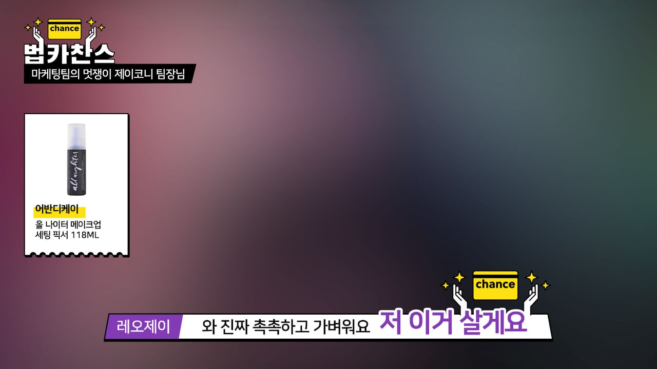
‘Corporate Card Chance’ Brand Identity This new YouTube content series is all about Olive Young employees getting the chance to use the Olive Young corporate card to purchase anything they want in the store. The visuals were developed to convey a sense of sympathy and familiarity with the office workers. In particular, the logo bug was designed with humor, showing a pair of hands pointed upwards at a glowing golden card, as if in worship. During the intro, the card (featuring the word ‘Chance’) flies up and lands in between the hands.
‘법카찬스’는 올리브영 임직원들의 인터뷰나 법인카드로 즐길 수 있는 기회를 주는 콘텐츠입니다. 직장인들의 공감과 친근한 일상을 담기 위해서, 로고(버그)는 밝게 빛나는 법인카드를 숭배하듯이 손으로 떠받드는 모양으로 재미있게 표현했습니다. 인트로 영상의 경우, Chance가 적혀있는 카드가 힘차게 날아올라서 손안에 완벽하게 장착하는 모습으로 연출했습니다.

Credits
Project DirectionBai ErinAccount DirectionKim SubinBX DesignLily NiuArt DirectionLily NiuGraphic DesignHong Heejung2D Motion DesignHong Heejung