Brand & Digital
Website construction for BI change and new identity establishment.
- Client
- Hanwha S&C
- Category
- Brand, Digital
- Services
- Content Design, Website, UX/UI
- Scope
- Content Strategy, UX Strategy, Art Direction, GUI Design, Mobile Site Design, Website Design, Style Guide, Graphic Design, Illustration, Content Production
- Year
- 2013
Through the BI change of 63 Square which is the multi-cultural space for couples and families, the website was reorganized for new identity building. Reflecting the changed logo, color and shape on website in order to express young and energetic 63 building, it established new brand identity and broke the old image of 63 building in order to deliver the new image of exciting and funny multi-cultural space.
연인, 가족의 복합문화공간 63스퀘어의 BI 변경으로 새로운 아이덴티티 수립을 위해 웹사이트가 개편되었습니다. 젊고 활기찬 63빌딩을 표현하기 위해 변경된 로고 및 컬러, 쉐입 등을 웹사이트에 반영하여 새로워진 브랜드 아이덴티티를 수립하고 올드 한 63빌딩 이미지에서 탈피하여 신나고 즐거운 복합문화공간의 이미지를 전달합니다.
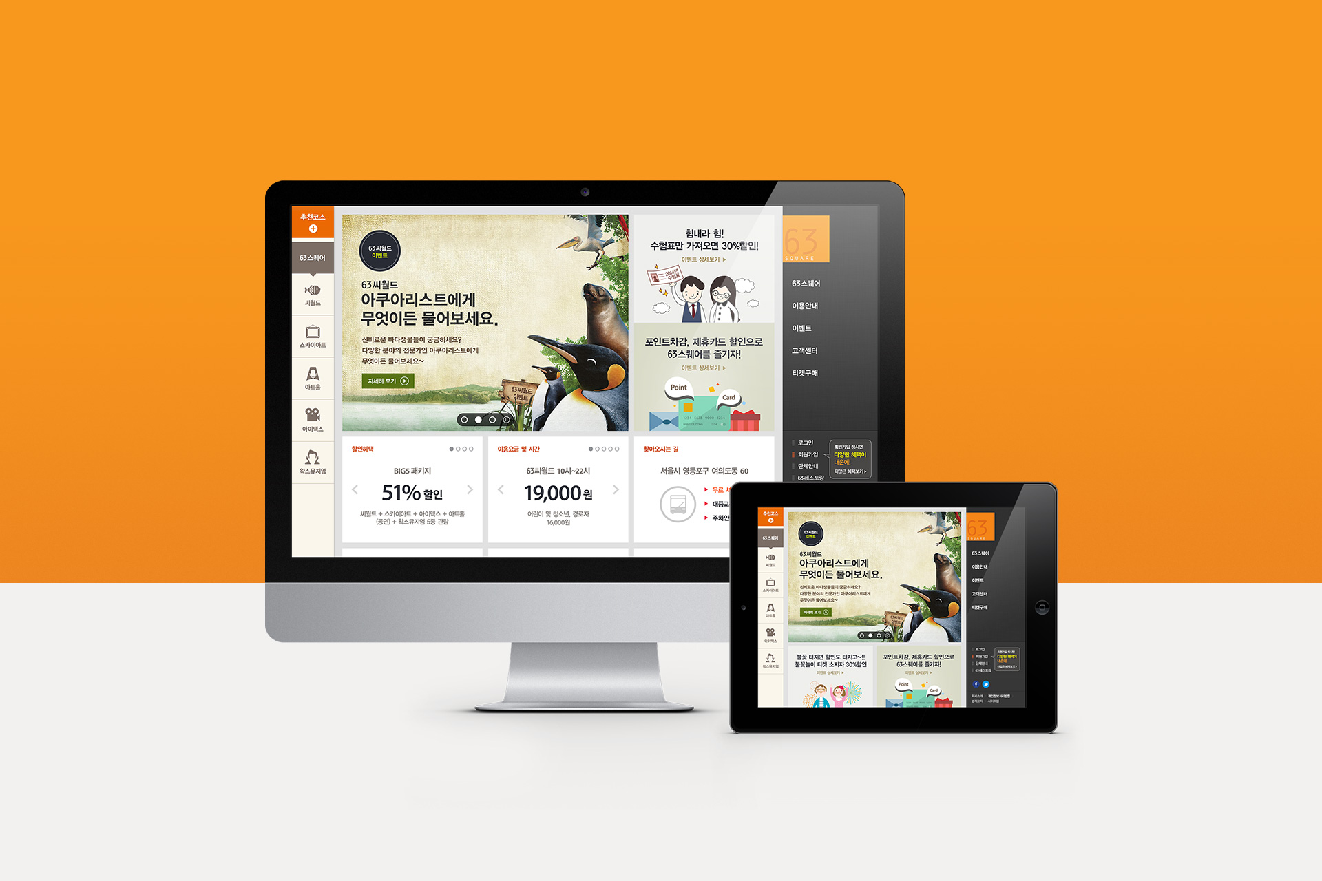
User-friendly 63 Square website.
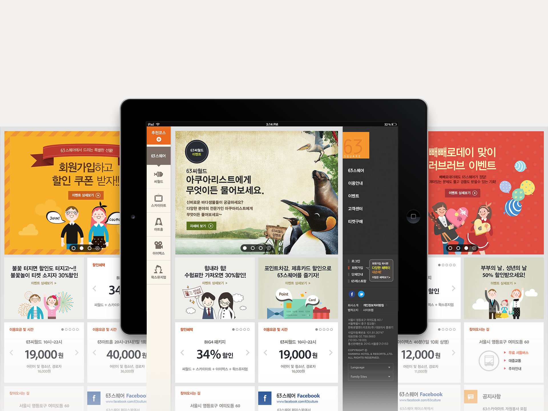
After dividing the users who visit 63 Square website by type, it analyzed their behavior pattern. On the basis of this, it improved the design, UX/UI and marketing strategy for the users to find the information quickly. And exposing the branding image and event banner on main visual area, it made 63 Square website play a role of online market place.
사용자를 먼저 생각하는 63스퀘어. 웹사이트에 방문하는 사용자들을 유형별로 구분한 후, 행동 패턴을 분석하였습니다. 이를 바탕으로 유형별 사용자들이 원하는 정보를 빠르게 찾을 수 있도록 디자인, UX/UI, 마케팅 관점에서 개선하고자 하였습니다. 또한 메인 비주얼 영역을 브랜딩 이미지와 이벤트 배너로 노출하여 63스퀘어 웹사이트가 온라인 마케팅 플레이스로서의 역할을 실현할 수 있도록 하였습니다.
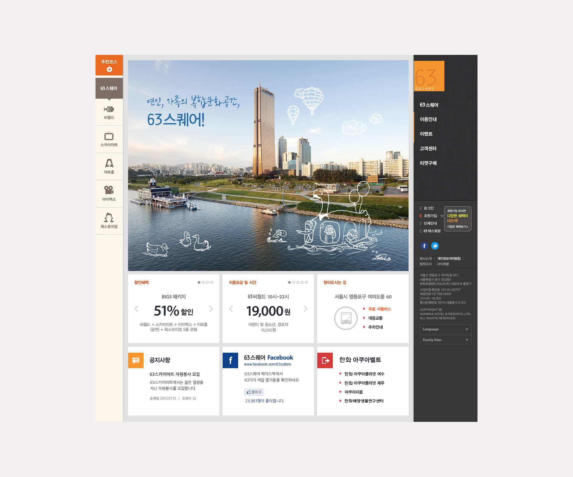
Brand identity unified with the layout using BI shape. Applying the interactive motion with the motive of BI and using the layout of square shape, it enhanced the popularity of new BI.
BI 쉐입을 활용한 레이아웃으로 브랜드 아이덴티티의 일관성을 유지합니다. BI를 모티브로 인터랙티브한 모션을 적용하고 스퀘어 쉐입의 레이아웃으로 새로운 BI의 인지도를 강화합니다.
Providing same experience irrespective of access device.
In order to provide the web environment equal to the disabled and the non-disabled, it advanced web accessibility and complied with web standards. The users can experience the things in PC also in tablet and mobile.
누구에게도 차별 없는 접속 디바이스와 상관없이 동일한 경험합니다. 장애인, 비장애인 모두에게 동일한 웹 이용 환경을 제공할 수 있도록 웹 접근성 고도화 및 웹 표준을 준수하였습니다. PC에서의 경험을 Tablet, Mobile에서도 동일하게 경험할 수 있습니다.
Touch the customer’s sensitivity through the familiar way of contents delivery.
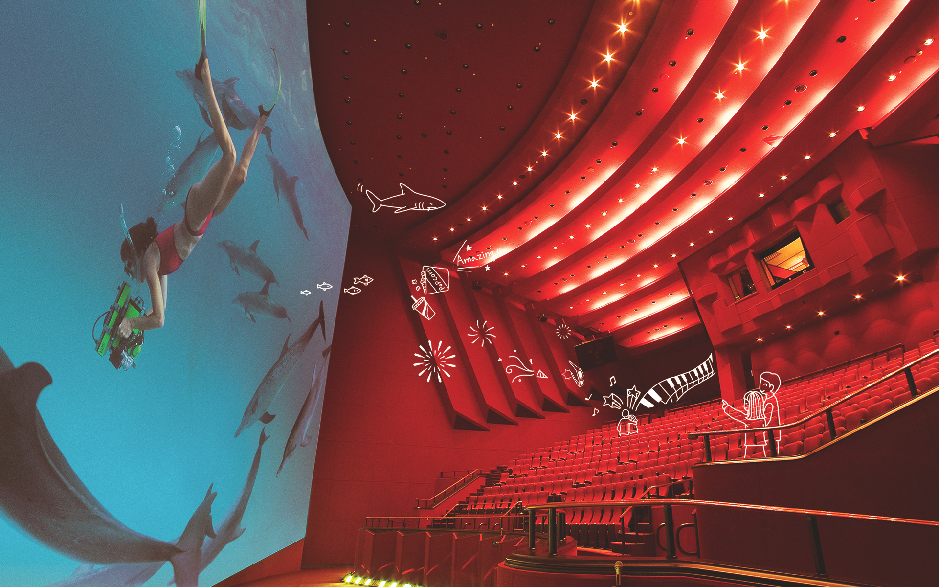
Touch the customer’s sensitivity through the familiar way of contents delivery Adding the familiar contents like emotional illustrations or colloquial phrases to the photorealistic images, it delivers the information to the customer comfortably.
친근한 콘텐츠 전달 방식으로 고객의 감성 터치. 현장감을 살린 실사 이미지에 감성적인 일러스트와 구어체 형식의 문구 등의 친근한 콘텐츠로 구성하여 고객에게 딱딱하지 않게 정보를 전달하고자 하였습니다.
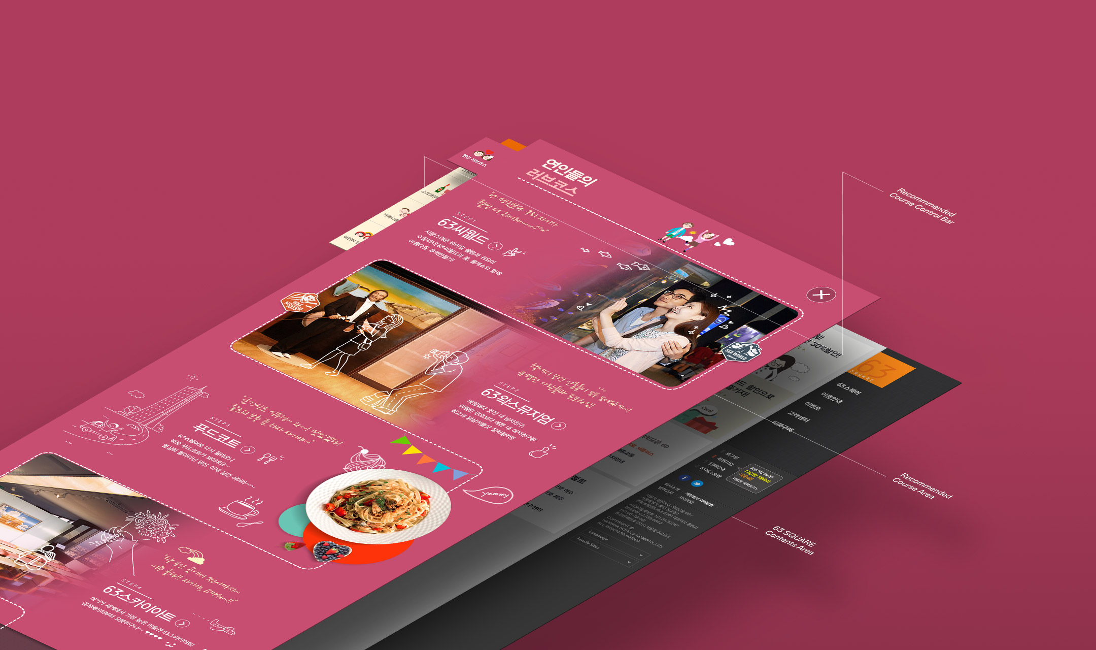
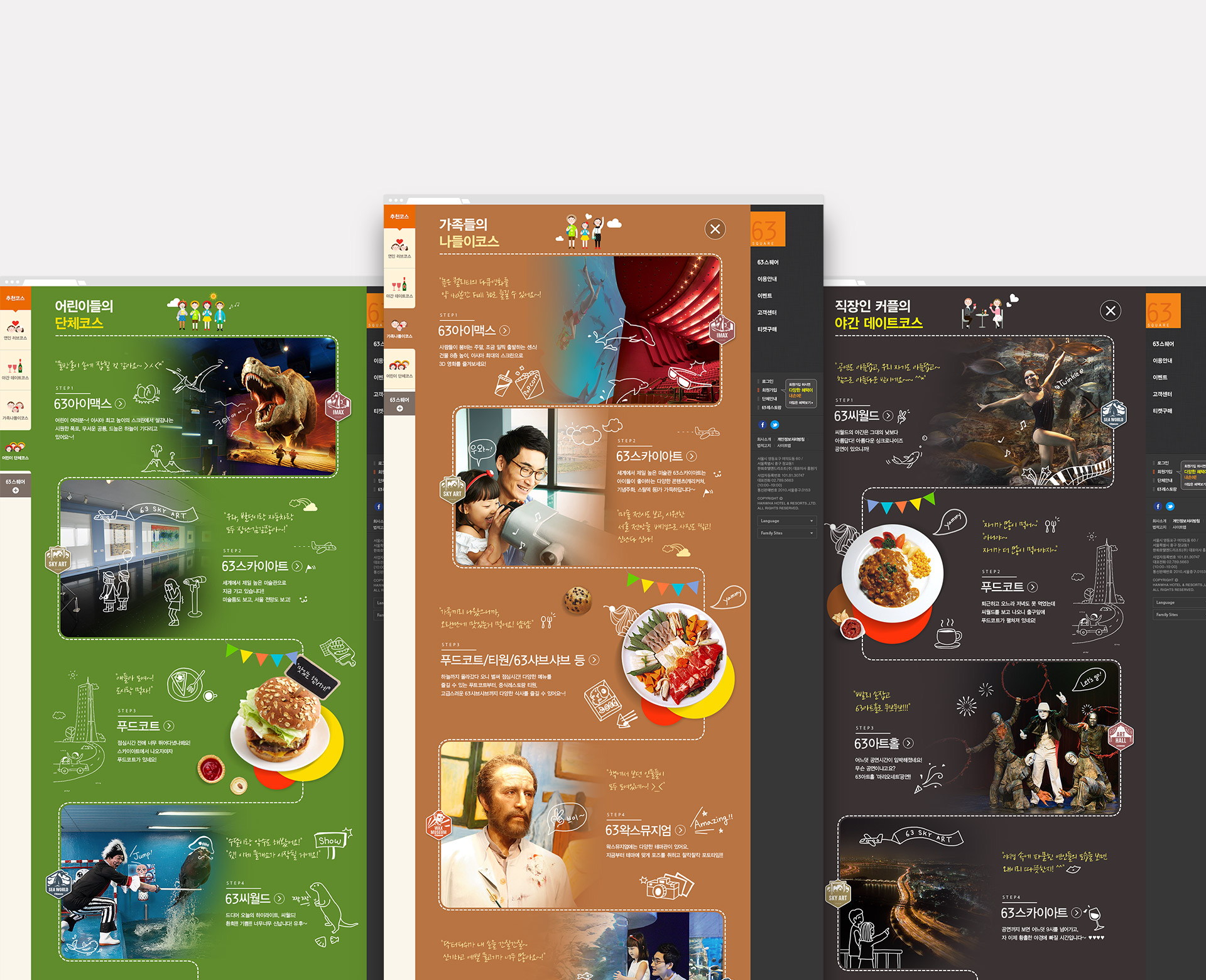
Contents composition through the analysis of user’s behavior pattern.
Providing the recommended course in accordance with the type of customers who visit 63 Square Exhibition, it composed the contents in order to maintain the customer base of young couples for date, families and infant/elementary school students which are the obtained base already.
온라인을 통한 경험을 오프라인에서 그대로 체험할 수 있습니다. 63스퀘어에 방문 전 홈페이지에서 전체적인 관람장 위치와 63씨월드의 경우 수족관 순서, 63스카이아트와 63뮤지엄은 전시관 위치 및 해당 위치의 사진을 미리 경험함으로써 오프라인에서도 온라인의 경험을 그대로 이어갈 수 있습니다.
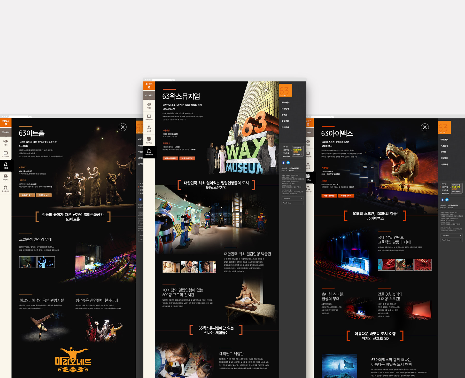
High accessibility to check the important information with a single click
The users can check the exhibits and performances of each halls as well as the simple introduction, service hours and fee about 5 exhibition halls of 63 Square with a single click.
중요한 정보는 한 번의 클릭으로 확인할 수 있는 높은 접근성 가지고 있습니다. 63스퀘어의 5개 관람장에 대한 간단한 소개와 가장 중요한 이용 시간, 요금뿐만 아니라 해당 관람장에서 진행되고 있는 전시와 공연을 한 번의 클릭으로 확인이 가능하도록 구성하였습니다.
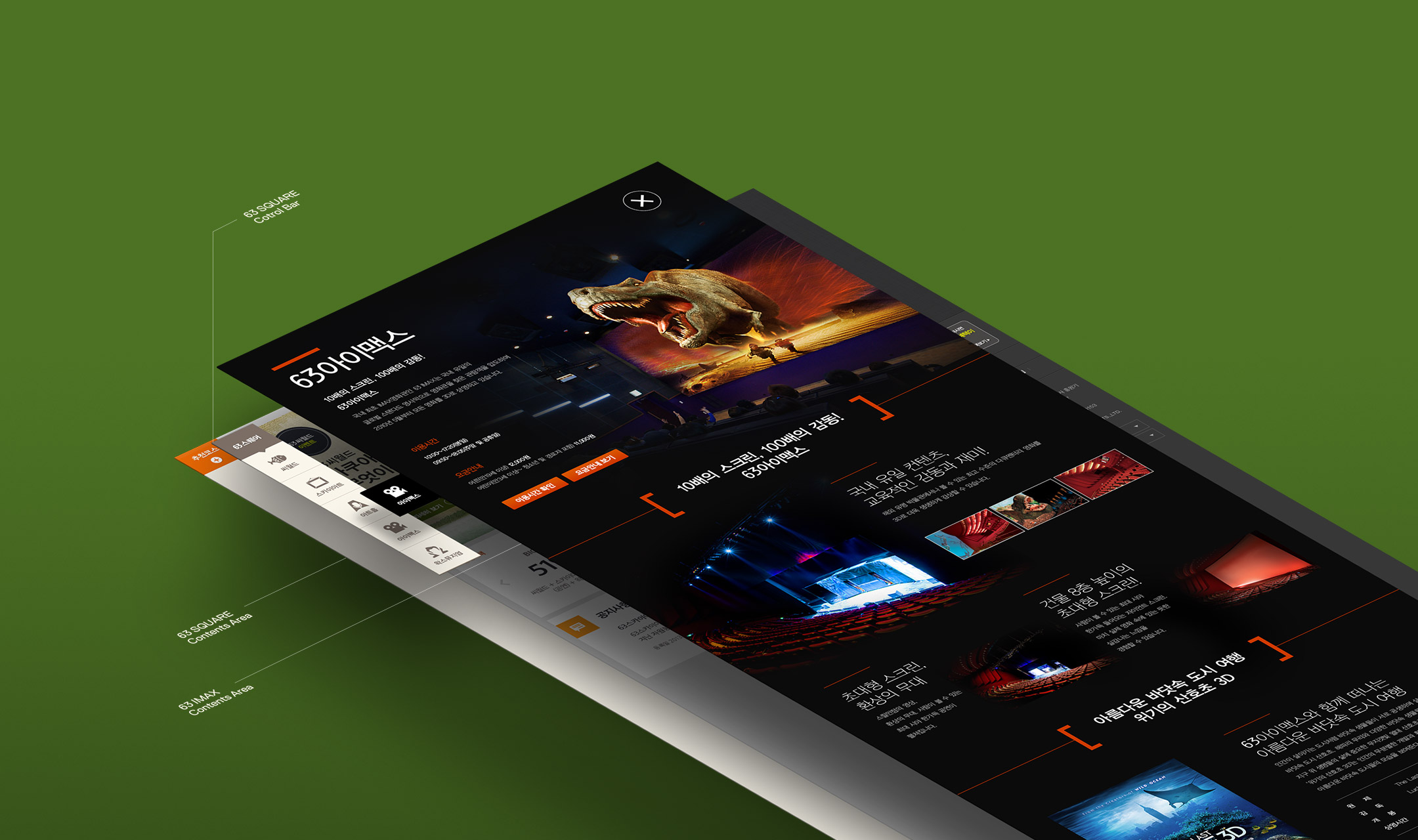
Natural connection to the ticket buying.
In order to cause interest in exhibition halls and induce the ticket buying naturally after checking the contents of website, it installed the ticket buying button at the bottom of contents page to increase sales.
자연스럽게 티켓 구매로의 연결합니다. 웹사이트에서 콘텐츠를 확인하여 실제 관람장에 대한 흥미를 유발하고 자연스럽게 티켓 구매로 유도할 수 있도록 콘텐츠 페이지 하단에 위치한 티켓 구매 버튼을 통해 구매로 연결하여 매출 증대에 기여합니다.
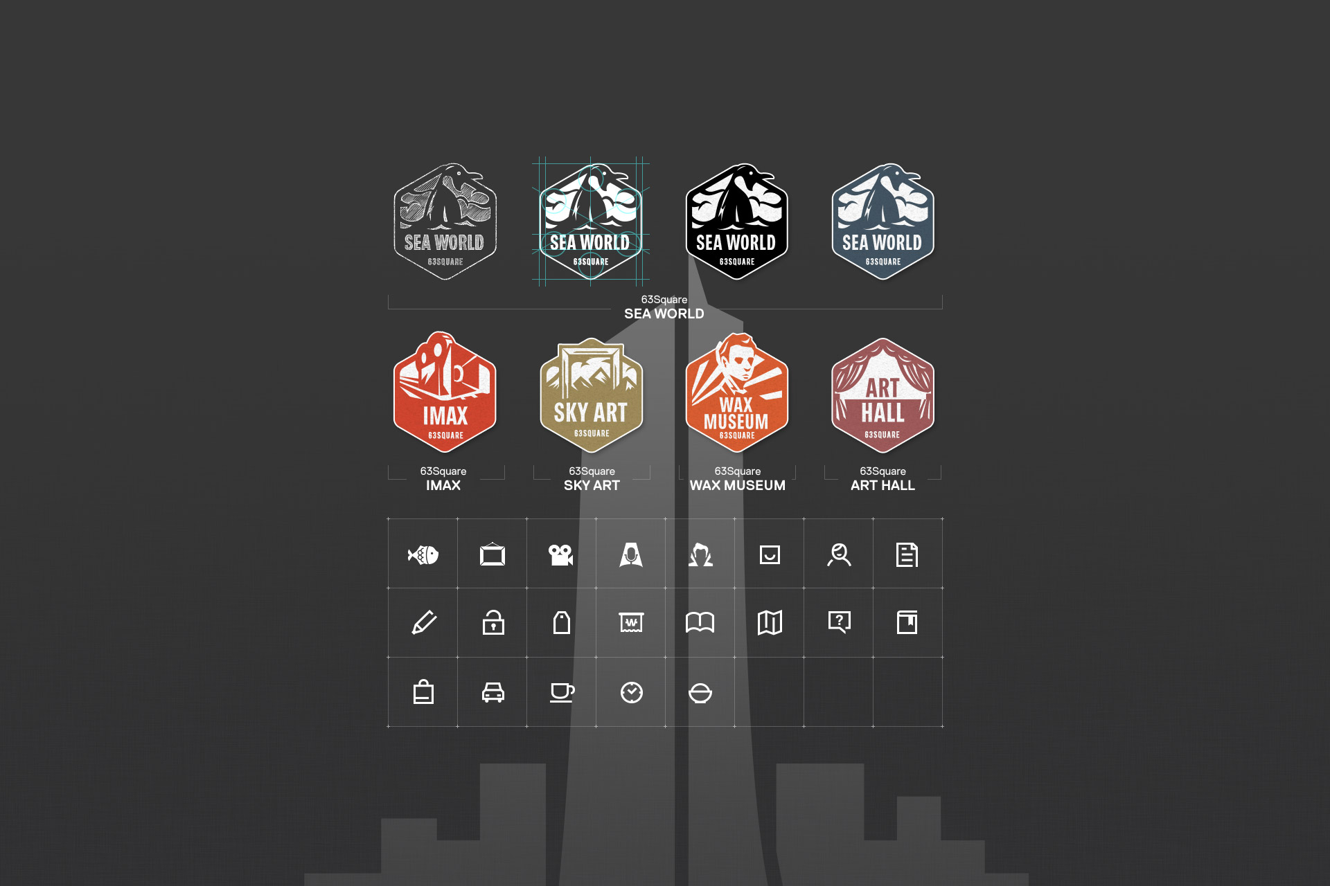
Icons to deliver the clear messages.
It provides simple and clear icons for exhibition halls so the users can recognize the meaning without reading text. In case of representative badges for exhibition halls, they were manufactured without greed in order to express the characteristics of exhibition halls interestingly.
읽지 않아도 보이는 명확한 아이콘을 제작하였습니다. 장애인, 비장애인 모두에게 동일한 웹 이용 환경을 제공할 수 있도록 웹 접근성 고도화 및 웹 표준을 준수하였습니다. PC에서의 경험을 Tablet, Mobile에서도 동일하게 경험할 수 있습니다.
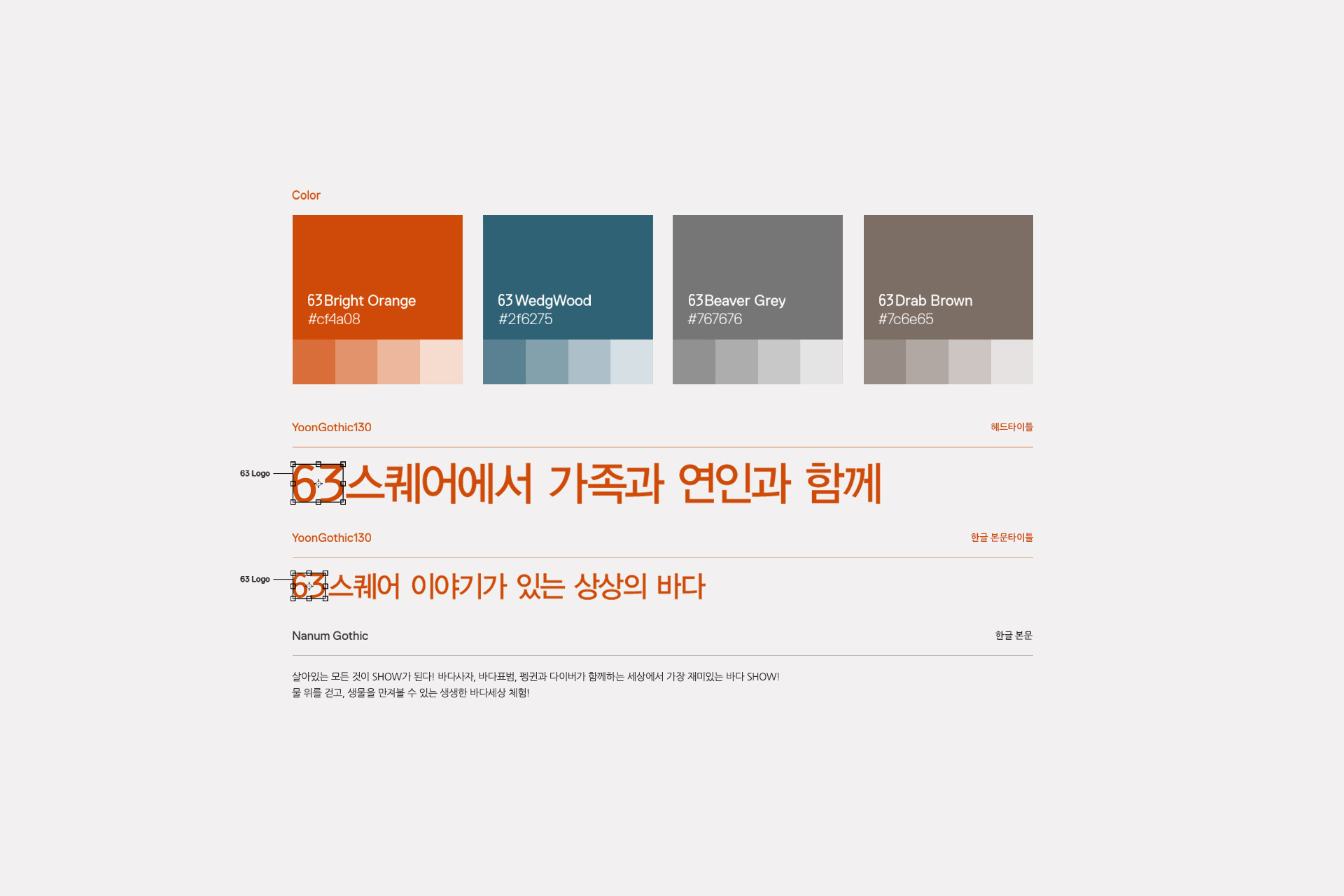
Funny and lively color palette.
It composed the color palette in order to give the funny and lively feeling to 63 Square which is the multi-cultural space for couples and families. By composing the color palette mainly with new BI colors, it established the brand identity.
연인, 가족의 복합문화공간 63스퀘어의 밝고 재미있고 활기찬 느낌을 줄 수 있는 컬러 팔레트를 구성하였습니다. 또한 새로운 BI의 컬러를 중심으로 컬러 팔레트를 구성하여 브랜드 아이덴티티를 구축하였습니다.
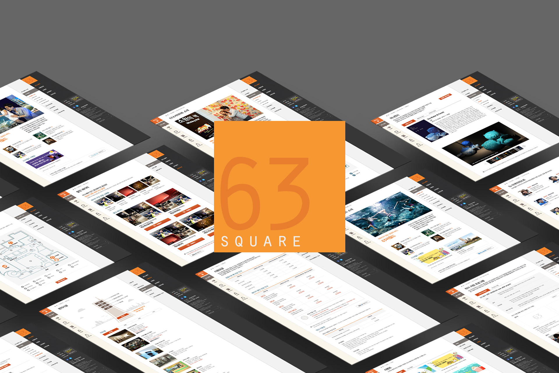
63 Square satisfying all customers and operators.
Extending the marketing area which was inefficient before to overall main screen after renewal, it exposed the messages and events that the operators wanted to deliver to the customers and improved the manager function which the managers can directly control the contents such as sold-out status or show time changing in order not to make a confusion to the customers.
고객도, 운영자도 모두 만족한 63스퀘어 웹사이트. 기존에 부족했던 마케팅 영역을 리뉴얼 후 메인 전반으로 확장하면서 운영자가 고객에게 전달하고자 하는 메시지, 이벤트 등을 쉽게 노출할 수 있도록 하였고 실시간 반영이 필요한 매진 현황, 쇼 시간 변경 등의 콘텐츠를 담당자가 직접 제어 가능하도록 관리자 기능을 개선하여 고객이 학습한 정보에 혼선이 없도록 하였습니다.
Credits
Production AgencyDFY
Project ManagementPark JihyeDesign LeadKim Junyoung